Hi All! 🤗
So, you registered a domain. And you started working on your personal site. Maybe you already got a first version of your site online. Perhaps you even published a few posts. But suddenly, there’s this question in your head:
“But – is it worth it?”
Almost everyone who starts building a personal website sooner or later asks themselves this question. And it’s a good, an important question. You invest a lot of time and energy into your site, after all. And those are precious resources which we better spend on something that is worthwhile.
Every now and then, you will hear somebody say (or write in a newsletter) that getting a personal website or blog has “changed their life”. Well, that definitely sounds like the type of change that would be worth the effort. But… life-changing… really? For whom? And in what way? I wanted to know more, so I once again asked you all on Mastodon: how has your personal website changed your life?
I expected to maybe get a handful of answers. But the reaction, once more, blew me away. To get the full picture, you can read through the responses and amazing stories yourself. But here are a few hand-picked quotes:
“Blogging for multiple years brought so many positives. The recruitment process for my last two jobs was simplified, mainly because of the stuff I shared about the web. Blogging gave me a space to express myself creatively and works well as a playground for new web features. I also have learned a lot of English through blogging.”
“The most important part is sharing and learning through writing. But then, having a place to showcase you and your growth has helped immensely. I have heard more than one time that people trust my expertise because they read my blog.”
“Mine has definitely helped me make connections in the industry, including meeting people at conferences, and getting invited to speak too.”
“Through my site, I've met some great people, made some good friends and had the opportunity to work on some fantastic projects.”
“I cannot imagine my career happening at all without my personal website.”
“It is the fuel of my growth.”
Isn’t that astonishing? It seems like having a personal website actually works. It opens up opportunities. It creates change and growth, both around you and inside of you. It builds connections. And it nourishes community. I can say from my own experience that all of the above is true for my site as well. I could never have imagined that, through writing on my site, I would meet so many new friends both on- and offline and become an active member of the Web community.
There is one crucial element to it though, and that is: consistency. People will not visit your site in droves right after you publish your first blog post. Maybe it takes 10 posts, before anyone pays attention. Maybe it takes 20. Maybe it even takes many more. But if you consistently show up and put yourself out there, people will take notice. There is no way to tell what or when it will happen. But something will happen.
Creating and maintaining your personal home on the Web takes a good amount of work. Work that you probably will do in your spare time. Work that will feel cumbersome at times. But whenever you ask yourself whether it is worth it, remember that the answer is a resounding:
~
If you have a personal site, feel free to quickly hit reply and tell me how it has changed your life or career.
Links
Here’s another mixed bag of links. Please let me know how you like them! And if you can think of someone who would enjoy reading this newsletter today, feel free to forward along.
This Website Is under Construction – a Love Letter to the Personal Website
Earlier this year, Sophie Koonin gave a wonderful talk about personal websites at beyond tellerrand and later also at CSS Day. Her talk included a lot of nostalgia for the web we lost, but was also a call to action to keep building playful, useless, weird, and truly personal websites.
Make it fun. Make it pointless. But most importantly, please, make it yours.
— Sophie Koonin
👉 https://beyondtellerrand.com/events/dusseldorf-2023/speakers/sophie-koonin
How To Dark Mode and Beyond
If you’re thinking about adding a dark mode to your site, this recent episode of the Syntax podcast with Scott Tolinski and Wes Bos might be really useful. Scott and Wes talk about why it makes sense to implement a dark mode right away, different strategies for using CSS custom properties aka color variables, and many details that you might have to think about like solving contrast issues, handling opacity, or theming (and switching the colors) of individual components.
👉 https://syntax.fm/show/690/how-to-dark-mode-and-beyond
A cohesive and unified identity for IndieWeb protocols
Paul Robert Lloyd shares his proposal for creating a clear and consistent identity for the protocols underlying the IndieWeb’s most exciting and powerful ideas, like POSSE, Micropub, Webmention, IndieAuth, Microsub and Vouch. A very thoughtful approach which he was also able to discuss in a session at the recent IndieWebCamp in Nuremberg.
👉 https://paulrobertlloyd.com/2023/298/a1/indieweb_identity/
Making the Patterns Day website
Jeremy published a wonderful little case study of how he built the website for Clearleft’s Patterns Day conference directly in the browser. Just with HTML, CSS, and a service worker for smarter caching – but without any build tools. As unreasonable as this approach might sound in the days of automated frontend cloud infrastructure deployments via CI/CD pipelines, it is still a totally valid – and fairly easy – way to build a website. And it’s actually a fantastic approach for getting started with your own website: start with just the content and a basic HTML structure. Then, define a color palette and basic styles for fluid typography. The rest is working with the material of the Web, designing directly in the browser, using the most powerful design tool we have today: CSS.
“Some of the best results came from happy accidents—the way that certain elements behaved at certain screen sizes would lead me into little experiments that yielded interesting results. […] when it comes to how the content is going to behave on the World Wide Web, nothing beats a browser for fidelity.”
— Jeremy Keith
👉 https://adactio.com/journal/20544
Cut The Intro
Here’s Robin with fantastic advice for all you writers out there: cut the intro. Far too often, we begin our texts with an elongated intro or backstory that isn’t really needed. Skip the intro and get right to the point. And here’s an additional trick that has served me well several times: start writing as you normally would, but then delete the first, or maybe even the first two paragraphs. You’ll be surprised how well your text still works – and how it suddenly starts with the juicy stuff right away.
👉 https://robinrendle.com/notes/cut-the-intro/
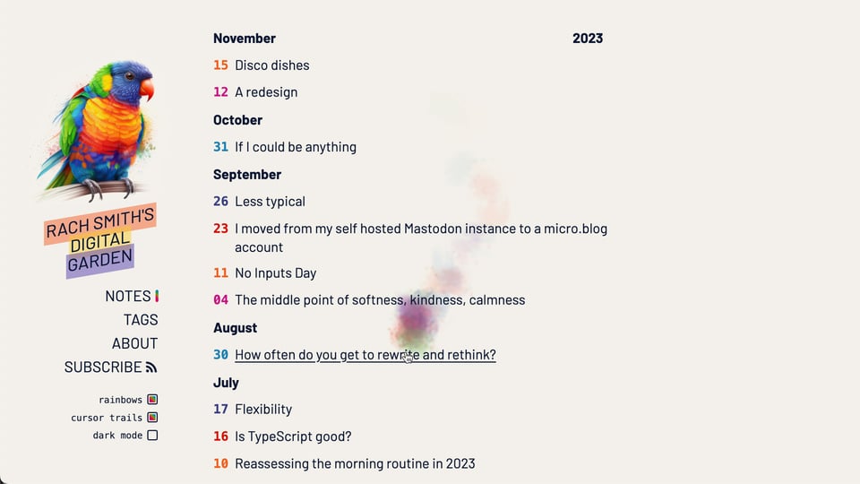
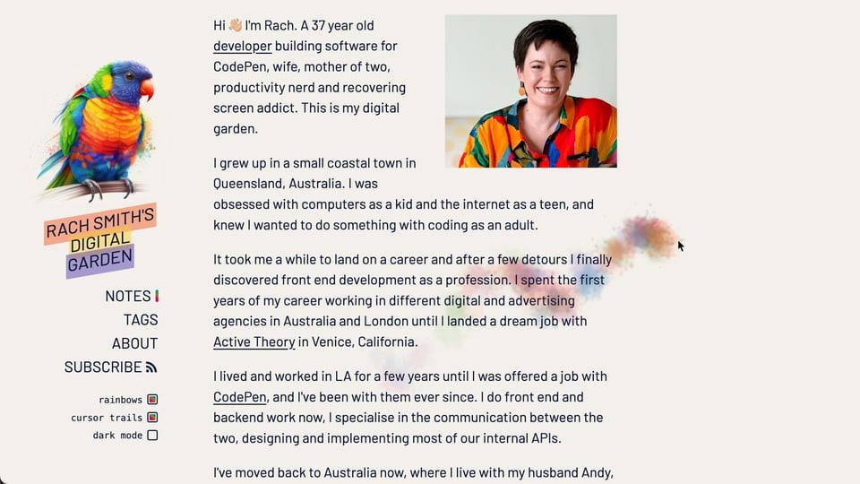
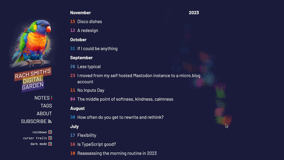
🌈 Personal Site of the Week 🦜 Rach Smith == rachsmith.com
Rach Smith is a developer from Queensland, Australia, who is building software for CodePen. She is also a wife, mother of two, productivity nerd and “recovering screen addict”. Rach just redesigned her personal website with a beautiful mix of vibrant rainbow colours, elegant and functional typography, a nice dark mode, and lovely details like colourful mouse cursor trails. But most importantly, Rach regularly publishes insightful and thoughtful posts about development, writing, blogging, productivity, wellbeing, and much more, which makes it a must to also add her feed to your RSS reader of choice.


And that’s it for today. How did you like this issue? Which one of the links was your favorite? What do you want more or less of? Do you have any other suggestions on how to improve this newsletter? Just hit reply and let me know.
Have a wonderful weekend! ☀️
– Matthias
