OW #18: “Typographic Bodies: From Colonial Dictatorship to Sex Education” by Silvio Lorusso
In this short issue, Silvio Lorusso reflects on a visit to the Aljube Museum in Lisbon. There, he noticed a photo from the colonial past of Timor where bodies of the local people were arranged to form celebratory words, leading him to explore similar uses of bodily typefaces in design history.

Some weeks ago, I visited the excellent Aljube Museum of Resistance and Freedom, a former prison located in Santa Maria Maior district which was used by the Estado Novo regime until 1965 to detain political prisoners. During my visit, I spotted a somber photograph that made me hesitate a little. It was shot in Timor, at the time a Portuguese colony. In the photo, dozens of bodies looking like corpses are laid on the ground to form the name of the dictator, SALAZAR.
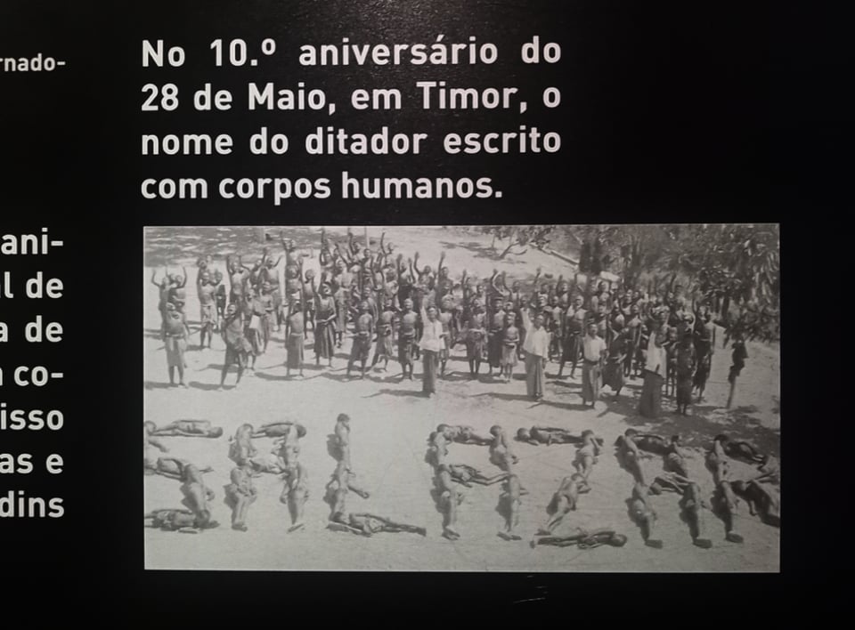
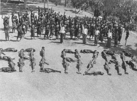
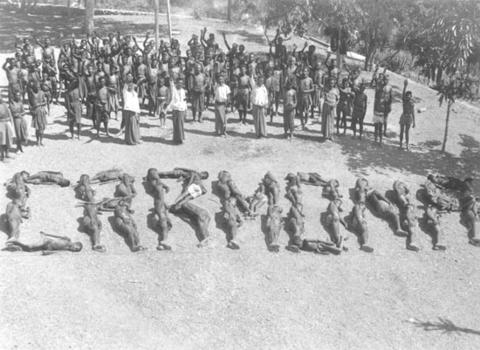
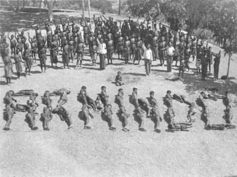
As the picture caught my attention, I searched for its source online, which led me to the Social History Archive at the Institute of Social Sciences of the University of Lisbon. On its website, within a series entitled “civilizing and colonizing action”, I discovered that the bodies did not only spelled the name of dictator, but also other names and words, such as “Carmona”, “revoluçao” or “Nacional C. Liquiçá”, and were even used to decorate the coat of arms of the colony. The pictures belong to the Álvaro Fontoura collection, which includes striking portraits of the local people as well.
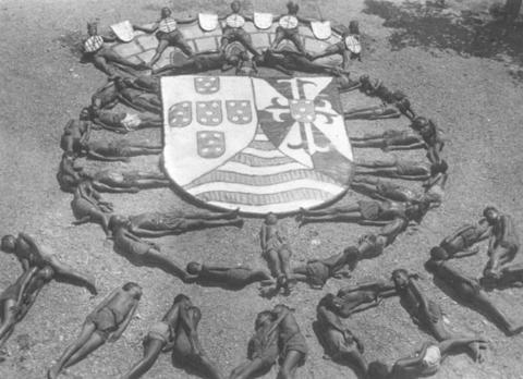
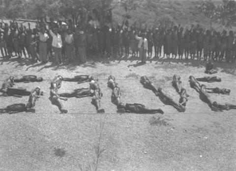
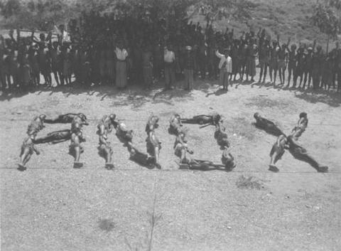
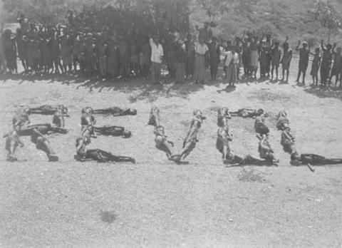
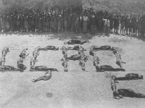
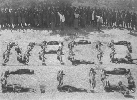
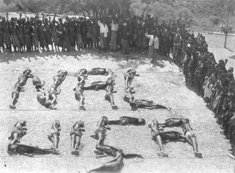
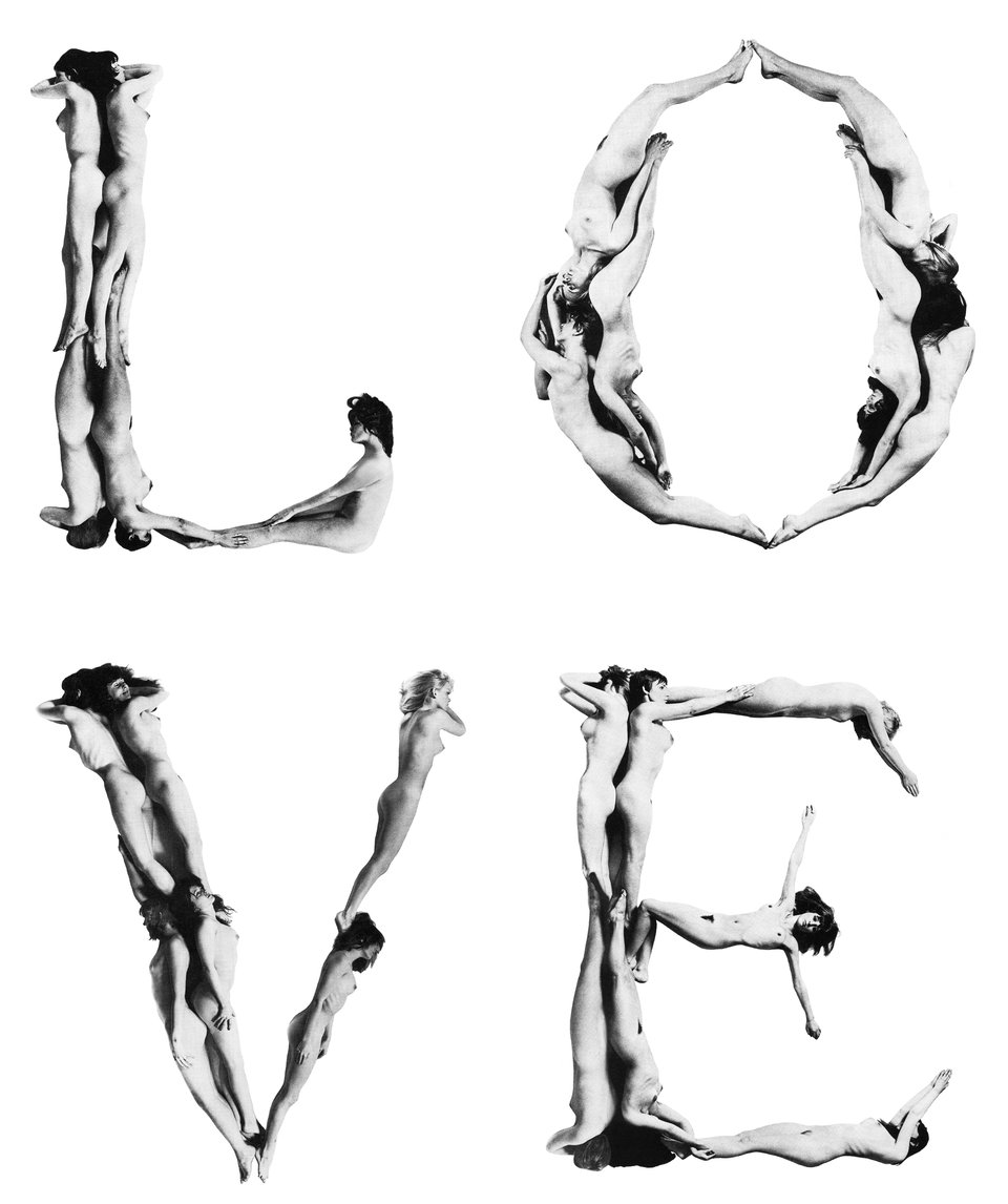
This made me think of the multifaceted history of typefaces made with bodies, and the various meanings that this visual form can convey. For instance, the infamous Body Type, designed by Anthon Beeke in 1969 (and originally called Naked Ladies Alphabet), was intended as a reaction to Wim Crouwel’s 1967 alphabet for the CRT monitors of early computers.
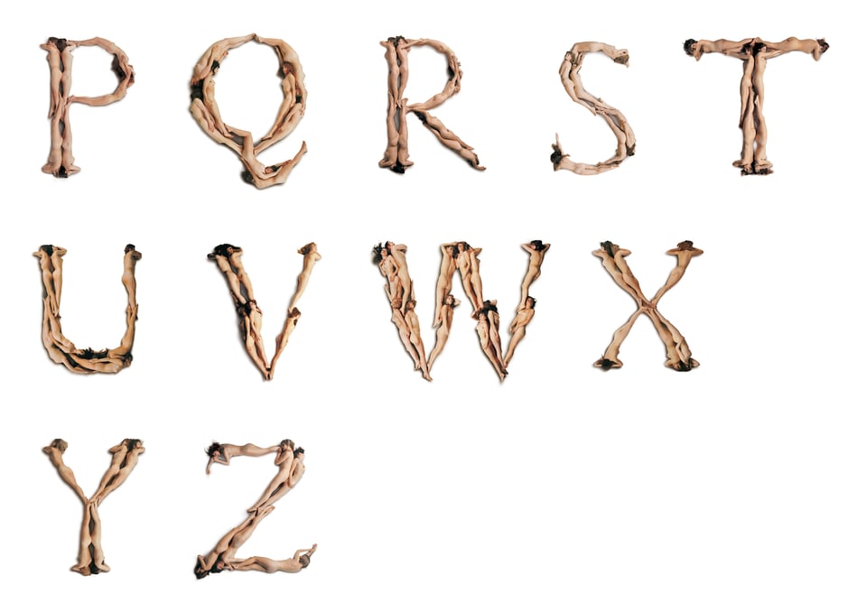
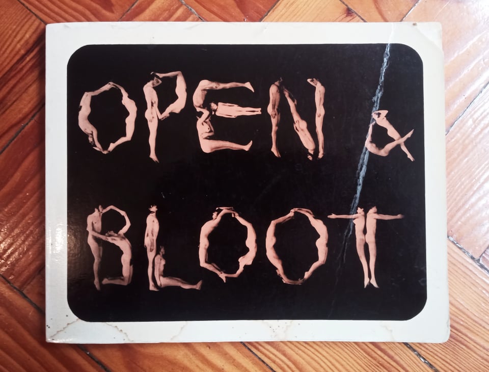
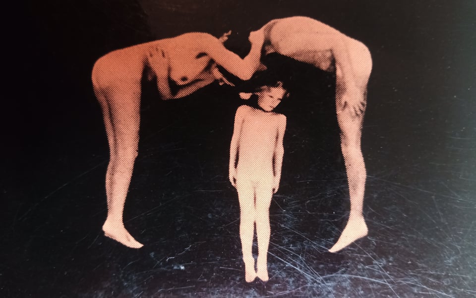
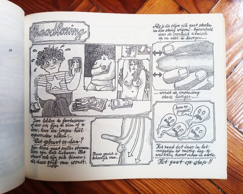
I also remembered that I own a book, also Dutch, featuring a typeface made with bodies. Entitled Open & Bloot (open and bare), it is a sex education manual that, unlike Beeke’s, does not only include women but also men and a child. The book is filled with late-60-style illustrations, reminiscent of the psychedelic work of Peter Max or Heinz Edelmann, who did the art direction for Yellow Submarine.
Other Worlds is a shapeshifting journal for design research, criticism and transformation. Other Worlds (OW) aims at making the social, political, cultural and technical complexities surrounding design practices legible and, thus, mutable.
OW hosts articles, interviews, short essays and all the cultural production that doesn’t fit neither the fast-paced, volatile design media promotional machine nor the necessarily slow and lengthy process of scholarly publishing. In this way, we hope to address urgent issues, without sacrificing rigor and depth.
OW is maintained by the Center for Other Worlds (COW), at Lusófona University, Portugal. COW focuses on the development of perspectives that aren’t dominant nor imposed by the design discipline, through criticism, speculation and collaboration with various disciplines such as curating, architecture, visual arts, ecology and political theory, having in design an unifying element but rejecting hierarchies between them.
Editorial Board: Silvio Lorusso (editor), Francisco Laranjo, Luís Alegre, Rita Carvalho, Patrícia Cativo, Hugo Barata
More information can be found here.