OW #16: “Other Typographic Worlds: Recap (Part II)” by Rita Carvalho
In this issue, Rita Carvalho details parts of the 13th Encontro De Tipografia, including the last day of the conference, several workshops, a small trip and an exhibition. 13ET took place between the 23rd and the 25th of November at the Lusófona University of Lisbon.

Hope, Resistance and Care
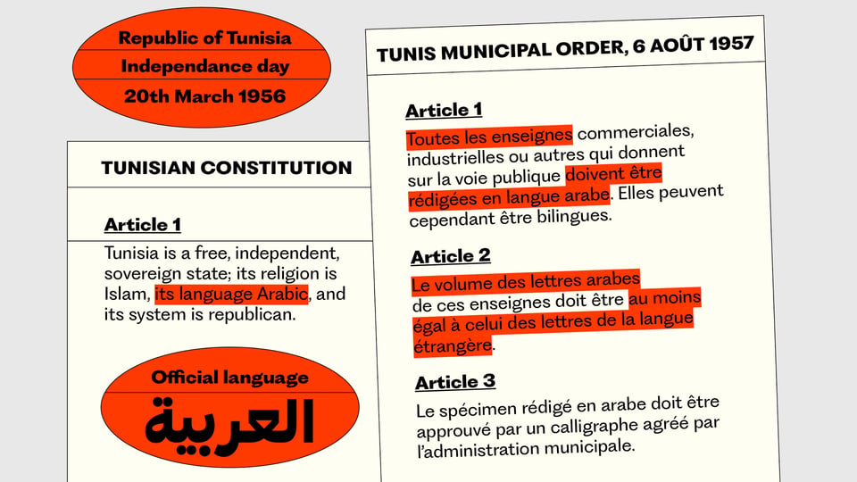
The third day of of the 13th Encontro De Tipografia began with the keynote session “(Type) Design(er) (with) in a Crisis” by the type and graphic designer Naïma Ben Ayed, who is also an educator (FR/TN). After expressing her outrage at the tragic international landscape, in particular the war in Palestine, Naïma shared Céline Semaan’s words on a necessary shift in design priorities: from aesthetics to ecosystems. Naïma’s approach to typography is an example of this shift, as she embraces the cultural and political complexity of typography instead of focusing on the traditional chase for perfection.
According to her, the attention asymmetry paid to Latin and Arabic script (to the detriment of the latter) in public spaces and, specifically, in multi-script typefaces, evidence a legacy of colonialism which must be questioned and reverted. This discussion is part of an interesting movement of valorization and dissemination of non-Latin script (a markedly cultural affirmation of countries once colonized) by type designers and researchers such as Adam Yeo or Emilie Aurat.
Using imagination as a tool for resistance, Ben Ayed proposed an alternative education format for type design: one that would shake the hegemony of the Latin script while challenging the teacher-student hierarchical divide still present in several design schools. Taking the form of an archive of letters, words and stories, her multi-script type design program would be built collectively from the basis of student’s realities and identities (following bell hooks’ notion of “teaching to transgress”), working as a healing structure by affirming and dignifying the cultural narratives surrounding all type. Ben Ayed’s approach is further discussed in an article for Futuress.
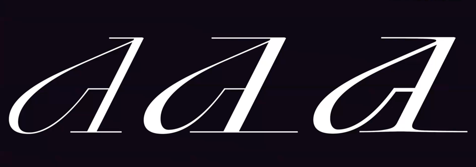
Among other projects, the French-Tunisian designer shared the process of construction of a typeface based on Tunisian and Italian references, designed in collaboration with Francesca Bolognini, which derives from a dialogue between the two. Their desire for equality and inclusivity in a multi-script typeface extends to its non-binary characteristics – making it an attempt at “queering language”.
Ben Ayed’s lecture was moving and witty. She reminded the audience of their social responsibility as citizens and visual communicators. Finally, she pointed out the democratizing role that typography once had and pushed us to move away from formal obsessions, trends, and prejudices.
Playfulness, Imperfection and Empathy
The following cluster of presentations, entitled Type Languages, started with “A Rede: Workshop3. The Written Word in the Design of Learning Spaces” by Marta Belo (COW, Lusófona) and Paulo T. Silva (DELLI, Lusófona). Not unlike Ben Ayed, Marta and Paulo questioned the hierarchical and inflexible structures of design education. They presented the idea of “a school without walls” which took a shape of a picnic, as part of Marta Belo’s PhD research on alternative and informal pedagogies in design. This temporary school for BA students lasted five days and included several workshops. One of these workshops consisted in collectively building suspended walls that would display words chosen from Carlos de Oliveira’s poems.

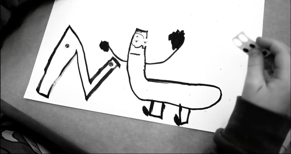
Playfulness and imperfection (the latter also present in other lectures such as “The Typecraft Initiative”) were key elements of “Letters… Are Friends. And Trees and Fish!” presented by Ellmer Stefan (Oslo National Academy of the Arts / The Pyte Foundry) & Tânia Raposo (Atelier National de Recherche Typographique/Université Paris 8). After going through their research on fantasy letters (which included some amazingly inventive ones) Ellmer and Tânia shared some of their pedagogical methodologies employed in the context of workshops, as well as some cool results. The lecturers demonstrated the value of unconventional or “stupid letters” in primary schools as well as undergraduate teaching. Finally, they reminded the audience of the importance of having fun while learning and working with type.
Letters can be many things, but can a typeface embody an eating disorder? This was the question asked by Joana Teixeira & Pedro Amado (FBAUP) in their presentation “The Potential of Design Expression in the Mental Health Field”. Teixeira discussed her ambitious MA research consisting in a campaign addressing eating disorders. The project included the design of a typeface that incorporates some of the characteristics of bulimia, anorexia and binge eating disorder. Besides creating more awareness for these disorders (thus, helping anticipate a diagnosis), the aim of the campaign was to reduce the stigma of those affected (currently about 9% of the global population).
Spiritual Writing
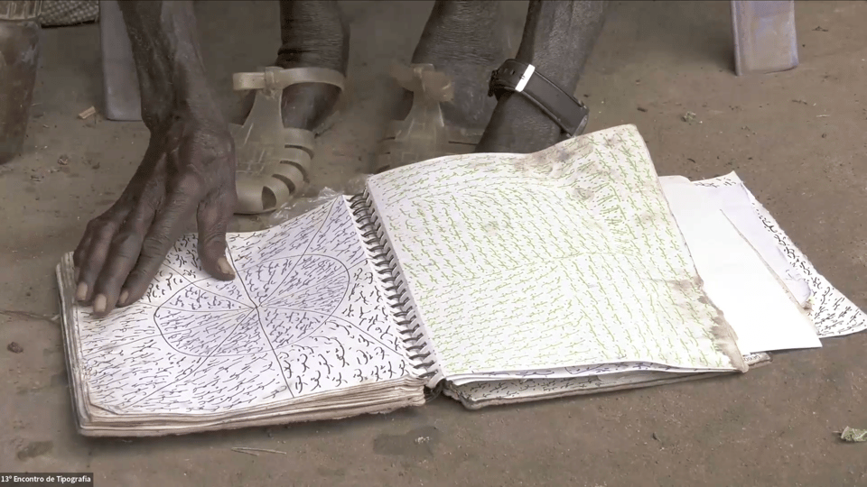
The afternoon began with the screening of A sombra, torrentes de sonhos e imagens (2023) by artist Daniel Barroca. The short film is about the intriguing vernacular writing of Victor Bor, a member of the Kyangyang, a group of Balanta healers and diviners who emerged in the 1980s in southern Guinea-Bissau. The visual richness of this writing, the complexity of its (post)colonial context, its spiritual substance as well as its controversial individual features (Victor Bor’s writing appears to be a repetition of signs that only he could decode) fed a lively roundtable with Daniel Barroca and Catarina Laranjeiro, a visual anthropologist who took part in the research leading to the film and to the documentary Fogo no Lodo (2023).
Letterpress Past and Futures
The last cluster of the conference was entirely dedicated to movable type and started with “Letterpress: Perspectives and Advances in the National Scenario” by Sofia Meira (Faculdade de Belas Artes da Universidade do Porto and Esad-idea), Pedro Amado and Rúben Dias (ESAD and Esad-idea). Sofia offered an overview of the evolution of the technologies associated with letterpress, as well as the growing interest in these analogue practices and their application in the context of higher education in design.
This presentation was followed by a Roberto Gamonal Arroyo (Universidad Complutense de Madrid) and José Luis Rubio Tamayo (Universidad Rey Juan Carlos)’s “Open Source Interactive Extended Reality Frameworks for the Virtual Representation of a Letterpress Workshop Environment”. What they proposed is a prototype of a VR printing letterpress workshop using 3D scanning techniques, having the software A-Frame as a tool for prototyping and testing interactions.
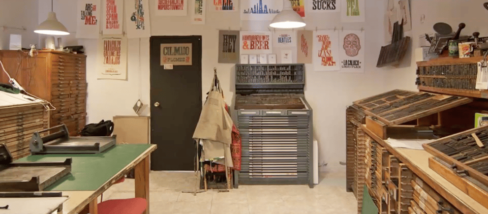
In “Tipografía en Plomo: Aprendizaje Digital”, Laura Membrado and Oriol Moret (Universitat de Barcelona) presented an impressive web platform that facilitates the training and practice of typesetting and printing through meticulous explanation of materials and equipment. The platform includes a section that allows you to try out compositions and order printing jobs.
The cluster ended with “Notes for a History of Portuguese Typeface Design: The Case of Alexandrino José das Neves’ Type Foundry” by António Fonseca who shared his vast historical research on this 19th century’s man and foundry. The research involved crossing sources form several archives with a meticulous analysis of two typefaces.
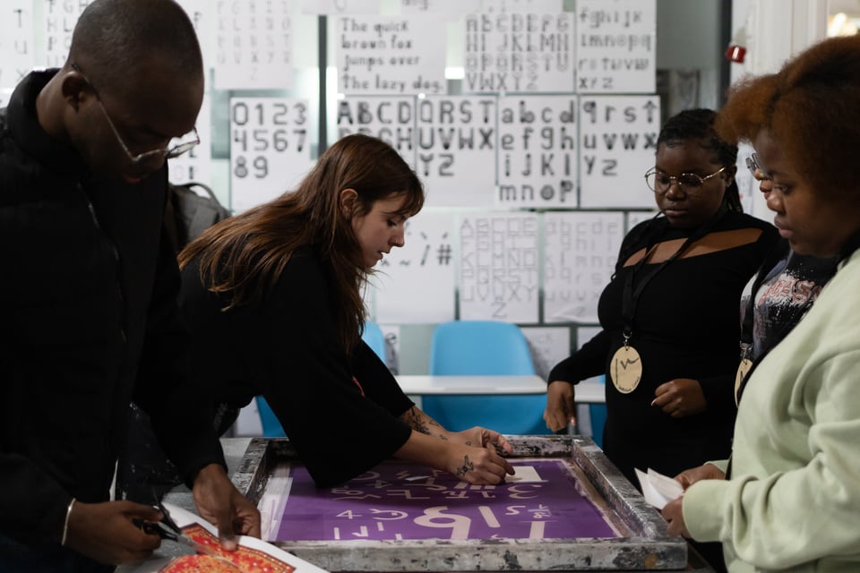
As a conclusion for the conference, a collective screen-printing session took place, coordinated by Maria Clara Lima (DELLI). It was a joyful moment which resulted in a series of posters.
Workshops, Exhibition and a Visit to Letreiro Galeria
The conference included several workshops, allowing participants (Communication Design BA students and the external public) to approach hands-on some of the lectures’ topics. The workshops were often both intense and playful, and they reflected the ethos of Other Typographic Worlds by exploring the boundaries of typography and its links to other graphic and artistic forms, by extending geographies in terms of practices and authors, and by employing typography to reflect and act on some of today’s most pressing issues.
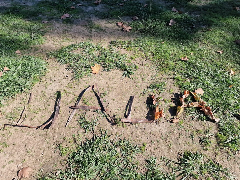
Environmental concerns characterized both Warm-Up Workshops given to Delli students on the day before the kickoff of the conference. “Piu/ Tweet/ Twilp”, by Inês Marques (DELLI/COW/ CEIED, Lisbon), focused on the singing of birds through a graphic/plastic action inspired by Rachel Carson’s foundational warning of the menace of a “silent spring”. The second workshop, “Efemerografias: Letras que desaparecem e mensagens que permanecem” by António Carmo (FAUL, Lisbon), proposed ephemeral typographic experiments and collaborative constructions with found and disused materials, which thus recover a function.
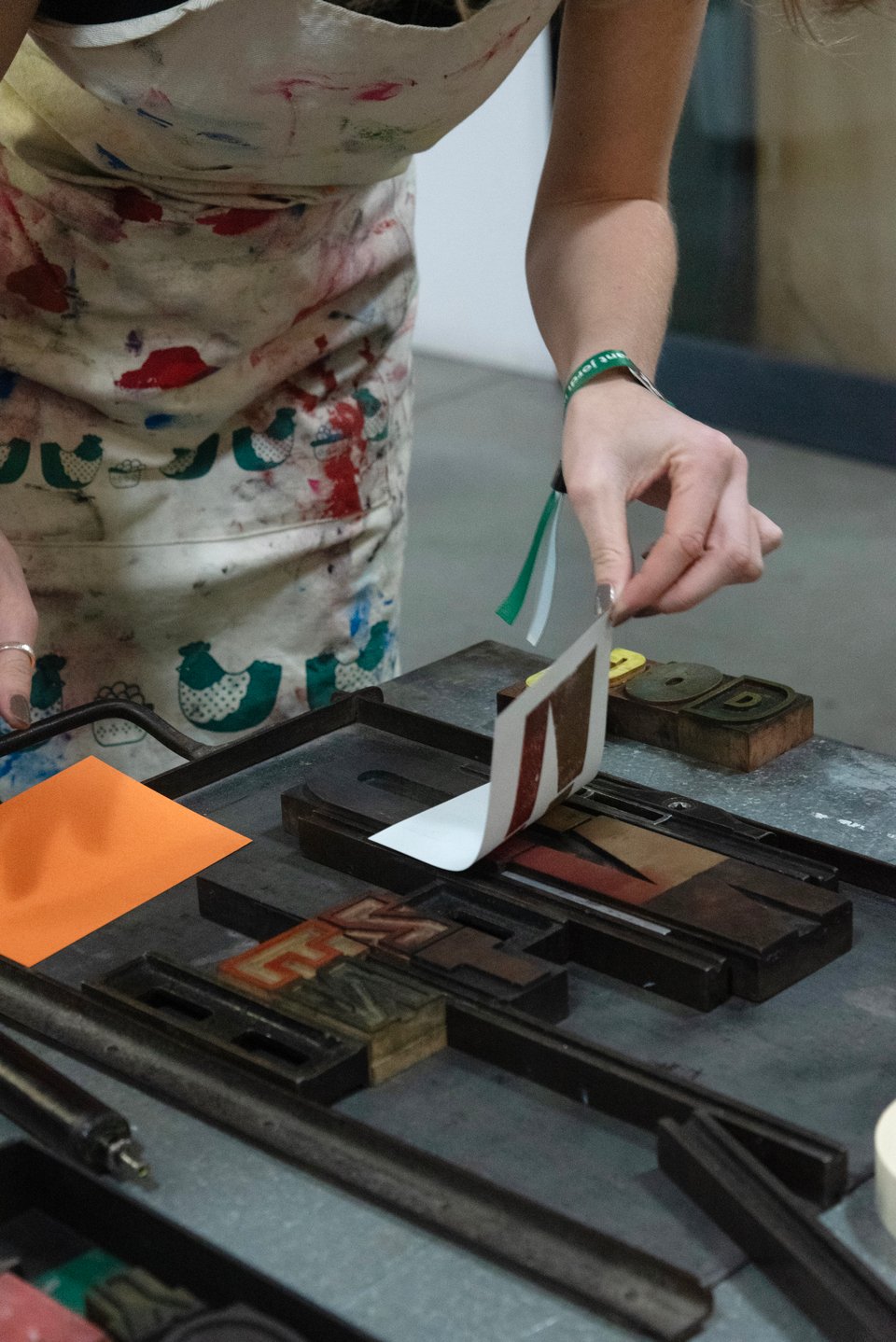
The following day (23rd Nov) was largely dedicated to the conference’s workshops, starting with “Parallel Alphabets: Beyond the 26th Letter” by Júlia Garcia (Oficinas de São Miguel, Azores) and Manuel Diogo (O Homem do Saco, Lisbon). Together with the participants, they deconstructed the letters of the Latin alphabet, in order to build and print a collection of non-verbal elements. A lot was shared about the challenges and joys of letterpress printing – a technology that both authors take as part of their creative process but also as a fundamental part of their independent publishing activity.
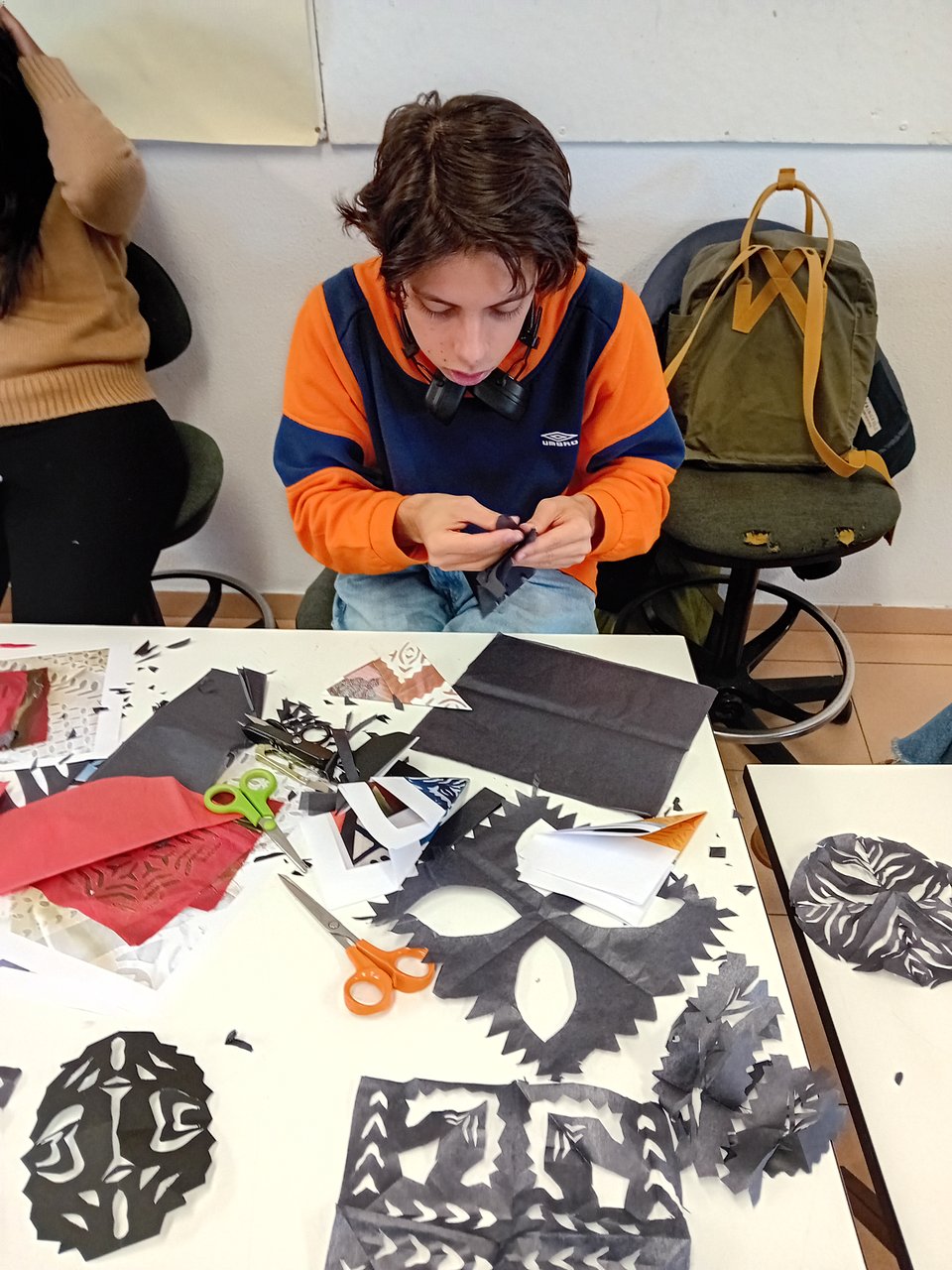
In “Typecraft: Hand-constructing Type from Indigenous South Asian Crafts”, Ishan Khosla (The Typecraft Initiative, UPES Dehradun) began with an introduction on the makers and contexts of production of South Indian crafts, as a reflection on the significance of a selection of objects. Then, participants adapted the techniques they observed and the visual lexicon of these objects to the design of typographic forms. It was a precious opportunity to expand graphic knowledge by experimenting with some fresh techniques and graphic languages. The participants engaged with a significant project which raises awareness of the role that graphic design and typography can play in valorizing local arts and crafts, and also the lives of the communities who practice them.
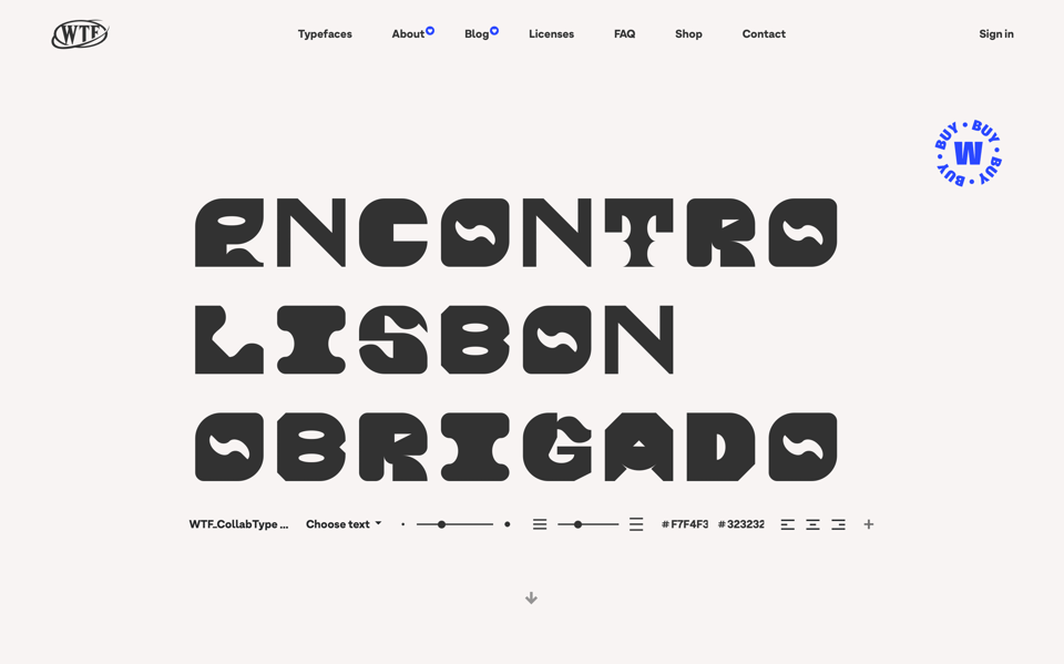
At the same time, the Chilean collective WTypeFoundry (Magdalena Arasanz, Patricio Gonzales and David Pavés) lead the workshop “CollabType” consisting in collectively creating a typeface. Despite the size of the task (the workshop only lasted a couple of hours), one could sense an enthusiastic and relaxed atmosphere in the room. This is certainly due not only to the collaborative nature of the work, and the generosity and talent of the authors, but also to the prospect of a gratifying final result: an open source font, currently available in the foundry’s catalogue.
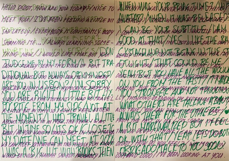
It was also a collaborative process that guided the workshop “Meet the Characters” by Stefanie Rau (Weißensee School of Art and Design) with Robert Preusse. Organized in groups, participants developed graphic dialogues that explored the characters and emotions that lie behind typefaces. This theatrical exercise/game created an atmosphere that allowed participants not only to connect with each other in a very specific way, but also to reflect on the power of typography and written communication in general. This workshop took place on Saturday the 25th, parallel to the lectures.
Visit to Letreiro Galeria
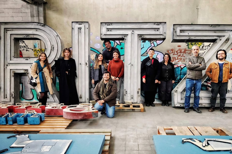
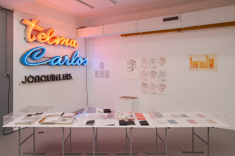
In the last few years, the designers Rita Múrias and Paulo Barata have been devoting themselves to collecting and displaying illuminated commercial signs from Lisbon and its surroundings. It’s a demanding mission that implies rescuing a significant part of the city’s history (deeply connected with the stories and memories of its inhabitants) with very little support. In the opening day of 13ET, Rita and Paulo opened the storehouse (temporarily located in Oeiras) to visitors, which was impressive, not only because of the size and graphic diversity of the collection, but also because of the knowledge and care dedicated to each piece. The afternoon was so special that Paulo and Rita generously repeated the session the day after the conference.
“The Types Between” Exhibition
The fringes between the word and its visual representation, as well as the value of failure in the process of experimentation were the ideas behind the conference’s exhibition “The Types Between” at Stolen Books Gallery, curated by Paulo T. Silva and Hugo Barata. The event enacted a stimulating dialogue between different languages, geographies, and points of view on type as well as materials and formats (from printed posters to illuminated signs). It included work from the following artists and designers: Andreu Balius, Ane Thon Knutsen, Delli Press, Fernando Ribeiro, Francisca José Rodrigues, Laura Meseguer, Letreiro Galeria (Rita Múrias & Paulo Barata), Omiros Panayides, Pouya Ahmadi; Ringaile Demsyte; Stolen Books and X-Lab (Levi Hammett, Hind Al Saad, Sara Al-Afifi). The curatorial approach brought forth deeper meaning and visual cross-referencing, the opening was lively and the evening became one of the most special moments of the event, with many visitors sharing ideas, celebrating type, and simply having fun.
Other Worlds is a shapeshifting journal for design research, criticism and transformation. Other Worlds (OW) aims at making the social, political, cultural and technical complexities surrounding design practices legible and, thus, mutable.
OW hosts articles, interviews, short essays and all the cultural production that doesn’t fit neither the fast-paced, volatile design media promotional machine nor the necessarily slow and lengthy process of scholarly publishing. In this way, we hope to address urgent issues, without sacrificing rigour and depth.
OW is maintained by the Center for Other Worlds (COW), at Lusófona University, Portugal. COW focuses on the development of perspectives that aren’t dominant nor imposed by the design discipline, through criticism, speculation and collaboration with various disciplines such as curating, architecture, visual arts, ecology and political theory, having in design an unifying element but rejecting hierarchies between them.
Editorial Board: Silvio Lorusso (editor), Francisco Laranjo, Luís Alegre, Rita Carvalho, Patrícia Cativo, Hugo Barata
More information can be found here.