OW #15: “Other Typographic Worlds: A Partial Recap” by Silvio Lorusso
In this issue, Silvio Lorusso chronicles a day of the 13th Encontro De Tipografia, which took place between the 23rd and the 25th of November at the Lusófona University of Lisbon.
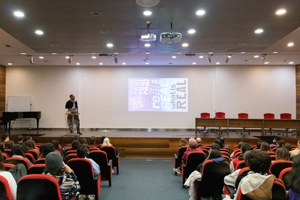
The second day of the 13th Encontro De Tipografia, focused on Other Typographic Worlds, was inaugurated by design critic Francisco Laranjo. His opening statement diagnosed the current state of the field of typography, “a discipline that lags behind design discourse, which in turn lags behind architecture and so many other disciplines in leading the way in this situated, engaged and critical quest.” With his trademark mordacity, Laranjo pointed out that “typography recurrently lives either in a nostalgia cocoon or wrapped in technological glitter and detailing”. Thus, Other Typographic Worlds is an attempt to break out of the cocoon, transcend technical minutiae and look at the bigger socio-political picture of the discipline.
Cool Shit and Black Grids
The first keynote speaker, Silas Munro, partner at the bi-coastal, LGBTQ+ and minority-owned studio Polymode, unapologetically delved into the pleasure of “making cool shit.” But Polymode’s work is no mere eye candy. Most of their projects are driven by a specific cultural perspective that allows them to translate cultural features into visual and processual results, such as the dynamic Polymode Sans, a font that includes a “realness” parameter (I’m reminded here of Mark Fisher and Simon Reynolds’s reflections on the meaning of “get real”).
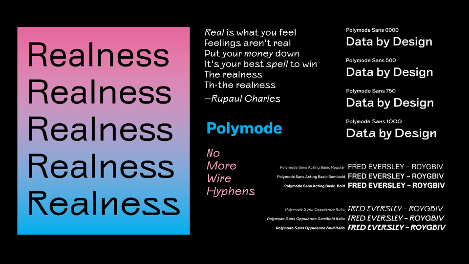
Munro called the studio’s approach “poetic research”, a method through which they can “bring your full self into a project”. What’s the self in question? A complex stratification of hobbies and passions (like surf, in Munro’s case) but also oppressions (historically segregated beaches where he practiced this sport). This is why Munro’s work leans logically towards the pedagogical and the historical, with projects such as the BIPOC Design History Course, an online program taking place over Zoom while Capitol Hill was being stormed.
The course was an occasion to forge a new critical lexicon that overcomes the reductions that even critical race theory itself might produce. A case in point is Munro’s concept of the Black Grid, through which he questions the disciplinary, stiff, “cagy” meaning that the grid has for people who were for the most part excluded from the modern project. To develop the possibility of a black grid, he looks at such things as the “Black Dada” work of Adam Pendleton and the infographics that W. E. B. Du Bois designed some 30 years before the advent of the Bauhaus or the Vkhutemas. Here, if we take modernism to be the thesis and critical theory to be the antithesis, Munro’s Black Grid might be a viable synthesis.
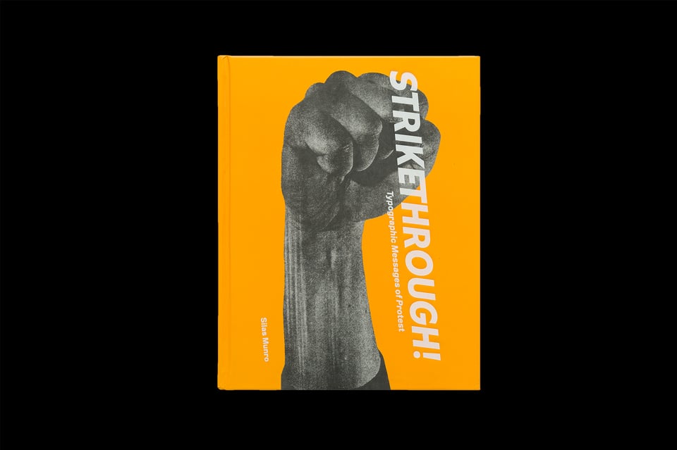
Another notable Polymode project is the exhibition Strikethrough: Typographic Messages of Protest, commissioned by the Letterform Archive, which includes among other things, materials from the 1968 “I Am a Man” strike of sanitation workers. Munro drew attention to the fact that in protests, typography is attached to human body, implying both power and vulnerability. In the layout of the exhibition the studio wanted to emphasize the sonic aspect of protests: chants, echoes, etc. It comes as no surprise, then, that Polymode usually creates project-specific playlists to share with their clients, in order to set up the ground for collaboration.
Yellow Peril, Skin to Screen, Nahuatl Mural, Chilean Book-Objects
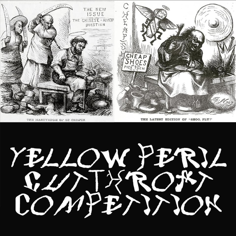
Chris Lee, designer and assistant professor at the Pratt Institute, introduced his ongoing project on “chop suey” typefaces employed as a lens into racial formation. Lee gave a glimpse into his rich visual archive of racially charged illustrations from the mid and late nineteenth century. The depicted scenes often included Latin letters in the style of Chinese logograms or, more technically, “fonts that allude to the morphology of Chinese script”. These fonts, now widely used, show how whiteness functions as a political phenomenon. Here, colonial expansion is legitimized through the definition of an emergent, external threat. In this case, the so-called “yellow peril”. The way in which such threat is constructed is particularly interesting because it defies the usual framing of racialized people, that is, as barbaric and regressive. The “yellow peril” narrative is different. As Lee puts it, its slogan could have been: “look at what they did to us!” In fact, the illustrations depict scenes of dubious hygiene and general unhealthiness. This was the stereotypes that other minorities like Irish people, at the time also racialized as non-white, used to distance themselves from the Chinese to be seen as white. The Irish insisted on the value of family against the Chinese “swarm”, on the excellence of their craft against the poor quality of Asian products. More than being mere racist artifacts, chop suey fonts contain multiple strata of racial formation, showing that race is neither a biological feature nor a purely ideological one.
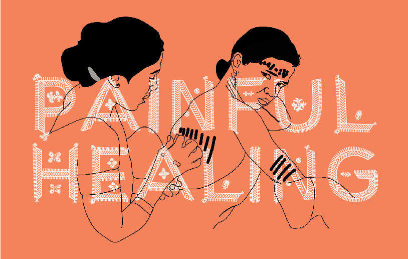
Ishan Khosla and Andreu Balius introduced The Typecraft Initiative, a co-design endeavor where specific folk arts and crafts are translated into digital typefaces. This is a way to connect urban designer with rural craftspeople, get rid of middlepersons and create novel forms of livelihood. In running their workshops, lasting a few weeks, Khosla and Balius try to be attentive of the hierarchies implied by their very position (for instance, the craftpeople are often women). The typeface Godna is based on the tattoo art practiced by women (called Godharin) of the Gond tribe of Chattisgarh in Central India. In this cultural milieu tattoos are understood as “jewelry to bring into the afterlife”. In this “skin to screen” process, it is crucial to understand how language codified through centuries. Furthermore, one needs to deal with imperfection in order to keep the flavor of the handmade design. In this sense, Khosla and Balius insisted that type design is not an end in itself but a medium.
A delegation of the Mexican Benemérita Universidad Autónoma de Puebla formed by Luis Aguirre, Laura Gutiérrez and Karla Rosas (in collaboration with Aritza Olguin, absent) gave a presentation (in Spanish! but with slides in English) about the preservation of the Nahautl indigenous language among young people by means of a social design process. The team designed a mural depicting the origin of the community name, which was later realized in 7 days, and a risoprinted fanzine including three indigenous stories. The design was inspired by Ed Johnston’s calligraphy as well as the Poliphilus, a typeface used in old Mexican gazettes.
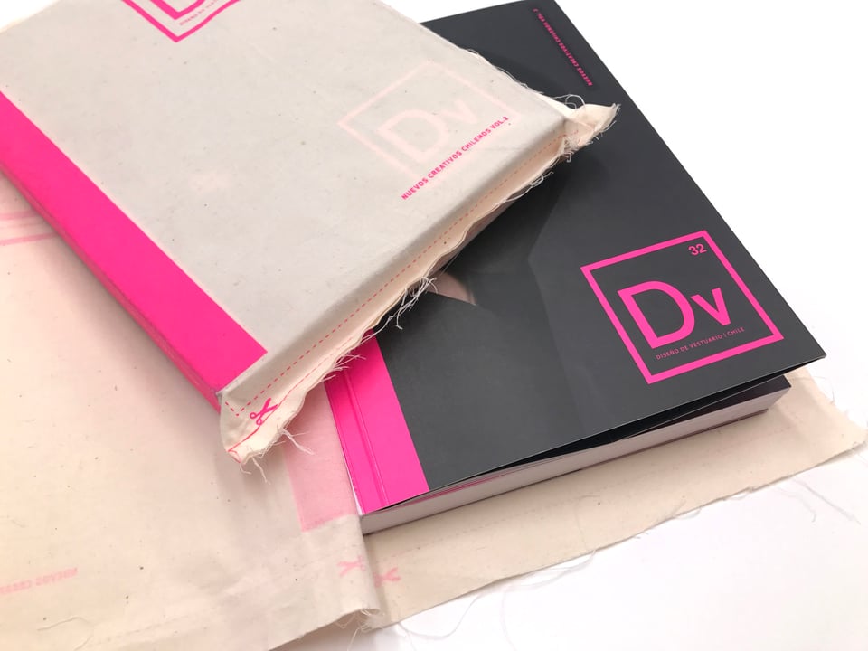
Finally, Paola Irazábal, a Chilean designer and scholar from Estudio Pi, showed her editorial design work specialized in sustainability. Among her focuses, there is paper and print management. The books designed by Irazábal often take advantage of unusual materials, such as wood and fabric (like in the case of book New Chilean Creatives, Costume Design) to represent the industries described in the volumes.
Organizing My Anger
The premise of Tereza Bettinardi’s keynote was to talk from four different perspectives, namely, that of the reader, the designer, the editor and the distributor. Interestingly (but not surprisingly, given the wide scope of her work), that of the designer was the role she emphasized less. However, not before telling us that she grew up with Corel Draw, a software she used to think of as a videogame.
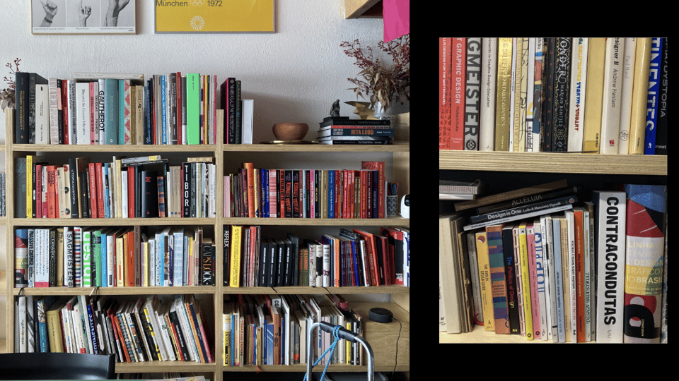
Bettinardi’s practice can be defined without hesitation bibliocentric (but not in the Biblical sense!): books are both inspiration, refuge, and survival strategy for her. “My bookshelf is where I find my allies and organize my anger” said Tereza in a sentence reminiscent of Walter Benjamin. Her bookshelf is also a map of her pilgrimages, a cartography of her privileges: it shows all the travels she could do. Tereza also watches films about books: particularly influential to her work was the documentary Graphic Means, where design history, feminism (a lens, not a subject for Tereza) and technology are intelligently intertwined. Moreover, her research on Brazilian art director Bea Feitler was crucial to her, since it shows that many of the issues Feitler had to deal with in the past (e.g. disparity of wages and recognition) are still haunting us.
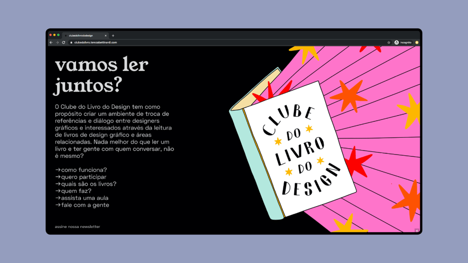
Bettinardi believes that “books make friends”. This is what happened during 2019, annus horribilis for Brazil: while the Amazon was burning, Bolsonaro was elected president. In the middle of it all, Tereza set up an online gathering to exchange and discuss books. 30 people were expected – 300 joined. The design book selected were not necessarily Bettinardi’s favorites, but simply those available in Portuguese. In those troubling times, the Clube do Livro do Design was a lifesaver for many, such as that culturally isolated “person in the remote midst of agrobusiness”, which she showed on a map.
The next step was a logical one: translating relevant design books to Portuguese. This is how the Clube do Livro do Design turned into a publisher. Bettinardi admitted she had a naive idea of the publishing activity, one where she could dedicate a few weeks to production, but she soon realized that the difficult part is circulation: “that’s the work, that’s the struggle”. And so she, together with the many members and supporters of the Clube, put up a podcast called Lombada (meaning book spine). While most of the books read and published by the Clube are clearly political, Tereza doesn’t like to speak of it as activism, instead she thinks of publishing as “a form of shared enthusiasm”.
Presses of One’s Own, In Situ Archiving, a Typefounder’s Notebooks
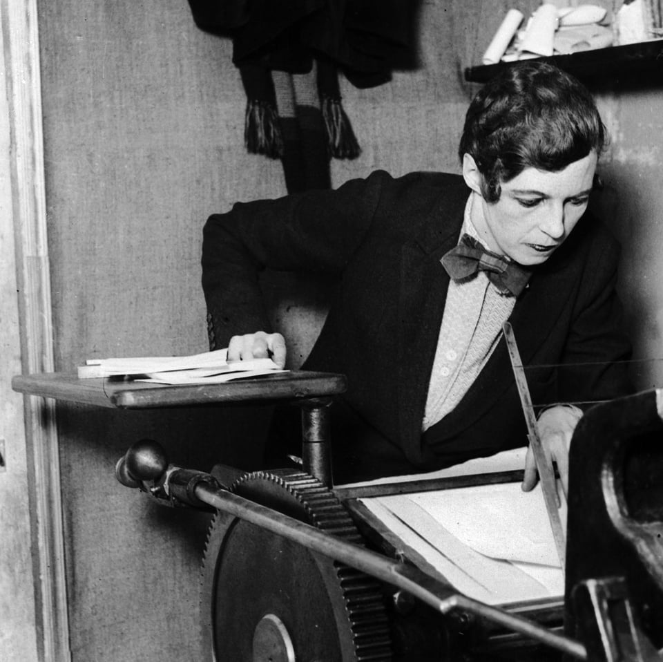
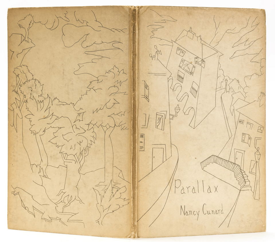
Norwegian graphic designer and artist Ane Thon Knutsen shed light on little-known aspects of the life and work of Nancy Cunard, a protagonist of the Dada movement, mainly remembered for a mesmerizing photographic portrait by Man Ray. Cunard was a poet and writer; her masterpiece Parallax was published (with a wonderful cover) by Hogarth Press, the publishing house of Virginia Woolf, who once said that thanks to her activity as typesetter she was the only woman in the world free to publish what she wanted. Such freedom was necessary since Parallax was heavily criticized for being a pale copy of T. S. Eliot’s The Waste Land.
Later, Cunard created The Hours Press, her “press of one’s own”, which was attacked by the tradesmen for not doing proper printing. In fact, The Hours Press publications had a punkish style, deliberately deployed by Cunard. Then, in a surprising turn of events, Cunard left typesetting and printing aside to become an anti-racist activist. This endeavor brought to the publication in 1934 of the Negro Anthology, a work for which she was publicly humiliated. The epilogue of Cunard’s life story is sad: her belongings were destroyed, she had to sell her house and her health became frail. She died at 69, poor and alone.
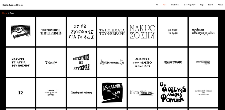
In line with several emerging archives of graphic design which attempt to decolonize, diversify and decentralize (e.g. the Palestine Poster Project or the People’s Graphic Design Archive), Omiros Panayides presented Books, Type and Cyprus, an archive focused on Cypriot book production, particularly interesting given this country’s post-colonial European and Middle-Eastern identity, typically affected by Stockholm syndrome towards colonizing forces. Panayides explained that digitizing books involved entering messy warehouses located in the weirdest places. As it would be laborious to bring the artifacts to a organized environment, he did the opposite, that is, bringing the scanning equipment to the warehouse. What they preserved was cover, spine, colophon, design credits. The archive is now easily accessible online and has many interactive features, such as the possibility to see the isolated display type – basically a “Trend List” of Cypriot design, and a web app that allows to write sentences using the individual display letters found in the book covers.
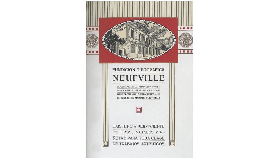
Oriol Moriet & Sheila Mardones focused on some internal documents of the Neufville Typefoundry, located in Barcelona. The originality of their work lies in the marginal sources they analyze, rarely considered in type studies. Among these management documents, there are some related to the casting of new fonts including information such as the total weight of the cast (reflecting the popularity of the typeface), typecasting cards (which partially reveal the working conditions of the foundry), the typefounder’s notebooks (showing that the founder was always a “he”, while the packer always a “she”), production books and stock cards.
Nonhuman Scripts, Google Translate for Fungi, Shorthands, Asemic Writing, Tight Cyrillic
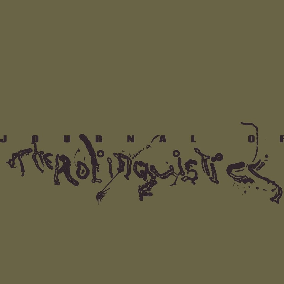
Oscar Salguero offered a detailed overview of scripts inspired by non-human forms of life, such as the digital fungi typography of M/M (Paris) for Bjork’s album Fossora, and even fictional ones, like the circular writing system that humans attempt to decipher in the movie Arrival. Further “exo-scripts” are those conceived by artists like the Finnish Jenna Sutela. Salguero’s own contribution to the field is inspired by a short tale by Ursula K. Le Guin entitled The Author of Acacia Seeds where the American science fiction writer invents the field of therolinguistics, namely, the science of how animals and plants communicate. Salguedo is working on his own therolinguistic script, with the designed of Darious Ou. He also published a manifesto; among its principles, we find one stating that “all beings, living and nonliving, write”.

What if we had a Google Translate to communicate with fungi? This is Ringailė Demšytė’s speculative design’s question. To answer it, Demšytė encoded text into binary form, and then crafted a visual set of symbols which were finally turned into electronic signals, because this is the way in which fungi “talk” to one another. The Visual Fungi Language project has now various outputs such as a VR installation, a booklet and a sonic publication.
Beatriz Martins Fernandes presented her thesis (supervised by António Silveira Gomes and Aprígio Morgado) on the development of stenography in Portugal. Also called shorthand, stenography was used by students and secretaries in such contexts as courts to quickly take note of spoken language, but it was also employed as a form of private writing. Fernandes explained that it took three to five years to master the stenographic technique (!) and showed how shorthand evolved together with technology. Of course, with the rise of AI-powered speech recognition, we are witnessing a decline of shorthand, but given trust issues related to digital systems, the disappearance of stenography might take more time than expected.
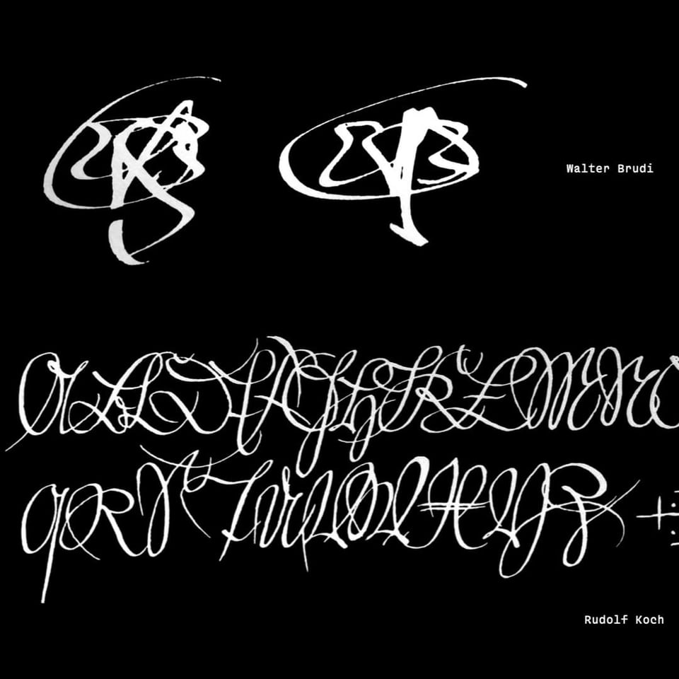
Stefan Ellmer gave a flash talk on asemic writing, consisting of letter-like structures without meaning or, to use a more enlightening definition, pseudo-writing open to various semantic interpretations. Along these lines, Ellmer insisted that the correct interpretation of a message is an exception rather than the rule (something which made me think of linguist Antoine Culioli’s idea that understanding is only a particular case of misunderstanding). Writing has three features according to the Austrian designer: conventions, gestures and tools. By removing the conventions part – Ellmer argues – one brings in the joy and freedom of communication and reveals its anti-elitist nature.

Finally, Varya Goncharova presented Ti(gh)tle, a contemporary typographic system inspired the Cyrillic Vyaz, a writing style characterized by its tightness, often found in Orthodox churches. Goncharova extracted a series of principles from this style: (con)density, decorations (often floral and including vignettes), and the heavy adoption of ligatures. In order to convert this style into a modern typeface, Goncharova got rid of the decorations, which were too literal, and used them instead as inspiration for the design of the very letters and their multiple ligatures.
Other Worlds is a shapeshifting journal for design research, criticism and transformation. Other Worlds (OW) aims at making the social, political, cultural and technical complexities surrounding design practices legible and, thus, mutable.
OW hosts articles, interviews, short essays and all the cultural production that doesn’t fit neither the fast-paced, volatile design media promotional machine nor the necessarily slow and lengthy process of scholarly publishing. In this way, we hope to address urgent issues, without sacrificing rigour and depth.
OW is maintained by the Center for Other Worlds (COW), at Lusófona University, Portugal. COW focuses on the development of perspectives that aren’t dominant nor imposed by the design discipline, through criticism, speculation and collaboration with various disciplines such as curating, architecture, visual arts, ecology and political theory, having in design an unifying element but rejecting hierarchies between them.
Editorial Board: Silvio Lorusso (editor), Francisco Laranjo, Bianca Elzenbaumer, Luís Alegre, Rita Carvalho, Patrícia Cativo, Hugo Barata
More information can be found here.