GT Standard’s microsite is (obviously) designed to showcase the typeface, but I’m going to bookmark this as an excellent resource for explaining some fundamental concepts like weight, width, and optical size with easy-to-understand and interactive illustrations. Here, I made a GIF of one of them for you:
Did you see Google’s new ‘M3 Expressive’ design language? The guidelines make for pretty interesting reading, even if you (like me) have no plans to design for an Android app any time soon. In particular, grab your popcorn and dive into the Typography section. My favourite part is the Editorial treatments page, where they have a load of excellent illustrations to illustrate some core typographic principles. (Also nice to see that many of the sub-sections link out to Google Fonts Knowledge articles I wrote!)
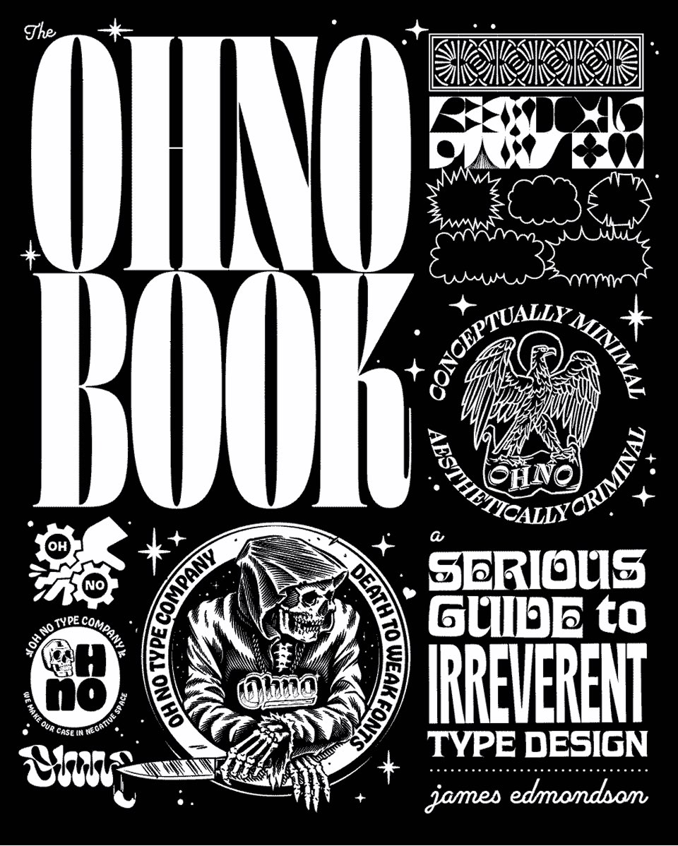
Insta-buy alert! Well, insta-pre-order, at least: Ohno founder James Edmondson has written a book and it’s called The Ohno Book: A Serious Guide to Irreverent Type Design. From receiving James’ email to getting my pre-order receipt: about 10 seconds.
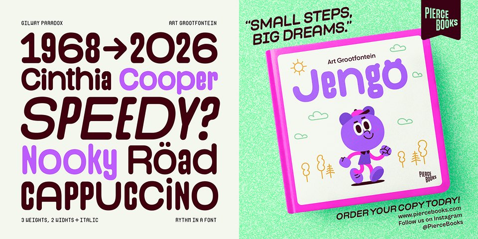
Art Grootfontein has released Gilway Paradox — a dual-width font with “irresistible visual rhythm”. I love the graphics Stéphane makes for his releases: colourful, vibrant, and full of fun — just like the typefaces themselves. Gilway Paradox also has a very cool promo video.
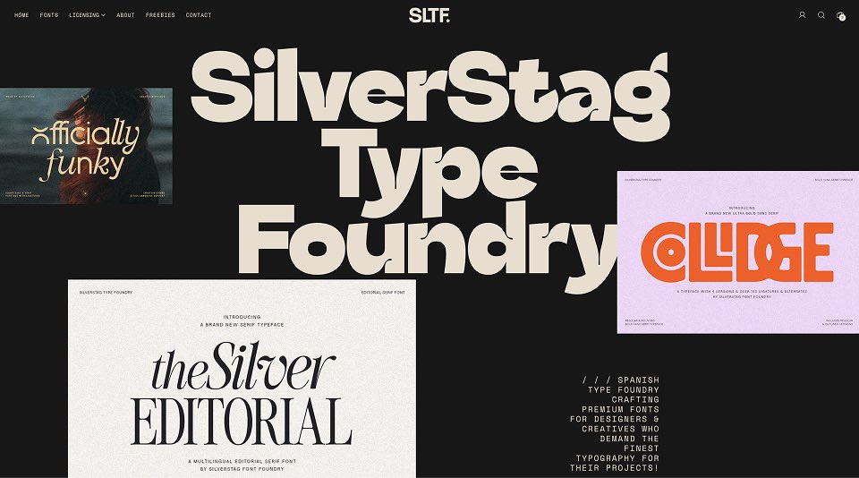
I was very happy to see that Alen launched the new (and first ‘proper’) website for his Silverstag Type Foundry, replacing his previous Gumroad page. IMHO, this much better represents the more mature direction his foundry has been taking, and I’m about to treat myself to a load of his fonts. You should, too!
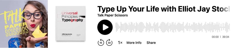
I recently had a lovely time chatting with Diana Varma for her podcast Talk Paper Scissors, and the episode with me on it (#251) went live last week. Specifically, it went up on the day I was speaking at Config and kind of got lost in the chaos, so I’m being sure to include it here.
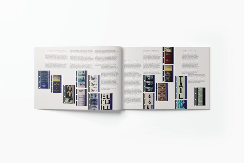
Read Frame Type Film — a collaboration between MUBI Editions and Éditions du Centre Pompidou — is a stunning-looking book that “sits at the intersection of film, visual history, and design”. I wish the website had more photos of the interior, but you can find some on Amazon, where it still appears to be available, too. Buy it from somewhere like Bookshop.org, though.
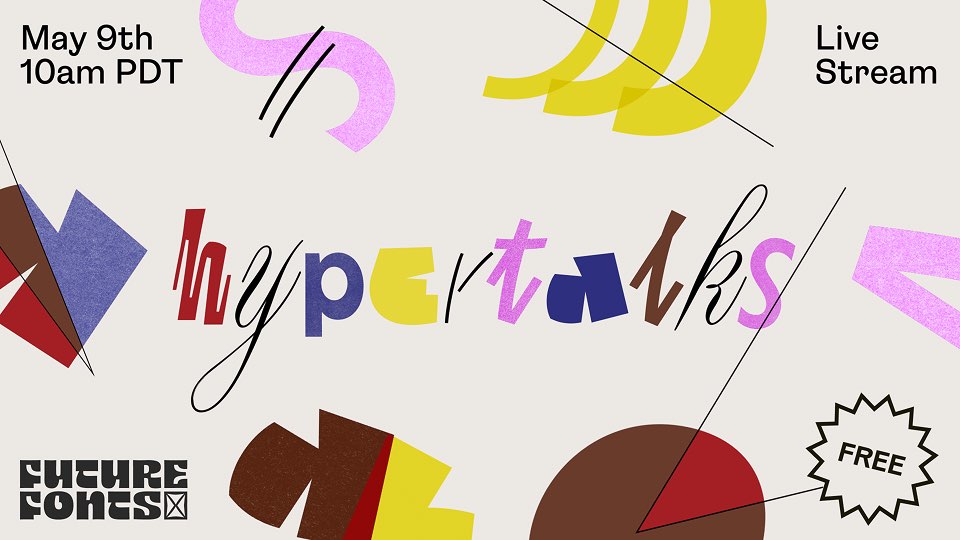
An earlier version of this issue mentioned the “forthcoming” HyperTalks event by Future Fonts, but it’s not forthcoming anymore — it happened last Friday, and I ended up watched the opening section from my hotel room. But fret ye not: the livestream recording is now on YouTube (we need a term for a livestream that is no longer live, don’t we?), which is great because I’m especially excited to watch the sessions by James Edmondson, and Diana Ovezea and Barbara Bigosińska.
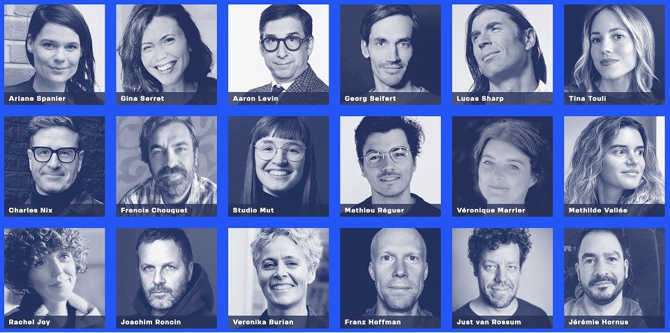
An event that definitely hasn’t passed yet is TypeParis Now25, which is happening on 31st May. I attended (and spoke on a panel at) last year’s event and thoroughly enjoyed it. Sadly I’m going to miss the ’25 edition, but the lineup looks fantastic. Also, a hot tip for you: my good mate Jamie Clarke may have some lovely swag for you if you go. Nudge nudge wink wink.
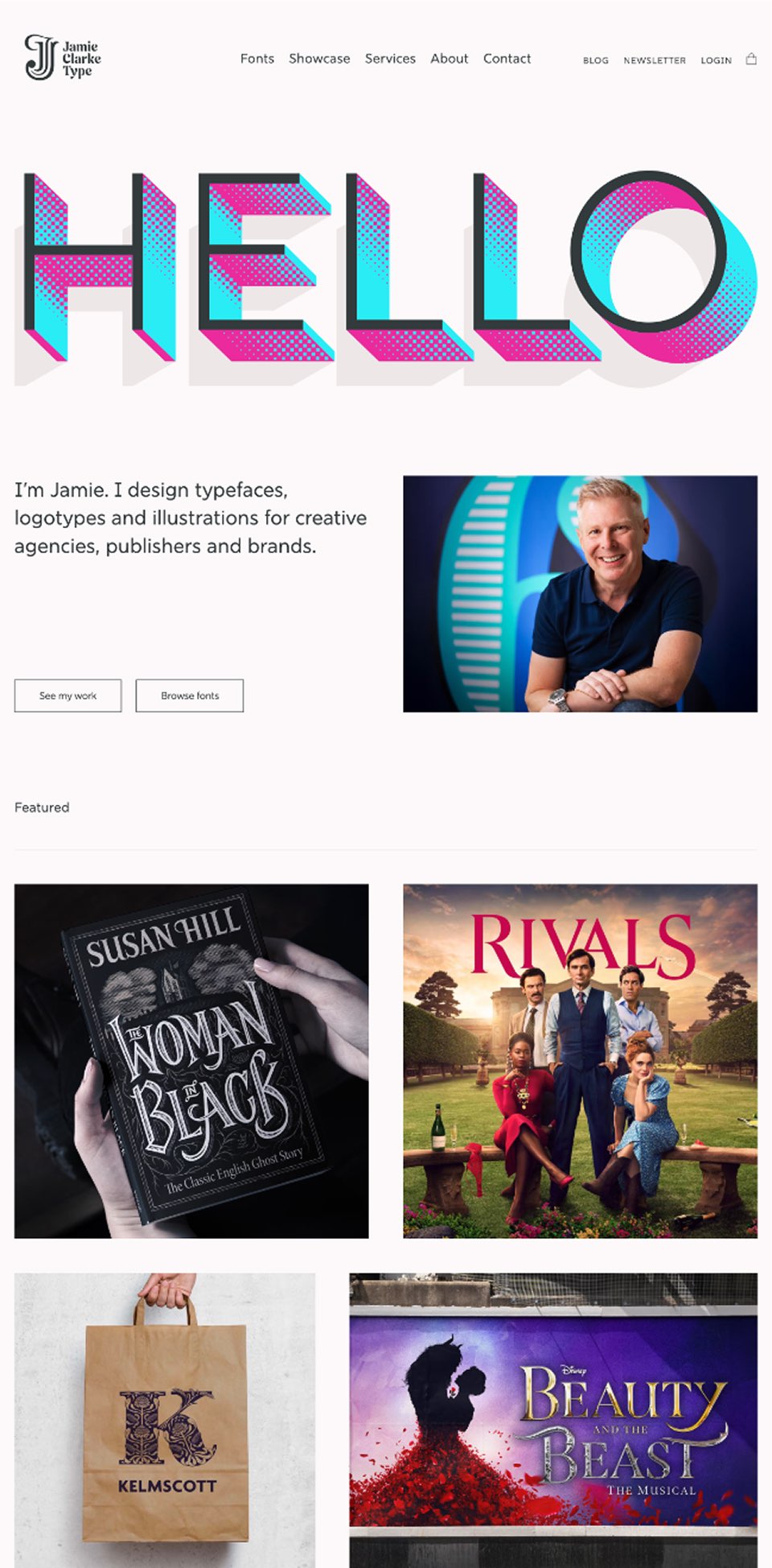
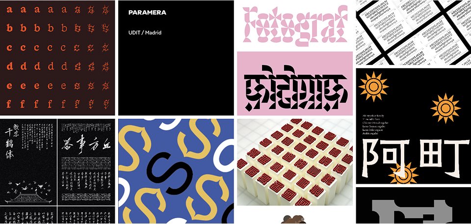
Speaking of Jamie (who, yes, makes regular appearances in this newsletter (bring on the nepotism, I say)) has a beautiful new jamieclarketype.com, designed and built by Andy Bell’s team of CSS sorcerers at Set Studio. In his most recent blog post, Jamie goes into detail about his new logo, which debuted on the redesigned site. I love process posts like this, as well as the concept behind the three Js.
Nice to see the winners of this year’s TDC71 competition. I’m especially excited to see that a few of these are also going to be in my forthcoming coffee table book, Fine Specimens. Speaking of which…
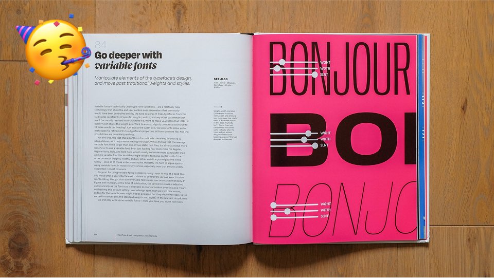
FINE SPECIMENS UPDATE! Work on the new book has been one of several plates I’ve been spinning lately. After a healthy amount of back-and-forth, I’m happy to say that both the cover and the BLAD (the core interior page templates) have been signed off by the publisher, and I’m now busy ordering everything in my gigantic InDesign file. My next big deadline is in early June, when I’m meant to have the first draft of the interior design done. Hopefully I’ll be able to share a few sneak peeks at that point.
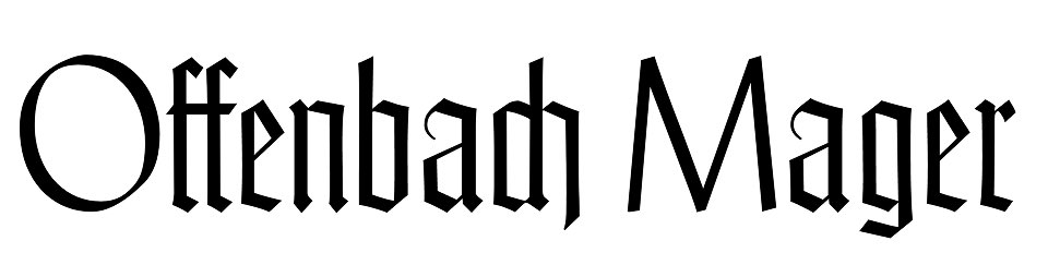
Offenbach is a digital revival of Rudolf Koch’s typeface originally drawn in 1928, which pairs wide roman capitals with narrow gothic minuscules. Poem Editions are generously offering the font — created in a one-week workshop in 2022 under the direction of Jérôme Knebusch — for free.
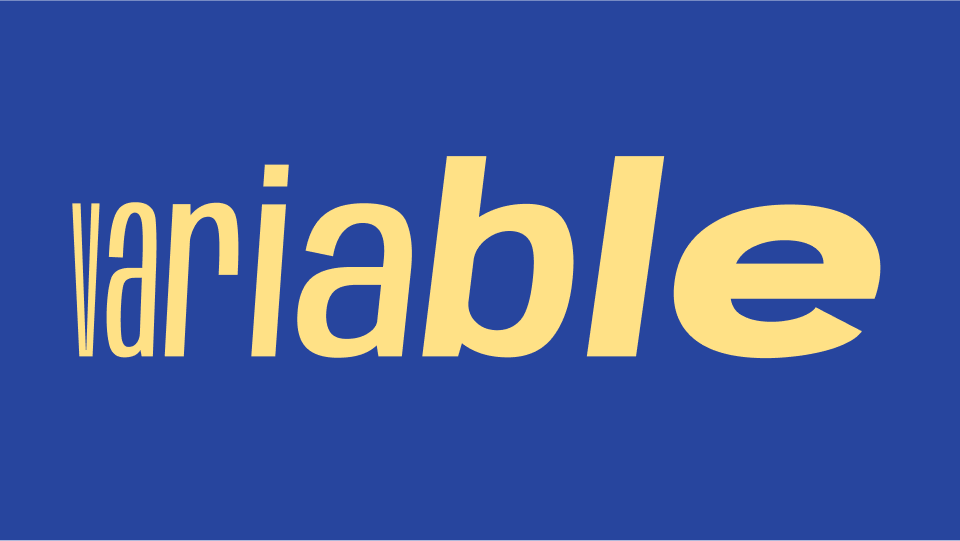
The other day, I found myself on the Contemporary Type website, enjoying the way they’d designed the nav that appears when you hit the hamburger menu, and the way each nav item animates between the upright and italic styles of the typeface. As well as a nice little interaction, it struck me that this was a great way of demonstrating some of the power of variable fonts. Or, at the very least, educating novice type users about the differences between the design of upright and italic letterforms.
Anyway, I took a screen recording and will definitely be using it in a future workshop. For now, here it is as a GIF:
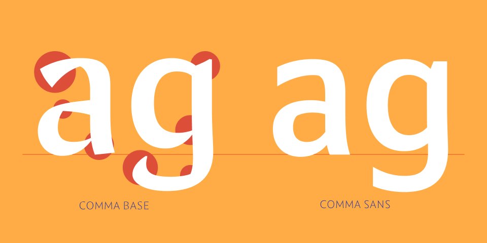
Martin Majoor has just released Comma Sans — the fully sans counterpart to his sans-esque Comma Base. I enjoyed the brief interview he did with ILT (who are currently the exclusive retailers of the new family), where he pointed out that many people think of Comma Base as a serif, purely because of the contrast between its thick and thin strokes.
This seems to prove that for a ‘serif-like’ feel, the presence of contrast is just as important as the presence of actual serifs.
Interesting. I’ve often wondered the same thing. Jamie’s Nave typeface, for instance, appears — in my humble opinion — serif-like mainly because of the exact same reason.
The other day, I got an email from my publisher (every time I write or say “my publisher”, I feel like I’m Hunter S. Thompson saying “my attorney” and a tiny part of my typo-gonzo dreams are fulfilled) to let me know that it was the one-year anniversary of my book’s publication! If I were the organised type, I’d have a ‘birthday sale’ or something ready to go, but hey, it’s me. If you’re interested in buying the book directly from me for a discounted price, simply reply to this email and I’ll send you the details.
I’m starting to prep an online workshop on variable fonts in September with the title Variable fonts — from novice to pro in 90 minutes. I feel pretty good about the content plan, but figured it’d be useful to ask: what would you want to learn about variable fonts? Again, just hit ‘reply’ if you’d like to weigh in.
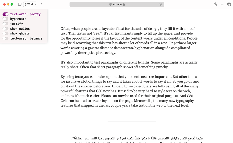
Jen Simmons recently published a post on the Webkit blog about using text-wrap: pretty. Although not yet widely available in browsers yet, this is a really exciting glimpse into the near future. And although other browser vendors have already implemented this to some degree, Jen points out that WebKit is “the first browser to use it to evaluate and adjust the entire paragraph [and] the first browser to use it to improve rag.” Download the Safari Technology Preview 216 and then head over to the demo page. You can play with a variety of text-wrap properties there, too.
Before we move on from the subject of web typography, my fellow CSS nerds might enjoy this conversation between Roel Nieskens and Kevin Powell. I’ve only recently discovered Kevin’s YouTube channel, but I’ve admired Roel’s work for years and have had the pleasure of making websites with him for The Type Founders (proximasupernova.com was a particular highlight).

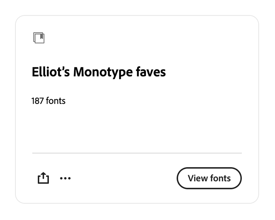
Just in case you missed the news: Monotype fonts are now on Adobe Fonts. Yes, that means Gotham is now on Adobe Fonts. I’ve collected a load of my favourites in a new Adobe Fonts library and, unlike the other public libraries I’ve created recently, I’ve not limited it to particular weights in order to hit the magic number of eight typefaces (if you know, you know), so entire families are in this one — ready for you to “add all fonts” to your devices in one click.
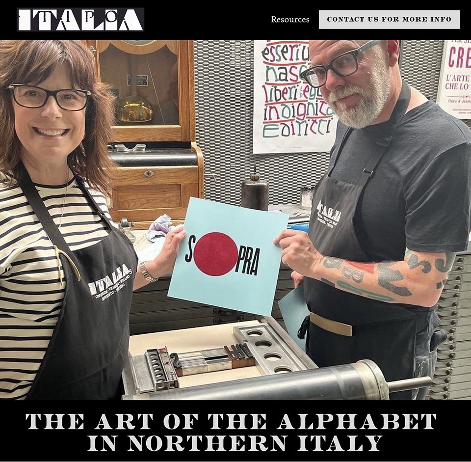
Miles Newlyn and Mark Simonson are supporting this year’s Tipo Italia, which I’d not heard of, but wow, it looks like a wonderful event. (Oh, hello, Dan Rhatigan!)
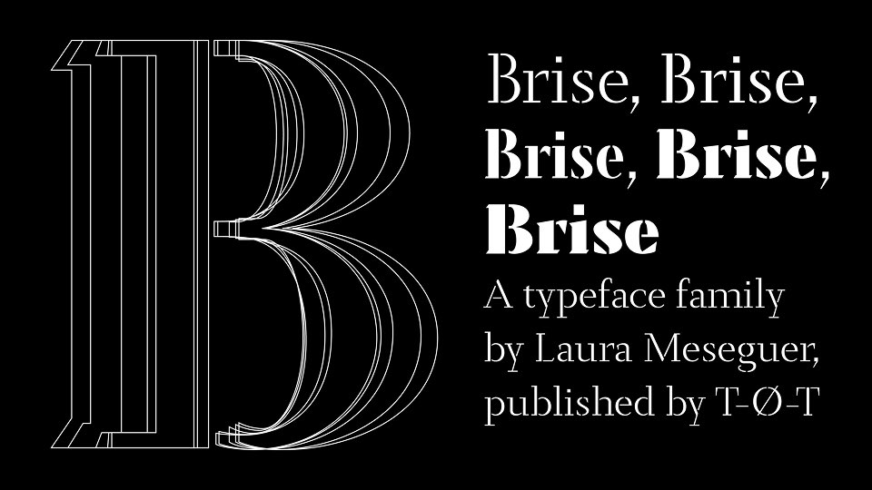
Laura Meseguer has released a new typeface, Brise, available from Type-Ø-Tones. I love this description:
A stencil is defined as much by its strokes as by the voids that interrupt them. These gaps are not losses but intentions — precise pauses that give the structure its rhythm, its balance between weight and air.
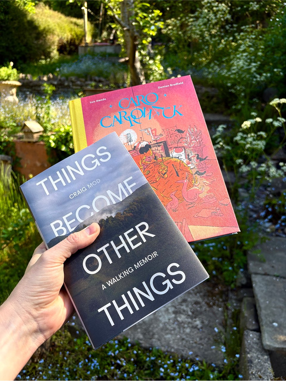
Don’t you just love it when friends’ books arrive in the post? This week, not one but two presents to myself landed on the doormat: the Luis Mendo-illusrated Caro Carrowack (written by WeTransfer co-founder Damian Bradfield) and Craig Mod’s Things Become Other Things (in which Luis also makes an appearance). Beautiful artefacts, both of them. And two more to add to my shelf of books I will definitely read as soon as I get just a little more time.
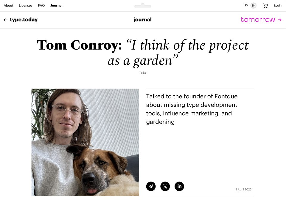
I thoroughly enjoyed reading the interview with Tom Conroy (creator of Fontdue, which I’m seeing used on more and more indie foundry sites) on type.today. I keep forgetting about this site. Can someone please remind me to not forget about this site?
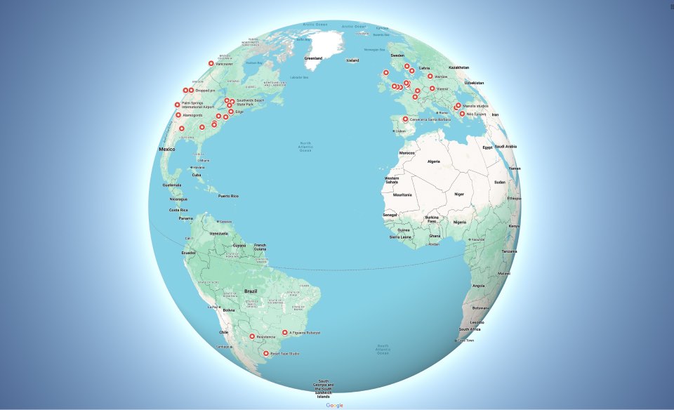
Here’s your regular reminder to add yourself to my little Readers of Typographic & Sporadic map. You see, what happens when someone adds themselves to the map is that the Google Maps app pops up a little notification on my phone, which I then tap and get instantly transported (virtually) to where that place is on the map. And every time that little moment happens, it puts a big ol’ smile on my face. So thank you to those of you who’ve been doing that lately — it’s very much appreciated.
Lastly and most definitely least, if you’re reading this in your email app, you might appreciate the light updates I’ve made to the design of this newsletter. Writing CSS for emails continues to be something of a dark art and it really is so easy to summon the readability-hating demons in the process, but hopefully things are now a little tighter where they need to be and more loose where they need to be, too. Still no web fonts in the Gmail app (how, Google, how?!?) so, as always, please do read this issue in your browser for the best experience. Oh, and if you spot anything that looks broken, please tell me (and forgive me).


