Palette swaps and blue electricity
Hello! Last week I got hyperfocused on background art and drew a whole bunch of environments for my game, and then I had the flu this week and was too ill to do anything other than drawing a few sprites. So expect to see a whole bunch of sprites in this post and not much else!
One sprite set, five environments
I took the fire and ice sprites that I showed off in my last newsletter issue and palette swapped them to create three more environments: a swamp, a beach based on the Ducky's Delivery Service beach colors and a sandy cave:
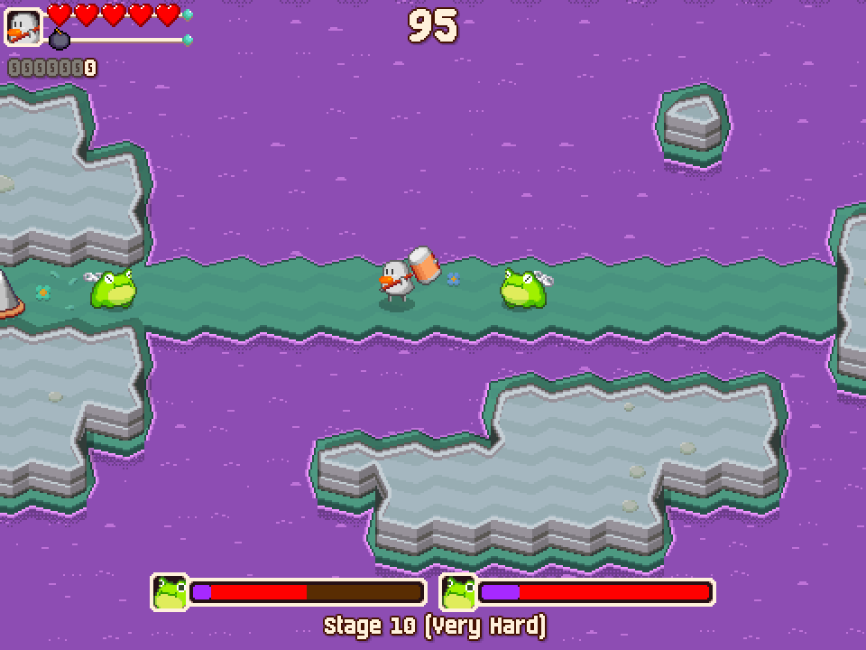
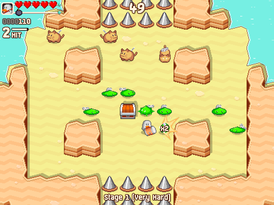
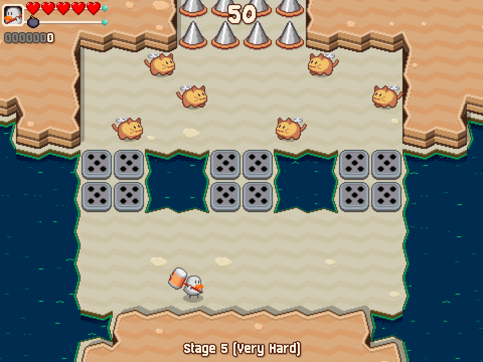
If you want to see the new environments in action, here’s a video of the first stage in beach form. The white ‘X’ sprites that warn you about falling enemies during boss fights (e.g. at the 0:43 mark) are extremely hard to see, but I’ll talk about that later in this post:
I love how these new environments turned out! My initial plan for this game was to make a total of three or four environments and stretch them out over the entire game, but this let me add even more visual variety without much extra effort.
Getting the most out of the other sprite set
Naturally, the next thing I did was to try and squeeze some more usage out of the game’s original field background sprite set. The bottomless pits weren’t a great fit for a grassy field, so I replaced them with water and made some other tweaks to the background sprites while I was at it:
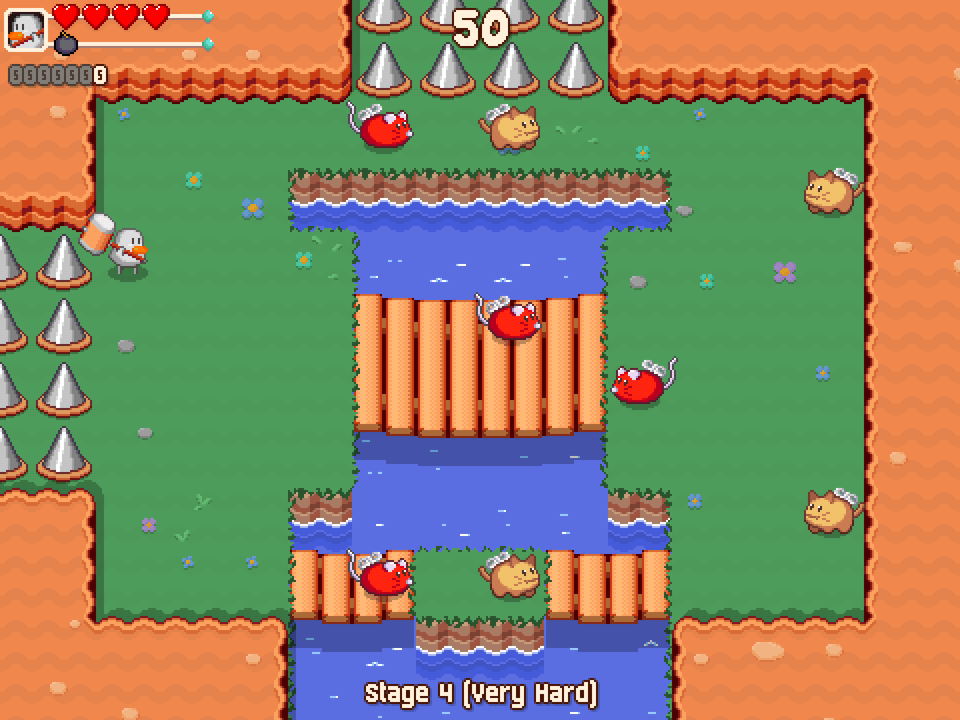
As much as I love these changes and think they’re an improvement on the previous sprites, I didn’t want to get rid of the bottomless pits entirely. So I palette swapped them out to make a canyon environment:
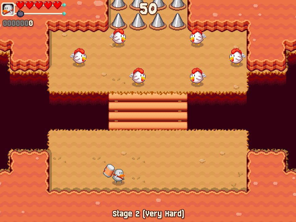
I love it! At this point the only other backgrounds I need for the game are the final two areas, and I’ll hold off on drawing them until I’ve finished coming up with a story and designing the game’s main antagonist.
Blue electricity, and other effect visibility fixes
As much as I love these new environments, they exacerbated a couple of the game’s visibility issues. The electricity effects from mice and chickens’ bombs were hard to see on the yellow or orange tinted stages, and the white ‘X’ warning sprites were hard to see on the lighter stages.
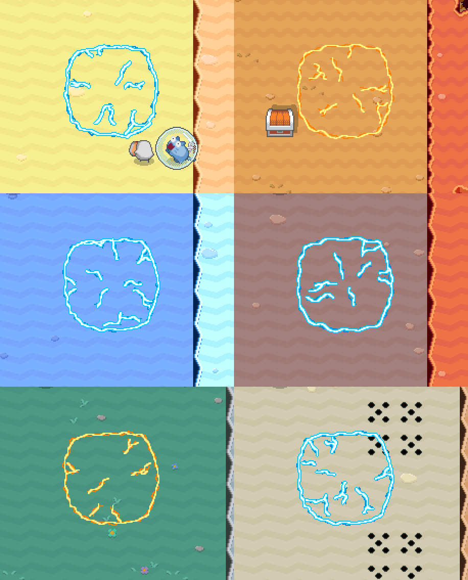
After trying various different electricity colors and styles, I ended up going with an effect that rapidly switches back and forth between blue and yellow. Here it is against all of the game’s different backgrounds - sorry about the flashing colors!
I went through a few variants of the warning sprites too. It was hard to make them stand out clearly against all the different background colors without making them too obnoxious, but for now I settled on making them flash red and orange:
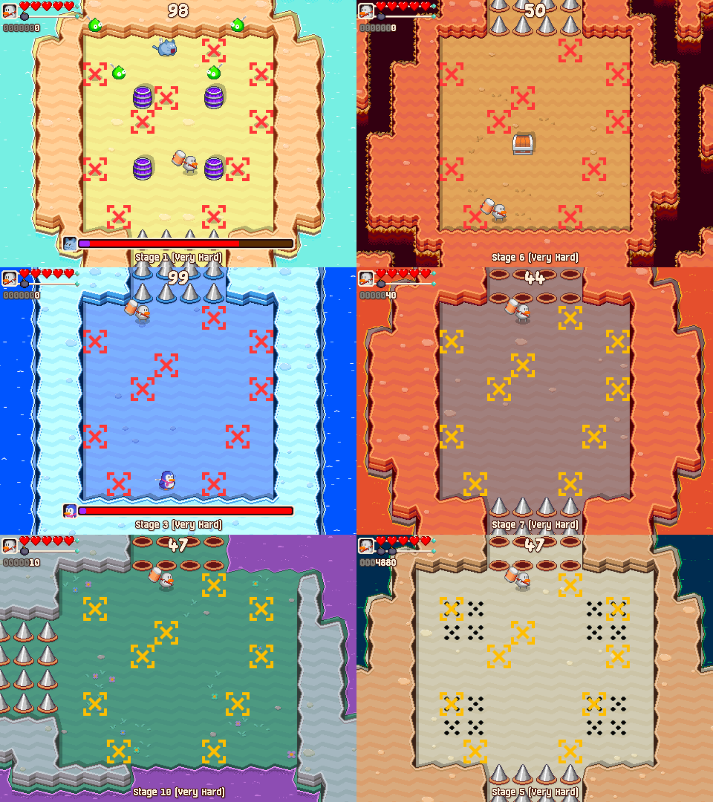
Admittedly they look pretty obnoxious while rapidly switching between all of the game's backgrounds like this, but I'm happy with how they look during standard gameplay!
Anything else?
I needed a break from playing the Ghosts ‘n Goblins series so I jumped into the old The Punisher arcade game instead. I’m still nowhere near being able to clear it but I’m having a great time! After bouncing off the arcade beat em up genre so many times over the years, I’m finally starting to get a feel for them. I’m sure I’ll have something more interesting to say about the game (and genre) once I can clear it!
Other than that, I’ve mostly just been resting and trying to recover. Hopefully I’ll feel better soon so I can get back to making music and deciding what the game’s main character should look like. I hope you have a great couple of weeks and I’ll see you next time!