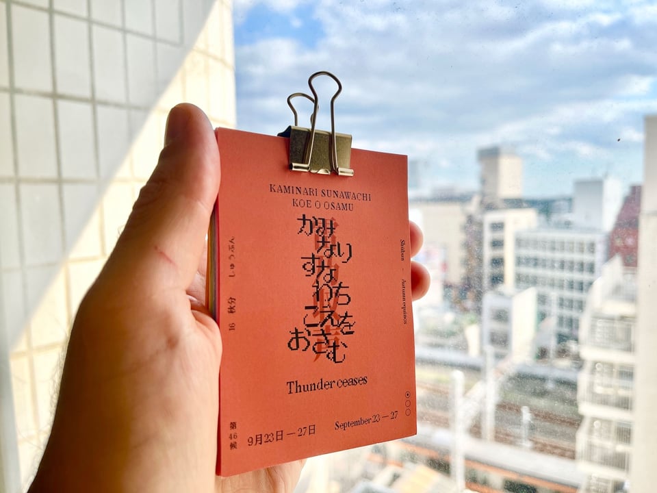
Currently in Tokyo, a new microseason in the “Autumn equinox” (秋分 Shūbun) division has begun: Thunder ceases (雷乃収声 Kaminari sunawachi koe o osamu.) Out of the 72 microseasons this is the 46th.
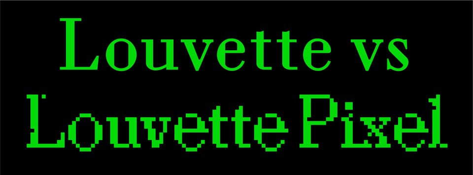
In case you missed CJ Type Newsletter #1, Summer 2025 you can look back at the archives to learn more about Velzyland, ʻŌpua Mauka and the Typographics conference in NYC. In this Fall update we’ll take a look at how the original Louvette typeface, released by CJ Type in 2019, inspired a glitchy pixel interpretation five years later, including CJ Type’s first typeface covering Japanese Hiragana and Katakana scripts as well as some classic emoji. And we’ll look at some in-use examples of Louvette Pixel, Pennypacker, and Dunbar. Plus newly available CJ Type merch via Draw Down books, and a coupon code!

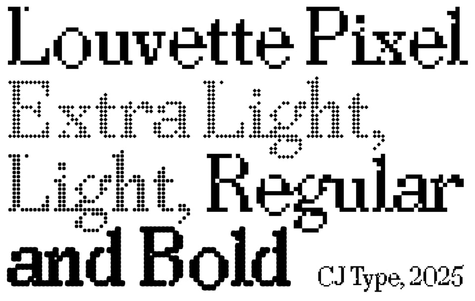
I drew the original Louvette as a high-contrast modern serif, with flat-sided round shapes and triangular serifs. From the beginning I designed a range of optical sizes so the hairline strokes could stay as thin as possible, from Banner for the largest sizes down to Text for the smallest sizes. Core to the design concept is the tension between the elegantly thin hairline strokes and the sharpness of the serifs and insides of the round shapes.
When I started experimenting with rendering this design as a pixel font, I realized that the sharpness of Louvette would work well with the inherent rigidity of a simplified pixel design, thus Louvette Pixel was born. But instead of trying to make it as “pixel-perfect” as possible, I found it more interesting to embrace the glitches that can happen with low-res screens which have a “dead pixel”, or when pixels “drop out” during rendering, which brought the tension I felt necessary to make the design interesting and to feel at home with the original Louvette styles. It turns out these “glitches” can be used strategically to lighten up the moments when heavy strokes intersect, and work well to smooth anti-aliased shapes, adding a nice amount of sparkle and texture to the design.
You can see a similar effect in the more pixelated styles of the Redaction project typeface, designed by Jeremy Mickel, with creative direction by Forest Young, which is a super interesting project inspired by The Redaction by Titus Kaphar and Reginald Dwayne Betts: https://www.redaction.us/ →
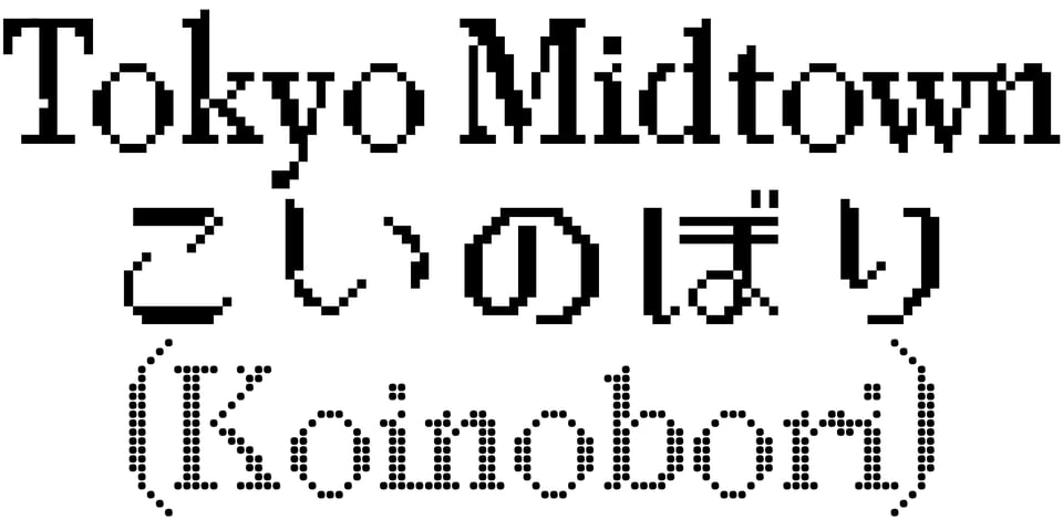


The first use of Louvette Pixel was for the Tokyo Midtown’s Koinobori festival in Spring 2025, right next to the amazing 21_21 Design Sight museum.
The design is centered around specificity of time and place, particularly Japan’s 19th microseason in early May: “Frogs Start Singing”, its seasonal flower: wisteria, seasonal fish: kinmedai, seasonal vegetable: carrot, and seasonal event: Children’s Day.
More about the Koinobori project →
The need for setting text in both English and Japanese for the Koinobori project lead to designing Louvette Pixel JP, which includes Japanese character for Hiragana and Katakana (330 characters, including alternates), and very limited Kanji (available upon request).
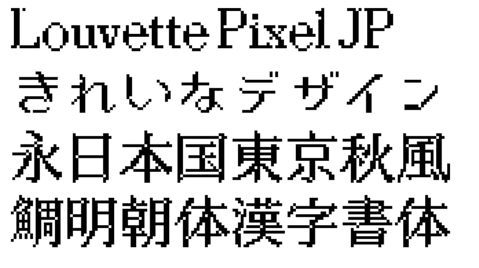
A basic set of Kanji will require over 2,000 characters so if this does get completed it will take some time 😅, but if anyone would be interested in licensing a version with Kanji, please let me know!
I also managed to include some classic pixelated emoji 😀 inspired by pre-smartphone era text messaging in Japan.
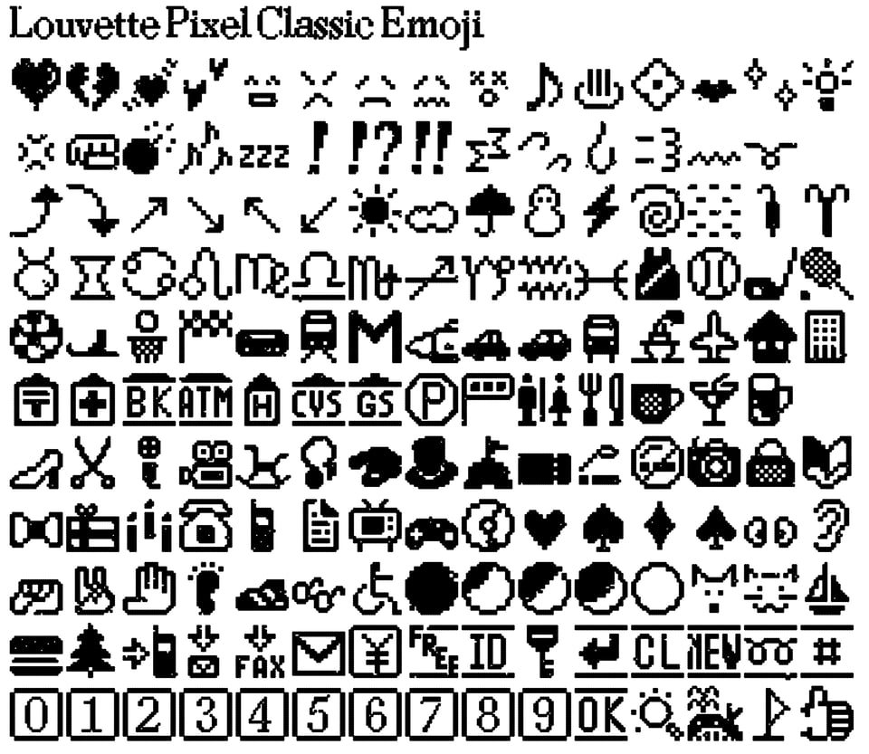
I used these original emoji when I was an exchange student in Tokyo in 2001 and have fond memories of this era, so I wanted to recreate this classic pixelated emoji set. And of course the emoji have built-in glitches like the rest of Louvette Pixel.
You can read more about the early emoji in Japan by J-Phone (later Soft Bank), DoCoMo (NTT), and AU (KDDI) via the wonderful site emojipedia →
Pennypacker has been used nicely by Dutch architectural building firm TeamWBC whose brand presence and typography communicates a modern, reliable, practical and business confident attitude.
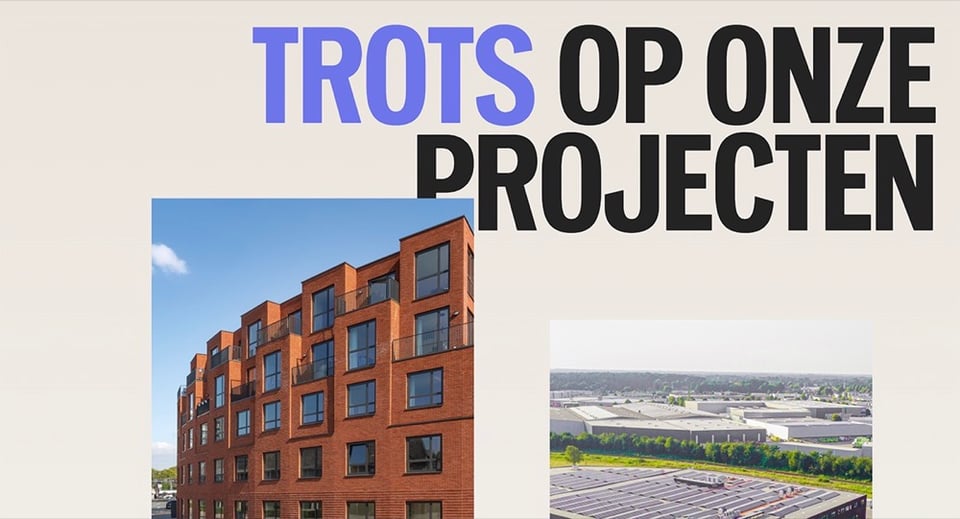
For the titles on their website and most headings Pennypacker Compressed is used in all-caps to maintain a heavily rectangular silhouette matching the imagery of TeamWBC’s portfolio.
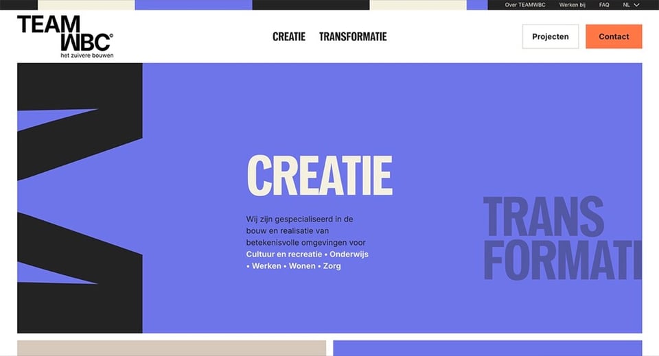
The title treatment of the two main pages on the website “CREATIE” and “TRANSFORMATIE” use vertical stacking of the words “CREATIE BOUWEN” and “TRANSFORMATIE VERBOUWEN” mirroring the idea of architectural elements such as pillars or tall apartment buildings adding dynamism to the typography used in its clean rigid grid system.
More about TeamWBC’s typography →
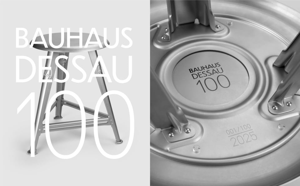
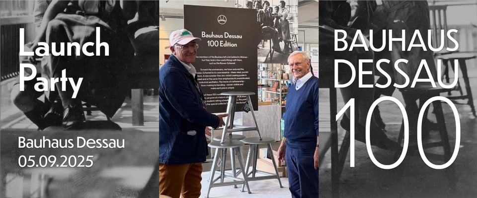
For the 100 year anniversary of Bauhaus Dessau, Rowac made a limited edition of their icon Schemel stool which was used historically by the students in the Bauhaus. Rowac makes wonderful use of Dunbar in their branding and advertising in general, and the limited edition stool, made of pure steel, features Dunbar for the Bauhaus Dessau 100 logo on the bottom of the seat. Rowac did a stunning job using Dunbar in promotional materials for the launch of this edition, including signage in the designshop at the Bauhaus Dessau museum.
More about Rowac’s typography →
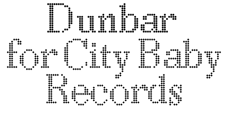
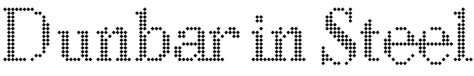
The latest release from City Baby Records is “Play to Lose” by Rapallo, which features cover illustration and lettering by ESPO, and the rest is typeset in Dunbar.
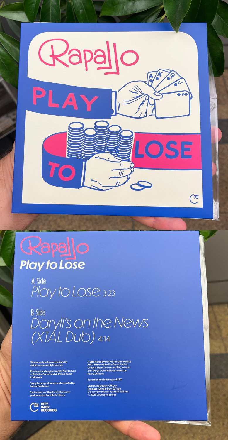
If you look closely you can see a glimpse of the yet-to-be-released Dunbar Compressed, used for the text “A Side” and “B Side”. And if you ask nicely, the Compressed and Condensed styles of Dunbar are available for licensing upon request.
More about the typography of this record →
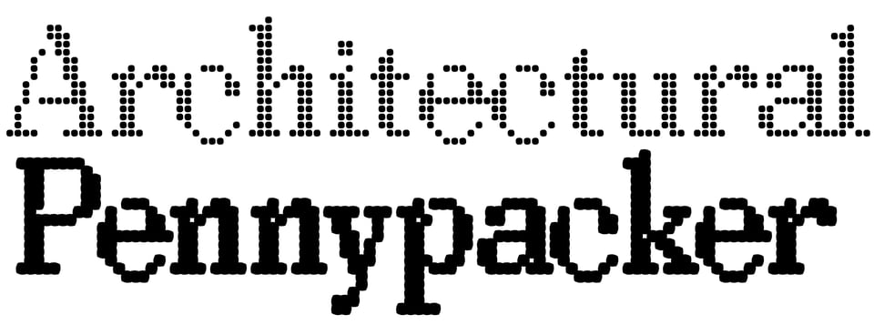
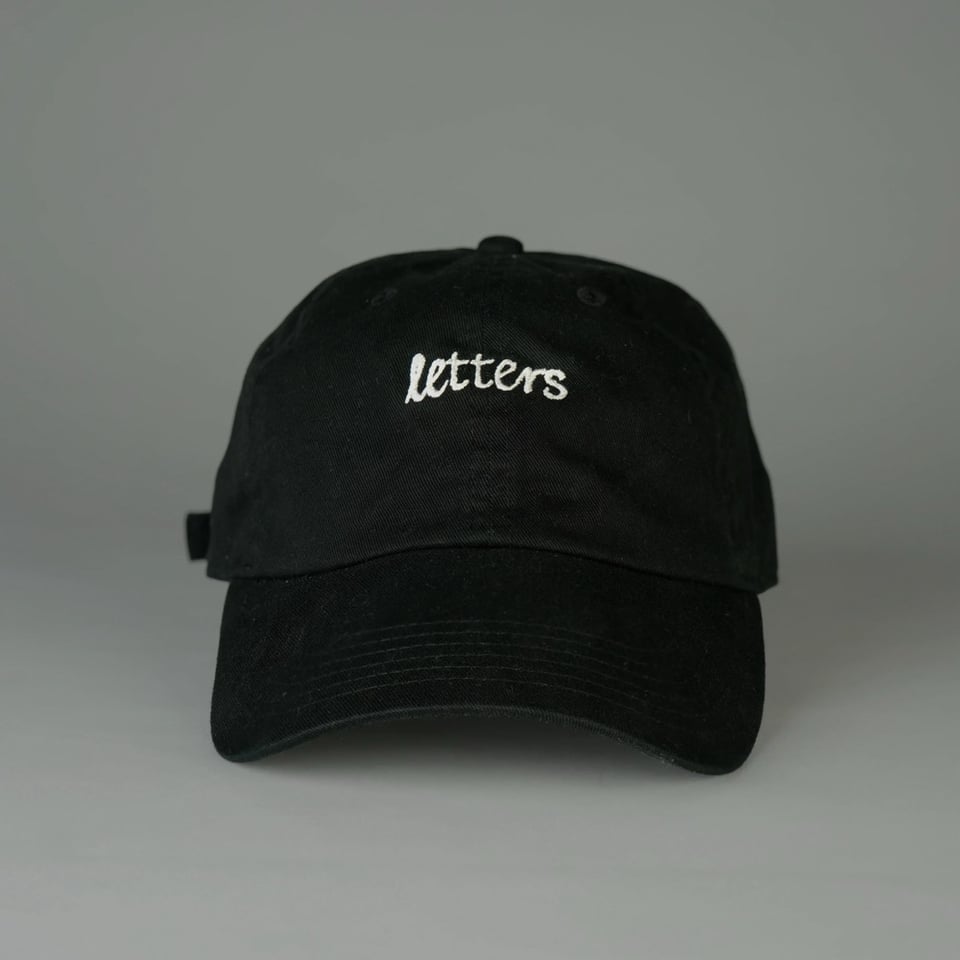
Some CJ Type merch is available through Draw Down Books such as the “letters” hat and the Pennypacker typeface specimen poster. Some of the hat colorways already sold out, so get them while they last.
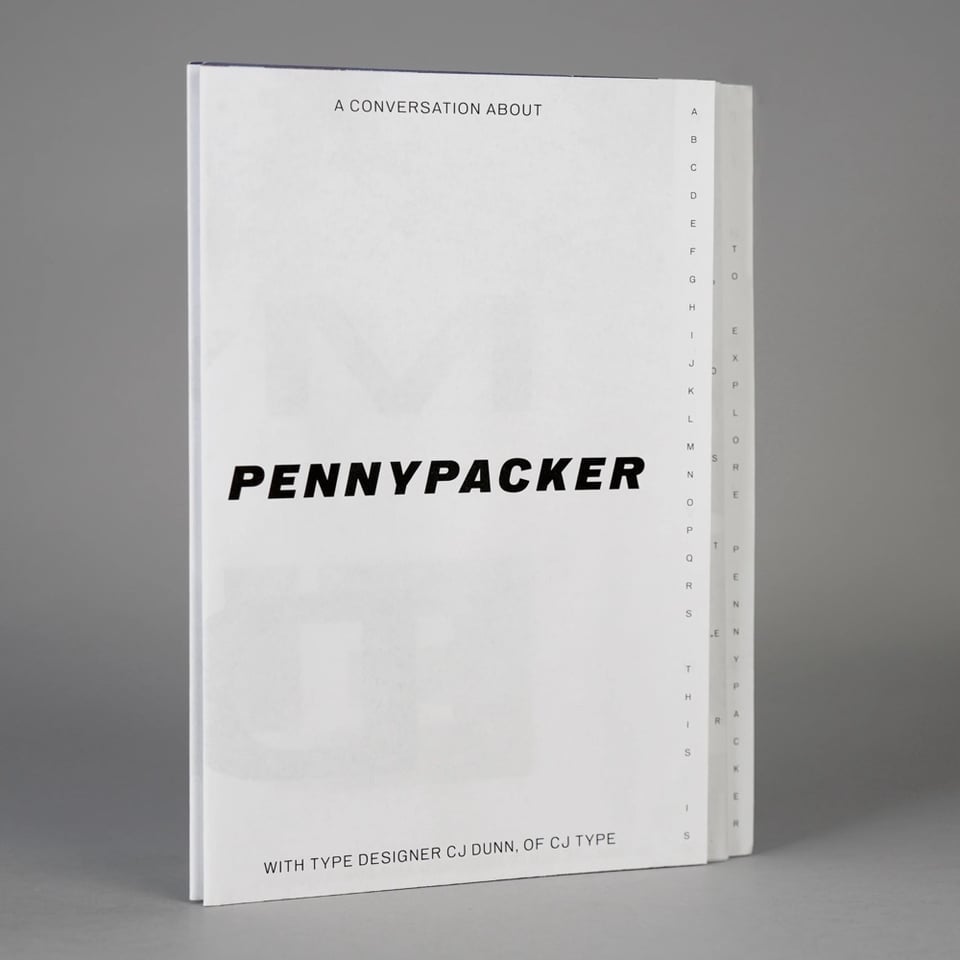
More about the Pennypacker Specimen →
Thank you for reading this far, and for supporting independent typeface design. To show my appreciation, please use coupon code: PIXEL at checkout to get the entire Louvette Pixel family (4 styles, + variable font, including optional Japanese version) for the price of a single style, valid through the end of 2025.


Have you used a typeface from CJ Type, or have you spot one in-use somewhere? Please let me know, and it could be featured in the CJ Type Gallery.
You just read issue #2 of CJ Type News. You can also browse the full archives of this newsletter.