CJ Type News #3: Typographic branding case study – Oliver’s Custom Coffee, Counterpress, + more
Happy Holidays from CJ Type! Winter Solstice has passed in the Northern Hemisphere marking the longest night of the year and the shortest day, which means that brighter days are ahead. Come gather ’round the digital hearth and let’s talk about type!
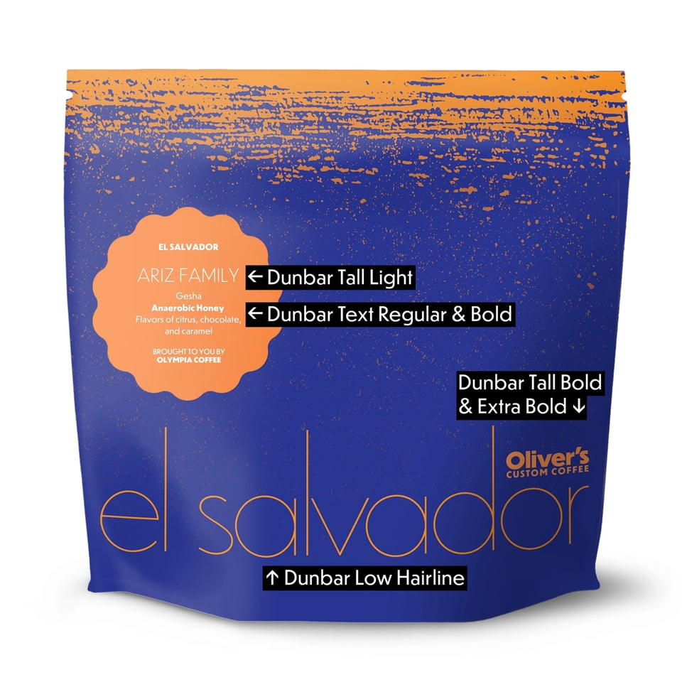
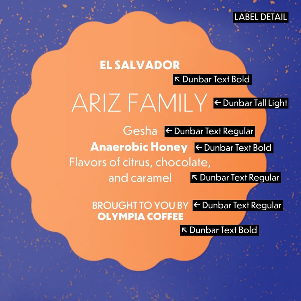
The brand identity for Oliver’s Custom Coffee designed by Needmore Design, includes packaging, logo, and web design, and is a wonderful example of how the wide variety of styles of Dunbar can be used in a cohesive system.
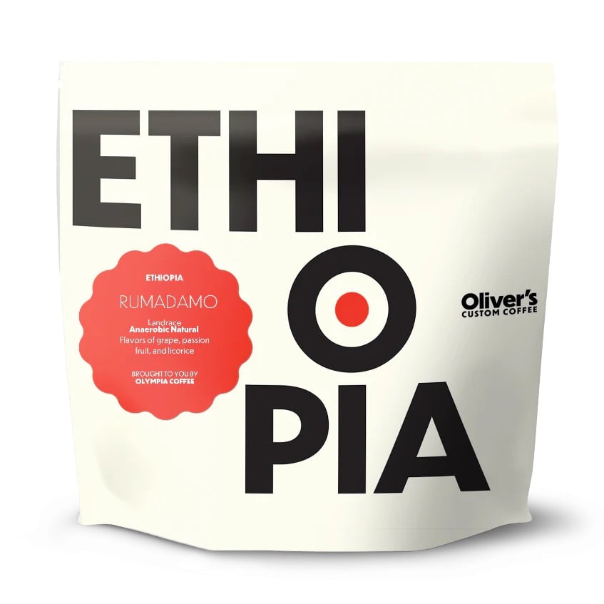
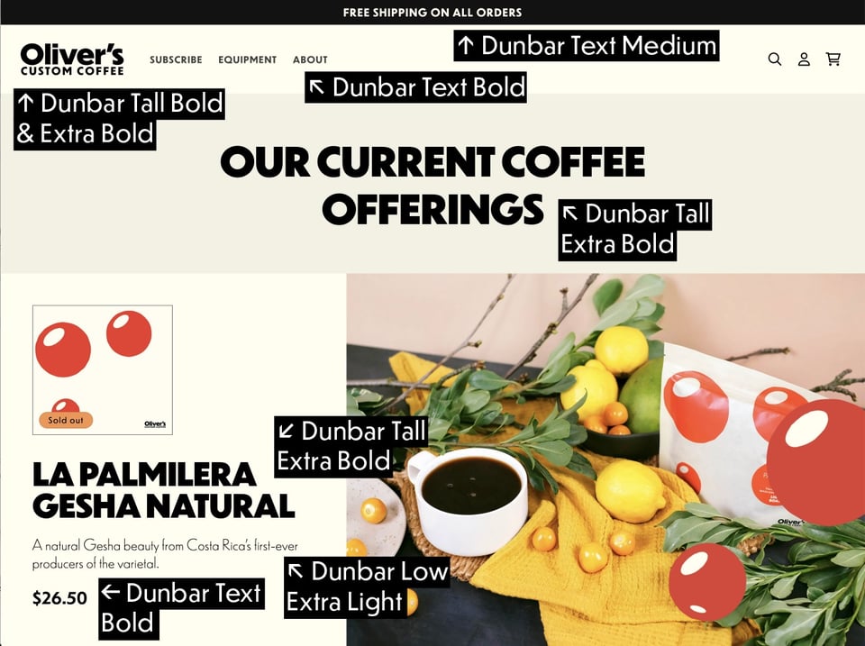
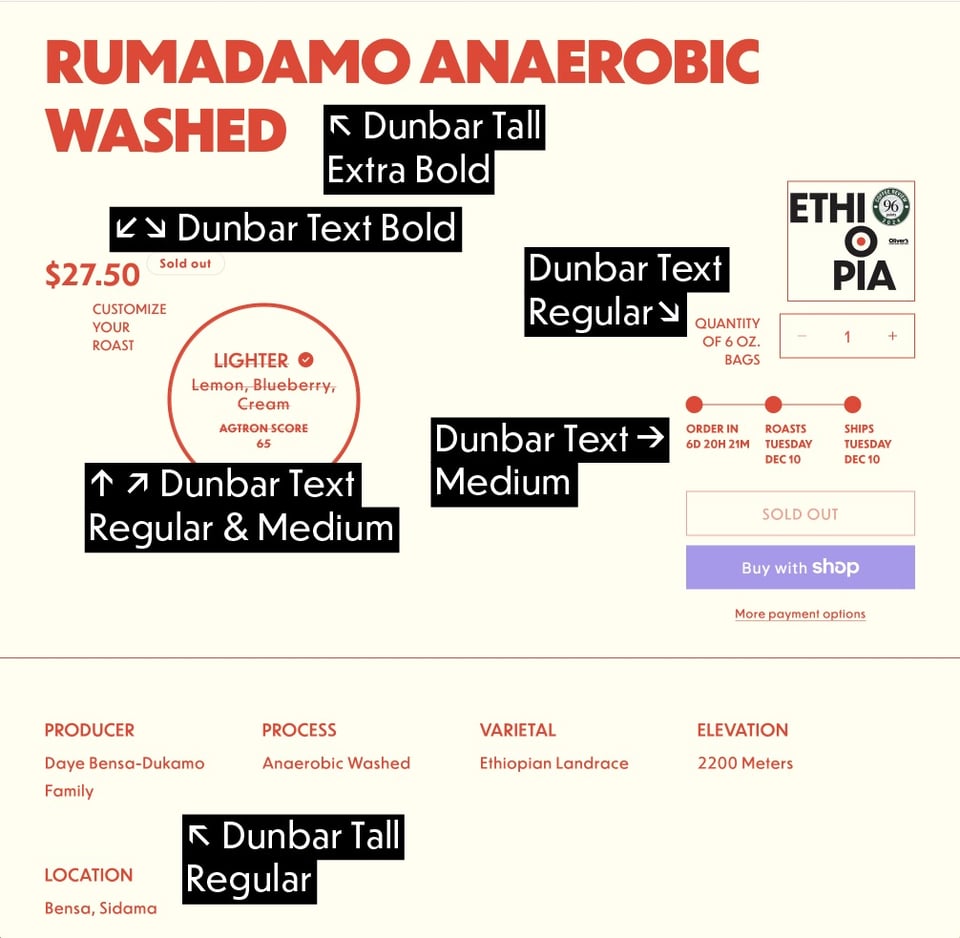
I particularly appreciate how this system leverages all three subfamilies of Dunbar: Dunbar Tall, Dunbar Low, and Dunbar Text, as well as the assortment of weights in each. So I thought it would be interesting to take a looks at this system as a case study for typographic branding, and examine the specific styles used in various deliverables throughout the identity system.
The website for Oliver’s Custom Coffee also uses the wide range of styles of Dunbar, from navigation using Dunbar Text, to Headlines in Dunbar Tall, and Subheads in Dunbar Low.


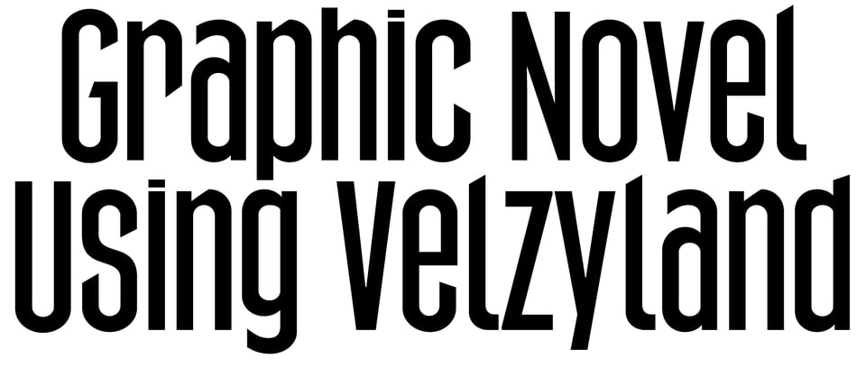
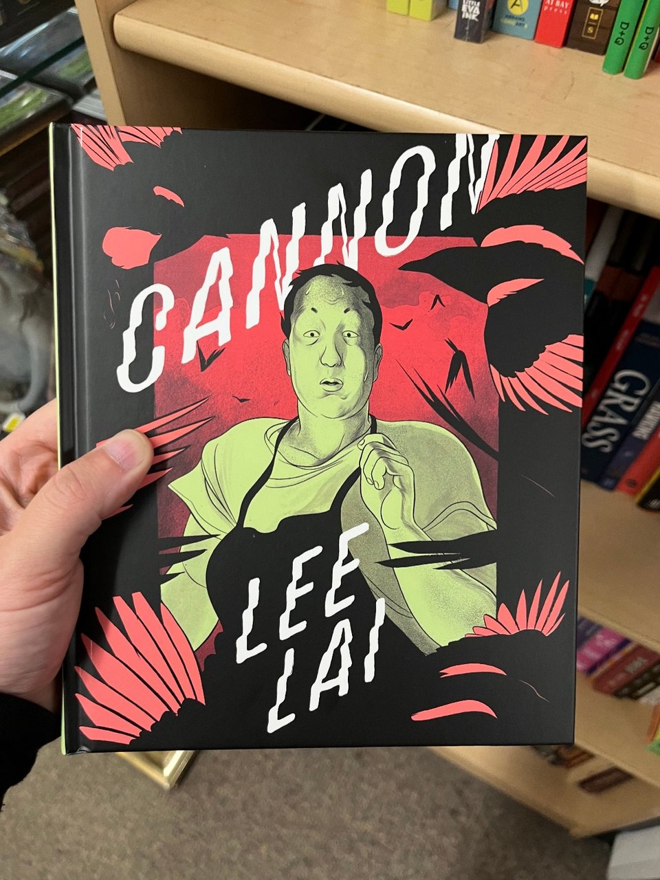
 Cannon is the new graphic novel from Lambda Award-winning cartoonist Lee Lai. The title and author’s name on both the cover and the spine are typeset in Velzyland. On the cover, the wavy letterforms of Velzyland pair nicely with the rhythmic bird feather motif. And the angled baseline on the cover works especially well with Velzyland’s extreme slant of 25 degrees.
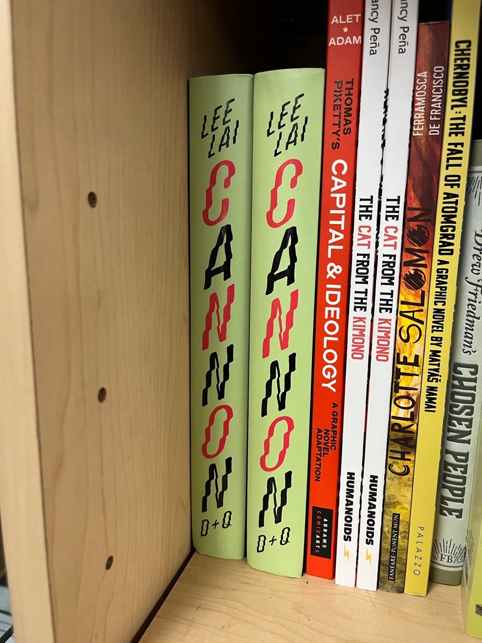
On the spine, CANNON is stacked vertically alternating from red to black, further echoing Velzyland’s wavy rhythmic effect, and it’s sandwiched between the author’s name and the publisher name, D + Q, shorthand for Drawn & Quarterly. More about Velzyland →
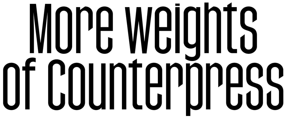
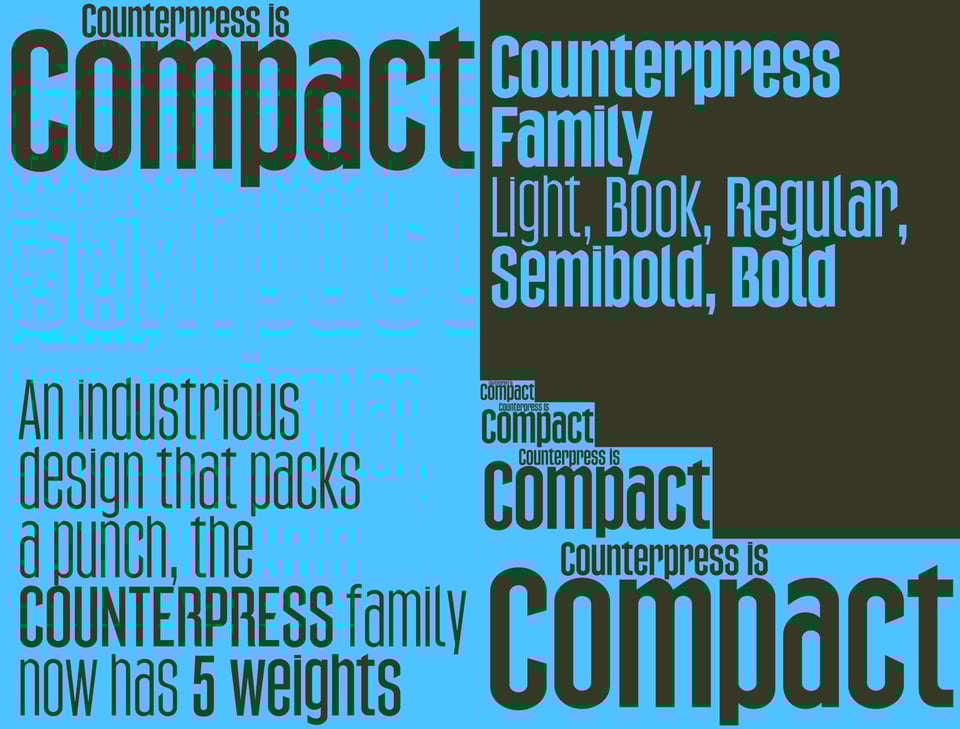
Counterpress was originally drawn as a custom typeface for professional soccer team Queensboro FC as an all caps design. This design was used on QBFC team merchandise, team uniforms, and across marketing, advertising and social media campaigns.

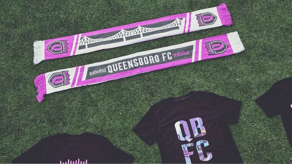


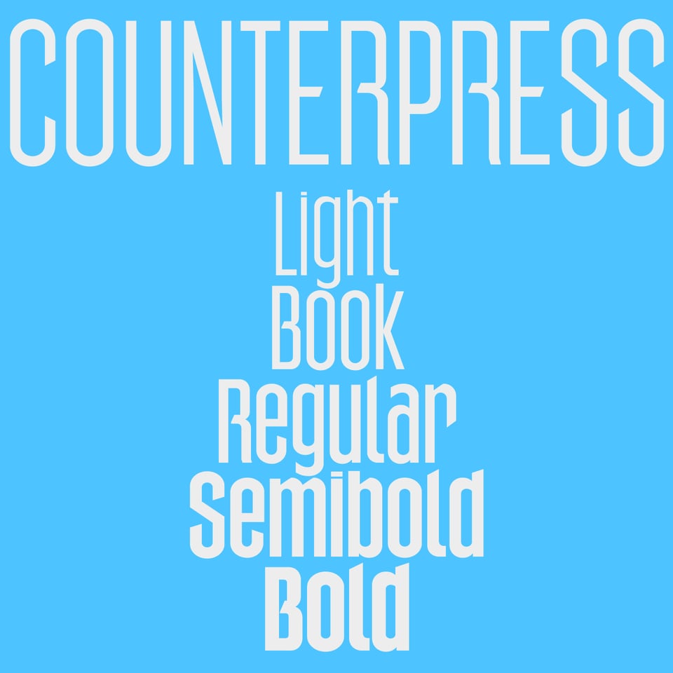
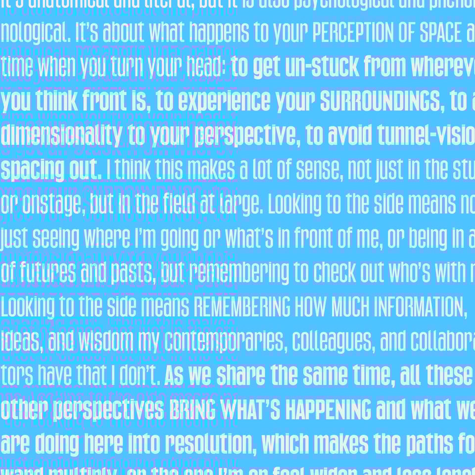
Counterpress has since been expanded to the Extended Latin character set. Now with a array of weights, from Light to Bold, it is perfect for usage in cohesive typographic design systems, from eye-catching signage and packaging, to multi-line headings and longer passages of display text. Check out Counterpress →



 For the winter season, I decided to add some snow to the CJ Type website using the snow-fall web component by Zach Leatherman, following this tutorial, and I customized it to use a few different emoji from Louvette Pixel using Extra Light, Light, Regular, and Bold weights. Watch the snow fall over at CJType.com →
Have you used a typeface from CJ Type, or have you spot one in-use somewhere? Please let me know, and it could be featured in the CJ Type Gallery.
You just read issue #3 of CJ Type News. You can also browse the full archives of this newsletter.