Behind the scenes: A Love Story
2026-06-10
My latest piece follows more than 1,000 people as they navigate their love lives across a massive societal disruption—something that has historically exposed the fractures in our relationships. Read it here.
***
I’ve started gravitating toward stories that map of disparate pieces of information. Today’s digital ecosystems deliver tidbits that are hard to piece together into a cohesive model of what’s happening or how the world works. So we end up holding contradictory models that are never resolved, or we end up doubling down on the one that feels most real while angrily rejecting the others. That’s why I find it particularly valuable to go on a journey to map out how everything fits together, and then share that journey with other people.
This story is a prime example of that. It uses the How Couples Meet and Stay Together dataset to track thousands of couples from 2017 to 2022. Much like other longitudinal datasets of that era, the dataset accidentally captures the effects of a global pandemic, and it ends up revealing large-scale shifts in what we think and how we live.
This dataset has probably received most attention from an analysis showing that online dating has become the most common way couples meet. I was able to recreate that analysis using the dataset and included it in my piece, even though that’s not the core of the story.
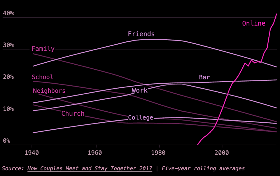
It’s an astonishing chart that describes a huge shift in human behavior. But when it gets shared on social media, it’s often used to reify our existing beliefs and critiques. This is true of so many social media charts that describe our experiences. They function as Rorschach Tests.
What I tried to do with this piece is show the reader a birds-eye view of more than 1,000 people and what happened to their love lives during and after a global pandemic. Sure, the data is a few years old, but I think we underplay how much it reshaped our world.
In the data, I ended up focusing on something the Stanford researchers found in their 2023 paper: Couples in high-quality relationships were resilient through the stressors of the pandemic, partially because they were able to created shared meaning out of the crisis.
This data story is interesting—and even more so in the historical and academic context of relationships.
For example, it was fascinating to explore what relationships looked like before, why they changed, and what they look like now in this historical context. I read a handful of books for this piece, including Stephanie Coontz’s “Marriage, a History,” which show that our prevailing models of relationships always had tradeoffs and that societal disruptions highlighted the weaknesses in that bargain. Some of these disruptions were bad, like pandemics and economic depressions, and others were driven by technological advancements. (Jean Twenge’s book, “Generations,” argues that the differences in people over time is largely driven by technology. I didn’t include this in the piece, but it’s an interesting thread to pull at.)
I also wanted to add context that helps make sense of the contradictory trend stories we see about relationships. I found a plethora of stories about how the quality of American relationships are eroding and that courting is broken; I also read stories about how American relationships have never been stronger, and that partners rely on each other more than ever. How can both trends be based in data, while existing in the same model of the world? Esther Perel’s “Mating in Captivity,” as well as readings from Eli Finkel, were quite useful. Both of them worried that we’re relying on our partners too much—sometimes to the point of breaking the relationship. And they argue that this is a product of losing the village that used to support our relationships.
I also kept coming back to John Gottman’s “The Science of Trust,” which I read as research for my upcoming book. He describes common traits of successful and unsuccessful relationships.
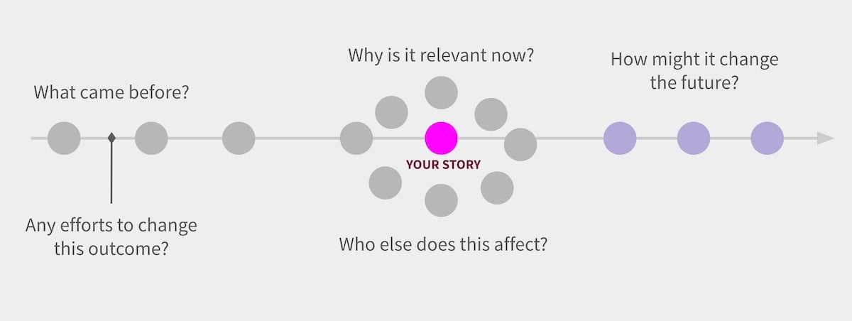
What I found so powerful about all of this reading is that they help us understand our own experiences, and where they fit into the larger map, both today and across history. I think it helps drive empathetic thinking because it helps us connect our experiences with everyone else’s. I try to teach this in my classes using the diagram below:
***
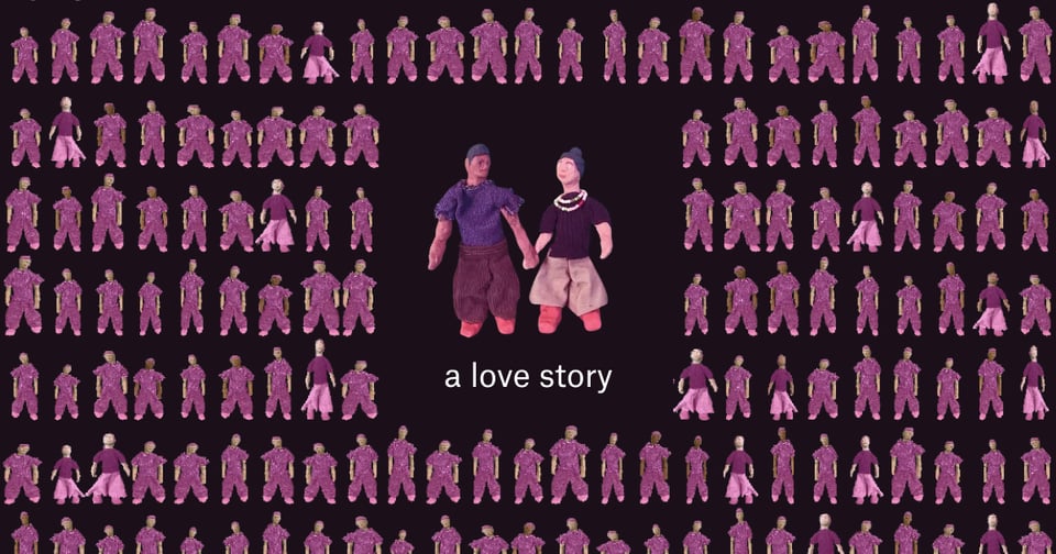
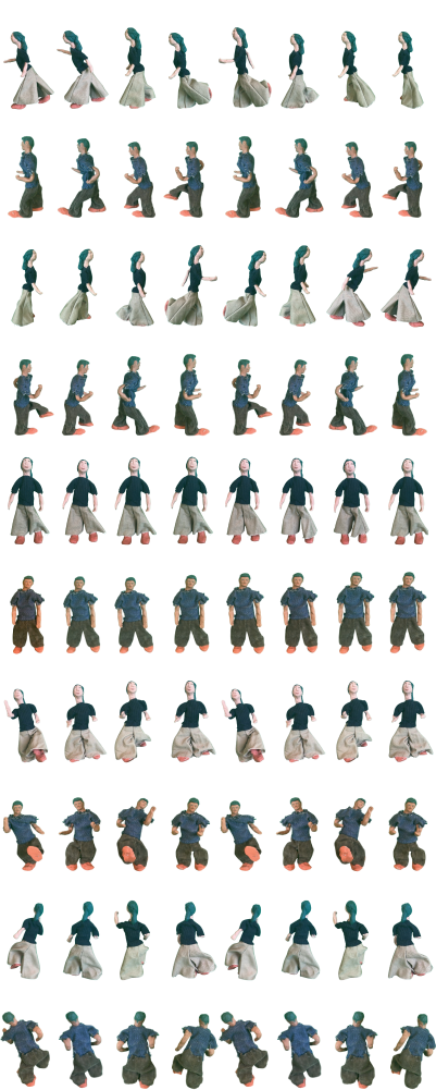
There is a big design tradeoff I made in this piece. This is the second time I’ve used a visualization that uses icons for each person in the dataset. You might recognize some of the same elements in my 2024 story, This is a Teenager.
I think it’s powerful to visualize individual people in datasets because it shows you how the experiences of individuals are aggregated into a bigger analysis—the finer details of how we go from lots of survey answers to one big finding. I think seeing methodology in this way, even if it’s basic statistics, can help us think about these stories as a description of the world and not just numbers or charts on a page. (I suppose I’m inadvertently weighing in on the Tufte vs. Holmes debate.)
That said, there are some huge downsides. One is that this doesn’t allow me to visualize survey weights, which is how researchers perform analyses that are representative of the population. The second is that it’s really hard to arrange icons into what are essentially bar charts—especially if we want the charts to be responsive.
In these stories, I’ve chosen to simply allow the reader to see what is bigger, smaller, and about the same. I think the goal of most of my stories is to integrate data, reporting, and research into a narrative that conveys a map of a topic—something that helps us see how things are related. But if someone expects the story to deliver precise metrics to cite in a research paper, these icon charts won’t do that, sadly.
***
I thought it’d be fun to make these icons out of clay. So I went to Blick and bought a bunch modeling clay and wire. Then I made figurines, and dressed them up in mini clothing (made by my partner, Amanda, who authored a Pudding story about women’s sizing earlier this year.)
Then I needed to take a bunch of photos that can be animated in a loop, so I used an iPhone stop motion app’s onion-skinning feature to do this. I set up my figurines in front of a green screen, and started taking photos.
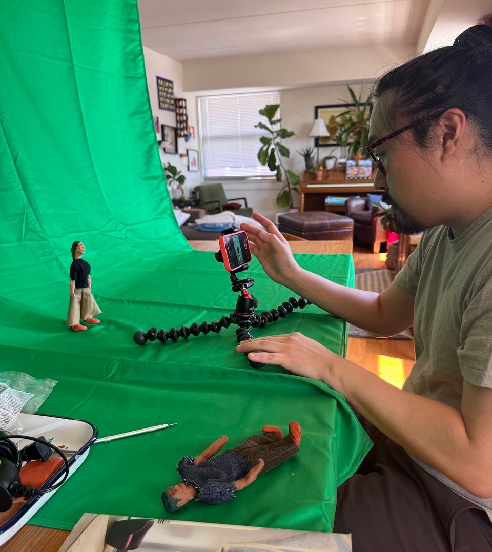
Eventually it all worked out and I got a really nice sprite sheet out of it. But the hot New York weather melted the arms and legs, and my clumsy hands kept knocking over the claymation figures. In short, I won’t be doing this again.
***
My school year is over, though things at the New School aren’t going great. (I’m the faculty advisor for the student newspaper, and I’m so proud of their excellent coverage of the deficit, restructuring, and layoffs.) The next few months will be spent finishing up my book and working on my next Pudding piece. I’ll probably spam everyone a bit more about my book next year, but I’m finding that it’s shaping how I think about my journalism.
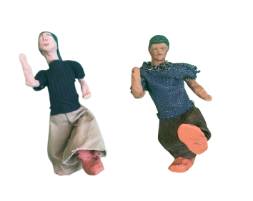
Thanks for reading to the end. Here’s a zoomed-in image of two claymation poses that I found particularly delightful.
Don't miss what's next. Subscribe to ChartHead: