Behind the scenes: Happy map
How I mapped more than 100,000 happy moments
My latest piece is an attempt to “map” more than 100,000 happy moments, from a crowdsourced corpus called HappyDB.
Happy Map
This project presented some interesting challenges, often at the intersection of content, tech, and design. So I’ll try to articulate those in this post.
Also, if you’re not subscribed to Charthead, do it!
The idea
I’m writing a book about the maps in our head. It’s preliminarily titled Why Maps Matter (forthcoming in 2027), and it’s a celebration of our incredible ability to experience the world, gather information, and organize it in our head to create meaning. But the topic feels urgent because of the ways algorithms and AI are shaping the way humans interact with information.
I’m a journalist who communicates visually, so I’m constantly consuming information and thinking about how I’ve organized that information in my head. Eventually I externalize the map, validate it, refine it, and publish it.
With data visualization, there are conventions that serve as guides for how to organize information. We have various chart types—and rules on how to design those charts. Oftentimes they are invaluable tools to not only help us share information, but also to serve as a shared visual language for quantitative information.
But the maps in our head don’t always follow these rules. We have messy and imprecise ways of organizing information—and the maps that we make in our head eventually shape how we view the world.
OK, so what the hell does this have to do with Happy Map?
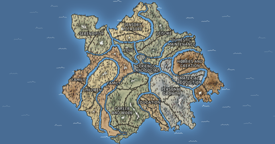
I wanted to understand the terrain of human happiness—or at least what that looks like in modern-day America. My own “happy map” is really quite simple: There are the things I do for immediate satisfaction, and the seeds I plant for longterm happiness—and I try to balance those two as best as I can. However, I wanted a more nuanced understanding of what this looks like.
I’ve long wanted to work with HappyDB—a crowdsource dataset of more than 10,000 people who shared more than 100,000 moments. So this was the perfect opportunity to get a better idea of what this looks like.
Inspiration
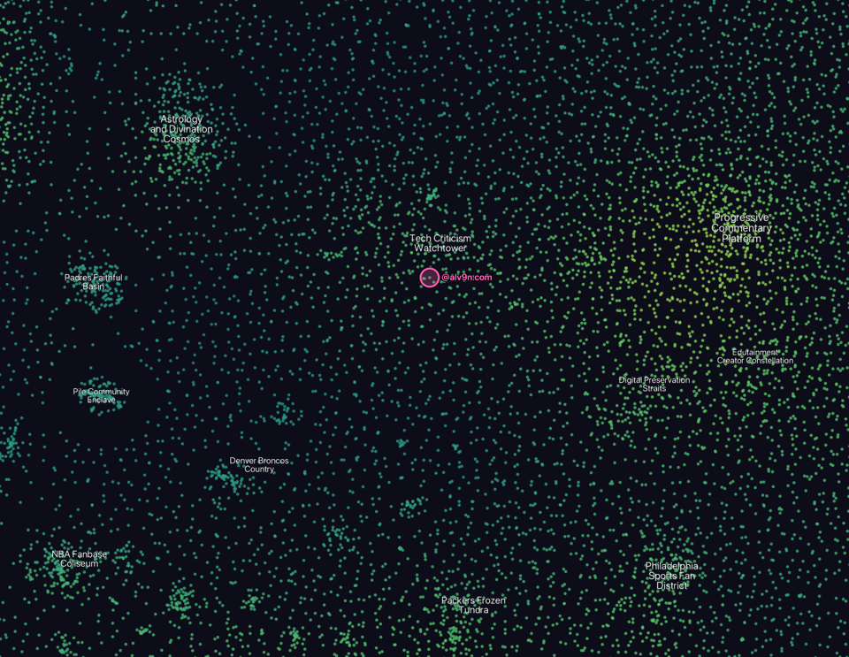
I love seeing maps of things that seem too big for me to grasp. For example, this map of subreddits gave me a much better idea of the Reddit world. More recently, this map of Bluesky users helped me see where I am in the sea of more than three million users.
Data work: From a bunch of text to mappable data
It felt a bit daunting to look at a bunch of sentences describing a happy moment, and then trying to figure out how to turn it into a map. But I came up with a general outline of what I needed to do:
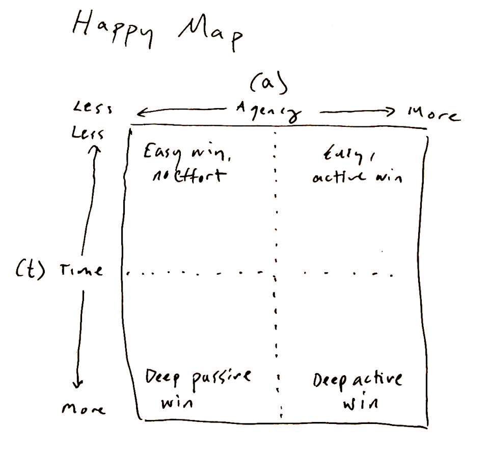
1) In order to make a map, I needed x and y coordinates to plot. This means we need at least two metrics to plot. So I decided the two metrics would be Immediate → Planned on one axis and Passive → Active.
I used the Gemini API to score each happy moment on a scale of 0 to 1 for both immediate/planned and passive/active. (A quick aside on LLM categorization: I’ve done this kind of LLM categorization a few times now, and the process has become a bit more routine. Come up with the prompt, run it on a randomized subset of the data, manually verify the results, adjust the prompt, repeat. I lost count of how many prompts I iterated through.)
2) Once I had reliable metrics, I initially thought I’d put all of these moments on scatterplot, figure out what the clusters are, and then name each region. Here’s my sketch of how I imagined this would go:
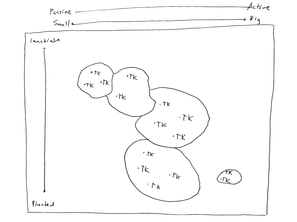
3) The problem, however, is that these groupings are pretty random and don’t really reflect how we think about “happy moments.” So I came up with a new plan:
Use the LLM to not only score, but also to create brief summaries of each moment.
Use the initial LLM scoring and summaries to see what groups generally emerge.
Come up with top-level groupings (continents), secondary groupings (countries), and tertiary groupings (states). At first I tried to find an algorithmic way to do this, but realized that I’m very capable of doing this on my own.
Use the LLM to categorize moments into these categories.
In other words, every moment is a “city,” and I needed to figure out what states, countries, and continents need to exist for the city to have a home.
This worked quite well!
Data to a map, in theory
First I needed to figure out the logic of how this map would be built. Here’s what I came up with:
First create a huge canvas and break it up into 150,000 tiny little land masses, using a voronoi algorithm.
Each “continent”—which are top-level categories like Family, Children, and Serendipity—is placed on the map, based on the average Immediate → Planned score and Passive → Active score. I called this the “capital” of the continent. Starting from the capital, the continents take turns taking over land, based on how many cities there are inside the continent. (I fiddled with this “conquest” logic so it would create shapes that looks like a map.)
After the continents are done taking over the needed land, the “countries” find a capital based on the data, and then take over land within its parent continent.
Then the “states” take over land inside the parent countries.
Finally, within the state, the cities are given a plot of land, based on the data.
In theory, this is just a nested scatterplot. In practice, it’s like a complex game of Risk.
Data to a map, in code
Me: Cool idea, bro. How will you pull it off?
Also me: We’ll figure it out…
We’re used to interacting with apps like Google Maps. But the tech behind these “slippy maps” is incredibly clever. The main problem is that, if you zoom all the way into these maps, the user still needs to see a sharp image. However, for that to happen, you need a HUGE image. The file size is too big, the browser can’t load such a big image, and creating this huge image is a nightmare.
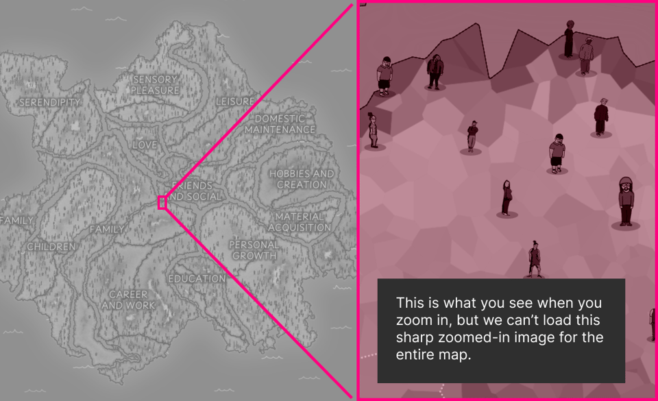
So the solution is to create a map for every zoom level—and then divide it up into small tiles. It’s basically a puzzle made up of just squares, and there is a separate puzzle for every zoom level. As the user, your computer only loads the tiles that you want to see; everything else doesn’t get loaded. Here are some of the tiles:
So I needed to make all of the tiles.
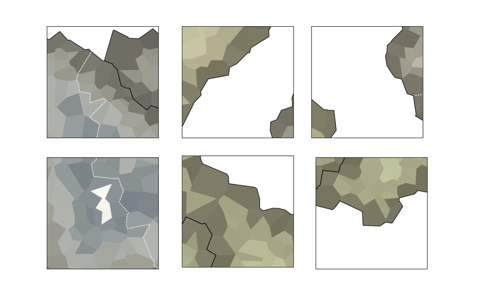
I won’t get too technical here, but a nice solution was to use a library called Matplotlib, which is normally a tool people use to make traditional charts in Python. But I co-opted that functionality to draw shapes. So all you really need to know is: I used this library to draw thousands of 256×256 pixel tiles that get stitched together into this map.
To give the tiles the sense of terrain, I had Matplotlibs color in each voronoi segment, with darker colors on the country borders. (I struggled a bit with visually separating the different regions. I ended up reading GIS Cartography: A Guide to Effective Map Design, which was immensely helpful in designing a map from the ground up.)
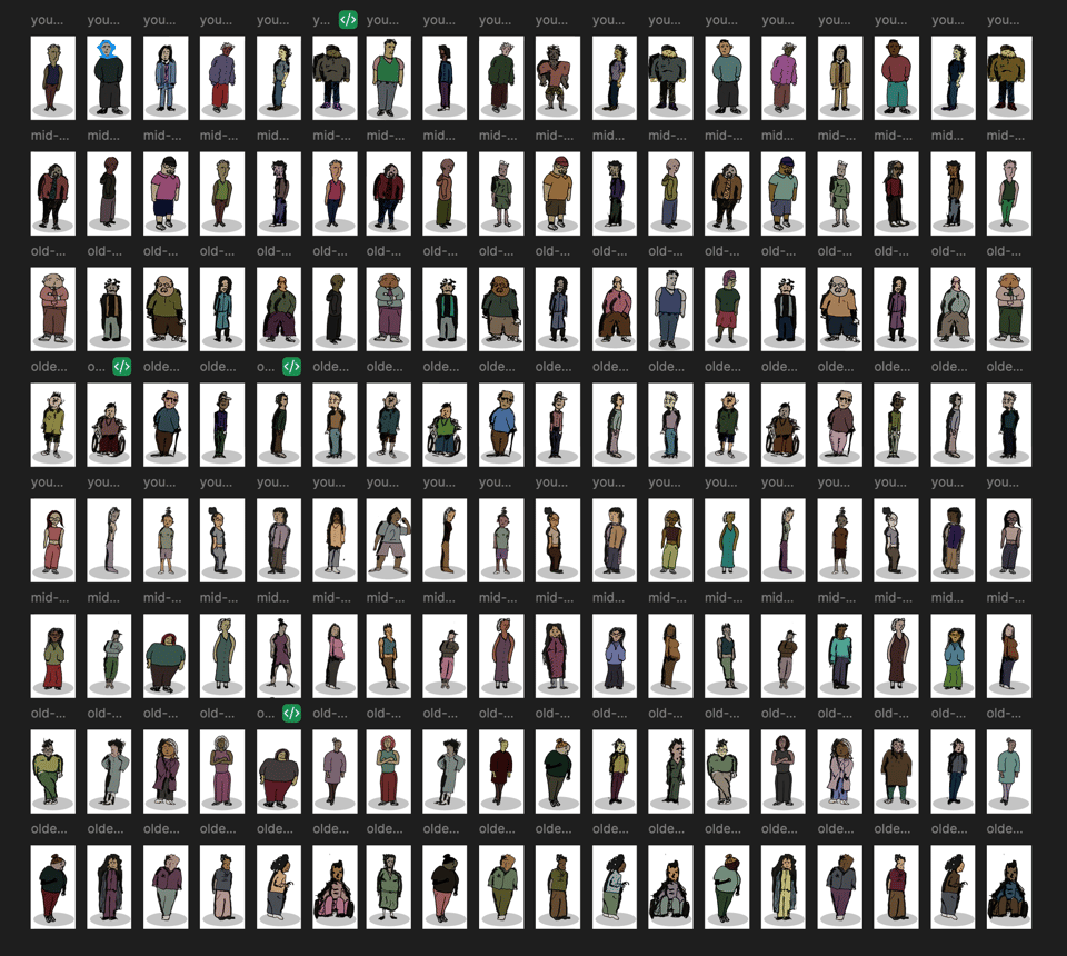
The icons
The code that generates the tiles also generates a JSON file that has an x- and y-coordinate for every “moment.” Those are the “cities” that get placed inside this map.
Then I used people icons to represent each moment.
By now, you know that I insist on drawing everything I can feasibly draw. (In fact, I thought about drawing the map itself, but realized I also need to live the rest of my life.)
I drew a bunch of people icons on paper, then scanned them in. They are, of course, each inspired by someone I know. Here’s one page of them:
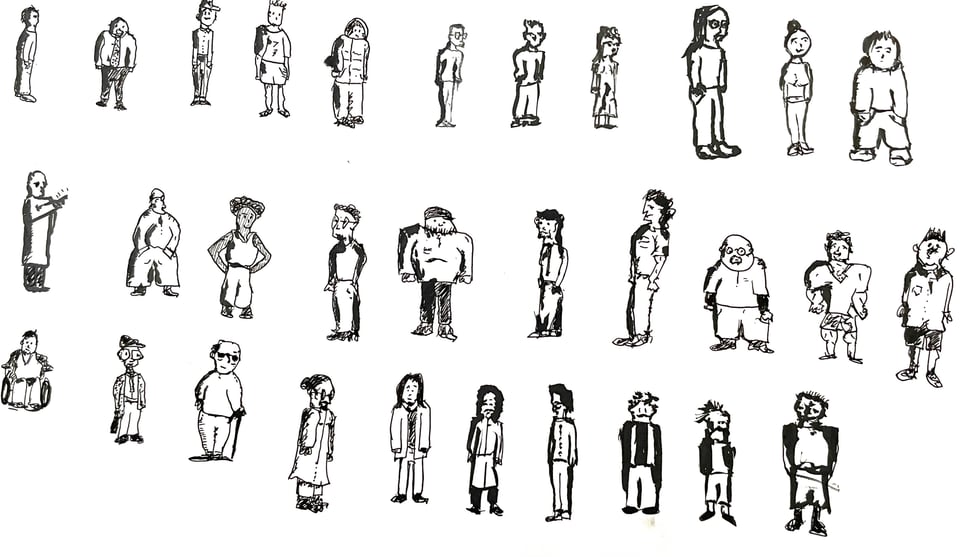
I eventually brought these into Figma and colored them in.
From there, all I had to do was build the actual map.
Making the browser map
I started with Leaflet, a wonderful mapping library that has saved me more times than I can count. I actually learned Leaflet during a coding test for a job I interviewed for in 2012. Little did my future employers know that I learned how to code slippy maps during the interview.
I had some performance issues with Leaflet; it didn’t load tiles fast enough and the zoom animations felt a bit choppy. So Matt Daniels suggested I use DeckGL. I’d never used it before but, damn, it’s very impressive.
There are plenty of tutorials on how to make slippy maps, so I’ll leave it at that.
The story
There is plenty of academic literature on happiness—or, more accurately, human satisfaction. (Different cultures interpret happiness differently. I wrote about that a bit in my loneliness story.)
This exercise of mapping happy moments actually changed my mind about how I view “happiness” in my mind.
The big takeaways is that smartphones and social media have fundamentally changed the experience of childhood, adolescence, and emerging adulthood. In the past, happiness surveys have generally revealed a u-shaped progression for happiness during our lives. We’re happy when we’re young, less happy during middle age, and happy when we’re older:
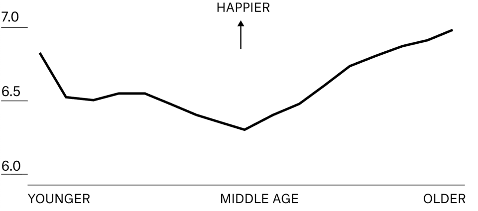
But young people are saying that they’re less happy now. And it makes perfect sense, given the research on happiness: strong relationships, financial security, and finding meaning and cohesion in our lives is critical to our well being. But social media has ruined our social lives; the economy has very little room for entry-level workers; and the world is dealing with a polycrisis that makes it hard to feel good about our futures—and harder to figure out what role we’ll play in that future.
I hope the wonderful researchers behind HappyDB go through this data-gathering exercise again. I think the current map reveals a world of people who grew up before the internet, and also a world of people who don’t know what a world without that connectivity looks like. But I think the shape of happiness is changing rapidly, and not for the better.
Anyway, I won’t go on too much here since I made an entire story about it.
One big tip
The map is super fun to filter and explore. The primary narrative I focused on was the youth happiness crisis, but you can find several other stories in here by filtering the data and seeing where the people are on the map. For example, if you’re a mom, many of your happy moments are tied to parenthood. Less so if you’re a dad. If you’re in school, professional and educational achievements are a huge deal.
Oh, and of course you’ll find a few wonderful nuggets of human experiences if you click around enough.
Thanks for reading!
Add a comment: