Behind the scenes: In pursuit of democracy
My latest piece is an analysis of every single mention of the word “democracy” in the Congressional Record since 1880. This includes more than 100,000 speeches and written remarks.
In pursuit of democracy (The Pudding)
Two pieces of housekeeping first:
This used to be called Big Chart on Substack. I migrated my newsletter to Buttondown because I didn’t like that Substack keeps trying to be “neutral” when dealing with Nazis.
I haven’t written as many “how it was done” posts lately, and some people have politely complained. So this will very much be a step-by-step look at how this project was done.
I think the biggest story in America today is the erosion of democracy. But when I mentioned this to some old friends, one of them replied: “You’re not going to complain about democracy again, are you?”
In fact, more than once I’ve heard Trump supporters tell me that the “democracy erosion” narrative is a political ploy. When Trump issued an executive order that tried to reverse birthright citizenship—a violation of the 14th amendment—Democrats argued this was a threat to democracy. But Republican Rep. Tom McClintock replied: “The Democrats call this a threat to democracy and a constitutional crisis. That is what they call anything they disagree with these days, but it is neither.”
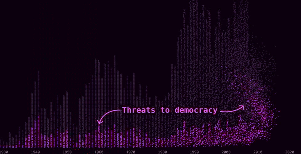
In this project, I wanted to show just how many times our Congress has invoked the word “democracy” on the House or Senate floor. Ultimately what the story reveals is that Congress is talking about democracy more than ever, and that they are worried about democracy more than ever. But before revealing this finding, I wanted to first drown the reader in a sea of speeches about democracy so that they can clearly see what the long arc of our history looks like. I wanted readers to see that our entire history is about striving toward these ideals and constantly debating what that means.
Ideation: An awe-inspiring artwork and a delightful stop-motion
I was initially inspired by the work of artist Josh Begley. I worked with Josh on The Listserve many years ago in grad school, but ever since he’s created incredible videos that show the breadth of something in America. For example, he once stitched together satellite imagery of the entire U.S.-Mexico border in a project called “Best of Luck With The Wall.”
I was also inspired by “Papers” by Yoshinao Satoh, an incredible stop motion video of newspapers over time. We should make more art like this.
The first attempt: A screenshot of every single page in the Congressional Record that mentions democracy
I initially wanted to show every single page in the Congressional Record that mentions the word “democracy.” Much like the “Papers” project above, I thought it would be interesting to keep the word “democracy” in the center of the page while all the other words animate around it. I thought it sounded cool and awe-inspiring.
Well, I immediately ran into several problems:
The Congressional Record was only kept formally starting in 1873. Furthermore, it’s not digitized in a consistent way over the years.
It took FOREVER to download all the PDFs via the Congress.gov API. I did it anyway. But I ran out of space on my hard drive to store the PDFs, so I had to use an external hard drive. But I didn’t realize the connection from my computer to the external hard was super slow. When I figured this out, I literally ran to the store to get a new cord.
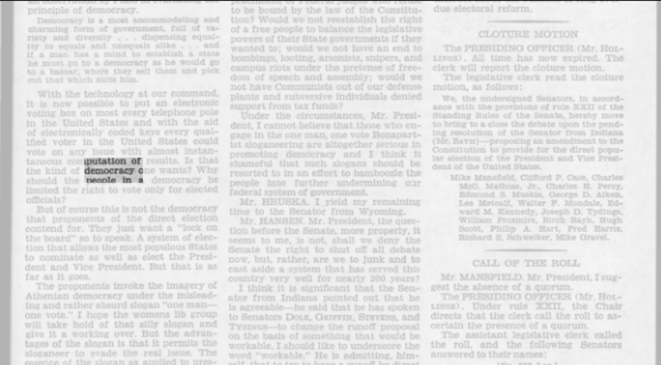
I wrote a Python script that went to every page and scanned for the word “democracy.” If it had the word, the script would export out a PNG file of that page, as well as a JSON file that told me the X/Y coordinate of where it appeared on the page.
I realized that there were more than 100,000 instances of the word “democracy” in the Congressional Record since 1873. There was no way I could load 100,000 images on a webpage.
I made a prototype anyway, because I wanted to see if the concept worked. But it didn’t.
I thought about forging ahead and making a video. The viewer would see pages and pages of the Congressional Record on the screen, perhaps with videos of congressional speeches sprinkled across the timeline. That would solve a bunch of technical problems, and it might’ve been awe-inspiring. But I feared it would just be a video of a bunch of text flying across the screen with no context. So I went back to the drawing board.
The second attempt: Working with text speeches
I resigned myself to collecting a text version of the Congressional Record, rather than images. I thought it’d be easy enough to scrape from the Congress API, but, well, it wasn’t. What was especially difficult was finding a way to match speeches with the speaker.
Luckily I found two critical resources:
Researchers at Stanford gathered all of this data from HEIN Online and posted CSVs of the speeches from 1873 to 2017.
I downloaded the rest of the speeches using a script on the @unitedstates Github page.
This let me construct a dataset of every single speech in the Congressional Record, along with the speaker.
The downside was that I no longer had images, which were critical in creating a sense of historical importance. The upside was that I now had text, which could be analyzed with various text analysis techniques. So instead of just showing the reader a bunch of images, now I could actually analyze the contents of the text.
After quickly filtering for speeches with the word “democracy,” I ended up with about 110,000 speeches to work with.
Notably, the text of these speeches were quite messy because they were OCR’d from image to text. Especially in the earlier years, a lot of text was mangled and punctuation was off. It was still legible, but I’d eventually use an LLM API to clean up these speeches.
Analyzing the text: Content analysis is hard, even with LLMs
Initially I tried to find the most common words and phrases in these speeches to vaguely understand what they were about. This wasn’t particularly fruitful, mostly because congresspeople really love to ramble.
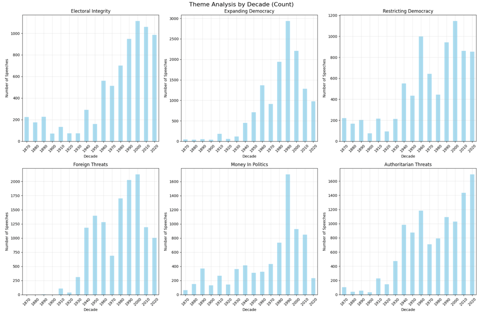
Then I tried using the Claude API to analyze the contents of the speech and to categorize it into predefined groups:
electoral_integrity: U.S. election security, voter fraud, election interference, voting systems.
expanding_democracy: Expanding U.S. voting rights, reducing voting barriers, civil rights, inclusion.
restricting_democracy: Limiting U.S. voting access, voter restrictions, excluding groups, voter ID laws.
foreign_threats: Foreign interference in U.S. elections, external threats to American democracy.
money_in_politics: U.S. campaign finance, corporate influence, Citizens United, lobbying.
authoritarian_threats: Domestic threats to U.S. democracy, extremism, insurrection, political violence.
I iterated on my prompt a dozen or so times on a randomized text batch of speeches. I got Claude to be really good at categorizing the contents of a bunch of speeches.
But the main issue was money: Claude was only returning reliable results when I used Claude Sonnet 4, which was a bit too expensive to analyzing more than 100,000 speeches with an extensive prompt. So I tried analyzing just a portion of the speeches—about 10,000. The results were promising. The manual check of the data showed the analysis was quite accurate.
So how do I categorize the other 100,000 speeches? I tried using a machine learning algorithm to do it for me. I won’t go too far into it, but it used something called “Term Frequency-Inverse Document Frequency.” This algorithm tries to identify terms that are unique to each category. For example, if phrases like “ballot harvesting,” “poll watchers,” or “mail-in voting” consistently showed up in the LLM-labeled “election_integrity” speeches, the algorithm would learn these as strong signals for that category.
At first, it seemed to return the kind of results that you might expect if you understand U.S. history; we can see the two world wars, the civil right movement, and the recent fears that democracy is eroding.
But when I checked the accuracy of individual speeches—both programmatically and manually—I found that while it didn’t return many false positives, but it was still missing a lot of speeches.
So I went to bed each night knowing that I should just run all of the speeches through the LLM analysis because it significantly was more accurate. At first, I tried spinning up a local LLM to see how it does. (Ollama is great.) But it wasn’t nearly powerful enough to return accurate results. Also, it was SO slow on my machine.
Finally, after several nights of brainstorming, I had three breakthroughs:
I tried another LLM API. The Gemini 2.0 Flash API returned extremely accurate results, and it was significantly more affordable than the Claude API.
If I wanted to know the context in which the word “democracy” was used, I could just look at the few hundred words that came before and after. So instead of asking the LLM to parse an entire 10,000-word speech, which was almost always a rambling rant about several issues, I only gave the LLM 200 words before and after the word “democracy”—and this really seemed to focus the responses, while reducing cost.
As I worked through the story and my research, I decided to simplify the prompt so it only needs to categorize them into four groups. You can see the final prompt in the methodology section at the bottom of the story.
Those solutions allowed me to analyze every single democracy speech for around $40.
The research: A fascinating dive into everything my history teachers didn’t teach me
I ordered The Rise of American Democracy by Sean Wilentz, knowing it would be a big and comprehensive history book. It arrived in the mail, and it was intimidatingly thick. However, it was critical foundational reading to understand the other two books I eventually read. It’s truly fascinating to read about how early American leaders thought about political power and collective decision-making. Another renowned historian, Gordon Wood, wrote a review of this book in 2005, which I’ll quote here since Wilentz isn’t a very concise writer:
The rise of democracy, Wilentz points out, was not a given from the outset. It "developed piecemeal, by fits and starts, at the state and local as well as the national level." It emerged, he says, through a constant struggle among different groups that cut across distinctions of wealth, power and interest (though they often claim the same democratic ideals). In order to demonstrate this struggle, Wilentz takes us through all the national elections (and some of the state ones), the presidential administrations, many of the Congressional bills passed and defeated, and much of the complicated political maneuvering of the period. This accumulation of detail nicely recaptures some of the contingency of day-to-day politics that the participants experienced.
(Fun fact: In the bar scene from Good Will Hunting, the main character, Will, confronts a preppy Harvard bully using Gordon Wood.)
I also read How Democracies Die by Steven Levitisky and Daniel Ziblatt, which is very much a political scientists’ modern take on the last decade or so with great historical context. It was a useful resource after I read Tainted Democracy: Viktor Orbán and the Subversion of Hungary by Zsuzsanna Szelényi, who was a member of Orbán’s Fidesz party in its early years.
Democracy Awakening by historian Heather Cox Richardson was a powerful read that contextualized what’s happening in more recent years in the longer arc of American history. I mostly knew what I was getting into because I’m subscribed to her newsletter, Letters from an American, which chronicles current events from the perspective of a historian.
After reading these books, I went back and read Nikole Hannah-Jones’s essay for the 1619 Project. I gained a new appreciation for her thesis that Black Americans have been the “perfecters of this democracy,” and that “without the idealistic, strenuous and patriotic efforts of black Americans, our democracy today would most likely look very different — it might not be a democracy at all.”
The design: One annoying problem that derailed me
There are two parts to this design.
The first is displaying the quotes. I wanted the user to be able to scroll through every single speech, while having the word “democracy” exactly in the center. This way all the text around the word “democracy” would change, but the actual word would stay put.
I want you to think about how you might solve this problem, because I thought it’d be relatively easy. But… it wasn’t.
I first calculated where the middle of the page is. Now, this is particularly complicated with text because for most fonts, each letter is a different width. However, monospaced fonts (like Courier) keep every letter the same width. So I figured out how many characters fit into each line, and then found the middle.
Then I placed the word “democracy” in the middle of the page.
From there, I filled in the text that comes before and after the word “democracy”.
But this only works if there are no line breaks. Once you add line breaks, you add additional space that misaligns the word “democracy”. So… I tried to account for the line breaks.
But then…
OK, I’m going to stop there, because this truly took me down an unexpected rabbit hole. However, I realized I should be spending my time on something else—like, you know, actually telling the story. It wasn’t that important for the word “democracy” to be in the middle of the page.
Eventually I settled for putting democracy on the center line.
The second design element is the actual data visualization. The first iteration used bars for every single year. It counted how many speeches used the word “democracy,” while allowing the user to scroll through the years from 1873 to 2025 and see a random speech from each month.
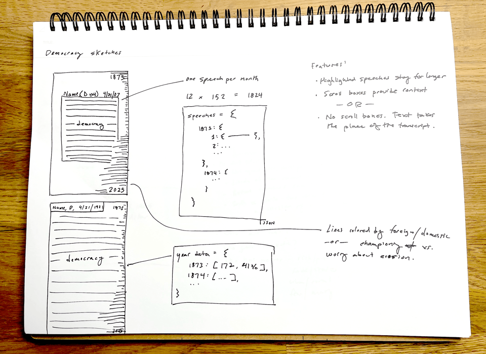
I made this wireframe before I had categorized the speeches, so all I could do was count speeches. I couldn’t show the reader what these speeches were about.
Once I figured out how to categorize the speeches, the design changed a little bit:
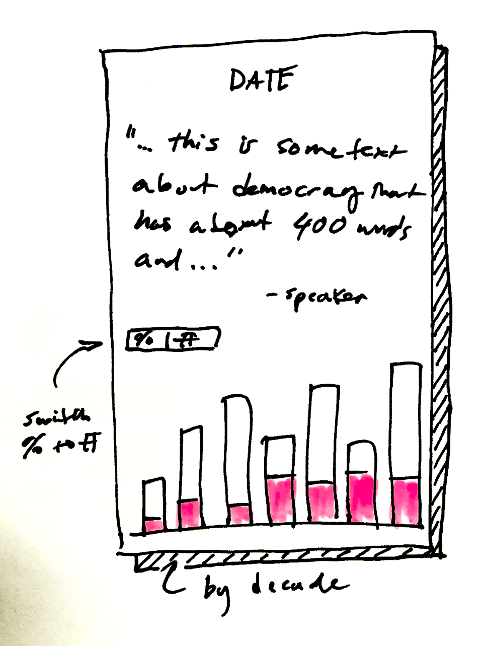
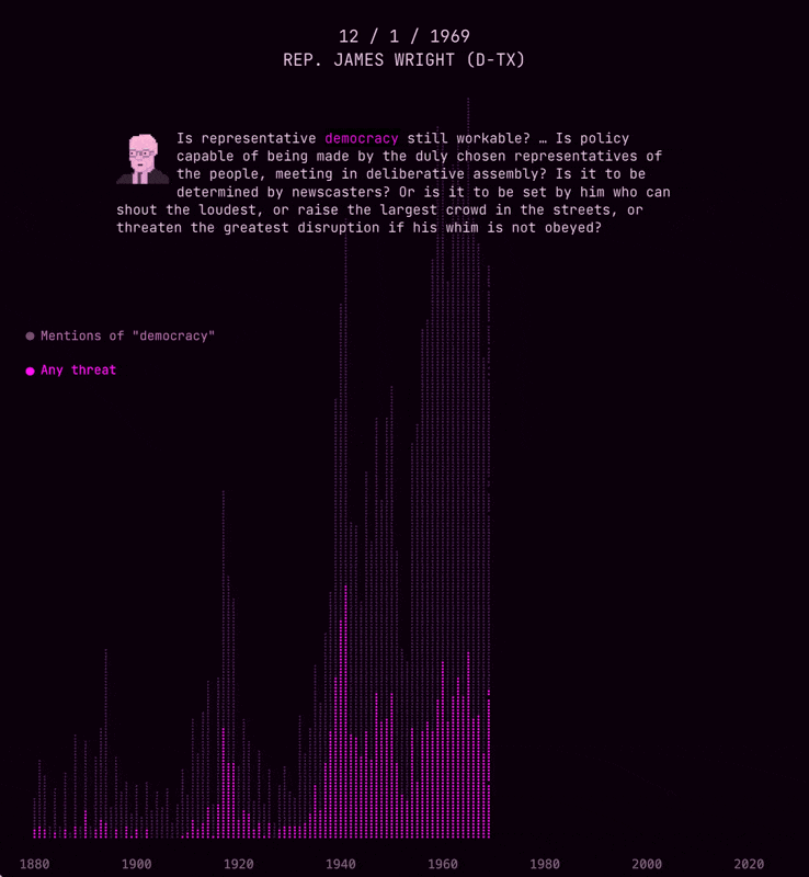
Bar charts are great. But the problem with just bars is that they don’t get across the sheer number of speeches than mention democracy. So I eventually used P5.js to create a bunch of circles to represent each speech—and organize those circles to create a bar chart:
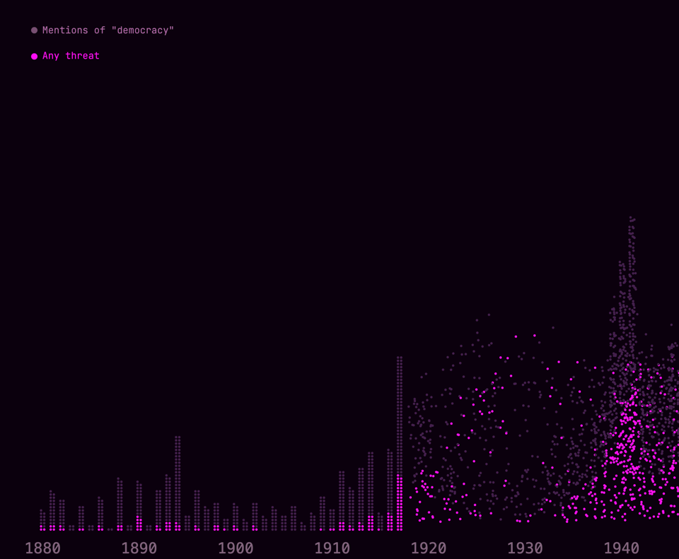
Eventually I used a circle to represent every five speeches, because my browser wouldn’t render 100,000 animating dots. To further optimize the code, I replaced the circles with dots.
Getting dots to “arrive” at a location to make a bar chart can be tricky. But I had done it for this Vox video, so I had some idea of what I was doing:
These dots do a really good job of showing the raw number of speeches each year. After all, I did want to “drown” the reader in the sheer breadth of speeches—and this certainly does that.
However, I also wanted to show that the percentage of speeches that mention democracy have increased to an all-time high. So halfway through this piece, you’ll notice the piece transitions from showing raw numbers to percentages.
This felt like a bit of a high-wire act. I don’t know how well readers comprehend the difference between a raw numbers and percentages, and why they show different things. (If you’re reading this newsletter, you probably understand the difference. But I teach this material to undergrads, and I always encounter people who have a tough time grasping this concept.)
So why didn’t I just show percentages from the start? Well, I wanted to start with a chart that is super easy to understand: just dots stacking on top of each other. But I eventually also wanted to show that Congress is spending a higher percentage of speeches than ever talking about democracy. So this was the design compromise.
This piece was tough
Since you’re several thousands words into a “behind the scenes” post, I think you should know that working on this piece was a struggle. The actual day-to-day of these stories involves a bunch of technical and logistical puzzles; carefully reading books that are too long; talking to experts who know so much; and drawing so much pixel art that my hand cramps. It all feels so small compared to what’s actually happening in the world, especially when every day is sprinkled with signs that we’re on a downward trajectory. I have to imagine others feel this way, too. My best justification to keep doing this is that totalitarians want us to stop creating freely, to question the value of art, to demonize truthful and critical speech.
On that note, it’s Election Day in New York. I’m off to vote.
Add a comment: