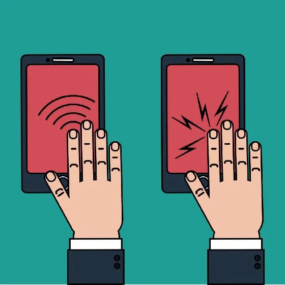
Improving Native App Accessibility via Haptics

If you are interested in haptics, you might also be interested in the predecessor article on Accessible Motion
Consider the following mobile native app error notification system:
Red text
Red text plus the word “error.”
Red text plus the word “error” plus some type of icon indicating “danger.”
Red text plus the word “error” plus some icon indicating “danger” plus alt-text
Red text plus the word “error” plus some icon indicating “danger” plus alt-text plus some type of auditory chime or beep to get the user’s attention
Red text plus the word “error,” plus some icon indicating “danger,” plus alt-text plus some auditory chime or beep to get the user’s attention, plus the device vibrating.
Each step adds a layer of user notification, using a different sense or a variation on a sense. More and more users will perceive notifications as additional notification forms are utilized. Anything below Step 4 in the above examples would fail a WCAG 2.0 Level AA audit and be considered inaccessible. That’s like hanging a lawsuit bull’s eye target around your neck these days.
What is Haptics?
Haptics is the “device vibration” part of the last step (6). Most commonly associated with games, haptics uses technology that stimulates the sense of touch through motion, primarily on game consoles and mobile devices. Braille was probably one of the first haptics invented (possibly before the word even existed). Braille utilizes a tactile feedback system — the sense of touch and the feedback from feeling the bumps with one’s fingers provide the sensation from which reading can occur for someone who is blind.
Haptics Dimensions
In general, haptics can be modulated by both:
strength (how strong the vibration is), and
behavior (the pattern of the vibration)
On iOS:
Strength can be further broken down into sharpness and intensity — is it a tight, tiny, strong, or a more diffuse vibration?
You can use “system” (i.e., predefined) haptics or implement custom haptics.
On Android
Amplitude is the term that refers to a haptic’s strength. The haptics associated with important messages can be more assertive with a more extended pattern to be more likely to get the user’s attention and
There are haptic feedback constants associated with triggering events like critical presses or releases.
Implementing Haptics
Like motion, haptics is essentially one of those “love it or hate it” things.
The default is typically for haptics to be off, requiring users to opt in to make them available.
Balance is the most crucial consideration. Overusing them will tank your user experience and make your app seem gimmicky. On the other hand, underusing them means the haptics won’t augment the experience.
Don’t use haptics by themselves. Use them to reinforce other audio and visual cues or other motion/gestures (such as scrolling through a list, long presses, or transactions)
Haptics must be implemented consistently across related apps and websites. Because there are currently no industry-wide haptic standards that software development teams can follow, developers are left on their own to decide the meaning of each haptic they will use.
Want SOS for critical errors (short short short LONG LONG LONG short short short)? You can do that.
One vibration for confirmation (short)? You can do that too.
The essential thing is to set a haptics standard consistently used within an app and across apps under a single corporate umbrella. Otherwise, a confirmation haptic vibration for one app may have been used as a critical error message on another — that would be an awful user experience at best and possibly a WCAG consistency violation at worst.
Add a comment: