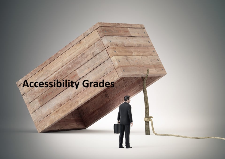
Don't Fall Into the "Accessibility Grade/Score" Trap
In the rush to make digital products accessible, many teams lean on a single accessibility score or grade to convey how good (or bad) a product is from the accessibility point of view. An example of this might be 92 percent accessible, Grade A-, or 68 % accessible, D+. To non-accessibility professionals, these grades feel reassuring and objective. Yet these scores tell a fraction of the story, and often the wrong fraction.
People with disabilities do not interact with code or pass-fail tests. They interact with products, frequently using assistive technology. A high score means nothing if someone cannot execute core workflows such as buying groceries online or submiting a job application. Accessibility is about real people doing real tasks. Numbers on a dashboard that look good are not terribly meaningful.
Accessibility grades / scores are popular because it makes accessibility appear manageable. It fits neatly into business practices that prioritize data-driven progress. It helps teams feel like they are measuring something important. It makes you believe that if your score is 75 %, you’ve done three-quarters of the accessibility effort. But that oversimplifies incredibly complex technological issues.
TL;DR: Accessibility is not a single dimension, and it cannot be captured in a single number.
Why Leaders Want Accessibility Scores
Accessibility scores attract executives, developers, product managers, and compliance teams because they:
• Appear concrete and measurable
• Fit well into reporting frameworks like OKRs, KPIs, and dashboards
• Enable quick comparisons across products or competitors
• Give the illusion of how much progress a product has made toward compliance
• Provide non-experts with something tangible to understand
If accessibility were only about markup compliance, these ratings might be enough. But real-world barriers are not just about code. They are rooted in user experience. Also, three-quarters of accessibility criteria cannot be tested using scanners.
Why These Scores Mislead
Automated scoring tools identify only a limited range of surface-level issues. Their scope is incredibly narrow. They mainly detect problems that algorithms can recognize: missing alt text, poor color contrast, unlabeled form elements, and weak heading structure. These matters are important, but they don’t address the full experience of disabled users interacting with a product.
Scores do not measure:
• Whether keyboard-only users can complete essential tasks
• Whether screen reader users understand the content structure
• Whether people with cognitive disabilities can navigate without confusion
• Whether users with sensory processing differences can tolerate the environment
•Whether blind or deaf users can use video content
Automated tools cannot replace human evaluation or real assistive technology testing. However, scores are often treated as if they represent complete accessibility when, at best, they account for only 30 percent of it.
Many accessibility dashboards treat every issue as if it has the same importance: one missing form label counts the same as an entire workflow that cannot be completed with a keyboard, or a total failure of reflow, which causes magnification at any level to break down. When tools reduce accessibility to a single score, developers are encouraged to focus on quick, simple fixes rather than addressing the barriers that truly block users with disabilities. A small change, like adding alt text or adjusting contrast, takes five minutes if that and can boost the score right away. Meanwhile, a complex keyboard trap, an inaccessible third-party widget, or confusing error handling may require weeks of redesign and testing. If you fix the simple bug that was picked up on a scan, the next scanner run will look better. However users, the only real form of accessibility measurement, will still face significant barriers because the issues that can’t be picked up except via assistive technology manual testing remain unaddressed.
The Gamification Trap
Organizations often turn accessibility into a competition. Teams get ranked on accessibility scores. Dashboards display progress. Bonuses and prizes may be awarded. Leaders talk about “moving up the leaderboard.” No one wants to be the last-place group. Gamification generates motivation, but the wrong kind. Teams start asking:
• How do we bump the score 10 points
• Which items can we silence or workaround
• What can we “fix” fastest without changing design patterns
Meanwhile, questions that matter most get pushed aside:
• Can blind users complete the checkout
• Can someone with a cognitive disability understand navigation
• Can a person with limited motor function operate controls without assistance
Gamification also introduces pressure that discourages honesty. Teams hide known issues. They avoid requesting expert help. They prioritize making the numbers look better without looking at whether that activity makes the product work better, also known as “accessibility theater.”
Scores Can Show Trends, but not Concrete Levels of Progress
A rising number gives the illusion of meaningful improvement, even when barriers remain untouched. Teams celebrate small coding adjustments while overlooking bigger problems that require user input, component library work, redesign, or investment.
The worst outcome is complacency: a belief that high scores equal accessibility success. Meanwhile, users with disabilities still cannot accomplish the most basic tasks because no one ever asked them what they needed.
A Better Path: Functional Performance Criteria (FPC)
Instead of measuring whether code passes tests, measure whether people can succeed. Functional Performance Criteria (FPC) come from Section 508 accessibility standards and focus on real-world achievement:
• Can someone who cannot see use assistive technology to perform essential tasks
• Can someone who cannot hear access all needed audio information in alternative forms
• Can someone who cannot use a mouse reach every feature
• Can someone with cognitive challenges understand instructions and complete actions without error
This approach shifts accessibility measurement from arbitrary scoring to practical usability.
Examples
Instead of asking:
“Does the form have labels?”
Ask:
“Can someone with no vision who uses a screen reader user complete and submit the form successfully?”
Instead of asking:
“Is color contrast compliant?”
Ask:
“Can a low-vision user enlarge text without losing context or overlapping elements”
“Can a colour-blind user consume all text and images”
FPC makes accessibility observable, testable, and meaningful. Measure each item separately. If the FPC grade for “Can a colour-blind user consume all text and images” is 84 %, that means one in every six pieces of text or images use colors in a way that colour blind users can’t perceive.
What Teams Should Do
FPC scores are still only a a tiny and imperfect piece of the accessibility picture. Automated tests are a triage tool. They help identify quick wins and highlight technical debt. They should never be treated as the verdict.
Shift the priority:
Validate core tasks with assistive technologies such as screen readers and speech input
Include users with disabilities whenever possible
Measure outcomes, not just conformance
Report what was tested and who was considered
Accessibility is not a checkbox. It is a commitment to equity.
Final Thoughts
Accessibility scores are attractive because they simplify what is complex. They offer a sense of control, progress, and success. But they collapse lived experience into a number that can never reflect the needs of actual people.
The goal is not scoring well. The goal is to ensure that every person can use the product to accomplish what they came to do.
Stop celebrating numbers. Start celebrating users who get to participate.
Add a comment: