Designing Toast Messages for Accessibility
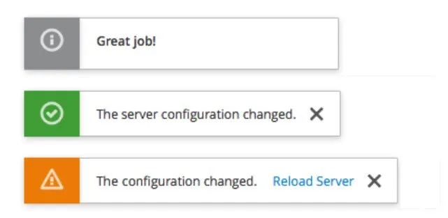
Three toast messages, the first is informational and says “great job” the second is success and says “the server configuration changed” with a close icon, and the third is a warning saying “the configuration changed” with a link to reload the server and a close icon.
A toast is a non-modal dialog that appears and disappears in a few seconds. It may also optionally have a small close “X.” Typically, toast messages display one or two-line non-critical messages that do not require user interaction. For example, once you hit the search button in a map client, the toast may display a message that looks like “Searching for location,” which disappears once the matching results or “no results found” are displayed.
Without taking extra steps, toasts can have numerous accessibility issues that can impact both people with and without disabilities.
Issue #1: How long should toasts stay up for?
The time necessary to read and comprehend a message is not just an accessibility issue. English Language Learners also have this issue, as do people without disabilities who are naturally slow readers. The length of time toast display is especially a problem in the Android environment where the default for short toast messages is 2 seconds, and the max length is 3.5 seconds.
Solution 1: Pick a decently long default
A good time to keep messages up is 5 seconds plus one extra second for every 120 words, rounding up. This is how fast the average American reads. That means the shortest default that should be used as a best practice is 6 seconds.
Because that is longer than the max length on Android, there are two implementation options:
1) Reimplement Toast Class (which is probably overkill)
2) Use the android CountDownTimer to instruct how long to display the toast
Solution 2: Keep a “toast rack.”

To account for memory loss and distraction as well as disability-related issues such as ADHD, a best practice would be to implement a location where users can refer to a list of past toast messages that have come and gone. Preferably, this list would be sortable, with the default being chronological (what was that message that just popped up) but also searchable and sortable by type (i.e., informational vs status vs. warnings). If you do make the list sortable, make sure the sort mechanisms are keyboard accessible with a keyboard focus indicator that meets the color ratio requirements and has alt-text and name/role/value if there is a toggle involved.
Solution 3: Let the user pick
In addition to a reasonable default AND the toast rack, you could allow the user to choose how long they want these messages to stay up. Most people inherently understand whether they are fast or slow readers. However, many people don’t understand how long 10 seconds is (or 4 seconds, for that matter).
Having a profile setting that is part of the user login will allow slow readers to pick up a longer time if the messages are going away too fast and fast readers to pick up a short time if the messages stay too long and annoy them.
Issue #2: What other Level AA accessibility guidelines do toast messages need to follow?
There are several other WCAG 2.0 and 2.1 Level AA standard accessibility guidelines that apply to most toast messages.
Guideline 1: Color
Toast messages need to meet the standard color ratio requirements for both text (4.5:1) and activatable components (3.0:1). The activatable components requirement is new to 2.1, but why do something that you know will be disallowed in less than a year?
Guideline 2: Consistent Identification and location
Per WCAG guideline 3.2.4, all components should be identified consistently. For example, decide whether the information icon has alt-text or whether all information messages will contain the word “information” in them. Then, do that consistently. Also, decide where the toast messaging will go and place them there consistently.
Guideline 3: Alt text for non-decorative images
Any non-decorative image (such as the close button) requires consistent alt-text. If it is an action icon, the focus should be on the action (i.e., “close”), not a description of the image (X)
Guidelines 4 and 5: Keyboard Access and Keyboard Focus Indicator
· Using the keyboard, the user should be able to tab and shift tabs through the elements of the toast message.
· Each activatable element requires a keyboard focus indicator, which should meet the minimum 3.0:1 color ratio requirement established by WCAG 2.1 guideline 1.4.11
Guideline 6: Focus Order
Using the keyboard, the toast message should always appear in the same place in the focus order. This is related to guidelines 2, 4, and 5. If you can tab to all the elements and you are always putting it in the same place, the focus order should be correct. Don’t be tempted to force focus order by using a positive non-zero tab index. That inevitably ends up causing more accessibility problems.
Guideline 7: Orientation
New to WCAG 2.1, Guideline 1.3.4 requires support for both landscape and portrait modes for native apps. Therefore, if a toast message is initially displayed in portrait mode and the user rotates the phone, it should reorient successfully in the exact location. The best practice would be to restartrestart the countdown after the rotation is complete.
Guideline 8: Announcing toast message content without focus
New to WCAG 2.1, satisfying Guideline 4.1.3 requires that:
In content implemented using markup languages, status messages can be programmatically determined through roles or properties such that they can be presented to the user by assistive technologies without receiving focus.
Using ARIA techniques such as role alert and aria-live, toast messages can be made available for screen reading technologies as soon as they are displayed.
Guideline 9: Spacing for Toast message content
New to WCAG 2.1, satisfying Guideline 1.4.12 requires that the toast message content itself cannot experience loss of content or functionality by setting all of the following and by changing no other style property:
· Line height (line spacing) to at least 1.5 times the font size;
· Spacing the following paragraphs to at least two times the font size;
· Letter spacing (tracking) to at least 0.12 times the font size;
· Word spacing to at least 0.16 times the font size.
Guidelines 10 and 11: Magnification and Reflow
New to WCAG 2.1, satisfying Guideline 1.4.10 requires that the toast message content must be presented without loss of information or functionality and without requiring scrolling in two dimensions for:
· Vertical scrolling content at a width equivalent to 320 CSS pixels;
· Horizontal scrolling content at a height equivalent to 256 CSS pixels.
Note that 320 CSS pixels equals a starting viewport width of 1280 CSS pixels at 400% zoom. For web content that scrolls horizontally (e.g., with vertical text), 256 CSS pixels are equivalent to a starting viewport height of 1024px at 400% zoom.
This reflow guideline inherently extends the WCAG 2.0 AA magnification guideline of 200 % to 400 %. Another guideline inherent to the magnification rule is the ban on embedded meaningful text in images. While this should not appear frequently in toast messages because they are so small, being conscious of this guideline is essential.
Guideline 12: Link Text
If your toast has a link (such as the first image in this article), the WCAG 2.0 Level AA guidelines about link text should be observed. This includes making sure that the link text:
Is not a full URL
Is not vague (such as “learn more”) UNLESS you have an ARIA override that announces “learn more about restarting the server” or something more descriptive
Is not the same link text announcement going to two different places
Is not ALL CAPS
Issue #3: Are there other A11Y Best Practices that toast messages should follow?
Of course, in addition to the guidelines identified above, there are always best practices that should be considered for creating the “perfect toast.”
Answer 1: Avoid popping up a toast message on the page load
Performing unexpected actions on page load is very confusing to screen reader users.
Answer 2: Make sure the toast messages are entirely announced before allowing the user to change focus. This is especially important if there are multiple toasts.
As discussed above, using ARIA techniques such as role alert and aria-live will allow the announcement of the toast messages to be handled explicitly and predictably.
Answer 3: Avoid overusing italics
Italic-styled fonts are complicated for people with dyslexia to read. WCAG does not have any specific guidelines about dyslexia. Still, since people with this issue represent 5–7 % of the population, avoiding techniques that may make it difficult for them to understand the message is a good idea.
Answer 4: Avoid overusing ALL CAPS
ALLCAPS is challenging to read for people with dyslexia and even people without disabilities when they are overused. Also, it is easy to make a mistake when a screen reader thinks that the ALLCAPS is an abbreviation. Instead of announcing the word, it will announce letter-by-letter, drastically slowing the announcement for screen reader users.
If you have a valid, acceptable abbreviation in your toast, use ARIA-abbr to announce the word (such as “ounce” when visually oz. is displayed)
Conclusion
Toast messages are a great way to report transient statuses and messages that are not critical. However, for a small visual element, there are many accessibility considerations. Twelve of the 50 total WCAG 2.0 Level AA guidelines apply to toast messages, as do several best practices and timing considerations. Incorporating these thoughts into all style guides designers and developers are working from is an excellent first step to implementing solid, consistent toasts that are entirely accessible.
Add a comment: