
Shiny rectangles
Out of the mouths of buyers
More proof, if it were needed, that there’s no such thing as an entirely rational decision. Not even when someone is a buyer of high-ticket, high-stakes b2b services. I asked a customer of one of my clients about the market for my client’s services, and they said this to me:
There's lots of companies of a similar size doing similar things, and it's a bit like choosing a television. Eventually you just go, “It's a shiny rectangle. It's just a telly.” You don't want to spend all that time on the nuanced detail because, ultimately, it'll do the job. So it's down to, “How does it make you feel?”
Chief “Something” Officer at a big company
I remind clients all the time that being evocative is more important than message-based communication. It’s always about how you make them feel. But this was extreme. This customer isn’t talking about a one-off product purchase. They’re talking about choosing a supplier with whom they’d potentially have a long-term, strategic relationship. And still they’re not moved by the rational detail. It’s brazenly not about the detail. It all comes down to how it makes them feel.
First impressions and lasting impressions
Most people swear that advertising and branding has no influence on them. However, the buyer above is much more self-aware. They know that first impressions count. And they know that the most powerful first impressions are made on the heart not the head.
If every supplier in a market is hell-bent on making the same first impression as their competitors by using the same words to say the same dry, rational things, it becomes impossible for a prospect to use reason to decide between them.
So, with their telly metaphor, this C-level customer makes a strong case for branded feelings in a supposedly rational, supposedly high-involvement buying process.
A more common first-impression metaphor is that of a shop window. I’m often hired because a client worries that their “shop window” isn’t working hard enough to generate more of the right kind of leads. They don’t have a shop window, they have a website. But it’s a good metaphor. Shop windows are about first impressions. So are websites. A b2b service industry website has one job: to make a prospect interested enough to make contact. Just as a shop window has to make a customer interested enough to enter the shop. Shop windows are 10% substance (it sells the thing I’m looking for) and 90% style (I like the look of this place.)
The rational stuff has more of a role once contact has been made. To convert a prospect, you need to move from first impressions to lasting impressions. But too many b2b service brands confuse these jobs and lead with the wrong one.
Selling substance and buying style
The shiny rectangle comment was unusually candid, but it describes a common issue.
I work with a lot of b2b service providers. They all think they’re selling rational features; namely process and expertise, sometimes in a productised form. They’re all trying to sell substance.
Then I talk to some of their best customers, who make it clear that they take the functional stuff for granted. They’re much more interested in the touchy-feely culture and character stuff. What’s it like to work with my client? Are they pragmatic? Do they have integrity? Will they make me look good? How do they make me feel? They’re buying style.
The irresistible truth of every service brand I’ve worked on includes a generous dollop of style.
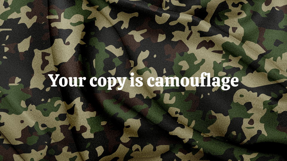
Your copy is camouflage
The shiny rectangle quote is more proof, if it were needed, that service brands put a lot of effort into looking and sounding the same as their competitors. So, if there’s nothing to choose between the substance, I can only go on style.
But, when brands in a given market all focus on the same substance, their styles tend to converge too. They use similar words to sell similar services that solve similar problems. What they’re saying is the same. And how they’re saying it is the same too.
In a kick-off workshop for one of my clients I observed that if a hacker randomly swapped sections of copy between their website and those of their competitors, it might be several weeks before anyone noticed. To emphasise the point I pasted paragraphs from various websites, including theirs, onto a camouflage background and asked them to spot the difference. “Your copy is camouflage,” I said.
When your messaging is the same as everyone else, and your style is the same too, what does a poor prospect have to go on?
The content is the bloody delivery
All this reminded me of something Brian Eno said to Rick Rubin (I assiduously collect and catalogue this stuff for occasions just like this.)
He describes how English covers of American hits in his youth were “truly pathetic” because they stripped out all the idiosyncrasies of style and all the rough edges of delivery.
Anything that became a big hit in America would get covered in England by an English artist, and the covers were just appallingly sad.
There was a man called Craig Douglas who covered every American number one. When you put the two together; on the one hand, this sort of raw, quite angry sound that American music had then - even the love songs had a sort of urgency and a grit to them - and then you'd hear the English [Craig Douglas] version. It had all been nicely sort of tidied up and all the rough edges taken off, and it's very, very “pleasant”.
It was one of the most important lessons to me that the content of a piece of art is the delivery. The content isn't what the words say. It isn't what the melody says. It's the bloody delivery. That's the thing you respond to.
And, of course, this was what made the Beatles so amazing, because they knew that delivery. They'd been listening to Chuck Berry and John Lee Hooker and everybody else, Howlin Wolf. So they they came with that style. Of course they wrote great songs too, but it was that style that made it great.
Brian Eno talking to Rick Rubin on the Broken Record podcast
He goes on to recall the first time he heard the Beatles - Love Me Do on a cafe jukebox - and how he was mesmerised by the style, which he describes as “beautifully awkward”. What a phrase! The main thing was that it wasn’t (bloody) smooth. Back then Eno hated smooth.
But smooth is what you get when you don’t cultivate a sense of style for your brand. And when everyone in your market is smooth, your copy becomes camouflage, and you’re just another shiny rectangle.
Maybe try this too: The irresistible truth of Jesse Armstrong. How, for the writer and showrunner of Succession, the tone is the idea.
Add a comment: