Clutter is character
You can’t have your treacle tart and eat it
Walk out with me onto the thin ice that surrounds my comfort zone. Hold my hand. We’re going to talk about design. Let’s hope the creaking sheet will bear the weight of my clumsy opinions.
I’m an adman. So I’m reasonably fluent with insights and ideas. Whereas, with design, I react from the gut and I don’t have the grammar. I might have something useful to say about the conceptual aspects of a design, but my reading age for aesthetics is relatively low.
Still, I wouldn’t spout the kind of nonsense that the Lyle’s Golden Syrup brand director offered to BBC News.
Our fresh, contemporary design brings Lyle’s into the modern day, appealing to the everyday British household, while still feeling nostalgic and authentically Lyle’s.
James Whitely, Lyle’s Brand Director
Design involves choices and sacrifices. It requires strategic discipline.
The statement above betrays an aversion to strategy. You have to be intellectually supple to say something like that with a straight face. It’s like doing the splits with your feet on two widely separated stools.
Fresh and contemporary is a legitimate design choice in the right circumstances. So is nostalgia and authenticity. But you can’t do both at once. That’s not a strategy, it’s a contradiction. You can’t have your treacle tart and eat it.
Except Lyle’s think they can by changing one pack and leaving the other the same.
But it looks like a fudge. They’ve made a leonine beeline for the muddled middle.

I’m late to the discussion about this brand “refresh”. Things got animated to the point of heated on LinkedIn. There was posturing, counter-posturing, and meta-posturing. As does every debate these days, it resolved to a binary clash narrative with the authentic heritage camp on one side and the self-appointed champions of commercial reality on the other. And, as with all clash narratives, it’s a false binary that obliterates any nuance. As far as I’m aware we’re none the wiser as to the true back story.
I’m commenting from the outside on this one, but I’ve seen my fair share of these refresh projects from the inside. And it’s not unthinkable that the impetus for the Lyle’s refresh had as much to do with personal and political issues as it did with market fit. Brand managers write brand plans and brand plans have to be filled with actions and activities. Of course those activities have to be justified but that’s not difficult if you want something to happen. There’s a difference between the truth and the whole truth when you use retail data and consumer insight for storytelling. I’m absolutely not saying that this is what happened here, but it wouldn’t be the first time if it was.
Cleanliness is next to oddlessness
Anyway, the motivation is a side issue as far as I’m concerned. My main beef is that the brief behind these brand refresh projects always seems to ask for a more clean and contemporary aesthetic. The press releases always talk about the new, streamlined identity and the new, cleaner packaging. There’s an unquestioned assumption, an assertion, that cleaner is better.
It isn’t. Not necessarily.
What if the opposite of clean is sophisticated? What if the opposite of clean is authentic? What if the opposite of cleaner is less premium. What if the opposite of cleanliness is heritage?
I’ve seen it happen time and again that cleaning up a packaged goods brand means stripping away its oddities and dialling up category conventions. The ‘oddless’ result of a refresh is cleaner for sure. But it’s also closer to a retailer own-brand aesthetic. It turns out that the quirks that were a messy indulgence to the brand’s manager were actually premium cues to its buyers.
The Lyle’s tin feels lived in. It feels like a nest. The pouring bottle is an exercise in new-build show-home sterility.
If you make a packaged goods brand cleaner, you make it less sophisticated. Cleansing is commoditising. Cleanliness is next to oddlessness.
Augmented authenticity
The (original) Lyle’s Golden Syrup tin is like a coat of arms. It’s cluttered with stuff, and the stuff feels meaningful. You don’t need to know what the stuff means to know, to feel, at a deep, visceral level, that it’s meaningful.
There’s a concept in heraldry called an ‘augmentation of honour’. Each augmentation is an addition or modification made to a coat of arms to commemorate a worthy deed or an honour bestowed. The more augmentations that are received, the more cluttered the arms become, and the more prestige is conveyed.
Brands that sell heritage are well served by heraldry. And heritage sells when it comes to baking ingredients like Golden Syrup. The Lyle’s tin has an augmented identity in the heraldic sense. It’s not just the lion, the bees, and the biblical reference. The tin even wears its weight as a badge of honour: 454g. That’s 1lb in old money. The brand lives in a metric world but its heart is still Imperial.
Heraldic branding works well for any brand that deals in heritage or provenance.
Reassuringly extensive
Stella Artois has an augmented heraldic identity. It’s dripping with the condensation of history. Its date of origin is presented like a motto (in Latin as well.) It has the original Den Hoorn brewery symbol. It has ornate mantling on each side. And it has gold medals for excellence. Its design elements are reassuringly extensive.
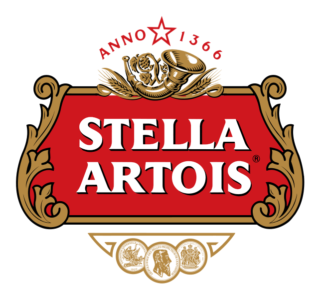
Clutter is character
For icons like Lyle’s and Stella, clutter is character. Clutter conveys status. Clutter speaks to a storied brand.
It has taken Lyle’s a hundred and forty years to accrue its augmented meaning; and just one brand refresh to throw it away.
The opposite of augment is to devalue, spoil, or impoverish. So when you say refreshed; I say disaugmented. I say despoiled.
As you can probably tell, I’m an antidisaugmentarian.
And, as I said up front, there’s a good chance that I’m talking nonsense.
-
Spot on Phill. , I’m an antidisaugmentarian too!

Thanks Tim. The idea seems to have struck a chord for a few folk.
Add a comment: