“To build a thing that immediately feels like you’ve had it forever is very hard to do.”
Welcome to this week’s digest of Unsung, a blog about software craft and quality. Here’s what was posted in the last week:
Unsung @ 250: Please send me your feedback!
Thursday, April 16
My original idea for Unsung was “a microblog with ~3 posts a week,” which seems like a distant memory.
Now that I published 250 posts since early December, what better way to celebrate than to ask for feedback?
- Do you enjoy specific kinds of content, or missing some topics?
- How could I make the visuals and interactions better?
- Any fun little ideas or bugs or improvements I could make?
- Any feedback about this blog’s information architecture (including the just-added tags), RSS, or the weekly email?
You can reach me via email, on Mastodon, or on Bluesky.
If the very idea stresses you out, I want to give you permission to send me just your bit of feedback without any greetings, or small talk, or “compliment sandwiching.”
Thank you in advance!
Unsung @ 250: Nine design details
Thursday, April 16
(This is one of the meta posts about this very blog. If that’s not interesting to you, skip to the next one!)
I thought I’d share a few of the small design details I am proud of for this small blog!
1.
After years of being annoyed at Slack for mishandling image sizes, it was important for me to show the screenshots (at least the desktop UI) at their 100% precise size, if possible. I think that helps to get a better sense of a scale and feel of things. This was harder than I expected (since I still want images not to grow too wide or too tall), but hopefully works well now.
2.
I wrote some extra code so that if an image has edge transparency or even soft shadows, it will be aligned accounting for all that. I think that feels elegant – especially on a blog that practices asymmetry probably to a fault.
3.
If the images or videos blend too much into the background, they get a lil border to separate them – but only in light or dark mode as needed. This is so that the whole page rhythm holds better together. (Manually assigned so far. Would be curious if one can make this automatic.)
4.
Speaking of dark mode, I almost figured out how to make videos with transparent pixels so that they look good in both dark and light mode. (Chrome only. Still working on it for Safari.)
5
I want autoplay videos (without sound!) so that it’s easier to see interaction design – basically, a modern version of what GIFs used to provide. This has been challenging and required adding some JavaScript, and is still not done! But it’s starting to feel nice.
6.
Given all the quotations I do, I added hanging quotes to text. Wildly, they are still not really supported by CSS (Safari is a sole exception), so that required some manual intervention.
7.
Short lists are (automatically) spaced differently than long lists. I’ve always wanted to try that.
8.
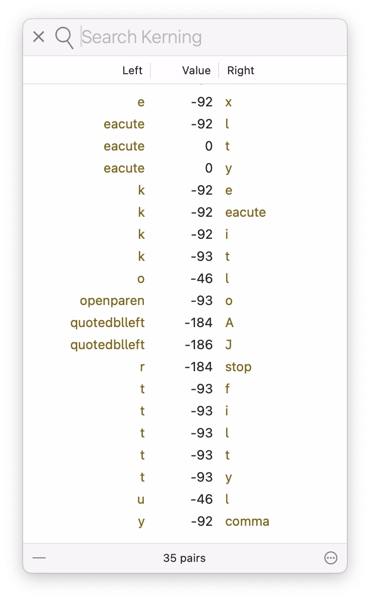
I’m having a blast with the pixel fonts I recreated from PC/GEOS. I keep adjusting the glyphs, adding kerning pairs, etc. It’s fun to keep improving a font as you’re improving its surroundings; I just redrew the @ glyph you can see above!
9.
It’s a bit old-fashioned, but I still like the idea of visited links being styled differently than non-visited links, to help you orient yourself. (Linking feels very important to me.)
Unsung @ 250: Goals and principles
Thursday, April 16
(This is one of the meta posts about this very blog. If that’s not interesting to you, skip to the next one!)
At Unsung’s 250-postiversary, if I reflect on where this blog has been, and where it might be going, this is what comes to my mind. I didn’t start the project by writing all this down, but I held a lot of this in my head. This feels like a nice moment to capture all this more deliberately, and perhaps some of you might find it interesting.
Goals of Unsung:
- Highlight hard, good, invisible design work that makes things better, but doesn’t often get spotlight.
- Find deeper meaning in craft, past the pretentious platitudes and surface-level delight. (Details matter not just in some abstract “craftsmanship” sense.)
- Help expand what craft means: highlight relations between things, show connections between history and present, talk about things that are hard to describe and impossible to measure.
- Revel in being pragmatic. Share useful things, not just hollow inspiration.
- Be fun to read.
- DIRECTIVE 6: CLASSIFIED_
Higher-level principles for this blog:
- Don’t ever share boring stuff, even if the concepts are good, or out of completeness. If you’re not enjoying reading or watching something, assume the audience won’t either. (You can occasionally salvage something boring by providing a non-boring commentary, but try to use this sparingly.)
- When you share something, always try to add your perspective or connections. At the very least, excerpt the most useful thing. This blog is QT, not RT.
- Find a good balance between positive and negative examples.
- In general, offer variety. The weekly digest should have both depth and breadth. (For the last two points, I made a little dashboard to give me some insight, although the sentiment analysis there right now is pretty worthless.)
- Be opinionated, but also humble and curious. You don’t know everything.
- Be candid, but not cruel. Punch up, not down.
- Avoid ridiculing, “walls of shame,” and so on. Even if the work you share is horrible, turn it into a lesson or two.
- This is not about people, but about work – except in some occasions it might be about people, so be candid when that happens.
- More links is better than fewer. Good linking rewards curiosity and is a form of curation (example 1, 2, 3). However, the post should stand on its own even if one doesn’t follow any of the links.
- Make an effort to showcase work by women, people of color, underrepresented minorities, and so on.
- Visuals are engaging and helpful. Think about them, but do not add gratuitous, irrelevant photos just to meet the quota (example 1, 2, 3).
- The best way to teach something general is to show something specific.
Lower-level principles:
- Credit people by full name.
- For longer videos, offer their duration to make it easy for people to make decisions about when they want to watch them.
- Avoid linking to X and Substack. (It really breaks my heart how much of the design community still supports particularly the former, given all the damage we know X inflicts on society.)
- Don’t use this blog as an example (e.g. by screenshots of itself), as this is generally confusing.
Personal goals:
- Practice writing things that do count in less than thousands of words.
- Do things differently – this blog is authored in Apple Notes, for example, which is kinda weird to a person like me who always writes straight in HTML.
- Have fun and learn working on this (completely custom) blog platform on the side.
- Give back some of what I learned in my career over the years.
- Practice stating my opinions and standing by them.
- Learn new things (about what I’m writing and about publishing on the web); the only way to teach something is to understand it yourself first.
“To build a thing that immediately feels like you’ve had it forever is very hard to do.”
Wednesday, April 15
What Version History, a YouTube show from The Verge, does really well is revisiting older tech products from today’s perspective without allowing nostalgia to take over.
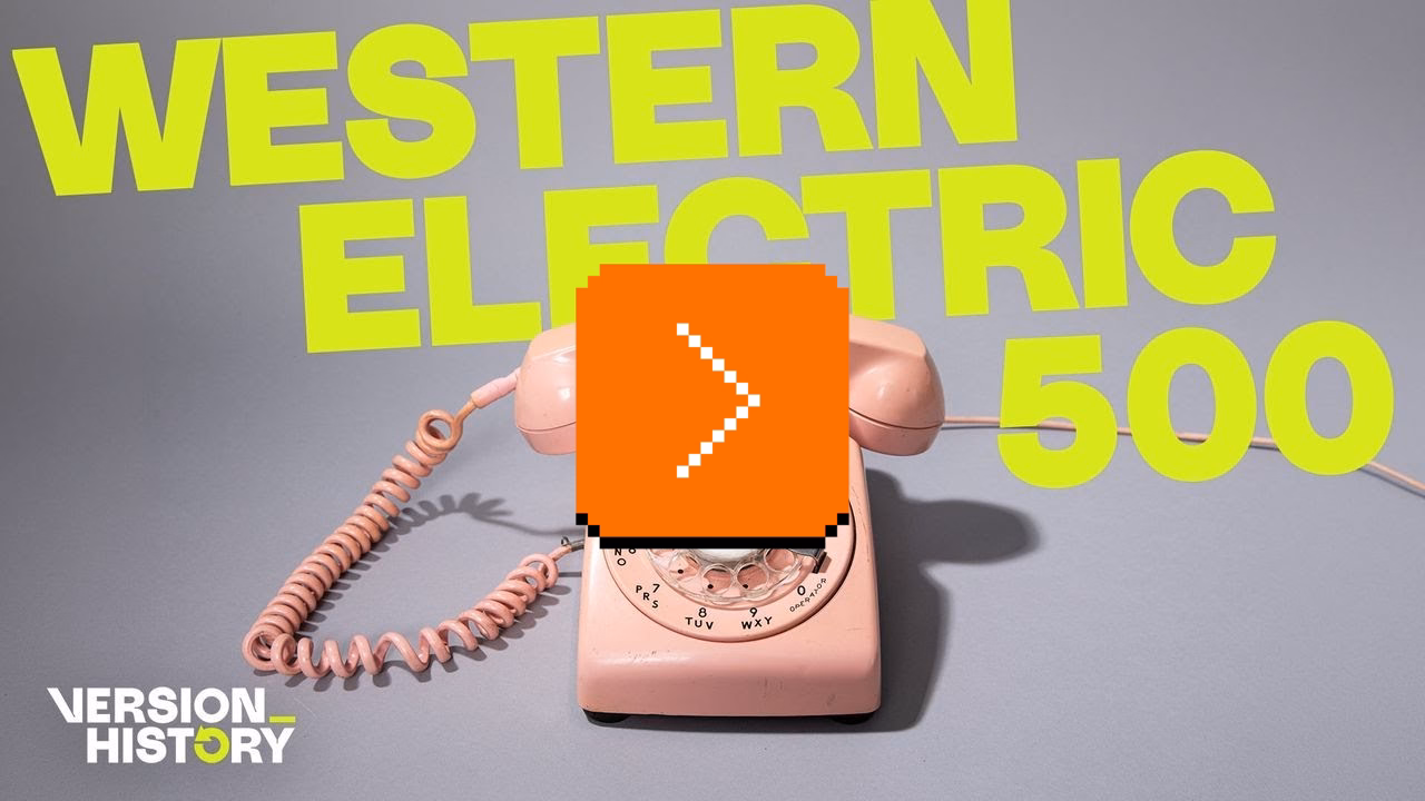
This episode about the Western Electric 500 – the canonical American landline rotary phone – is worth watching by all UX designers. There is no software here, as the phone is entirely electromechanical. But there are a whole lot of details to admire and be inspired by: the shape of the handset, the interface to change the volume, the iconic ring, the balanced and improved rotary dial, the behaviour of the cable, even the weight and balance of the whole device.
It’s not only that phone calls should all sound as good as they did in the 1950s – in my experience FaceTime Audio comes close, sometimes, but it’s so unreliable – it’s that you should try to play with a Western Electric 500 because you want your modern interface to feel like that.

The hosts – David Pierce and Nilay Patel, helped by Tim Wu, author of the excellent The Master Switch – also weave into it an entirely different angle, of how that phone fit into (and reflected) a specific period of American tech history, and how it related to AT&T’s then monopoly, including the phone jack and third-party access we just discussed re: John Deere. Even the discussion whether this is or isn’t a “hall of fame” object is good fodder for thought.
The episode – and the entire show – is also just a really enjoyable watch. If you like this ep, it pairs nicely with the one about the iPhone 4, another phone that transcended its origins through good industrial design, exactly sixty years later.
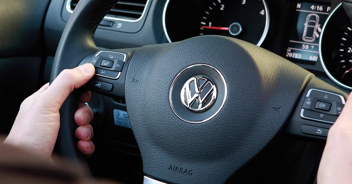
“Should be no trouble at all for a driver to understand.”
Wednesday, April 15
The 2021 revision of the Mini Cooper ramped up its Britishness by introducing Union Jack flag-inspired turn signals. They looked okay when stationary:

But when actually indicating an intention to turn, people started realizing what happens when you have two types of mapping fight each other:

On one hand, the left-turn indicator was on the customary left side. On the other, the light looked like an arrow – and the arrow was pointing to the right.
I don’t know how many people were actually confused by it, but it made for a few spicy pieces with “stupidest turn signal ever” and “most annoying thing” in their titles. The company’s official response was:
Mini has chosen the Union Jack lights to highlight Mini’s British heritage, and has been using them for a while. With regard to the turn indicator light pattern, there should be no trouble at all for a driver to understand, when seeing the full rear of the car, which direction is being indicated.
Mini has not heard any concerns from customers regarding the rear turn indicators, and has in fact received positive feedback about the taillight design.
It didn’t help that one of the worst cars this side of the Cybertruck did something similar in the 1950s:
Drama aside, I did agree with this commenter (emphasis mine):
It doesn’t cause massive confusion, but taillights should cause no confusion for anyone.
I can think of one modern version of a similar issue. If you use the iPad in landscape mode, the volume buttons seem to go “the wrong way”:

Is this anything? Probably not. I imagine it’s better to be consistent and allow motor memory to develop between all the iPad orientations, and throw in the iPhones, too. But if you only ever use your iPad in landscape, this might feel, perhaps, like “the stupidest volume controls ever.”
Oh, and the subsequent Mini revamp in 2024 solved the issue by making the turn signals less like arrows:

Thoughtful file dropping in Wakamaifondue
Tuesday, April 14
Wakamaifondue is a web tool to inspect font contents, and it starts by you dropping a font file (.ttf, .otf, or .woff) into a browser.
It handles file dropping so thoughtfully, it’s worth pausing and recognizing it:
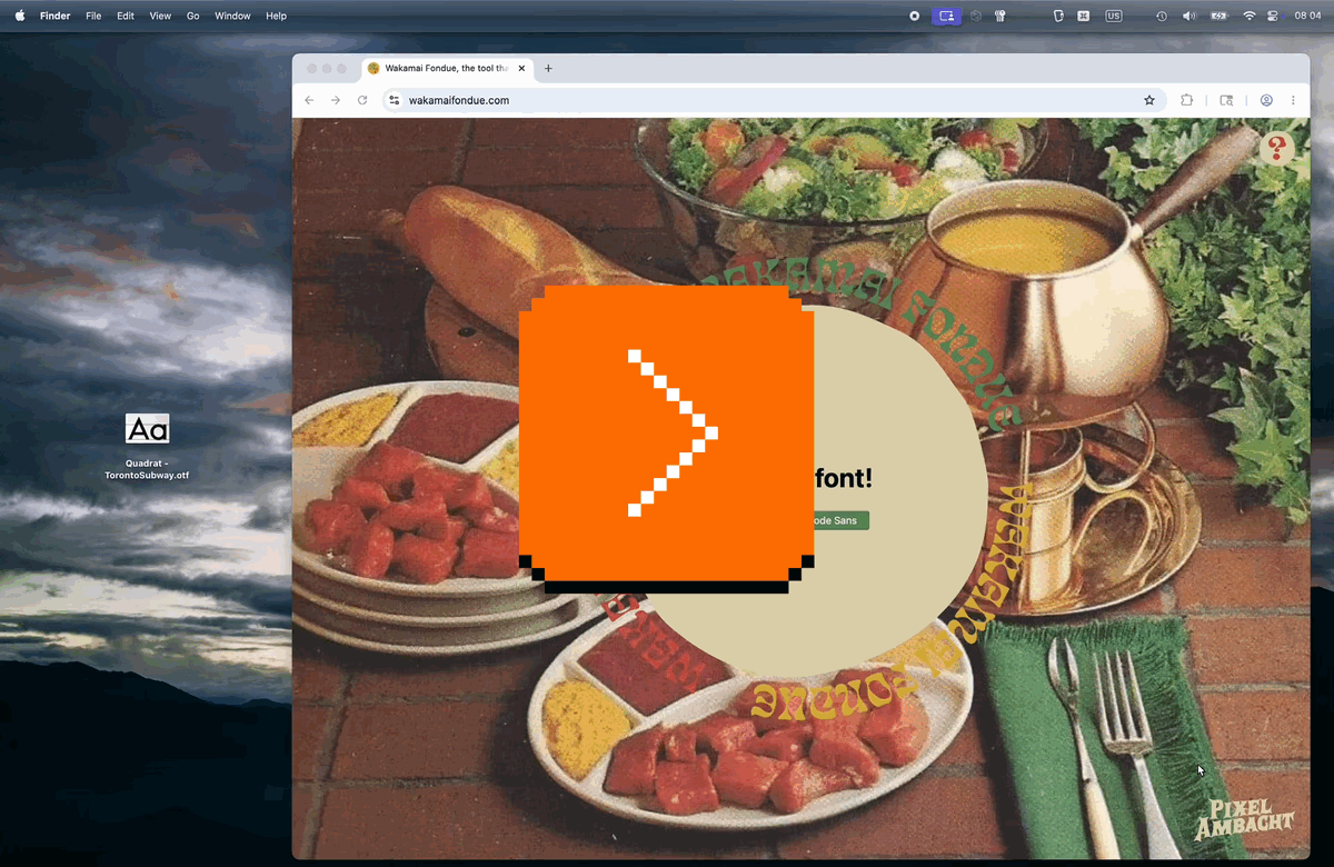
Here’s what’s great about it:
- You can drop the file anywhere. There is no designated small drop area like in some other apps; every last pixel of the window is ready to receive your file, so you can drop without worrying.
- You get a hover state confirming you are safe to drop.
- You can drop the file on other screens, too!
Why is all this important? Because dropping a file into a browser is a notoriously frustrating experience. If the tab doesn’t claim the file, left to its own devices the browser will do anything from replacing the current tab with the contents of the file, through opening a new tab, to… starting to download the file you just dropped and ask you for its new location!
It is frustrating when a failure mode of an action is not just that action failing – already here, repeating a drag is more work than e.g. repeating a keystroke – but also you having to do extra clean-up steps.
Wakamaifondue gets this right, and allowing to drop a file on any screen in particular is very thoughtful. Your cursor holding a file indicates your intentions rather strongly – when you see a person wearing a wedding dress, you don’t think “I wonder what they’re up to today?” – so there should be no need to switch to a certain mode or to navigate to an “import screen” beforehand.
“Rather than trying to fix this mistake, the developers leaned into it hard in the sequel.”
Tuesday, April 14
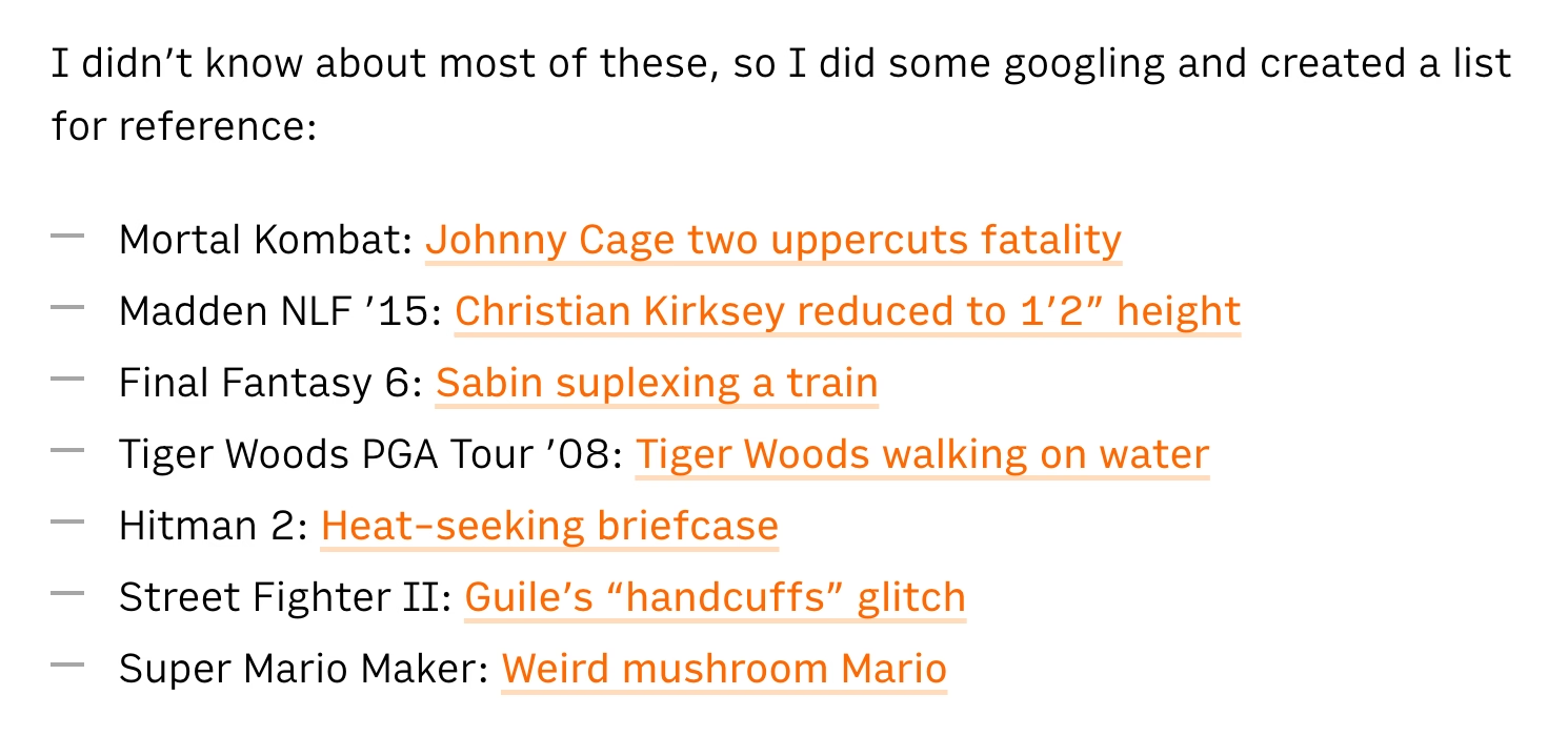
A fun 16-minute video from outsidexbox with 7 examples of videogame bugs where the game creators not only owned up to their mistakes, but creatively acknowledged or remixed those bugs in subsequent versions:

I didn’t know about most of these, so I did some googling and created a list for reference:
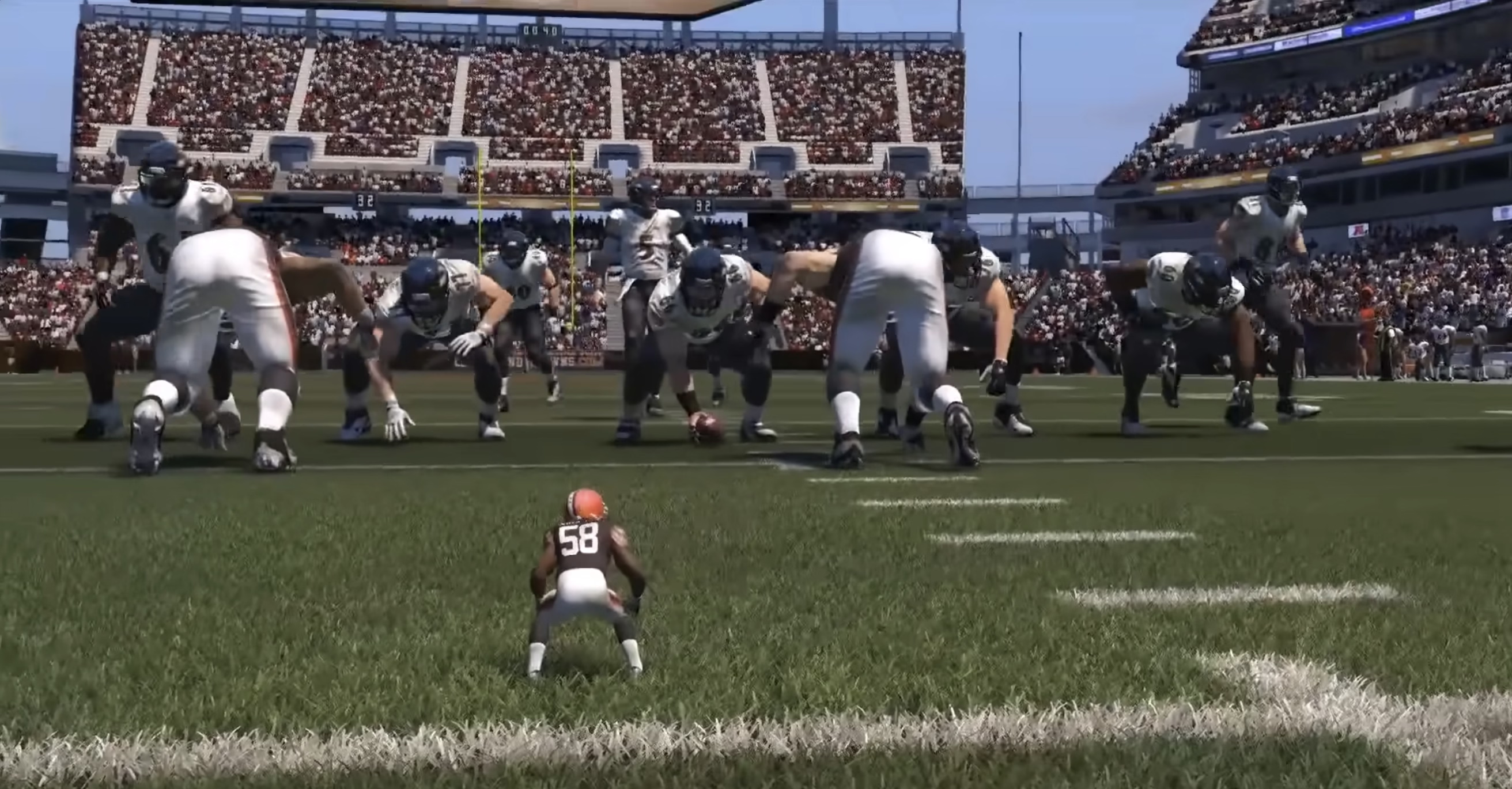
- Mortal Kombat: Johnny Cage two uppercuts fatality
- Madden NLF ’15: Christian Kirksey reduced to 1′2″ height
- Final Fantasy 6: Sabin suplexing a train
- Tiger Woods PGA Tour ’08: Tiger Woods walking on water
- Hitman 2: Heat-seeking briefcase
- Street Fighter II: Guile’s “handcuffs” glitch
- Super Mario Maker: Weird mushroom Mario
Off the top of my head, I cannot think of any non-videogame software that received a similar “bugs as lore” treatment from people responsible for the bug in the first place.
Microsoft made a blue-screen-of-death screensaver, but it was originally third-party, and kind of a prank? A mean-spirited one? I didn’t find this particularly good.
The likely second-most-famous error message, the fail whale, transcended Twitter and was even referenced in other products…
…but as far as I understand Twitter the company was itself embarrassed by it, and eventually switched the whale to a caterpillar.
(Those two examples aren’t really even bugs in the same category as those in the video, anyway.)
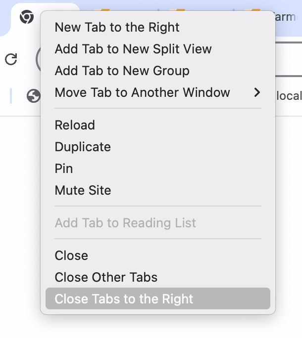
The beauty and the terror of oddly-specific commands
Monday, April 13
Right next to the generic function to delete photos by going through them one by one, my camera has a specific version – Delete All With This Date:

Below the actions to close the tab, and close all other tabs, Chrome has a specific version called Close Tabs To The Right:
In After Effects, next to typical save options, there is this – Increment And Save – which saves a file and changes the number at the end to be one notch higher (Project 2 → Project 3, and so on):

I’m mildly fascinated by these strangely specific accelerators.
The one in the camera is genuinely useful. Photo projects are often day-long affairs where you download the photos at the end of workday, but might still keep them on the card just in case. Allowing to quickly delete a day’s worth of photos makes a lot of sense, saving you from having to go through them one by one in an interface not suited for that kind of operation.
Chrome’s “Close Tabs to the Right” takes a bit of figuring out, but I believe it’s meant to make it easy to clean up after a fruitful research session where you kept ⌘-clicking and opening tabs to learn more, and those tabs now fulfilled their purpose. (Curiously, Firefox also has “Close Tabs To Left” which I don’t understand.)
After Effects’s “Increment and Save” is… I don’t know. Maybe it’s cheap? Maybe it’s honest? A proper version history would be nicer, but that’s a tall order. This is simple and, most importantly, reliable. I still often do the “poor man’s version control” elsewhere…

…so this works for me.
It’s always interesting to me to think whether these kinds of oddly-specific examples are nice gestures toward the user, or treating symptoms in lieu of fixing actual problems. Either way, I don’t think an interface can survive too many of these, as their obscurity and weirdness add up and can contaminate the entire UI.
Would love if you sent me more of these kinds of commands from the apps you use!
“We can have the best of all worlds.”
Monday, April 13
A fun 24-minute video from Technology Connections about designed sounds in real life: elevator dings, airplane chimes, railway crossing dings, and so on.
While I am sympathetic to the notion that sound pollution is a thing we need to be concerned with, the choice between silence and sound pollution is a false choice. There’s a lot of those happening these days, probably because we’re so stuck in binary thinking. But as airplanes show us, we can design sounds which aren’t obtrusive, but which are helpful. And when you get yourself out of binary thinking, you can do things like make your most obnoxious apps be silent while your important ones make themselves known, and in ways which are meaningful to you and pleasant to everyone else.
It is an interesting parallel to the post about syntax highlighting from a while back, and one of the posts about cartography design I shared recently; they all explore how you can create a richer space capable of conveying more information without overwhelming people, by being intentional about the design.
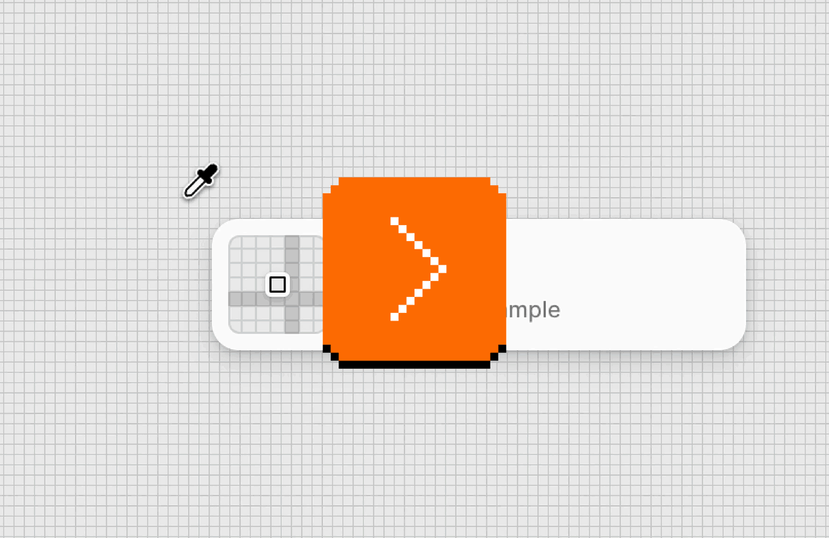
In search for a more precise cursor
Sunday, April 12
One of the casualties of Apple’s otherwise brilliantly executed transition to retina pixels has been the mouse pointer, which remains aligned to what “traditional pixels” used to be, rather than the retina/physical/smaller pixels.
Turn on the zoom gesture from a few weeks ago, and you can see the challenge. The gridlines are ½ logical pixel and 1 physical pixel wide:
This limitation is inherited by most tools: Photoshop, Affinity, xScope, even the built-in Digital Color Meter. It’s not the end of the world, of course, but it can be maddening if you are trying to sample a color from a “half pixel” and the cursor stubbornly skips it no matter how delicately you move. Here it is in Figma:
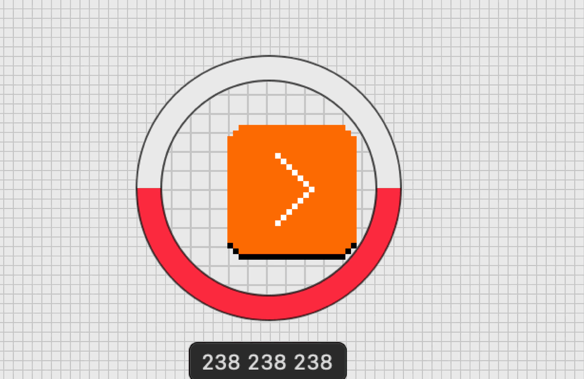
Of the few tools I tested, only Pixelmator allows to sample at the correct, precise level:
I was curious how would a truly precise cursor feel in general – would there be any disadvantages? – so I built a little simulator that allows a regular arrow cursor to be aligned to “half pixels” or “retina pixels.”
In the process, I discovered that both Chrome and Firefox already receive sub-traditional-pixel measurements for mousing events, so this was even easier to build than I expected. Now, precise targeting in Chrome and Firefox becomes possible:

I don’t personally see any big difference in terms of either upsides or downsides, and I’m curious if you do. iPadOS and its Safari already seem to support the precise mouse pointer, too. That makes me curious: why isn’t it available in macOS? I imagine you could even turn it on by default for apps – or, if you want to be more conservative, make it opt-in.
Pixelmator also shows that the apps can do it without waiting for macOS as the data is already there; they would just need to render the cursor on their own with more precision.
“Deere charges six figures for a tractor. But the farmers were still the product.”
Sunday, April 12
Cory Doctorow, in 2022, wrote an essay about how John Deere – a farm tractor manufacturer – restrict repairs by owners or third-parties:
Deere is one of many companies that practice “VIN-locking,” a practice that comes from the automotive industry (“VIN” stands for “vehicle identification number,” the unique serial number that every automotive manufacturer stamps onto the engine block and, these days, encodes in the car’s onboard computers).
VIN locks began in car-engines. Auto manufacturers started to put cheap microcontrollers into engine components and subcomponents. A mechanic could swap in a new part, but the engine wouldn’t recognize it — and the car wouldn’t drive — until an authorized technician entered an unlock code into a special tool connected to the car’s internal network.
Big Car sold this as a safety measure, to prevent unscrupulous mechanics from installing inferior refurbished or third-party parts in unsuspecting drivers’ cars. But the real goal was eliminating the independent car repair sector, and the third-party parts industry, allowing car manufacturers to monopolize the repair and parts revenues, charging whatever the traffic would bear (literally).
The same tactic was used by John Deere, forcing farmers to hack the tractors they purchased just so they could repair them.
In a decision that bolsters right-to-repair movement, John Deere and farmers reached a settlement that has the company pay $99 million to repay prior inflated repair costs, and requires it to share software required for maintenance and repair with farmers.
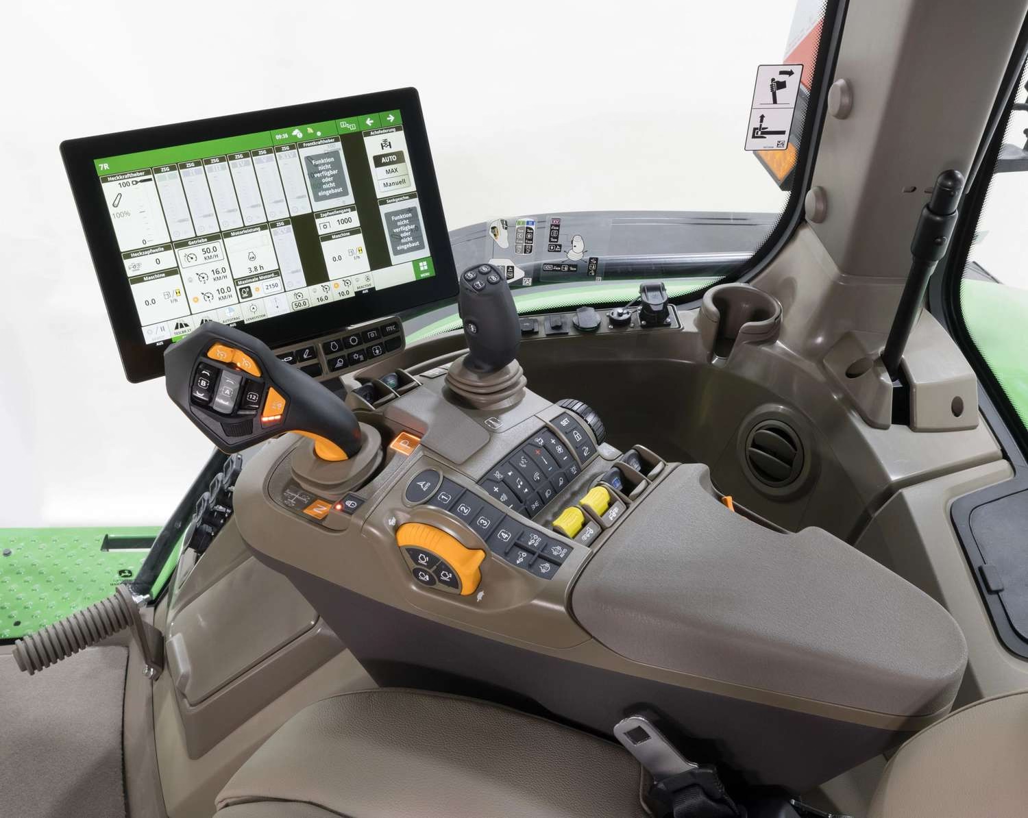
Just because I was curious and you might be also, here’s an example of a modern tractor interface:
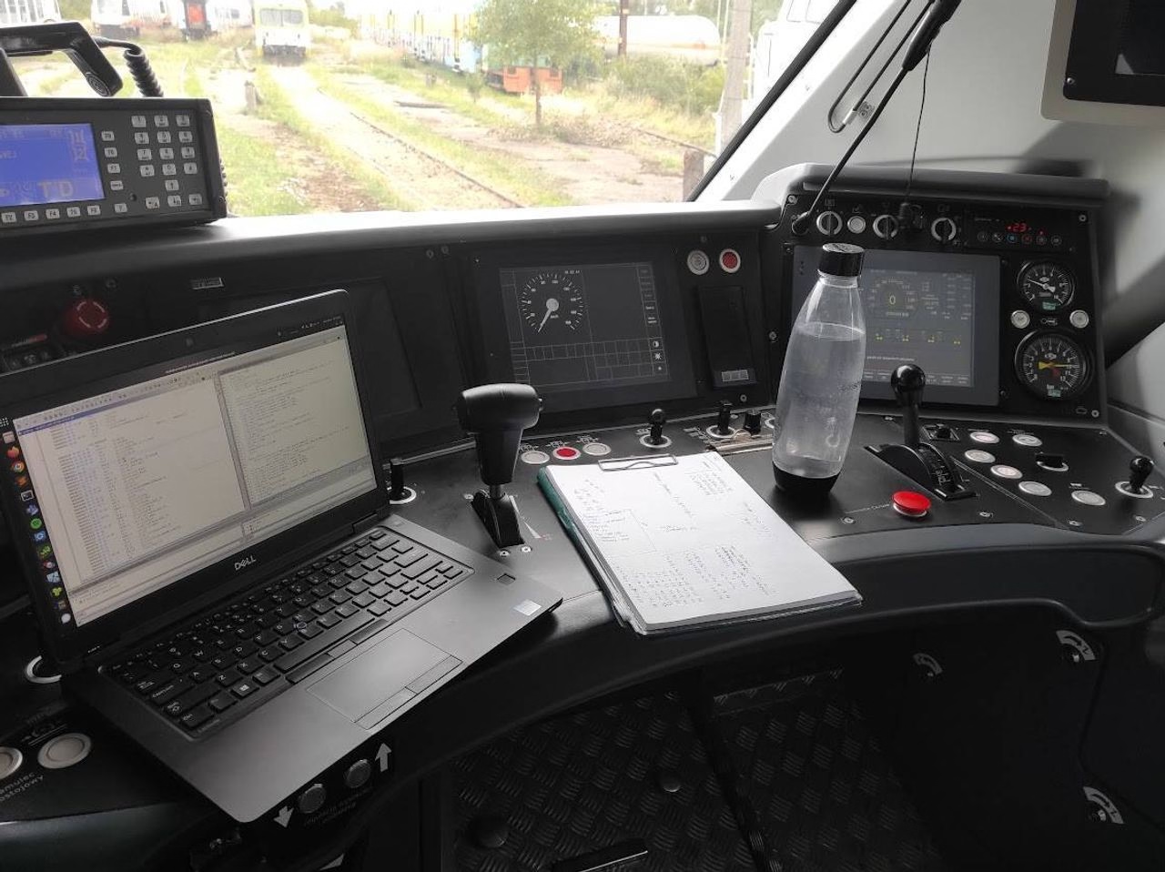
The story reminded me of an ongoing battle in Poland where a train manufacturer Newag used VIN locking and coupled it with GPS hardcoding in an even more brazen attempt to prevent third-party repair: if a train spent too much time at a location of another train repair company, it’d simply stop running – not by some hardware fault, but by a simple if condition in code.

“This is quite a peculiar part of the story—when SPS was unable to start the trains and almost gave up on their servicing, someone from the workshop typed “polscy hakerzy” (“Polish hackers”) into Google,” the team from Dragon Sector, made up of Jakub Stępniewicz, Sergiusz Bazański, and Michał Kowalczyk, told me in an email. “Dragon Sector popped up and soon after we received an email asking for help.”
The (white-hat) hackers helped unbrick the train, but since European law is stricter on DRM, the case gets murkier. The article above is from 2023, and contains this quote:
Newag said that they will sue us, but we doubt they will - their defense line is really poor and they would have no chance defending it, they probably just want to sound scary in the media.
However, in 2025, the manufacturer proceed to sue the hacker group and the train repair company. As far as I can tell, the case is still in courts.
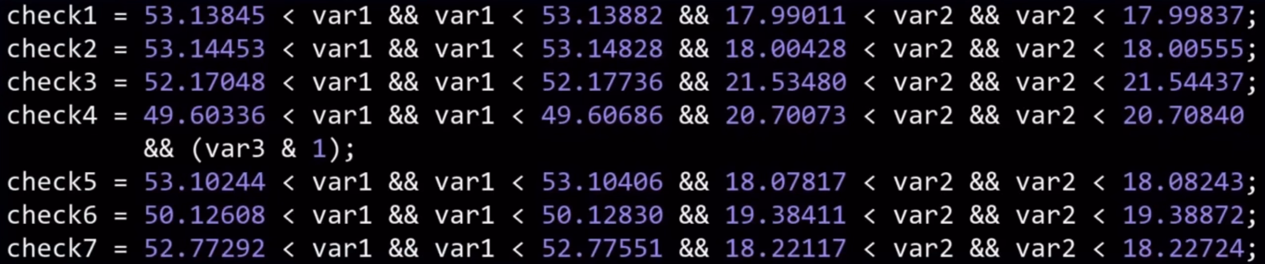
The three hackers explained their work in this 45-minute conference talk. It’s honestly not the most polished presentation, but it goes into a lot of engrossing details and if the intersection of hacking and trains hardware interests you, check it out! I had fun looking double checking this presented code by punching in the lat/long coordinates into Google Maps and verifying they’re exactly the locations of competitive repair shops:
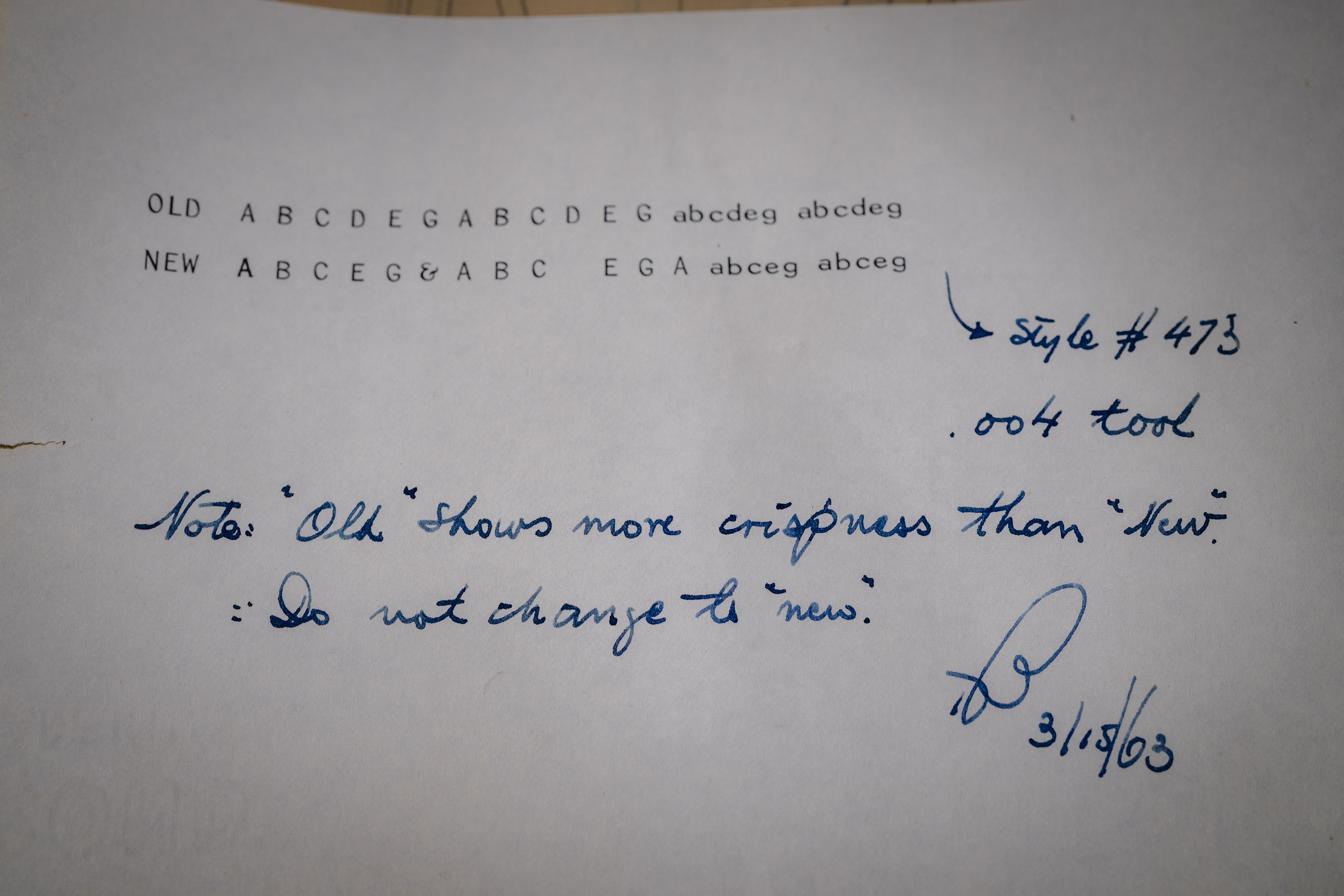
Is this the latest?
Saturday, April 11
Found in an archive of font design (for Olivetti typewriters) and smiled:
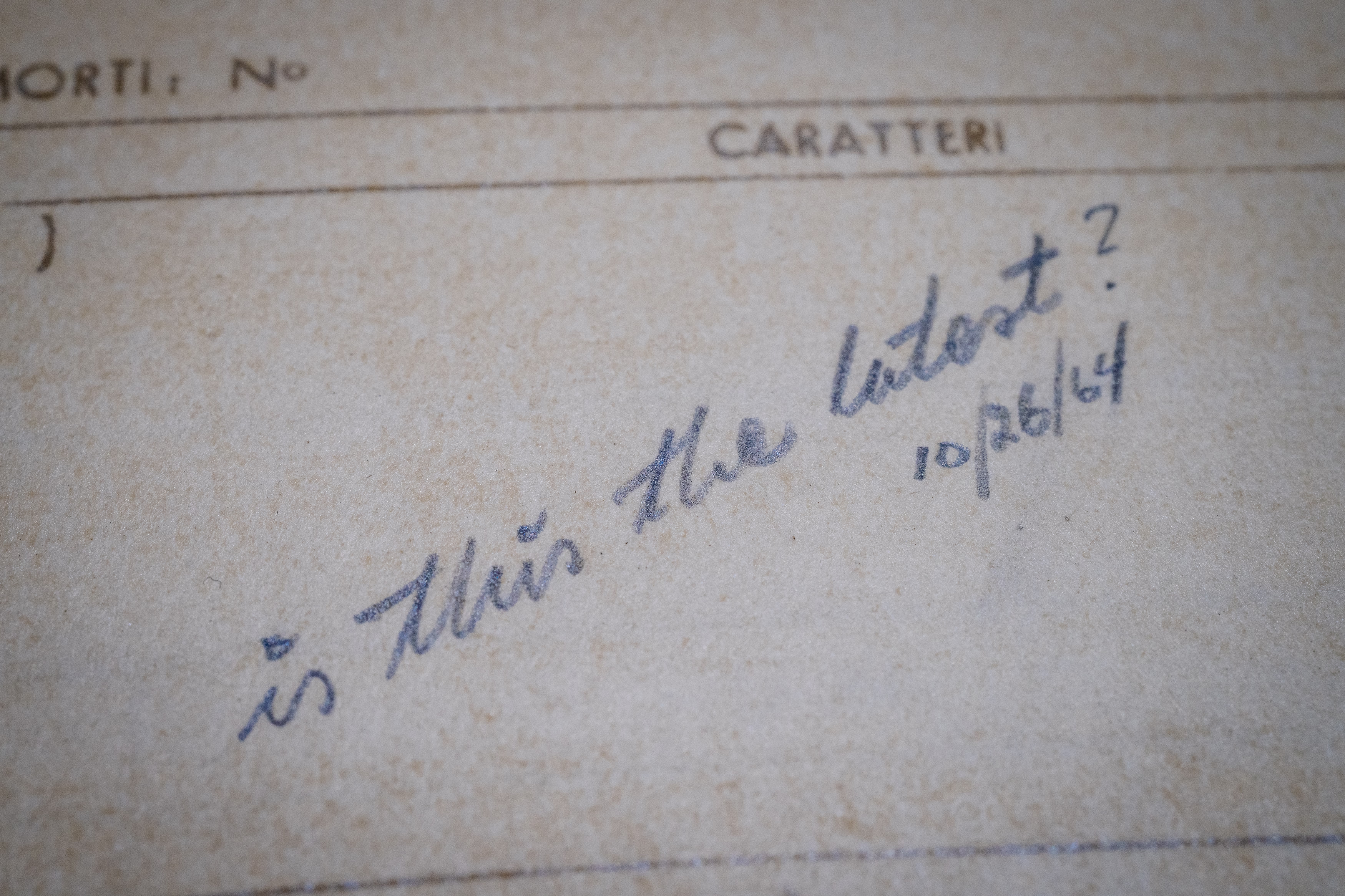
Handoff problems were there before us and will remain after we’re gone.
This, too:
“So I wrote a script that takes monthly screenshots of Google and Apple Maps.”
Saturday, April 11
From 2010 to 2021, Justin O’Beirne had been writing about online cartography, specifically in Google Maps and Apple Maps.
While both of these services changed a lot since the essays, they are still worth reading. They might be the closest to modern reviews of software as I can think of, and the way the essays are done also teaches us storytelling lessons – from nice visualizations and comparisons, to rich footnotes. There is also a great balance of high-level overview, and then jumping into specifics that reinforce it.
Here’s one example of cool tooling O’Beirne used to make his points more sticky:
I wrote a script that takes monthly screenshots of Google and Apple Maps. And thirteen months later, we now have a year’s worth of images:
The result is informative and mesmerizing:
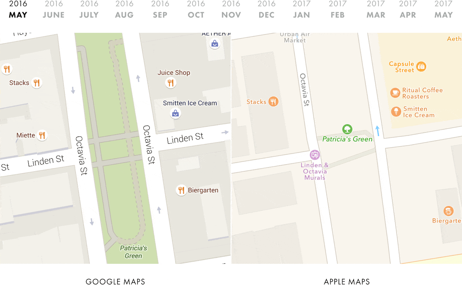
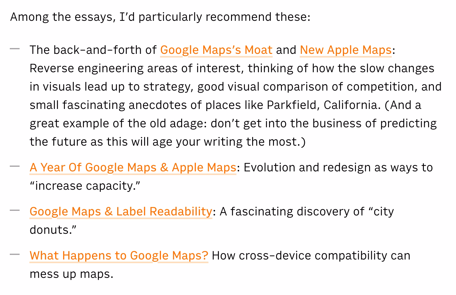
Among the essays, I’d particularly recommend these:
- The back-and-forth of Google Maps’s Moat and New Apple Maps: Reverse engineering areas of interest, thinking of how the slow changes in visuals lead up to strategy, good visual comparison of competition, and small fascinating anecdotes of places like Parkfield, California. (And a great example of the old adage: don’t get into the business of predicting the future as this will age your writing the most.)
- A Year Of Google Maps & Apple Maps: Evolution and redesign as ways to “increase capacity.”
- Google Maps & Label Readability: A fascinating discovery of “city donuts.”
- What Happens to Google Maps? How cross-device compatibility can mess up maps.
There are also book recommendations and a memorable user story.
Only time will tell
Saturday, April 11
Why is there a short wait if you press a button on your headphone remote or your AirPods to pause the music? Because the interface has to let a bit of time pass to figure out if you’re going to press the button again, making it a double press (advance to next track) instead of a single press.
This kind of disambiguation delay is everywhere for simple gestures.
Why is there a short wait if you press a button twice in that situation? The double press processing also has to be delayed, because there is a chance it might become a triple press (go to previous track).
Why is there a short wait if you press a button to go to the next track on your car’s steering wheel? It’s a delay of a different kind, but the same principle: the function cannot kick in on press down, because press down and hold mean “fast forward.” So, software has to wait for button up event to go to the next track (which feels a bit slower than button down), or for enough time to pass so we’re certain it’s a button-down hold rather than a slow press. Here, both interactions experience a penalty for coexisting.
The most infamous of those disambiguation delays exists in mobile browsers. Since every double tap can zoom into the page ever since that famous 2007 iPhone presentation, every single tap on a link or elsewhere has to be delayed by about 300ms. This has been a source of contention since it does make the web feel a bit slower, and today browsers suspend double tapping on sites designed for mobile, trading zooming affordances for higher interaction speed – after all, you can still zoom in by pinching. But if you always wondered why older websites tend to be a bit sluggish to interact with, now you know.
Different tradeoffs are possible. In the Finder, clicking on icons isn’t slowed down even though double clicking exists, because selecting an icon is compatible with opening it! So in effect it’s not a choice between a faster A and a slower B – it’s A or A+B.
Even in the iPhone presentation above, you can see the interface highlights the link on double tap, to at least make it feel snappier, at the expense of the highlight being “wrong” and potentially distracting – or even confusing – when you end up double tapping. (You can imagine smartphones pausing on the first remote/headset button press, too. It feels like it would be compatible with advancing to the next track, but I think it might also feel too “choppy,” too chaotic, in practice.)
Lastly, why is there a short wait if you press a button on your hotel TV to increase the volume? Oh, I think that one is just sluggish for no good reason.
“Approximately 21 times the estimated age of the universe”
Friday, April 10
A few years ago, some sort of a bug at my work caused all of the timestamps appear as “54 years ago,” a seemingly arbitrary date. It took me a bit to realize: “Wait, you know what year was 54 years ago? 1970!” “Why is 1970 important?” asked another designer. I explained that by convention, Linux time counts up from Jan 1, 1970 – and so if the time “value” is zero or unavailable, as it was because of the bug, it would be rendered not as an error, but as that specific day long ago.
Computing is filled with all sorts of arbitrary numbers like these. The most famous one was Y2K (99 + 1 = 00 if you only allocate two digits), Pac-Man’s kill screen was number 256, people still bring up the infamous and likely non-existent “640 kilobytes should be enough for everybody” quote, and the Deep Impact space probe died a lonely and undignified death after its timers overflowed the two pairs of bytes given to them.
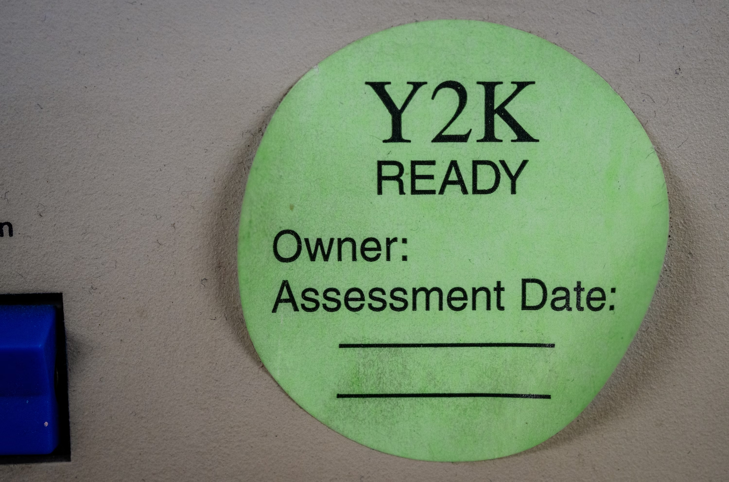
Here’s a new magic number to remember: macOS Tahoe has, for a while at least, a kill screen of its own – after 49 days, 17 hours, 2 minutes, and 47 seconds (or, 4,294,967,295 milliseconds), one of its time counters overflows and no new network connections can be made, rendering the machine rather useless. The only solution is a reboot. Talk about a deadline!
(Well, new-ish. In perhaps a bit of karmic payback, Windows 95 and 98 once had a similar problem with the exact same threshold of 49.7 days.)
Wikipedia has a nice list of other time storage bugs. The next big one? The problem of the year 2038. The technical fix, as always, is to give the numbers a bit more room to breathe. This is, in a way, kicking the can down the road, but that might be okay since the road is rather long:
Modern systems and software updates address this problem by using signed 64-bit integers, which will take 292 billion years to overflow—approximately 21 times the estimated age of the universe.
However, as always, the technical side won’t be the hard part.