“This sounds completely impractical and we love it.”
Welcome to this week’s digest of Unsung, a blog about software craft and quality. Here’s what was posted in the last week:
“The killer app is making calls.”
Friday, February 13
I was randomly checking the Wikipedia entry for killer apps – apps that were so good that they single-handedly made people buy a particular hardware platform just to run them (Wii Sports for Nintendo Wii, Super Mario 64 for Nintendo 64, and so on).
There are some interesting nuggets in there I didn’t know, like Sibelius (music software) being a system seller for the British computer Acorn Archimedes, Xevious doing the same for Famicom (I had no idea Xevious, as beautiful as it is, was so huge!), and Steve Jobs focusing so much on making calls on the first iPhone. How quickly we started taking visual voicemail for granted…
But I was suprised not to see killer apps for Fortnite, Minecraft, Roblox, or even Mac OS X. Does the concept of killer apps not work anymore? Is iMessage a killer app for those who want blue bubbles, but it’s much harder for us to know that?
(I’m also curious about a parallel list of botched updates: Digg in 2010, Sonos in 2024, the “simplified” iMovie ’08 and Final Cut Pro X, Liquid Glass, as some of them ended up being anti-killer apps. I don’t immediately see anything like this online, but it could be an interesting series of posts to analyze those more carefully, going past schadenfreude or ridicule.)
Also, it made me think of one of my favourite ads. It’s for VisiCalc, the first computer spreadsheet, and the first-ever killer app. The ad was unassuming, small, in a corner of a 1979 computer magazine. But, in hindsight, what a prescient and brilliant question: How did you ever do without it?
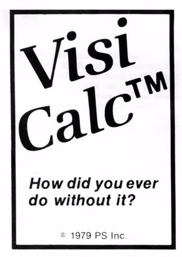
We take spreadsheets for granted, too, but chills. Literal chills.
“Problem solved, right? Well, not exactly.”
Thursday, February 12
I was embarrassed for Apple when I saw the recent bug fix for columns introduce a new bug, explained in this post by Jeff Johnson:
Without the path bar, the columns are now taller, but the vertical scrollers remain the same height as before, leaving vertical gaps, a ridiculous amount of space between the bottom of the scrollers and the bottom of the columns, looking silly and amateurish.
It’s impossible to talk about craft without talking about embarrassment, and pride, and shame, and lust, and a lot of other words – all tricky to describe, all fluffy. So, I tried to interrogate my feelings.
First, it was embarrassing that it broke. I’ve been there: you build a complex system, and forget about some lesser-known state. That’s why it’s important to invest in whatever it takes to shine a light on those states: quality assurance, automatic screenshotting, tests, and so on. Sometimes it’s simple hacks – like half of your team having scrollbars visible. And when you notice a bug, you try not to just fix it, but to rebuild it to be stronger (“leave the campsite in a better place you found it”) – be it by fixing the cause and not just the symptom, adding unit tests, changing practices, and so on.
But it also felt embarrassing how it broke. It feels clear there’s some manual calculation going on somewhere, and someone forgot to add this new change to it. One of the tricks I learned over time is that a well-designed system designs itself, but it takes effort and imagination to make a system resilient in this way. Here, if there was some abstraction of “adding stuff to the bottom,” then you wouldn’t have to worry about adding extra math. The system would take care of itself in many of these corner cases you will forget about.
I don’t want to shame (see, that word again!) individual people at Apple because I don’t know if it’s the lack of talent, or the whole system being wired in a way that doesn’t reward forward thinking or the kind of invisible work that needs to happen in those spaces. But the embarrassment should be there – if it doesn’t exist inside Apple, then that’s perhaps the sign of a real problem.
Molly guard in reverse
Thursday, February 12
Old-school computing has a term “molly guard”: it’s the little plastic safety cover you have to move out of the way before you press some button of significance.

Anecdotally, this is named after Molly, an engineer’s daughter who was invited to a datacenter and promptly pressed a big red button, as one would.
Then she did it again later the same day.
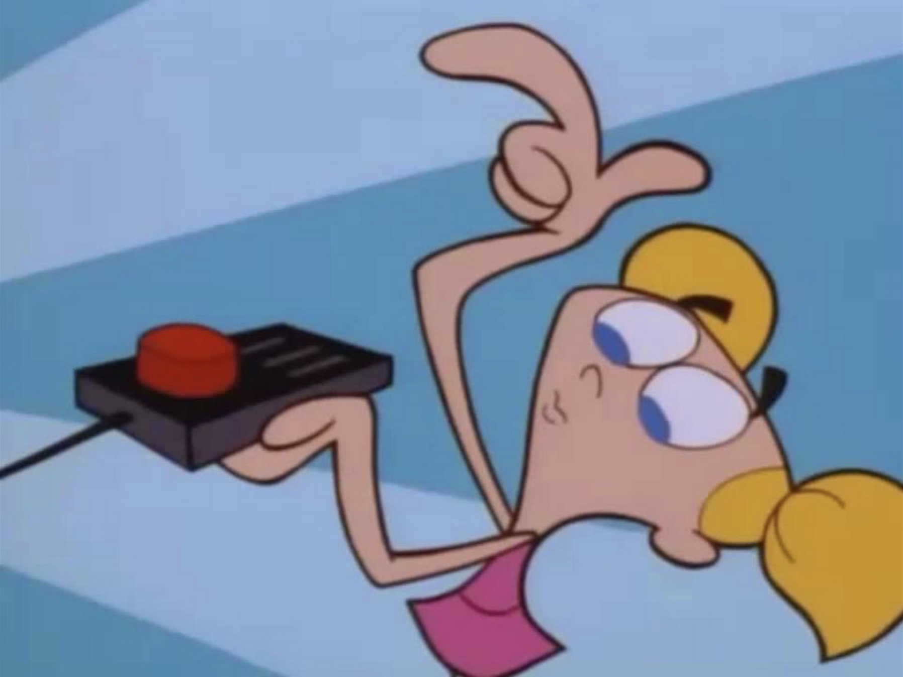
You might recognize molly guards from any aerial combat movie you ever watched:


And some vestigial forms of molly guards exist everywhere in civilian hardware, too: from recessed buttons, through plastic ridges around keys, to something like a SIM card ejection hole.


Of course, molly guards happen in software, too: from the cheapest “are you sure?” dialogs (which sometimes move buttons around or disable keyboard activation to slow you down), through extra modifier keys (in Ctrl+Alt+Del, the Ctrl and Alt keys are the guards), to more elaborate interactions that introduce friction in places where it’s needed:
But it’s also worth thinking of reverse molly guards: buttons that will press themselves if you don’t do anything after a while.
I see them sometimes, and always consider them very thoughtful. This is the first example that comes to my mind:
Here’s what became a standard mobile pattern:

These feel important to remember, particularly if your computer is about to embark on a long process to do something complex – like an OS update or a long render.
There is no worse feeling than waking up, walking up to the machine that was supposed to work through the night, and seeing it did absolutely nothing, stupidly waiting for hours for a response to a question that didn’t even matter.
It’s good to think about designing and signposting those flows so people know when they can walk away with confidence, and I sometimes think a reverse molly guard could serve an important purpose: in a well-designed flow, once you see it, you know things will now proceed to completion.

How to make sure a designer never files a bug again
Wednesday, February 11
- The UI for filing bugs is inscrutable and has too many hoops to jump through.
- No one does anything unless every field has been filed meticulously and there is a clear repro.
- The designer is ridiculed if the thing isn’t actually a bug, is a duplicate, or if it was filed in the wrong place.
- Front-end bugs are automatically “minor” or “nice to have”s without listening (as there is no loss of functionality, and no data loss).
- The designer is always responsible for stating how it should work, without being able to say “I am not sure why, but this started feeling off and it’s in an important place. Can we investigate?”
- “This is as designed” is an automatic conversation ender.
- The tiniest of external reports, social posts, or blog posts, immediately are prioritized higher than in-house experience.
- Once every few years, a designer gets 20+ demotivating automated emails saying 20+ bugs they filed over the years have been closed automatically during a purge, without any word of explanation.
- Simple human touches like “thanks for filing!” or “nice catch!” never enter the picture.
- Engineers never file design bugs themselves.
If you’re an engineer, I can sense you might be getting frustrated, as most bullet points I listed look like extra work. I agree with you. It is. This post is as much about process, as it is about culture and the incentives it establishes. The best places I’ve worked were filled with shared trust and treated bugs as a joined responsibility of everyone, rather than a black-and-white division into “filers“ and “fixers,” with the ultimate end goal always being user’s experience – nothing else.
I also understand this dives right into an age-old tension between manufacture and craft. Bug-fixing processes have to be well-oiled bureaucracies with very specific rules so that they don’t turn into a pile of vibes and Brownian motions. But design (and, by extension, a lot of front-end) doesn’t work like that. Design needs room for taste, for careful exceptions, for escalation of immesurable things, and for a certain flexibility in even the basic definitions.
If it’s a tiny, but embarrassing bug, or a flow killer, or a thing that bothers your most valuable group of users, or something appearing in a well-trafficked place – it is no longer tiny. If it’s working as intended, but it feels buggy to the user – it ought to be a bug. If it’s a long-standing bug, it should be considered as cumulative damage already done, not “oh, this has been like this for a long time, no one cares.” If there’s a shaky repro, but the bug feels important, you need to work from principles or analyze the code. If it’s something no one mentioned externally (ergo: why fix it?), consider a lot of bugs rankle but never get reported, particularly if your company doesn’t project an external presence of caring about feedback and acting upon it. cough cough Apple cough cough cough cough cough dies coughing
Of course, designers have responsibilities in the process also, among them mutual respect and understanding of engineering, clarity of communication (particularly about things that are hard to reason about mathematically), seeing patterns that could be grouped into bigger bug bundles to make fixing more efficient, (occasionally!) helping figure out a fix if the obvious fix isn’t available, and shared understanding with their team about what actually matters. There is always a thousand details that could be better, but for every thousand only a hundred might actually be worthwhile. Flooding the bug process with irrelevant minutiae that won’t realistically ever be fixed is not very helpful.
This is the only way I know of to capture the full spectrum of bugs that ruin software – from front-end to back-end, from visual/interactive quality to works-or-not functionality, from what can be measured to what never will be. And this is not just about designers, of course. It’s not even about any non-engineering function. Design serves everyone; if your bug-filing UI or your process or your definitions are not well-designed or -balanced, I strongly believe you’re also hurting engineers on your team. And you’re definitely hurting your users.
“It’s just a nice thing to have, you know.”
Wednesday, February 11
An 8-minute video by Bread on Penguins about some fun uses of terminal:
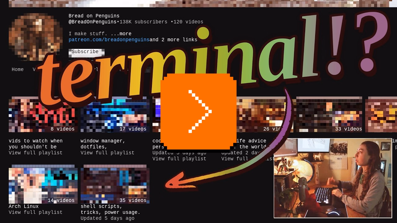
I am pretty sure this is nothing new for heavy command-line gurus (and heavy Raycast users, and so on), but I found it delightful to see someone so excited about creative uses of the terminal, and it made me realize how much time I do waste going through the browser, then Google Search, then scrolling. I am sure tightening some of these loops would feel great.
There is also something interesting in the argument about terminal being the ultimate “reading mode” of any website, chiefly because it cannot be anything else.
Mostly, this and Strudel before make me excited to see some new (to me) stuff happening with text-based user interfaces.
“Hello... I am right here!!!”
Wednesday, February 11
I liked this little microinteraction by Mario Guzmán explored on Masto – it felt like a clever idea to help you locate a tiny widget on what might be a huge screen or two:
But it also made me think. I still strongly associate macOS shake with “wrong password,” meaning “you’re doing something wrong” – something the system has been teaching us ever since the late 1980s NeXT computer, whose windowing manager it inherited. Am I careful about the motion vocabulary and the semantics of shake, or am I simply overthinking it? Sometimes it is hard to tell.
(By the way, is it okay for me to link to random work by strangers, or is it weird? Don’t be afraid to let me know. One thing I want to practice on this blog is various ways to be a critic, in the sort of Roger Ebert sense.)
“4 billion unique (and sometimes very memorable) sentences”
Tuesday, February 10
I spotted this interesting thing at work today, and was curious about that phrase at the end:
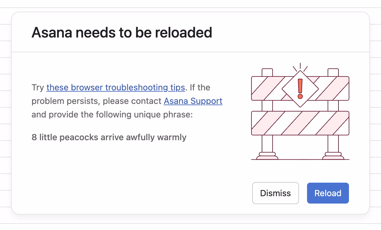
Turns out, it is basically a unique human-readable encoding of a 32-bit digit, I’d guess particularly for ease of voice/phone support communication. (Otherwise I imagine copy/paste would work well?)
Asana has been doing it since at least 2011:
What is novel in Asana is the form these IDs take. In most other applications, a customer-facing ID is usually a long jumble of numbers and/or letters. There are lots of small, subtle drawbacks to representing a number to a human this way, and so for the sake of curiosity—and to add a little levity to an otherwise frustrating situation—we tried something different.
Imagine representing 32 bits of information (numbers up to 4 billion) as a sentence instead of a jumble of digits. One possible sentence structure can be: count + adjective + plural noun + verb + adverb, e.g. “6 sad squid snuggle softly.”
I am very curious what data gets encoded this way since 32 bits is not really a lot. That detail, however, is not covered in the post.
“Projects just drift toward chaos unless a person is actively holding them together.”
Tuesday, February 10
Complementing my previous post, a lot of great thoughts in this post about invisible work from Hardik Pandya:
When the project succeeded, her work had dissolved into the project’s infrastructure. The doc was just “the doc.” The tracker was just “the tracker.” The alignment was just how things were. People forgot it had ever been otherwise. That’s the thing about good coordination. I’ve realized that when it works, it disappears. You can’t see it precisely because it worked.
Even though Pandya didn’t call that out, it’s worth highlighting that his “founder friend” example wasn’t a woman by pure chance; often the invisible work becomes the second shift of women in the workplace. And then:
The problem is that recognition follows narrative. When a project succeeds, credit flows to the people whose contributions are easy to describe. The person who presented to the board. The person whose name is on the launch email. The person who shipped the final feature. These contributions are real, I’m not diminishing them. But they’re not more real than the work that made them possible. They’re just easier to point at. Easier to put in a slide. And I think that’s where the unfairness starts, slowly, without people really noticing.
However, I disagreed with these parts:
There’s no framework that fixes this. You can’t design a rubric that captures “held the project together.”
Wait, why not? This is a similar challenge to quantifying design contributions (some of which might not clearly map to KPIs or sometimes even OKRs). You can’t measure being in the flow, true user satisfaction and frustration, or world-class-adjacency of taste. But it doesn’t mean you cannot design a system or a rubric that recognizes and talks about them.
“Maintenance in this larger sense has nothing optional about it.”
Tuesday, February 10
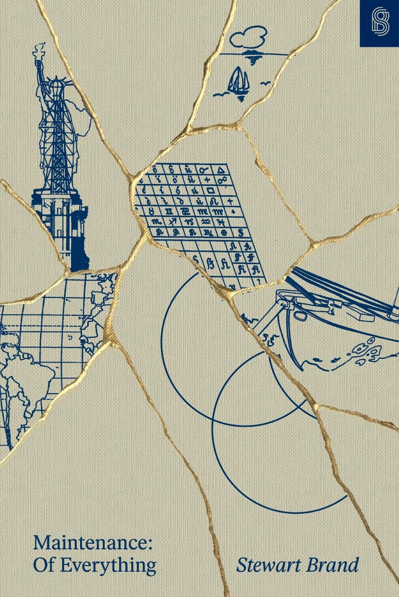
I learned from Diana Berlin’s always excellent newsletter Diagonal that Stewart Brand has a new book out, and it’s about maintenance, and it’s published by Stripe Press. From the introduction:
This book, I’m pretty sure, is the first to look at maintenance in general. It asks: What can be learned if you think about all the varieties of maintenance at the same time? I doubt if there are any non-trivial “laws” of maintenance to be discovered. All I can offer here is to muse across a representative sample of maintenance domains and see what emerges.
Very excited to give it a go, somewhat worried about “Part One” appearing in the title, disappointed in Stripe not caring enough to ask one woman for a blurb.
“This sounds completely impractical and we love it.”
Monday, February 9
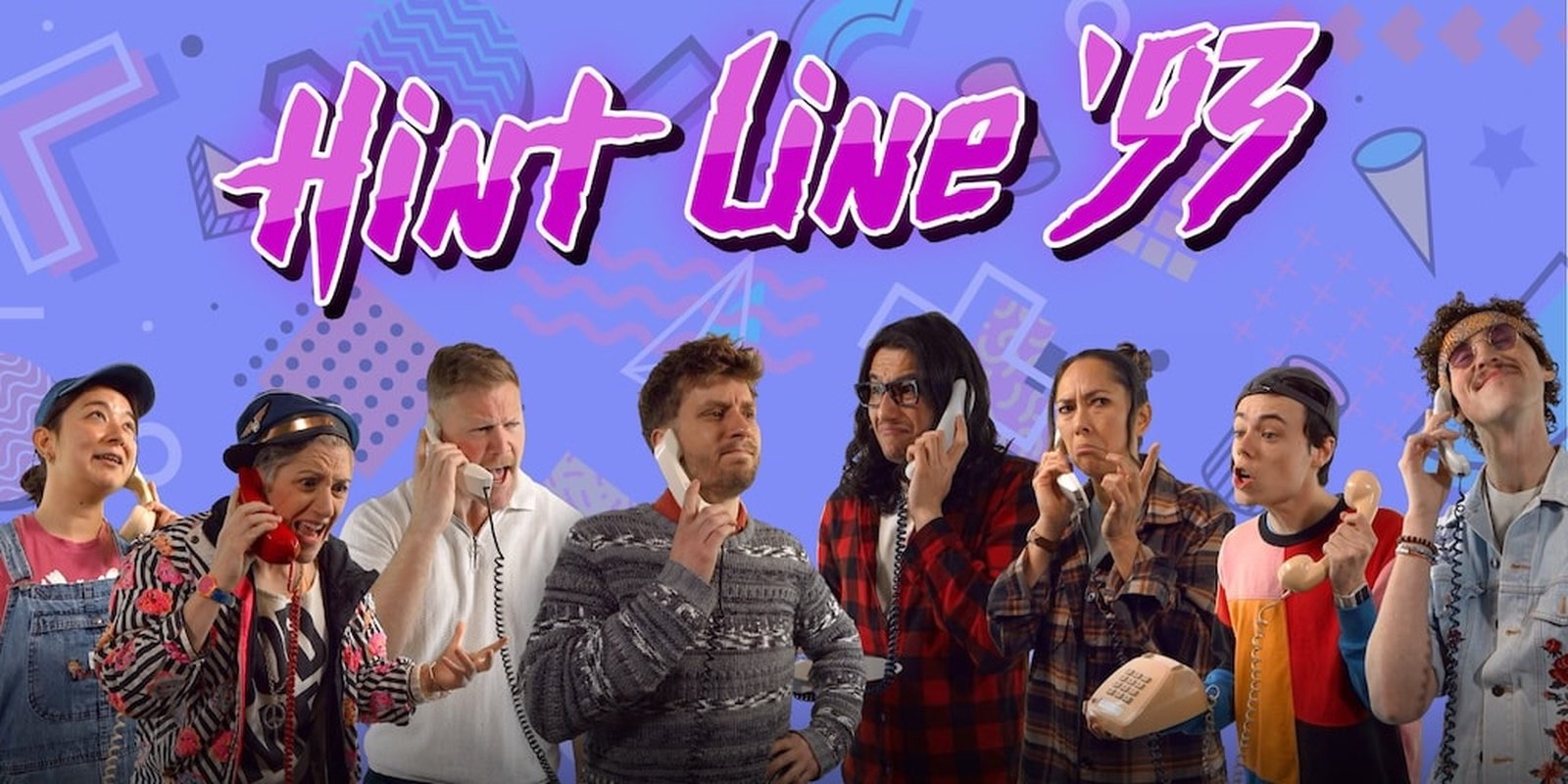
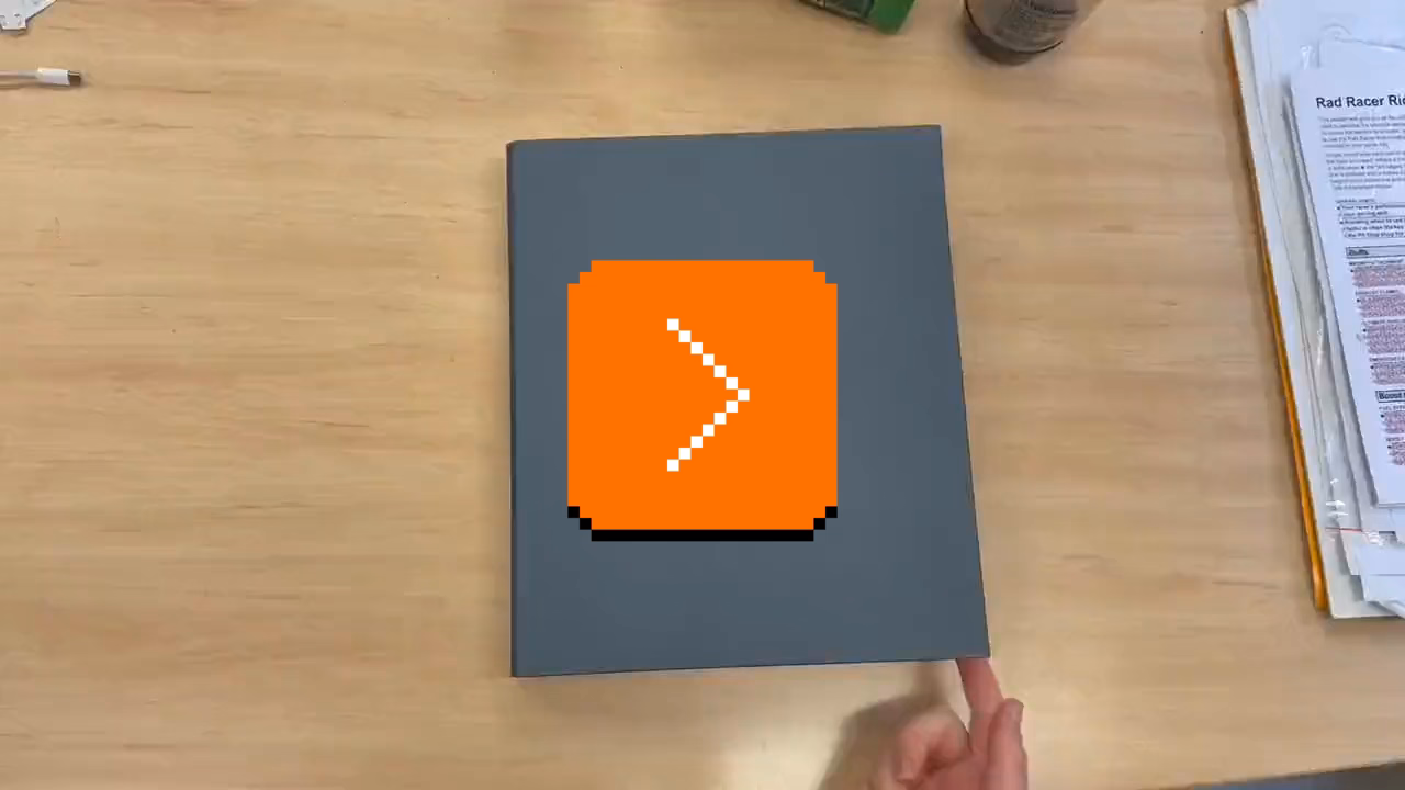
This is incredible – a story of a museum exhibit that replicated an experience of being a tech support person for a videogame company some time in the early 1990s:
You knew hint lines existed, right? 1-900 numbers, long-distance charges, hoping whoever answers actually knows what they’re talking about. They had incomplete documentation, contradictory notes, whatever the previous shift scribbled down. Nintendo’s Power Line is probably the most famous example. There’s a few great videos floating around about them.
The team invented a few new games (“We weren’t just making a game about hint lines. We were making the games that would’ve required hint lines to exist in the first place”), a few personas, and put together a 300-page realistic binder:
The entire story is so worth a read.
Looking back, we think ACMI said yes because we pitched infrastructure, not nostalgia. If you’re old enough, you probably remember that hint lines existed. We wanted people to experience what it was like to be part of that system.
[…]
Next time you tab over to a wiki page or watch a YouTube guide, spare a thought for hint line counselors of the early 1990s, armed with incomplete documentation, good intentions, and hope that the person on the other end was asking about a game they’d actually played. They were unsung heroes of gaming’s most chaotic era, and now, for a few minutes at least, you can experience their particular brand of helpful desperation firsthand.
The exhibit is still available at ACMI in Melbourne until March this year, “along with a life-size usable corporate cubicle (with a dead plant!) and matching hardware straight from the ’90s.”
You can also play it online, although the team warns: “Online is not the intended experience. Flipping through the physical artifact is half the fun.”
This, by the way, is why ACMI is one of my fav tech museums.
“See the picture of some guy in place of the X button?”
Monday, February 9
In 2009, there was a strange one-off build of Chromium with a guy’s face in place of the close box:
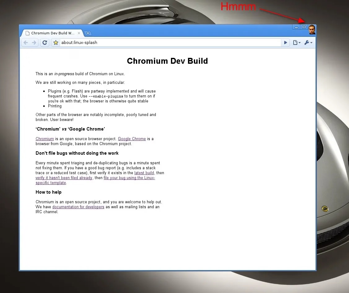
If I remember the story correctly, this was neither a bug, nor an Easter egg, but instead a joke’y punishment for not delivering the correct asset on time.
“These small, repeated experiences shape us more than we like to admit.”
Monday, February 9
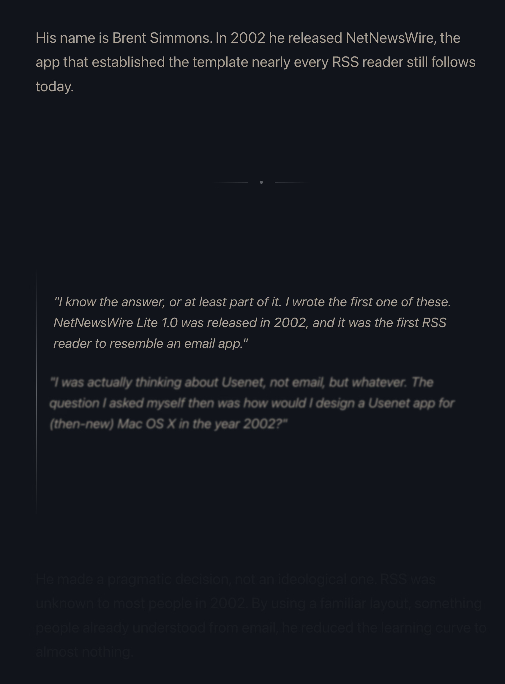
Many people already linked to Terry Godier’s thoughtful essay about email and RSS and the dangers of skeuomorphism by default:
Email is where the metaphor made its jump from atoms to bits. “Inbox” was borrowed legitimacy. It sounded like that wooden tray, so it inherited its psychology. But the wooden tray had a constraint: physical space. A desk could only hold so much. The digital inbox had no bottom. Still, mostly real obligations. Humans writing to you, expecting responses.
This all resonated me, although only to a point. I long stopped paying attention to those unread counters in Gmail and even though I know they exist, they feel wholly meaningless. And I personally would prefer my RSS reader to work more like email, because worrying that I cannot catch up if I wait too long and old entries get recycled is actually adding stress for me.
But I’m thankful for someone else pushing back on the barrage of red dots and fake urgency, and just thinking about it all is worthwhile. I’m very open to the idea of building something that eschews numbers to begin with, and for trying different operating models. (I deleted Threads from my phone after it was pushing me toward the algorithmic timeline filled with outrage, which was detrimental to my mental health.) I could even imagine choosing different RSS feeds to have different rules – this one “cannot miss,” the other one “casual.”
I also want to talk about the essay’s presentation.
The site makes heavy use of scroll effects. Okay, heavy subdued use, but like most of these, this is presentational rather than semantic. In this story at least, it feels a bit more thoughtful and it does feel like it enhances the experience and atmosphere, starting with the ticking number at the very top.
Yet, there are challenges. First, it does seem like there’s a lot of subtle movement going on and at some point that becomes a distraction. Also, I don’t know if it’s a bug or a particular stylistic choice, but things do not reveal themselves until they are almost off the screen. As an example, this is not a screenshot in the middle of animation – this is the page in a resting state, where the bottom is impossible to read:
This property, combined with the fact that all these are always reversible (something that even the recent Death to Scroll Fade page that ridiculed these avoided) makes the essay fiddly and harder to read than it needs to be.
To author’s credit, there is an alternative static version provided and linked to at the very top. But that version is also styled differently, and has more of a “terminal” look.
Thinking out loud and building a set of principles out of these observations, I would personally do it this way:
- a static version should be stylistically indistinguishable from the dynamic version
- ideally, there would be an easily accessible switch between motion/no-motion, similarly to how some sites allow you to switch to dark/light theme regardless of where you are in the story
- if the user specifies “prefer reduced motion” in accessibility settings, a static version should kick in automatically
- make the text effects finish as they scroll in, continuing the momentum on their own – don’t make them stop in the middle
- unless the animation is particularly important or gimmicky (by the way: I love a good gimmick!), going back and forward again should not replay it
“You’d get knuckle pain if you typed too much.”
Sunday, February 8
I’m slightly suspicious of this story that Unix commands were made so short (cp instead of copy, mv instead of move, ls instead of list, and so on) because the console keyboard had really unpleasant keys.
I imagine it must be a confluence of many things, not just this one. Shorter means faster even with amazing keyboards. Shorter also means the commands travel quicker over the slow modems of the era. The downsides were limited: the early nerdy user base of Unix could handle the extra confusion.
On the other hand – no pun intended – I typed on the keyboard on the picture and I can confirm it is absolutely, positively atrocious, with the tallest keys you have possibly seen:
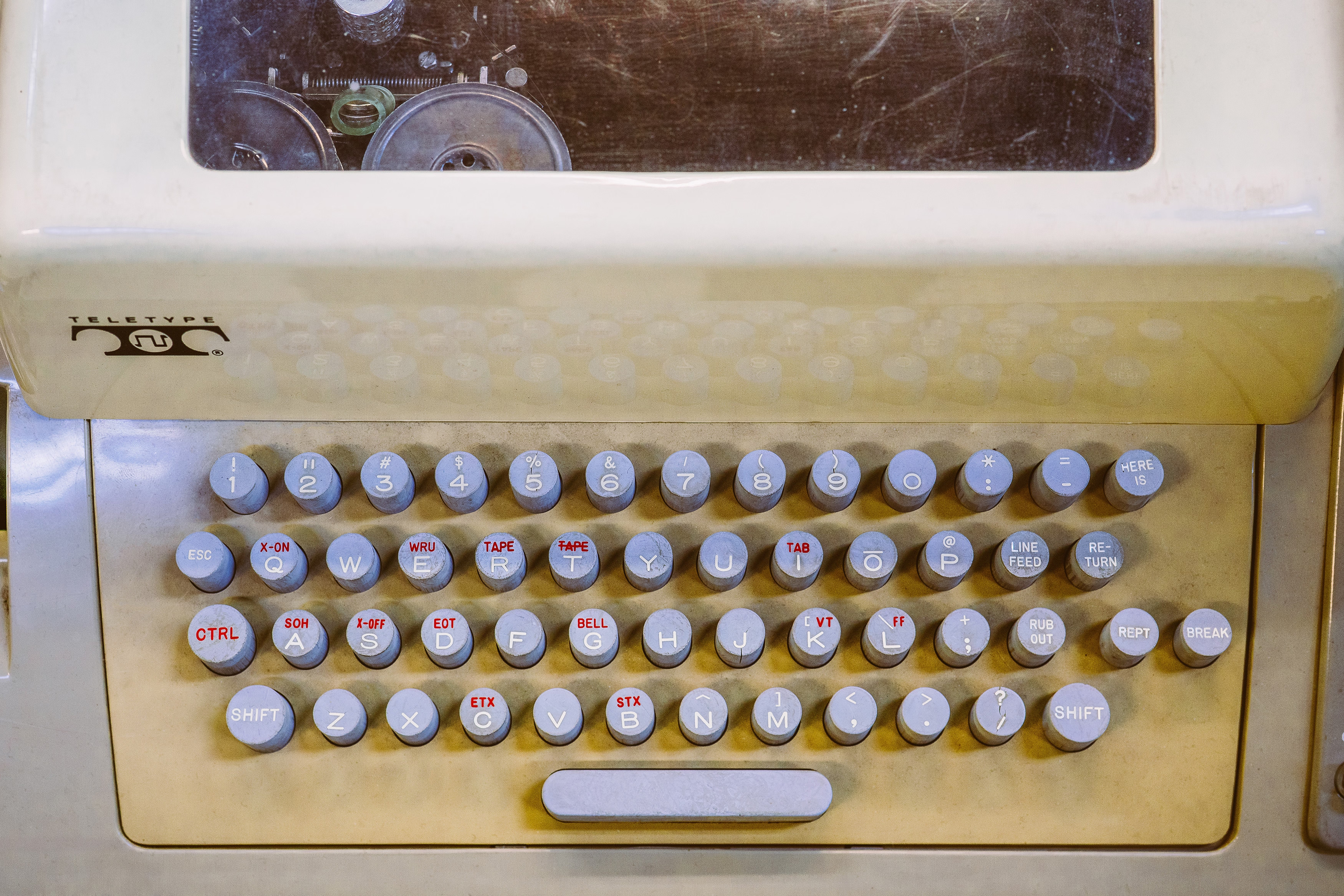
At any rate, it’s a good a reminder of the power of motor memory, and the difficulty of change management. Even the worst keyboards imaginable are so much better now, and the modems so much faster. And yet, the short and confusing commands remain to this day.
“Battered, bedraggled, inexplicably enthusiastic about a bargain flight to Bermuda”
Saturday, February 7
I thought about it on Masto in January (the responses are interesting if you want to read), but recently Robin Sloan eludicated it a lot better:
What makes the AI chatbots and agents feel light and clean, here and now in 2026? Is it an innate architectural resistance to advertising, to attention hacks, to adversarial crud? No — it’s that they are simply new! The language models in 2026 are Google in 1999, Twitter in 2009. Their vast conjoined industry of influence hasn’t yet arisen … though it is stirring.
And I believe their architecture makes them more susceptible to adversarial crud, not less. I suppose we’ll see.
It’s interesting and useful to imagine — really visualize — the chatbots and agents in ten years or twenty … barnacled with gunk … locked in a permanent cat-and-mouse game with their adversaries … just as a platform like Google is today. In 2036, you send your AI agent out into the internet, and it returns battered, bedraggled, inexplicably enthusiastic about a bargain flight to Bermuda.
This is no criticism — just an observation about the way things go.
The AI community tends to say “this is the worst this will ever be” in response to criticism, but in a very learned sense, in many aspects it is also the best it will ever be.
Or maybe, to steal words from another person smarter than me, Ted Chiang:
I tend to think that most fears about A.I. are best understood as fears about capitalism. And I think that this is actually true of most fears of technology, too. Most of our fears or anxieties about technology are best understood as fears or anxiety about how capitalism will use technology against us. And technology and capitalism have been so closely intertwined that it’s hard to distinguish the two.
I remember The Master Switch being an excellent book that taught us how to spot and anticipate these patterns. It might be worth a re-read.
“A demake of a remake of a demake of a game that is ostensibly a semi-sequel/semi-adaptation”
Saturday, February 7
I have zero nostalgia for Mario, and yet I was surprised how much I enjoyed this 30-minute video by Sheddux:
It serves as a bit of design history and even critique of early Mario games, and then in the middle it turns into an analysis of the Mario port on Game & Watch – an obsolete technology even in the 1980s, and something that could have been an easy cash grab, except someone cared.
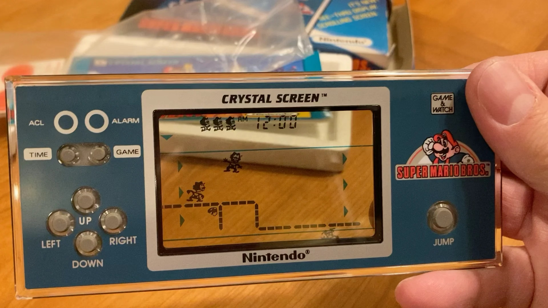
Translating Mario’s mechanics to a much inferior tech is an interesting design challenge, plus there’s just this universal pleasure of seeing someone go extra. And the video has a nice ending message, too.
The dusty menus of the world’s most popular desktop browser
Friday, February 6
This menu in Chrome feels like a surface running away from its creators:
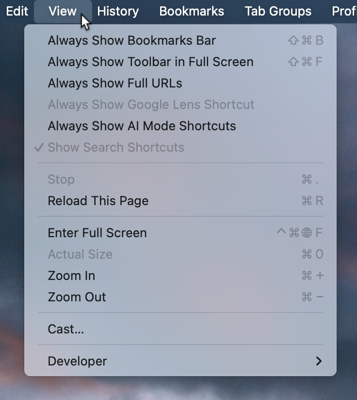
I think cerebrally I understand the subtle difference between Show and Always Show, but is that difference worth it? Because at some point the repetitiveness and heaviness of that top section is casting a huge shadow over the rest of the menu.
I have an internal rule for adding a new menu item that happens to result in the longest string yet: think about the volume – the literal amount of pixels – you’re adding to the whole surface. Big menus are scarier, wide menus separate items from their shortcuts, submenus become harder to jump into, and so on. The economy of words can benefit in more ways than just the obvious ones.
But what made me a little nervous were the two grayed out options. What does it mean for something starting with Always Show to be grayed out here? What does it mean for something to be grayed out and enabled? My guess is that someone wired these without thinking too much about all the states, but it results in a stressful tension. Software should be making it very clear about what is under my control, and what is not.
Lastly, and this is almost funny: Full Screen is either F or ⌃⌘F, in all standard Mac apps. This alone is already confusing, as is Apple’s entire horrible Globe/Fn strategy (this is a story for another time), and I verified they both work independently in Chrome. How did they get conflated into one shortcut from hell is probably a really interesting bug somewhere – but also a sign no one is seemingly paying attention.
“A number of hidden problems in the naïve approach”
Friday, February 6
A fantastic 37-minute video by Nic Barker that explains ASCII, Unicode codepoints, and their relationship to UTF-8, UTF-16, and UTF-32.
I learned a lot, and I never thought I’d walk away from the video appreciating the craft of text encoding. Also, really good storytelling!