“The fancy software figures it out for you.”
Welcome to this week’s digest of Unsung, a blog about software craft and quality. Here’s what was posted since last time:
View this issue in the browser with inline videos and better formatting
“The deeper you look, the more it starts to feel like a platform.”
Thursday, April 23
An interesting 10-minute video from gruz about Super Mario Bros. Remastered, a modern Super Mario fan remake with surprising depth that puts Nintendo’s own efforts to shame:
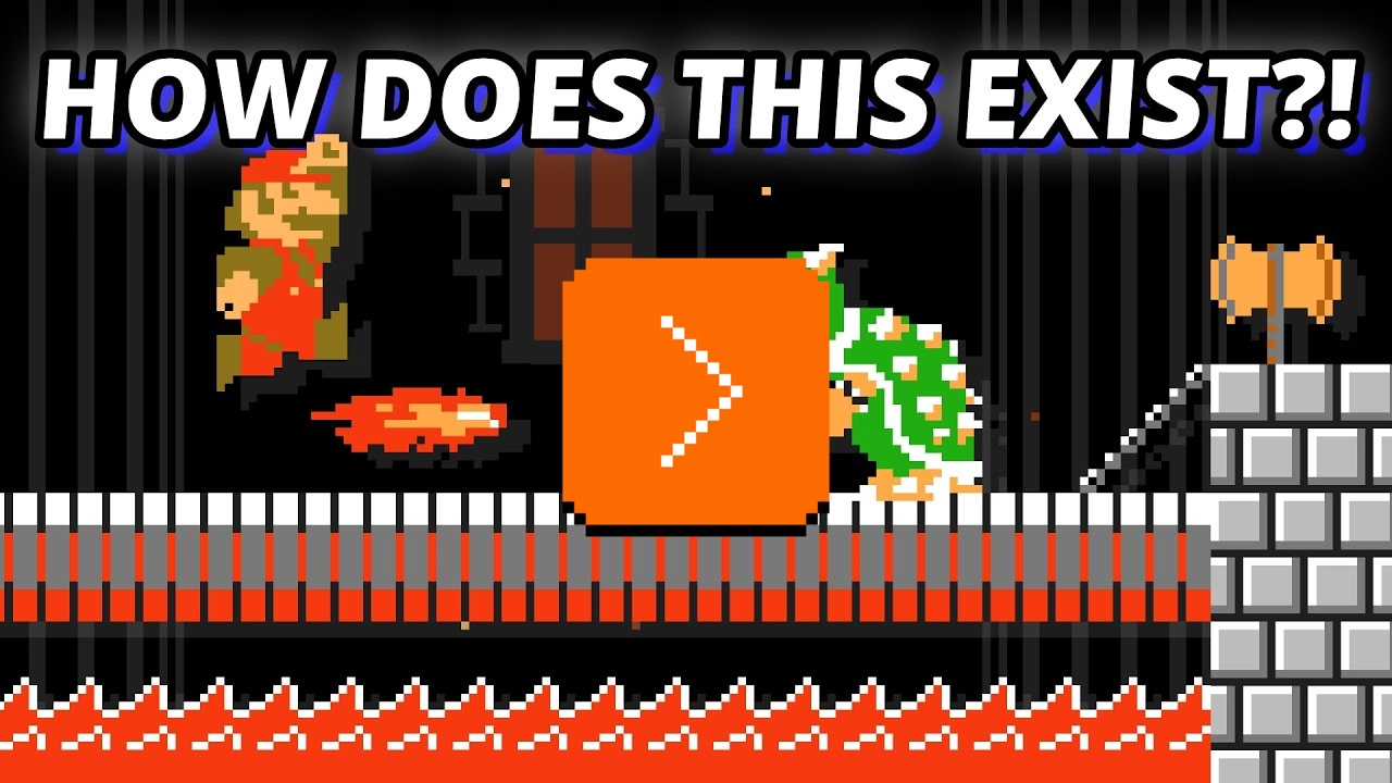
What I liked about it is that it’s wresting with the idea “How do you improve on something considered perfect?” and touches upon the important area we cover occasionally here on this blog: when is software finished?
There is also another interesting angle. Even though the game requires original game ROMs to work, it’s still in a very, very gray area:
[…] Once you strip it down, this thing is built around Nintendo’s world: the Super Mario Bros. name, the characters, the visual identity, the level concepts, the branding, the whole presentation. And the more ambitious it gets, the riskier it feels. Once a fan project starts offering not just a remake, but extra modes, editor tools, custom-level browsing, ratings, and a growing user-generated content scene, it stops looking like a small tribute and starts looking like something operating in Nintendo’s lane.
(I didn’t expect to see the original Super Mario game to come up so often on this blog – I just added a tag for it – especially since I don’t have any personal reverence for it. But it seems it’s Super Mario and Doom specifically that became timeless pieces of software that keep being resurrected, revisited, and remixed, over and over again.)
Out of touch
Thursday, April 23
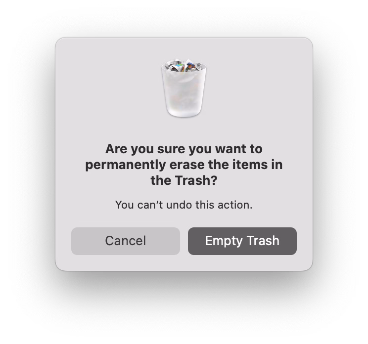
An interesting flavour of a molly guard that can only happen in onscreen interfaces is “occasionally moving things out of the way to mess with the user.”
The messing-with-the-user part is, ostensibly, for their benefit. Making something not appear in the usual position, or not behave the usual way, becomes a speed bump, cancels out motor memory, and forces a conscious reaction rather than flying through the interface on autopilot.
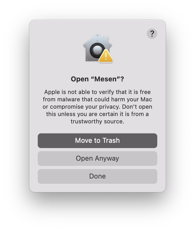
The simplest example is dialogs that ask about dangerous actions suspending the “default action happens when you press Enter” behaviour:
(There is a way to continue the dialog on the right using the keyboard alone – but it’s only via ⌘R and not the default, breezy Enter.)
Another version is swapping buttons or showing them in an otherwise unusual order:
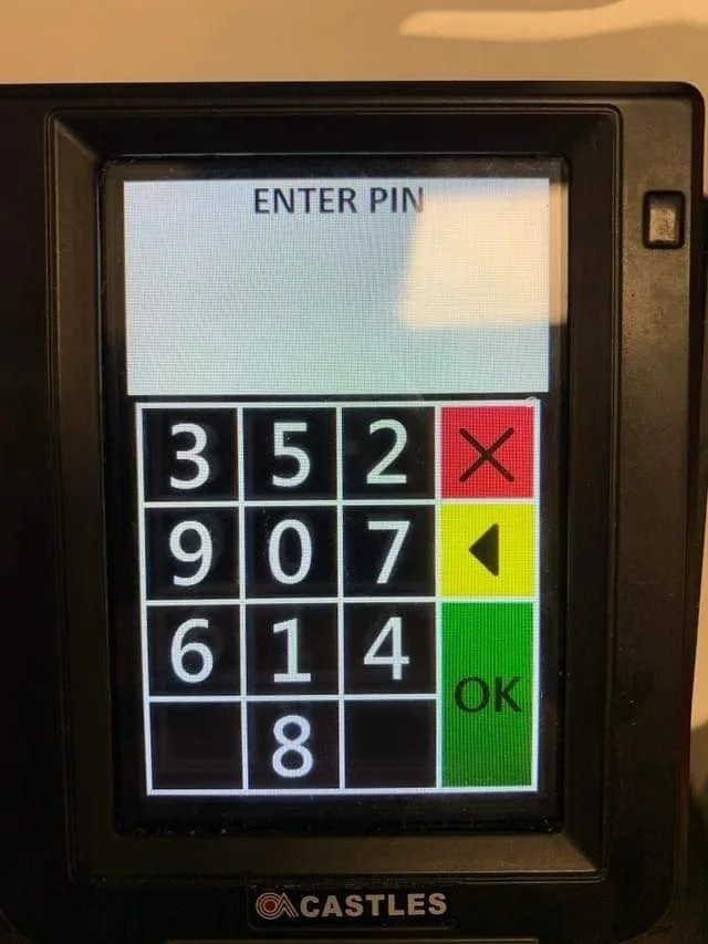
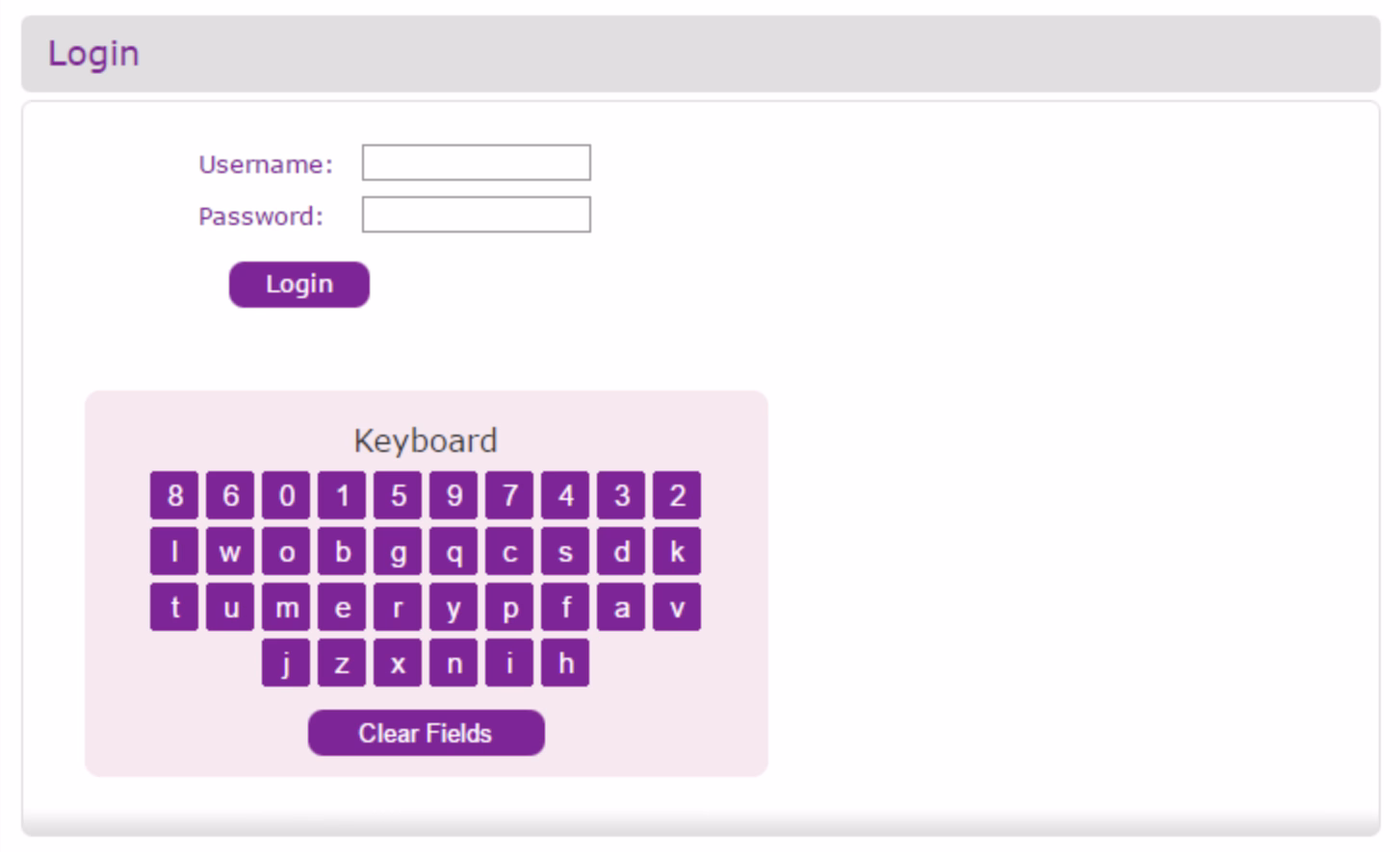
But remember when I said “can only happen in onscreen interfaces?” Well. The apotheosis of this very idea, spotted in a New York alley, proves otherwise:
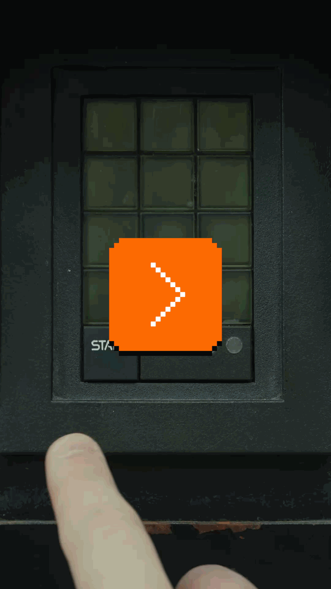
It’s a Hirsch ScramblePad, inconsistent very much by design, a login mechanism where every time the digits get put in a different place.
The idea is meant to help with two problems:
- It makes it harder for someone standing behind to learn your code from just watching your movements, as it abstracts the movements to be one step away. (The strange visual filter is meant to make the viewing angle as narrow as possible, too.)
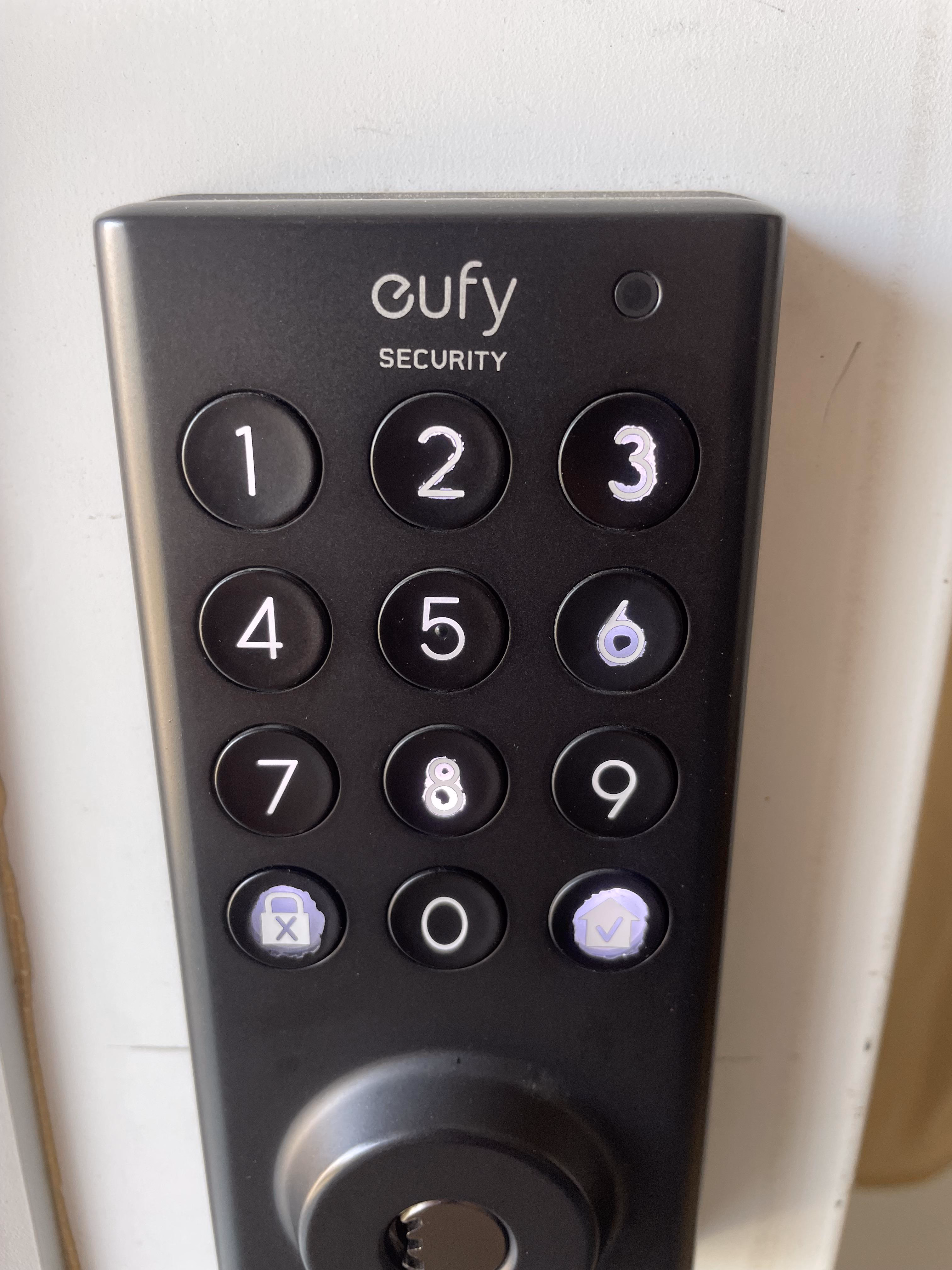
- It prevents uneven wear and tear of the buttons, which people could use to guess your code:
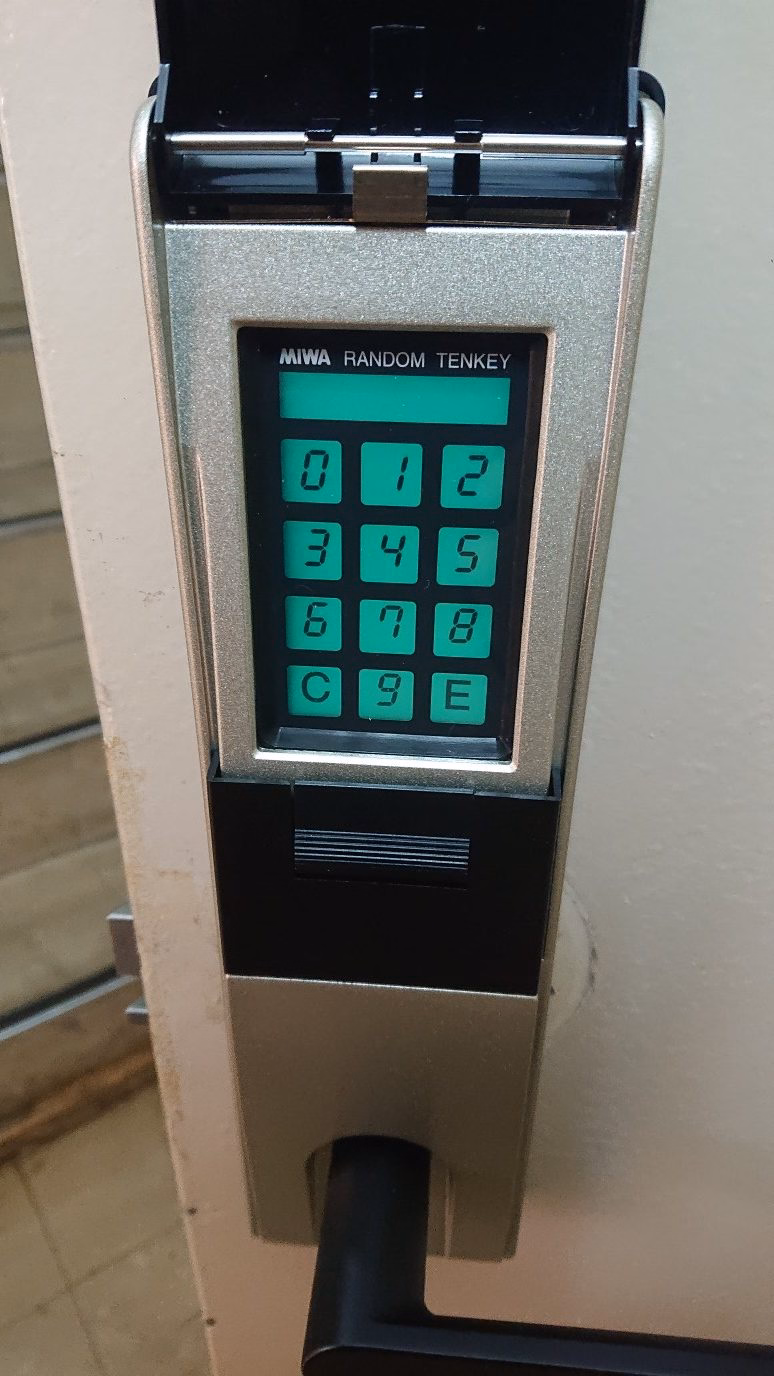
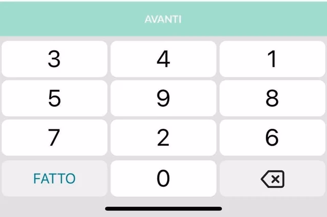
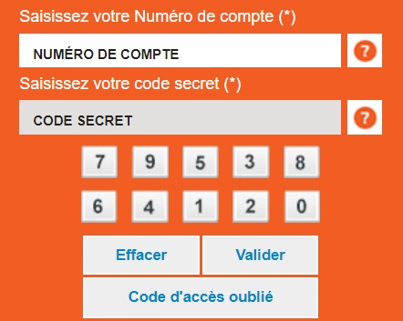
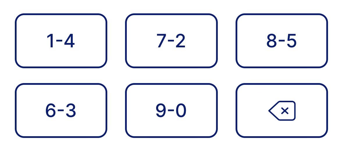
I understand “ScramblePad” was the original product (here’s the patent with some nice illustrations), and the name got genericized since. Here’s competition, MIWA Random Tenkey – once probably so much more futuristic, today equally quaint:
One can occasionally see more modern versions today:
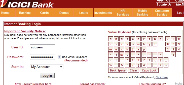
But back to our beloved screens, where some banking web apps copied the idea:
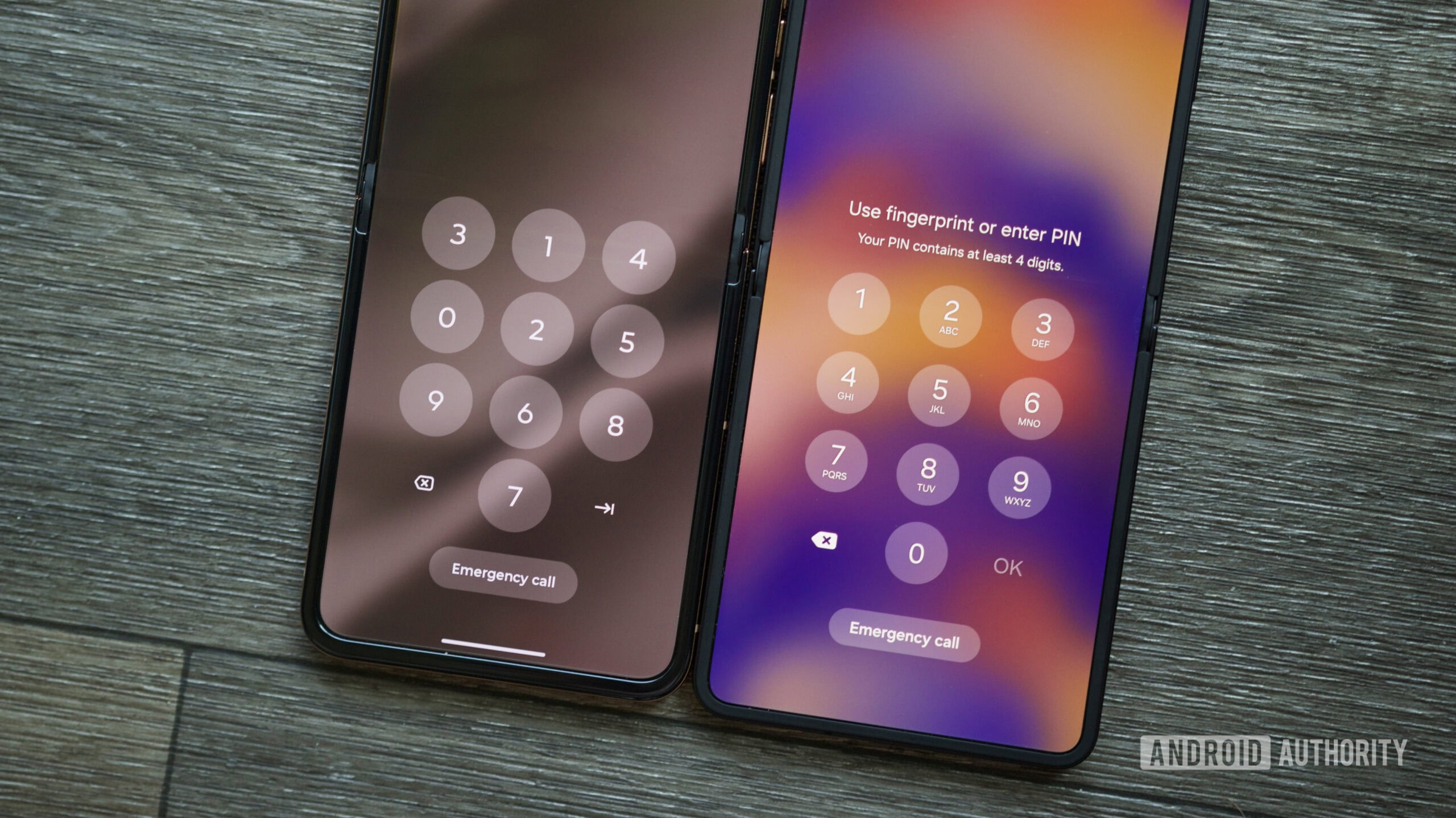
And even recently, Motorola touted it as a feature on their phones:
I’m not a security expert, so I won’t try to opine how effective those things are. I tried to research whether forcing a password out of motor memory – which these will accomplish – is ultimately better or worse, but a lot of the papers I found were inconclusive. (As always, some of the theoretically good ideas for security bounce off of human limitations and convenience: Forcing someone to remember a password might mean they will write it down somewhere, effectively making things worse.)
Recency bias (non-derogatory)
Thursday, April 23
I am a huge fan of all sorts of “recent” features in software; I think they’re extremely helpful in removing tedium, and thoroughly undervalued. A lot of our work is repetitive, even if it’s sad to admit.
I shared one example previously, and here’s five more.
1.
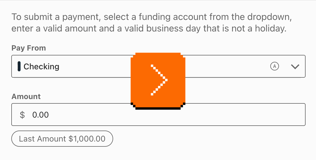
My bank’s website not only shows me the last payment I made, but also allows me to click to use the same number again:
2.
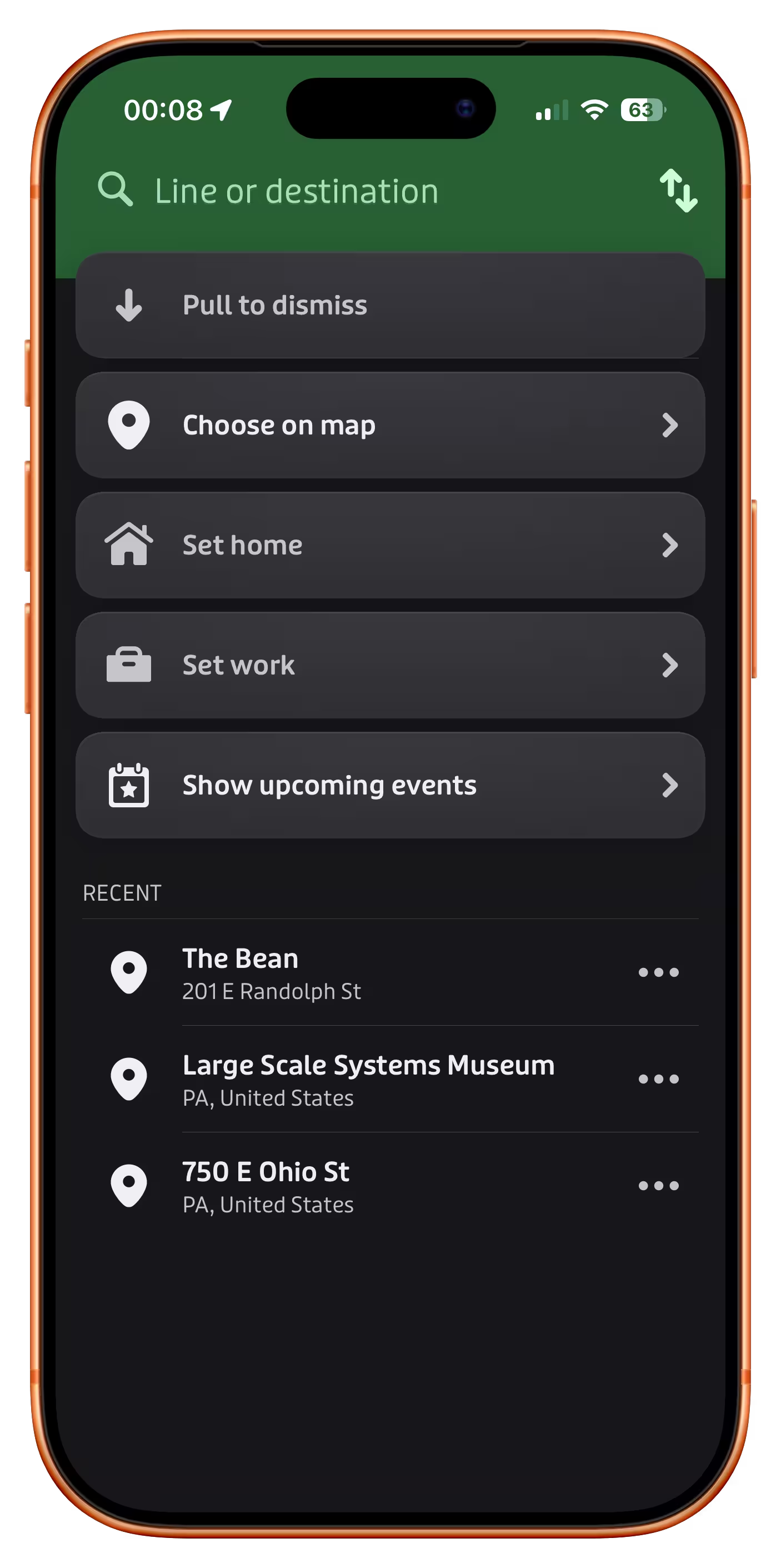
The app Transit has a nice list of recent destinations just below the main options:
3.
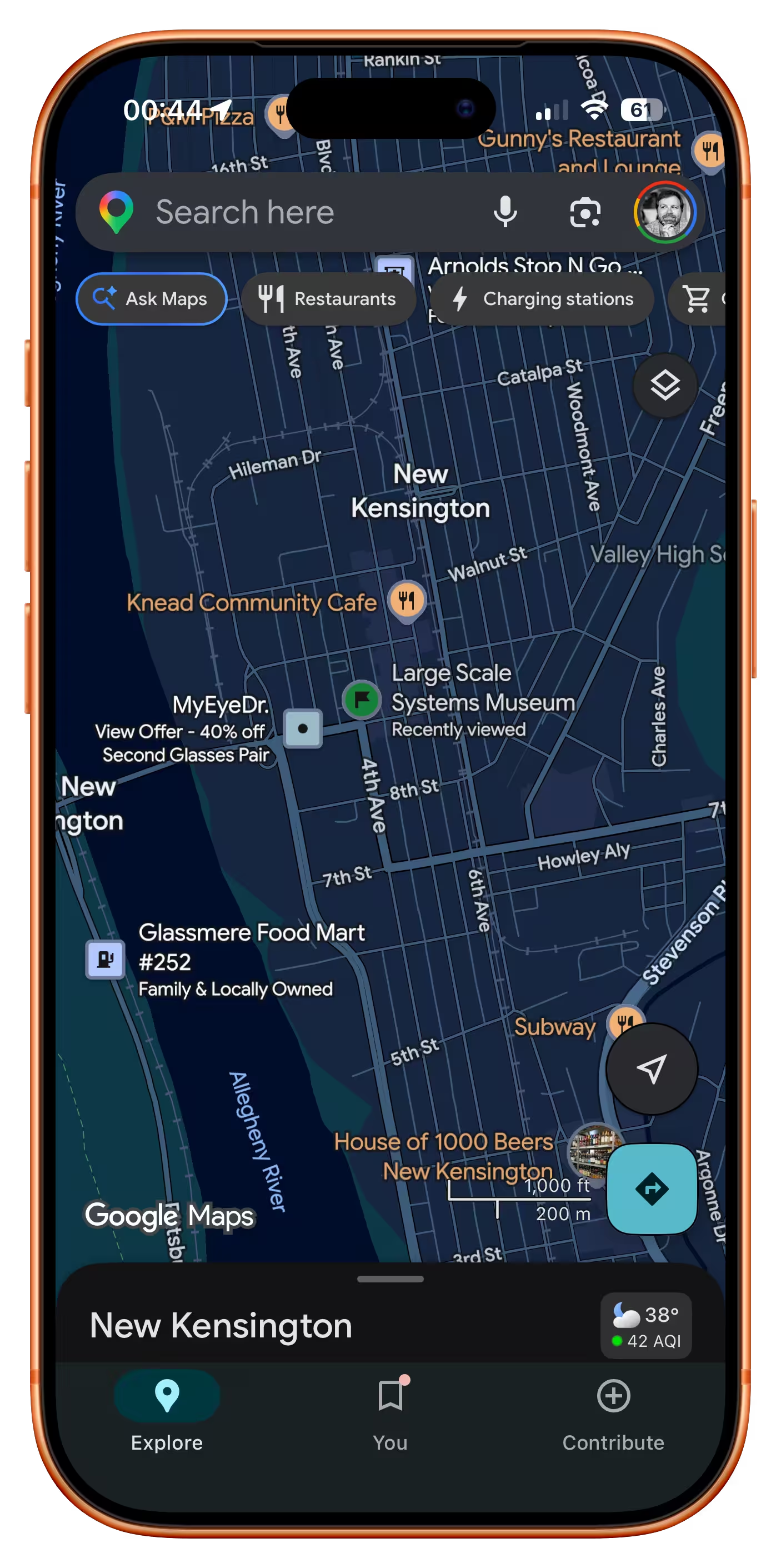
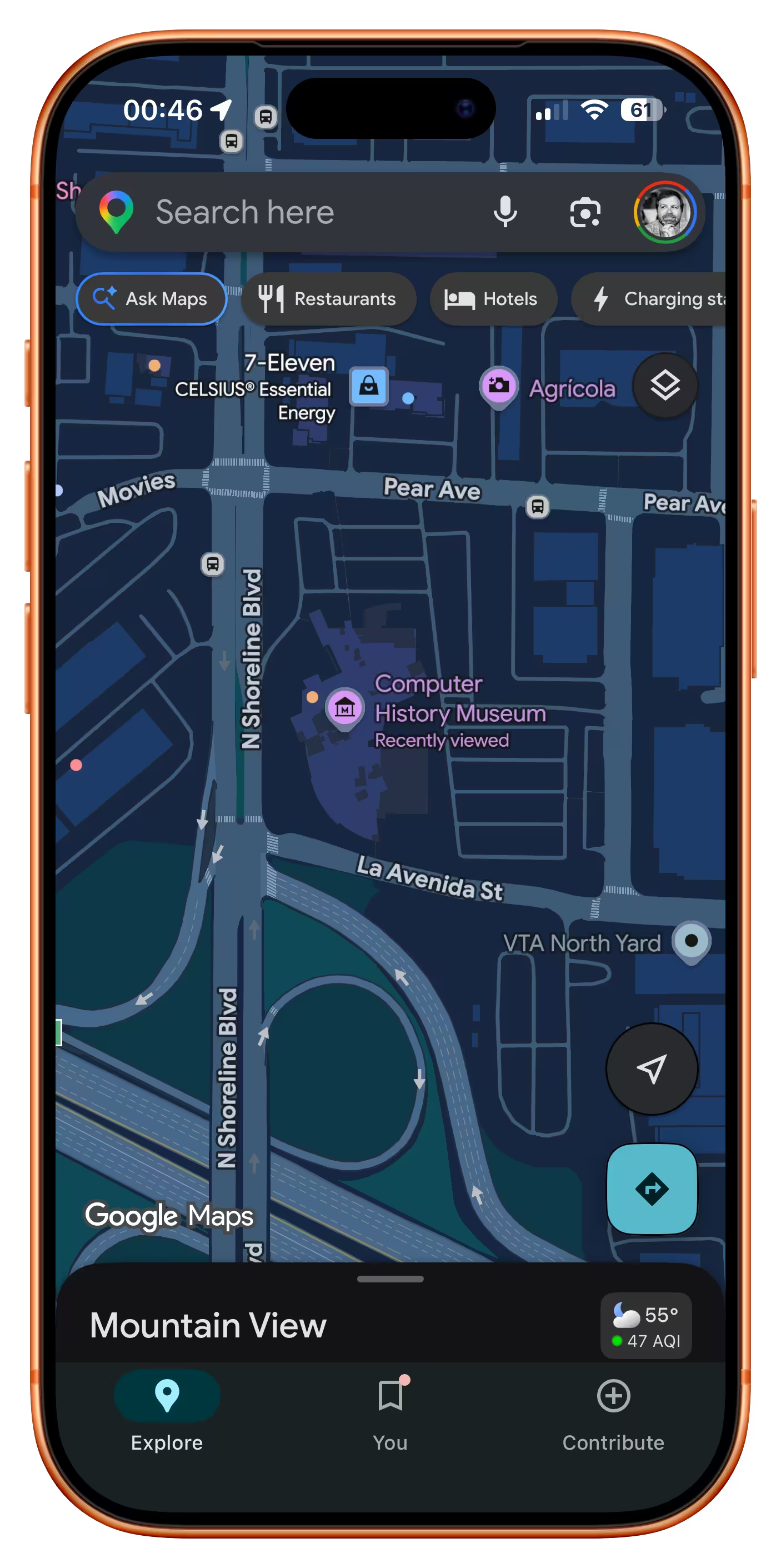
Google Maps promotes recently tapped-on items to be more visible than they would normally be:
4.
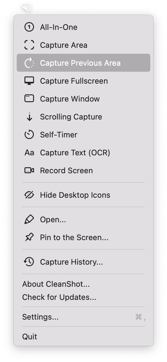
CleanShot X offers something I have always wanted from built-in macOS screenshotting – being able to capture with one keystroke the same area as I delineated last time:
5.
Google Pixel allows you to swap the current wallpaper and three previously chosen wallpapers easily:
What unifies all of these is that “recent” doesn’t live in a submenu somewhere, treated as a second-tier pathway. No, in all of these “recent” is embedded in the fabric of normal interactions, side by side with forward-facing options. I believe this is necessary for any sort of feature like this to be truly successful.
That last Google Pixel example also shows that “recent” isn’t only for repeating something faster – here, it becomes more of a “soft setting,” without introducing a lot more complex UI and interactions that a “real” setting might require.
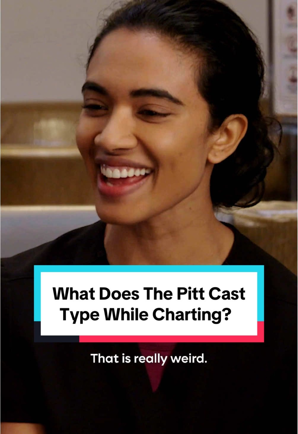
“You could key smash, and it would type out the thing.”
Wednesday, April 22
I can finally update my ancient WarGames reference – turns out the computers on the TV show The Pitt are also preprogrammed to show the right things on the screen regardless of what the actors are actually typing.
But you still need to flail your fingers in vaguely realistic ways, so the actors in this (spoiler-free) TikTok share their strategies:
“The fancy software figures it out for you.”
Wednesday, April 22
I want to tell you about something that might seem oddly specific and perhaps too technical, but a) at the end of it you will have a useful phrase somewhere in your brain that will pay off one day, and b) I swear I will make it worth your while.
Have you ever seen this problem?
The screenshot on the left is fine. But there is something wrong with the one on the right. In light mode, the shadow is wispy and weird. In dark mode, things are even stranger, and the shadow is almost… a glow?
I stumbled upon this problem occasionally for years now – there are a few screenshots on the blog with this weird problem, even – but it was never feeling like a deal breaker. However, I finally sat down to figure it out today.
Turns out, there are two kinds of approaches to alpha channel/transparency. The normal one we all know well is called “straight alpha.” But on the right, we were looking at “premultiplied alpha” – something entirely more complicated, where the background is baked into transparency for… reasons. Premultiplied alpha is conceptually – and often literally – dirtier, but it also has benefits: more flexibility, better filtering, sometimes better performance. As far as I understand, premultiplied alpha exists primarily in the world of video and vfx, but occasionally it rears its unconventionally attractive head in our boring static 2D world of screenshots, too.
In my case, I finally figured out this was happening whenever I’ve pasted the screenshot from the clipboard to Photoshop instead of Preview – for some reason, a screenshot then got an alpha channel premultiplied against white background. But I wouldn’t be surprised if it happens to some of you under other conditions, too.
So, “premultiplied alpha.” That’s the useful phrase. What was the other thing?
This is an absolutely hilarious 7-minute video by Captain Disillusion that talks about various challenges with the alpha channel:

Captain Disillusion (or, Alan Melikdjanian) is one of my favourite YouTube educators. His work is mostly debunking fake videos – his most well-known one is about the Cricet bracelet, although my personal fav is one about laminar flow – and they’re just constantly interesting and hilarious at the same time.
Disillusion also occasionally does a more straightforward “let’s talk about some technical aspects of video production” episode which he bundles under a “CD/” umbrella. Here’s a handy list of all of them:
- Intro to the whole series
- Aspect ratio
- Frame rate
- Resolution
- Interlacing (and addendum)
- Color
- Alpha channel
- Shutter speed
- Blur
I am sharing this list because you should watch them all. Most are <10minutes, they are consistently entertaining, and even though none of them are about UX design, there is enough overlap between the two universes that you will come out of it all a lot smarter.
Pragmatically, in my case, I searched for [premultiplied alpha] + [Photoshop] and quickly learned of a new-to-me menu option: Layer > Matting > Remove White Matte. It turns premultiplied alpha back to straight alpha, and fixes the screenshot.
Non-pragmatically? If you want to really understand premultiplied alpha, the last thing I can do is suggest another great internet educator, Bartosz Ciechanowski, who has a more comprehensive interactive web explainer. There will be math. There will also be sliders. You decide.
Got your back, pt. 5
Tuesday, April 21
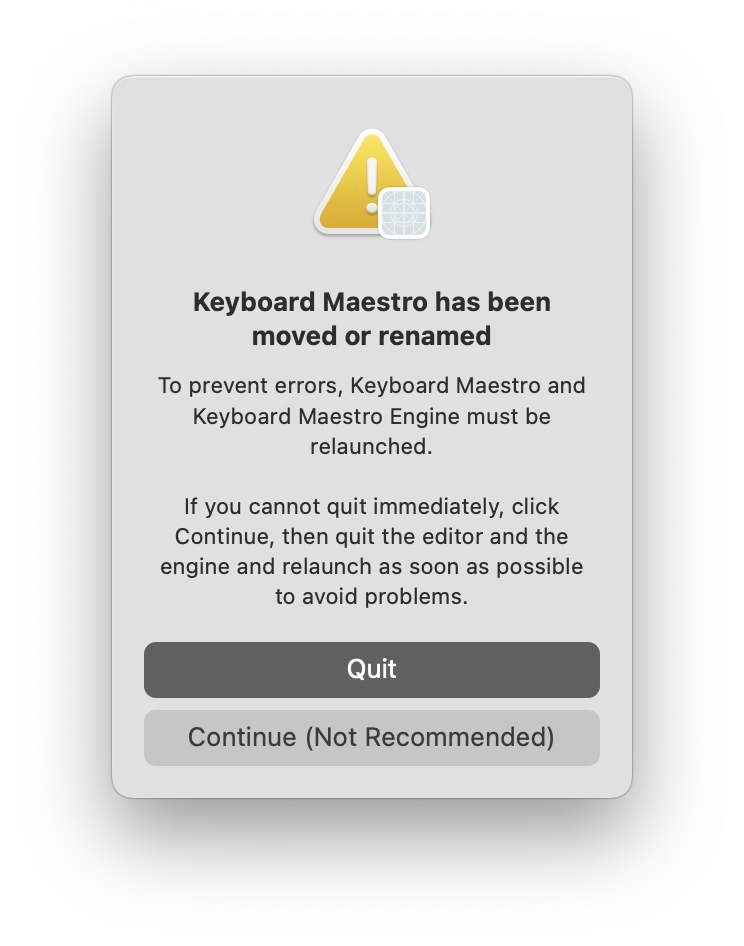
I moved Keyboard Maestro app to a different folder as it was running. I gather there must be some technical reason for the app to have to be power cycled, so I appreciated this warning, and the thoughtful bit of copywriting: “Continue” is caveated with “not recommended” so that you feel more comfortable choosing “Quit,” usually the less safe choice. I thought it was a good attempt to add the right scent to the strange options at a strange moment.
(This tradition has reportedly been started by a software company Rogue Amoeba, which wrote about it in 2019.)
If a feature falls in a forest
Tuesday, April 21
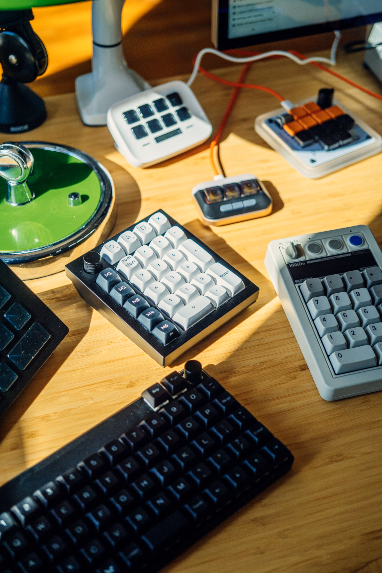
I have been working on an essay about how to gently get started and have fun with keyboard customization. I am finding myself surrounded by programmable keypads…
…and I am going out of my way to try various new shortcuts and automations, big and small, just so I can write a helpful article.
In Photoshop, one of the classic dialogs I use a lot when scanning things is brightness + contrast:
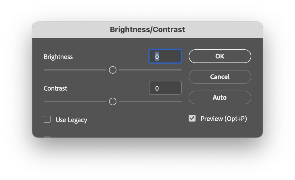
It doesn’t come with a keyboard shortcut, so I mnemonically assigned ⌘B (for Brightness) to it. ⌘B is easier than using your mouse to select a menu option, but still tedious in the long run; every time I have to input brightness and contrast numbers, then click on Use Legacy which is not sticky, then realize that enabling Use Legacy inexplicably resets the values I just typed so I have to input them again…

…which really isn’t as much fun 20th time in a row, 20th year in a row.
So imagine my surprise when one day I invoked the dialog, and it came up looking this out of the box:
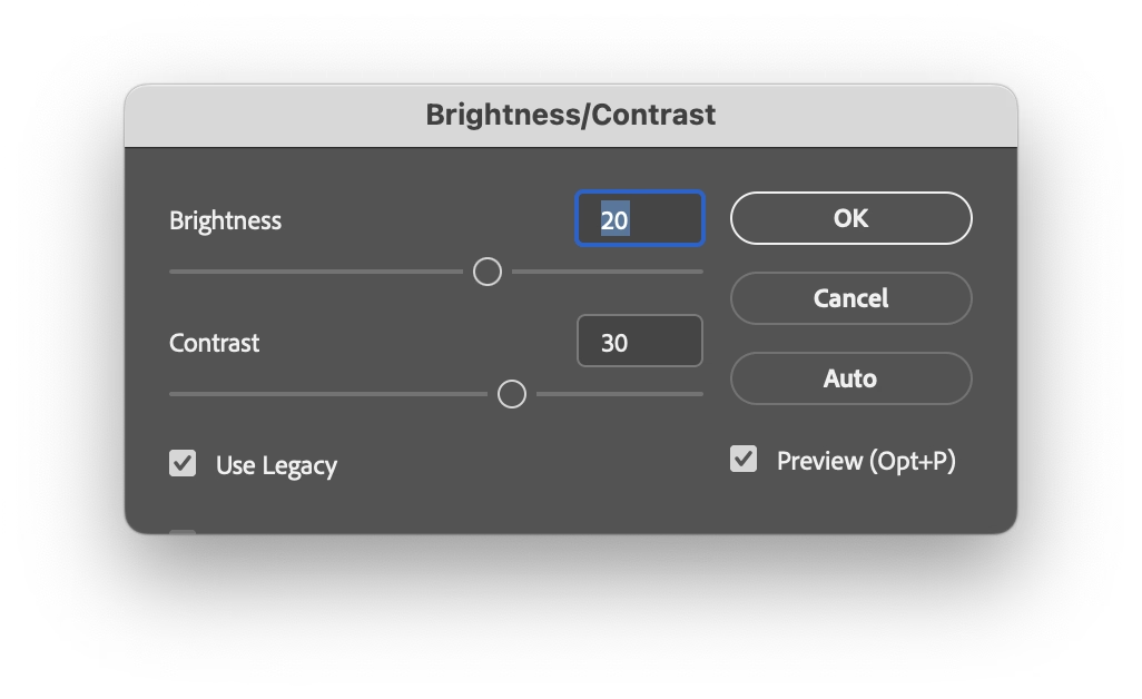
It somehow remembered the previous settings. How? Why? Was that a new thing? Was that a bug? Did the stars align or did they misalign? Figuring out how to make it do this every time would have save me so much trouble.
I dug deeper and figured it out. On the way to ⌘B, my fingers grazed the ⌥ key. This invoked a “use same settings as last time” option I never knew existed. This option would have been a lifesaver, has been there for god knows how long, and I just discovered it by accident. Moreover, it wasn’t just a feature of this dialog. One can hold ⌥ for many more Photoshop dialogs – a thoughtful system to make repeated tasks faster.
Damn.
This reminds me of something. I am curious if you’ve seen what I’ve witnessed probably ten times by now: once in a while my corner of the internet overflowing with awe when someone shares that on the iPhone, you can hold the spacebar and it functions as cursor control:
Inevitably, tons of people are always amazed and excited, proclaiming this is the best thing since sliced silicon wafers…
…and that always make me a little sad inside. Both this and my ⌥ story feel like failures of onboarding, of software growing with you and sharing its motor-memory nooks and power-usery crannies. If a helpful thing exists, but people don’t know about it, it feels worse than it not existing. Imagine all these interactions made more pleasant, all these hours saved, all these flow states undisturbed.
I want to spend more time on this blog highlighting onboarding and conveyance done well – I just shared a tiny example a few days ago – particularly since this feels to me like an area underinvested in. If you have a story of an app or a service doing this well, I’d love if you could share it with me so I can highlight it and we can learn from it.
“The system is so twisted that even Apple itself begs for these reviews from its own apps.”
Monday, April 20
A good post by John Gruber on Daring Fireball investigating why apps pester you with the annoying “enjoying this app?” windows and attendant semi-shady practices (choose 5 stars and you get sent to App Store, but choose anything less, and your review will get redirected to Mr. Dev Null).
The answer? They don’t really have a choice:
“[Steven Troughton-Smith:] Review prompts are the difference between a great app getting five positive reviews, and thousands of positive reviews. […]”
You have to play the game as the game stands, and Apple controls the game. And in the game as it stands, apps need 5-star reviews to gain traction in the App Store, perhaps especially so for apps in crowded categories. And for most apps, the only way to achieve that is through prompting. But the right thing to do, for the user experience in the app, is never to prompt for reviews.
I think it’s worth knowing about stuff like this for another reason. Absent understanding or institutional memory, any exception gets normalized and ceases being an exception. If specifically iOS apps have to do this for reasons explained in the post, this is still not an excuse for web apps or websites to indiscriminately pester people with prompts like these, too.
“It can be really disorienting to scroll around a fully monochrome hexdump.”
Monday, April 20
A fun blog post from Alice Pellerin – if you can color code source code, why not try that for hex data?
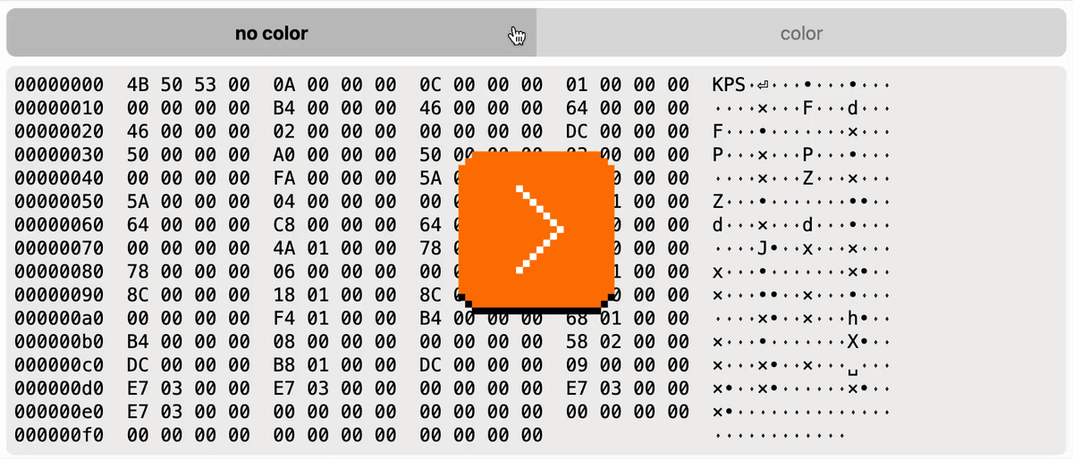
This pairs nicely with a previous post on Unsung in that it too actively investigates what makes for useful, not just “pretty” color coding.
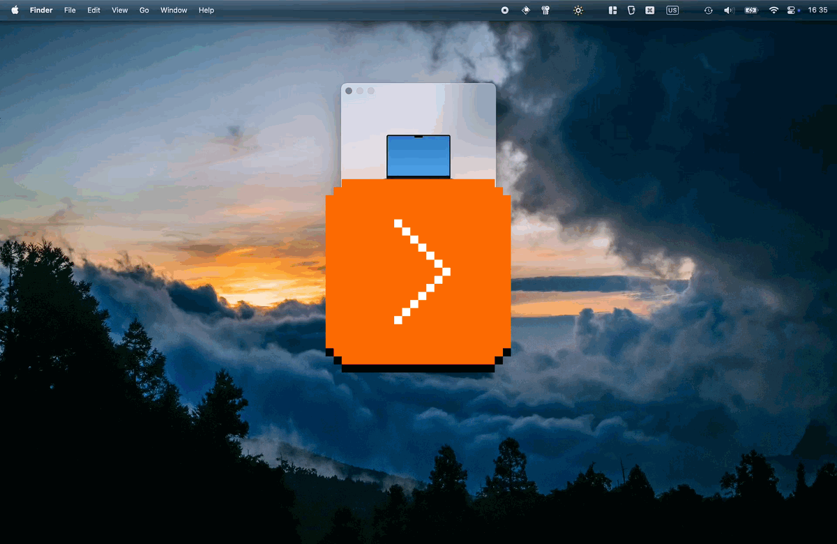
Raycast’s confetti cannon
Monday, April 20
Among many genuinely useful deeplinks you can use to control Raycast from afar in a simple way, I just spotted an interesting one:
raycast://confetti
This is what it does:
Despite it being a confetti cannon and nothing more, I think it goes deeper than stuff like e.g. Asana’s “celebration creatures”, and it deserves recognition for three actually kinda serious reasons:
- You can use it to quickly test whether you’re wiring deeplinks correctly. It’s clever the Raycast team put it at the beginning of the doc page; I think every API or a complex connection method should have a simple and delightful “success scenario” for two reasons: to celebrate you establishing that connection, and to have something so simple it cannot itself be misbehaving (this way you know that if you can’t get confetti to work, you for sure messed up something elsewhere).
- Once you know how to invoke it from far away, it’s also great for testing other things. Sounds can be muted. In JavaScript,
console.log()can be too buried if you don’t have a console open or visible, andalert(“Test”)is kind of depressingly old-school and steals focus. This HUD-like thing feels like a modern way of approaching this: You know you’ll notice it when it fires away, and it will leave no lasting damage. (Okay, fair, it does steal focus too, so that’d be one thing to improve.) - It has great production value. I hate perhaps all of Google’s search easter eggs because they’re built so extremely cheaply – try searching for “do a barrel roll” or “askew” (and no, I’m not going to dignify them with links because links are my love language). It’s rare and worth celebrating when something that could very well be an internal joke or a test feature for nerds is actually something you want to use because it’s so well-made. (See also: Linear’s internal testing UI.)
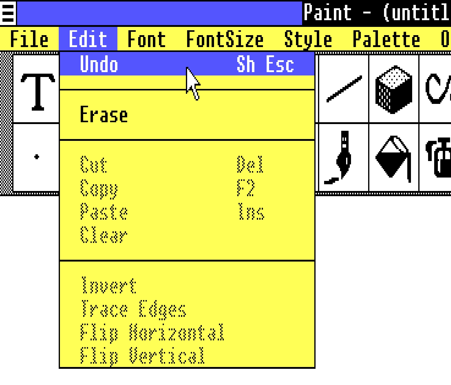
The edge not taken
Sunday, April 19
Did you catch one interesting bit in the last post? The undo shortcut in Paint and other apps in Windows 1.0 used to be Shift+Esc:
This reminded me that the classic Ctrl+Alt+Del shortcut was initially Ctrl+Alt+Esc. Except, people apparently invoked it a bit too often by accident, so it was split to require two hands for extra safety.
When you look at the keyboard for the original PC, it all makes sense. Esc is at the edge of the main typing block, and in line with all the modifier keys. It would make sense to build a system around this, and it’s interesting to imagine the Esc Kinematic Universe that never happened.
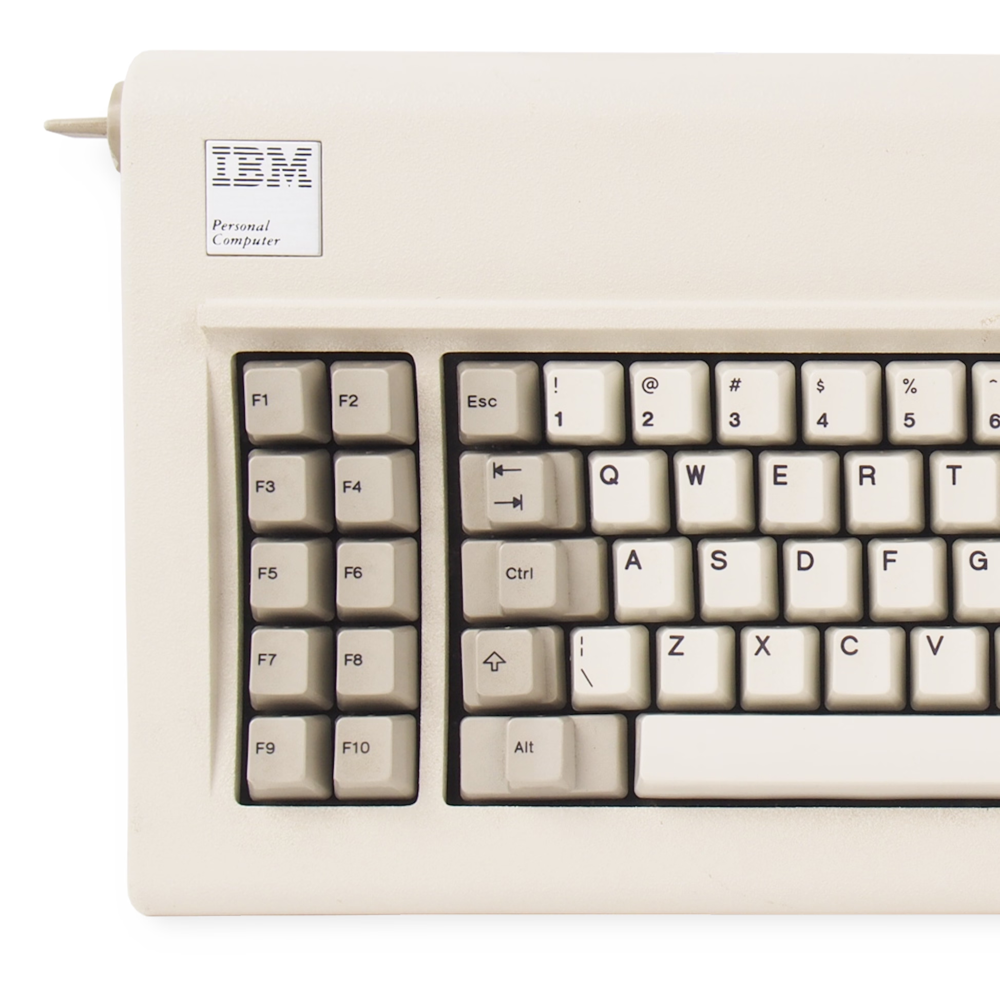
Don’t get me wrong: I think it’s good that it didn’t. ⌘Z or Ctrl+Z are much easier to get to than Shift+Esc, especially in concert with cut/copy/paste next door – that system introduced by Apple Lisa and Mac teams deserves endless trophies and infinite accolades. (In case you are curious, Windows 1.0 used Delete for Cut, Insert for Paste, and… F2 for Copy.)
But it has always been peculiar to me that Esc isn’t seeing more use. I see Backspace tasked with all sorts of modifier key combinations in various apps, but Esc – equally available on the other side, and even easier to target on some keyboards – is often left alone.
Poetically, given the beginning of this story, it was Mac that grabbed ⌘⌥Esc for force quit:
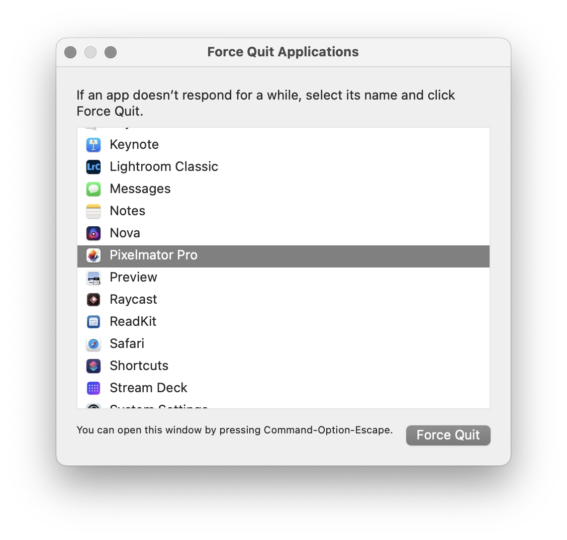
There is a nice thoughtful design element in that window that’s worth calling out: the hint line the bottom.
Why, of all places, would this window go out of its way to announce its own shortcut after you already figured out how to open it? I think this might be for a similar reason airlines repeat the safety announcements before every takeoff. If your computer goes haywire, if one of your apps starts hogging resources, if the UI slows down so much any action takes forever, it might benefit you if somewhere in the back of your head exists one small bit of information: “ah yeah, I don’t know how I know this, but I think I’m supposed to press ⌘⌥Esc now.”
“Area connected to a given node in a multi-dimensional array with some matching attribute”
Saturday, April 18
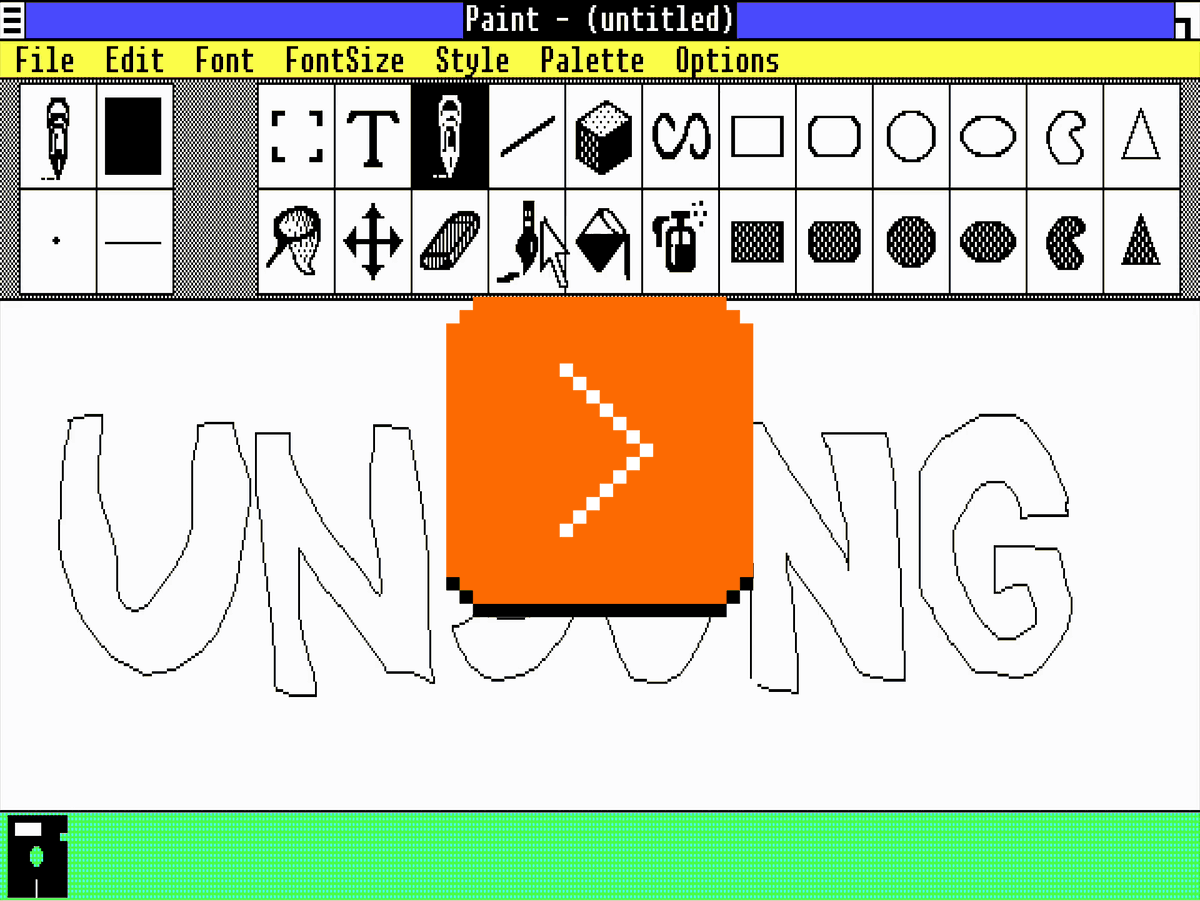
Anyone using old computers for graphics remembers the strangeness of “flood fill”:
The 1950s and 1960s computers were so sluggish that their consoles with blinking lights were not just for show; the operations were slow enough that you could still follow the lights in real time.
This ceased to be true soon afterwards. The microcomputer revolution temporarily reset some computing progress, but by the 1980s and 1990s more and more things were happening too fast for us to keep up.
But here (this above is Paint in Windows 1.0, and you can try for yourself in a browser!) was one example where you could still see an algorithm working hard. It was mesmerizing and educational, and it was a rare example where perhaps you didn’t mind the computer taking its sweet time. Even messing up like I did above – maybe especially messing up – ended up fascinating to watch.
Wikipedia has examples of a few different flood fill algorithms, which are even more interesting:
A few years later, Minesweeper had a very memorable flood fill, too (also available in a web emulator today):
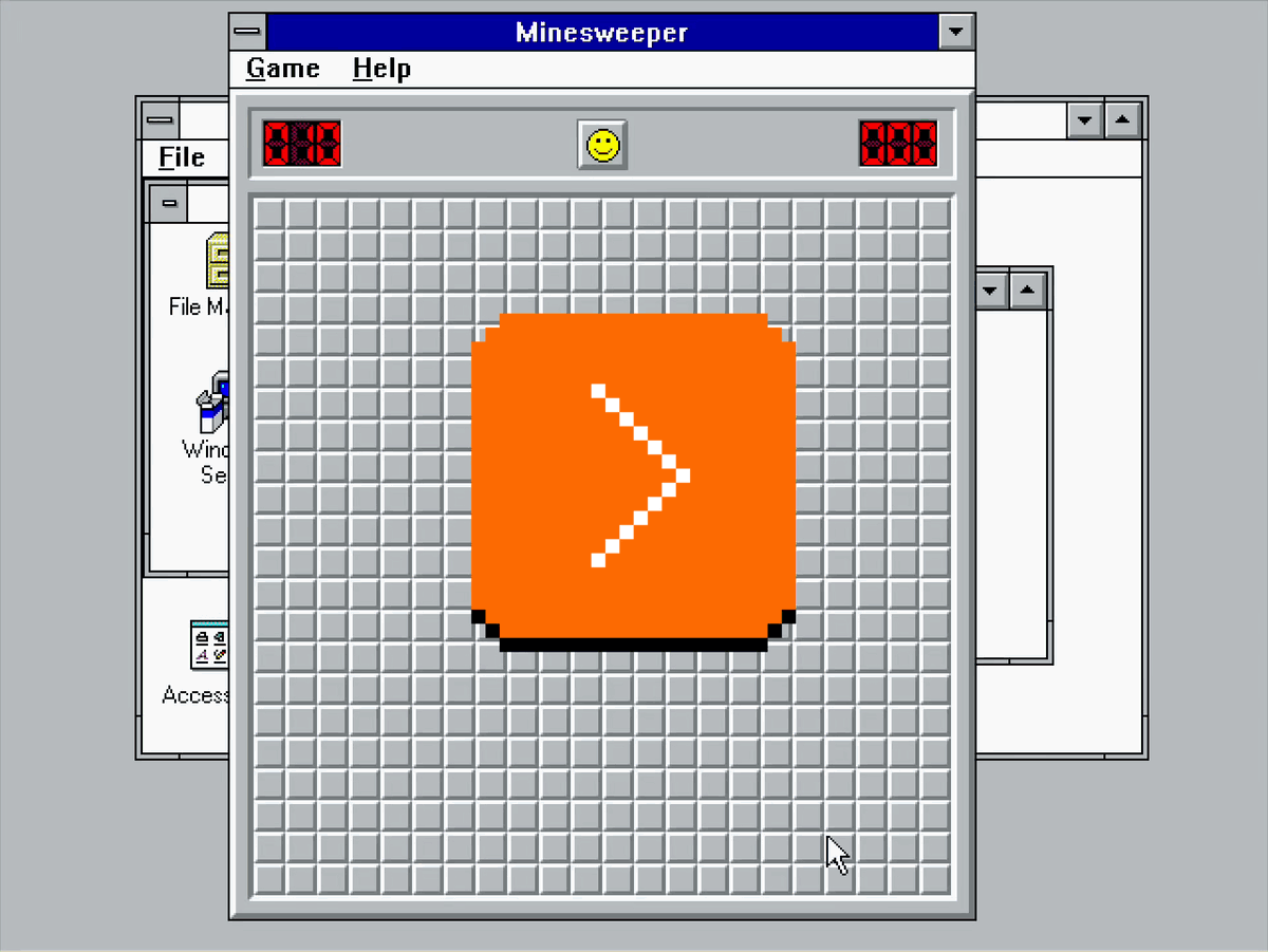
But by now Minesweeper retired from sweeping mines, and today computers are so fast that it’s hard for me to imagine any flood fill being anything else but flash flood…
…except this is what I just saw in Pixelmator on my Mac:
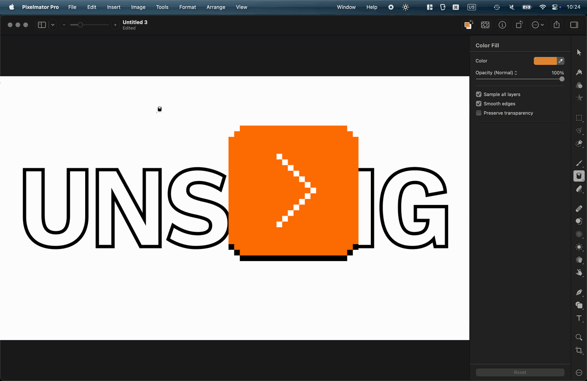
I don’t know if this is a nod toward a classic flood fill, or just a nice unrelated transition. But I found it genuinely delightful, and it’s fast enough that I would imagine it doesn’t bother pros who need to do it often.
Sometimes it’s nice to see a computer working when there’s a good reason; some apps like banking apps even insert artificial, visible delays after crucial operations, just so that the users feel comfortable knowing their important transaction went through.
But sometimes it’s nice to see a computer working for no reason at all.
“Use links, don’t talk about them.”
Friday, April 17
The classic – but still important – rule of web design says to avoid labeling links “click here.”
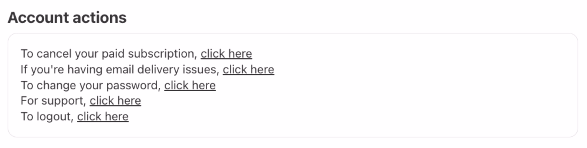
It’s one of the oldest web design principles. Tim Berners-Lee wrote about it in 1992; if you visit this link right now, it might be the oldest page you will have ever visited.
The gist of it is simple: the mechanics of following a link are not important, and should be replaced by something that can make the link stand on its own. This is important for screen readers, but also for basic scannability: a “click here” label has a lousy scent and requires you to take in the surroundings to understand what it really does. The rule is, in effect, a variant of “show, don’t tell.”
(In modern days, you can also add another transgression: on touch devices one cannot click, but only tap.)
There is a similar rule about button copy design. Button labels, too, should be self-sustainable. Below is a good example (just reading the button lets me understand what I’ll achieve by clicking it), juxtaposed with the bad one (“OK” is so generic you have to read the rest of the window).
Earlier this week, I was passing some train cars on my coffee walk, and saw this bit of UI:


Why are these okay, and “click here” is not? Here’s why, I think: Yes, the ultimate goal is to move a train car, or empty it, or send it on its way. But here, the mechanics matter, too. They’re dangerous. They require preparations. No one says “I’m going to open my laptop and start clicking on links,” but I imagine people say “we have to jack this car” or “we need to lift it.” Even “here” has depth: these are specific tool mounting points. Choosing the wrong “here” will have consequences.
But, going back to the web, avoiding “click here” in strings isn’t always easy. Imagine trying to put a link in the sentence “To change your avatar, visit the profile page.” I’m personally never sure how to linkify it well:
To change your avatar, visit the profile page.
To change your avatar, visit the profile page.
*To change your avatar, visit the profile page. *
Linking “change your avatar” seems correct since it points to the eventual outcome, but then it leaves the actual destination dangling and unlinked – like putting an accent on a wrong syllable. “Visit the profile page” is better than “click here,” but it’s still not scannable. Linking the entire sentence seems strange and complicated to me, and I also disagree with Tim Berners-Lee, who on the page I liked to above seems to suggest this should be…
To change your avatar, visit the profile page.
…just because this might make a user think there are two separate destinations and actions, and contribute a wrong mental model.
You could, of course, simplify this to “Change your avatar,” but while that would work in a UI string, it wouldn’t within a larger paragraph of text, or a blog post.