Unsung (Weekly Digest) logo

Unsung (Weekly Digest)

Archives
Subscribe
September 18, 2026

“Sweet, a whole website of video game menus”

Welcome to this week’s digest of Unsung, a blog about software craft and quality. Here’s what was posted since last time:

View this issue in the browser with inline videos and better formatting

Fingers don’t look around

Buttondown, a newsletter publisher, has a pretty standard CSS editor in its web app. You can edit the code and whenever you make any change, you can then press the Save button to make it go live:

The view also thoughtfully supports pressing ⌘S to do the same thing:

However, if there is nothing to save, ⌘S is ignored by the CSS editor, and falls back to the browser’s handling:

It feels logical: ⌘S only takes effect when the button is visible, otherwise why would a user press it? In a front-end sense, it might even seem thoughtful. We all witnessed web apps that greedily took over some interaction, and broke things in the process. Hell, I did that myself.

In theory, you – the user – take a careful look at the state of things, notice the button, and then press ⌘S.

But in practice? It’s none of the above. Fingers don’t look around. You might press ⌘S twice in a row. Or after an undo to an already saved state. Or after pressing another key so light it didn’t register. Or after just sitting down to an open document that’s already saved. Or because you weren’t sure if the previous ⌘S press worked. Or just to be sure. You might not know why, and you might not even notice. The beautiful raw power of ⌘S as a citizen of motor memory is that it’s automatic, mindless, habitual.

That’s why ⌘S here needs to be both deterministic and idempotent – if there is nothing to save, don’t let it fall back to the browser, don’t show an error message, don’t beep at the user. Just ignore the keystroke altogether.

It might feel funny, but there are tons of places in the UI that already look the other way. Off the top of my head:

  • if you center align already center-aligned text in any writing app, the app just ignores you,
  • if you press ⌘A to select all more than once, no one’s shouting at you,
  • if you try to click a disabled button, the click gets quietly swallowed.

It gets a lot more interesting than these, but we’ll talk about more examples of “finger logic” in future posts.

Friday, Sep 11 / #errors / #flow / #keyboard

Key symbols we lost to time, pt. 1: The PC side

Various old computers had their keyboards adorned with unique symbols. Companies like Commodore, Atari, Amiga, or even – in its previous life – Apple chose to put their company logos on keys, and there were other weird and obscure keys on weird and obscure keyboards.

But it was Apple’s recent push to move their American keyboards closer to European ones by embracing more iconography, that made me think of forgotten key symbols less obscure, ones that belonged to platforms we still use today. Even on a Mac and a PC, some key symbols didn’t make it to modern times. So let’s start with the PC side today since that part of the story begins earlier, and do Macs in a follow-up post.


For a lot of 20th century, a battle has been waging between words and icons. The first salvo was, perhaps, the traffic signs: America embraced words, while Europe relied more on iconography. (As much as it looks like it, it wasn’t just “graphic design vs. not”; as a more varied continent with multiple languages, Europe needed a more universal visual language to help people travelling between countries.)

This, I understand, trickled down to other things: home electronics, and computers. There, iconography also made it easier to make one product and sell it across all of Europe, without needing to introduce many SKUs with different UI strings.

Here’s IBM’s Selectric typewriter from the 1970s, in its American and European edition:

(If you’re curious, Express was a very fast Backspace, and Index moved the page down; both were prototypes of future arrow keys.)

Here’s IBM’s early 1130 computer from 1965, which sported an unusual symbol for space:

Some IBM laboratory and scientific computers in the 1970s and even 1980s veered more into iconography, but eventually lost to text as office PC users rejected the confusing symbols. As their keyboards morphed into PC/​Windows keyboards we know today, only four symbols remained and gained widespread acceptance: ⇧ for Shift, ↵ for Enter, ⇥ for Tab, and some version of an arrow for Backspace.

But let’s look at those old symbols, some beautiful, all interesting.

The two symbols below are: Print Screen (old CRT screen turning into a piece of paper) and key beep – popular when people were transitioning from loud typewriters to relatively quiet keyboards:

Here – on the front edge of the also-forgotten Reverse Tab – you can see Home, which historically meant “return to the top left corner of the screen” and sometimes even “clear the screen”:

But my favourites were these, for Insert (gone from many keyboards) and Delete (still with us):

These seem inspired by proofreader marks, which feels wonderfully old-time’y:

Building on that visual language, one could also find invert/​reverse video, blinking, and underline:

And this absolute beauty, which I think meant “delete word”:

The really interesting thing is that some of those symbols survive today in Unicode. I spotted at least ⎀, ⎃, ⎁, and ⎂. The last two are for contiguous and non-contiguous underline, which I feel is a story I should know, but I don’t (yet).

Friday, Sep 11 / #history / #iconography / #keyboard / #localization

“Sweet, a whole website of video game menus”

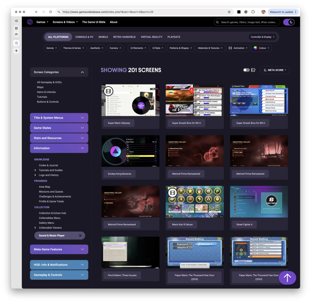
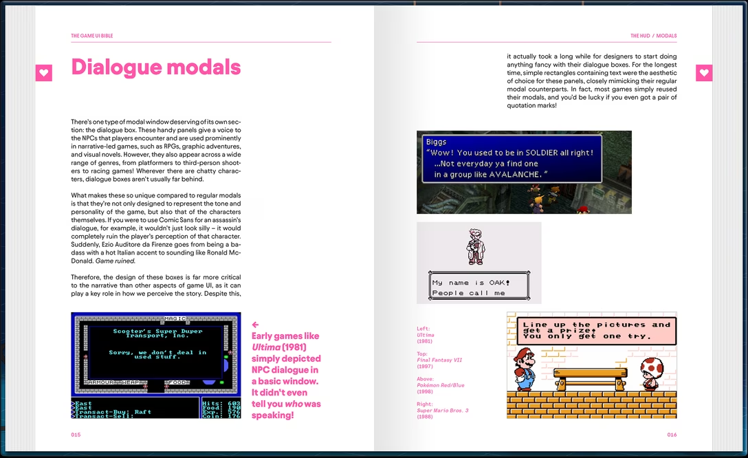
The Game UI Database is a website that covers the interfaces of almost 2,000 games via over 75,000 screenshots.

It has meticulous information architecture, so you can jump into specific sections, for example:

  • Game difficulty settings
  • Game UI settings menus
  • Modals and pop-ups
  • Loading screens
  • HUDs
  • Minimaps

Even if games and productivity software seem worlds apart – the creator of the site, Edd Coates, calls himself “UI artist,” which is not a title I’ve ever seen in my line of work – I’ve long thought games do some things better, and these can be an inspiration.

The database was started by Coates a few years ago. This launch article on Mashable has this interesting passage:

The site is relatively short on context, with only the collections of screenshots gathered under different tags for visitors to go on. […]

That’s the site working as intended. As Coates explained: “It’s useful for designers to identify recurring and pre-established patterns in successful titles when building their own interfaces.” Added context isn’t necessary because the contrasting approaches evident in each image is the whole point.

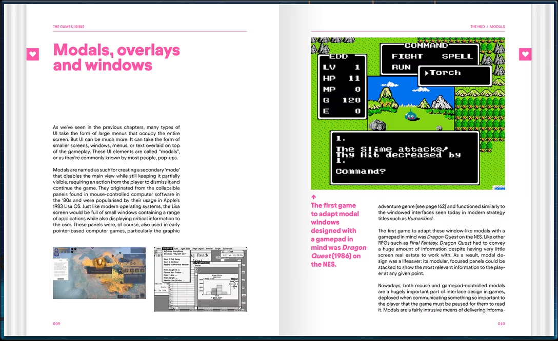
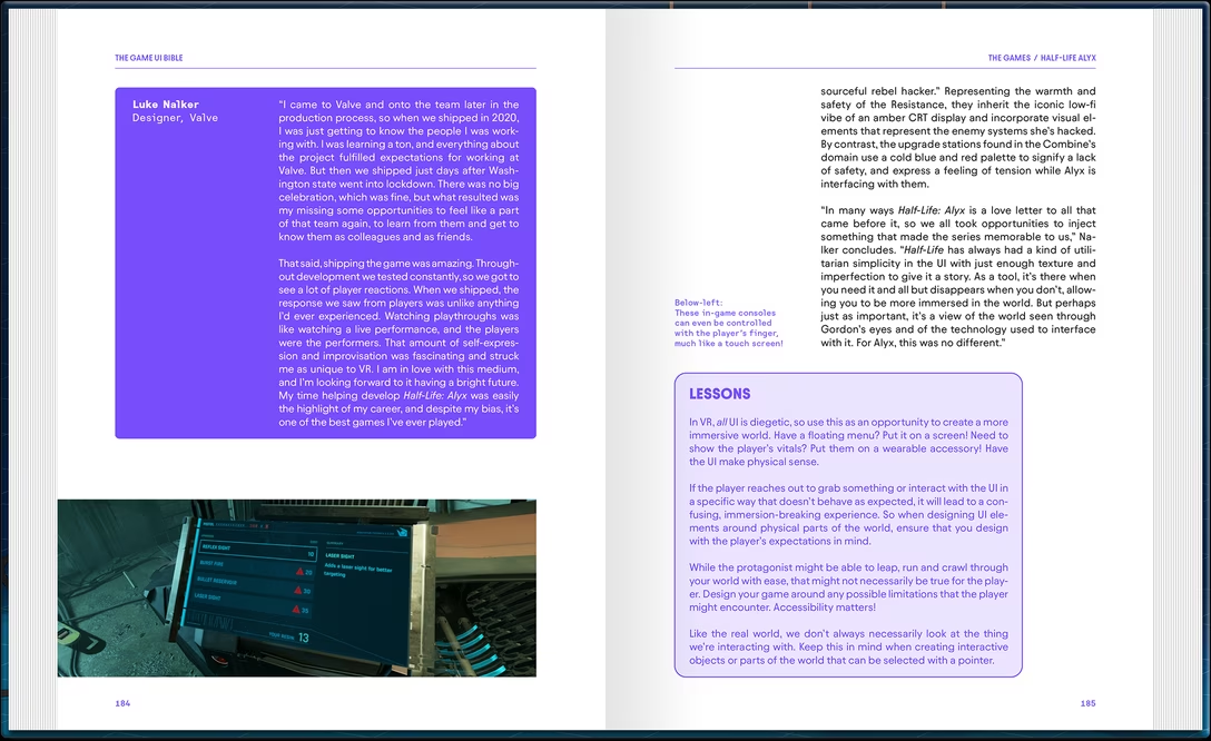
Needless to say – I mean, you know this after spending 12 seconds on this blog – I disagree. But it seems the author does too, since he’s working on a book called The Game UI Bible, to be released in the first half of 2027:

I recognize the volume is pricey and last time I was excited about a book, it turned out to be quite a disaster. The Game UI Bible book also touts a lot of interviews with UI artists, and I find these to be a mixed bag in practice; it’s really hard to interview people in a way that yields something interesting.

But still, I am excited again – and if you’re not, the Game UI Database is worth checking out.

The title of the post comes from a different blog post about the database.

Saturday, Sep 12 / #book / #games / #interface design / #reference

Nova’s menu wayfinding

From its earliest days, Macs established an interesting convention – whenever you press a keyboard shortcut to an action that’s somewhere in the app menu, the matching top menu label blinks quickly.

Here, I am pressing ⌘A (Edit > Select All), followed by ⌘+ (Format > Font > Bigger), and then ⌘B (Format > Font > Bold):

I believe this is meant to help you connect those things better. While you might not need a map to an action that you already know a shortcut for, it might be helpful to tell you where to find other actions like it.

I imagine it also helps whenever you press a wrong shortcut – or the right shortcut under the wrong circumstances – and you want to deduce what happened or what was meant to happen. Knowing roughly where a command “lives” makes it easier to open the menu and look for it, even if you might still have to dig through all the submenus.

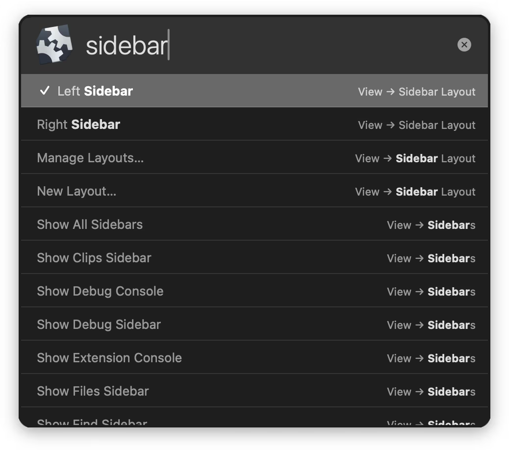
Recently, I spotted the programming editor Nova use a parallel technique. In its command palette, commands show their keyboard shortcuts, but if they’re hiding in submenus – also their menu path:

I am not sure how effective either of these techniques is, and both can feel a bit… busy. But they also appear thoughtful – we’re all spatial creatures, and I imagine helping you visualize a map of the entire system of commands can make it easier for you to feel at home.

Saturday, Sep 12 / #keyboard / #menus / #nova / #onboarding

“Act now, apologize later”

Fighting games require rather precise timing: the action is frenetic, the inputs rapid, and the outcomes can be determined by what players do down to – sometimes – individual one-sixtieth-of-a-second frames.

This is fine when you play locally, but gets infinitely more tricky the moment you attempt to kick someone’s more remote ass:

Information sent to your opponent may be delayed, arrive out of order, or become lost entirely depending on dozens of factors, including the physical distance to your opponent, if you’re on a WiFi connection, and whether your roommate is watching Netflix.

The part of the game responsible for dealing with networking is called netcode, and the classic solution to the lag problem has been delay-based netcode with a sort of lowest common denominator approach: if your opponent has a “ping” of 50ms, your actions will also be delayed by 50ms, to ensure fairness.

It’s not that hard to imagine many problems with this idea. Lag comes and goes but the game doesn’t smooth it out, the play feels like jello with even an okay connection, and the game occasionally freezes, waiting for a suddenly dropped connection to resume, not knowing what to do in absence of information.

That’s why within the last decade, what gained popularity is a new kind of netcode called rollback netcode, which operates by… lightly predicting the future. Most of the time, within a reasonable lag, the game will feel as fast as a local game to both players – and even when the optimistic prediction doesn’t match what eventually happens in reality and the code has to roll it back, visibly, in front of a player, the change might be too small to notice and only rarely it’ll result in rubber banding.

Core-A Gaming has a great video about specifics of rollback netcode:

It covers a lot of stuff, including nuances like drift and design decisions that game makers might want to incorporate to soften rollback netcode’s most annoying side effects. (Also, the guitar playing bit at 0:22 is absolutely brilliant.)

The video is largely based on an earlier essay by Infil, which has even more details (audio!) and which I excerpted above.


It’s not just videogames. When Apple announced in 2019 that they reduced the latency when using their iPad Pencil from 20ms to 9ms, they didn’t hide that they had to peek into the future as well:
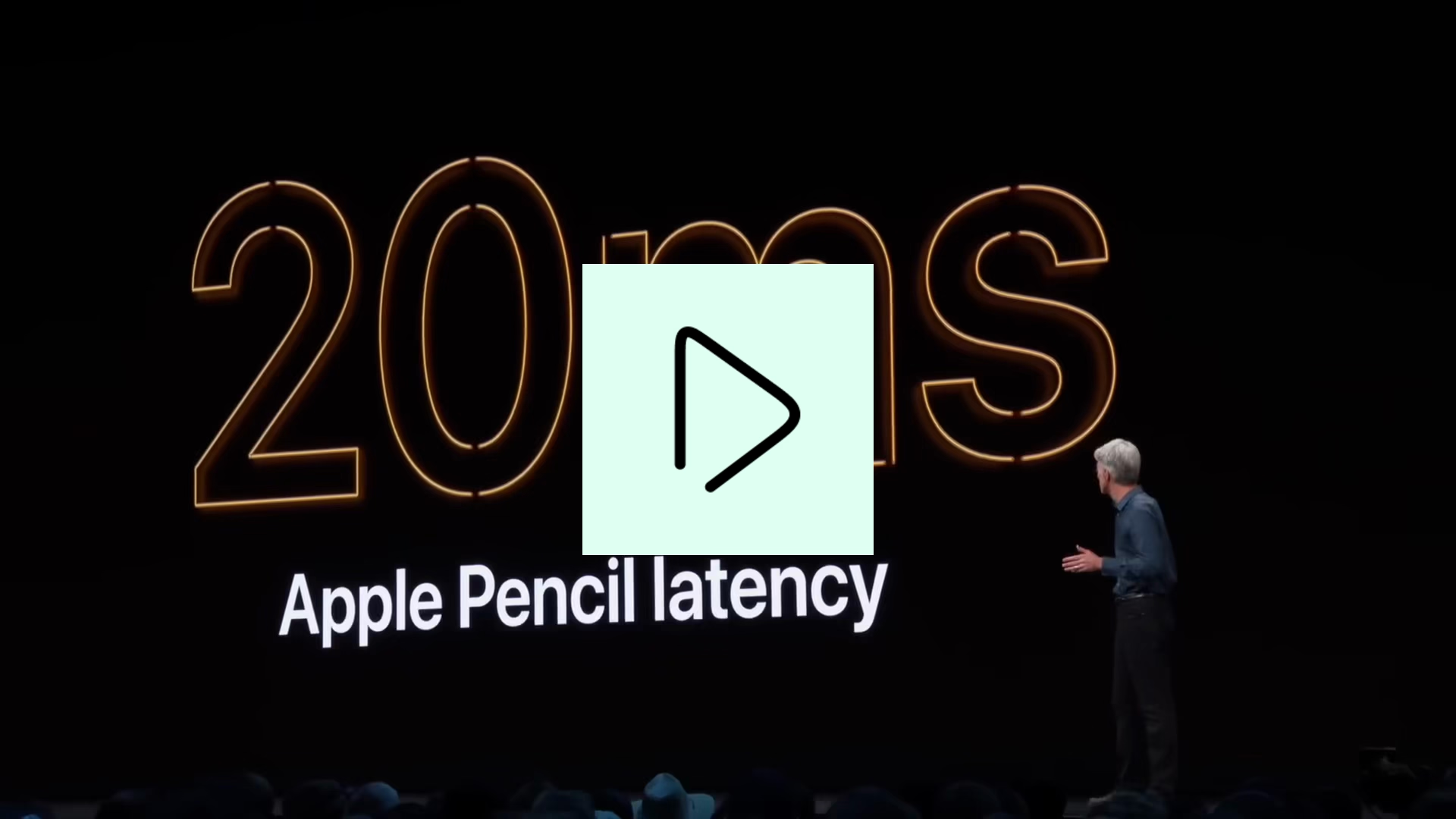
The specifics were, as far as I know, never revealed. But the fact that some of the input events the app receives are not actually real is official and documented:

It takes time for UIKit to generate and deliver touch events to your app, and it takes time for your app to process those events and render the results. In fact, it takes enough time that there can be a visible lag between the movements of a person’s finger or Apple Pencil and the rendered results. To minimize the perceived latency between touch input and rendered content, you can incorporate predicted touches into your event handling.

In fighting games, the most accurate prediction is a trivial “whatever buttons and controls the player holds on the current frame are likely the same they will hold on the next frame,” but for other games – and for Apple’s Pencil – slightly more advanced prediction might be necessary:
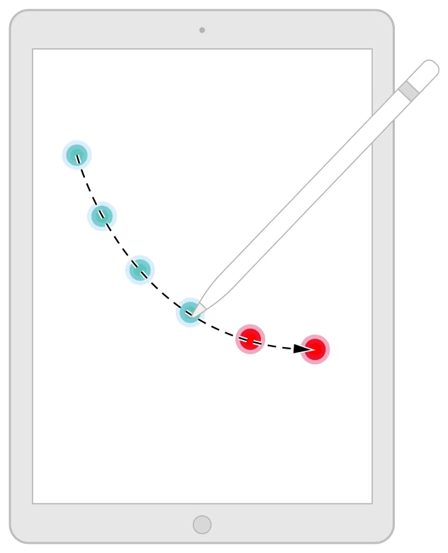

It feels disappointing that no matter what we do, there might be no way to reduce latency below a certain threshold without cheating.

But if there’s any consolation, it’s that cheating seems to be the only answer, and that has been the case long before computers came aboard. There are many documented ways our brains have their own netcode to cover for various lags occurring within our bodies. There’s the stopped-clock illusion, the cutaneous rabbit effect, the color phi phenomenon, and – most relevant for today, even though it has the most boring name – the flash-lag effect, documented on this nice page by Michael Bach:
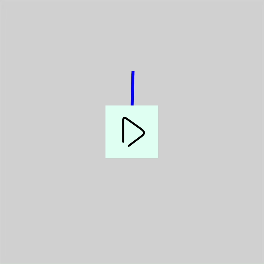
The flashing lines are shown exactly at the same time and angle as the rotating line, but it certainly doesn’t appear to be the case. Just like fighting games and Apple Pencil do, our brains predict and extrapolate the movement of the moving line so that our other senses can intercept it at the right moment. The go-to example of why it’s needed is that you wouldn’t otherwise ever be able to catch a ball thrown your way – but I imagine it might be useful in a street fight, as well.

For a lotmore technical aspects of rollback netcode, check out this long conference presentation from GDC.

Sunday, Sep 13 / #direct manipulation / #games / #loading states / #youtube

“Redesigned callouts to be less visually chaotic.”

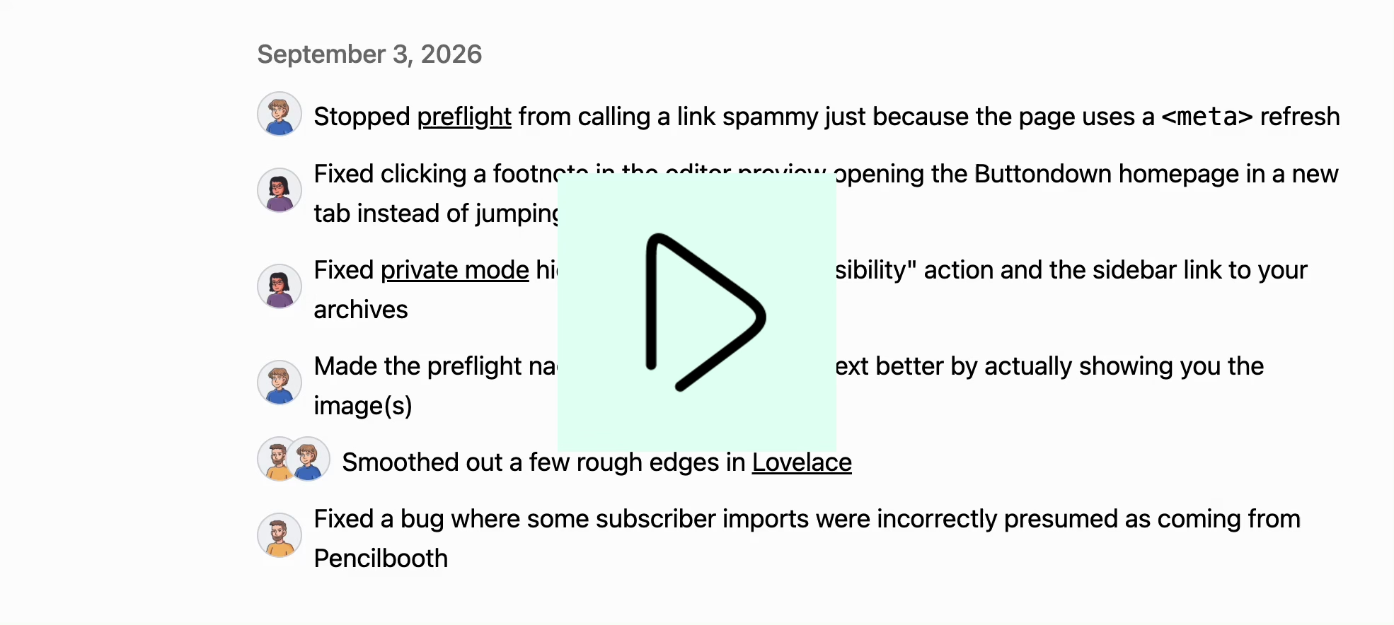
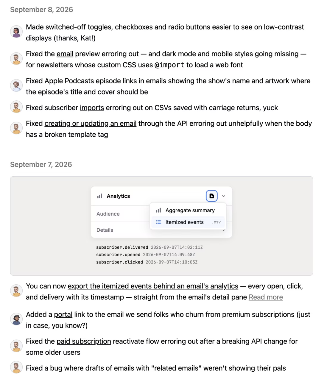
Three nice moments in Buttondown’s (pretty comprehensive) release notes:

  • There is a filter and tags to search more easily.
  • Blog entries are linked throughout, complete with cover images – it’s a nice way to distinguish small changes from big improvements.

  • The fixes are attributed to specific people. (This part doesn’t appear on mobile.) Particularly nice to see support for more than one person collaborating on a fix – I’ve had fun memories working at various companies of pairing up with someone else to debug a particularly tricky problem.

Monday, Sep 14 / #culture / #release notes

“Tuned to the particular typing mistakes to which Teitelman was prone”

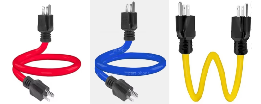
Recently, I asked on social media, “Is there a UX design equivalent to this?”, and attached this photo:

In case you don’t know, this is a (mythical) male-to-male power extender. Requests for those seem to spike around Christmas, and the reason is this: if you put up your lights, chain them together, and only then realize you did it in the wrong order – with the holes next to a socket – it seems much easier to imagine using this cable than reversing all the lights.

There are apparently other uses, like powering your whole house from a portable generator. But I don’t know if you can actually buy such a cable. What I do know is why you wouldn’t want to buy one. The cable has a horrible flaw that might not be immediately obvious: once you plug it in, the other end now has exposed live wires that can electrocute someone.

So, my question was really: What in design has a similar property? What’s something that seems like a good idea, but is actually pretty bad and/or even dangerous?

I would be curious if you have any nominations, but I got two answers that seem interesting enough to share.


The first one comes to us from the (also mythical) Jargon File, in an entry for DWIM:

DWIM [acronym: Do What I Mean]

Warren Teitelman originally wrote DWIM to fix his typos and spelling errors, so it was somewhat idiosyncratic to his style, and would often make hash of anyone else’s typos if they were stylistically different. Some victims of DWIM thus claimed that the acronym stood for ‘Damn Warren’s Infernal Machine!’.

In one notorious incident, Warren added a DWIM feature to the command interpreter used at Xerox PARC. One day another [user] there typed `delete *$` to free up some disk space. (The editor there named backup files by appending `$` to the original file name, so he was trying to delete any backup files left over from old editing sessions.) It happened that there weren’t any editor backup files, so DWIM helpfully reported `*$ not found, assuming you meant 'delete *'`. It then started to delete all the files on the disk! The [user] managed to stop it with a Vulcan nerve pinch [Ctrl-Alt-Del] after only a half dozen or so files were lost. […]

DWIM is often suggested in jest as a desired feature for a complex program; it is also occasionally described as the single instruction the ideal computer would have.

I have a complicated relationship with the Jargon File – a collection of computing anecdotes from the 1970s – and I don’t know if I fully trust it, but I liked this story and Wikipedia has a bit more about it:

Teitelman’s DWIM package “corrected errors automatically or with minor user intervention”, similarly to autocorrection for natural language. […] Critics of DWIM argued that it was “tuned to the particular typing mistakes to which Teitelman was prone, and no others” and called it “Do What Teitelman Means” […]

If this rings bells, it’s because we talked about a similar idea before vis-à-vis Postel’s Law.


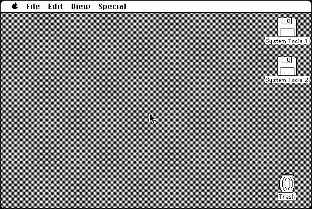
The second answer was a property of the desktop trashcan on Windows or a Mac, and this one I could’ve thought of myself, because in 2020, I wrote about it in my book’s newsletter.

To spoil the story: any onscreen trashcan that has a bulging/​filled/gross appearance whenever there are files inside will prompt some percentage of users to clean it just to restore its pristine appearance… in the process nullifying its utility and purpose.

Like the original power extender, the second visual state of the trash seems like a useful thing to offer to the users, but it comes with a possibly regrettable price. This is what connects the two stories – both talk about “nice,” but underbaked improvements leading to potentially losing files.

Oh, you say, all of onscreen trashcans do that? Well, then, there’s your problem.

Monday, Sep 14 / #command line / #details / #errors / #skeuomorphism

“But, as we all know, the individual light bulbs are not moving.”

I linked to palette cycling before, and I was just reminded of palette cycling art by Mark Ferrari, who back in the 1990s made 30+ landscapes that looked like this:

They have been collected on this webpage some 15 years ago, and I’m linking to it in part because it’s also a great explainer of how palette cycling works – you can see the colors move around, you can point to one to see it frozen, and you can see multiple cycles running in parallel, compare palette ranges between different environmental conditions, and turn on a “blended” technique that feels clever and I didn’t realize existed.

The page was made by Joe Huckaby, who wrote a little intro:

Mark J. Ferrari […] invented his own unique ways of using color cycling for envrironmental effects that you really have to see to believe. These include rain, snow, ocean waves, moving fog, clouds, smoke, waterfalls, streams, lakes, and more. And all these effects are achieved without any layers or alpha channels – just one single flat image with one 256 color palette.

The launch was also accompanied by an interview with Ferrari, which is an interesting read – in part because it shows the work was even more elaborate than all of the above:

These versions of the scene are all the same piece of art ‘shifted’ to different palettes, and, in some cases, using additional ‘baked in’ overlays, (such as rain or the lighted windows at night). But those overlays are all ‘baked in’ to the same layer of the same piece of art that appears in any other ‘day-time’ or clear weather iterations, and are all deriving their color and motion from the same palette as the rest of the picture in that state.

While [the page above] finally allows us all to watch these images color cycle online, many of the scenes posted were actually ‘built’ to do much more than merely animate. By fading the one piece of art through whole sets of palettes, sometimes also using a very sparse set of ‘baked in’ overlays, a number of these scenes can go seamlessly through the 24 hour light cycle, and even change weather conditions ‘naturally’ and seamlessly in real time as you watch. I am not just talking about changing the brightness or color scheme of these pictures either. In the images built for it, over the course of ‘sunrise and morning,’ ‘morning to afternoon’ or ‘evening and sunset,’ light and shadow will actually gradually change angle, climb down the sides of things, move across lawns, up cliffs or building walls, as changing light does in life – all just by fading through palette series designed to make those things happen without altering or adding anything at all to the single layer of 8-bit pixel art.

Ferrari also suggests an interesting analog to palette cycling, which I quoted in the title.

Bonus: Ferrari’s animated landscapes were made for a new-age’y personal organizer app called Seize The Day, and on top of the above preservation effort, there is also this independent, extremely retro page from a fan of the app who loved it so much she decided to keep the app itself alive, too.

Tuesday, Sep 15 / #art / #explainer / #graphics / #history / #preservation

Not everything needs to be a round rect

For the many early years of its existence, Chrome sported a pretty distinctive – perhaps even iconic? – look to its tabs…

…with even the “new tab” button looking like a tab embryo waiting to be brought into existence. At some point, however, during one of the redesigns, the tabs have been flattened to look like many other round rects in the UI, and the new tab button asked to dress in the minimalistic button uniform every other button was already wearing:

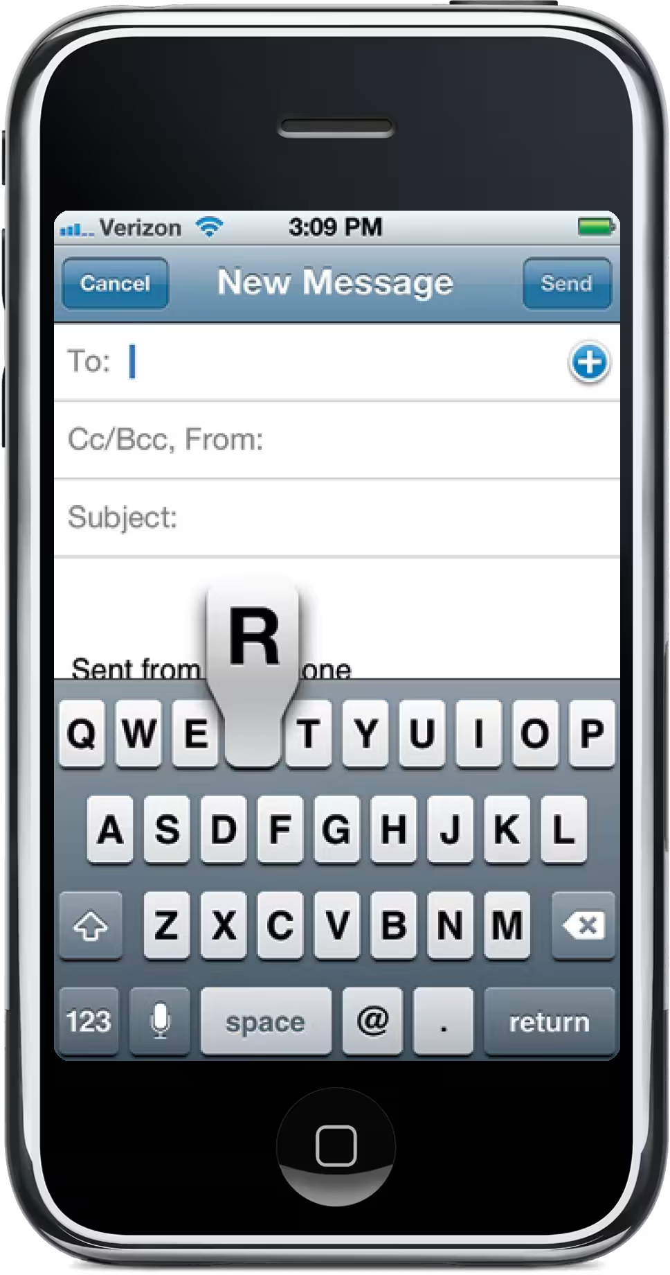
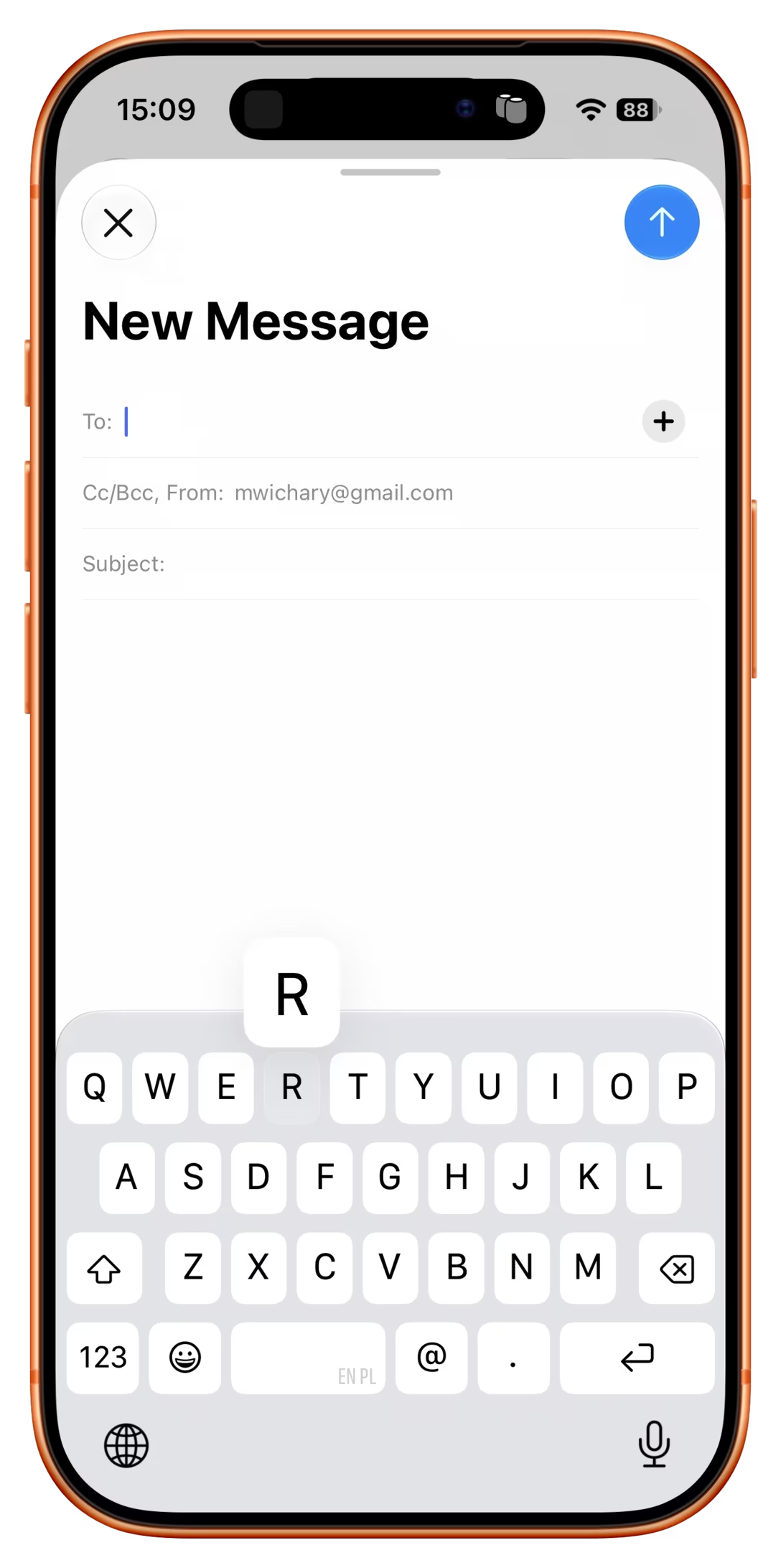
Here’s a new example of this trend. iOS’s memorable tooth-shaped keyboard key extensions, there with us since 2007… that is, until yesterday, when iOS 27 designers turned them into Yet Another Round Rect:

There would be a time in my life where I’d see these two as a triumph of minimalism and consistency. But I feel differently today.

I don’t even mean that tabs should look a certain way to help users, or that skeuomorphism absolutely needs to come back, or that someone has to brush up on shape coding. I mostly feel that way because modern interface design practice – these ubiquitous round rects on ever-present white backgrounds, set in one of the near-identical neogrotesque fonts – is just, once again, so… boring. It’s not fun, not inspiring, not – in any real way – exciting.

I also have this feeling that “consistency” might be just an excuse. Defaulting to round rects could be running away from a challenge; the original shapes would be harder to make work, but it was absolutely possible to do that, given enough effort and care.

Occasionally a designer is faced with an important question that awaits an honest answer: are you doing something to make your user’s life simpler, or yours? It’s not that the first answer is always better than the second, of course; sometimes you have to put on your mask before helping others. But, without knowing all the considerations, I feel that way about these two examples – and a tinge of sadness seeing those unique shapes bulldozed.

(And yeah, I know I’m not doing the case any favours by comparing these to teeth. I think originally the key shape might have been typewriter-inspired; early iPhone’s keyboards were making what to me felt like typewriter-esque sounds too.)

Tuesday, Sep 15 / #graphics / #interface design / #ios

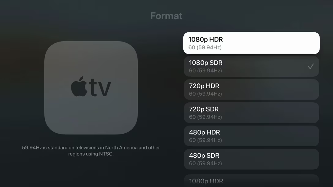
“59.94Hz is standard on televisions in North America.”

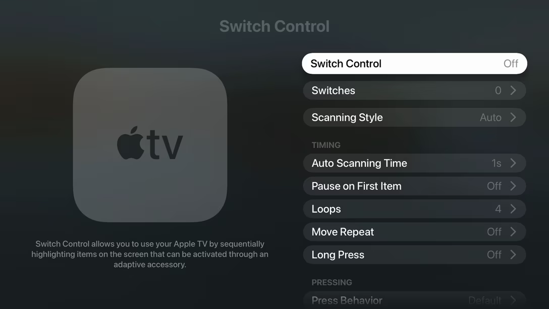
A big screen carries with it different UI expectations, and how that manifests itself in Apple TV’s Settings app, is that there’s always room for an additional hint about the thing you’ve just selected.

So yes, I have been exploring Apple TV’s Settings after the recent update like any normal person would, and I have noticed how well-written those are. They help navigate difficult technical things, and they’re not afraid to get conversational, or offer advice, or even commentary… but they always seem to stay succinct and on-point. I think they’re worth studying.

59.94Hz is standard on televisions in North America and other regions using NTSC.

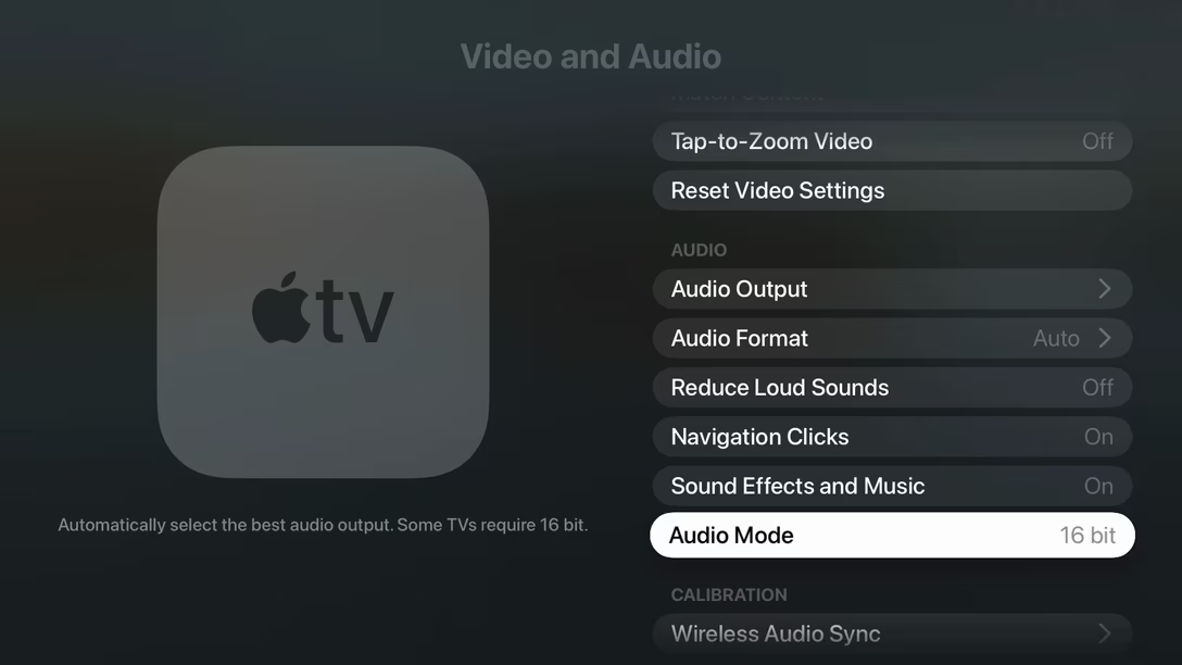
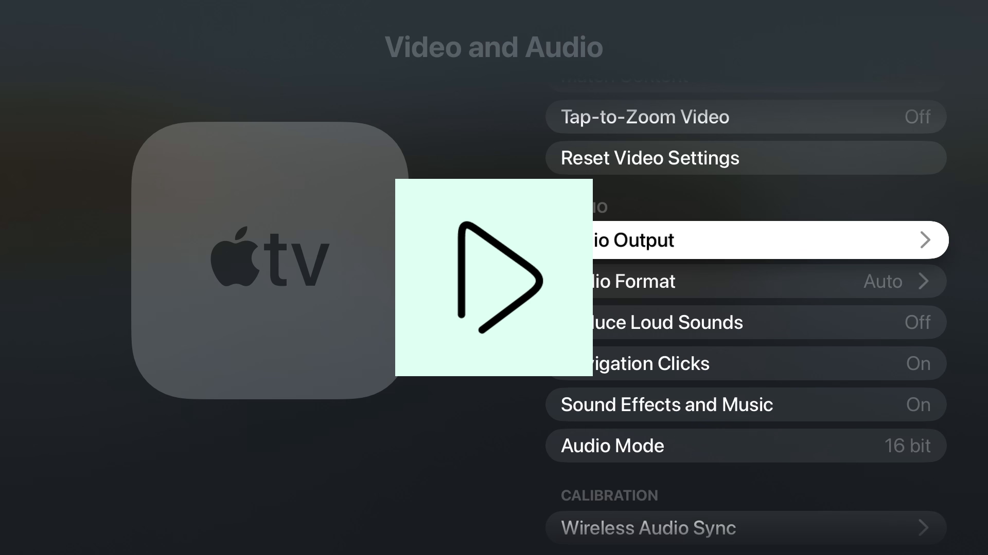
Automatically select the best audio output. Some TVs require 16 bit.

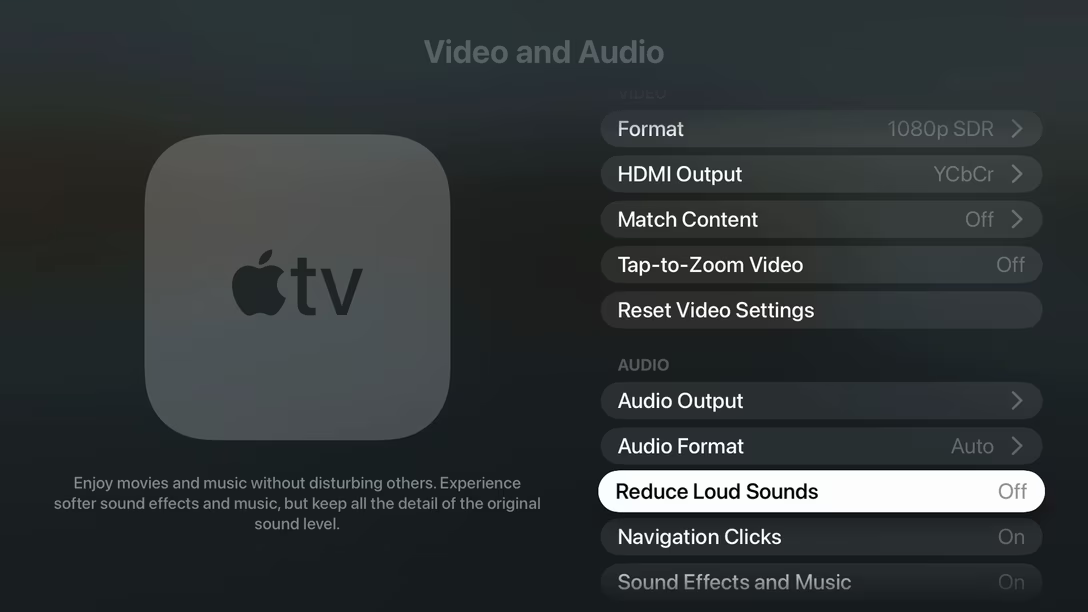
Enjoy movies and music without disturbing others. Experience softer sound effects and music, but keep all the detail of the original sound level.

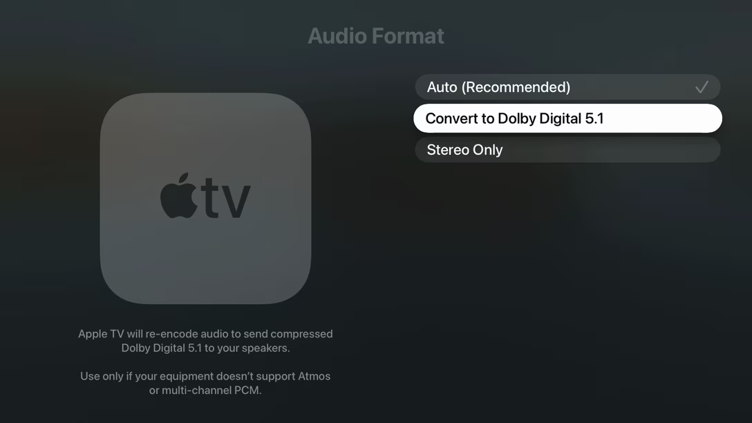
Apple TV will re-encode audio to send compressed Dolby Digital 5.1 to your speakers. ¶ Use only if your equipment doesn’t support Atmos or multi-channel PCM.

Switch Control allows you to use your Apple TV by sequentially highlighting items on the screen that can be activated through an adaptive accessory.

À propos Unsung’s first post ever, whoever works on these did not abuse the privilege. It would be so easy to just keep writing, but if a hint is not necessary, it just doesn’t appear:

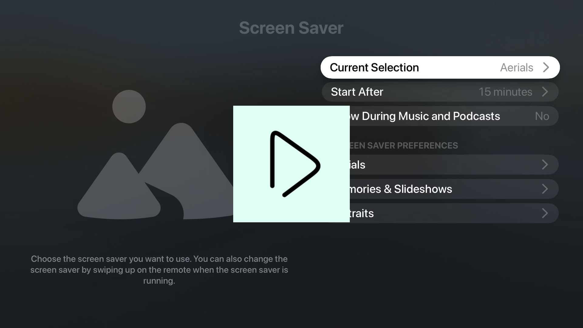
…with one exception, which is the screensaver section. Here, the hint strings feel redundant, mostly repeating what the label already said:

Wednesday, Sep 16 / #apple / #writing

“Insert your favorite nursery rhyme.”

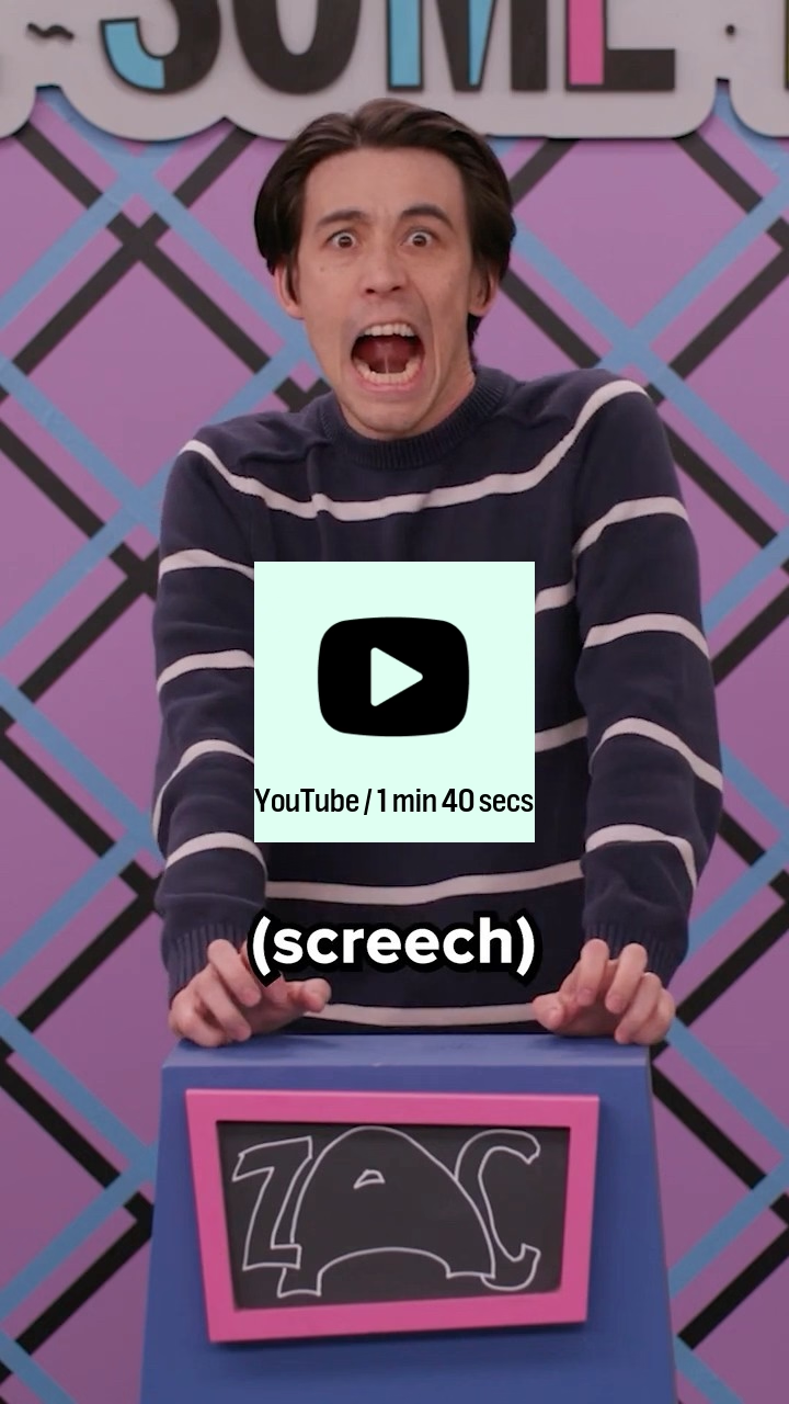
Make Some Noise is one of many fantastic improv comedy shows on Dropout. I noticed one of the ongoing themes is “tech gone bad,” so I compiled a short list below. I just find these really funny.

Video call with shitty wifi:

Logging in with 30-factor authentication:

A cutscene in a video game that’s glitching out:

In case you’re curious, the improv actors are: Zac Oyama, Josh Ruben, and (occasionally) Brennan Lee Mulligan.

If you’re a Dropout member, these are the original, slightly longer landscape videos inside their respective episodes: wifi, 30-factor, game.

Thursday, Sep 17 / #humor / #youtube
Don't miss what's next. Subscribe to Unsung (Weekly Digest):

Older → “A great look at the destructive power of an uncaught Infinity value”