“Not everything that can be counted counts, and not everything that counts can be counted.”
Welcome to this week’s digest of Unsung, a blog about software craft and quality. Here’s what was posted in the last week:
“1H in a config menu = 10C”
Thursday, January 29
One of the most potent themes in Stanisław Lem’s writing was the fallacy of first contact.
Lem argued that we are just not ready for an actual meeting with something truly alien. That the most open-minded of us are close-minded on a cosmic scale. That sci-fi made us think that aliens will look like human with prosthetics when good, and insect-like creatures when evil, but sci-fi needs to be self-constrained for all the same reasons; showing us something actually inhuman will immediately render it utterly incomprehensible.
He wrote about it in Eden, and Solaris, and The Invincible, and Fiasco. The last of these is a book I was once so angry at that I threw it at the wall.
It also happens to be my most favourite book, ever.
Anyway. This is a diagram for a single-button flashlight called Andúril 2 (larger version):
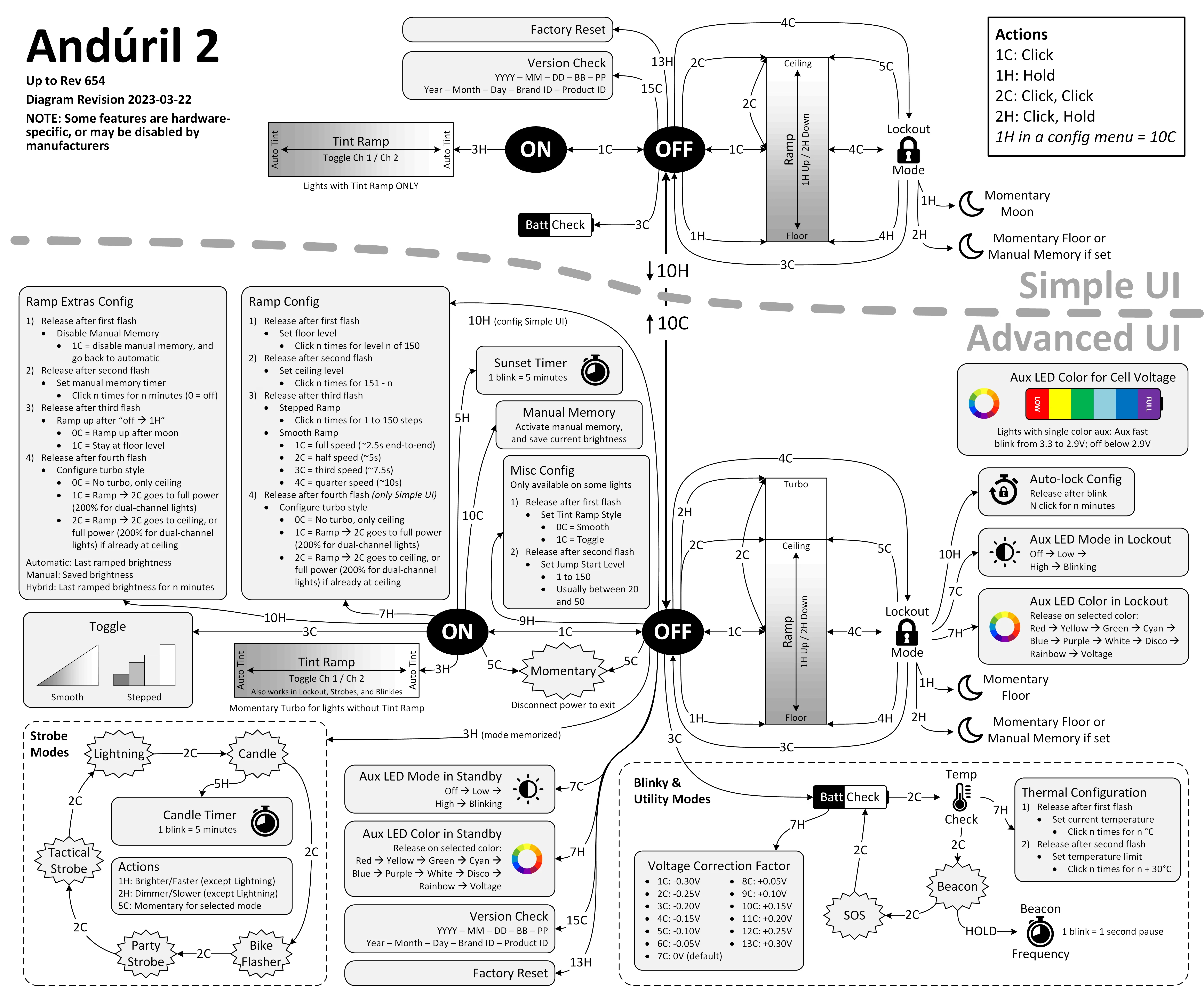
I saw it for the first time earlier this week. I was speechless. Maybe a little bit in awe. I know I’m supposed to hate this, but this feels so profoundly… alien, that I don’t know if anything I know applies here. I don’t want to judge it by the wrong set of rules. I want to understand the dividing lines between the UI and its explanation. I want to study it more.
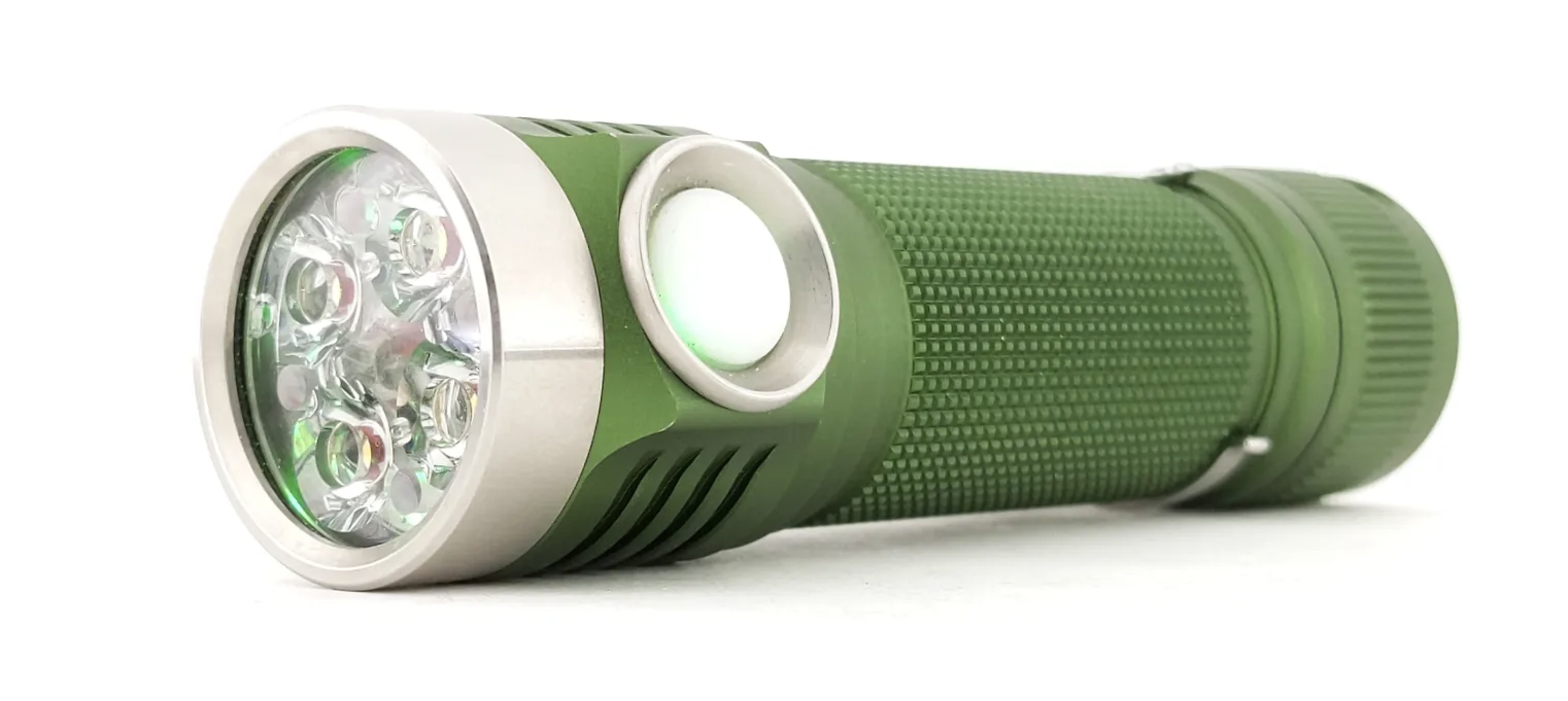
Oh, and because I was curious too – this is the flashlight:
“We can go deeper by patterning inside of our pattern”
Thursday, January 29
I linked to Strudel before, but this 6-minute video is even better – it shows a musician named Switch Angel constructing a trance track from scratch:
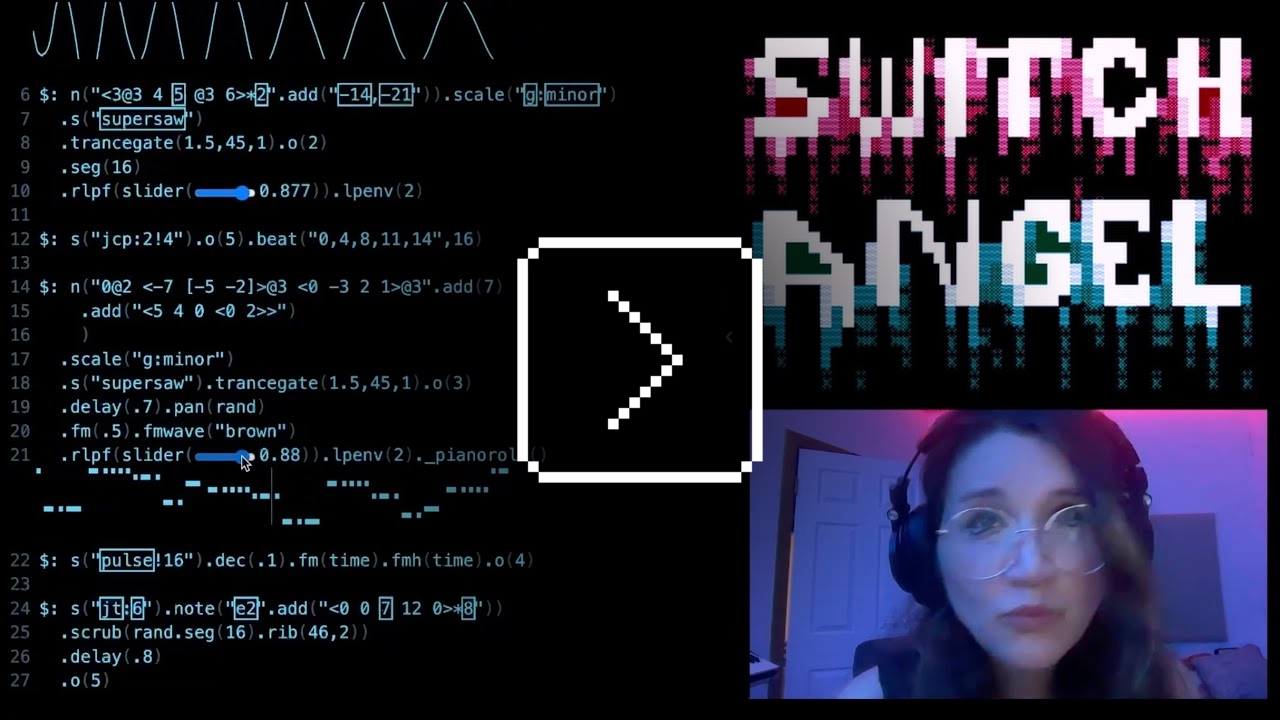
This is of course competence porn, made even better by the droll Polish lektor-like delivery. But it’s also a puzzle. I watched this so many times. There are so many great UI lessons in here:
- You can absolutely put graphics inside a textbox
- Sparklines rule
- Slider is still the best UI element in history
- Previews don’t have to feel like training wheels
- Synchronizing sounds to visuals is so powerful (see: turn signals on a car dashboard)
I found myself thinking about how you’d design something that feels real-time, but also needs to be resilient against typos, and has a distinct “commit” moment (which is what I think those yellow flashes are); some of the best moments in the video are the quick fixes that aren’t narrated.
Ultimately, this also shows how powerful and underrated plain text can be as interface. It’s a bit like designing straight in CSS, operating at the weird intersection of motor memory, creativity, and abstraction. (Is there a CSS editor that feels more like this?)
On top of all of this, the act of building the track this way is also how the finished track would sound like. Amazing stuff.
Remember all these jokes that went like this?
[God looking at a pug dog for the first time] What the hell did you humans do with my bad ass wolf I gave you?
Imagine sitting the creators of the typewriter in front of YouTube and having them watch this video.
“Stuck on level 256 forever”
Wednesday, January 28
I’d guess a lot of people know that the original 1980 Pac-Man ends accidentally with an iconic, glitchy, and impassable “kill screen.” Many people will also nod with recognition at hearing the kill screen is level 256, a number that immediately gives some ideas on what might have happened.
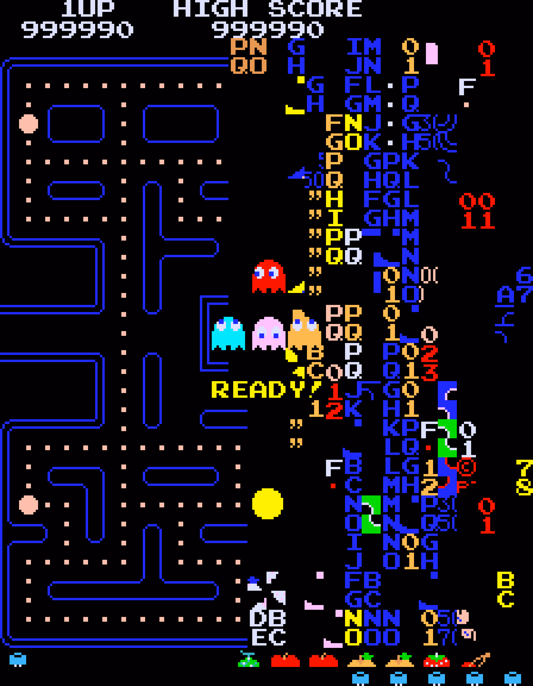
But this fun 11-minute video from 2017 by Retro Game Mechanics Explained doesn’t stop there. It shows, step by step, exactly what is going on when you reach level 256, and how each one of the glitchy things appear on the screen.
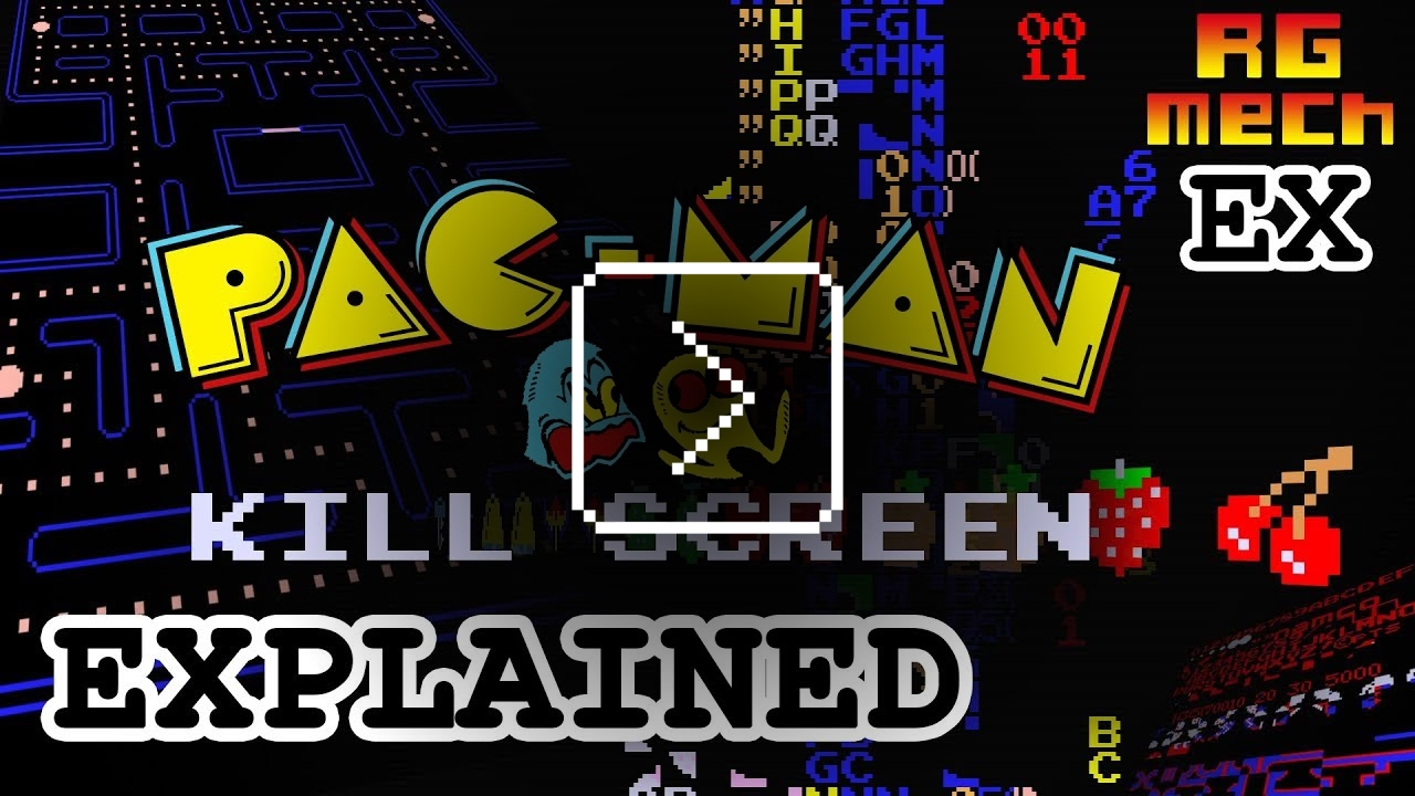
It’s a little mesmerizing, like watching a building demolition in slow motion.
“Coding typography is not like any other kind of typography”
Tuesday, January 27
I was reminded of and rewatched this 43-minute 2016 talk by David Jonathan Ross with great interest:
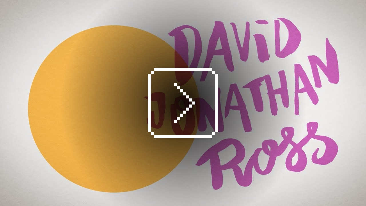
Ross designed Input, a coding font superfamily which was very inspiring to me in the day, and taught me that coding fonts could be a place of surprising creativity and innovation.
First of all, Input has four width options: from regular through Narrow to Condensed to Compressed – this not only allows to avoid the “blocky/squareish” nature of many coding fonts, but also, pragmatically, to squeeze in more stuff on mobile screens.
Secondly, since a lot of coding environments didn’t (and maybe still don’t) allow for fine-tuned typography settings, you can bake them into a font upon download – choose a different default line height to be there in the font itself, or have your favorite style of zero just hanging there in the default slot.
Thirdly, serif versions of Input coexist with sans serif, and so does italic, and you can mix them together.
But most important thing comes at the end: you can imagine coding in non-monospaced fonts! What seemed like blasphemy before made so much sense once I put it to use – I still code in Input Sans Narrow (non monospaced) to this day:
Of course, since the release of Input in 2014 a few other coding fonts did interesting creative things in this (mono)space. But to me this will always be the original that opened my eyes to what’s possible, and the talk captures so well a lot of deep thinking that went into the font. To quote Ross:
Type design is design and design is about solving problems.
“I do not want to tell you about my recent experience”
Monday, January 26
On Mastodon, Hendrik Weimer posted 5 most boosted Fediverse posts of 2025. The numbers look kind of low, but the author explains the methodology below.
At any rate, two of the 5 posts have to do with our trust in software.
Number 1 from Max Leibman:
No, I do not want to install your app.
No, I do not want that app to run on startup.
No, I do not want that app shortcut on my desktop.
No, I do not want to subscribe to your newsletter.
No, I do not want your site to send me notifications.
No, I do not want to tell you about my recent experience.
No, I do not want to sign up for an account.
No, I do not want to sign up using a different service and let the two of you know about each other.
No, I do not want to sign in for a more personalized experience.
No, I do not want to allow you to read my contacts.
No, I do not want you to scan my content.
No, I do not want you to track me.
No, I do not want to click “Later” or “Not now” when what I mean is NO.
Number 5 from JA Westenberg:
RSS never tracked you.
Email never throttled you.
Blogs never begged for dopamine.
The old web wasn’t perfect.
But it was yours.
“I’m a shame-driven developer”
Monday, January 26
Found listening to this 2-hour episode of The Talk Show podcast with Daniel Jakut very enjoyable, and more thoughtful than just “bitching about Tahoe.”
One particular thing that stood out to me was a discussion of shame and embarrassment and pride that all come with shipping software. And looking to Apple itself for direction that the company is not really providing, as many of their apps are not using the new Liquid Glass interface – or when they do, they use it in ways that are inconsistent or disappointing.
Some other good themes:
- it’s okay not to change something if the alternative is change for the sake of change, a posture Apple’s hardware team feels more comfortable with than Apple’s software team
- internal Apple politics and the story of the Control Strip
- loved this phrase from Gruber about the macOS’s Tahoe release: “they vandalized it.”
Also, this:
A fair criticism of Apple over the years is that sometimes fixing 50 little misaligned text boxes or divider bars… using your time to do that, is time better spent than adding another user feature.
“Every Mac’s floppy disk had a garbage name”
Monday, January 26
Fun little story by Bruce Horn on folklore.org about the original Mac and how modes are sometimes good:
We went to quite a few stores in the week or so after the introduction, and found that, without exception, every Mac’s floppy disk had a garbage name! They were all named something like ”;lkakl;rt;klgjh”, as if someone had just randomly typed characters to see what would happen. Which is exactly what they did.
In the Finder, the startup disk would appear on the desktop, in the top-right corner, ready to be opened. The Finder would initially select it; once selected, typing would replace the current name, following the modeless interaction model that I had learned in the Smalltalk group from Larry Tesler. This meant that whatever anyone typed when they first came up to the Macintosh would end up renaming the disk.
On the early Mac, just typing with any item selected renamed it, which caused all sorts of trouble.
The eventual solution for renaming that survives until today was: click to select and then click again to rename… but don’t click too fast, because that’s double-clicking, and that means something else. Windows, starting in Windows 95, did something similar, but also put rename under F2 – so at least you didn’t ever have to wait.
I liked the emergent behaviour from some graphic apps which put rename under ⌘R. It’s not that hard to make Finder work that way – see below – but I have always been curious why Mac or Windows didn’t steal this solution.
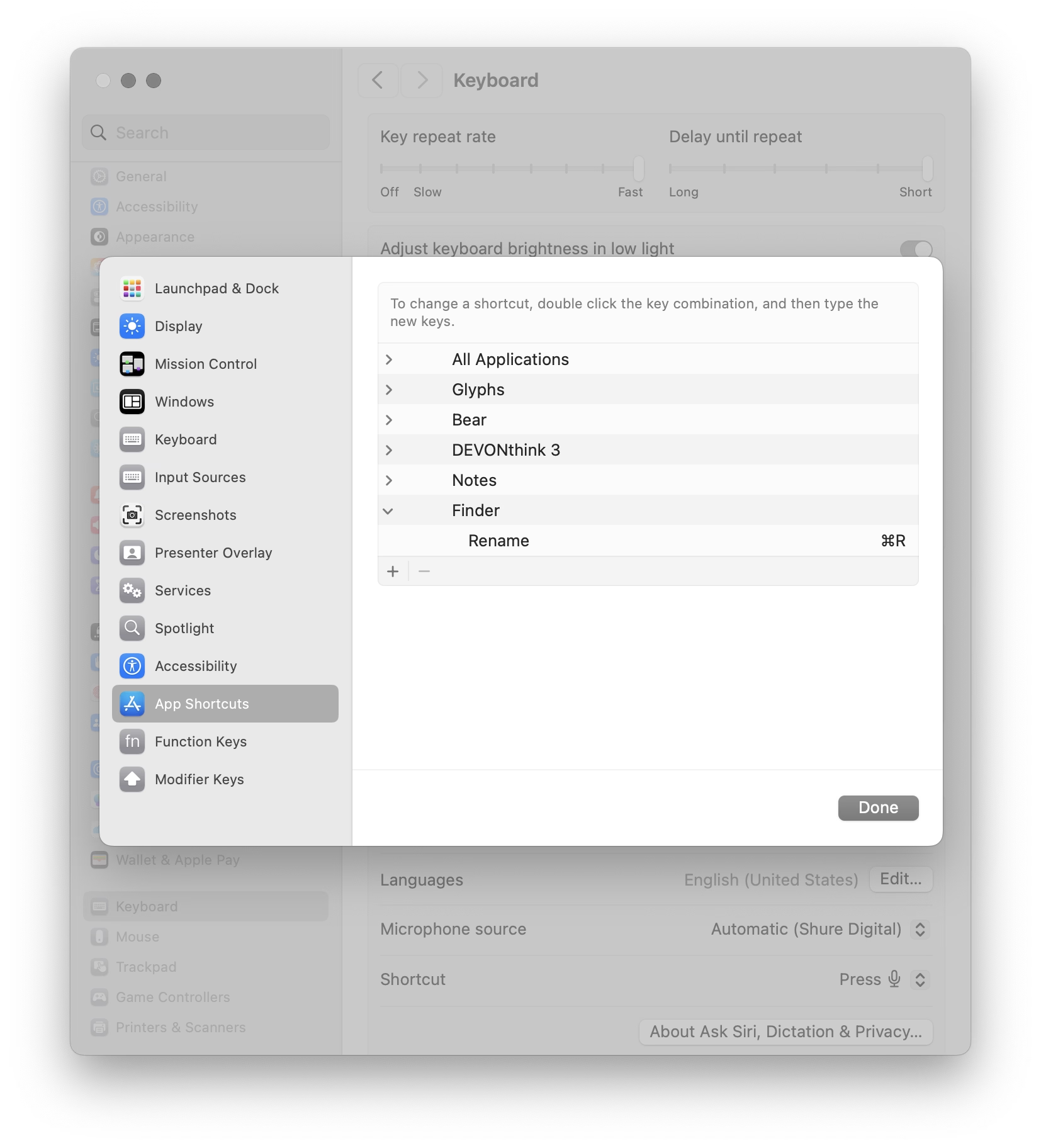
(Added later: People reminded me that of course Enter also renames, and does so immediately. I wonder why it slipped my mind in this context – possibly because in any other list or similar place, Enter would be the equivalent to opening? Maybe I’m discovering in slow motion how unusual Finder can be in its details compared to conventions we established after.)
Movie review: Koolhaas Houselife
Sunday, January 25
★★★★☆
2008, 58 minutes
The house is a masterpiece. It is perched on a hill overlooking Bordeaux. It’s made of glass and concrete and seemingly nothing else. It has pipes cleverly hidden to the side, a cantilevered roof that seems to defy the laws of physics, and a beautiful center elevator platform for a wheelchair-using owner who commissioned it by telling the architect – Rem Koolhaas, by the way – “I do not want a simple house. I want a complex house, because the house will define my world.”
The house is also a nuisance. The platform gets stuck. The back staircase is frustrating to navigate. Parts of the physics-defying roof started to rust years ago. The glass needs cleaning and very occasionally shatters whole as the house slowly sinks into the hill. In the summer, the garden door gets too hot to touch. In the winter, rain and snow leak between holes in the walls – holes whose very presence cannot fully be explained.
The documentary is sort of a human-centered flip side of How buildings learn, the absolutely fascinating book written by Stewart Brand (this is the good part; the book is really smart and you can learn a lot from it) and designed by Stewart Brand (this is the bad part; the book’s typesetting is so terrible I literally cannot stand to open it). The movie follows Guadalupe, the person who takes care of the building and sees it not in the first day’s pristine light, but a decade after it was finished, and years after the figurative cracks showed up, and then literal cracks, too. She knows it so intimately that she struggles in explaining it.
My design team watched this documentary during an offsite. I couldn’t attend the showing for reasons I no longer remember; afterwards multiple people came to me and told me “You should watch it. It’s actually about you.”
I watched it yesterday as I’ve been thinking a lot about this recently. Towards my later years at Medium, more recently at Figma, and increasingly when it comes to UX design as a whole, I feel like a caretaker, a living historian, a person tasked with the sometimes-sisyphean work of preserving the past but not gatekeeping the future, tending to something mostly taken for granted, and knowing something so intimately that you develop a sense of it that is increasingly hard to explain to others. “I don’t know how I know it, but bet $20 this is related to this,” I hear myself saying at work with strange regularity. (I’m far from always being right, but it still surprises me how often I get to be.)
Caretakers burn out, of course. It happened to me a few times. You can take too much care. You can fly so close to the details you forget the color of the sky. There’s enough minutiae for all of the minutes in every day.
And even outside of burnout, things can get weird. Medium’s editor then and Figma’s editor now feel like strange beasts, so complicated that it exceeds any single person’s understanding. One learns about their moods and the good days and the bad days. One can try to placate them, but only partially, and learn to understand them, but only partially. One develops a strange relationship with them, and only gets to observe them even as others assume one controls them; I once gave a talk about a singular keyboard shortcut, one of possibly 5,000 details that could each be a subject of its own conference talk.
But it can also all be wonderful, and beautiful, and meaningful, being what I sometimes jokingly describe “caretakers of undo” – the phrase itself a shibboleth, as I’m always watching whether someone thinks it derogatory or laudatory – and carrying with you that calmness and quiet satisfaction of keeping the strange beast alive and perhaps even happy.
It doesn’t matter that Guadalupe cannot explain how the building’s award-winning architecture works, or why one staircase is designed so differently than the other. The best parts of the movie is watching her own shorthand with the house, that special years-in-the-making universe of tips, and tricks, and hacks, and nods of understanding, and frustrations attenuated by the passage of time, and quirks internalized so long ago that they their sudden disappearance would today itself register as a quirk.
You can develop a relationship with a sophisticated piece of software, like you can with a strange house that has a life of its own. “I want a complex house, because the house will define my world,” said the owner just before his untimely passing, but the house defined someone’s world, anyway.
The house is not beautiful because of the stories of people inside – we never get to see them, by the way, and there is only a 30-second quiet glimpse at the building actually being lived in, at the tail end of the movie. The house is not beautiful because it was designed by a starchitect, or because of the views, or the clarity of its form, or the cantilevered roof, or the cleverly operated portholes. The house is not even beautiful because of all its flaws, although you could find beauty in them, too.
The house is beautiful because you show up every day and try to stop it from getting worse, and occasionally, you show up and make it better.
There won’t be a documentary made with you in it, so no one might ever know. But you will.
The modern powers of ten
Sunday, January 25
I have recently stumbled upon two websites that try to do something interesting and inspiring when it comes to showing scale.
John Wallace’s Tangible Media Connection’s initial appearance might not feel very well-crafted, but jump to any page (for example this one) and it’s astonishing how great the photos of the objects are.
They’re great not just on their own (it’s really hard to photograph metals and plastics!), but also consistent with each other when it comes to angle, style, and – most importantly – scale. I am not sure if I have ever seen on online museum do this before. It’s very well worth checking out.
The other example is Neal Agarwal’s recent Size of Life. The whole website is delightful, with subtle music and sound effects, great handling of keyboard navigation and swiping, and so on. And the way it resizes objects and uses transitions to always keep you oriented is something a lot of other interfaces, even for productivity apps, could learn from.
Of course, now I wonder what the first website would feel like with the user interface of the second.
“We made it be ok by being bored and fixing stuff”
Sunday, January 25
I have been thinking about this a lot since the pandemic, and Rob Napier on Mastodon summarized this really well:
I spent a lot of time in the 90s working on Y2K. It wasn’t a huge panic. It was just a slice out of everything else we spent auditing code. It wasn’t “spend 80 hours a week fixing this.” It was just boring. Incredibly boring. And we made it be ok by being bored and fixing stuff.
And the one thing I never thought would happen was that people would say it was never a problem. Oh good grief, it was a problem. All over. We just fixed it. Like we thought grownups should do when there’s a problem.
There are some good responses to the post and the original post it quoted. This one was brilliant in its vulgarity:
My analogy for this is that I work to maintain a kind of public sewer system. You never think about sewers... until you’re up to your neck in shit.
This isn’t just about Y2K and COVID, of course. It’s also about the invisible work of people who make well-behaved menus, and all the other things like that.
“A masterclass in Interaction Design (IxD)”
Sunday, January 25
The state of menus on Google’s search result page: all inconsistent, most ugly, ignoring UI mechanics learned decades ago (for example understanding the importance of diagonal movement or supporting mousedown-drag-mouseup in addition to just clicking), with easily triggered buggy states, bad animations, and even clicks falling through.
I wouldn’t be so angry, but I use – or at least see – these all the time. I wouldn’t be so angry if we hadn’t learned how to make GUI menus well 30 or so years ago.
I don’t want to pin it all on browser makers; if the designers and engineers cared above, there are ways to make great menus in custom JavaScript. But I wonder why the web tech didn’t evolve quicker to provide well-built and stylable and accessible primitives for this kind of stuff. I would love to understand more why that didn’t happen. Even scrollbars and sliders still feel unfinished on the web, and those are much easier than multi-level menus.
Also, Gemini:
Are the mechanics of menus on google search page working well?
In terms of technical execution, the mechanics of Google’s menus are a masterclass in Interaction Design (IxD). They are designed to feel “snappy” even on low-powered devices, using a blend of instant feedback and carefully timed animations.
Skynet would probably love Papyrus, too.
A good person to follow: David Aerne
Saturday, January 24
I am still figuring out what this blog is, and I hope I’m not going to make this part too awkward, but I’d love once in a while to point to someone whose work I admire or find inspiring.
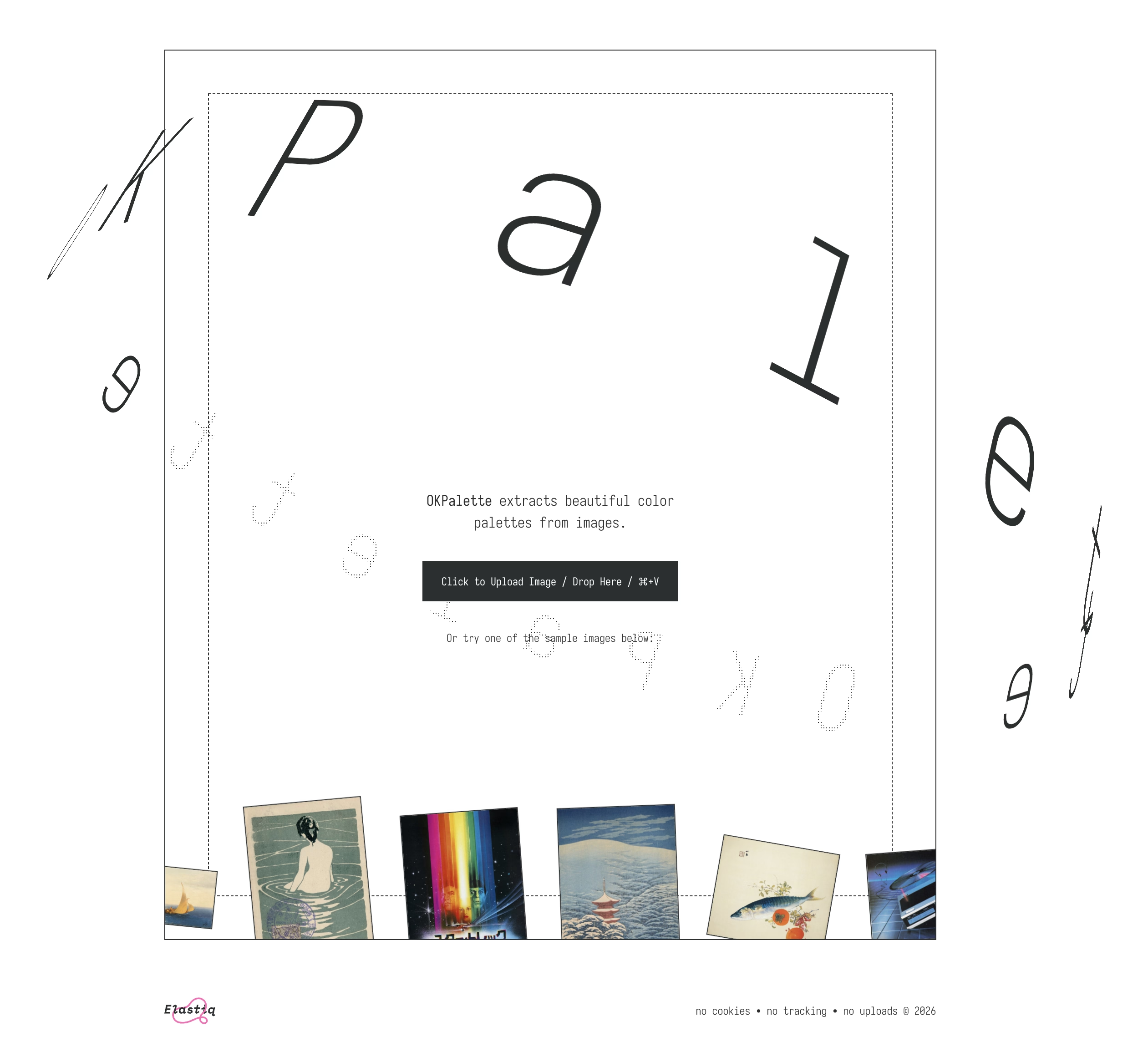
I just spent an hour or so simply scrolling through David Aerne’s Bluesky feed, and I felt it was just so much fun for me. David is interested in color and works on various small refined tools – one recent example is OKPalette – and reposts other people who work in this space, but is also very generous with sharing his creative process around tools and their details.
I’ve always been more of a “functional” designer and less of an “artist” (please excuse labels in progress), and this kind of stuff feels like connective tissue and expands my horizons.
Check out David Aerne’s work on Bluesky – no account is required.
Also, I’ll always welcome recommendations of other people to follow! (Just please: not on x.com).
“The glossy, shimmering future of computing”
Saturday, January 24
A good 22-minute video from XDA about the debacle that was Windows Vista and the corrective measure that followed, Windows 7:
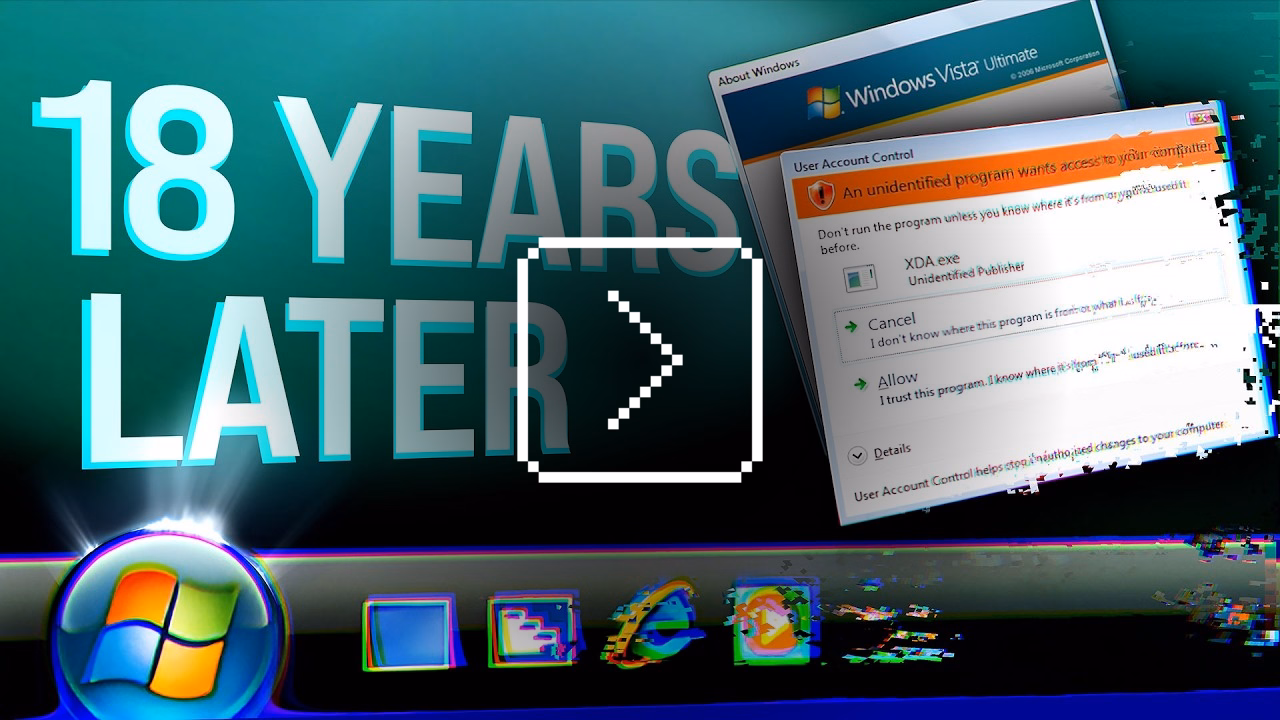
It taught me many things and it clarified that things were more complicated than they seemed. Windows Vista (widely seen as failure) perhaps wasn’t so bad, and 7 (quoted by many as the best Windows ever) was not that far away from Vista, down to its internal version number being 6.1 to Vista’s 6.0.
It’s also interesting to reflect on this today, when macOS is having its own Vista moment.
There is also a follow-up video on Windows 8, the possibly most consequential Windows release of that era, with product decisions that reverberate still today.
Main takeaway: An entire book could be written and a lifetime of lessons learned from Microsoft’s “.1” releases.
“Not everything that can be counted counts, and not everything that counts can be counted.”
Saturday, January 24
An absolutely fantastic post about software nudges and pop-ups by Mike Swanson:
If you’ve ever read about “choice architecture” and nudging, this will feel familiar. The modern language for it was popularized in the late 2000s, and the core idea is simple: how choices are presented changes what people do, even if nothing is technically forced.
Then product teams go one step further. Instead of just shaping choices, you can shape timing. Prompts start showing up in the middle of workflows because that’s when the user is “most engaged.”
The industry also has a whole discipline around persuasive design and how to move someone from intention to action with prompts, friction removal, and well-timed triggers. B.J. Fogg’s behavior model is one of the more cited frameworks in this space.
Some nudges are genuinely helpful. But the same machinery that helps you discover a feature can also be used to push you into something you didn’t come here to do. And once the machinery exists, it gets reused.
I am finding myself wanting to quote most of it.
You cannot easily measure the resentment. Or the rage clicks when they smash a button to dismiss another “did you know” pop-up. You cannot easily chart the moment a user thinks, “I used to like this product, and now it feels needy.” You cannot easily quantify the slow erosion of trust.
I have long been frustrated by how the “growth” interfaces haven’t really evolved past cheap and loud pop-ups and defaulting to “let’s just show it.” One of the behaviours that bother me a lot that’s not listed in the post is, for example, installing an app and receiving one or even more “here’s what’s new” onboarding callouts. Hey. I just installed you. Everything is new.
Anyway, maybe one more quote:
Optimize for trust, not just return visits. Short-term engagement can be increased by annoyance. Long-term loyalty is harder and more valuable. The best products I use don’t constantly remind me to use them. They quietly do their job so well that I come back when I need them. That’s what tools are supposed to do.
Worth reading the whole thing.
“Distinct absence of anything that takes away screen real-estate”
Friday, January 23
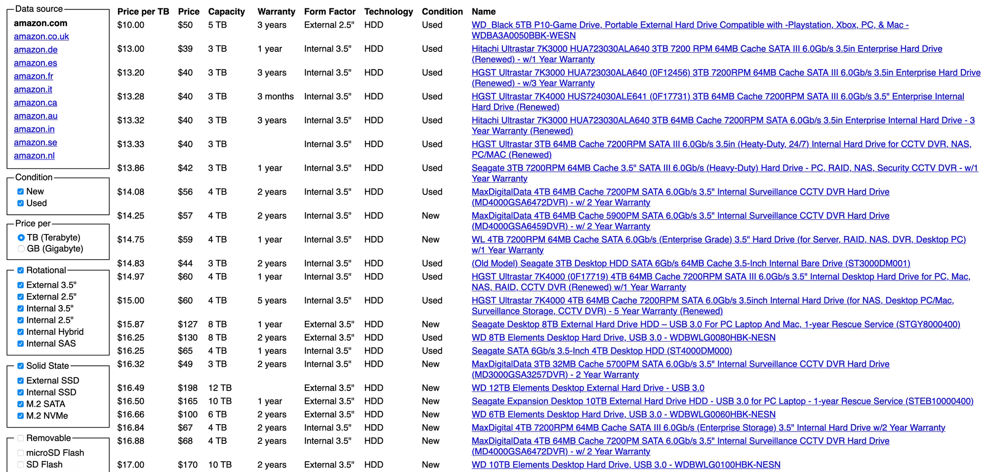
Neil Panchal writing in 2020 about a cool little page called diskprices.com:
The performance of this website is stellar. It loads almost instantly. And the list (although it’s not sortable) gets the job done, it is sorted by price already which is the most important attribute.
Diskprices.com deserves the UI/UX award of the decade. We’ve lost our ability to design user interfaces laser-focused on the user. Instead, we have purple gradients, scroll jacking, responsive bullshit, emojis, animations, and many other things designers do today. The utilitarian approach of Diskprices.com is refreshing, although the contemporary designers cast it off as ‘brutalist design’, thereby marking it as a statement of fashion.
But both the creators of the page and Panchal might be getting this wrong:
Do you need a graphic designer?
No. This site is designed to maximize information density, accessibility, and performance. More whitespace, colors, and icons won’t help.
I think this is incorrect. The creator of the page is a graphic designer, that just happens to be the perfect graphic designer for the job.
“Intentional pagination is progress with awareness”
Friday, January 23
I stumbled upon this small page about friction by Carl Barenbrug. I found myself vehemently disagreeing with one example listed; I don’t think Undo Send is an example of friction, as to me it actually feels like the exact opposite (“Are you sure you want to send this email?” dialog box would be friction – just like the last example Barenbrug showed).
But this paused me in my tracks:
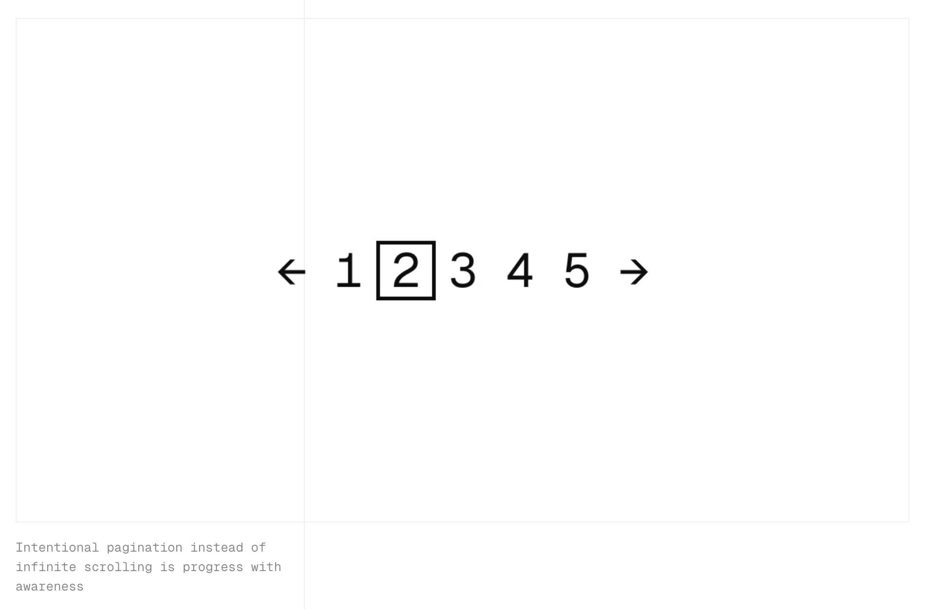
“Intentional pagination instead of infinite scrolling is progress with awareness.”
It made me realize that the only implementation of infinite scrolling I know is basically pretending the page has already been there the whole time… if it’s done well, and if you move slow enough, and if you don’t pay attention to the scrollbar, it really feels like the page goes on and on forever.
But… it doesn’t have to be that way. You could turn off the smoke or hide some of the mirrors. You could uncouple the gesture from what follows. You could add milestones (in the traditional sense of the word) after every X results. You could make the scrollbar react differently. Instead of frictionless scroll, you could force the user to bounce off of a bottom of the page in a similar vein as pull-to-refresh forces them to bounce off of its top.
I’m curious now. Did anyone ever experiment with infinite scrolling that feels… closer to pagination?