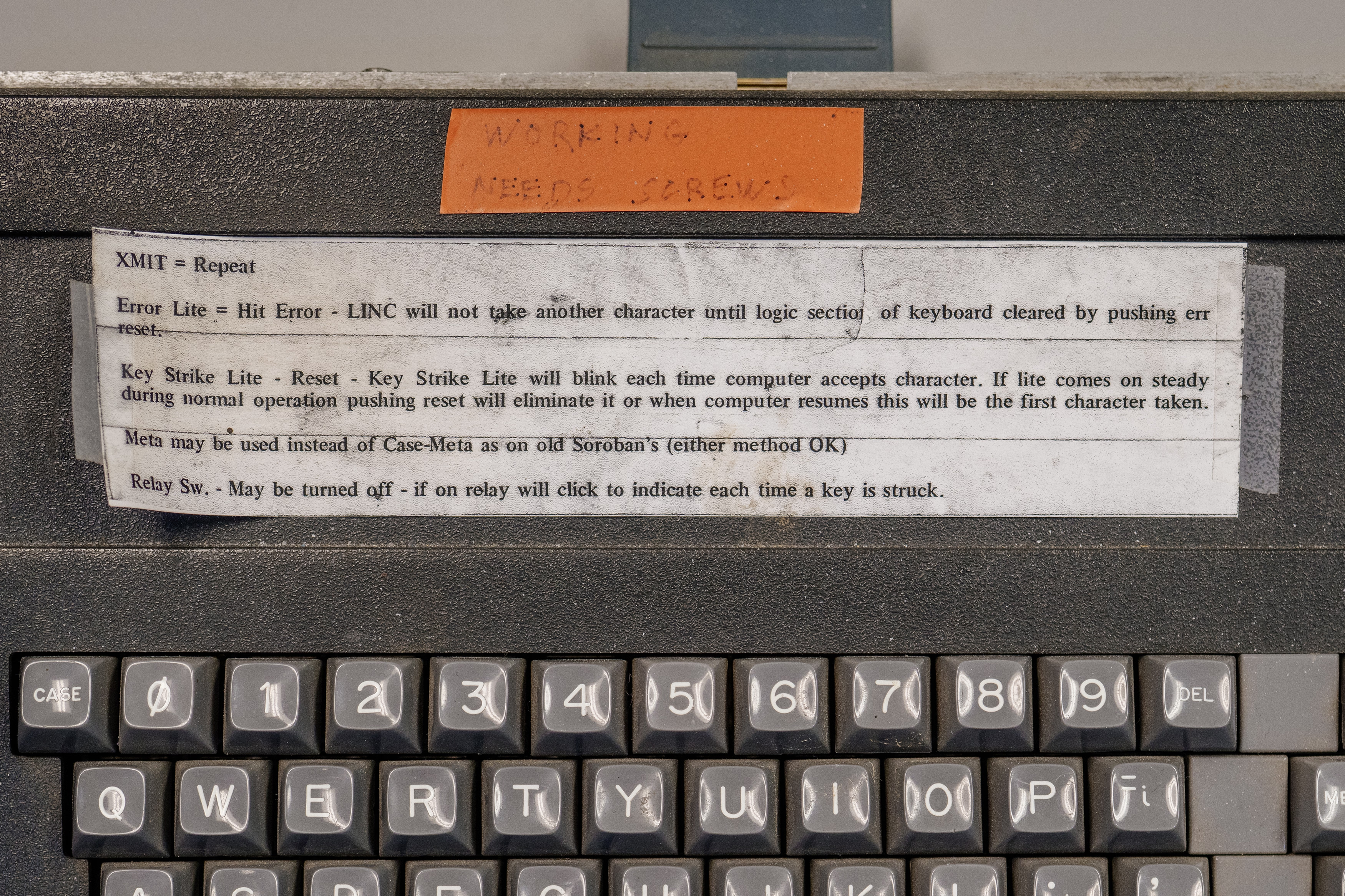
“Michael here will handle the bullshitting.”
Welcome to this week’s digest of Unsung, a blog about software craft and quality. Here’s what was posted in the last week:
On tools and toolmaking
Thursday, March 26
Not long ago, a blog I otherwise like a lot included this passage:
Designers have been saying this for years. Cameras don’t take pictures, photographers do. Tools don’t make you a better designer. Now the PM world is arriving at the same conclusion.**
I am not linking to the post because I hear this argument from time to time, and I want to comment on the general notion.
I think I understand the sentiment behind it: You’re not a designer because you know all the Figma shortcuts. You’re not a perfect typewriter away from The Next Great American Novel. Mastery of a tool is not mastery of the subject matter. And there is definitely a certain amount of performative pretense of an insta photo of a meticulously arranged desk with a bougie keyboard, going at length about the only correct set of presets and plugins, or an idea that “if only you do this one creative habit, a firehose of creativity will follow.”
But I also disagree. Good tools do make you a better designer.
A good tool can make you go faster and, as a result, let you spend more time doing revs and trying new things. A good tool can make you go slower when needed, practicing a connection with the material underneath.
A good tool will prevent you from shooting yourself in a foot, will teach you new things about what you’re doing – and perhaps even about yourself.
A good tool will value your growth, make you reflect on your growing body of work, and push you to try harder.
A good tool can inspire you. A great tool can make you fall in love. A bad tool can make you walk away, and a horrible tool will make you never want to come back.
A good tool will make you seek out more good tools.
Sure, people wrote books on a BlackBerry. Would you want to? Sure, the best camera is the one you have on you. But wouldn’t you prefer that camera to also be the best camera for whatever it is that makes you tick – a great sensor or glass, an amazing build quality, a friendly user interface, a logo that makes you want to step up, or some particular quirk or sentiment that you can’t even explain, but matters a whole lot to you?
I’m told I should be annoyed if someone’s first reaction to seeing a nice photo I made is “what kind of camera do you use?”, as it diminishes my accomplishments as a photographer. But: I chose the camera, and bolted on the appropriate lens, and realized over the years the aperture priority mode and very precise focus area is what makes my brain happy. I went through other cameras before, and learned I didn’t like them and I liked this one. At some point in my life I even ventured out into the frightening underworld of the settings menu, opened a new browser window, and decided “I will now try to understand all of these terms.” It took years, but I did.
The reason I enjoy scanning and processing old documents is because I invested in my tools. I have a little keypad, a bunch of hard-earned Photoshop actions, and some bespoke Keyboard Maestro combos that boss Photoshop around. This little tool universe doesn’t just make me more efficient, but it also makes me have fun.
I’d go even further. The mastery of the subject matter and the mastery of the tool are both important – but they also have to be joined by fluency with tool choices, and deep understanding of the relationships you have with your tools.
No single writing advice book will give you a perfect recipe, but read ten of them and scan twenty more, and you might compile the right mixtape of practical tidbits for your brain, and inspiration for your soul. Likewise, you have to try out a bunch of tools – some bad ones, a few great ones – to understand what you need. Not just for efficiency, but also for enjoyment, and ambition, and flexibility or maybe rigidity, and this sort of unmeasurable feeling of a tool getting you, or a tool made by someone like you.
Maybe it’s the 1960s typewriter you need, or a newfangled e-ink-based writing implement, or maybe you just have to open TextEdit and close everything else. I’m not going to tell you the novel comes out then. But the novel might never come out if you don’t figure out what tool can help get it out of you.
You also have to recognize the telltale signs when you outgrow the tool, or when the tool starts disappointing you. Over the years, I learned that I hate InDesign, but that I hate LaTeX even more. I switched from Apple Notes to SimpleNote in 2012, went back to Notes in 2017, and just this year moved over to Bear. I once cargo-culted Scrivener for writing and ran away screaming, but I also once cargo-culted DevonThink and still use it today, in awe of its clunkiness and old-fashionedness that match my own.
AI tools are still tools. And generative AI will allow you to build more tools for the solitary audience of just you – but, like elsewhere, it will require some understanding what makes for a good tool and what makes for a good tool for you.
Craig Mod wrote recently about using AI to build his own custom tools:
My situation is pretty unique. I’m dealing with multiple bank accounts in multiple countries. Constantly juggling currencies. Money moves between accounts locally and internationally. I freelance as a writer for clients around the world. I do media work — TV and radio. I make money from book sales paid by Random House via my New York agent, and I make money from book sales sold directly from my Shopify store. […] Simply put: It’s a big mess, and no off-the-shelf accounting software does what I need. So after years of pain, I finally sat down last week and started to build my own.
But I bet Mod knew what tool he needed to build based on his experience with tools that didn’t work for him – and software and design in general.
Elsewhere, Sam Henri Gold in a widely-shared essay that is worth a read, about MacBook Neo and the beginning of the tool journey:
He is going to go through System Settings, panel by panel, and adjust everything he can adjust just to see how he likes it. He is going to make a folder called “Projects” with nothing in it. He is going to download Blender because someone on Reddit said it was free, and then stare at the interface for forty-five minutes. He is going to open GarageBand and make something that is not a song. He is going to take screenshots of fonts he likes and put them in a folder called “cool fonts” and not know why. Then he is going to have Blender and GarageBand and Safari and Xcode all open at once, not because he’s working in all of them but because he doesn’t know you’re not supposed to do that, and the machine is going to get hot and slow and he is going to learn what the spinning beachball cursor means. None of this will look, from the outside, like the beginning of anything. But one of those things is going to stick longer than the others. He won’t know which one until later. He’ll just know he keeps opening it.
I am bothered by black-and-white, LinkedIn-ready statements. “Tools don’t make you a better designer” feels like another version of the abused and misunderstood “less is more.”
My camera taught me to be a better photographer. DevonThink told me how to better organize my thoughts. Norton Utilities showed me how to have fun when doing serious things, and Autodesk Animator how to be serious about having fun.
I’m a toolmaker, so perhaps I arrive at this biased. I endured some crappy tools, wrote some okay ones, benefitted from some great ones. I don’t think I would have become a designer without them.
To streamline or not to streamline
Thursday, March 26
Software engineering has long had a concept of “premature optimization” – overbuilding things too early in anticipation of future that might or might not come.
I feel design has a version of that, too. Here’s viewer menu hierarchy in Google Drive:
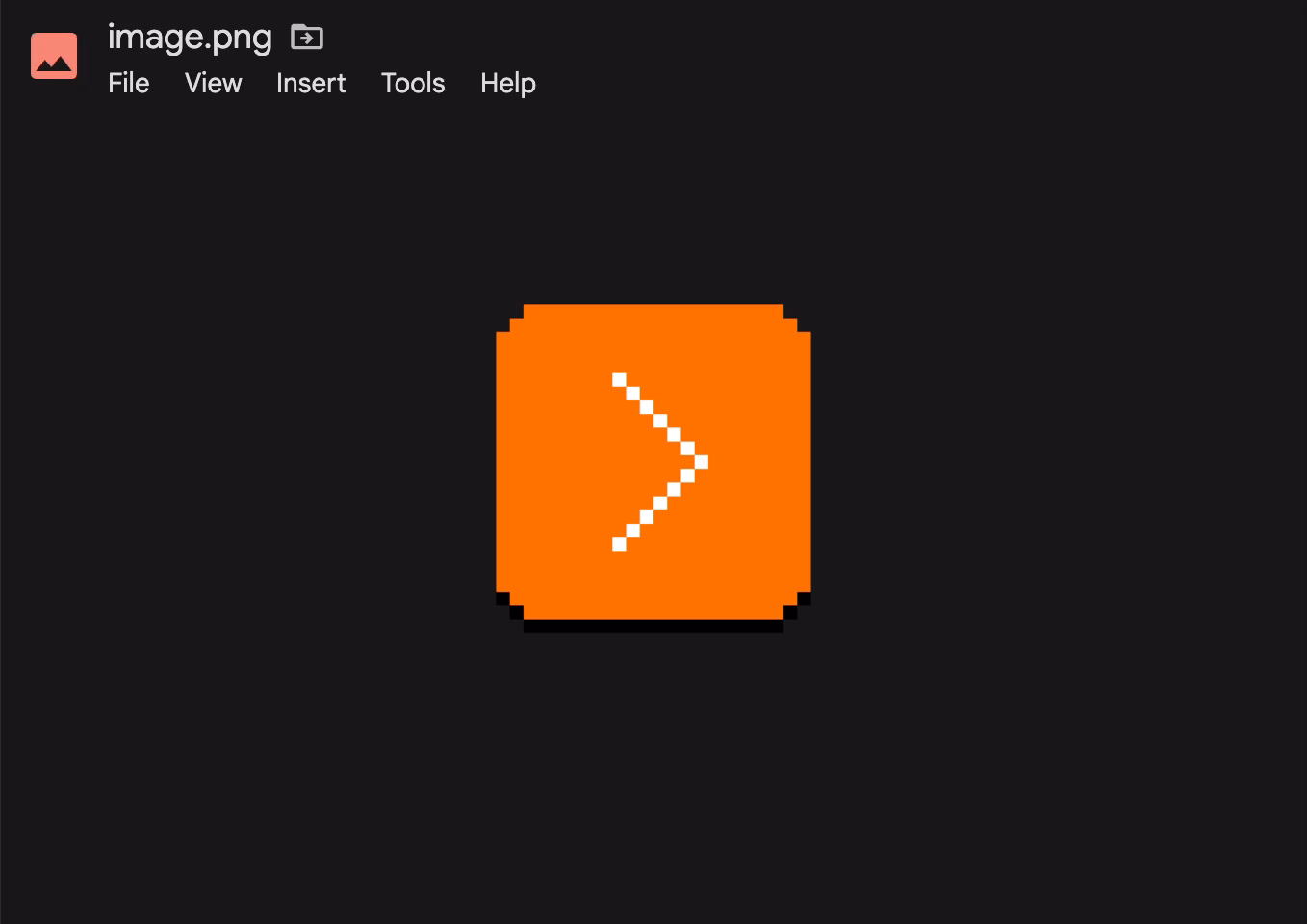
One should always feel very uneasy about a menu with just one item, like Insert here. Even within the View menu, one could imagine streamlining all the commands to be in one main menu, rather than two tiny submenus (coupled with pretty excessive width that makes for an interaction that feels like walking a tightrope).
These are the menus for a PNG image. It’s entirely possible other file types offer more options and this menu structure earns its keep then, paying off in consistency over a long run – but I tried a few file formats, and the menus all looked similarly sparse.
As a counterpoint, here’s an example I just spotted in the context/right-click menu in Apple’s Notes:
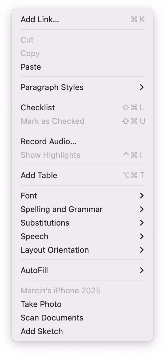
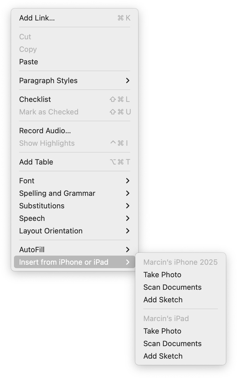
When you have one device, the three options get appended to the ground floor of the menu. But if you have more than one, they all get ejected into a submenu.
I like this soft consistency of introducing hierarchy only when it’s needed – or in reverse, flattening/streamlining it as necessary.
I have mixed feelings about this one particular use, however. This menu is already very long (and seemingly abandoned – look at table and checklist and link options), so in this case perhaps a consistent submenu would be overall better. Also, the “Insert from iPhone and iPad” label is long and makes the entire menu slightly wider.
But as a pattern, it’s worth considering. (Just for completeness’s sake, you could also half-streamline by adding a submenu for the iPhone and another one for the iPad. But in this particular case, it’d also likely be a bad idea.)
System shock
Thursday, March 26
I occasionally move older writing that still feels interesting to my new site, and today I republished the 2015 story about a strange bug that brought back an old pixel font from beyond the grave:
Some of the technical details inside are obsolete, but the story might still be fun. (Plus, it seems like at every job I have, I eventually stumble upon a bug that brings back something from the annals of history. Here’s one from 2019.)
Some more placeholder misuse
Thursday, March 26
I mentioned placeholders before in the context of Dropbox Paper…

…and I wanted to share a response by Niki Tonsky, because he had a great point about those Dropbox Paper placeholders that I didn’t consider:
For me it’s […] confusing placement. Like if somebody writes “Have a nice day” on a door instead of “Push” or “Pull”. I don’t mind seeing “Have a nice day” message somewhere neutral, in a place not occupied by any other function, but not where I expect very specific help.
I was reminded of Tonsky’s comment when I saw this at the airport yesterday:
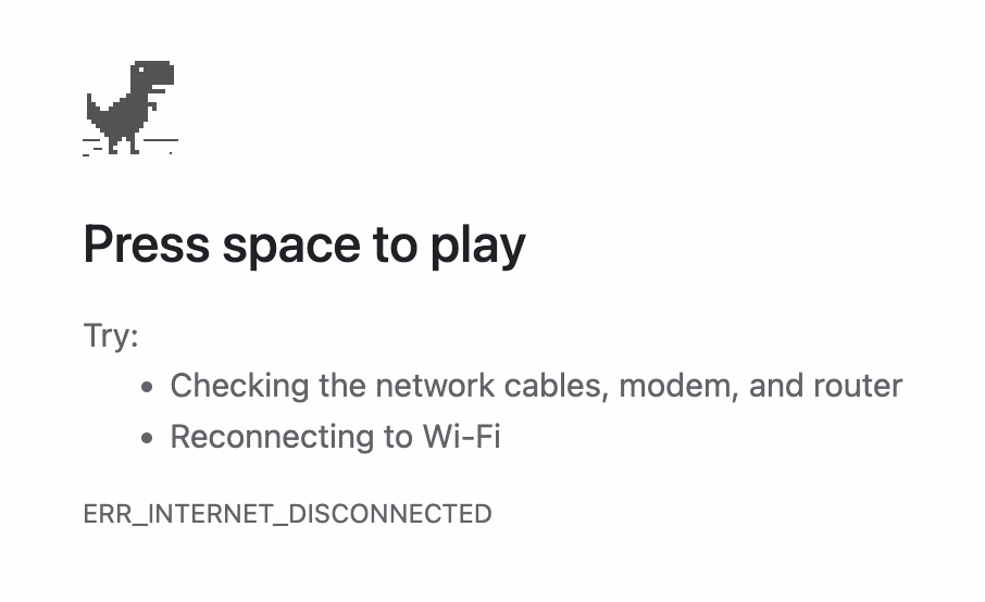
I remember, eons ago, how impressed I was when one of the Chrome designers was telling me how all of these error pages were specifically designed to feel like liminal spaces and not like destinations. These were, in a way, placeholder content.
But “Press space to play” feels like a strange thing to put in here. (Previously, the message said “No internet” or “There is no Internet connection.”) I understand that this is Chrome’s popular mascot, but this is still an error page whose purpose is to tell me what’s wrong, rather than serve as an entry point to a minigame.
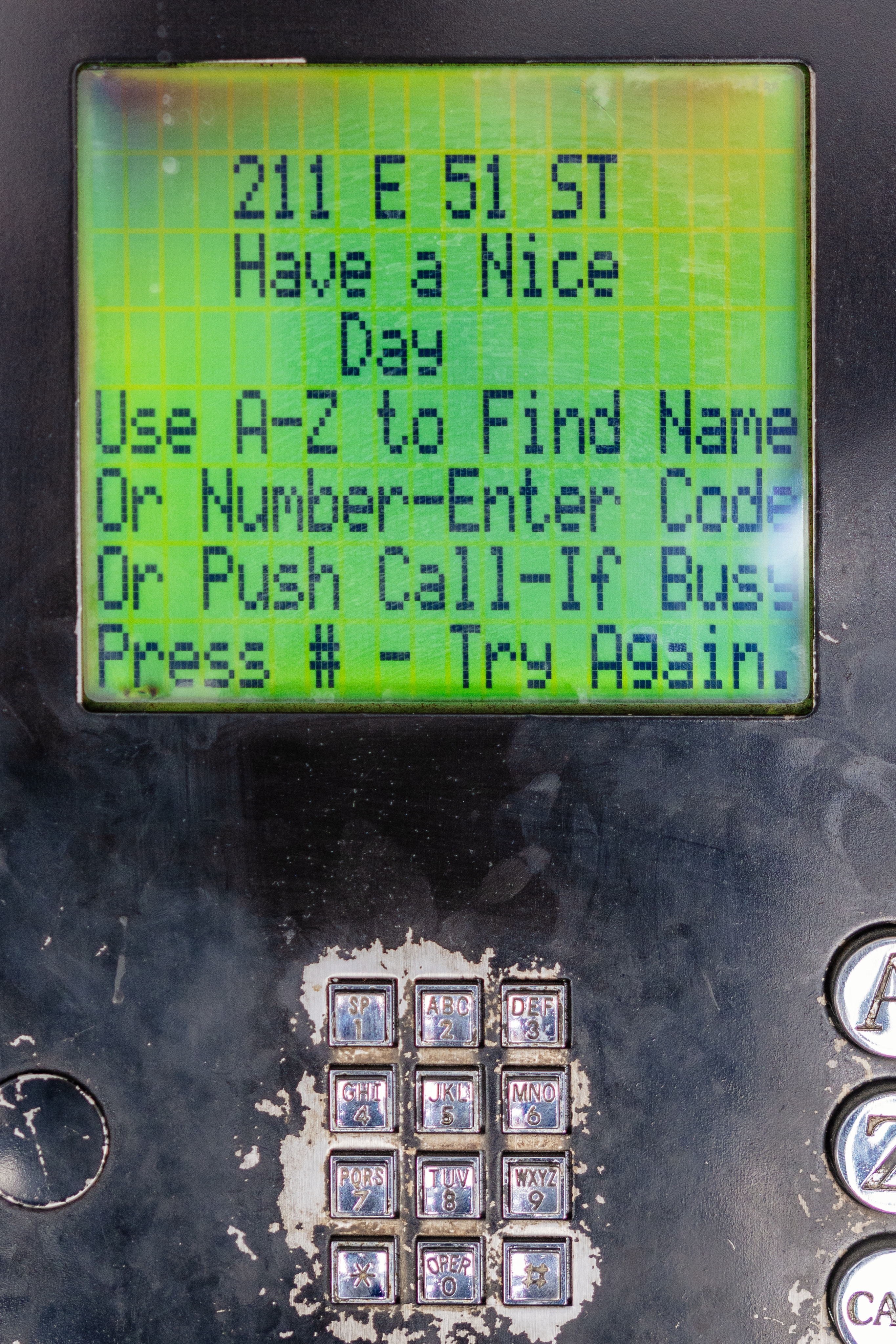
Also, just a few days ago, I just stumbled upon this fun example of a placeholder collapse – where a temporary text becomes permanent:
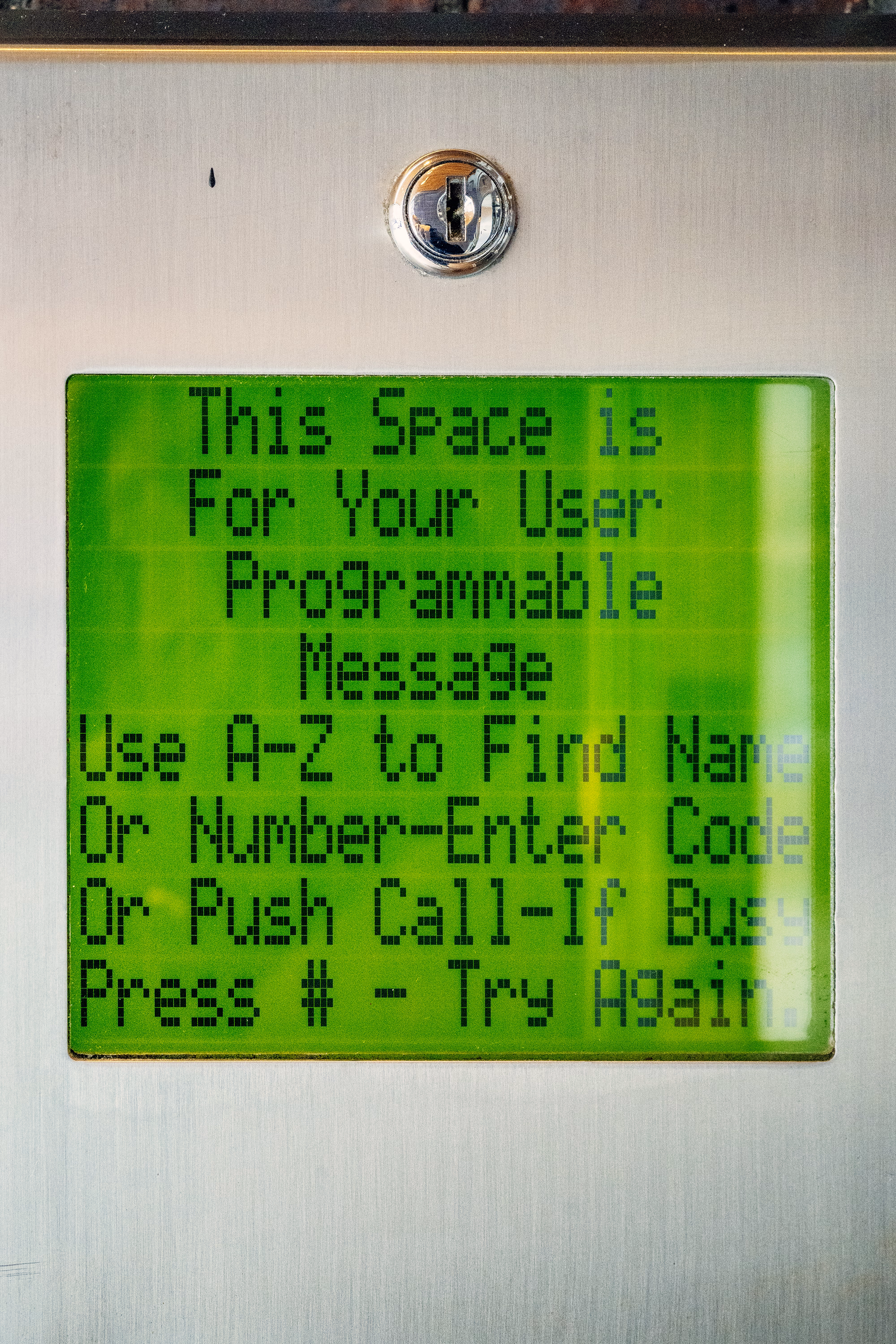
If you are curious, this is what it looks like if you don’t forget to set the message. And funnily enough, given where we started, it says “Have a nice day”:
“Publishers aren’t evil, but they are desperate.”
Thursday, March 26
A meandering and messy, but otherwise an absolutely worthwhile essay from Shubham Bose about the bloat and hostile behaviours on news sites:
I went to the New York Times to glimpse at four headlines and was greeted with 422 network requests and 49 megabytes of data. […]
Almost all modern news websites are guilty of some variation of anti-user patterns. As a reminder, the NNgroup defines interaction cost as the sum of mental and physical efforts a user must exert to reach their goal. In the physical world, hostile architecture refers to a park bench with spikes that prevent people from sleeping. In the digital world, we can call it a system carefully engineered to extract metrics at the expense of human cognitive load. Let’s also cover some popular user-hostile design choices that have gone mainstream.
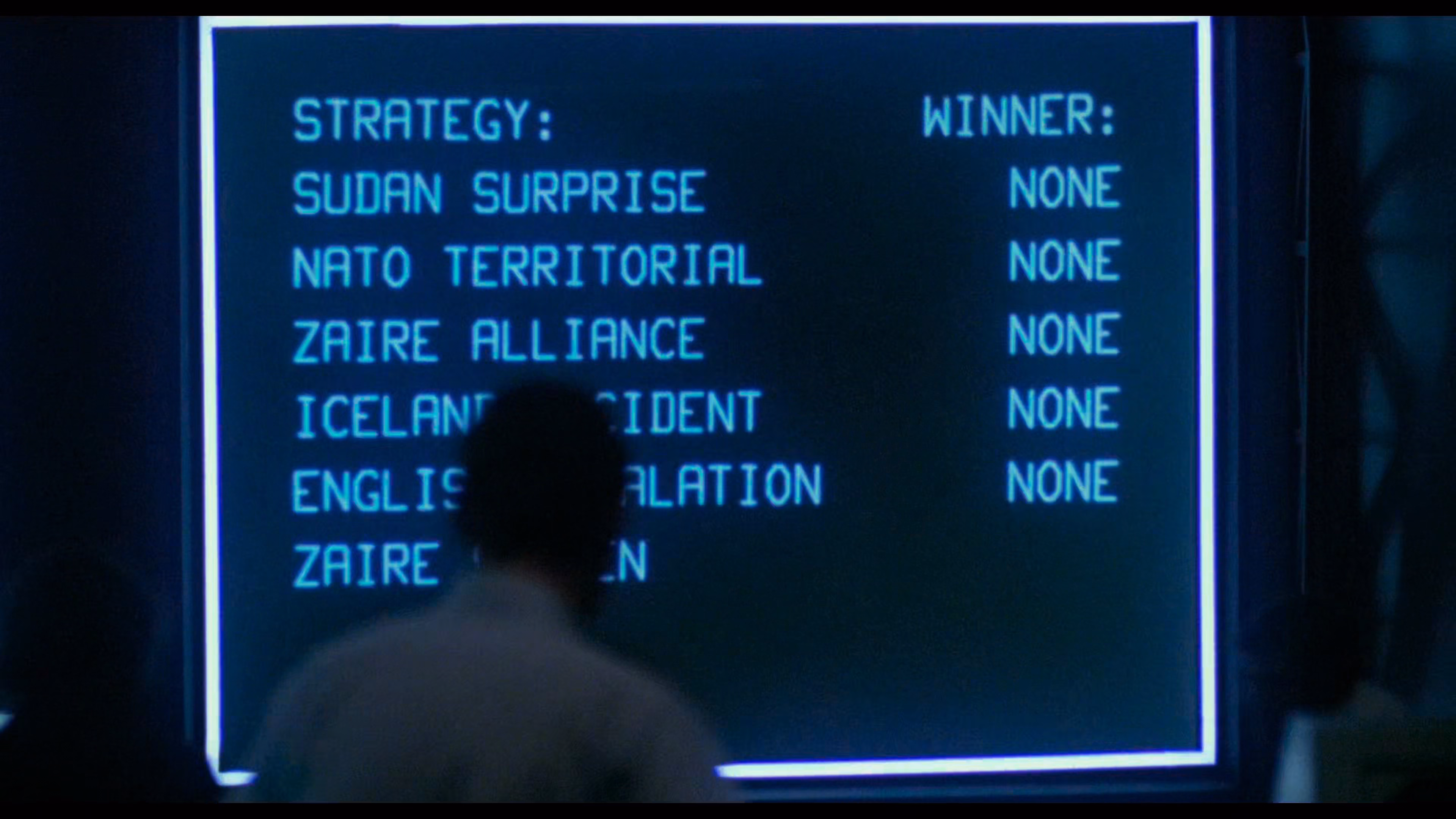
Bose has a knack for naming some of these hostile patterns: The Pre-Read Ambush stands for distracting you even before you start reading, Z-Index Warfare is about multiple pop-ups competing with each other, and Viewport Suffocation is about covering so much screen with crap you can barely see the content. You can almost see those names fly by on the massive screens in the final scenes of WarGames:
By the way, I didn’t know that the ad bidding is actually happening on my computer, using my CPU, and clobbering my interface speed:
Before the user finishes reading the headline, the browser is forced to process dozens of concurrent bidding requests to exchanges like Rubicon Project […] and Amazon Ad Systems. While these requests are asynchronous over the network, their payloads are incredibly hostile to the browser’s main thread. To facilitate this, the browser must download, parse and compile megabytes of JS. As a publisher, you shouldn’t run compute cycles to calculate ad yields before rendering the actual journalism.
The essay ends on a call to action:
No individual engineer at the Times decided to make reading miserable. This architecture emerged from a thousand small incentive decisions, each locally rational yet collectively catastrophic.
They built a system that treats your attention as an extractable resource. The most radical thing you can do is refuse to be extracted. Close the tab. Use RSS. Let the bounce rate speak for itself.
Funny you should say that. There is another user-hostile pattern not mentioned in the article, as it happens on the other side; the swiping back gesture on the mobile phone is hijacked to insert a frustrating “Keep on reading” page, rather than getting you where you came from:

It’s there on many sites, from Slate to Ars Technica.
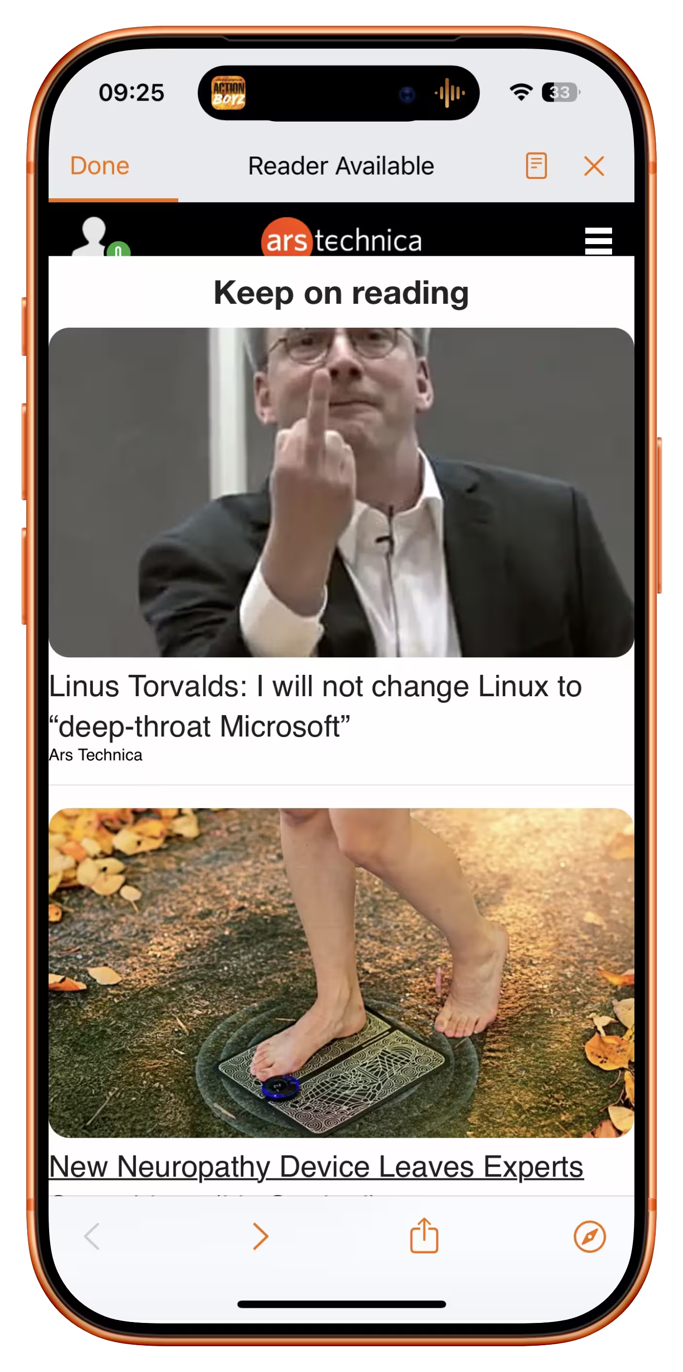
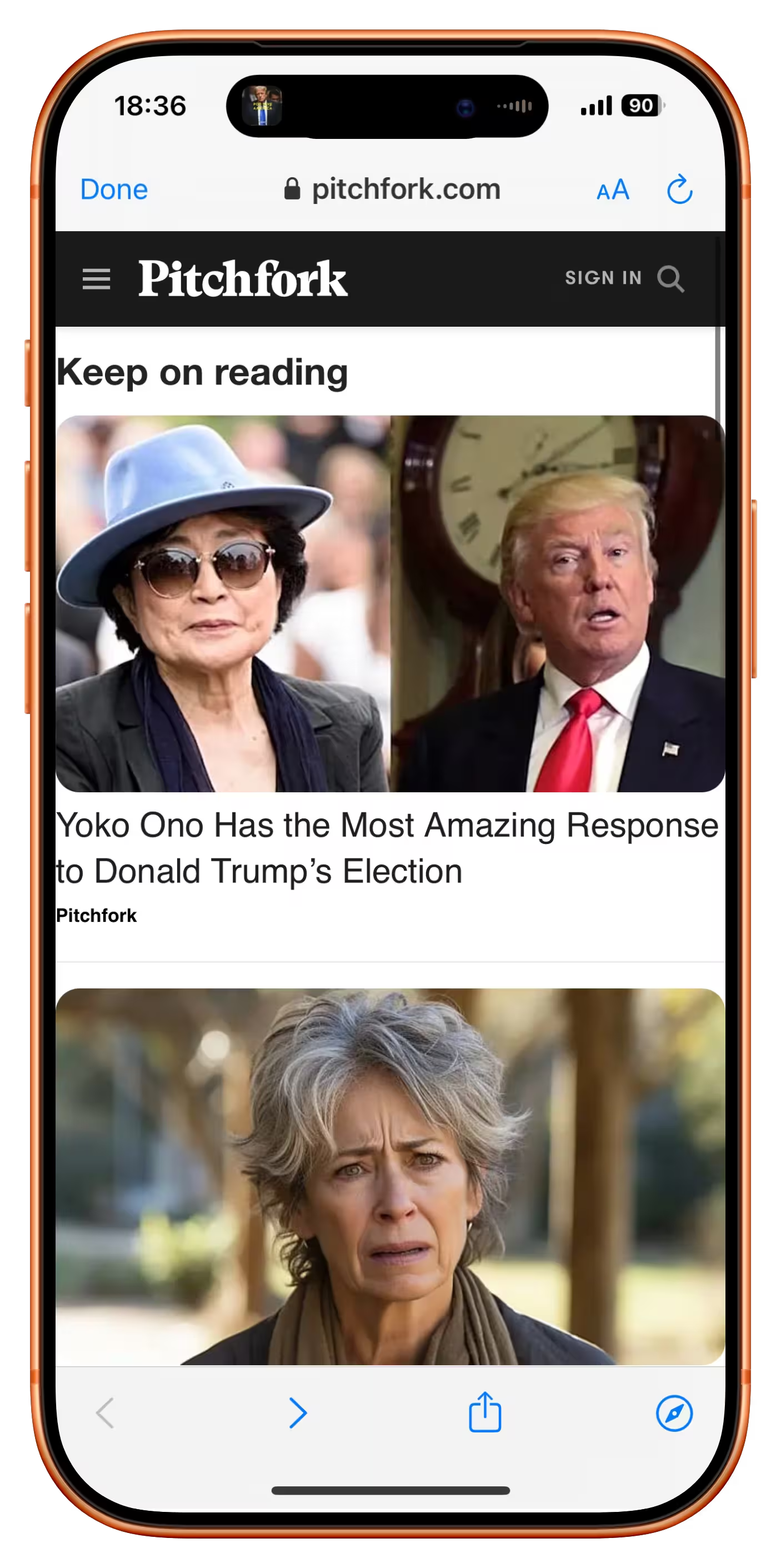
It usually shows cheap, attention-grabbing headlines (in the case of Ars Technica, the Linus Torvalds article was over a decade old!). I originally thought this was just a last-ditch attempt to keep me on the site, but when I asked on social, a reader suggested there is another reason:
It’s an SEO play. If you land on a site because of a Google search and swipe back to Google, it sends a signal to Google that it wasn’t the result you were looking for. So by forcing users to click a link on the page to read more than two paragraphs, it means the user is unable to swipe back to Google and send that negative SEO signal.
Even the bounce rate is not allowed to speak for itself.
Bear’s seamless OCR integration
Wednesday, March 25
I feel like social media and recently the slate of AI-powered “tell me what’s here” features continue to show us the power and longevity of screenshots. After all, nothing beats a more or less approachable shortcut and a file format that works literally everywhere.
But screenshots have issues, and I liked how Bear (a note-taking app) brilliantly integrated OCR inside images into its flows. This just worked for regular ⌘F finding without me having to do anything:
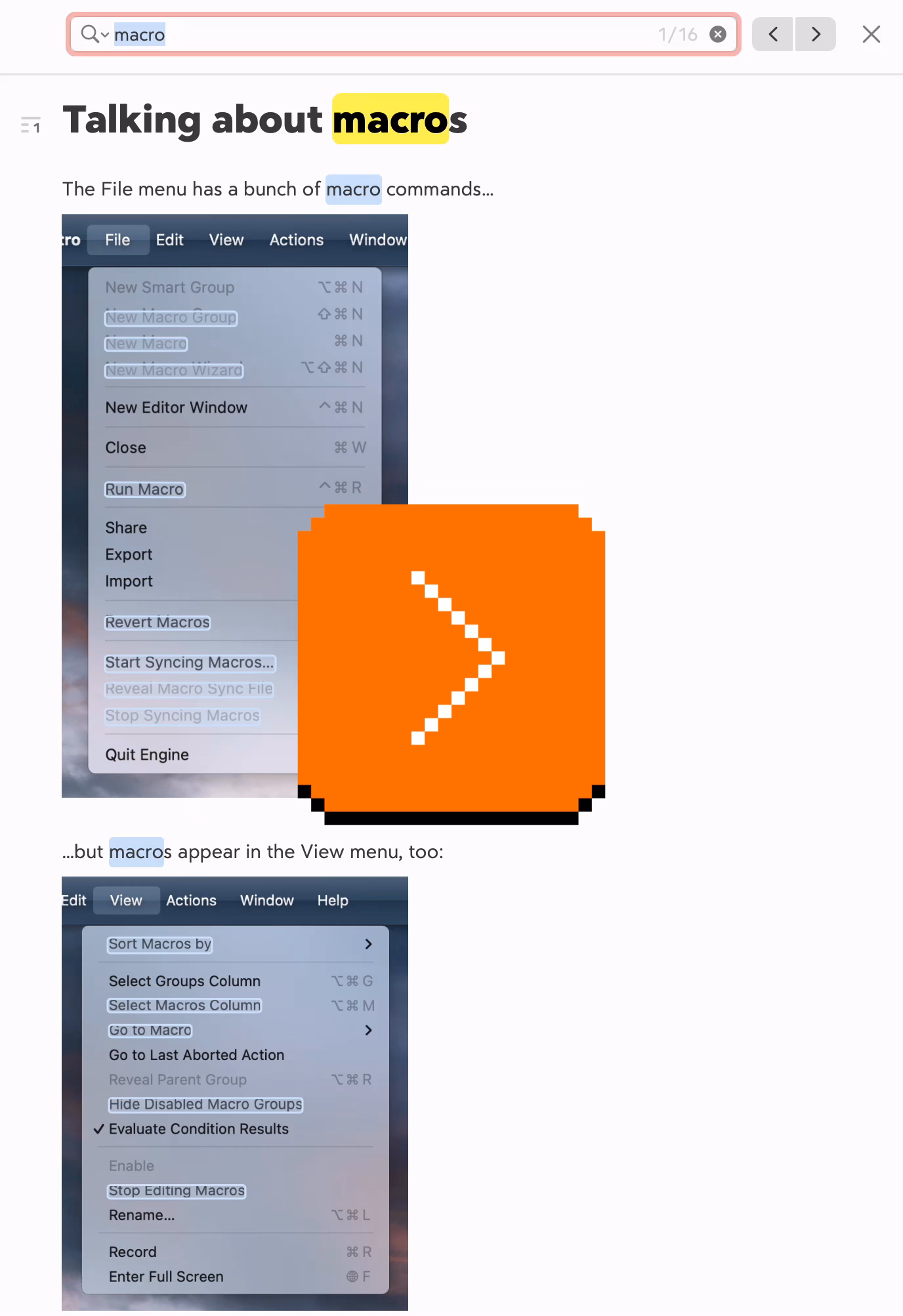
The recognized text also appears when you search through notes, and so on. It’s just a great peace of mind that you’re not going to miss on text just because you happened to screenshot it.
Apple operating systems have had detection of text inside images for a while – I know on iOS in particular it sometimes gets in a way of normal gestures – so I thought it was just that, but curiously this doesn’t work as nicely in Apple’s own Notes.
Two nice moments from MoMA in New York
Wednesday, March 25
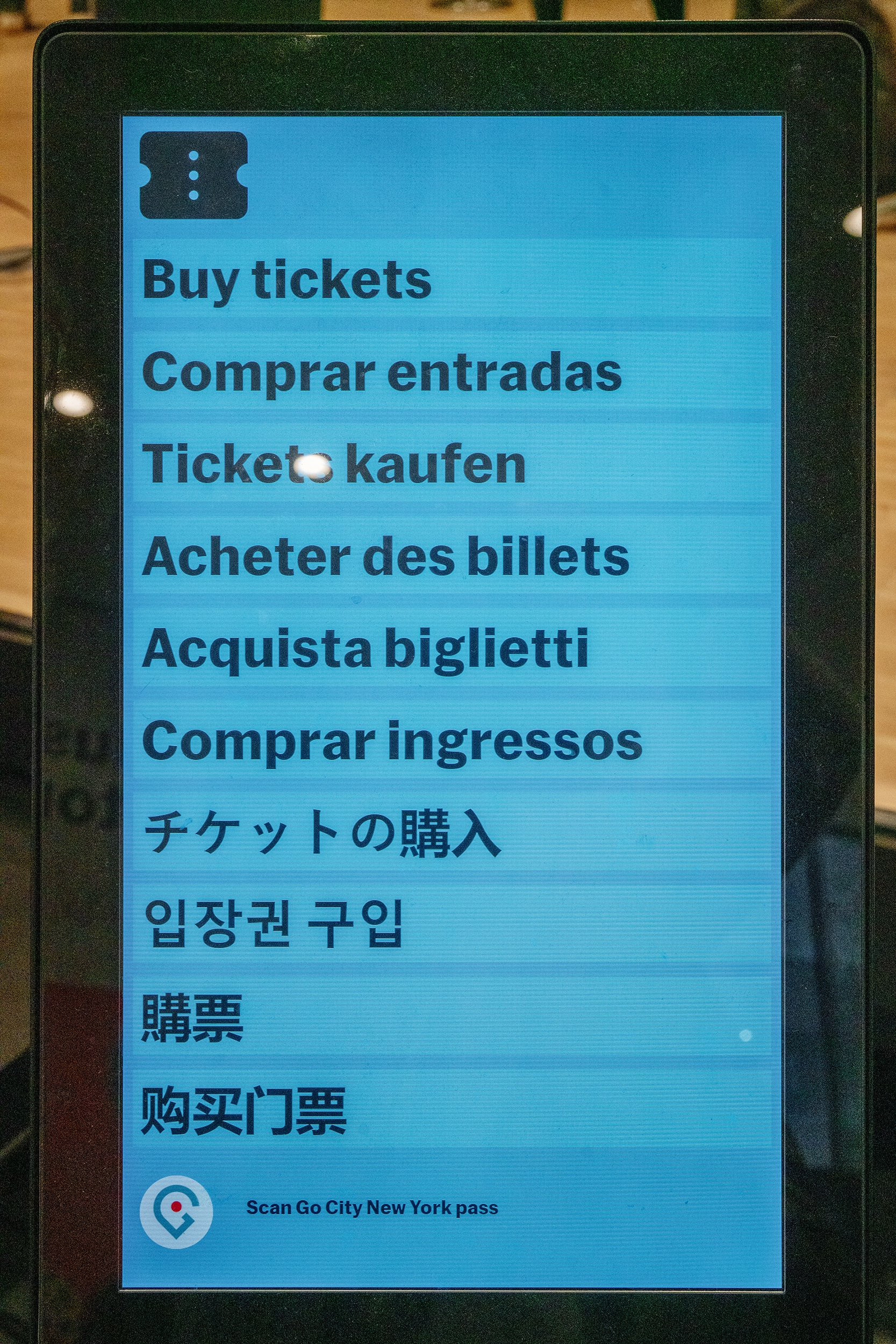
To be fair, I am traveling and haven’t looked for solid evidence or citation that this works for people, but I personally like this approach: in lieu of a separate language selector button, each option here itself is both a language selector and a commit button.
The labels themselves are not the name of the language, but a call to action; I imagine recognizing the one label that means something to you should be easy if the other nine look like gibberish.
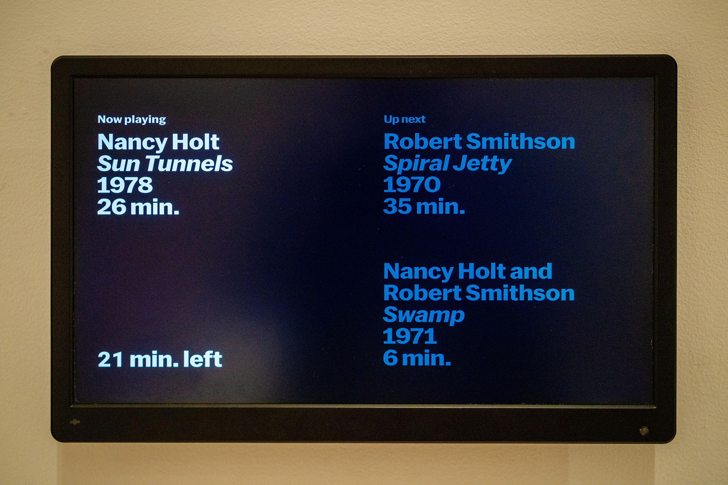
And, a thoughtful moment by one exhibit: Not only showing you where you are in the sequence of three videos, but even within the currently-playing video.
(I’m less of a fan of stretched type, though.)
“It takes an airplane to bring out the worst in a pilot.”
Monday, March 23
Speaking of fly-by-wire… William Langewiesche is one of my favourite technical writers. He finds a way to explain complex aviation aspects really well, and then add a certain amount of beauty and poetry on top of that. His style was a big influence on my book, and I like him so much I once compiled links to his writing so that others could find it more easily.
Here’s Langewiesche’s essay from 2014 about the 2009 Air France Flight 447, where an implementation of fly-by-wire – which means disconnecting the flight stick and attendant levers from immediately controlling flight surfaces via physical linkage, and instead putting motors and software in between – caused a fatal accident, as the pilots’ mental model of the system diverged too far from what was happening:
The [Airbus] A330 is a masterpiece of design, and one of the most foolproof airplanes ever built. How could a brief airspeed indication failure in an uncritical phase of the flight have caused these Air France pilots to get so tangled up? And how could they not have understood that the airplane had stalled? The roots of the problem seem to lie paradoxically in the very same cockpit designs that have helped to make the last few generations of airliners extraordinarily safe and easy to fly.
It’s an interesting read today in the context of robotaxis and self-driving, but also AI changing software writing:
This is another unintended consequence of designing airplanes that anyone can fly: anyone can take you up on the offer. Beyond the degradation of basic skills of people who may once have been competent pilots, the fourth-generation jets have enabled people who probably never had the skills to begin with and should not have been in the cockpit. As a result, the mental makeup of airline pilots has changed. On this there is nearly universal agreement—at Boeing and Airbus, and among accident investigators, regulators, flight-operations managers, instructors, and academics. A different crowd is flying now, and though excellent pilots still work the job, on average the knowledge base has become very thin.
It seems that we are locked into a spiral in which poor human performance begets automation, which worsens human performance, which begets increasing automation.
I was devastated to discover, while writing this post, that Langewiesche died last year. Rest in peace.
“This thing that Tamron’s doing is actually very cool.”
Monday, March 23
This 9-minute video from PetaPixel probably won’t make much sense for non-photographers, but there is something refreshing about this idea that there are still places where adding software is seen as positive:
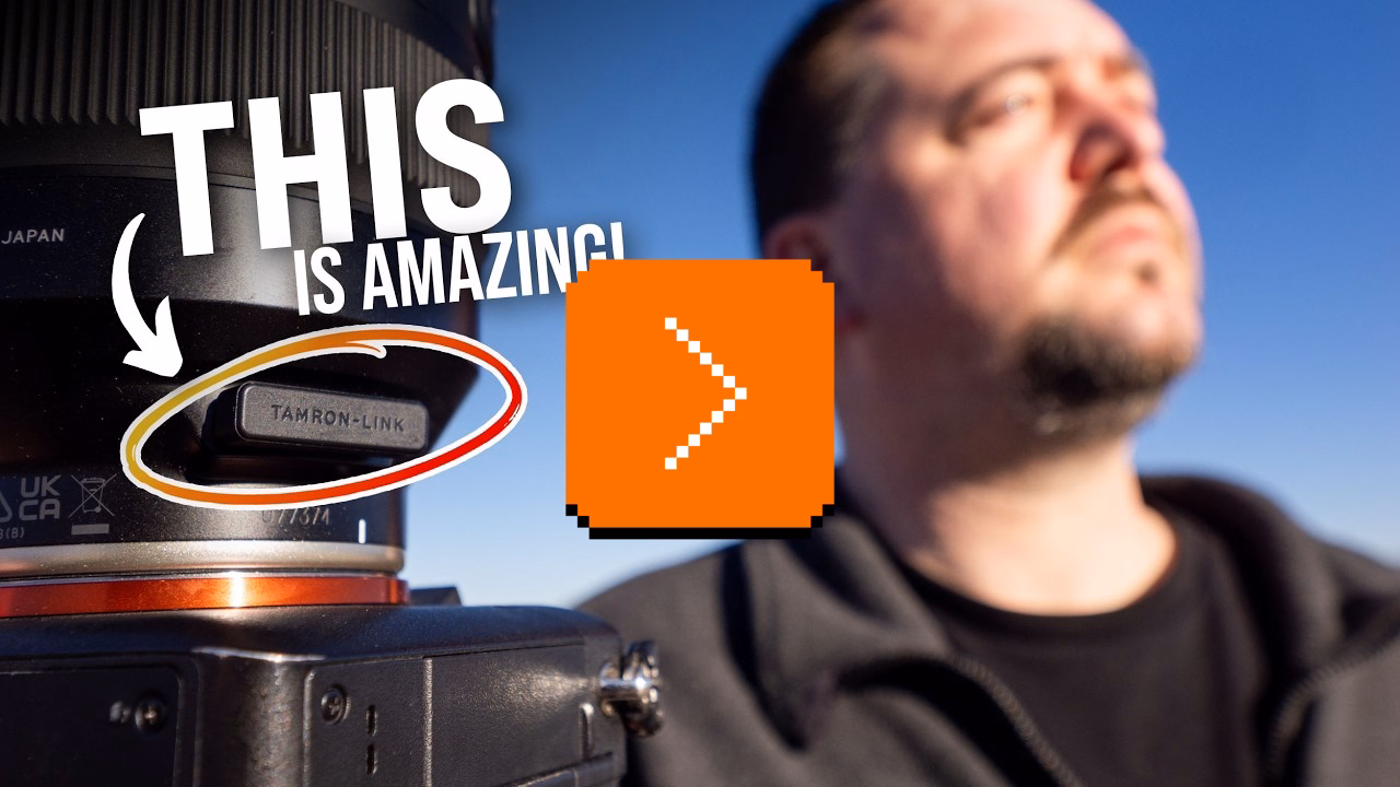
The video talks about Tamron’s lenses which have their own software (independent of the camera), and even their own USB-C port.
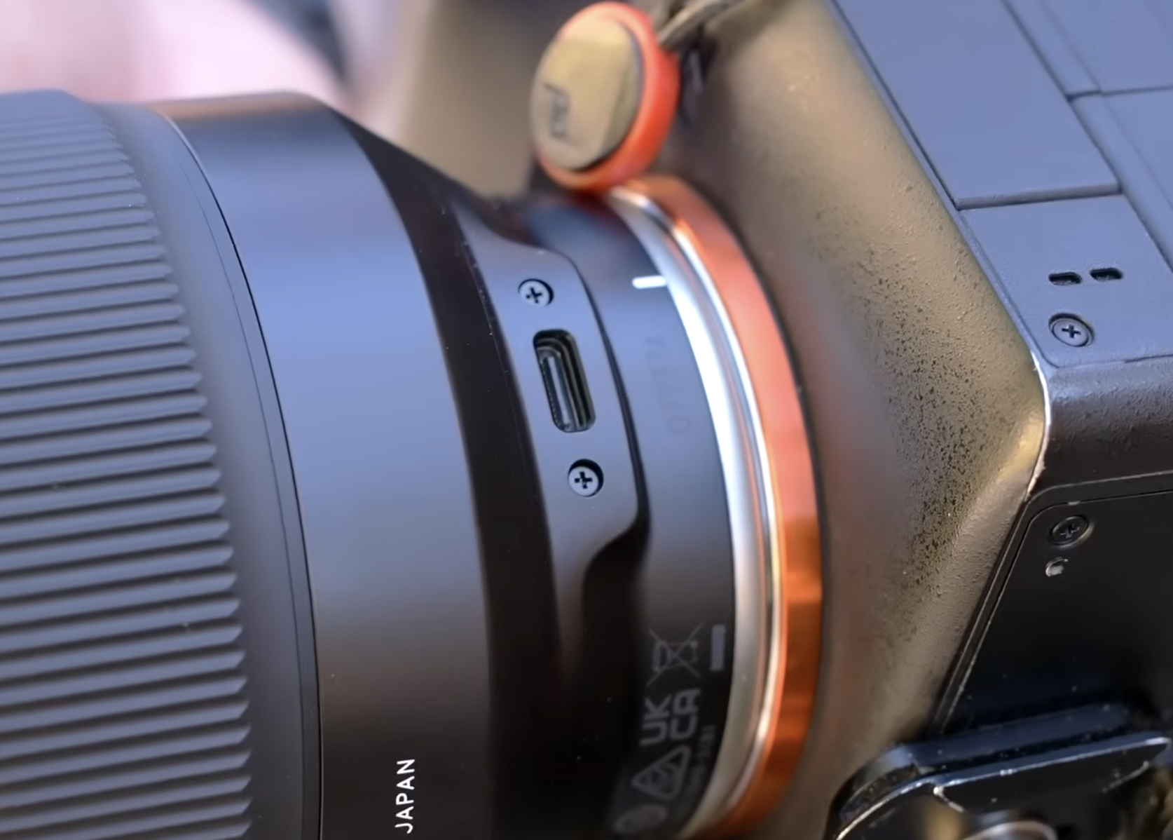
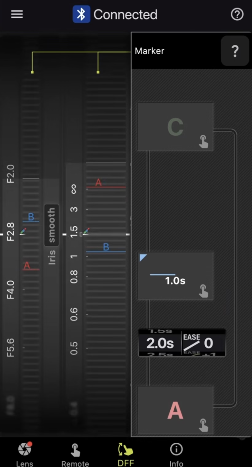
In a camera lens equivalent of fly-by-wire, the software allows to fine-tune the behaviour of hardware: what should soft buttons do, should the focus ring be responding in a linear or not, or even in which direction should it rotate. However, there are also more complex behaviours – like time lapses with focus pulls – with an interesting interface that’s definitely not beautiful, but I think still worth checking out for how it uses skeuomorphism.
“So, what makes 3D so scary and different?”
Sunday, March 22
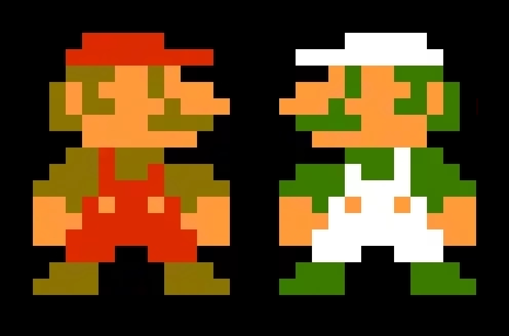
It is common knowledge that Luigi is just a palette-swapped Mario, and that the characters facing left are the same characters as those facing right, only rendered mirrored.
This interesting 9-minute video from Core-A Gaming explains how this can be kind of tricky for fighting games in particular:

Suddenly, a character with a claw on one hand, or a patch on one eye, becomes a more complex situation – without redrawing, the claw or the patch move from one side of the body to another. Then there’s the issue of open stance toward the player, turning left-handed characters into right-handed ones just when they switch to the other side.
3D fighting games can, in theory, fix all of this with more ease, as instead of redrawing hundreds of sprites they can just introduce one change to a model… but they often choose not to. Enter the issues of 2.5D fighters vs. 3D fighters, 2D characters in 3D spaces, and lateralized control schemes.
It’s a small thing that quickly becomes a huge thing.
Here’s an object in Figma with one rounded corner. Notice how the UI always tries to match the rounded corner value based on where it is physically on the screen…
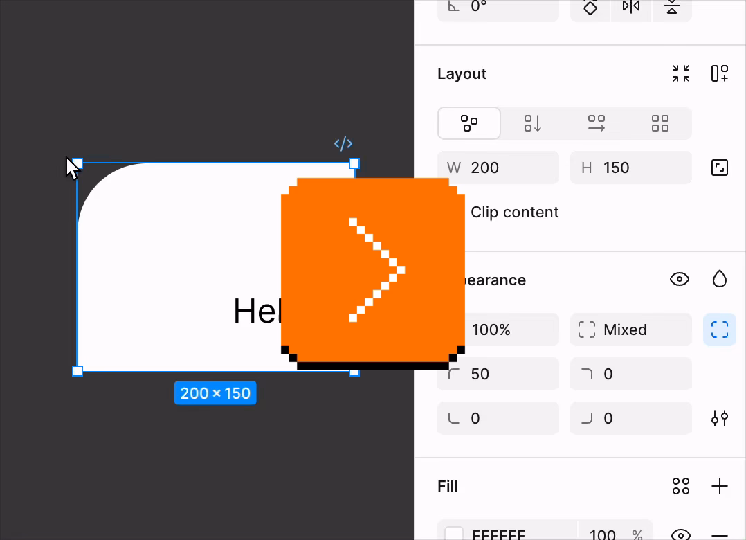
…which makes for a fun demo and feels smart, but: why don’t width and height do the same?
Turns (heh) out that this is a similar set of considerations as those in fighting games: both thinking deep about what is an intrinsic vs. derived property of an object, and what is the least confounding thing to present to the user. Since objects usually have noticeable orientation – text inside, or another visual property – width still feels like width and height like height even if they’re rotated. The same, however, isn’t necessarily true for four rounded corners. Or, perhaps, the remapping of four “physical” corners to four “logical” corners can be more error-prone.
Then, of course, there’s a question of what to do when the object doesn’t have a noticeable orientation. Like with many of the things on this blog, there are no “correct” answers. This too is a small thing that quickly becomes a huge thing.
One big step forward, three small steps back
Sunday, March 22
This is a typical iOS Gmail dialog that allows you to snooze an email so it resurfaces later:
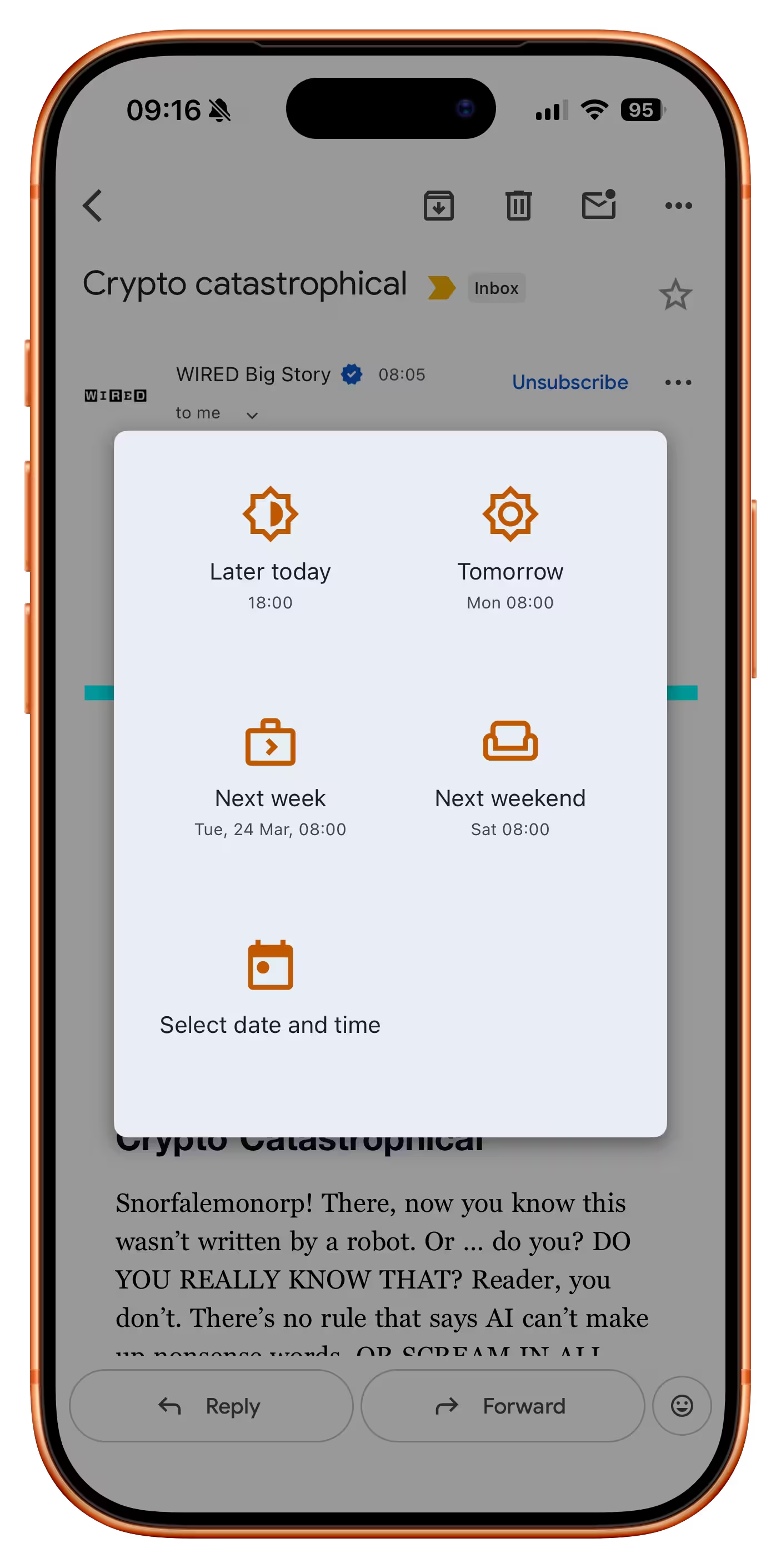
If you invoke that function on an email that’s an order receipt, a new option appears:
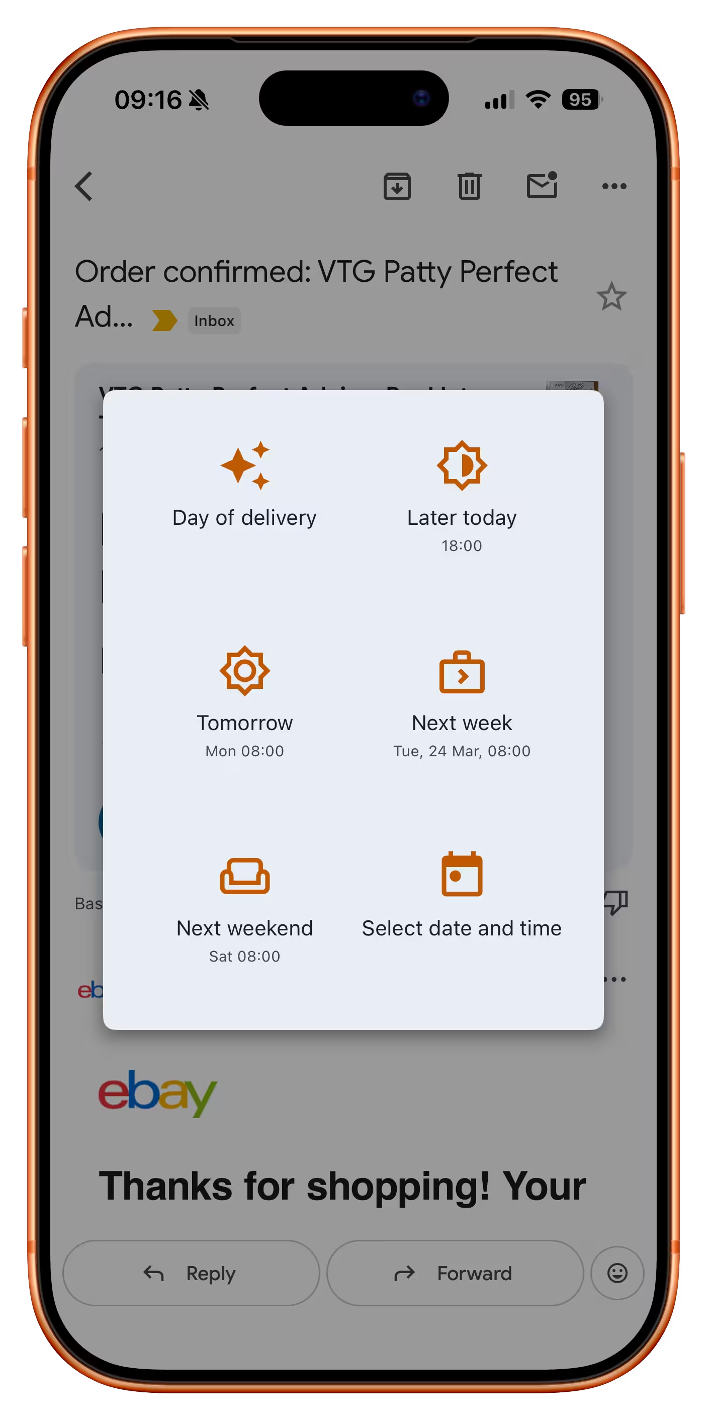
It’s great to see this clever and thoughtful button which is likely the best option here. But:
- It reshuffles everything else, preventing motor memory from building. At this point, you can no longer rely on “bottom left” to always be “custom date,” and so on with other buttons. (One idea would be to put it at the back but draw attention to it visually, or at least make it span the entire row.)
- It doesn’t show you the inferred date, even though there already is a precedent for doing that – especially important here as the feature seems to be powered by AI, which can get things wrong.
- The icon heavily promotes the AI association, which is not that useful. It would probably be better to show a truck or some other visual signifier of “delivery.”
“I don’t like it but at least I know. Thanks.”
Saturday, March 21
The search for the strangest Adobe setting continues in Lightroom, where the first option in the Interface section is… end marks:
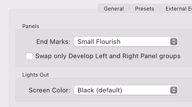
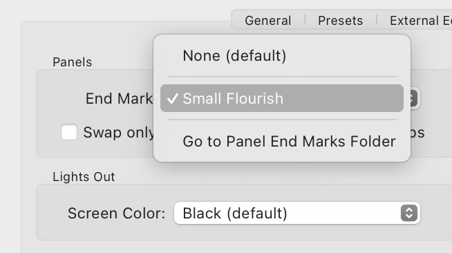
Presently, only one option is there…
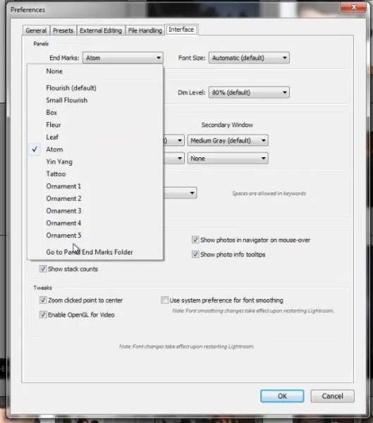
…but at least back in 2012 there were many more:
What does it do? It adds an old-time’y glyph at the end of either left or right panel.
The internet is rife with people perplexed by this option and I cannot deny – I’m one of them. (The title of this post is a reaction of one of the users.) It feels like such a peculiar way to add delight.
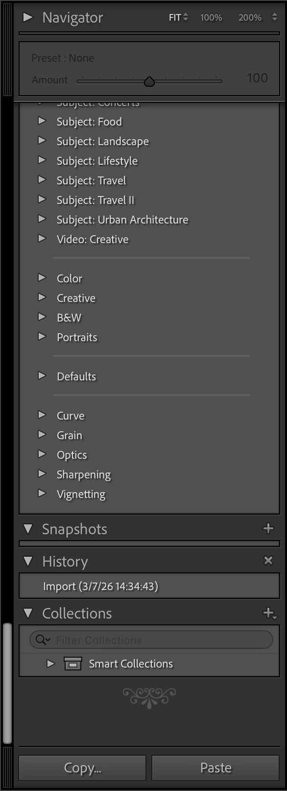
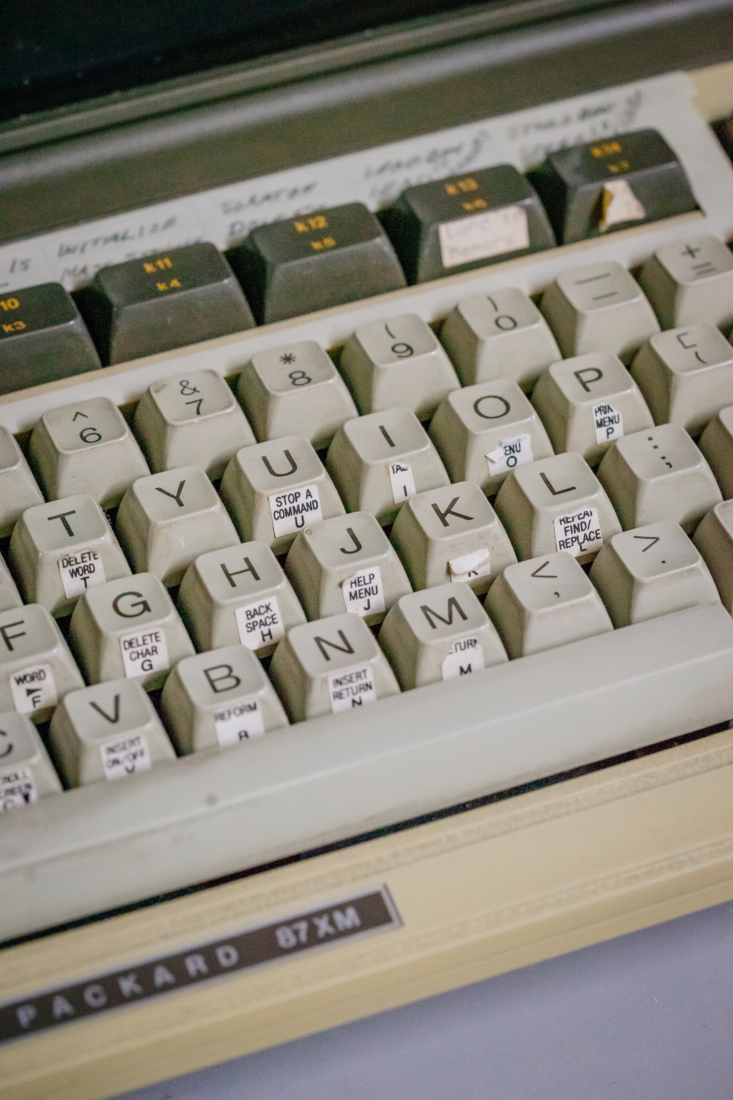
You are not limited to the pre-existing (one) flourish, as you can upload your own. Some people add a logo of their production studio, but John Beardsworth found a more creative use:
Alternatively, with a tiny bit of imagination you can exploit an often-forgotten detail of Lightroom’s interface – the “panel end marks”. These decorations at the bottom of Lightroom’s panels have often been derided as a waste of programming time, but in fact they can be made to serve more than their somewhat-trivial purpose. And as you can see in the examples on this page, they can serve as a reminder of star ratings, colour labels and even keyboard shortcuts for flags.
This is a fascinating hack, and an example of William Gibson’s famous “the street finds its own uses for things.” It made me curious why didn’t onscreen interfaces ever evolve to allow you to annotate them easily? You see stuff like this a lot in real life…


…but the Lightroom end mark hack is the only thing that comes to my mind where an onscreen UI got this kind of a treatment – and the feature wasn’t even intended for that use.
“Michael here will handle the bullshitting.”
Saturday, March 21
I linked to this opaquely on Thursday, but it deserves its own entry. Michael Bierut’s 2005 essay called “On (design) bullshit” is one of my favourite design essays:
It follows that every design presentation is inevitably, at least in part, an exercise in bullshit. The design process always combines the pursuit of functional goals with countless intuitive, even irrational decisions. The functional requirements — the house needs a bathroom, the headlines have to be legible, the toothbrush has to fit in your mouth — are concrete and often measurable. The intuitive decisions, on the other hand, are more or less beyond honest explanation. These might be: I just like to set my headlines in Bodoni, or I just like to make my products blobby, or I just like to cover my buildings in gridded white porcelain panels. In discussing design work with their clients, designers are direct about the functional parts of their solutions and obfuscate like mad about the intuitive parts, having learned early on that telling the simple truth — “I don’t know, I just like it that way” — simply won’t do.
So into this vacuum rushes the bullshit: theories about the symbolic qualities of colors or typefaces; unprovable claims about the historical inevitability of certain shapes, fanciful forced marriages of arbitrary design elements to hard-headed business goals. As [Harry G.] Frankfurt points out, it’s beside the point whether bullshit is true or false: “It is impossible for someone to lie unless he thinks he knows the truth. Producing bullshit requires no such conviction.” There must only be the desire to conceal one’s private intentions in the service of a larger goal: getting your client it to do it the way you like it.
“I don’t know, I just like it that way” is such a tricky part of craft.
Design is more
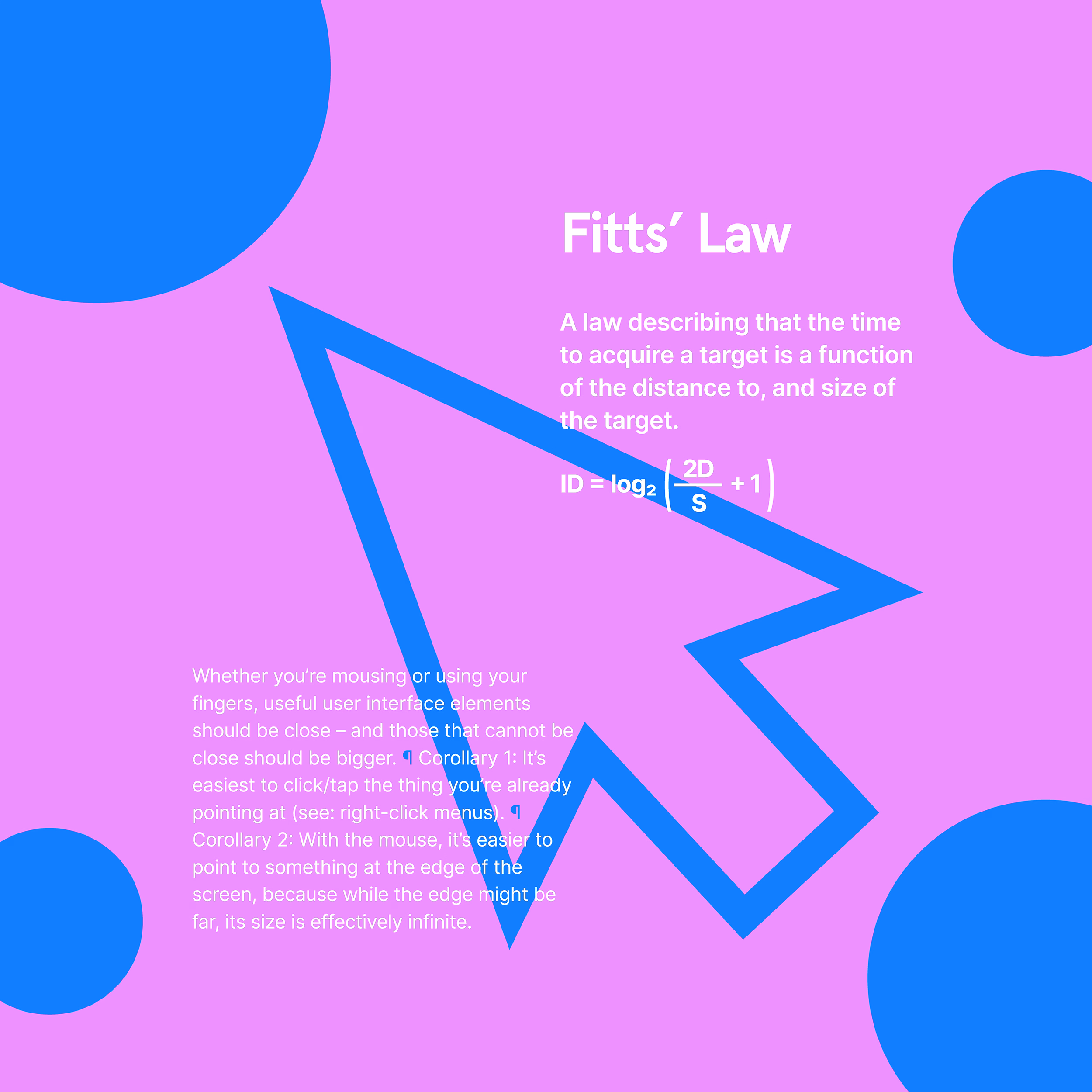
Friday, March 20
During my first year at Figma, I designed and printed a run of posters for the office titled “Design is more.” The idea was to highlight that UX design is more than people expect, and connected in interesting ways to other domains. Today, they feel like a spiritual predecessor to this blog.
The first series was three posters:
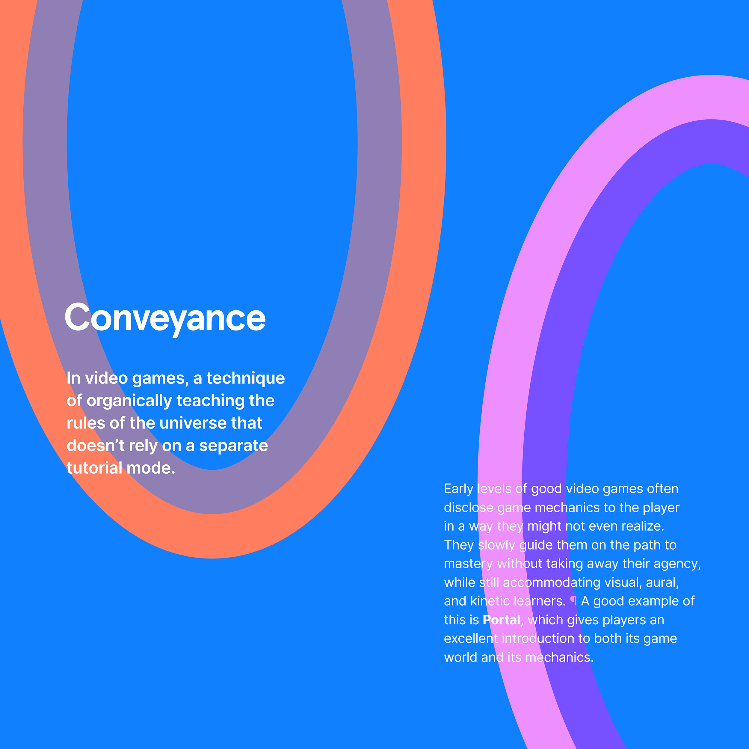
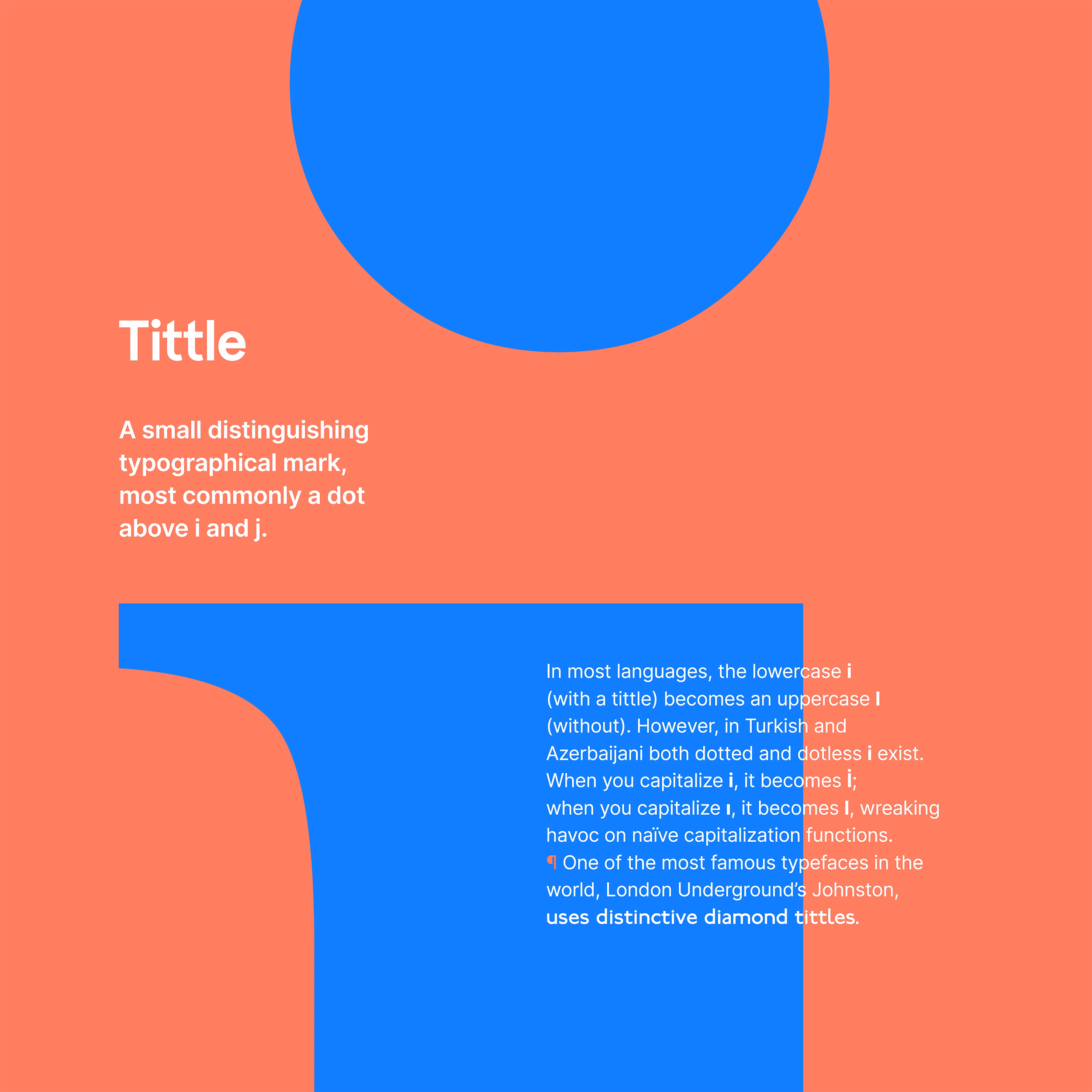
I still (mostly) like them. I do believe that software can learn more about conveyance from video games; a lot of first-run experiences and particularly new feature onboarding still feel like a series of random pop-ups floating around the screen without much understanding of me as a user.
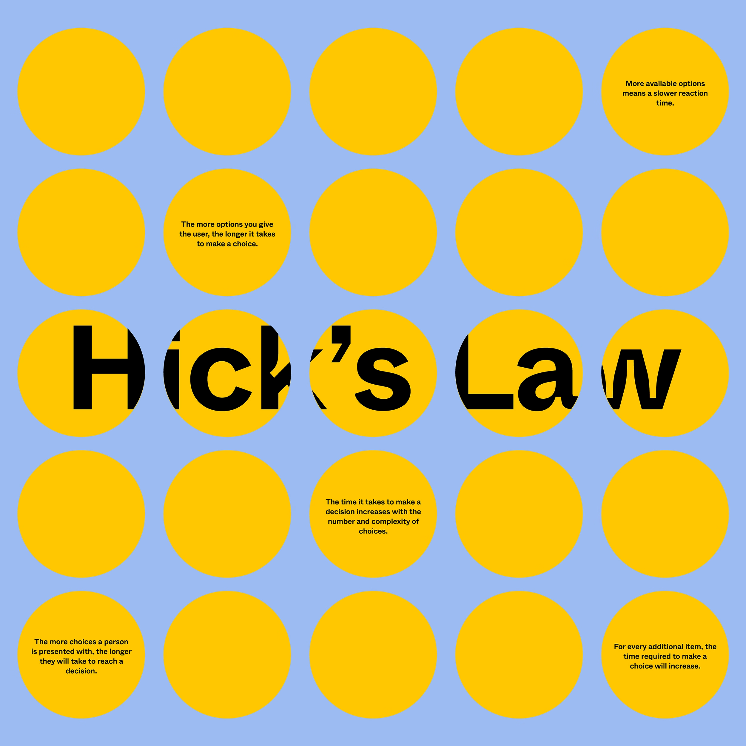
I would rewrite these posters, however, and particularly the Fitts’s Law examples: they’re generic and probably not as relevant to today’s applications.
After series one, we also collaboratively started working on series two, but the pandemic put a halt to the effort, and these posters were never finished/printed. But the two below were perhaps closest to ready, and they seem fun today; I particularly liked the joke on the Hick’s Law one.
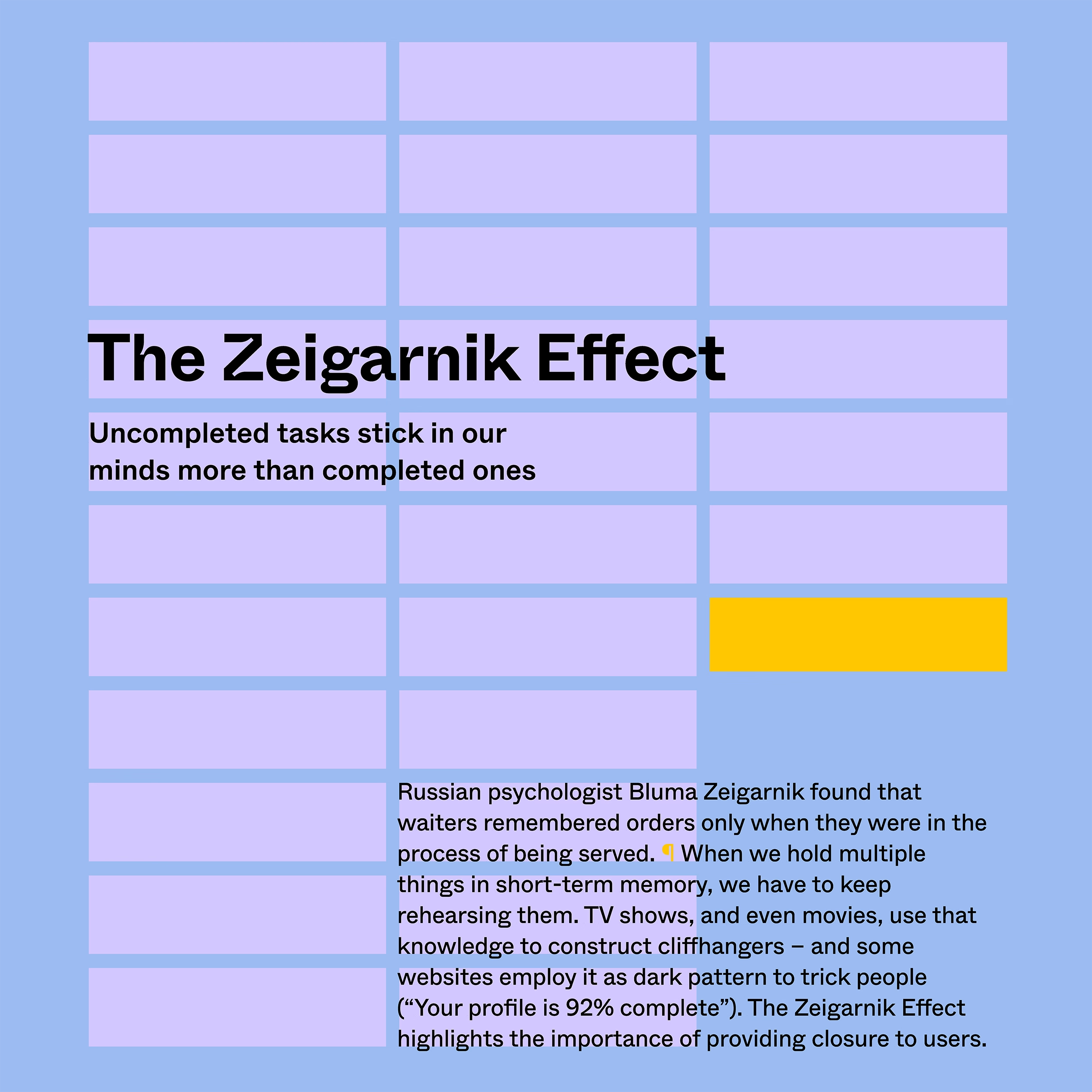
Jon Yablonski, the author of “Laws of UX,” made some posters in a similar vein and they’re available for purchase. His are slightly more on the visual side, but I was delighted to discover today that we both chose a rather similar approach to visualizing the Zeigarnik Effect.
(200th blog post here!)