“Less of a pitch, more of a prediction”
Welcome to this week’s digest of Unsung, a blog about software craft and quality. Here’s what was posted in the last week:
“I’m hoping that the listeners out there, when they hear it, they’ll feel seen.”
Thursday, April 2
This 25-minute segment on MKBHD’s Waveform podcast (video or audio, segment starts at 40:21) is from November 2024, and is a nice counterpart to the post about favourite well-made apps and sites.

The original theme is “what is an app that you use all the time, and like to use, but is actually a bad app?” but it quickly moves to a more general conversation about good and bad mobile apps.
It’s always interesting to me to see what themes emerge and what other people think is important. Here’s the list where I linked to relevant apps as long as I could find them:
Bad apps:
- Google Messages – dinged for unreliable spam and lack of organization/filtering
- Notion (on mobile) – hard to orient yourself and some direct manipulation is wonky
- many smart home accessory apps – bad and redundant with Google Home, but have to keep for emergencies
- Netgear Orbi (network router) – specific functionality and bad password recovery
- Hatch (white noise machine for babies) – simple things are hard to discover
- Nest app/Nest Yale Smart Lock – bad integration
- Goodreads – stale
Good apps:
- ButterflyMX (smart building lock app) – reliable
- UDisc (score keeper for disc golf) – good functionality, great in a free version
- New York City ferry
- New York City ticket payment – reliable and has many payment options
- Greenwich, CT and San Francisco parking apps – live activities
- The StoryGraph – cool graphs and stats about your book reading patterns
#above and beyond / #podcast / #touch / #youtube
For your consideration: Tab to fix spelling
Thursday, April 2
A few years ago, I suggested adding a new interaction to Figma. If your text cursor was on a misspelled word (anywhere inside, or the edges), you could press Tab to quickly accept the suggested correction, without even seeing it:
Independently, Google Docs approached it from a slightly different angle, but landing on a similar interaction – in their version there’s a small visual callout, although you can still press Tab (and then Enter) to accept the suggestion:
I know the Tab key has a lot of jobs – from indenting bullet points to jumping through GUI elements – but in this context this new addition doesn’t seem to be in conflict.
(Should I write a long photoessay about the Tab key, similar to the ones I wrote for Return/Enter and Fn keys?)
Since we added it, I’ve really loved how it feels. From various typeaheads and autocompletes elsewhere, Tab has a strong “forward movement” energy so it makes conceptual sense, and it’s just really fun to go around and quickly fix your writing this way.
I think a lot about how to make keyboard interactions feel superpower-y: a good keyboard shortcut on a large key, a tight interaction, a blink-of-an-eye velocity – something that’s eminently designed to lodge itself in your motor memory as quickly as possible, as it builds on top of prior motor memory. I’m biased, of course, but I like the “no scope” Figma version more, and it has that feeling to me.
#flow / #interface design / #keyboard / #text editing
Anachronisms
Wednesday, April 1

#easter eggs / #humor
Testing tip: Enable the zoom peek gesture
Tuesday, March 31
Go to Settings > Accessibility > Zoom, and then turn on “Use scroll gesture with modifier keys to zoom.”
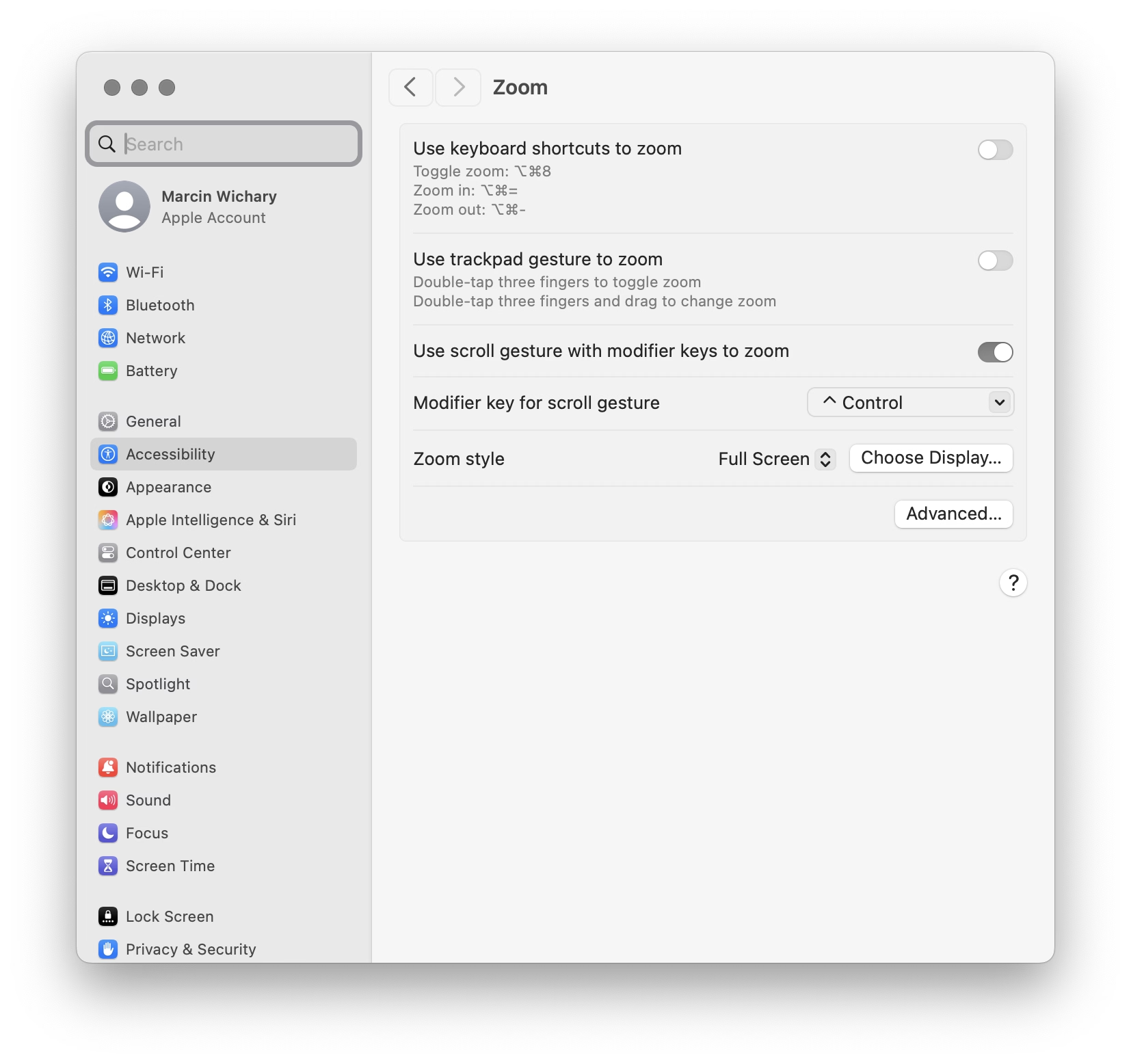
Then, at any moment, you can hold Control and swipe with two fingers (or use a scroll wheel) up or down to zoom the entire screen.
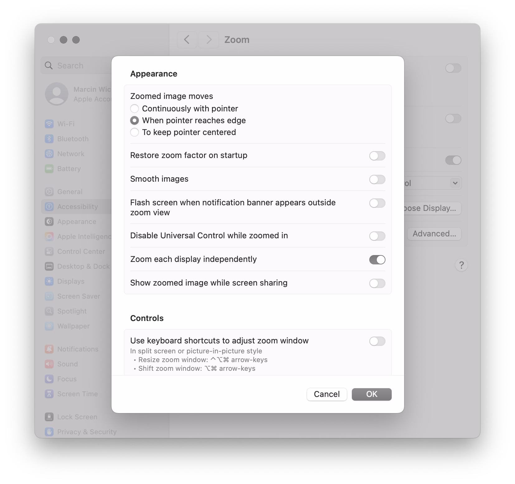
I’d also recommend turning off “Smooth images” under “Advanced…” so you see individual pixels better:
Over the years, I found this feature very useful to inspect various misalignments, to check visual details, and occasionally simply to read text that’s too small.
Compared to other ways of zooming, this one has three benefits:
- it’s extremely motor-memory friendly and so my fingers do it without me even thinking
- it’s a system-wide thing, so it will work everywhere
- it’s safe, because it’s something that I call a peek gesture
Peek gestures are fast, but the main benefit is that they’re safe. In some apps, pressing ⌘+ a few times and then ⌘– the matching amount of times doesn’t guarantee you will end up back in the same situation. The window size might change, the scroll position might move, the cursor might end up in a different place. In contrast, the Ctrl gesture is 100% deterministic and reversible; it will always work the same and never mess anything up.
I treasure peek gestures in general. Here are a few other useful (and/or inspiring?) ones:
- previewing things in Finder by pressing (or, for power users, holding) the spacebar
- using ⌘⇧4 with the intention not to take a screenshot, but just to (roughly) measure a distance between two objects, and then pressing Esc to abort
- in tools like Figma and Sketch, using Ctrl+C just to quickly verify the color, and pressing Esc to cancel (rather than clicking to put the color into the clipboard or apply it elsewhere)

- I also previously mentioned Chrome typeahead and macOS menus that had a similar property
#definitions / #mac os / #tips
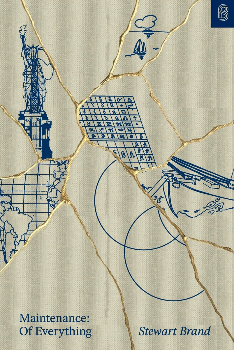
Book review: Maintenance: Of Everything (Part One)
Tuesday, March 31
★★★☆☆
The new book by Stewart Brand is tackling a subject that’s important to me. The introduction struck a chord:
The apparent paradox is profound: Maintenance is absolutely necessary and maintenance is optional. It is easy to put off, yet it has to be done. Defer now, regret later. Neglect kills.
What to do? Here’s a suggestion: Soften the paradox, and the misbehavior it encourages, by expanding the term “maintenance” beyond referring only to preventive maintenance to stave off the trauma of repair—brushing the damn teeth, etc. Let “maintenance” mean the whole grand process of keeping a thing going.
Ultimately, alas, the book doesn’t really expand on this suggestion. While the volume feels rich and dense in some ways – illustrations, extra commentary, highlights – its surface area ultimately appears to be rather shallow. Ironically, given the subject matter, it feels like Brand fell prey to a bunch of “sexy” stories, some of them only tangentially related to maintenance.
I will just say it: I wish the author was more woke. The book is very male-coded. The main chosen areas of investigation are: motorcycles! tanks! guns! wars! There are moments towards the end where Elon Musk and Bill Gates are talked about as if it was still 15 years ago and we haven’t actually learned anything since. (No word of Cybertruck, either.)
We know maintenance tends to be unrewarded and forgotten come promotion time. We know that tedious tasks are often assigned to women and people of color while white men go around doing “genius things.” It’s hard to imagine women not being present in a book about maintenance, and yet – and I wish I was joking – the only woman of any significance in the entire book is… The Statue Of Liberty.
That aside, before opening the book, I hoped it would provide me some vocabulary and evolved thinking about maintenance that I could put to use, and there are some moments where it almost approaches what I wanted from it. Here’s a passage:
Powell credits the Israeli military with a mindset that naturally viewed damaged tanks as soon-to-be-repaired tanks, rather than the irredeemable flotsam of battle. The fact that [Israeli] commanders thought in these terms gave purpose and direction to the maintenance-related technical and tactical skill their crews possessed.
This is fascinating. Tell me how? Tell me what was needed to make it happen? But, unfortunately, outside of some basic tenets of “give the rank and file more freedom to do things” and “embrace improvisation,” the book doesn’t seem to offer more.
Elsewhere, there is this quote:
In almost every plant I worked at, QA was seen as a hindrance to hitting productivity metrics. We never got credit for a well-maintained manufacturing capability, but QA almost always got blamed when things went wrong.
…which, again, felt like a fascinating thread to pull on. But instead of digging deeper, this is left hanging without investigation.
The book doesn’t really have a proper ending with synthesis of what came before, and generally meanders a lot – to a point that the table of contents has more “digressions” than actual subjects. It also feels occasionally rambling and occasionally showing off (name-dropping people like Kevin Kelly and Freeman Dyson, or quotes from “beta-tester” readers that mostly serve to paint Brand in a positive light), which takes away from otherwise brisk writing and at times truly excellent storytelling. (The first chapter in particular is fantastic.)
If you want an easy-to-read, breezy, well-typeset book filled with historical anecdotes, and the above caveats do not bother you, this might be a fun read! But I expected more from it.
The one place where the book shines is pointing people toward other books – there are pages that feel more like literature review (done really well!), and the end matter has bibliography and recommended reading with notes. So in that way, while disappointing in and of itself, it could also become an interesting starting off point for more research.
#book review / #maintenance
“Naïve, simple, not good enough.”
Monday, March 30
This is a thoughtful post from Florian Schulz about designing a typeahead experience.
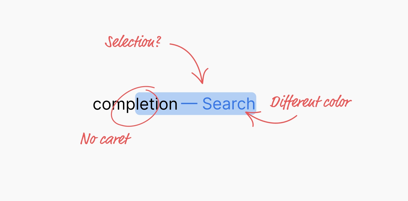
I liked the details both within the implementation – for example, making sure the kerning is preserved! – but also in the presentation. I particularly enjoyed Schulz making the component demo itself, rather than using prerecorded videos. (I was delighted to discover that even the first large “picture” of the component is actually interactive!)
A small comment to this bit:
Unfortunately, not all browsers expose the selection or accent color of an operating system. For example, if a user would set the accent color in macOS to pink, the special CSS keyword color “Highlight” will still result in a light blue color in Safari. In other browsers like Chrome, the color will match the user preference. But since this is an attack vector for user tracking / fingerprinting, Apple made the right choice to hide the user preference from developers.
From my understanding, this is not necessarily correct. For example, in theory, the purple visited link color can be used for fingerprinting, by building a profile of whether or not I visited one of the hundreds of popular websites, quietly in the background.
The way browsers solve this is to never expose the color programmatically back to JavaScript – if your code asks for a link color, it will be blue regardless of whether the link was visited or not. It seems to me that the Highlight color could be used the same way here. Given that CSS now supports things like color-mix(in srgb, Highlight 20%, white), it would even allow a designer to riff on the color without ever knowing what it is.
#frontend / #keyboard
“There is no quality or historical significance standard.”
Monday, March 30
Multibowl is one of my favourite emulation projects because it’s a rare example of using emulators creatively, rather than for nostalgia or research.
It’s a 2016 game by Bennett Foddy and AP Thompson that reimagines older existing games as smaller pieces of a new, Super Mario Party-like experience. Two players randomly join one of 300 games – sometimes in medias res – with a small explicit goal that can be accomplished in about ~30 seconds, after which a point is awarded, another game is loaded, and so on.
All of this is done through actual emulation and fast switching of games’s original code:
Regarding the game choices, at the outset, I wanted to curate a list of moments of gameplay that would be meaningful if played for just a short period of time. Sometimes it’s obvious – you can take a moment from a fighting game where both players are low on health, or play a sports game from the start until the first point is scored. So that’s where I started. Over time, I figured out that you could make exciting moments in games that are not otherwise interesting for a competitive duel. For example, in Dodonpachi (a bullet hell game) we take away the player’s guns and challenge them to stay alive in a huge hail of bullets.
For games that were designed as cooperative experiences, I eventually gravitated toward the structure ‘score more points but do not die’, which forces the players to calibrate how much risk they take relative to the other player.
This excerpt is from a 2017 interview of Foddy by Seb Chan from ACMI. There are many interesting moments in that interview, such as the issue of curation:
Multibowl is not a very precise historical curation like you might make for a museum exhibition, where you can only show a couple of dozen things at most. It’s a huge driftnet of games. There is no quality or historical significance standard, and no attempt to balance out the games in terms of nationality or gender. The only curatorial instinct that it follows is to find the most diverse set of game ideas. With each piece distilled down to a randomly-selected 30-second slice, there’s room for an infinite number of them.
In fact, contrary to a museum curation, the point of Multibowl is to have too many games for a single player to see. It’s best when it feels too big to grasp. I think, now that there are 300 games in there, it’s starting to feel that way.
Unfortunately, it is not possible to actually play Multibowl outside of special events, given copyright issues. In addition to general emulation copyright murkiness, Foddy adds, “I don’t think the actual bits of actual games have ever been used as the fabric of a larger game before.”
However, a really fun introduction to Multibowl is another art project from a now-defunct comedy duo Auralnauts, who actually played Multibowl pretending to be Kylo Ren and Bane, to hilarious results:
#art / #emulation / #games / #humor / #youtube
World-class female singers
Sunday, March 29
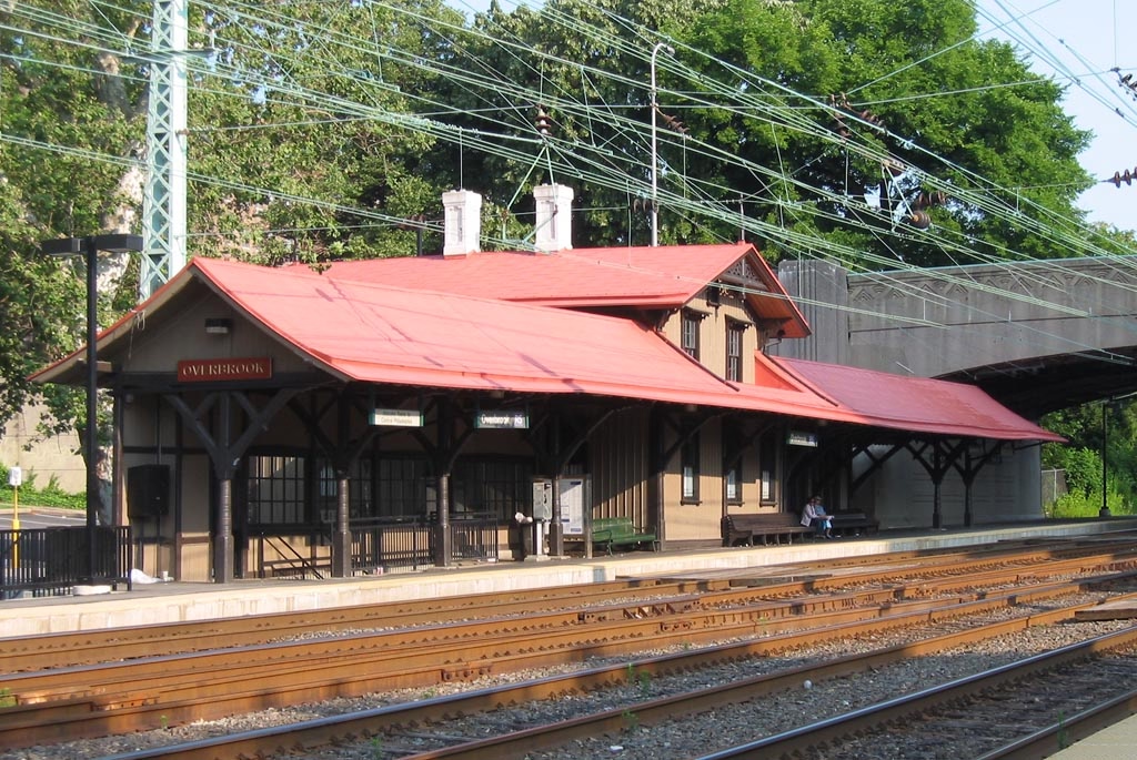
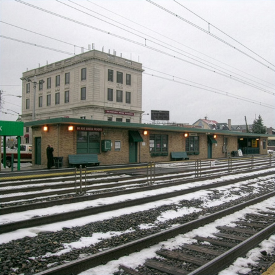
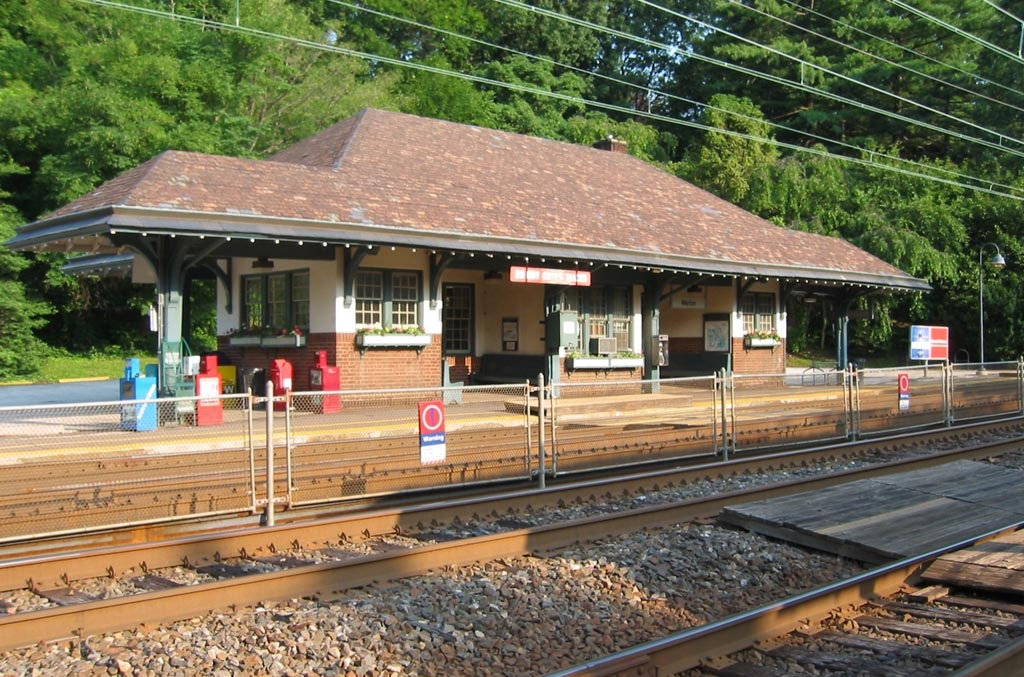
The story about the original Macintosh’s built-in font set being named after “world-class cities” is well known and documented by Susan Kare on the Folklore site:
The first Macintosh font was designed to be a bold system font with no jagged diagonals, and was originally called “Elefont”. There were going to be lots of fonts, so we were looking for a set of attractive, related names. Andy Hertzfeld and I had met in high school in suburban Philadelphia, so we started naming the other fonts after stops on the Paoli Local commuter train: Overbrook, Merion, Ardmore, and Rosemont. (Ransom was the only one that broke that convention; it was a font of mismatched letters intended to evoke messages from kidnapers made from cut-out letters).
One day Steve Jobs stopped by the software group, as he often did at the end of the day. He frowned as he looked at the font names on a menu. “What are those names?”, he asked, and we explained about the Paoli Local.
“Well”, he said, “cities are OK, but not little cities that nobody’s ever heard of. They ought to be WORLD CLASS cities!”
So that is how Chicago (Elefont), New York, Geneva, London, San Francisco (Ransom), Toronto, and Venice […] got their names.
If you check out the actual Philly stops and witness all their provinciality, you can understand what Jobs was after:
Go to first Macintosh via Infinite Mac, open Infinite HD and MacWrite within, and you can examine the nine eventual fonts in their pixellated, cosmopolitan glory:
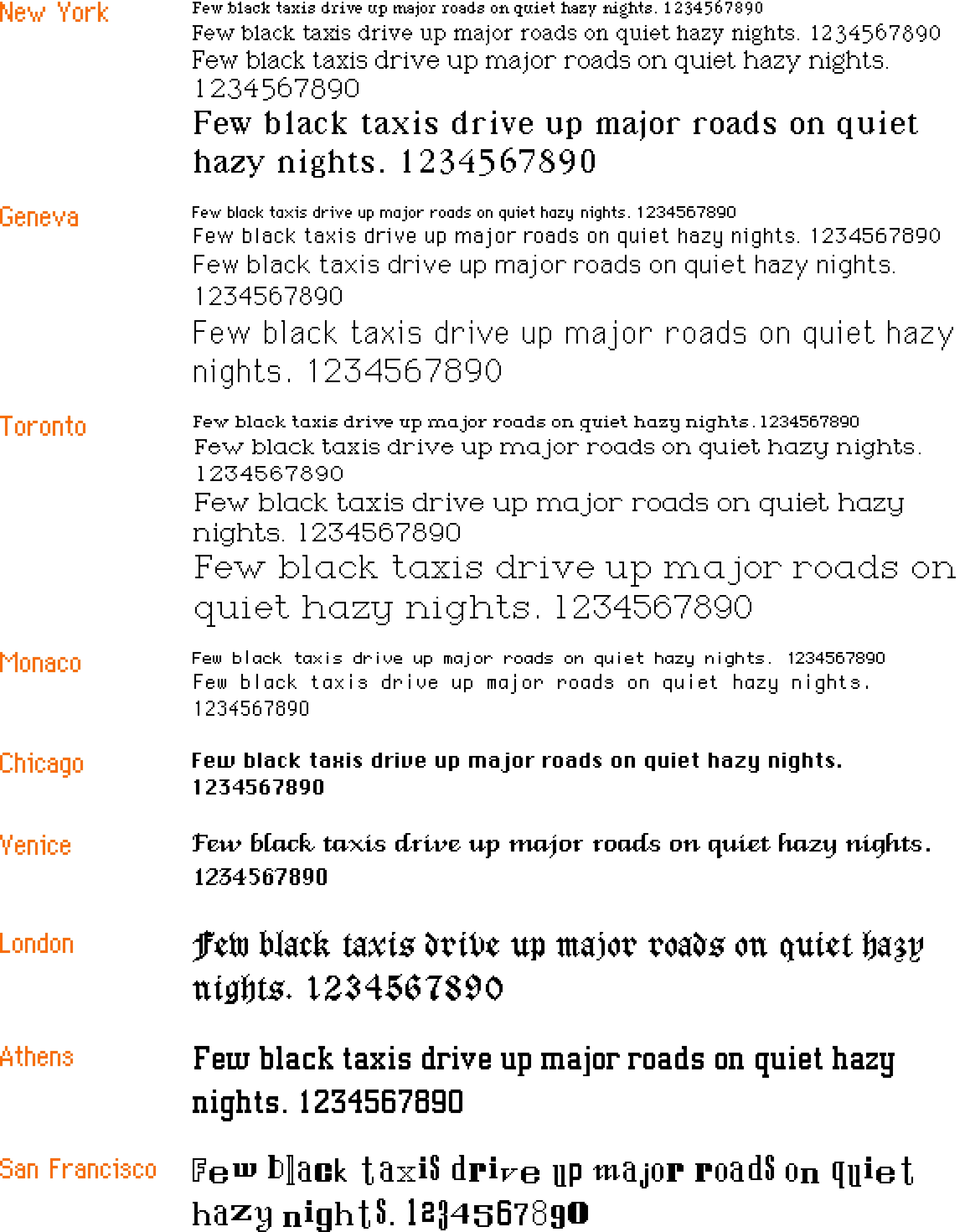
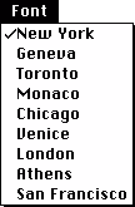
The list goes in this order: New York, Geneva, Toronto, Monaco, Chicago, Venice, London, Athens, San Francisco.
But: How about some hard evidence for the original anecdote? Turns out, the March 1984 issue of Popular Computing used pre-release Mac software and printed a screenshot of the names rejected by Jobs:
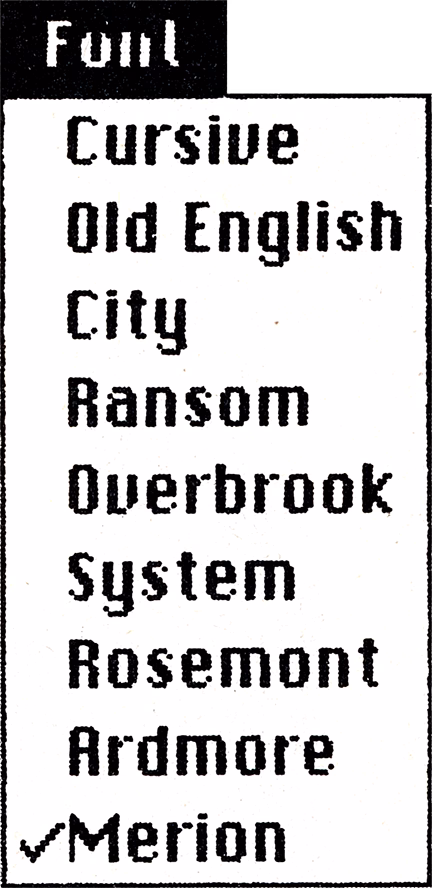
Since on the facing page we see the output in the same order, coming up with the correct mapping is not hard:
- Cursive → Venice
- Old English → London
- City → Athens
- Ransom → San Francisco
- Overbrook → Toronto
- System → Chicago
- Rosemont → New York
- Ardmore → Geneva
- Merion → Monaco
One has to admire the final order of the Mac fonts that went from dependable and utilitarian at the top, to progressively more weird; this earlier list is all over the place.
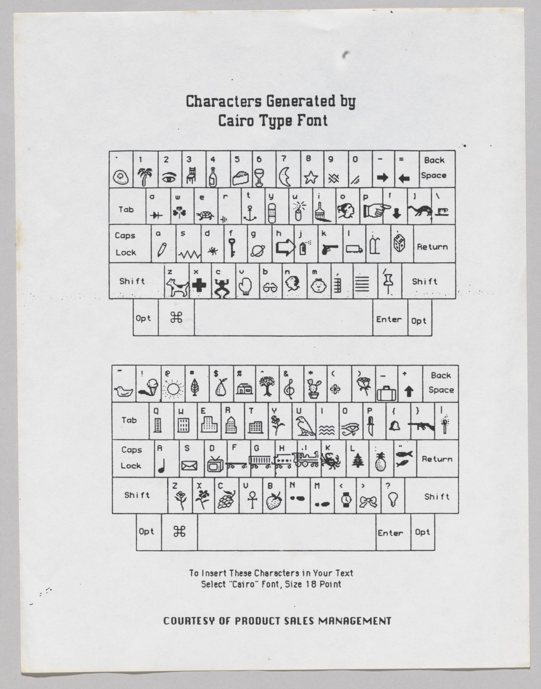
In later releases of Mac OS, three other world-city fonts – Boston, Los Angeles, and Cairo – joined the party, so let’s show them here for completeness’s sake:
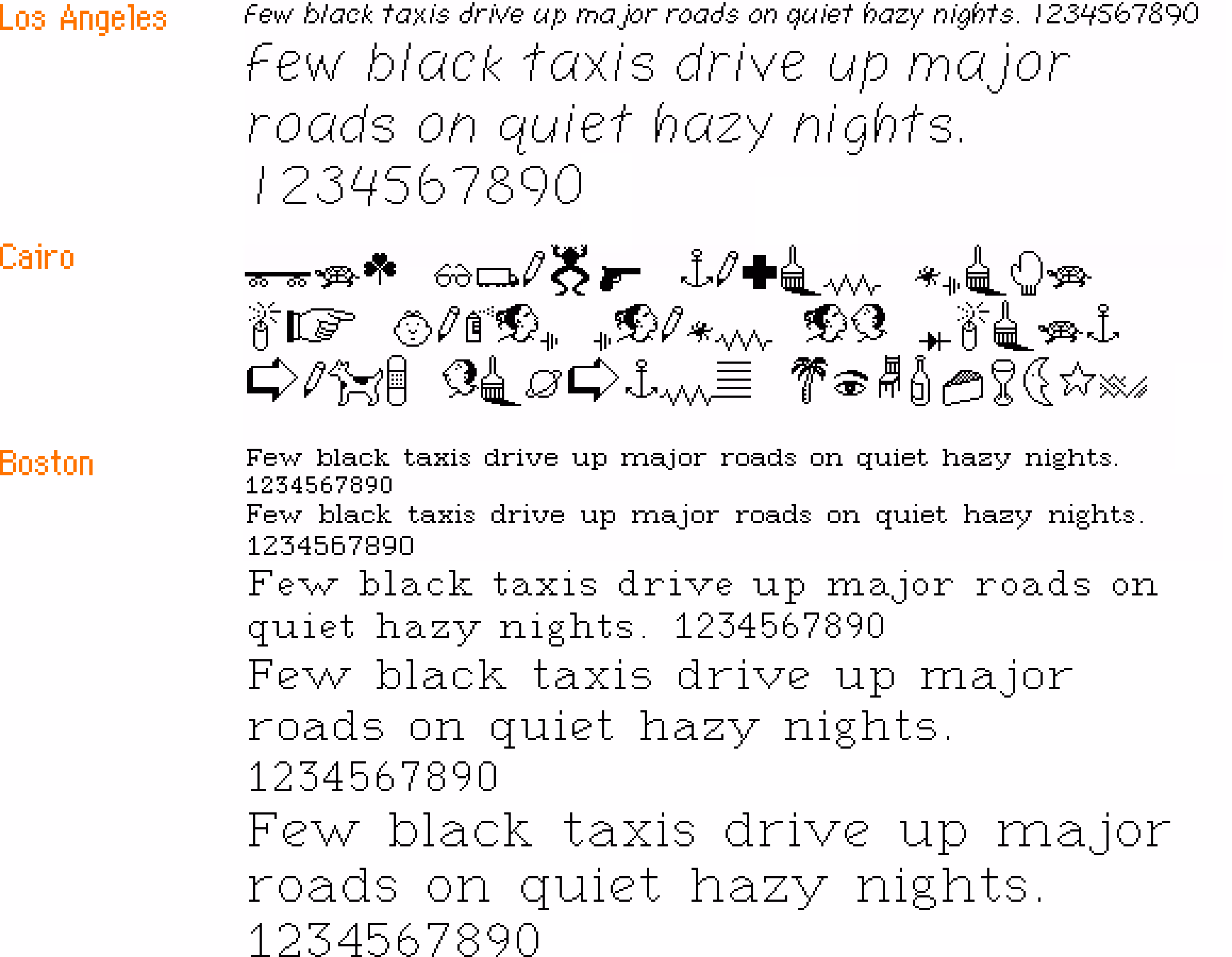
(Cairo is the classic icon font and in a way a predecessor of modern emoji, with inside jokes like Clarus The Dogcow.)
But that’s not the end of the story of the original Mac fonts. Let’s get back to 1983. On yet another page of the magazine, we see this list from MacPaint:
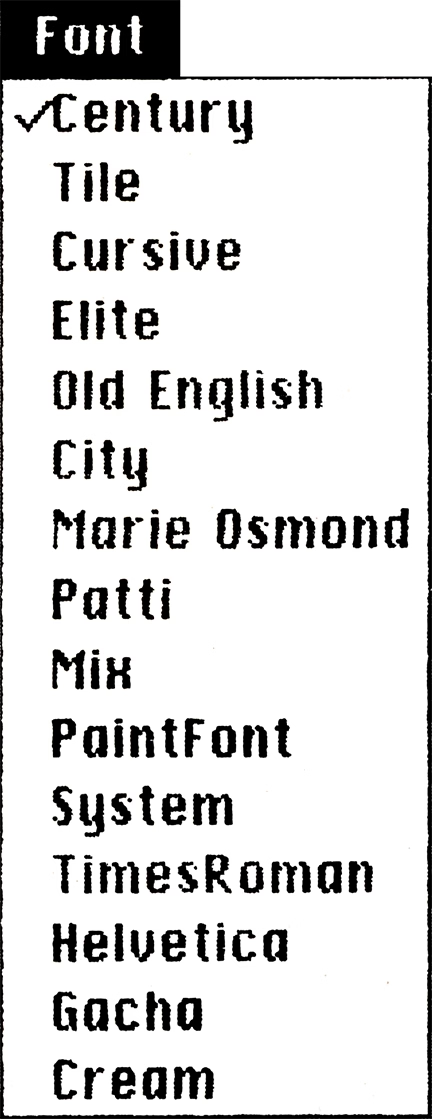
You can tell this screenshot is even older than the previous one, because it is itself set in an earlier version of Chicago, with a single-storey lowercase “a,” and many letterforms being works in progress. (I talked about the history of Chicago in my 2024 talk about pixel fonts.)
And it is old enough that this isn’t just interim names for surviving fonts – it’s actually quite a few old fonts that didn’t make it to the release day.
Unfortunately, this particular version of Macintosh software remains unknown, but one similar pre-release version of the first Mac software leaked, and so we can take a look at some of these fonts, too:
(You can download a lot of these fonts thanks to the hard work of John Duncan. They are still bitmap fonts and might not work in all the places in modern macOS, but they seem to work in TextEdit at least.)
Here’s what I learned from looking at this list:
- You can definitely see how unpolished some of these fonts are in terms of spacing, letterforms, and available sizes – kudos to the team for holding a high quality bar even though there was little precedent for proportional fonts on home computers at that time.
- Even the fonts that shipped – London (née Old English), Venice (née Cursive), and Chicago (née System) – have had their letterforms tweaked and improved.
- Chicago is not named Elefont, but simply System. Had the System name persisted, this Medium snafu from 2015 would have been even more hilarious.
- The name of the monospaced Elite font is likely inspired by one of the two classic sizes of typewriter fonts: pica (larger) and elite (smaller).
- Cream came all the way from Xerox’s Smalltalk and was the original system font for Macintosh-in-progress, before Susan Kare created Elefont/Chicago.
- PaintFont was a symbol/icon font, but distinct from Cairo and emoji in that it seems it was meant to be used only by the app to draw its interface. (Today, SF Symbols serve a similar purpose.)
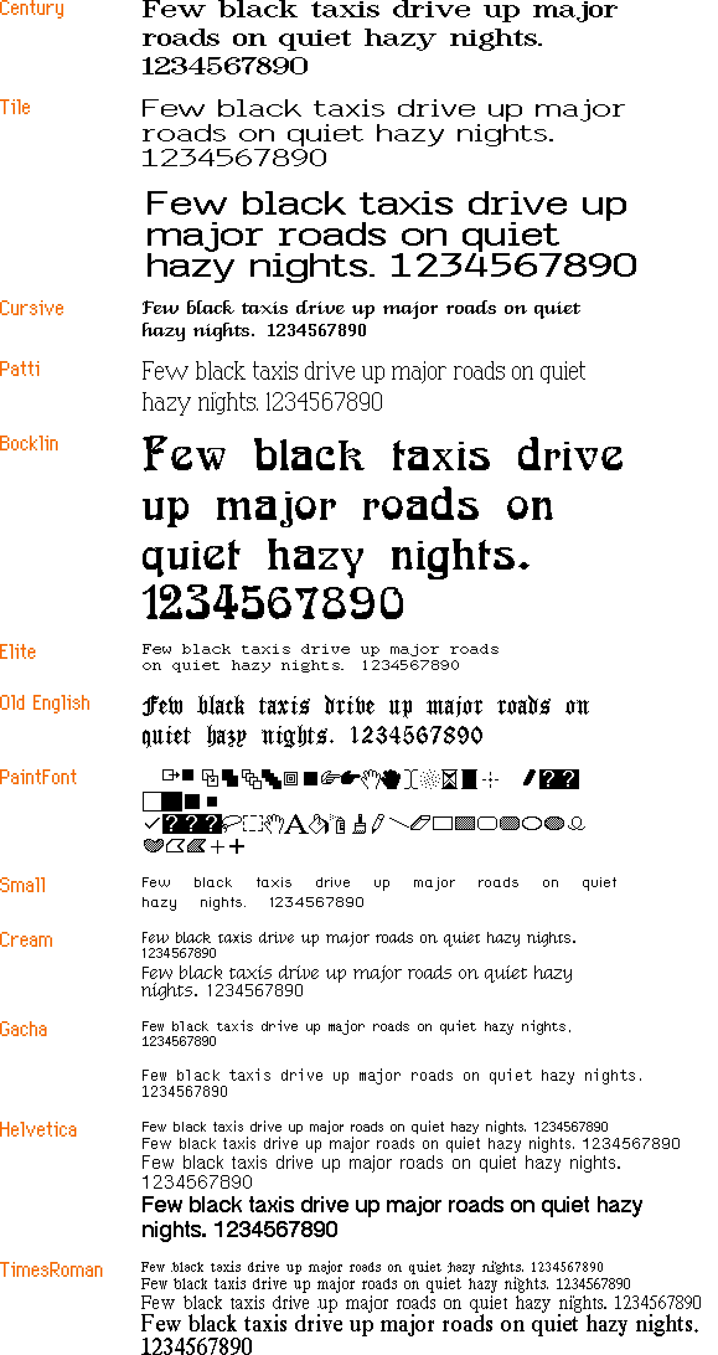
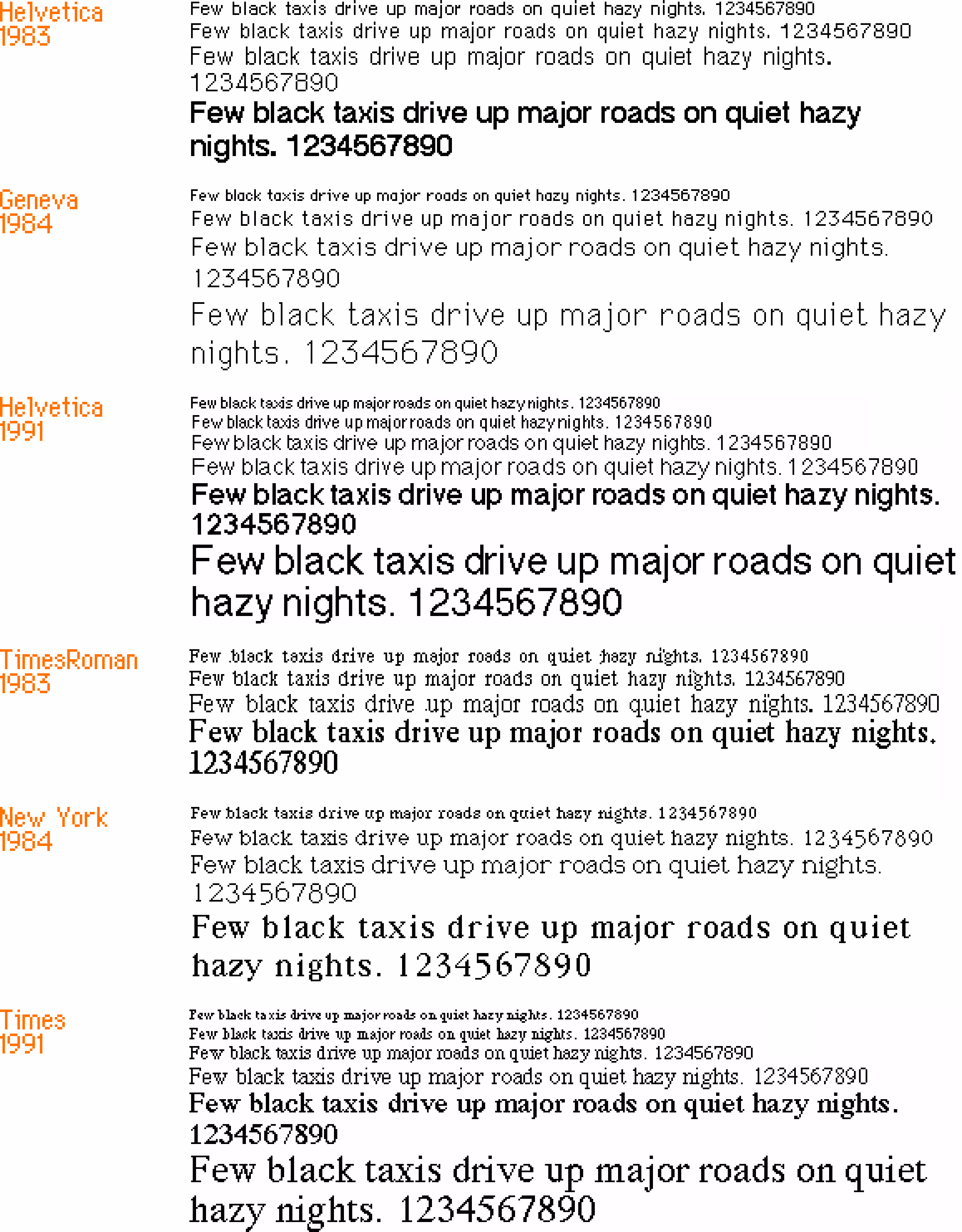
- Apple originally planned to use Times Roman and Helvetica, but this hasn’t happened presumably because of licensing issues. Only years later, the proper Times and Helvetica fonts were introduced. Here’s a comparison:
But the most interesting thing I haven’t noticed before are two fonts called “Marie Osmond” and “Patti.”
I am reaching outside of my well of knowledge here, but from context clues I’ll assume the latter means Patti LaBelle. And so, pulling on that thread, it’s kind of cool to imagine an alternate universe where the original Mac fonts are neither suburban Philly stations, nor well known cities, but something like this:
#history / #mac os / #typography
“That’s because the metro cab is his right hand. Videogames!”
Sunday, March 29
In the Fallout 3: Broken Steel addition, the team wanted to introduce a moving subway train under Washington, D.C.:
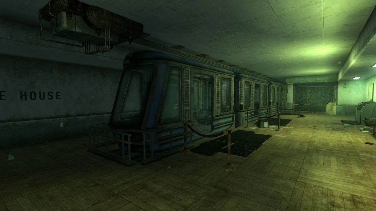
However, the engine did not have any moving vehicles. Instead of adding a new kind of primitive into the game engine, the creators… made the player character itself become the subway car when in motion:
This was done by removing freedom of movement from the player, forcing the character to slide on the floor, and equipping him with… a “metro hat.”
The visuals of people hacking this to use it outside of the subway area are really funny:
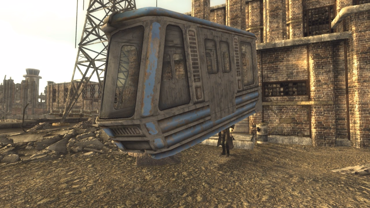
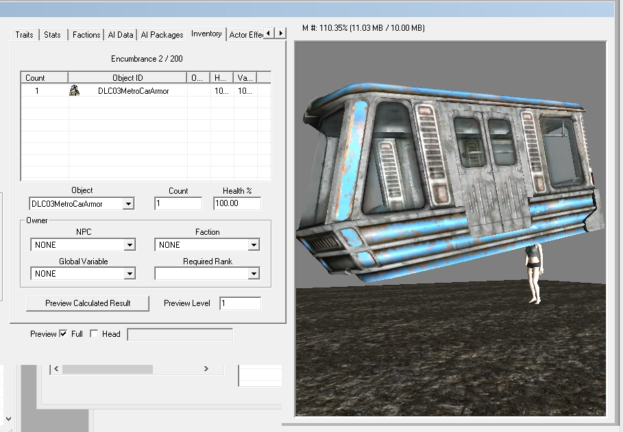
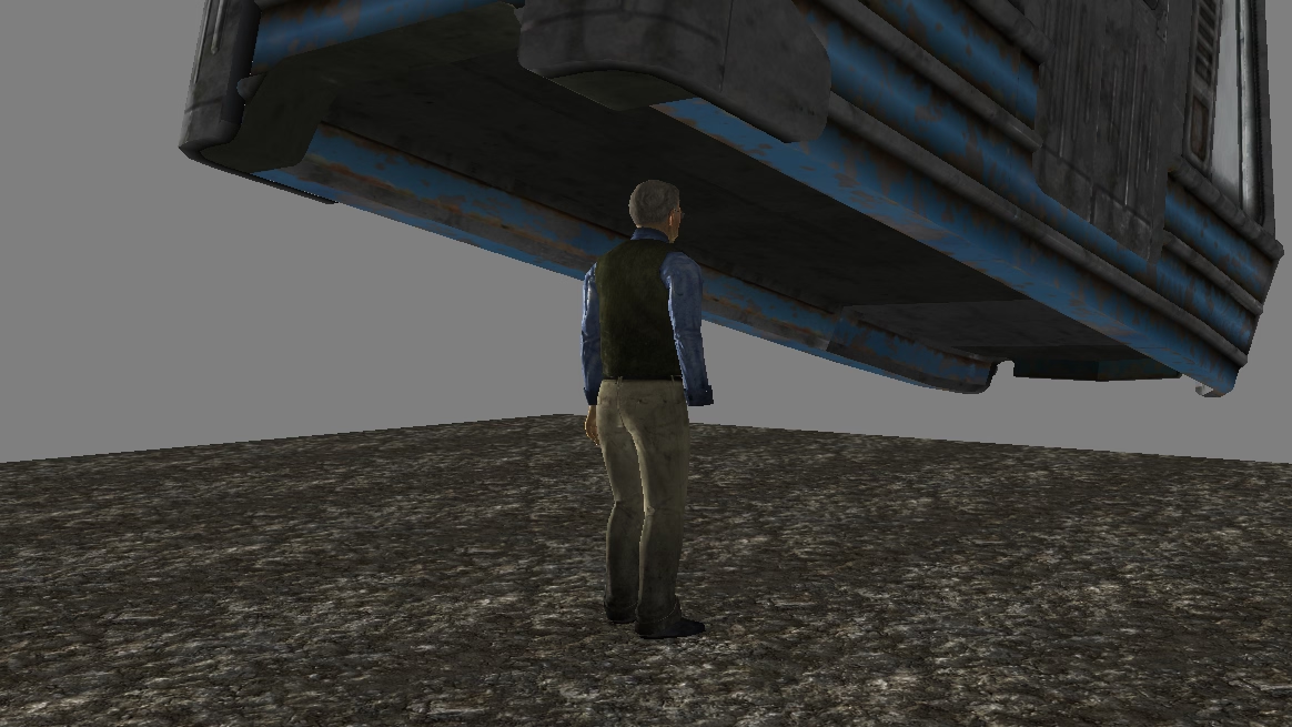
Technically, it was not a hat, but a right-arm armor, as you can see from the right hand missing in the above picture.
The FPS genre is filled with all sorts of hacks for hand-held weapons, to compensate for the challenges of depicting things accurately not feeling as great…
…but I have never heard of someone “wearing a train.”
(The title comes from this post.)
#games / #hacks
“Decentralization does not always equal delight.”
Saturday, March 28
A thoughtful 26-minute talk by Imani Joy, the solitary full-time designer on Mastodon, reflecting on her nine months there:
It’s an interesting peek behind the curtain at designing for this particular space, and the many unenviable constraints: lack of data, care for privacy, tension between Mastodon’s power-user early adopters (“they are values-driven, they want control, they’ll tolerate a lot of the clunkiness of the Fediverse”) and “mainstream audience [that] expects polish.”
At some point, design needs to be authoritative, but how do you combine that with wanting the process to be as inclusive as possible? The product itself is a federation of various servers that can exert their own control – so how do you bring it all together under one neat umbrella for the user? (Also a challenge for Android in comparison with iOS.) The mainstream design has certain fashion-y tendencies. How to make sure you don’t lose yourself while chasing them, but also not to stay ossified out of fear of making changes? (Wikipedia, Internet Archive, and other similar places look and behave a certain way, after all, and it’s not usually because of lack of talent to “modernize” them.)
The most interesting thing to me was this:
It’s easy to talk in terms of who to optimize for. Things get harder when you start to articulate who you won’t optimize for, what trade-offs you must make in pursuit of your goal, and who you’re going to risk letting down along the way. What the team needed from me more than anything was not the probabilities, not the usability findings, not the story of who we’re making happy. They needed to hear who will choose to disappoint and why. And I told them that building the best experience on Mastodon means that we’ll solve for the extremes, but we won’t center them. And sure, we do risk frustrating some power users who want absolute control over their profiles, but that risk is necessary to optimize the experience also for browsing users.
When we were working at Figma in 2019 shipping an update to text line height algorithms (moving them from the way print does things to the way web does things), I started an internal document called “The new line height and its discontents,” where myself and the team deliberately wrote out who will be most annoyed about the changes, and why. We listed our arguments, workarounds, even “deal sweeteners” (“but look at this other thing that will get better as a result!”), but we also tried very hard to be candid with ourselves. Some people were not going to be happy no matter what we do or say. Do we know precisely who these people are and are we okay with that? I’d recommend that approach for any change-management project, rather than keeping fingers crossed or toxic positivity.
Joy so far worked on quote posts and new profiles, and I appreciated her ending the talk on a note of recognition for these kinds of projects in these kinds of settings:
I know that we’re building something that will continue to be imperfect, but it doesn’t have to be perfect to make a positive difference in the world.
#change management / #conference talk / #youtube
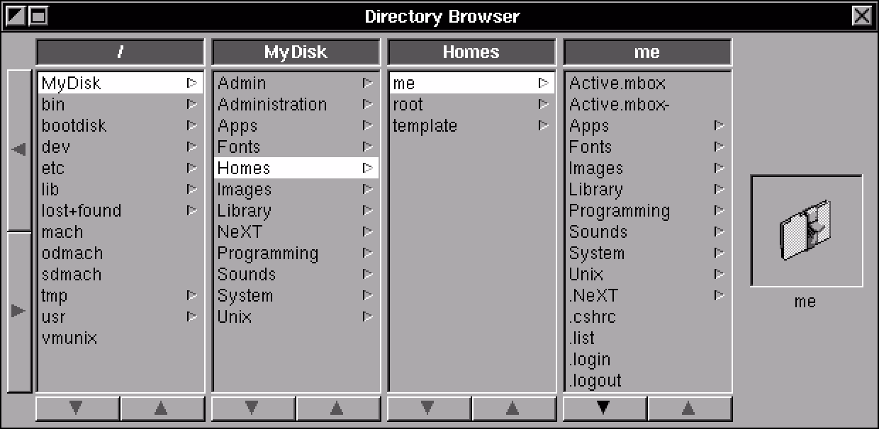
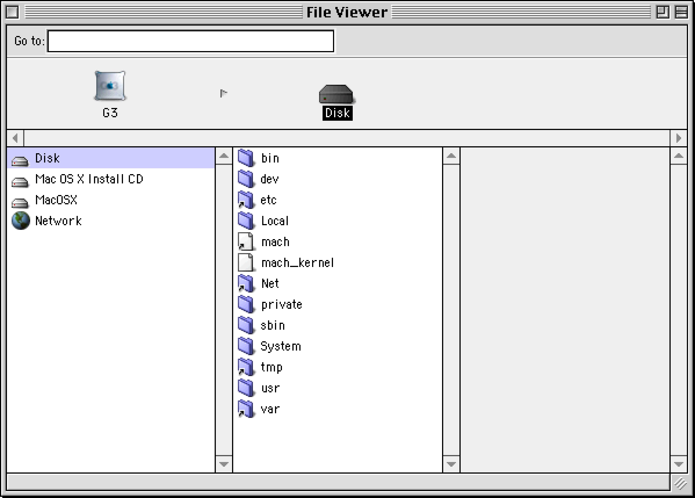
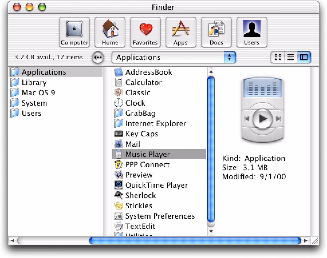
Come at the king, you best not miss
Saturday, March 28
Column view cut its teeth on NeXT computers…
…and blossomed on early versions of Mac OS X…
…but where I thought it really shone was the first iPods:
This was perhaps the most fun you could ever have navigating a hierarchy of things; it made sense what left/right/up/down meant in this universe, to a point you could easily build a mental model of what goes where, even if your viewport was smaller than ever.
It was also a close-to-ideal union of software and hardware, admirable in its simplicity and attention to detail. This is where Apple practiced momentum curves, haptics (via a tiny speaker, doing haptic-like clicks), and handling touch programmatically (only the first iPod had a physically rotating wheel, later replaced by stationary touch-sensitive surfaces) – all necessary to make iPhone’s eventual multi-touch so successful. And, iPhone embraced column views wholesale, for everything from the Music app (obvi), through Notes, to Settings.
Well, sometimes you don’t appreciate something until it’s taken away. Here are settings in the iOS version of Google Maps:
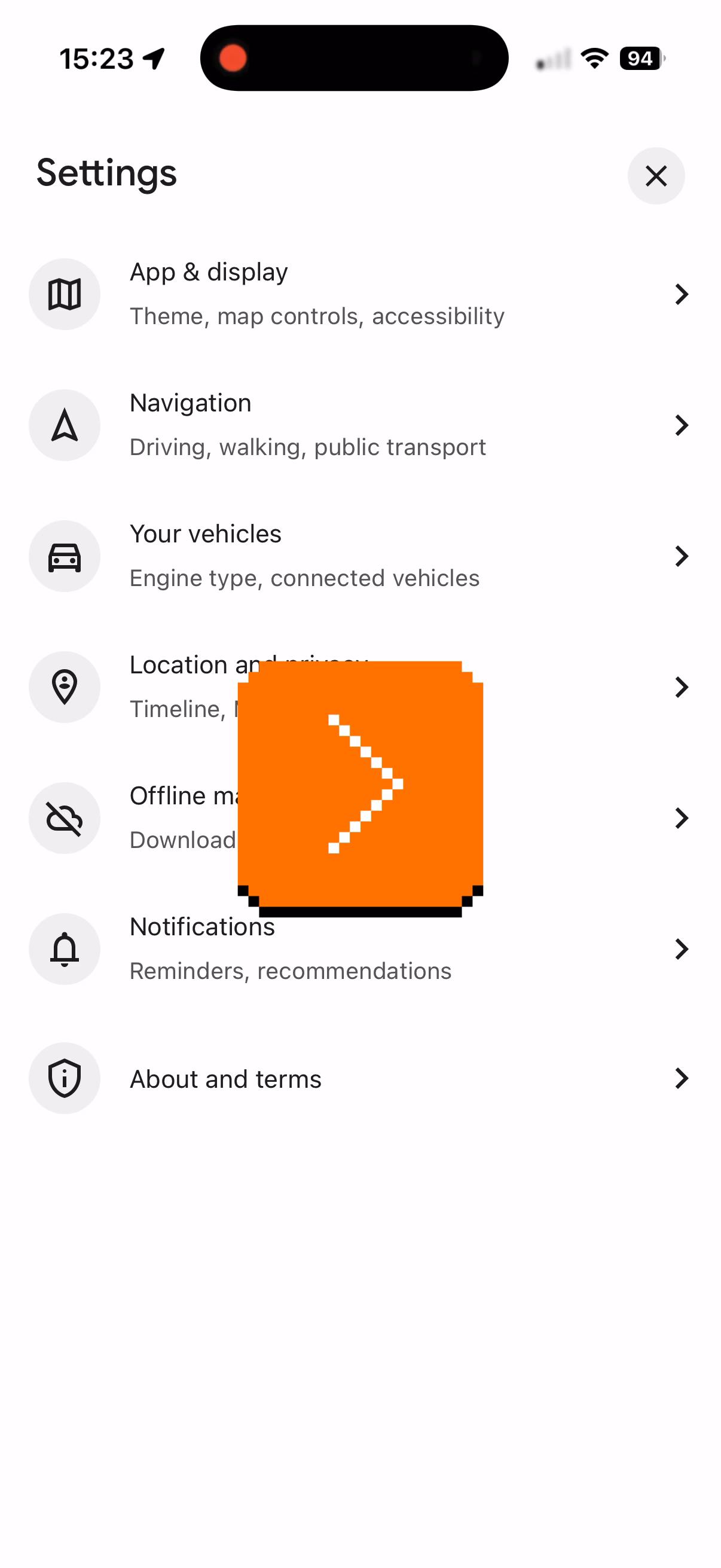
I am not sure why the designers chose to deviate from the standard, replacing a clear Y/X relationship with a more confusing Y/Z-that-looks-very-much-like-Y. They kept the chevrons hinting at the original orientation – and they probably had to, as vertical chevrons have a different connotation, but perhaps this was the warning sign right here not to change things.
I think the principle is, in general: if you’re reinventing something well-established, both of your reasoning and your execution have to be really, really solid. I don’t think this has happened here. (Other Google apps seem to use standard column view model.)
#apple / #google / #interface design / #mac os / #next
“Less of a pitch, more of a prediction”
Friday, March 27
An excellent 17-minute video from The Art Of Storytelling that analyzes the now-infamous 2021 Mark Zuckerberg Metaverse introduction video:
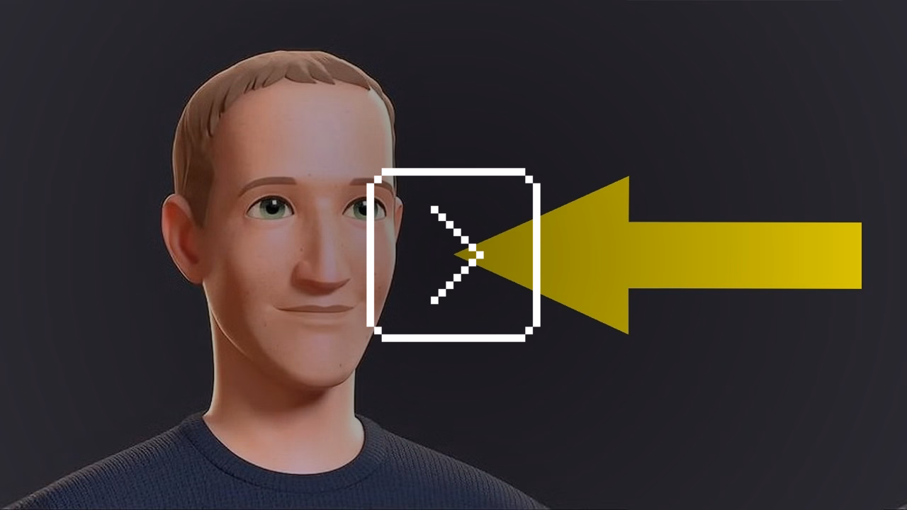
What I liked about it is that the author goes beyond cheap shots and deeper into both storytelling aspects (drawing from his experience)…
Now, as you can tell, the big problem with the design and execution of this video is that the producers failed to recognize the importance of point of view in telling this story. Now, perspective is already very important in any film, but it’s doubly important in a film for which one’s point of view in reality is also the subject. But this failure is present even in some of the more mundane parts of the film like the interviews that Mark does with various meta staff members. Now, as it’s plain to see, these are not real interviews. They’re fully scripted and staged – again, a classic mistake in corporate film. You can even tell that they’re not looking at each other. They’re clearly reading from a teleprompter. Yikes.
Of course, the entire premise of an interview is that two people are speaking candidly. So watching an obviously fake interview can be deeply unsettling as the speakers try to act out natural conversation and inevitably fail. This is why so many people in this video, including Mark, seem to not know what to do with their hands while speaking. It’s because they’ve been told to act naturally in a social situation that does not normally exist.
…and the meaning of these kinds of propaganda-esque announcements:
They are joined by some friends who are calling from Soho to tell them about some cool augmented reality street art that they’ve just discovered. […] And with a wave of his hand, Mark teleports the artwork into his spaceship so that he can appreciate it for himself, thus extracting this street art from any sense of place and context, which is the point of street art. I know this might sound like a nitpick, but I think it’s just worth lingering on the fact that, you know, in this high concept tech demo about how this technology will empower people to appreciate art in new ways. Nobody paused to ask what the social and cultural function of street art actually is.
The entire introduction video comes across as thoughtless and careless – “It’s not a product launch or even a demo. It’s just a cartoon about the world Mark Zuckerberg is telling you that you will one day live in.” – and some of the observations here will be relevant to other things, even in other mediums: UI redesign minisites, the font announcements articles, rebrand unveils, and so on.
I would love similar analyses of Apple’s stuff – not just the most obvious parallel which would be the 1987 Knowledge Navigator vision video, but some of the more recent scripted virtual keynotes, too.
#storytelling / #youtube
Got your back, pt. 4
Friday, March 27
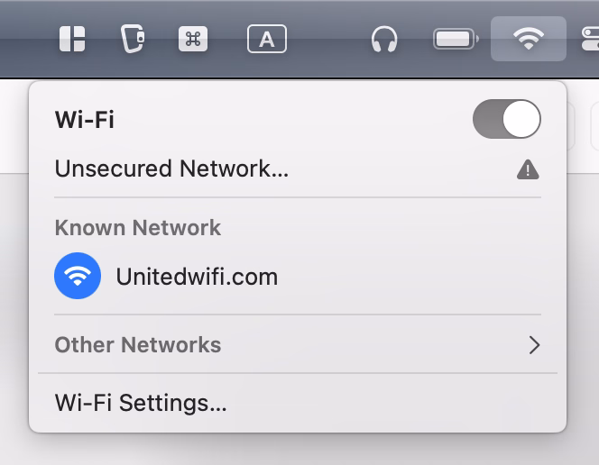
Connecting to public wi-fi networks with their captive portals is always a bit of a wonky proposition, and nothing makes public wi-fi wonkier than using it on a plane.
I believe that the resurgence of https made things harder – if the captive portal doesn’t kick in, no secure traffic can happen – and over time I just started remembering that “captive.apple.com” is a reliable HTTP-only destination to visit.
But I noticed this week that United’s onboard wi-fi network is called “Unitedwifi.com” as a reminder where to go once you are connected, to avoid that problem. I thought this was a nice touch.