“Just because it’s consistent doesn’t mean it’s consistently right.”
Welcome to this week’s digest of Unsung, a blog about software craft and quality. Here’s what was posted in the last week:
The curse of the cursor
Thursday, March 19
I had no idea it was Alan Kay himself who was responsible for the mouse pointer’s distinctive shape. In 2020, James Hill-Khurana emailed him and got this answer:
The Parc mouse cursor appearance was done (actually by me) because in a 16x16 grid of one-bit pixels (what the Alto at Parc used for a cursor) this gives you a nice arrowhead if you have one side of the arrow vertical and the other angled (along with other things there, I designed and made many of the initial bitmap fonts).
Then it stuck, as so many things in computing do.
And boy, did it stick.
But let’s rewind slightly. The first mouse pointer during the Doug Engelbart’s 1968 Mother Of All Demos was an arrow faced straight up, which was the obvious symmetrical choice:
(You can see two of them, because Engelbart didn’t just invent a mouse – he also thought of a few steps after that, including multiple people collaborating via mice.)
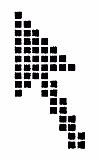
But Kay’s argument was that on a pixelated screen, it’s impossible to do this shape justice, as both slopes of the arrow will be jagged and imprecise. (A second unvoiced argument is that the tip of the arrow needs to be a sharp solitary pixel, but that makes it hard to design a matching tail of the cursor since it limits your options to 1 or 3 or 5 pixels, and the number you want is probably 2.)
Kay’s solution was straightening the left edge rather than the tail, and that shape landed in Xerox Alto in the 1970s:
Interestingly enough, the top facing cursor returned as one of the variants in Xerox Star, the 1981 commercialized version of Alto…
…but Star failed, and Apple’s Lisa in 1983 and Mac in 1984 followed in Alto’s footsteps instead. Then, 1985’s Windows 1.0 grabbed a similar shape – only with inverted colors – and the cursor has looked the same ever since.
That’s not to say there weren’t innovations since (mouse trails useful on slow LCD displays of the 1990s, shake to locate that Apple added in 2015), or the more recent battles with the hand mouse pointer popularized by the web.
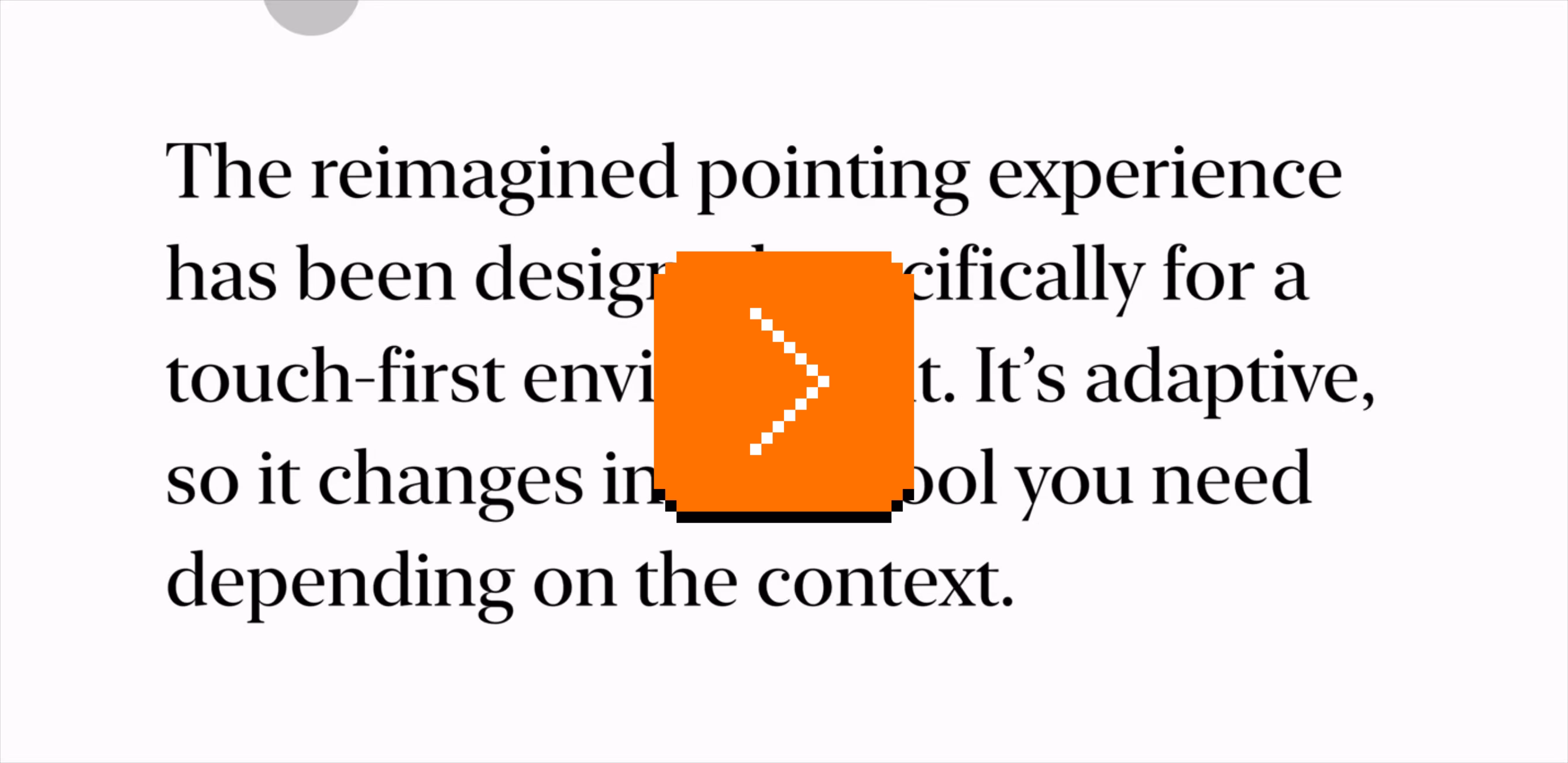
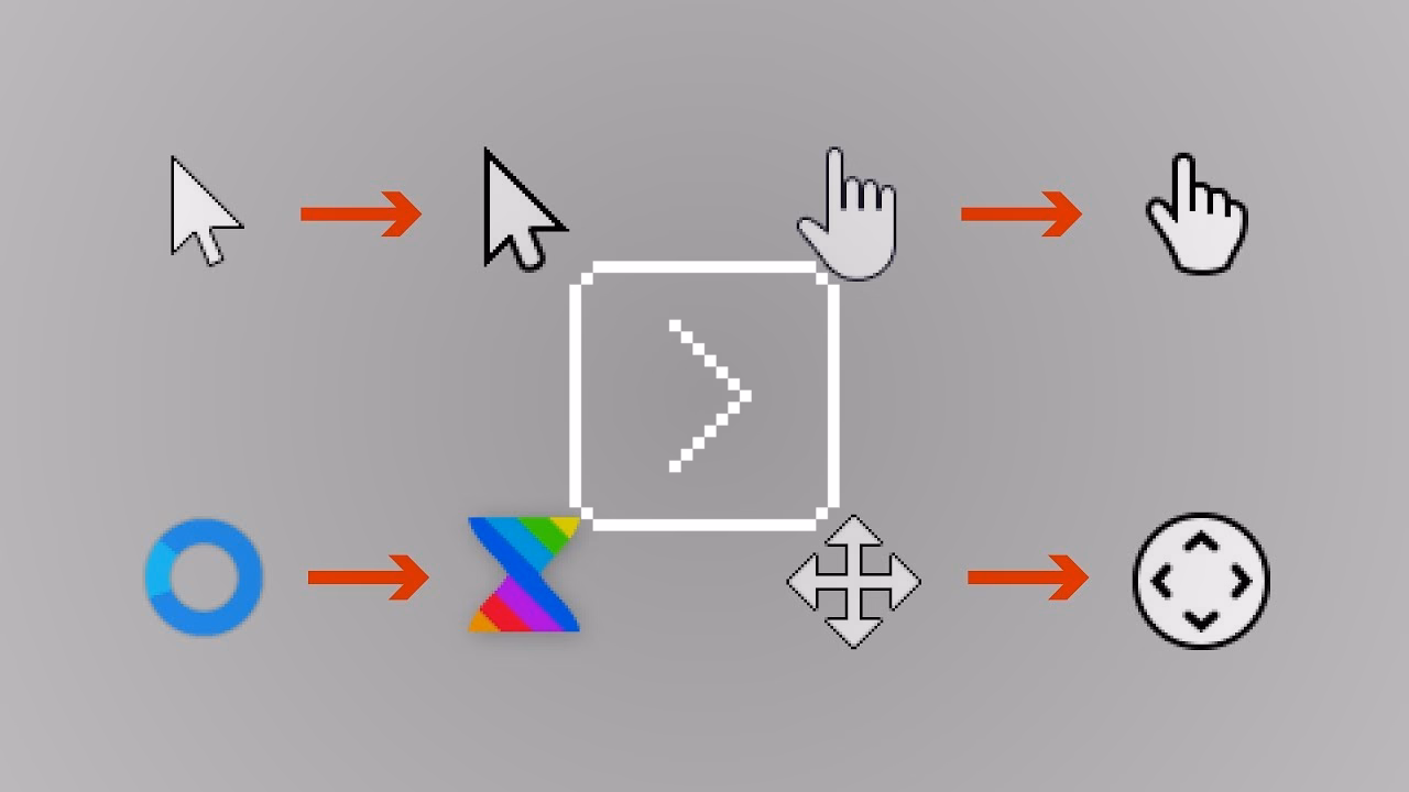
But the only substantial attempt at redesigning the mouse pointer that I am aware of came from Apple in 2020, during the introduction of trackpad and mousing to the iPad. The mouse pointer a) was now a circle, b) morphed into other shapes, and c) occasionally morphed into the hovered objects themselves, too:
The 40-minute deep dive video is, today, a fascinating artifact. On one hand, it’s genuinely exciting to see someone take a stab at something that’s been around forever. Evolving some of the physics first tried in Apple TV’s interface feels smart, and the new inertia and magnetism mechanics are fun to think about.
But the high production value and Apple’s detached style robs the video of some authenticity. This is “Capital D Design” and one always has to remain slightly suspicious of highly polished design videos and the inherent propensity for bullshit that comes with the territory. Strip away the budget and the arguments don’t fully coalesce (why would the same principles that made text pointer snap vertically not extend to its horizontal movement?), and one has to wonder about things left unsaid (wouldn’t the pointer transitions be distracting and slow people down?).
Yet, I am speaking with the immense benefit of hindsight. Actually using that edition of the mouse pointer on my iPad didn’t feel like the revolution suggested, and barely even like an evolution. (Seeing Apple TV’s tilting buttons for the first time was a lot more enthralling.) And, Apple ended up undoing a bunch of the changes five years later anyway. The pointer went back to a familiar Alan Kay-esque shape…

…and lost its most advanced morphing abilities:
Watching the 2025 WWDC video mentioning the change (the relevant parts start at 8:40) is another interesting exercise:
2020:
We looked at just bringing the traditional arrow pointer over from the Mac, but that didn’t feel quite right on iPadOS. […] There’s an inconsistency between the precision of the pointer and the precision required by the app. So, while people generally think about the pointer in terms of giving you increased precision compared to touch, in this case, it’s helpful to actually reduce the precision of the pointer to match the user interface.
2025:
Everything on iPad was designed for touch. So the original pointer was circular in shape, to best approximate your finger in both size and accuracy. But under the hood, the pointer is actually capable of being much more precise than your finger. So in iPadOS 26, the pointer is getting a new shape, unlocking its true potential. The new pointer somehow feels more precise and responsive because it always tracks your input directly 1 to 1.
(That “somehow” in the second video is an interesting slip up.)

I hope this doesn’t come across as making fun of the presenters, or even of the to-me-overdesigned 2020 approach. We try things, sometimes they don’t work, and we go back to what worked before.
I just wish Apple opened itself up a bit more; there are limits to the “we’ve always been at war with Eastasia” PR approach they practice in these moments, and I would genuinely be curious what happened here: Did people hate the circular pointer? Was it hard to adopt by app developers? Was it just a random casualty of Liquid Glass’s visual style, or perhaps the person who was the biggest proponent of it simply left Apple? We could all learn from this.
But the most interesting part to me is the resilience of the slanted mouse pointer shape. In a post-retina world, one could imagine a sharp edge at any angle, and yet we’re stuck with Kay’s original sketch – refined to be sure, but still sporting its slightly uncomfortable asymmetry.
The always-excellent Posy covered this in the first 7 minutes of his YouTube video:
But specifically one comment under that video caught my attention:
Honestly, I’ve never thought of the mouse cursor as an arrow, but rather its own shape. My mind was blown when I realized that it was just an arrow the whole time.
…because maybe this is actually the answer. Maybe the mouse pointer went on the same journey floppy disk icon did, and transcended its origins. It’s not an arrow shape anymore. It’s the mouse pointer shape, and it forever will be.
User interface sugar crash
Wednesday, March 18
I think about some aspects of interface design as sugar.
This is how you adjust the photo in Photos app in the previous version of iOS:
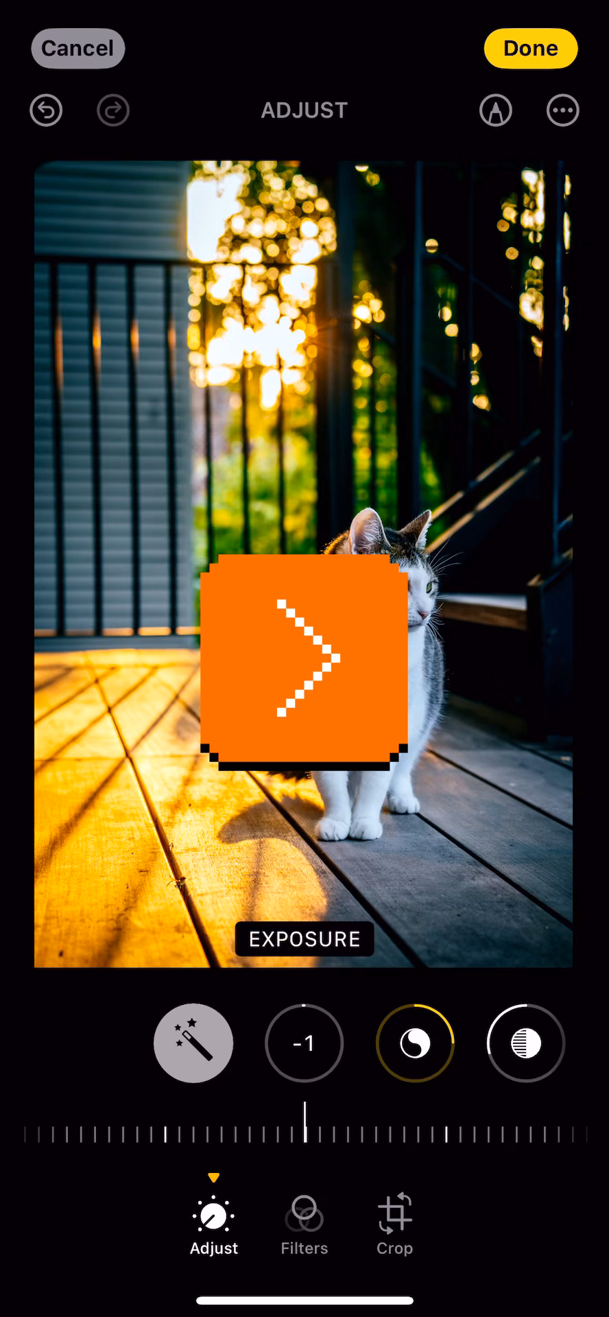
And this is the same view in the current version:
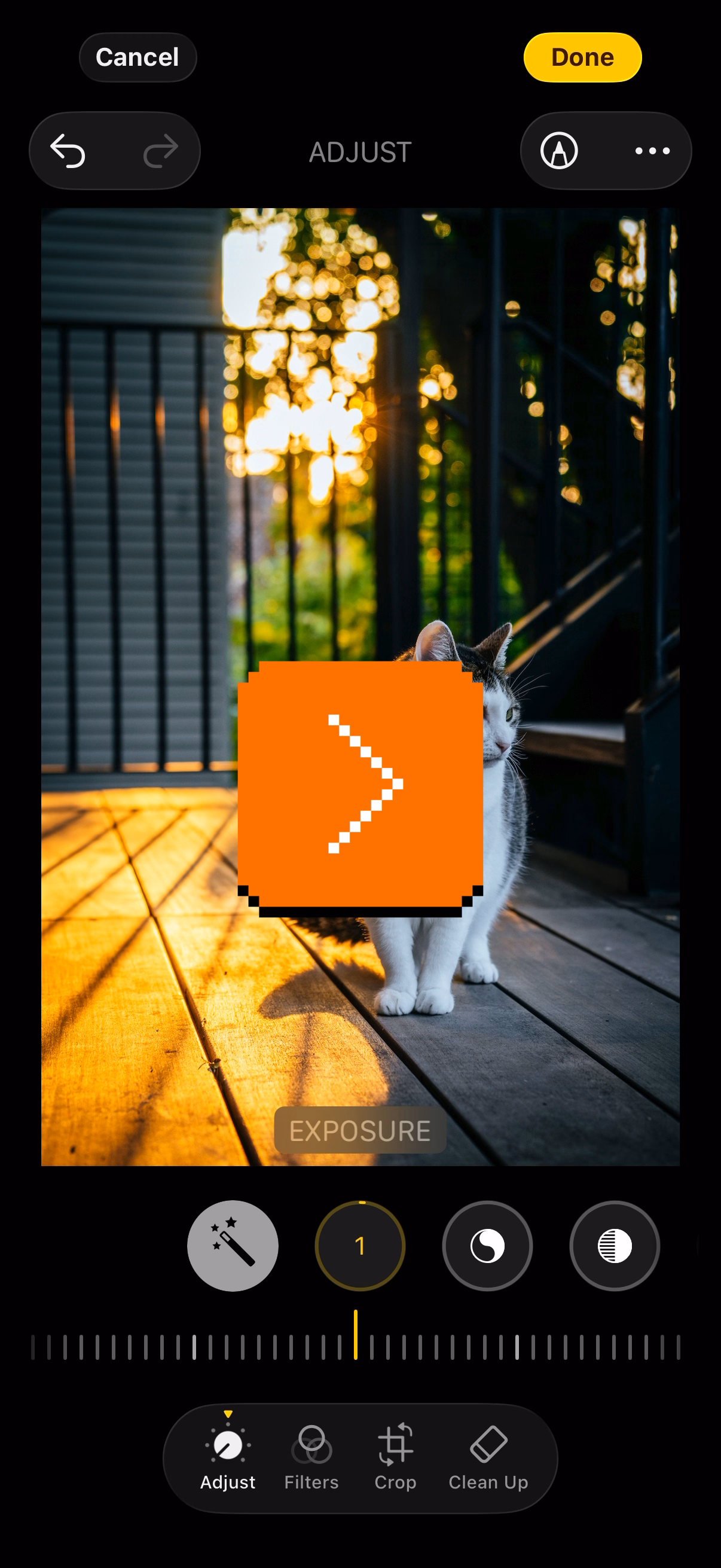
The difference is in the delayed/animated falling of the notches.
I don’t think it’s great. It’s “delightful” in a rudimentary and naïve sense, but like sugar, you cannot just add it to your daily diet without consequences. This extra animation serves no functional purpose, and the sugar high wears off quickly. What remains is constant distraction and overstimulation, the feeling of inherent slowness, and maybe even a bit of confusion.
It pairs nicely with the previous post about avoiding complexity and rewarding simplicity. I often see this kind of stuff as related to designer’s experience. Earlier on in your career, you are proud you’ve thought about this extra detail, you’ve figured out how to make this animation work and how to fine-tune the curves, and you’ve learned how to implement it or convince an engineer to get excited about it.
Later in your experience, you are proud you resisted it.
“And to make matters worse, complexity sells better.”
Wednesday, March 18
A smart post by Matheus Lima at his Terrible Software blog:
What you just learned is that complexity impresses people. The simple answer wasn’t wrong. It just wasn’t interesting enough. And you might carry that lesson with you into your career. […]
It also shows up in design reviews. An engineer proposes a clean, simple approach and gets hit with “shouldn’t we future-proof this?” So they go back and add layers they don’t need yet, abstractions for problems that might never materialize, flexibility for requirements nobody has asked for. Not because the problem demanded it, but because the room expected it.
I nodded to a lot of it. There’s some parallels to design, too. Perhaps in design, “future-proofed” gets replaced by “bespoke” – everyone wants a custom interface with a novel thing that doesn’t exist anywhere else in the app. That feels better. Tailor-made. Special. It’s hard to resist that, and go back to making your UI out of reusable parts, consistent, and boring in all the best possible ways.
This advice about how to talk about simplicity feels eminently universal:
If you’re an engineer, learn that simplicity needs to be made visible. The work doesn’t speak for itself; not because it’s not good, but because most systems aren’t designed to hear it. […] The decision not to build something is a decision, an important one! Document it accordingly. […]
If you’re an engineering leader, this one’s on you more than anyone else. You set the incentives, whether you realize it or not. And the problem is that most promotion criteria are basically designed to reward complexity, even when they don’t intend to. “Impact” gets measured by the size and scope of what someone built, which more often than not matters! But what they avoided should also matter.
One more thing: pay attention to what you celebrate publicly. If every shout-out in your team channel is for the big, complex project, that’s what people will optimize for. Start recognizing the engineer who deleted code. The one who said “we don’t need this yet” and was right.
“I like to use Soviet control panels as a starting point.”
Tuesday, March 17
One of my favourite genres is “I’m going to teach you something secretly while you’re having fun.”
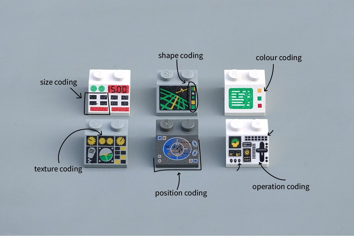
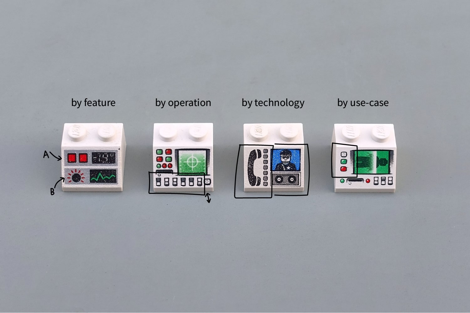
This 2020 post by George Cave is ostensibly about Lego interface panels, but quietly sneaks in some stuff about shape coding and other kinds of coding:
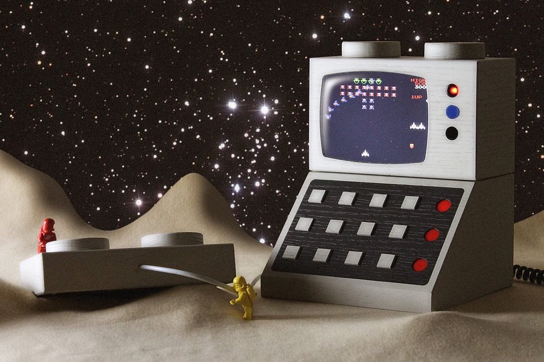
The Lego interface panels seem to have a certain hold on people. Artist Love Hultén recreated some of them in a more human-compatible scale and even made them interactive:
It was fun to see one of the most well-crafted of early arcade games, Tempest, in this kind of a view, with the stud reimagined as a paddle controller:

Just earlier this month, designer Paul Stall announced his project M2x2 (the page itself is beautiful and interesting to visit – I paticularly loved the horizontal galleries):
The M2x2 is a functional homage to the classic Lego computer brick, upscaled and re-imagined as a high-performance workstation. […]
If our tools could look as playful as the things we built as kids, would we approach our work with more joy? The M2x2 is just the beginning of a workspace that feels less like an office and more like a laboratory for breakthroughs.

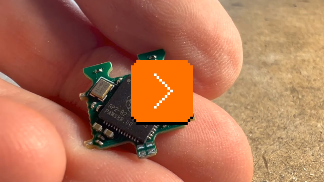
But both of these are enlarged Lego bricks. Three years ago, James Brown a.k.a. Ancient made an effort to embed an LCD screen in a regular-size Lego brick. It’s a fun 12-minute video of the construction process:
If you are into that kind of stuff, Brown followed it up 2 months later by putting a playable Doom inside a Lego brick:

But the most amazing to me outcome was this video, called “Busy little screens”:
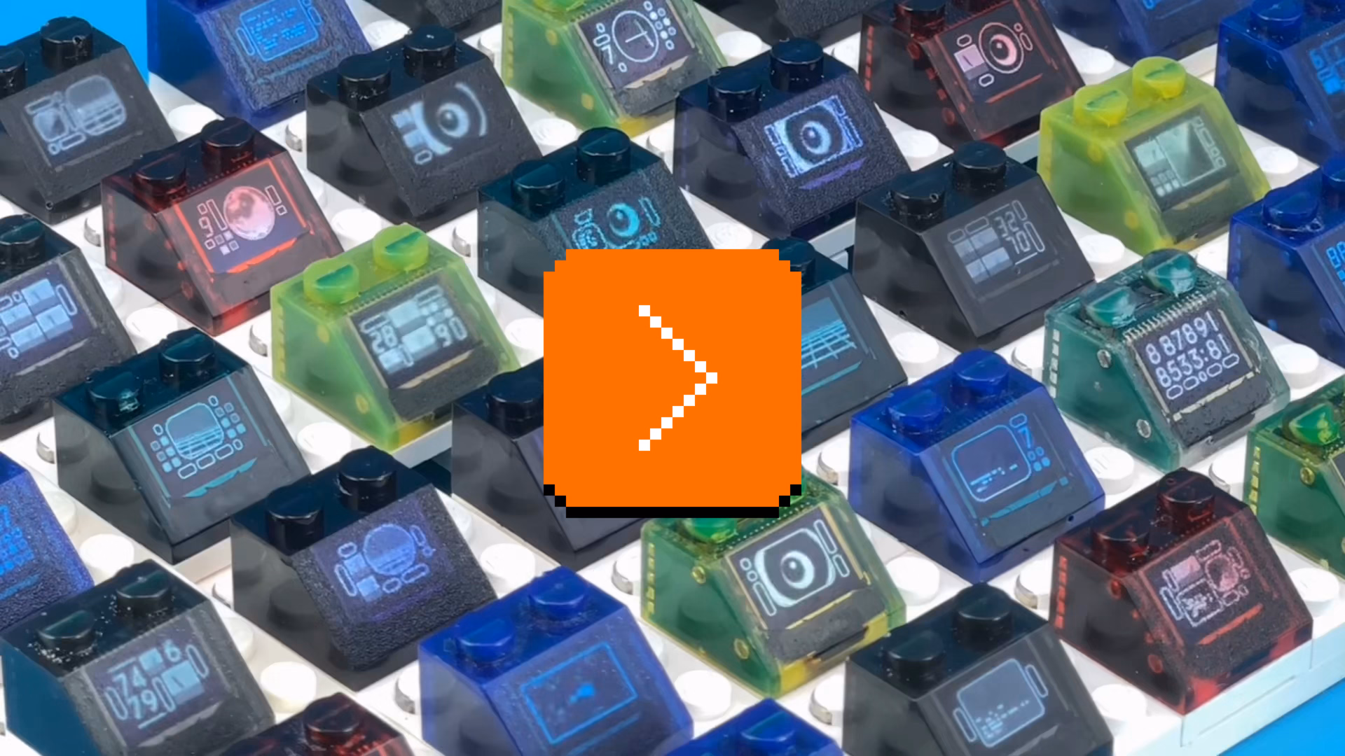
A lot of diversity of the original bricks is gone, but it’s hard to expect Brown to recreate and animate them all. It’s a mesmerizing thing to watch nonetheless; one can almost taste a future where the technology will allow for Lego bricks to be animated, but look exactly as they originally did.
Night mode predictions
Tuesday, March 17
Night mode is a mode inside the iOS camera app where the app takes a longer-exposure photo in low-light conditions, but “stabilizes” it programmatically, to achieve something similar to holding a camera on a tripod for the same amount of time.
I noticed a little detail that might be new to iOS 26: the night mode icon will now show you how many seconds it expects you’ll have to hold it, ahead of pressing the shutter button.
This is me turning the light on and off in the hotel room. The icon is in the upper right corner:
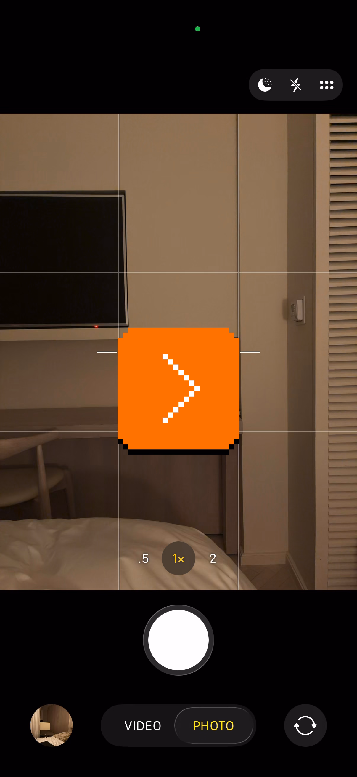
It’s hard for me to know how useful this is in practice, but the gesture seems nice. What I like about it, too, is density. By my calculation, this is 10-point type, smaller even than the battery percentage at about 12. (The standard interface elements usually go for 15–17.) Retina displays allow you to add text this small and have it still be legible.
Photoshop’s challenges with focus, pt. 1
Monday, March 16
You can tell the story of Mac OS via the story of its settings, and the same is likely true of Photoshop.
Recently, spelunking in the preferences of Photoshop 2025, I found this extremely curious thing:
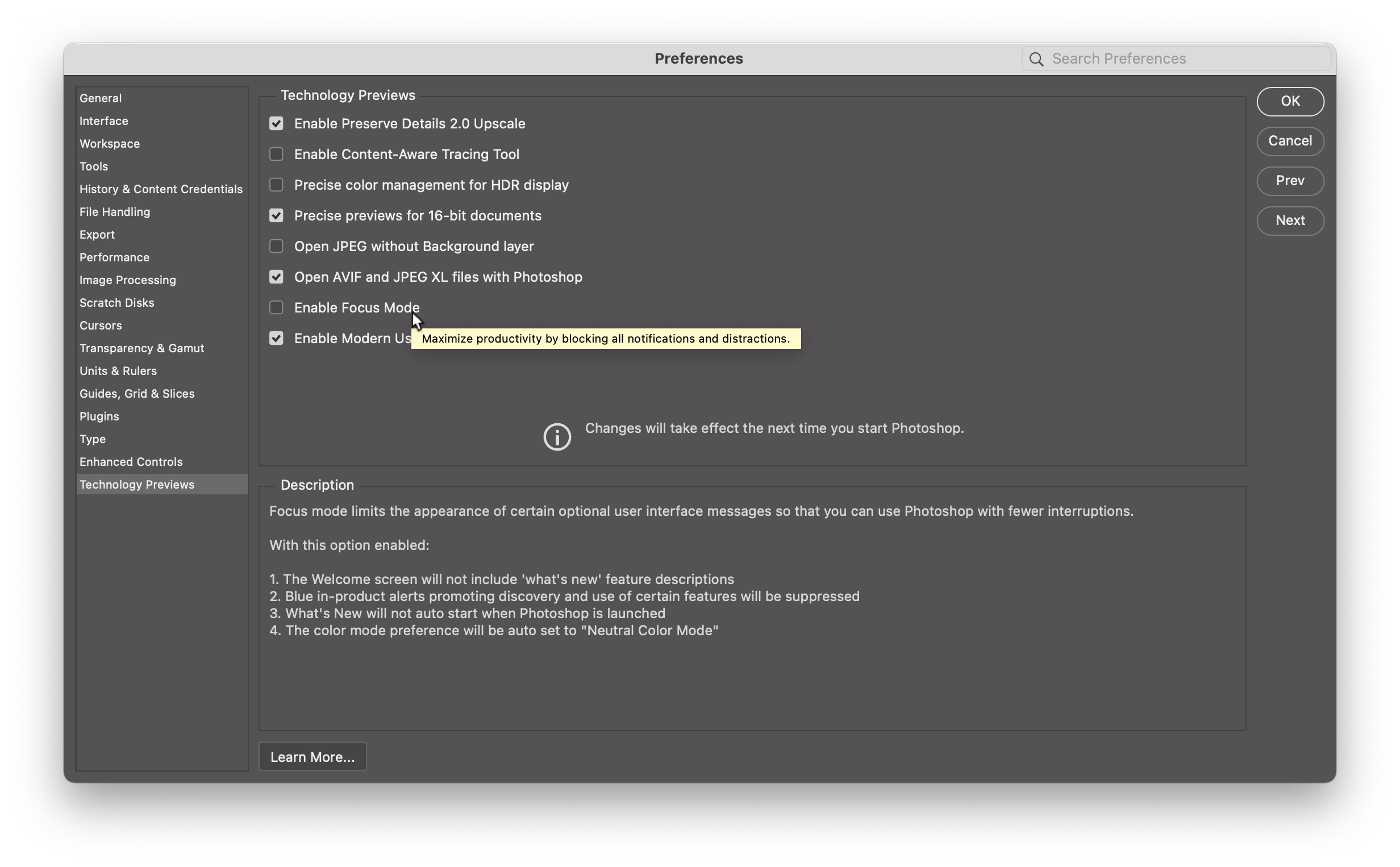
To transcribe:
Focus mode limits the appearance of certain optional user interface messages so that you can use Photoshop with fewer interruptions.
With this option enabled:
- The Welcome screen will not include “what’s new” feature descriptions
- Blue in-product alerts promoting discovery and use of certain features will be suppressed
- What’s New will not auto start when Photoshop is launched
- The color mode preference will be auto set to “Neutral Color Mode”
The three first options should be self explanatory. Neutral Color Mode is sort of the “graphite” option of Photoshop’s UI where the (already rare?) accented blue elements become white instead.
As much as I’ll always applaud a piece of software working on annoying you less, this is all so very strange. I don’t mean that the last option seems unrelated, and the first and third one kind of mutually exclusive… but just the very idea of shoving it in as an opt-in in the last tab of settings, under “technology previews”, and asking people for feedback feels peculiar to me.
Not to spoil the outcome, but even this “technology preview” is completely gone in the updated Photoshop 2026. I wonder if this is fallout from a mangled launch (even for those few who I imagined turned it on, the option didn’t live up to its promise), but also perhaps a political fight inside Adobe between product and growth teams? I bet we’ll never know.
I do not personally have a grand unified theory of how to explain things or announce features in products because it’s so situational, and I understand that especially Photoshop given its age might be the hardest difficulty level. I’d personally prefer to receive announcements of new features over email so I can read them at my leisure, and with each new thing or change linked to a playground that would allow me to experience it in the best way – but I can’t say with any certainty that this would work for everyone.
But I would expect people on the Photoshop team to have more experience here, and this focus mode approach just feels a bit… naïve to me. My two warm takes: 1. People aren’t generally as frustrated with how features are announced, but with what features are. 2. Why wouldn’t everyone deserve the gift of focus?
“Just because it’s consistent doesn’t mean it’s consistently right.”
Monday, March 16
I mentioned before how the old-fashioned pixels on CRT screens have little in common with pixels of today. The old pixels were huge, imprecise, blending with each other, and requiring a very different design approach.
Some years ago, the always-excellent Tech Connections also had a great video about how in the era of analog television, pixels didn’t even exist.
But earlier this month, MattKC published a fun 8-minute video arguing that for early video games it wasn’t just pixels that were imprecise. It was also colors.
What was Mario’s original reference palette? Which shade of blue is the correct one? Turns out… there isn’t one.
Come to learn some details about how the American NTSC TV standard (“Never The Same Color”) worked, stay for a cruel twist about PAL, its European equivalent.
Adjust in smaller steps
Sunday, March 15
In the video linked in the previous post, one of the hosts mentions at one point:
The biggest rebuttal is that the greatest audio engine of all time, the one baked into all Apple products, has 16 volume steps. And no one has ever been like, “My iPhone doesn’t have enough granularity to the volume.”
But of course they have. And the solution is easy: on both the iPhone and Mac you can grab one of the many volume sliders and immediately get a lot more precision:
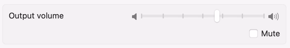
(Can’t help but notice this volume control has a nice set of notches, too!)
But if I told you that you can actually also increase the precision from 16 to 64 stops using the volume up/down keys, would you know how to do it?

Occam’s Razor: it must be a modifier key. So let’s go through them all.
Pressing ⌥ and brightness up/down opens the Displays settings pane, and consequently, pressing ⌥ and any of the three volume keys gives you the Sound settings pane. (This convention, however, isn’t followed for other keys. ⌥ and Mission Control only opens top level of Settings, and ⌥ and other function keys like Spotlight, Dictation, or media transport doesn’t do anything. My guess is that someone simply forgot about this over time which is a pity, because one of the best ways to teach people about a power-user shortcut is to make it as transferrable as possible, to allow motor memory to blossom.)

So ⌥ is out. ⌃ and brightness keys changes the brightness on the external display, and even though that doesn’t really apply to volume, it’s safe to stay away.
⇧ + volume keys reverses the meaning of this toggle below, making ping sounds if the toggle is off, or suppressing them if the toggle is on. This is nice.
That only leaves Fn/Globe which already reverses top-row keys into function keys, and ⌘. But ⌘ is inert. Instead, the combination to add precision is ⌥ + ⇧ + volume keys. (Same with brightness, which can be useful e.g. on a very dark plane.)
I don’t understand this, and I wonder what is the reason it got this way. Modifier keys are generally tricky, but this doesn’t follow any of the go-to rules I would try in this situation:
- Reuse an existing convention for consistency: I don’t think anywhere else ⌥⇧ means “precision.”
- Follow naturally from existing UI building blocks: ⌥ and ⇧ do different things and this is not an intuitive combination of what they do independently.
- Use mnemonics: This doesn’t feel like it’s doing that at all.
- Failing everything else, make it pleasant to press: ⌥ and ⇧ is possibly the least ergonomic two-modifier-key combination.
This shortcut has another problem, which is that it is the only two-modifier-key option here. If you don’t use it often, you might only remember it as “two modifier keys” without further detail, which actually ends up being 10 possible combinations of keys! So if you’re like me, you always awkwardly button mash a bunch of them before rediscovering ⌥⇧.
My recommendation for a small tweak here?
- ⇧ and brightness/volume: Secondary display/Add pings (both are most important; Shift is nice to press and the “default” modifier key).
- ⌃ and brightness/volume: Add extra precision (as that gives you more control).
- ⌥ and brightness/volume/other keys: Open the relevant Settings pane.
Obviously, I might not have all the information that led to the current situation (and it’s possible I don’t even understand it fully), plus changing any long-existing shortcuts is hard. But as above, ⌥⇧ is so peculiar, and it also misses out on the last important consideration: I don’t think anyone would ever discover it by mistake or out of curiosity.
“Why do we care about numbers? Numbers make me mad.”
Sunday, March 15
MKBHD’s Waveform podcast (audio or video) sometimes has a fun “Did they even test this?” section. This week, for the first 12 minutes, the team was ranting about various volume controls – a meandering conversation that I also found just very enjoyable.

The cited answer to “why do a lot of car volume controls max out at 38?” is in a 2021 article from Car And Driver:
But then some research revealed that about 20 years ago, Chrysler decided to try to find the perfect volume interval, one that would result in meaningful difference in sound level without going too far. After much experimentation, they decided that 38 discrete volume settings provided the perfect amount of adjustability—not too fine, not too coarse. So the decree went out across the company that all stereos should go to 38.
However, no citation is given, and I couldn’t find any more information about it.
The one thing the group missed in their discussion is “why even show a number”? I think it helps people in remembering their preference, especially if they share a car with someone else. Remembering that “my volume number is 17” can be helpful, even if it feels a bit clunky.
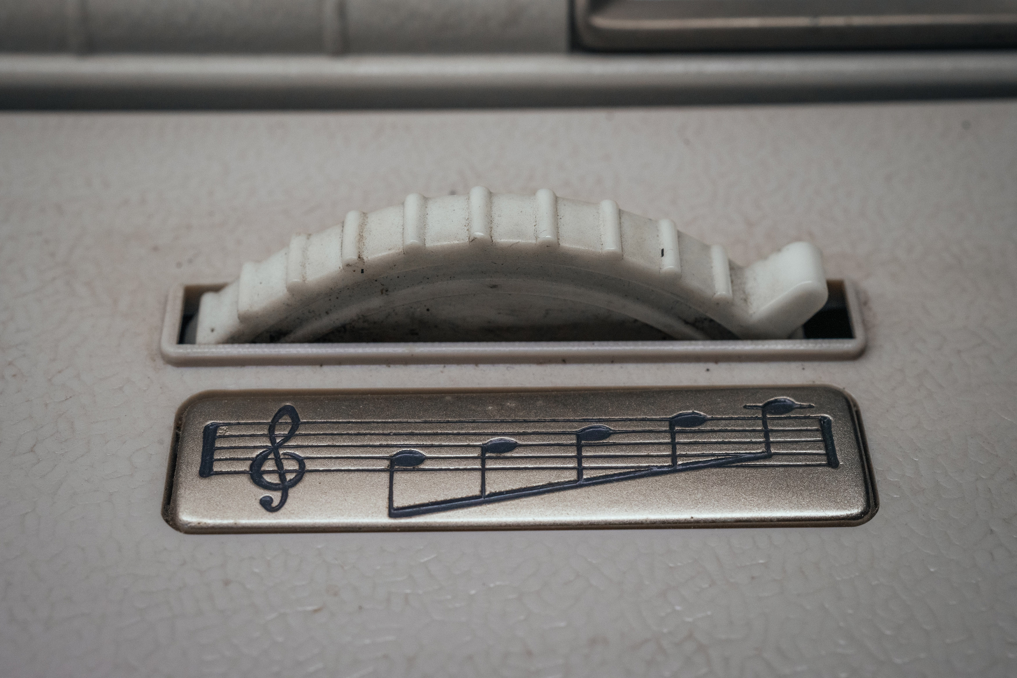
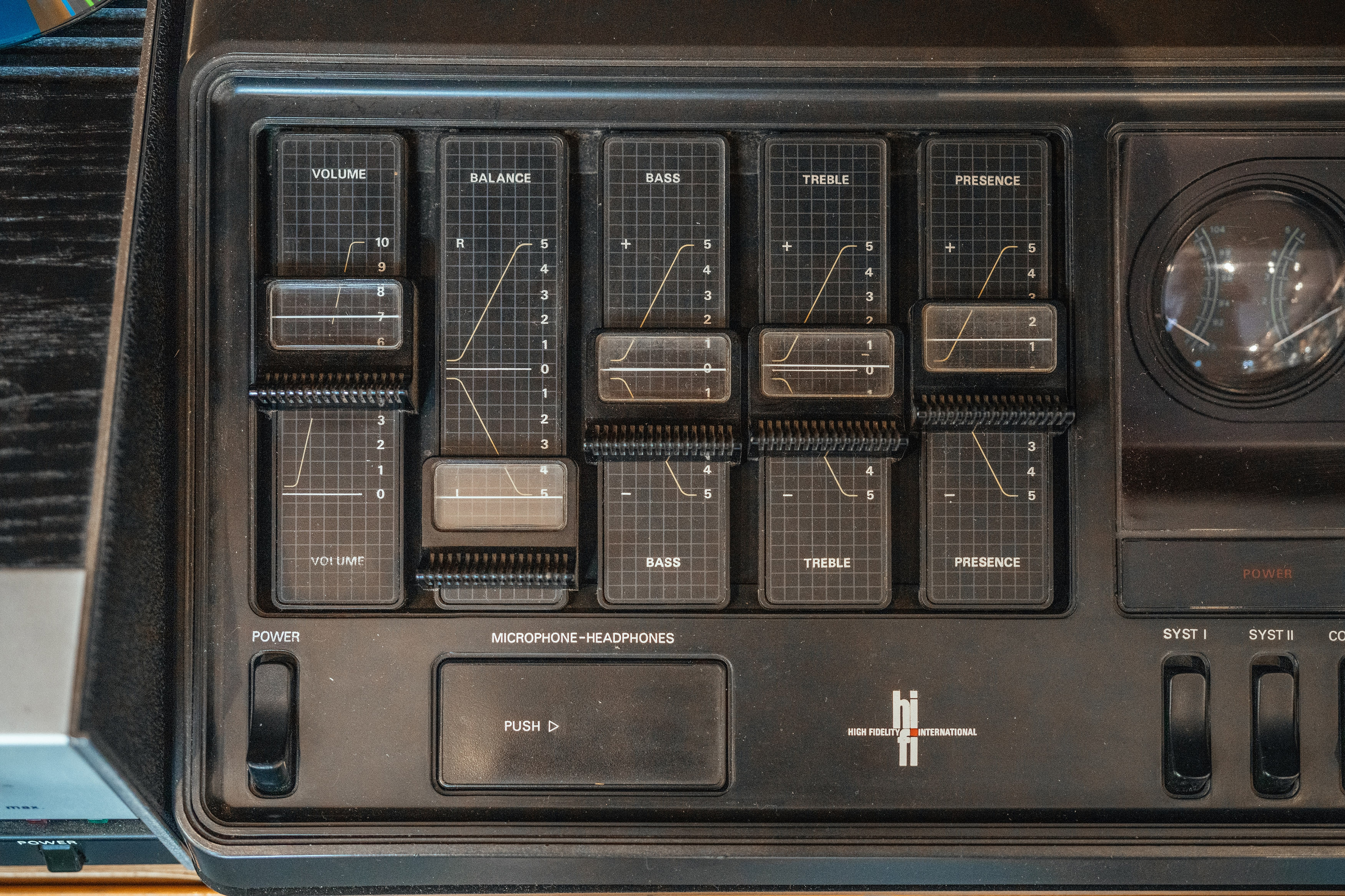
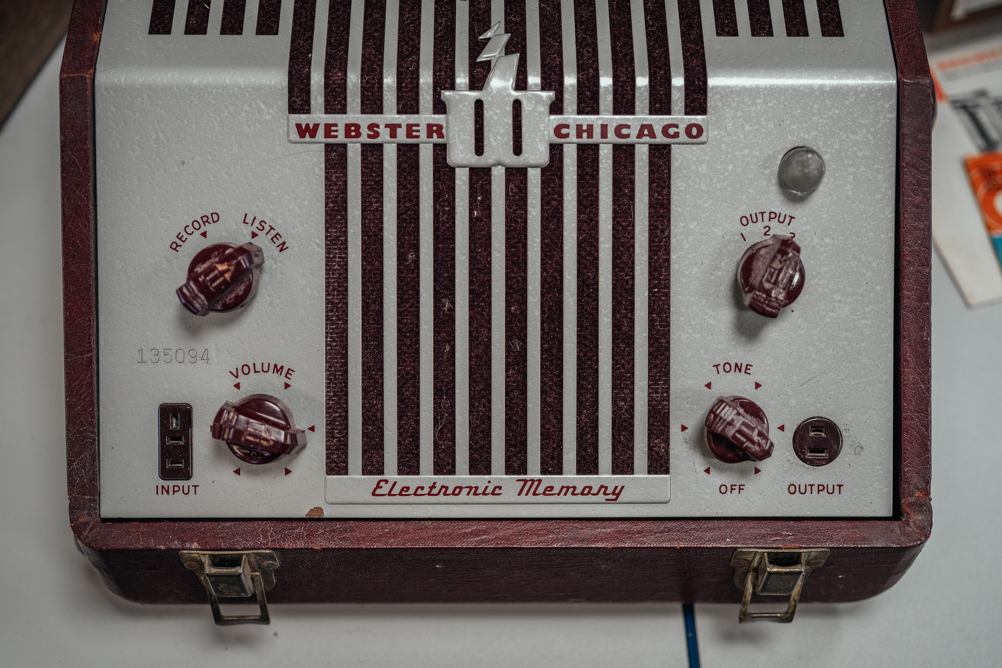
When volume controls were physical, I believe if they didn’t have a number, they at least had a certain amount of notches so you could remember the nearest notch you liked:

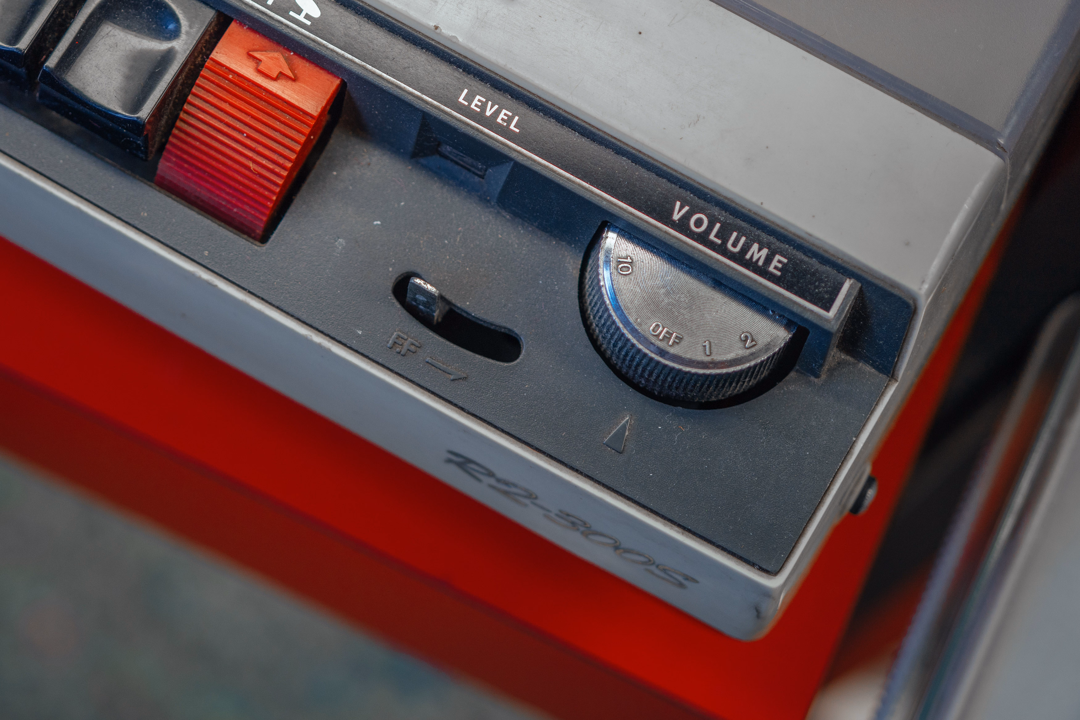


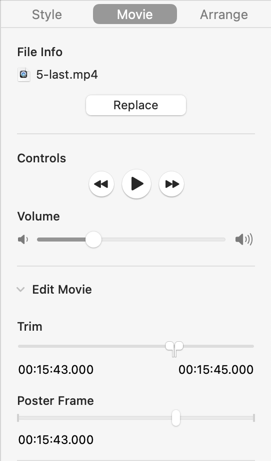
Keynote is an app that could use something like that. At this very moment, I am trying to unify the volume of various clips across slides for an upcoming presentation, and having to use environmental cues like “between Edit Movie below and the rewind button above”:
“Their attitudes about the issues still shifted.”
Saturday, March 14
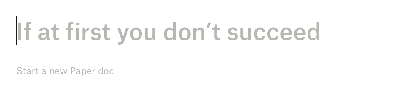
I have been at times frustrated by cute placeholder text in places, most notably Dropbox Paper, which still puts them in a just-created doc…


…and in new to-do items:


This bothered me for two reasons.
First was a potential tone mismatch. What if you are writing a layoffs announcement, a project cancellation doc, or something personal and heartfelt? At Medium back in the day, at some point we added a fun celebratory dialog after publishing that said something like “Now, shout it out from the rooftops!” We took it down very quickly as people made us realize Medium is used to write many kinds of things we didn’t anticipate, and in those situations the cutesy message really failed to read the room.
But the other half of my frustration with Paper was that it felt like the app was making itself too comfortable in my space, in effect shouting all over my inner voice and distracting me. I felt like any app giving you a creative canvas should back off of that canvas unless it’s explicitly invited to participate.
Turns out, I can now attach something tangible to that discomfort. From Scientific American earlier this week (emphasis mine):
The researchers asked participants to fill in an online survey with questions about hot-button social and political issues. Some were prompted with an AI autocomplete answer that was deliberately biased toward one side of the issue. For example, participants who were asked whether they agreed that the death penalty should be legal might receive an AI suggestion that disagreed.
Across all the different topics in the survey, participants who saw the AI autocomplete prompts reported attitudes that were more in line with the AI’s position—including people who didn’t use the AI’s suggested text at all. Overall, the study participants who saw the biased AI text shifted their positions toward those espoused by the AI.
Interestingly, the people in the study didn’t tend to think the AI autocomplete suggestions were biased or to notice that they had changed their own thinking on an issue in the course of the study.
The quoted study shows an example…

…and elaborates on how adding warnings didn’t really help:
The Warning and Debrief messages failed to significantly reduce the attitude shift, which is concerning because they were also inspired by those used in real AI applications. AI tools such as ChatGPT show brief and general statements about AI’s propensity to hallucinate false information (e.g., “ChatGPT is AI and can make mistakes. Check important info.”), similar to the messages used in our interventions.
I know on this blog I often focus on the mechanics of interactions, but the job of every designer is to think of more than that. I keep coming back to both pull-to-refresh and infinite scroll mechanics. Both can be put to good use and feel “delightful,” but both started being abused so much that it led to their respective creators disowning them.
Thirteen characters
Saturday, March 14
Nice, clear, simple copy in ClarisWorks from 1997:
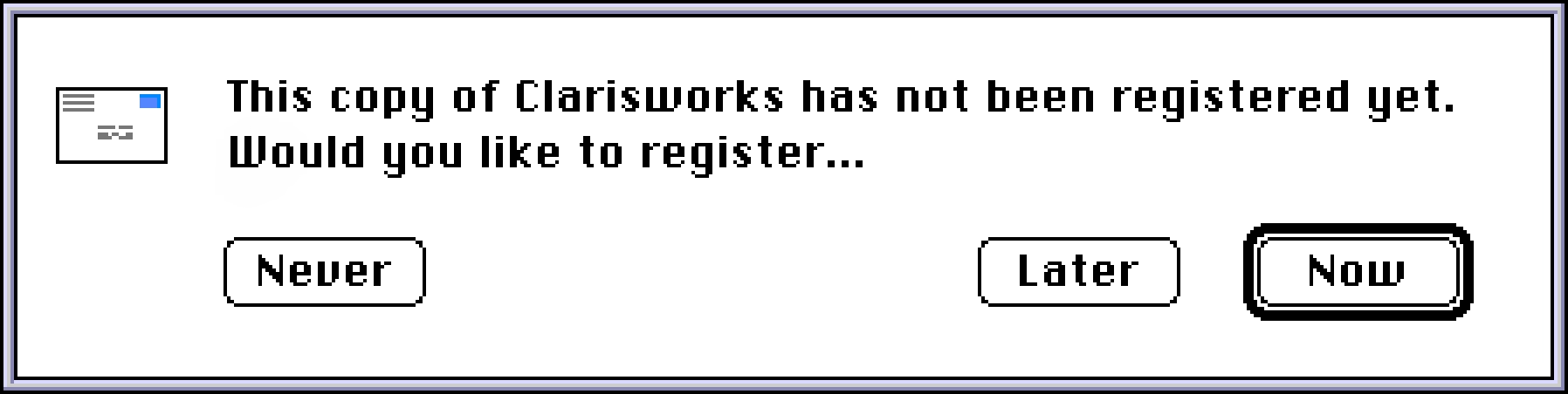
No “Maybe later.” No “Not now.” Thirteen characters. Now, Later, Never.
(Can’t help but notice that Esc and ⌘. – the classic Mac’s equivalent of Esc – still map to Later, however. Also, this breaks the rule of button copy being fully comprehensible without having to read the surrounding strings first, perhaps most well-known as the “avoid «click here»” rule. Never Register/Register Later/Register Now would solve that problem, but wouldn’t look so neat.)
“We’re going to start out by going to the FAKEY folder.”
Saturday, March 14
One of my favorite bits of trivia about the 1983 movie WarGames is that all the computer typing scenes have been faked in a clever way: The actors (many of whom might have never typed before, as home computers were only slowly becoming popular) were allowed to press any key they wanted, but the interface would still proceed as if the correct letter was typed.
This allowed the computer to respond to keystrokes, making it all feel real, but also reduced the burden on actors to type things properly – and also make it easier for proper sight lines to happen, as the actors didn’t have to constantly look at the keyboard.
WarGames used it really well, showing all sorts of face reflections in the CRT screens, as if people literally talked to the machines, which must have been hell to film:
I have never seen this demoed or mentioned outside of the anecdote. However, yesterday, Cathode Ray Dude released an excellent video about the challenges of filming computer screens. The whole video is worth watching, although at this point mostly off-topic for this blog. But starting at 1:32 and ending around 1:37, there’s an actual demo of a similar piece of auto-typing software used in the 1996 movie Scream:
You might think this is just a piece of old-computer trivia, but I’ve actually used that in at least two of my talks, for some of the similar reasons! I run most of my talks from HTML/CSS/JS; it’s nice for the audience to see things being typed and responding properly to (audible, and occasionally visible) key presses – but it’s also nice as a speaker not to worry about messing things up under pressure.
For extra realism, make sure Backspace goes back in the script – you might occasionally press it instinctively – and for extra extra verisimilitude, actually bake in a typo or two into the predefined sequence. (And an escape hatch if you actually change your mind and want to go manual.)
Then, of course, there’s a classic 2011 piece of software called HackerTyper. Did someone already marry this idea with an LLM? Seems like a logical next step.
“Juggling my phone, my camera, and the umbrella, having to tap the wet screen multiple times to get anything done”
Friday, March 13
I know some of you are all whispering “he’s posting all of these hour-long YouTube videos, when am I supposed to find time to watch them”? I hear you loud and clear and I’m going to make it better…
…by sharing this four-plus-hour long YouTube video by Jenny Nicholson from May 2024 – just so those other videos will feel short in comparison:

Seriously, though, this is an extremely enjoyable deep dive into Disney’s failed Galactic Staircruiser hotel.
I don’t know much about Disney, but it was engrossing as half of the failures were actually software-related: from the flawed UI in various spaces in the hotel and screen-laden space windows in the rooms, to poor integration with physical elements of the scenery, an “immersive” interactive game that felt untested plus gave you poor feedback, and the general trends of laziness and cheapness that could never fully be remedied by the performers going above and beyond.
What Nicholson does a lot is trying to debug what actually happened to make her experience so miserable, and it’s really refreshing to see debugging in a different context than I usually see it.