“Just a little detail that wouldn’t sell anything”
Welcome to this week’s digest of Unsung, a blog about software craft and quality. Here’s what was posted in the last week:
“Our programs are fun to use.”
Thursday, February 26
Beagle Bros was a 1980s software company making apps for Apple II that is still remembered fondly for their personality.
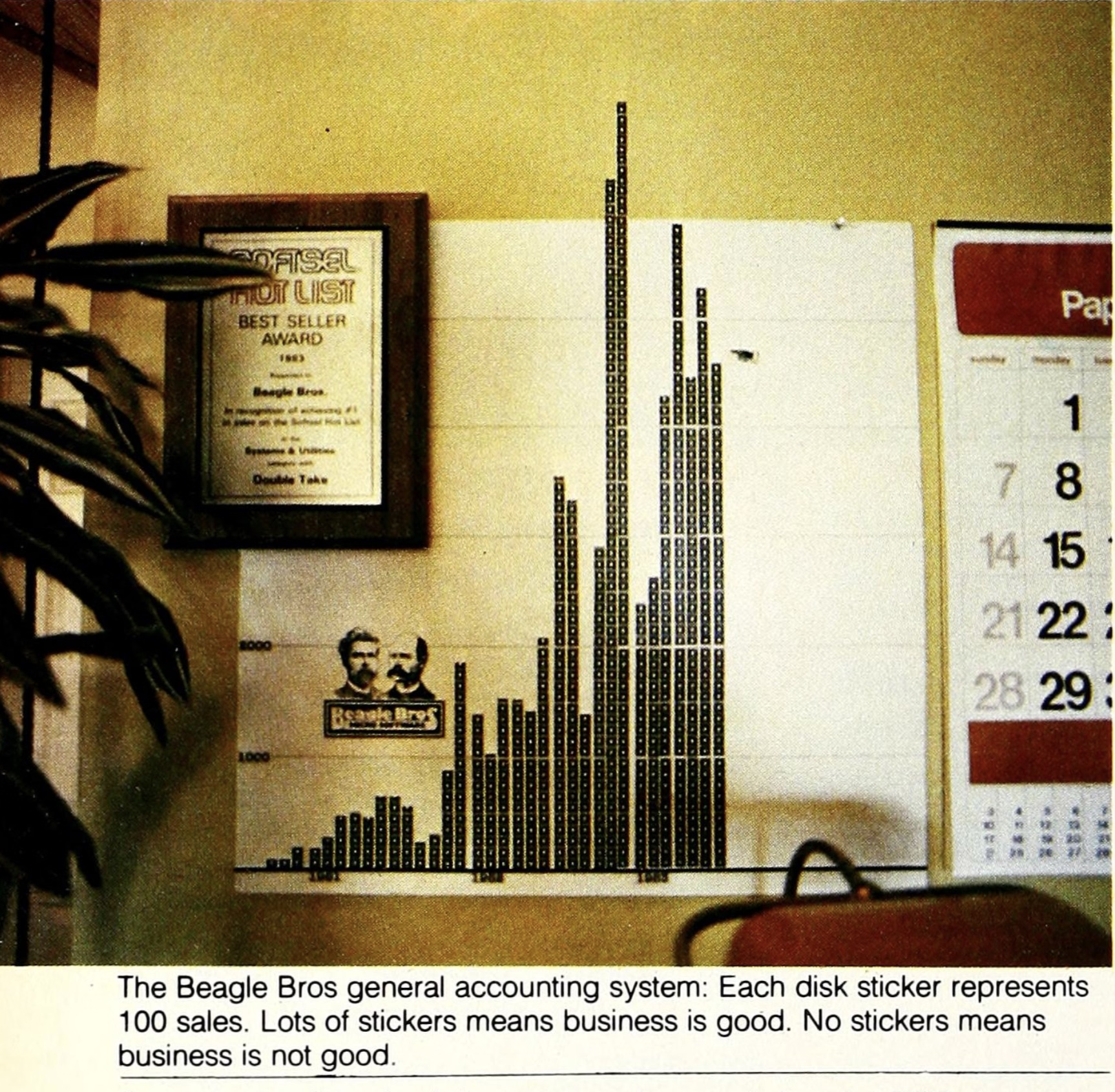
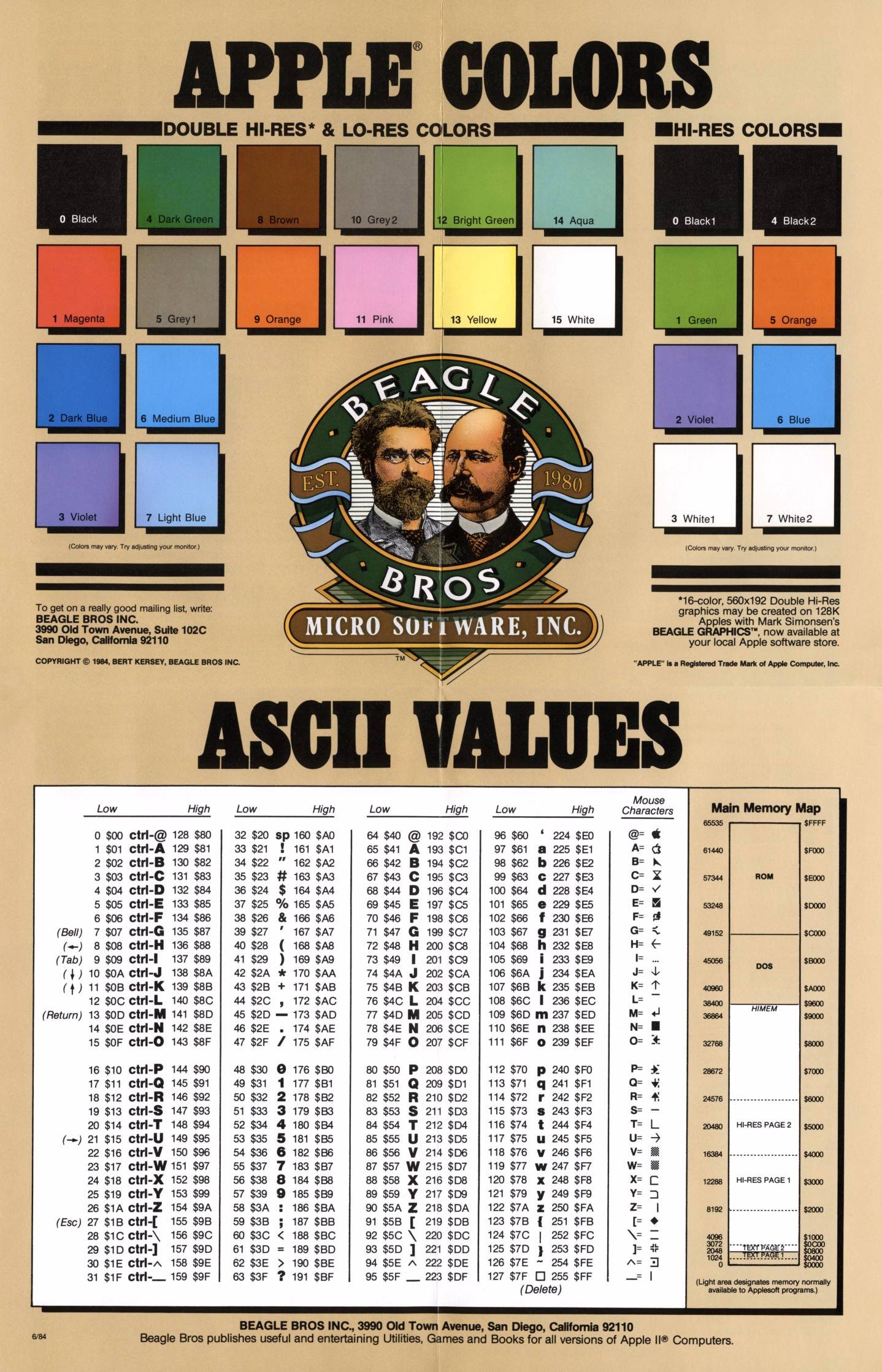
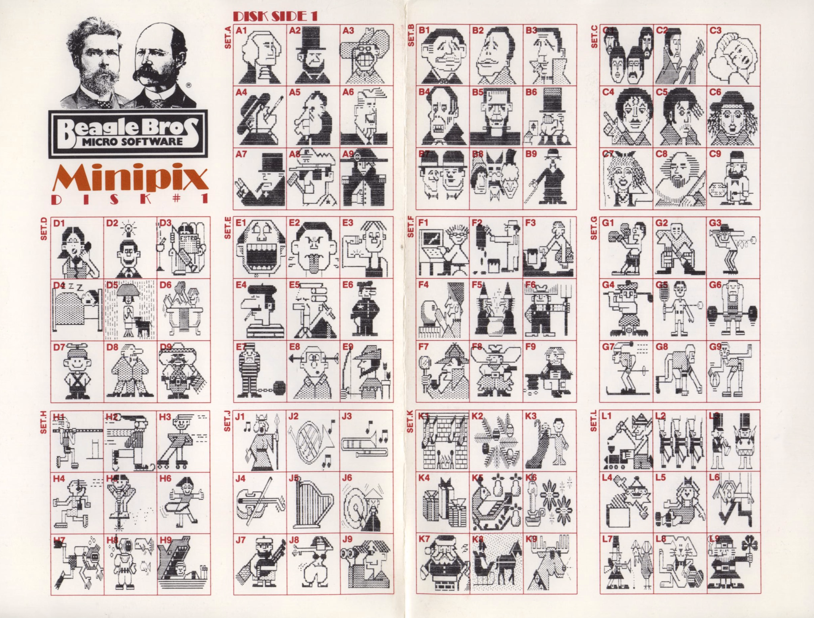
The company had a hobbyist slant, selling various small tools and collections with fun names like Beagle Bag (in the “Indoor Sports” collection) and DOS Boss and Utility City – similar perhaps to Norton Utilities on the PC side, but with a lot more fun and charisma. This is one of their loading screens, also showing both their recognizable logo and their endearing quirkiness:

The fun and well-photographed interview in Softalk in 1983 starts like this:
How do you understand a man who has three clocks on his wall, showing the time in three different cities-San Diego, Fresno, and Seattle-all, of course, showing the same time (″If anything changes in those cities, we’ll know about it”)?
…and has images like these:
Beagle Bros catalogs and manuals were filled with old-timey woodcut illustrations repurposed to tell jokes:
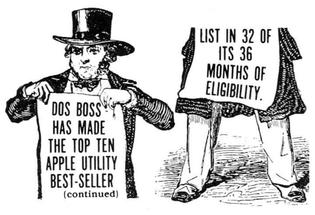
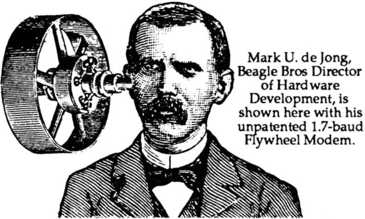
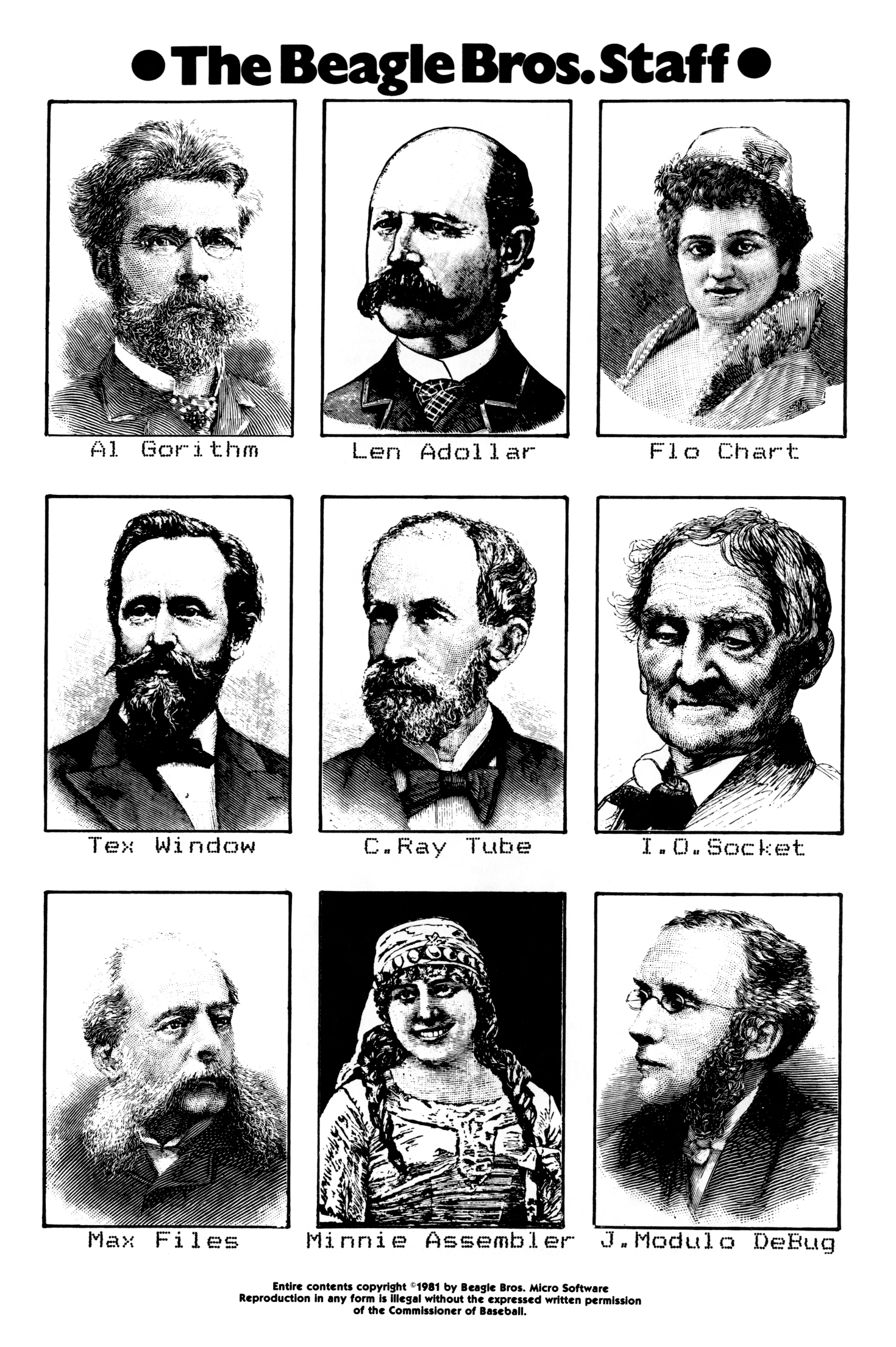
(I find the anachronistic combination of hedcuts and dot matrix printer typography particularly fascinating.)
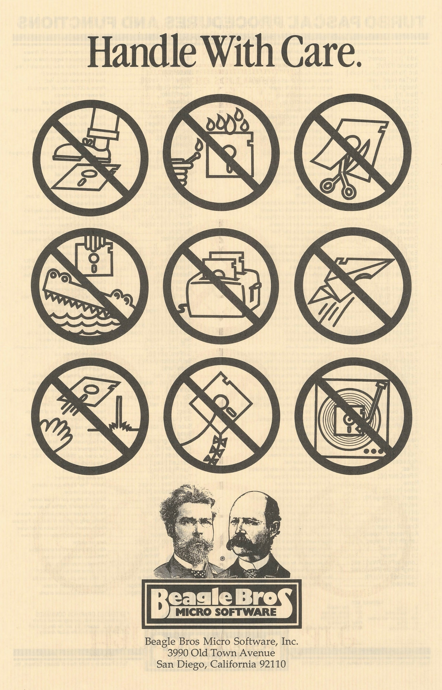
Some of their software was more serious; Beagle Bros released many useful tools and even text editing and presentation apps. They also sold practical posters:
But other stuff…? It was just goofing off:
How does this relate to craft and quality?
There is this interesting question about how much product and marketing and vibes and lore correlate. Did we forgive Sierra On-Line the numerous flaws of their games because we liked the company? Do we love Panic because we like what they do, or because of how they do it? Did Google put doodles on its homepage to distract people from more nefarious things, or because it just felt like a fun way to celebrate things? Is there such a thing as pure selflessness? What is the nature of free will?
Those are, perhaps, topics for future posts.
But Beagle Bros must have been doing something right if there is still a living, elaborate catalog of their works online, 40+ years later. Jeff Atwood also argued in 2015 that it was more than just fun – or that “fun” itself can give back in great ways:
Here were a bunch of goofballs writing terrible AppleSoft BASIC code like me, but doing it for a living – and clearly having fun in the process. Apparently, the best way to create fun programs for users is to make sure you had fun writing them in the first place.
But more than that, they taught me how much more fun it was to learn by playing with an interactive, dynamic program instead of passively reading about concepts in a book. […]
One of the programs on these Beagle Bros floppies, and I can’t for the life of me remember which one, or in what context this happened, printed the following on the screen: “One day, all books will be interactive and animated.”
I thought, wow. That’s it. That’s what these floppies were trying to be! Interactive, animated textbooks that taught you about programming and the Apple II! Incredible.
Steven Frank, the co-founder of Panic, wrote this in 1999, with similar themes:
You never knew exactly what you were going to get. I remember one program listing printed on the side of a bird that, when run, produced a series of wild chirping noises from the Apple’s speaker. And this was from a program that was only five to ten lines long. As a neophyte BASIC programmer myself, I was stunned and amazed. How could you make something this cool with this small amount of code? […]
Beagle Bros’ tools were fantastic. They literally let you do the (allegedly) impossible, like change the names of operating system commands. And they always packed the disks full with extra stuff. Demos of their other products, and strange graphics hacks that existed for no reason other than the fact that they were cool, and because there was spare room on the disk. Beagle Bros. had a lot to do with why I ever wanted to learn programming in the first place. […]
I’ll never forget the book. […] The book was a huge compilation of all around interesting stuff. Weird Apple II tricks that were pointless, but endlessly fascinating. Like the fact that there were extra offscreen pixels of lo-res graphics memory that you could write to, that never got displayed. Or how to put “impossible” inverted or flashing characters into your disk directory listing. Or how to modify system error messages. Not very useful, but really fun to know and really, really cool to mess with. My dad was convinced I was going to somehow break the computer with all this hacking, but a simple reboot always fixed everything.
(I swear I did think of Panic above as a spiritual successor to Beagle Bros without knowing that their work literally inspired one of the Panic’s founders!)
Frank’s essay provoked more emails, and this excerpt caught my attention:
The subtlety: They had utilities which would produced formatted Basic listings and they would give example output of these utlities in their ads and catalogs. It was quite a while before I realized that most of those examples were not program excerpts, but complete programs which of course contained the Beagle Bros signature weirdness. And then there were the seemingly innocent hex dumps. My favorite was from the cover of one of their catalogs, which had a classic picture of this fellow sitting in a chair. On the floor next to him is a handbag with a piece of tractor paper sticking out. On the paper is a hex dump: 48 45 4C 50 21 20 and so on, which are ASCII codes that spell out the message: “HELP! GET ME OUT! I’M TRAPPED IN HERE!----SOPHIE”

Toward the end of the prolific 1980s, Beagle Beos tried to strike it big by making an integrated office suite:
After the work the company had done on AppleWorks 3.0, Simonsen felt ready to jump into the Macintosh market with a “Mac AppleWorks” of their own – they called it Beagle Works. Unfortunately, other companies – giants in the Mac market such as Microsoft, Claris, and Symantec – had the same idea. Their resources were far greater than Beagle Bros had imagined, and the race was costly.
The gamble killed the company. It’s likely that the changing software market would anyway.
But the years before seem to still inspire some people. Check out the Beagle Bros Repository – the homepage is a bit confusing (I think it prominently shows last-updated or last-added things for some reason?), but just use the nav at the top. Maybe it will inspire you, too.
“Some are papercuts, others a throbbing migraine.”
Wednesday, February 25
A thoughtful essay by Nick Heer as a sidebar to the annual Apple/Six Colors report card, in which he proposes this simple framework:
In short, the way I think about software quality is the amount of meaningful problems. […]
There are problems in Finder — resizing columns, renaming or deleting files synced with a FileProvider-based app, and different views not reflecting immediate reality. There are problems with resizing windows. AirPlay randomly drops its connection. AirDrop and other “continuity” services do not always work or, in an interesting twist I experienced a couple days ago, work fine but display an error anyway. The AirPlay and AirDrop menus shuffle options just in time for you to tap the wrong one. […]
These are the products and features I actually use. There are plenty others I do not. I assume syncing my music collection over iCloud remains untrustworthy. Shortcuts seems largely forgotten. Meanwhile, any app augmented by one of Apple’s paid services — Fitness, News, TV — has turned into an upselling experience.
As I’m reading this and thinking about my own Apple usage patterns and a similar litany of problems, I keep returning to Apple TV, which feels by far like the most stable and least troubled platform. I wish I had a better explanation for it: Is Apple magically really good at TV interfaces? Are their benefitting from it being a “hobby project”? But I think the Occam’s Razor here is this: tvOS is just a lot simpler.
And just like that, a thought appears: Is what we’re seeing overall is really just Apple losing the battle with complexity?
Apple won once, in the late 1990s, when on the hardware side all the Performas and Newtons and LaserWriters were cut ruthlessly, and on the software front Mac OS X pushed Classic away as the operating system. The situation was different then, however, because there was no other choice. Today, Apple seems successful on paper, so the pressure needs to come from inside, from someone high up enough to recognize that what Apple is doing vis-a-vis software quality is not sustainable and hasn’t been for some time now. That the bill already came due on all of the decisions where systems thinking and deep testing and focus and preventative maintenance and paying off design debt have been deprioritized in favour of another shiny launch event that stretches the teams and platforms even thinner.
When thinking about complexity, a different go-to framework I have is “can I explain a situation in a short paragraph?” This can help separate regular bugs (where the explanation is typically: I am doing the thing that used to work and it’s no longer working, so something broke), from bigger problems that require some serious long-term system-thinking approach. Off the top of my head, there are many things I can no longer explain:
- I cannot explain Apple’s widget strategy
- I cannot explain what is going on with the Fn/Globe key
- I cannot explain the long-term thinking surrounding icons in Tahoe menus
Of course, it’s not me who should be explaining those things. And I haven’t done this exercise before so I don’t know for sure if things are getting worse here. It feels like it, though. I wonder if Apple just hit a limit of some sort of being able to deal with complex things, and first course of action should be: don’t throw even more complex things on your plate.
A good thought from Dr. Drang, too:
It’s probably impossible to tell the upper echelon of Apple that it’s breaking revenue records in spite of its software design, not because of it. I hope the next regime knows better.
“Some rather obscure and complex mathematical process”
Wednesday, February 25
When you start a new game in SimCity 2000 (you can try it in the browser yourself), as the city is generated, you see a few messages fly by: Creating Hills, Tracing Rivers, Smoothing. Among them, for a bit, one can see “Reticulating Splines”:
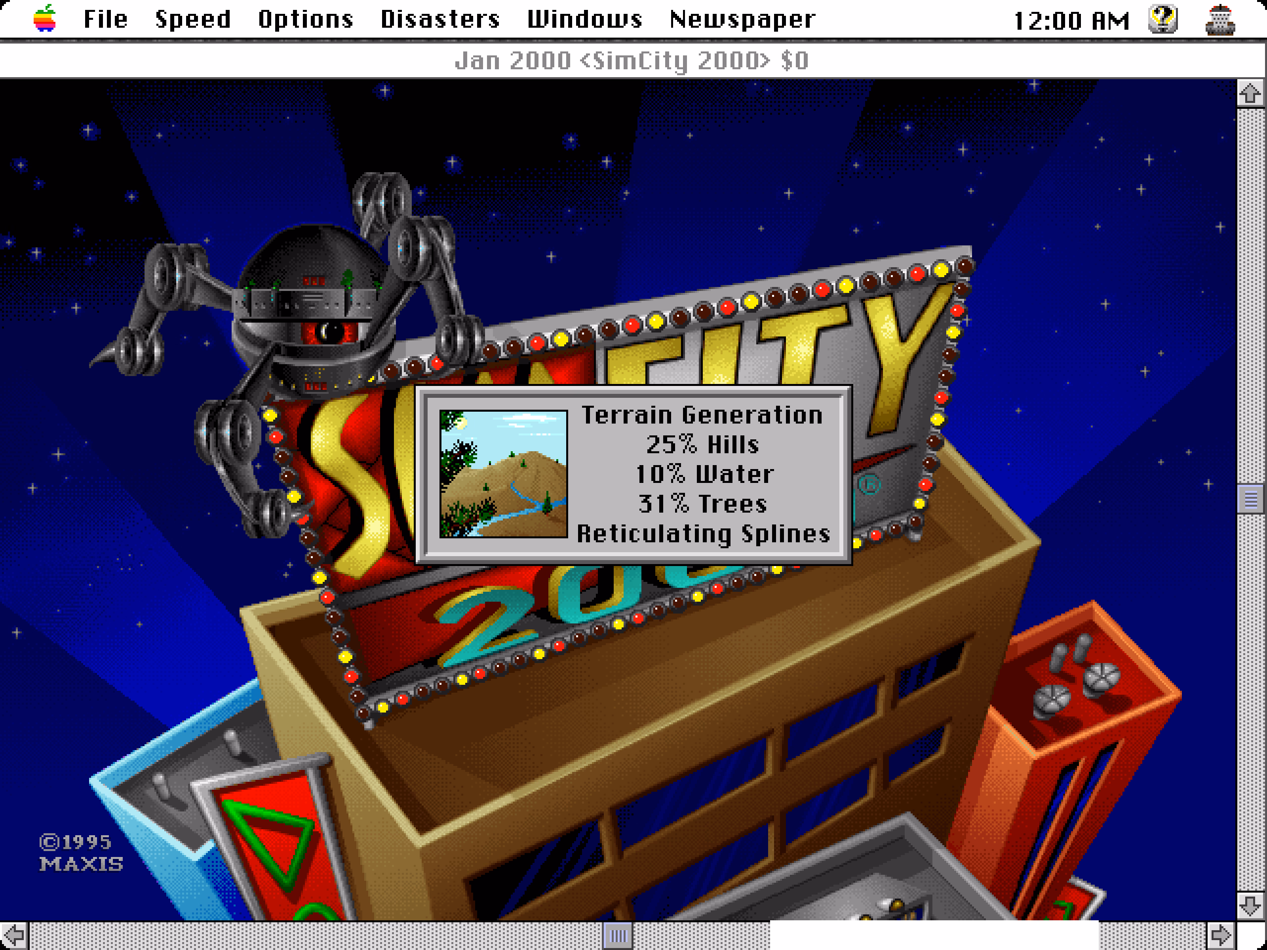
If it was not obvious from seeing Smoothing followed by More Smoothing and then Yet More Smoothing, the phrase is a joke. From The Official SimCity 2000 Planning Commission Handbook:
“Reticulating splines” is a giant pulling of our legs. Will and some others made up the phrase because they thought it looks and sounds as if it means something. It might: the word “reticulate” means to divide something so that it looks like, or appears to be, a net or a network generating, perhaps, from a single point; a “spline” can be an irregular curve or the approximation of a curve. Individually the terms have meaning. Together – in the case of SimCity 2000 – they don’t. It’s just a prank and a joke.
In some versions of the game, there was also a seductive woman’s voice saying the phrase out loud, which presumably made it even more memorable.
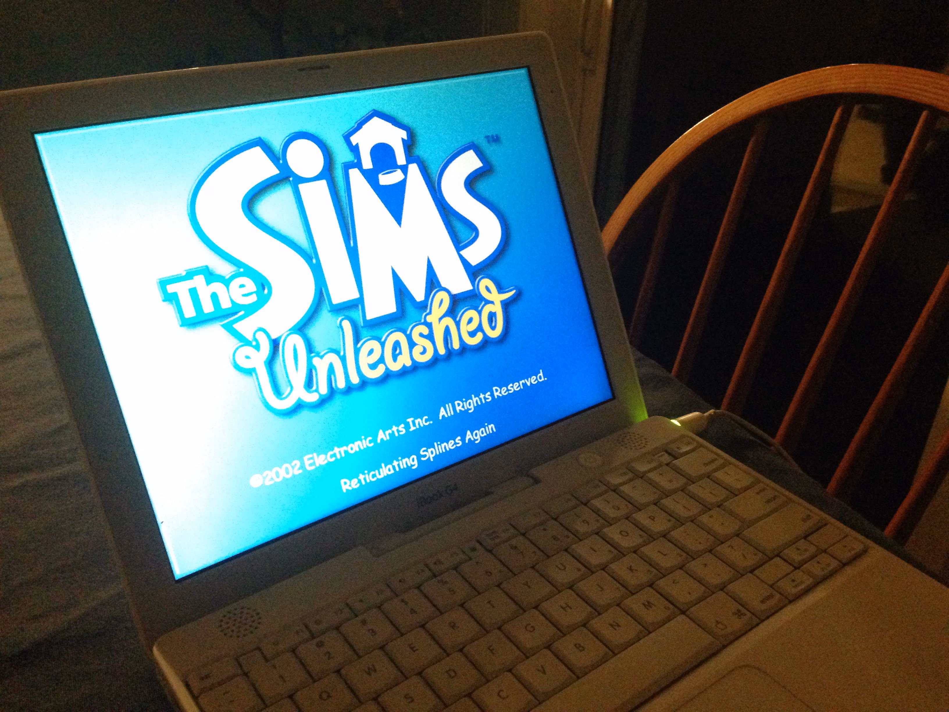
The phrase moved to other Maxis games, notably The Sims…
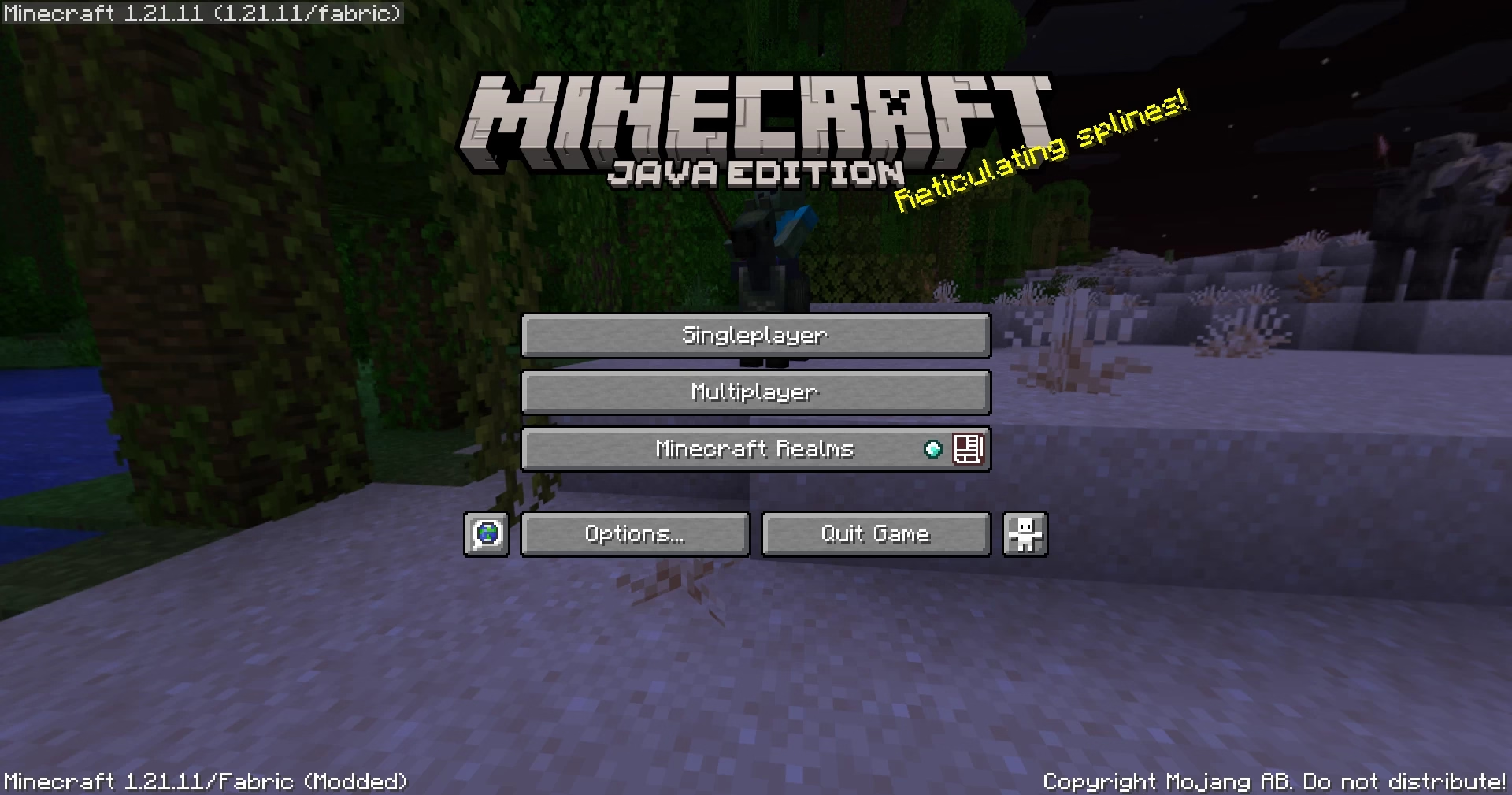
…and subsequently Minecraft…
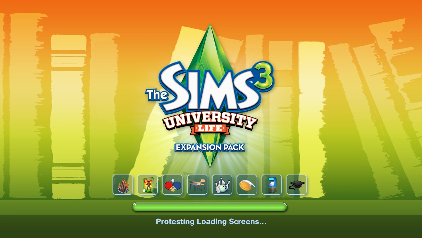
…and then tons of other places.
I’ve heard the argument that it wasn’t just Reticulating Splines – that Will Wright’s joke was the beginning of the habit of putting “cute” loading messages in apps, including actual not-game and definitely-not-cute applications. I am 100% sure there are some earlier examples of “funny” loading or error states, but I also see how this one attained a certain critical mass and influence.
I hate these cute loading strings with passion. I think I’m in the minority. It’s a topic for a future time, but it was fun at least to trace some part of its history, sifting through hundreds of pages earnestly explaining the concept of “reticulating splines” to people. Whether they’re in on the joke, I am not sure.
Also, okay. Fair enough. I chuckled just now when I saw this:
“It’s not so simple to celebrate a phrase.”
Tuesday, February 24
This was a fun 15-minute architectural video from Stewart Hicks (absolutely worth a follow otherwise) that mapped precisely into the same kind of tension and internal debate I sometimes feel when talking about minimalism in UX design: Minimalism is good! Until it’s not!

One interesting lesson here is that the famous “less is more” was actually – surprise! – perverted from the original poem, where it meant “less technical perfection means more emotional impact.”
I wasn’t fully sure why Hicks decided to incorporate a commentary to his own story this way – maybe he was afraid that the sarcasm of “steel wanting to share its joy” and “lessness” and “simplificity” wouldn’t land well? Or perhaps it was just the introduction that didn’t quite work for me, as it confused the entire joke.
But it was fun to watch it twice anyway. Those stories are never easy. I am not ready to draw too many parallels between architecture and UX design, even if Hicks lightly does so at the end. There’s no gentrification and displacement when Liquid Glass takes over Aqua, although I think a lot of people would love to see a Apple’s recent design decisions meeting the business end of a wrecking ball.
My favourite recent saying to replace “less is more” is this, by Paul Valéry (another poet!):
Everything simple is false. Everything complex is unusable.
You can see it as unsolvable, cynical, maybe even nihilistic. I do too, on a dark day. But more often, I see it as a great challenge. “Less is more” has this simplistic seductiveness that feels naïve. “More” is not an option, but often in my work on complex systems “less” is neither, and a lot of UX design is finding the perfect shade of gray.
Accidental UI calming
Tuesday, February 24
I keep thinking about this very good 11-minute Not Just Bikes video about traffic calming. In it, a simple argument is made: the posted speed limit of any given street or road doesn’t really matter. What matters is how the street feels. Generously wide and separated lanes, sparse traffic lights, and the road being straight past the horizon will make you unconsciously speed up. Reducing the posted speed limit or adding flashing YOUR SPEED signs won’t help:
The truth is that many drivers will not slow down because of signs or speed limits. They’ll slow down either because they don’t feel safe, or because they’re afraid of damaging their car.
The only answer is redesigning the street for the desired speed limit – narrowing the lanes or joining them, creating choke points and speed bumps, adding posts and planting trees close to the road, and even adding visual cues like “dragon’s teeth.”

One of the great thing about driving in the Netherlands is that it’s rarely necessary to look at the speed limit. The road design takes care of that for you.
There is an app I use a lot called Forklift, a suped up Finder, with one of its functions being syncing files to a remote server.
In its version 3, the syncing window looked like this:
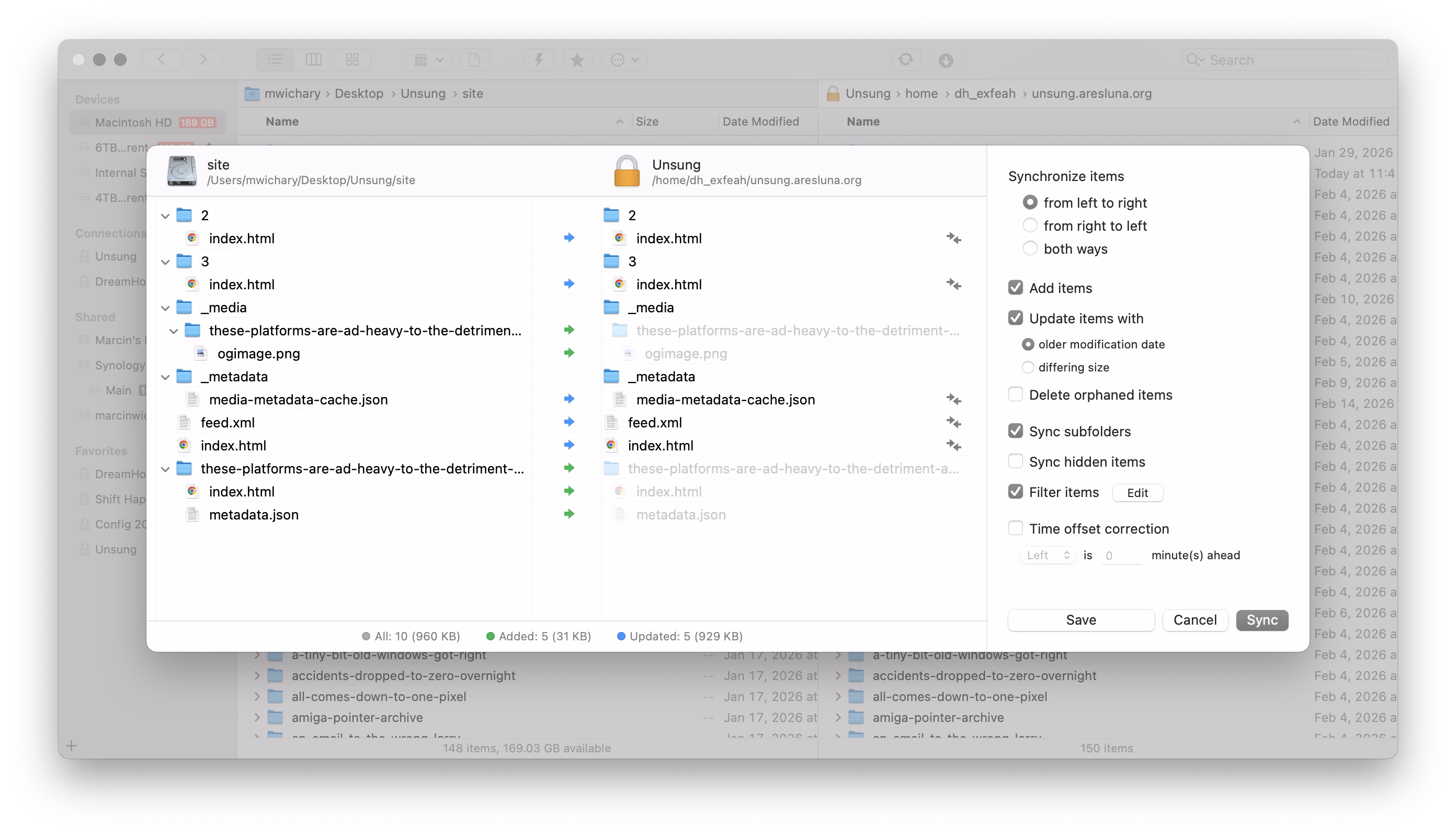
This is a pretty straightforward and dependable function – and I’ve depended on it for years.
I recently updated to version 4 to check it out, particularly since it promised faster syncing. But I was thrown aback by how it randomly deteriorated:
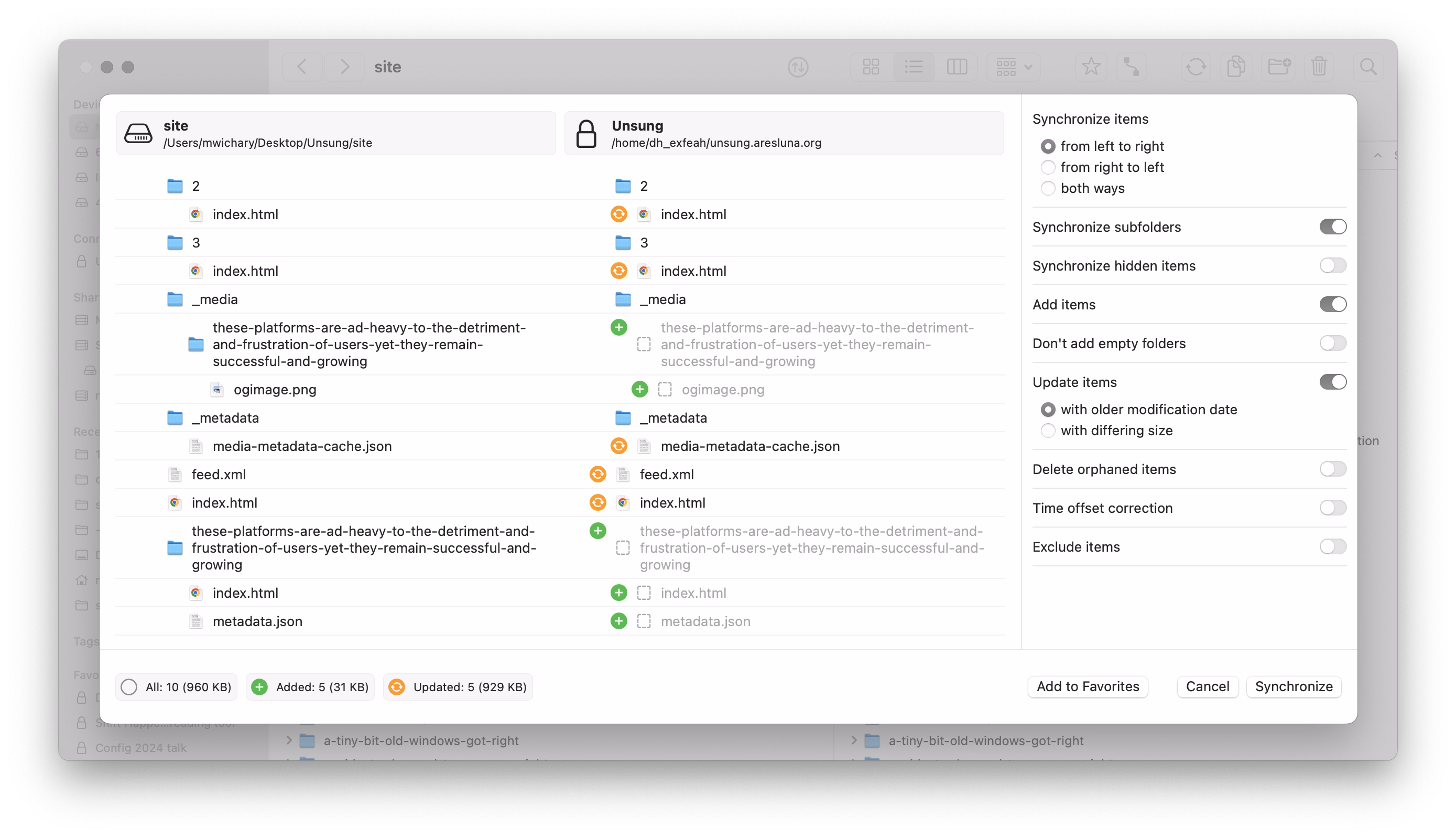
It’s not that there seem to be some UI challenges: the new icons make it harder to understand hierarchy, and one of the switches starts with “Don’t” in contravence of rules of avoiding double negatives.
No, the worst part is this:
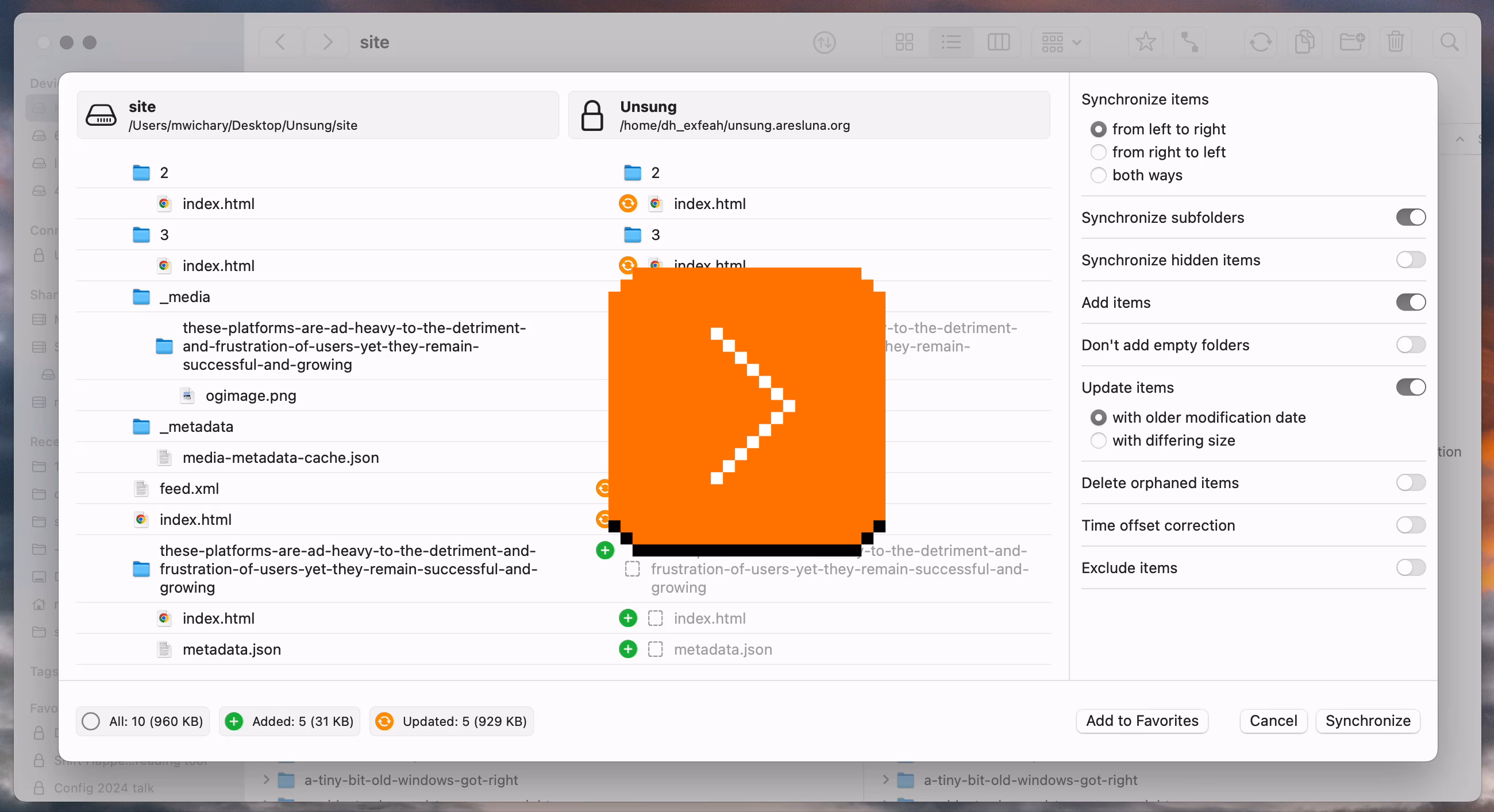
This is a new temporary state that meant to help me understand the details of what’s changing.
On the surface, it’s a thoughtful thing. But it’s done in the worst possible way for this kind of a power-user interface: It’s very slow to invoke and slow to cancel. I often activate it by accident – it makes large swaths of UI a minefield where you can no longer rest your cursor safely. It also changes the hierarchy of the output in a way that’s confusing – and it even animates the text wrapping in a distracting way. Then, if you press Esc instinctively to get rid of whatever happens, the window closes altogether.
It’s a “delightful,” luscious transition that is completely out of place. I think this is how many people misunderstand craft – that it’s only about “high polish” without any thought underneath. Here, the effort was spent on executing something that couldn’t be saved this way and needed a more serious rethink. It seems like its creators forgot who’s using the app and for what, and embarked on accidental UI calming.
There are other challenges along the same lines, both downgrades from version 3:
- when the app analyzes the differences, I can no longer press the Sync button and walk away
- even when the button becomes active, I can no longer press Enter to activate it – I have to use the mouse
In version 3, I could invoke Sync, immediately press Enter, and get on my merry way, with syncing continuing in the background. It was exactly what I wanted. Version 4 slows me down by requiring me to pay constant attention to the interface: it matters where I rest my mouse, it matters when I click the button, it matters what input device I use to commit.
It’s okay to think of friction and sometimes transitions are indeed very helpful for UI calming to avoid drastic movements or accidental activations. But here, this isn’t great at all; the creators of Forklift promised me faster syncing and achieved the opposite.
“So long I’m showing it sideways”
Monday, February 23
This from a blog post by my friend Glenn Fleishman about audio/video settings in macOS just made me laugh:
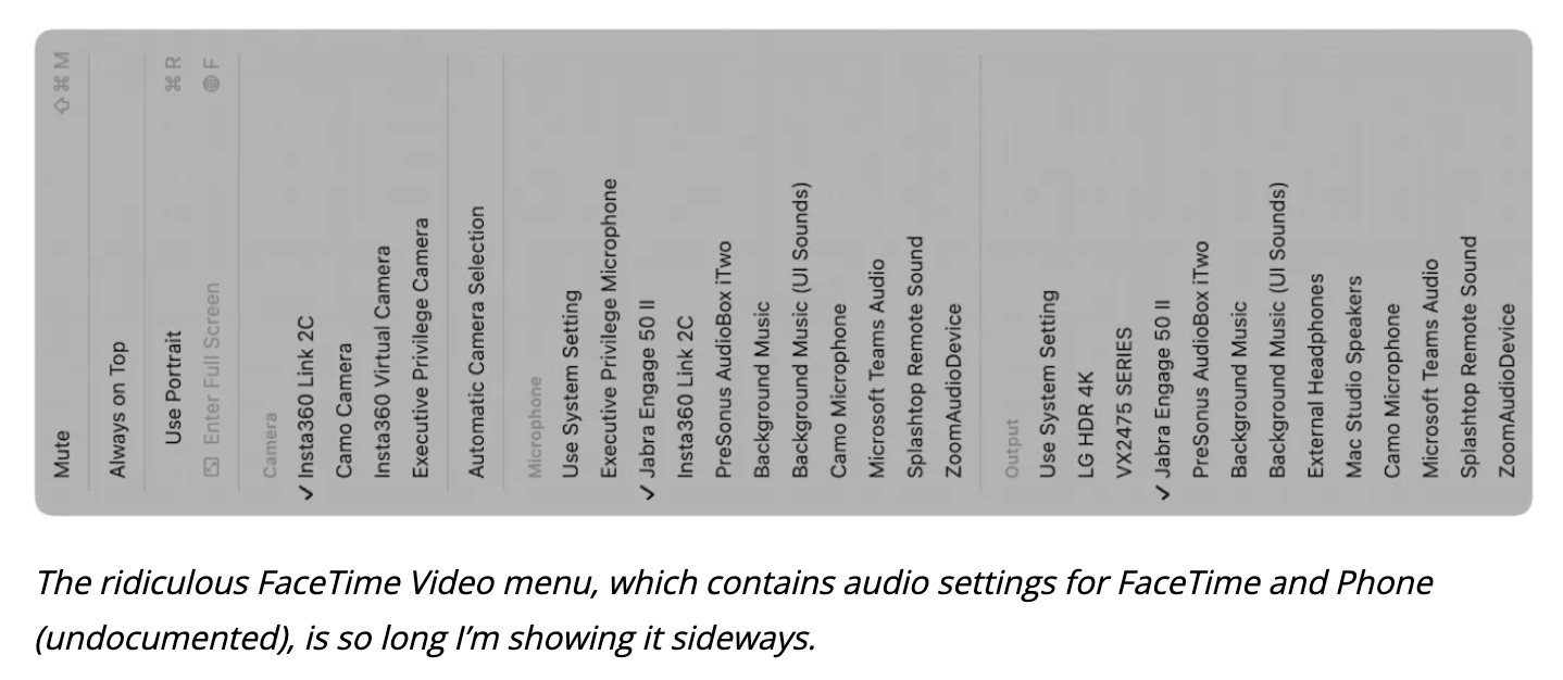
It’s doubly funny if you are aware of Fleishman’s extensive experience in printing.
Also, this:
I guess this is how I keep humble. Despite decades of using a Mac, I can still miss a Video menu in an audio app.
Safari release notes
Monday, February 23
I thought Safari’s release notes are pretty good – exhaustive, direct, something you won’t ever read for pleasure, but something you can actually learn a lot from even if you are just scanning.

I wish either MDN or Can I use… integrated them in some way (and, of course Chrome’s and Firefox’s as well), so that looking up a certain feature or property – for example, will-change – would show you the recent changes in browsers in reverse chronological order, which could help you understand the details of the feature evolving, and help with debugging.
“It’s very small, but still leaves room for creativity.”
Monday, February 23
A really interesting 28-minute video by daivuk about making a first-person shooter game QUOD that fit in just 64 kilobytes:

I found watching it strangely enthralling and even nerve racking. The creator keeps adding stuff that seemingly has no chance of fitting into such a small space – textures! sounds effects! music! his own language! – and somehow finds a way to squeeze them all in.
This is inspiring, but also practically useful: even though you and I are maybe never likely to need such high optimization, some of these techniques alone could be useful in some tight quarters like a load-bearing CSS file, or embedded software.
As an example, the author wrote his own “music tracker,” which is a clever way to reduce the weight of music: instead of the tune being one big audio file, only the instruments are sampled, and then arranged in repeating patterns.
Except in his case, there were no instruments… just audio effects already existing in the game. And audio effects themselves were generated in a similar way, by combining smaller waves and effects.
The same was done for textures: the creator wrote a bespoke text editor that saves each texture as smaller pieces and combination instructions – a sort of a “PDF” of a texture rather than a more costly scan of the printed page – and re-generates it on entry.
Lastly, this debug view of “cost” was really interesting. (Good debug views, in my opinion, are generally underrated.)
Living in the Upside Down
Sunday, February 22
As you progress in your UI design career, you learn that there are quite a few unsolvable challenges:
- do you write My Items or Your Items in UI?
- do you put hand cursors over buttons?
- for a boolean item (especially in the menu), do you talk about the present state or the future state?
- do you try to solve for change blindness or change aversion?
I was reminded of one of those today: how do you sort items in a bottom-aligned menu?
One school of thought is to keep it in the same order as you would a regular top-aligned menu:
On the positive side, this allows to build consistent understanding of how menus are structured: the most important thing is at the top, Quit is always at the bottom. But the downsides are obvious, too – now the most important item is furthest away from where you cursor started, and you have to awkwardly cross all the other items on the way to it.
iOS’s springboard went, literally, the other way:
Here, the bottom aligned menu reverses its item order. This tripped me up today. The dock in macOS was actually more defensible upside down because there, every menu was always going the same way. Here, the inconsistency starts rearing its ugly head.
Of course, the best way to not face an impossible choice is to avoid it altogether. Not sure how one could accomplish it here, though. Placing the menus consistently below would make some of them scrollable, or basically invisible for bottommost icons. You could also slide the entire screen up to make room for the menu, but that would probably feel disorienting.
So, I can’t say this is a wrong solution. The inconsistency might only bother people who use this often, and maybe no one uses this often? Or, perhaps, it was really important to allow to resize widgets and make that item as easy to tap as possible? But still, I think I would have done it the other way – align as needed, but items always in the same order.
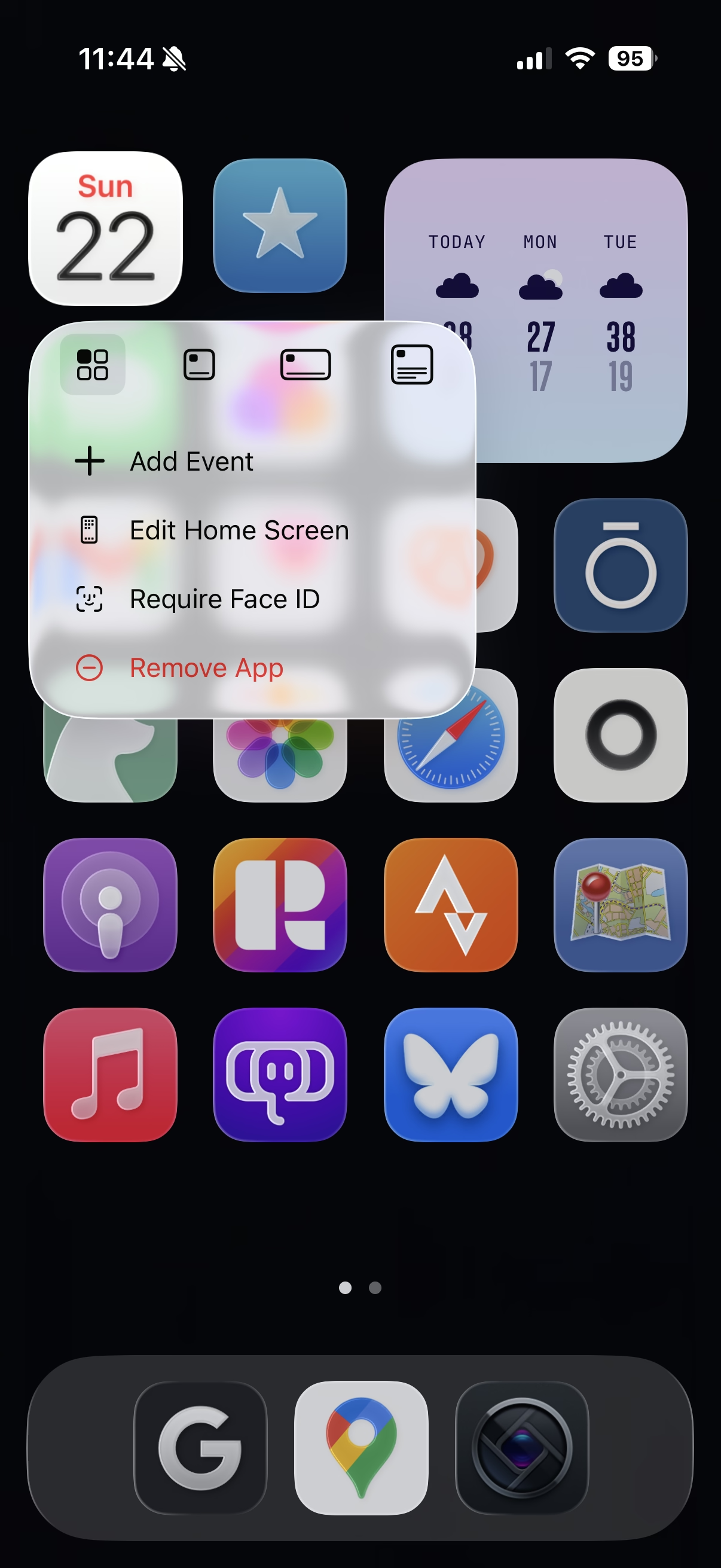
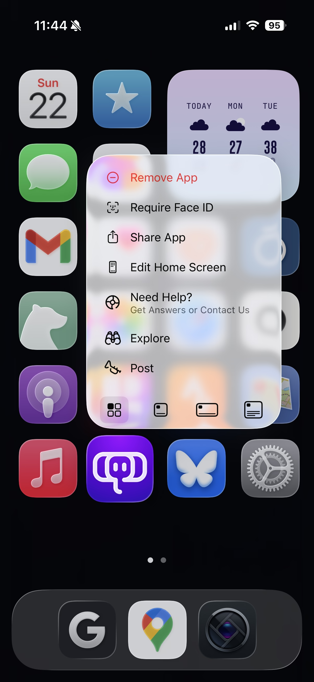
“Please star to express your interest.”
Sunday, February 22
An interesting crowdsourcing effort from Mimestream that asks users who want snoozing to pick up a phone and dial their representative put pressure on Gmail to add that feature to the API.
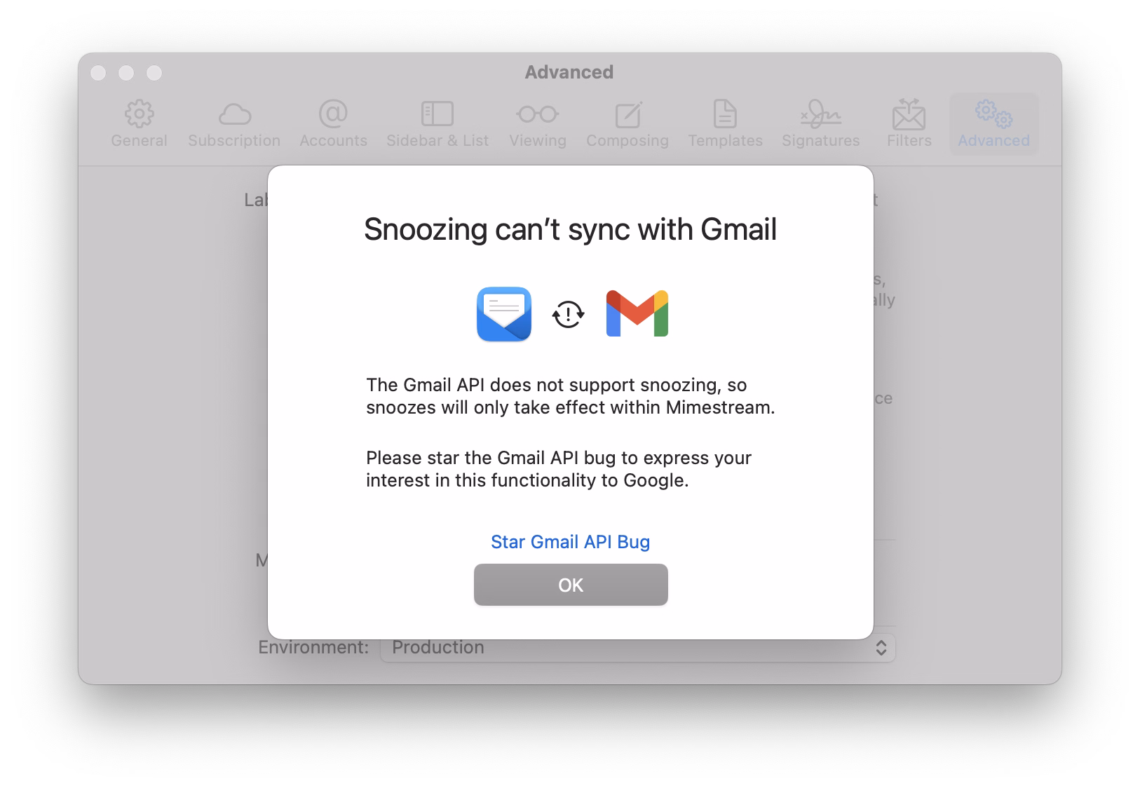
I wonder how much of a chance of succeeding this has. The issue has been open since 2018, and was reopened in 2023. It has over 5,100 stars. Those dates seem old and the numbers seem huge, but I don’t have a full frame of reference. Casual search shows there are only two more bugs that have been starred by more people.
Sins of our Finders, pt. 5
Saturday, February 21
I feel macOS these days starts feeling like Windows in the 1990s where occasionally some core component of it breaks, and a reboot is necessary to restore it to full functionality again.
But even with that in mind: this happened literally right after the reboot, with nothing much happening and no other signs of the system in distress.

It’s hard for me to even understand what would make this kind of thing pop up. Trash feels like one of the core tenets of a GUI – like undo, or copy/paste, or windows gaining focus. You don’t expect it to just… stop working, especially with a circular error message like the above.
“Just a little detail that wouldn’t sell anything”
Saturday, February 21
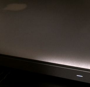
The breathing light – officially “Sleep Indicator Light” – debuted in the iconic iBook G3 in 1999.
It was originally placed in the hinge, but soon was moved to the other side for laptops, and eventually put in desktop computers too: Power Mac, the Cube, and the iMac.
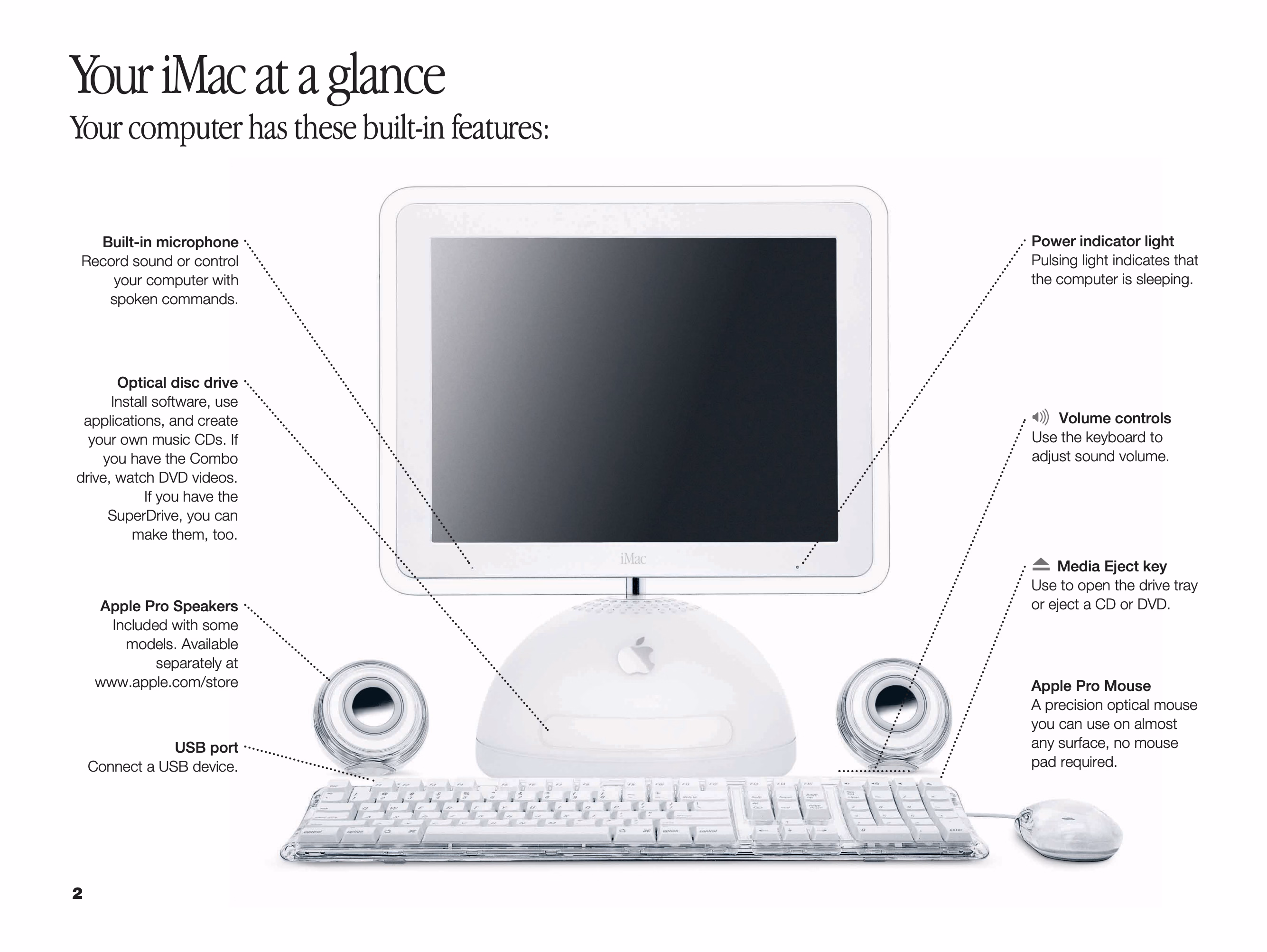
The green LED was replaced by a white one, but “pulsating light indicates that the computer is sleeping” buried the nicest part of it – the animation was designed to mimic human breathing at 12 breaths per minute, and feel comforting and soothing:

Living through that era, it was interesting to see improvements to this small detail.
The iMac G5 gained a light sensor under the edge of the display in part so that the sleep indicator light wouldn’t be too bright in a dark room (and for older iMacs, the light would just get dimmer during the night based on the internal clock).
In later MacBooks, the light didn’t even have an opening. The aluminum was thinned and perforated so it felt like the sleep light was shining through the metal:

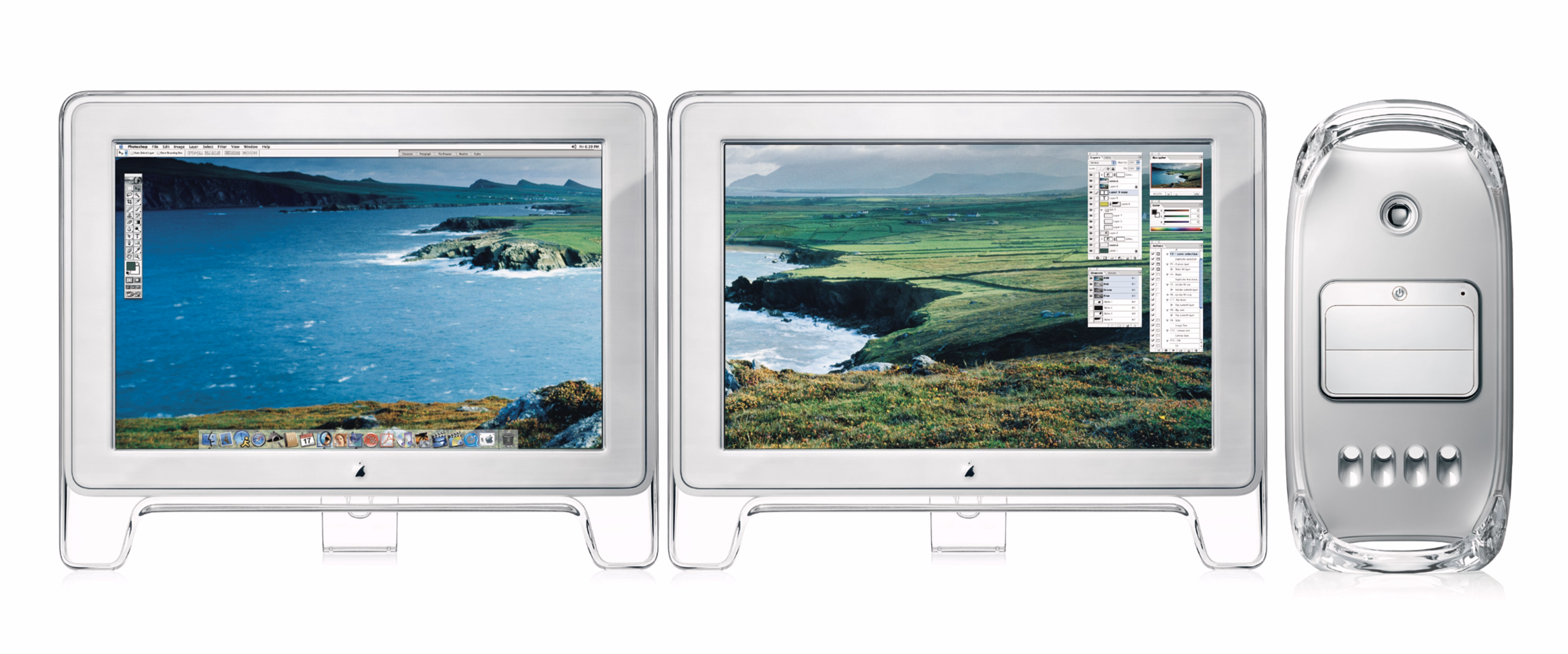
And, for a while, Apple promoted their own display connector that bundled data and power – but also bundled a bit of data, which allowed to do this:
Back when I had a Powermac G4 plugged into an Apple Cinema Display, I noticed something that was never advertised. When the Mac went to sleep, the pulsing sleep light came on, of course, but the sleep light on the display did too... in sync with the light on the Mac. I’ve tested that so many times, and it was always the same; in sync.
Just a little detail that wouldn’t sell anything, but just because.
Even years later, some people tried to recreate it on their own:
To do this I shifted the first gaussian curve to that its domain starts at 0 and remains positive. Since the time domain is 5 seconds total and the I:E ratio is known, it was trivial to pick the split point and therefore the mean. By manipulating sigma I was able to get the desired up-take and fall-off curves; by manipulating factor “c” I was able to control for peak intensity.

But at that point, in the first half of 2010s, the breathing light was gone, victim to the same forces that removed the battery indicator and the illuminated logo on the lid.
I know each person would find themselves elsewhere on the line from “the light was overkill to begin with” to “I wished to see what they would do after they introduced that invisible metal variant.”
I know where I would place myself.
This blog is all about celebrating functional and meaningful details, and there were practical reasons for the light to be there. This was in the era where laptops often died in their sleep – so knowing your computer was actually sleeping safe and sound was important – and the first appearance of the light after closing the lid meant that the hard drives were parked and the laptop could be moved safely.
The breathing itself, however, was purely a humanistic touch, and I miss that quirkiness of this little feature. If a save icon can survive, surely so could the breathing light.

Got your back, pt. 3
Friday, February 20
A nice moment spotted in Slack:

By definition security and usability coexist wearily, so it was nice someone thought about allowing me to do this at an opportune time, rather than at a random moment that might be extremely untimely or stressful.
I’m with stupid →
Friday, February 20
I think a lot about bugs or design decisions that make software appear dumb.
At some point in my career I started fitting everything against two principles: “don’t make your app treat your user as if they’re dumb” and “don’t make your app itself feel dumb.”
To wit:
This is, very obviously, my website. I have made it from scratch. I have visited it a million times. And yet, at some point my friend Noah shared a link of it with me, so now Safari occasionally announces that with glee when I check it out.
Me having visited something many times should outweigh someone sharing it with me once.
There is a close box here, although you have to hover over the bar to see it. (And, after closing, it seems to come back after a few days!) I can also right click and choose Remove which does… absolutely nothing.

I believe this whole feature is called Shared With You. Elsewhere, on occasion, I find it useful. But its tentacle right here makes Safari appear just… kinda obtuse.
Also, speaking of obtuse: Can you spot a grave typographical mistake I made on this screenshot? (I already fixed it in production.)