“It moved too slowly to be an asteroid.”
Welcome to this week’s digest of Unsung, a blog about software craft and quality. Here’s what was posted in the last week:
“We’re trying to copy this old machine, weirdness and all.”
Thursday, April 9
I’ve loved Chris Staecker’s videos about calculating devices and machinery for years now, and I finally have a reason to link to one here. This is a fascinating 12-minute review of The Kensington Adding Machine from 1993:
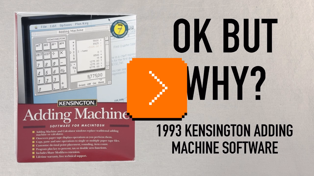
It’s a fun (as always) watch, but as a UX designer, it’s also interesting to try to figure out what are the underpinnings of the things Staecker lists as strange from today’s perspective.
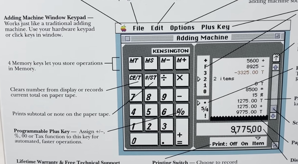
I believe that “CE/T” (clearing and totaling) coexisting on one key is a nod to professional accounting use of adding machines where you wouldn’t want to accidentally enter something into the record twice – so totaling also automatically resets the value and prevents you from making a mistake.
I also believe the strange [+=] rule is only because the keypad has to look forward at the same time it is looking back: it needs to serve as a universal computer keypad where [+] and [=] are separate key, but it also needs to pretend to be an adding machine where one key served both purposes.
(You can spot that the back of the box just allows you to swap the [+] key to be something else.)
Overall, the video is a fascinating tale of an “in-betweener” product that was stuck not just in the middle of a transition from physical devices into apps, but also at the intersection of calculators and adding machines (once two very different lines of products), themselves trying to learn from each other. It also serves as a great reminder that skeuomorphism is not just about visuals and sounds, but also behaviours: tearing off the tape, details of specific keys, nuances of rounding.
It’s not a thing of the past, either. In my post about determinism I linked to Apple’s recent travails with the deterministic Clear button (part one, two, and three). A few years ago, Apple also changed the built-in iPhone calculator from its “desktop calculator” roots to a more modern model where you get to input the entire equation before you see the result. But that change had bigger consequences; for example the [=] key could no longer repeat an addition. People complained, and Apple added it back – but the change feels incompatible with the new system and potentially confusing:


Elsewhere, the entire iPhone is an in-betweener, as the keypad coming from calculators is incompatible with the keypad coming from phones.

At this point it seems the calculator keypad will win, but transition has been over a century in the making. Staecker’s video is a good reminder how important, but also hard it is when you try to make these transitions happen faster.
#change management / #flow / #history / #real world / #skeuomorphism / #youtube
“Software is a unique art because it is so reactive.”
Thursday, April 9
As far as I can tell, no truly huge world-shifting software product has ever existed in only one version (even Flappy Bird had updates). Just about every global software product of longevity grows, changes, adapts, and reacts to other software over time.
So I set myself the task of picking five great works of software. The criteria were simple: How long had it been around? Did people directly interact with it every day? Did people use it to do something meaningful?
I came up with:
- the office suite Microsoft Office,
- the image editor Photoshop,
- the videogame Pac-Man,
- the operating system Unix,
- and the text editor Emacs.
Ford’s criteria felt more interesting than those of the other similar lists:
I propose a different kind of software canon: Not about specific moments in time, or about a specific product, but rather about works of technology that transcend the upgrade cycle, adapting to changing rhythms and new ideas, often over decades.
This – about Unix – also caught my attention:
There’s a sad tendency in most manuals and programming guides to congratulate people simply for thinking. Not here; you’re expected to think. That can be very exciting when you’re used to being patronized, and it’s one of the best things about Unix.
#history / #software evolution
Blink comparators in photo editing apps
Wednesday, April 8
One of the readers (thank you, Peter!) reminded me that there is a version of a blink comparator that all of us are exposed to perhaps every day: many photo editing apps – Apple Photos, Darkroom, Aphera, I imagine others – allow you to quickly compare the photo as-shot and with your edits. Sometimes it’s a tap, sometimes an onscreen button, and in the case of Lightroom it is a backslash key. Here’s that feature on a color graded photo with some dust removed:
But these blink comparators are smart. If you e.g. rotate the photo, the comparison will be with the original also rotated so the pixels still map to each other 1:1 – even if you rotated the photo as the last step in your editing process:
I think this is a brilliant example of understanding the spirit of a feature rather than its letter. A naïve blink comparator would show an unrotated photo, but in this way it would cease being a blink comparator.
#details / #interface design / #principles
“Prototyping turned into an excuse for not thinking”
Monday, April 6
The 2016 launch of No Man’s Sky and the 2020 launch of Cyberpunk 2077 were catastrophes. No Man’s Sky fell so incredibly short of the promises the founder shared over the years – from smaller ones like rivers on the surface of planets, to huge ones like seeing other players – that some people felt it must have been a scam all along.
The other game was a simpler case study: Cyberpunk was buggy as hell. Not just the abysmal performance, but also the overall quality. People called it “the Hindenburg of videogames” and made YouTube compilations and listicles of its often hilarious bugs: cars exploding for no reason with perfect comedic timing, intimate body parts protruding through the clothes, and the infamous T poses.
In an unprecedented move, Microsoft slapped a big warning atop Cyberpunk’s app store listing, and Sony pulled it from their store altogether.
But it is 2026 now, and both games redeemed themselves. For years after the launch, the No Man’s Sky team worked hard on adding promised features:
Over a decade on from its initial reveal, No Man’s Sky both manages to remain the same game it was at launch while also bringing almost every single missing feature (and dozens of new surprise ones) into the title – implementing them intelligently and with great consideration for how it will affect the core of the game. They achieved their redemption years ago, yet continue diligently with massive update after massive update.
No other title has done what Hello Games have managed to achieve. And the best part? Every single update, patch and addition to the game was and is 100% free, with no falsified hype or build-up to each update.
Cyberpunk 2077 had a redemptive arc of its own, too, highlighted and contextualized in this 17-minute video from gameranx. Today, both games are rated “very positive” on Steam, and are actually still gaining daily players.
So, wonderful comeback stories, right? Depends on how you look at it. It’s great that both these games ended up being good products, but perhaps not as great that it was all happening in the open.
The videogame industry tried to get creative about it and established an idea of “early access”: being able to purchase an incomplete game earlier, and watch it get better while the publisher receives funding to keep going. But for every Minecraft there is Godus, and for every Kerbal Space Program there is The Day Before. Plus, neither No Man’s Sky nor Cyberpunk launched in early access with attendant caveats and discounts. (By the way, Wikipedia’s entry for early access is worth checking out – it’s so eloquent I’m surprised not to see any warning boxes.)
There seems to be ongoing and perhaps rising frustration with companies releasing software products too early and fixing them in flight, if at all. Already in 1996, Geoff Duncan wrote about his annoyances with that:
What Beta Means Now: […] In many cases – particularly with Mac Internet software – “beta” doesn’t mean anything close to what it used to. We’ve seen programs in public beta that not only contain innumerable known bugs the developers are aware of and plan to fix, but also accumulate major new features through subsequent releases. Similarly, we’ve seen products that change fundamental system and technology requirements during beta – details which should have been etched in stone long before. Beta often means what “alpha” or even “development build” used to mean.
Subsequently, Google and other web-first companies diluted the meaning of beta labels even more.
The trend of premature launches extended to devices, too. About two years ago, AI assistant gizmos from Humane and Rabbit were pilloried by audiences for launching in an effectively unfinished form. Both devices failed in the market; MKBHD’s video reviews of Humane AI Pin and Rabbit R1 remain both entertaining and informative watches.
AI complicates this even further in many ways. I enjoyed Pavel Samsonov’s recent post on his blog Product Picnic analyzing another disastrous launch: Grammarly’s writing advice feature that replicated well-known authors who never agreed for their likenesses to be used this way:
Reading between the lines, Mehotra’s interview paints a picture that I think many tech workers will find familiar: features are conceived, coded, and shipped as quickly as possible. He is happy to admit that the feature was a mistake… in retrospect. But in the moment it actually mattered, critical thinking was swept away by the false urgency of pushing things out.
It is worth reading in full and following the links, too; I watched the mentioned (tense) interview, and was similarly frustrated with the CEO’s lack of accountability or even a hint of an explanation of why the feature was launched to begin with. Key line from Samsonov’s post:
If you don’t know what are you trying to learn when you ship a prototype, do not ship a prototype.
This becomes even more important as the difference between a prototype and a final product is now thinner than a retina pixel. Both No Man’s Sky and Cyberpunk had, at least, well thought through foundations.
I understand that for some people gen AI software building tools is a discovery – perhaps for the first time – of a genuine joy of creation. But there’s also the other, newish side, a sort of “cult of velocity” where people show screens filled with agents coding things as if the world needed every possible app right this second.
Velocity and urgency can be important, but it’s hard to be careful and thoughtful when you’re going really fast; unsurprisingly, some don’t know what to do with that newfound AI-powered speed or realize the importance of thinking about crucial aspects other than time to market. (When digital cameras came around, the barrier to entry for photography was drastically lowered – it was possible to take a lot of photos without worrying about cost or quality. Tons of people took tons of objectively subpar photos; some were the end goal, some were a stepping stone toward more photographic mastery. However, I am not sure I remember people on either side ever bragging “I took over 1,200 photos today!”)
All this could be contrasted with movement of slow software (the name is part of a bigger slow movement although has unfortunate connotations in tech – it’s slow as in “speech,” not slow as in “beer”). Jared White in 2023 defined it as:
- Sustainable software. Architecting and writing code in ways which are easily understandable and maintainable over time, requiring few dependencies and a rate of change that is healthy for the underlying ecosystem.
- Thoughtful software. Working through feature development and making decisions based on what will benefit the userbase over the long term, placing mental and social health as priority over immediate gains or selfish interests.
- Careful software. Seeking to understand the ways software might be used for harm, or itself be harmful by taking attention away from more important concerns in the broader culture.
- Humanist software. Recognizing that most software—at least in application development—is primarily written for humans to understand and reason about with ease across a wide array of skill levels, and that relying on complex code generators or “generative AI” tooling to resolve complexity instead of simply building simpler human-scale tools is an industry dead-end.
- Open software. Looking to established collaborative software movements like open source and the standards bodies responsible for open protocols to inspire how we build and maintain software (regardless of licensing).
I don’t really have a conclusion for this meandering post, as I am not sure a snappy conclusion is possible. Perhaps some of the links above can provide inspiration or food for thought about urgency, reputation, and doing things in the open.
Some patterns I’m noticing are:
- Velocity is never an end goal.
- Velocity is only one of many ingredients of software building.
- It is necessary to think of people who will experience your work-in-progress as it is, not as it might one day be.
#ai / #bugs / #games / #software evolution
“Every step they take, in every single direction, is right on top of a rake.”
Monday, April 6
Just like the video I shared last week, this 20-minute video by Mariana Colín at The Morbid Zoo is sharper than most, and also extremely entertaining:

Colín is not “in tech,” and the video is of “the king is naked” variety which is very, very refreshing.
Among many good observations, this caught my attention as relating to this blog’s topic:
It’s a little weird to have this almost adversarial relationship with your customer base. They’re not trying to solve a problem customers have. They’re trying to convince people that the product on offer is something more than it clearly is.
What VR is, is a fun parlor trick. What they want VR to be is literal reality.
It does indeed feel Meta’s version of VR/metaverse has always been cargo-culting real world in a particularly awkward fashion, which Colín analyzes deeper.
Too many quotable laugh-out-loud moments, so maybe just this one more:
Down here in the real world, there are really only two things a media technology can be. It can be a solution to a specific discrete informational problem, or it can be an artistic medium. These two things are not mutually exclusive. There is crossover here – like, radio was a military tool before radio plays were ever a thing.
But by the former, I mean you’re literally just making information go faster. You’re reducing the amount of noise between a message and its receiver. Any kind of metaverse is going to be really, really bad at this because you don’t need to look at a weird Pixar version of your coworker in order for them to convey what a deadline is.
#research / #software evolution / #youtube
“Subtle line between animations that help and animations that hurt”
Monday, April 6
In late 2023, designer Anthony Hobday published a small list of 20 interface quality of life improvements, and recently Hobday and Katie Langerman chatted about it on an episode of their podcast Complementary.
It’s a fun listen (perhaps if you skip a bit of a bummer 9-minute beginning), covering four listed things in more details:
- generous mouse paths (especially in menus)
- coyote time for modifier keys
- optical alignments
- tooltip timing details
There were a few interesting things that caught my attention:
- Figma does have “coyote time” in the very interaction the hosts are talking about, perhaps showcasing that the details of the details can make or break them.
- “Should modifier keys be reversible” and “should modifier keys be consistent with one another” are interesting challenges; some more recent graphic tools have changed the long-standing behaviour here, malking modifier keys more “sticky.”
- Wholeheartedly agree with how frustrating it feels that the menu interactions are not yet baked into browsers as primitives. “The fact that the companies keep having to implement it themselves manually is maddening.” It is.
- Good observation that some people associate animations with “feeling premium” (see also: the quote I put in the title).
#details / #interface design / #podcast
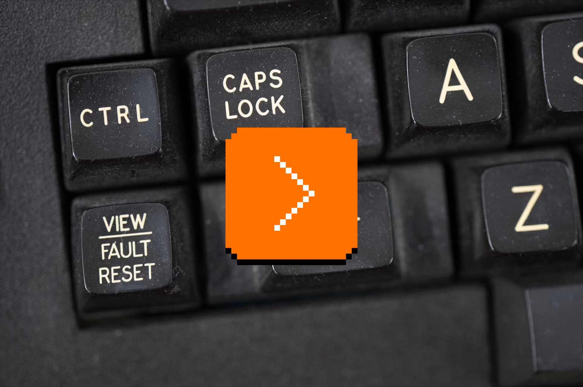
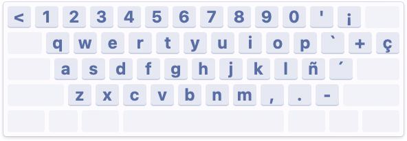
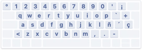
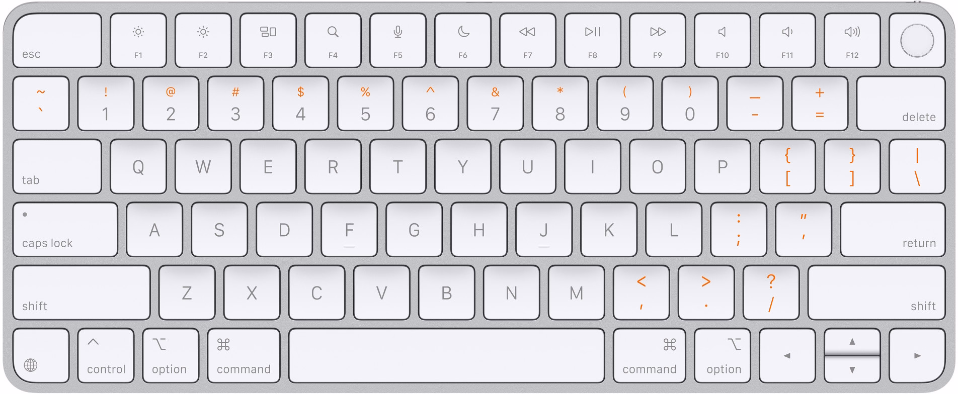
Why do Macs ask you to press random keys when connecting a new keyboard?
Sunday, April 5
You might have seen this, one of the strangest and most primitive experiences in macOS, where you’re asked to press keys next to left Shift and right Shift, whatever they might be.
Perhaps I can explain.
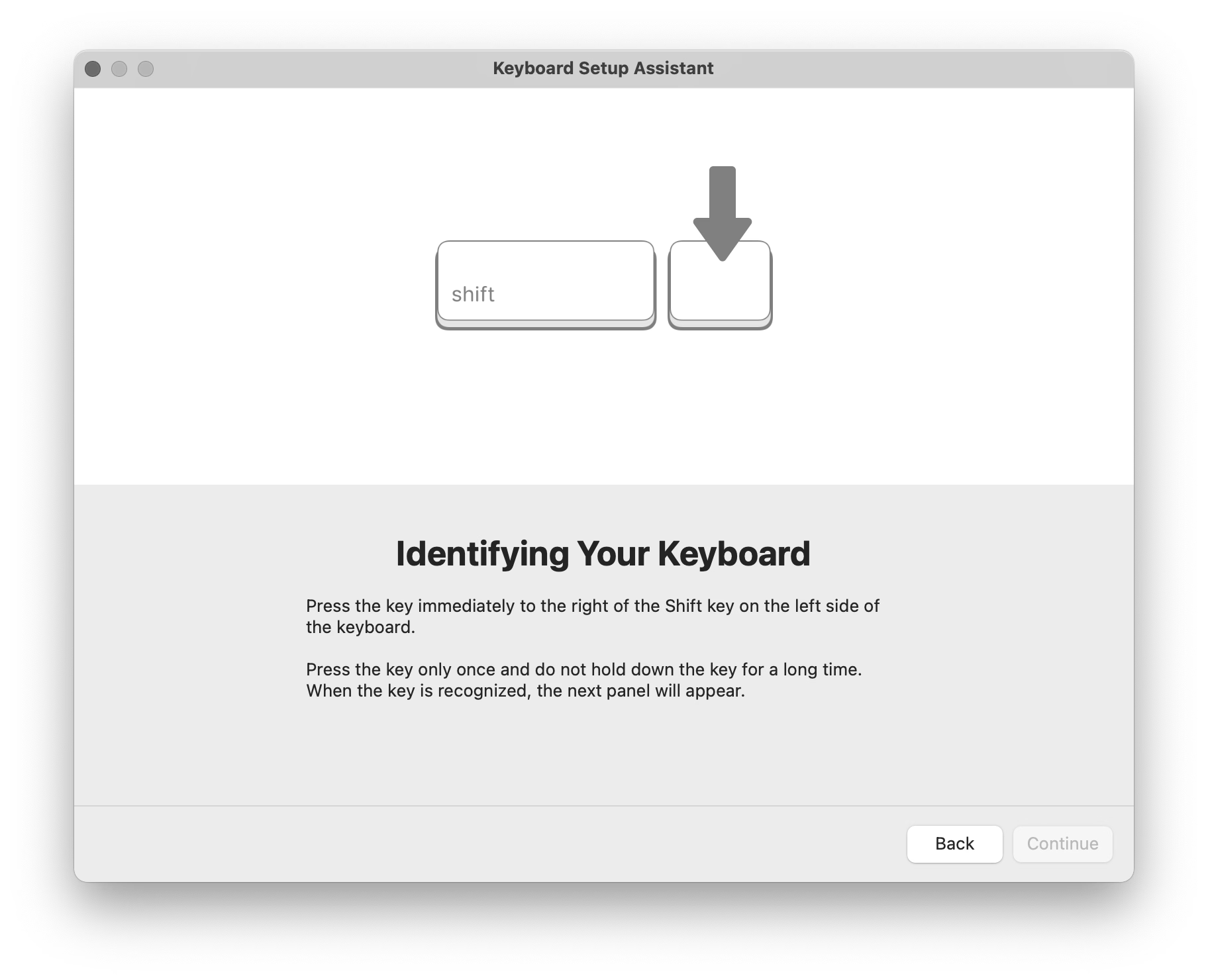
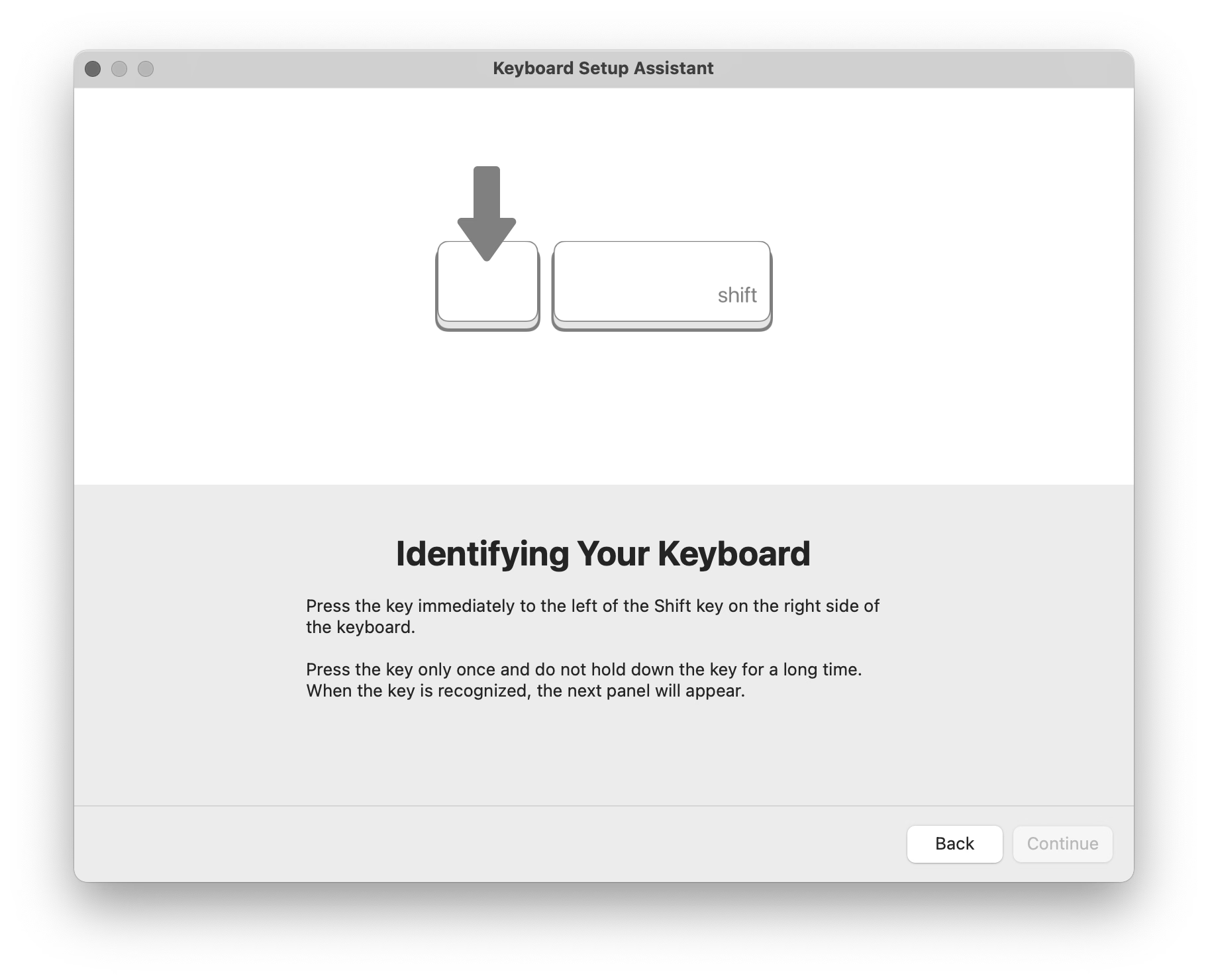
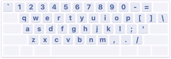
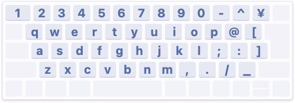
There are three main international keyboard layout variants in common use: American (ANSI, with a horizontal Enter), European (ISO, with a vertical Enter), and Japanese (JIS, with a square-ish Enter).
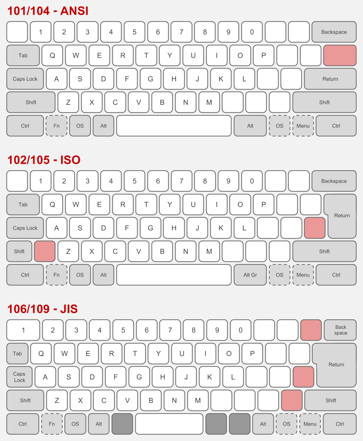
The shape of Enter and the shuffling of the surrounding keys is not the only difference. It’s also that the European layout has historically always had one more key – shoved in between Shift and Z – and the Japanese layout a few more.
But the main challenge is that a keyboard doesn’t have a way to tell the host computer what are its exact keys and where they’re located.
So, pressing the thing next to the left Shift can help Apple understand whether the keyboard is American or Japanese (always Z) or European (something else, but never Z). And pressing the thing next to the right Shift differentiates JIS (where it’s the _ key) from another keyboard (always /).
What I called “primitive” just above is actually clever in its approach. The legend of the key next to left Shift varies per locale (you can compare here), so the system can’t just tell you to press the < > key – and besides, asking the user to find a key that might not exist is a lot more stressful. And, identifying the keyboard by choosing a layout visually wouldn’t work either, since there are a million of layout variations – imagine having a split or a compact keyboard!
But it still is primitive, because it will still open up even if the keyboard you connect isn’t really a typing keyboard…
…or even if it doesn’t have any keys at all. (Some peripherals like credit card readers and two-factor dongles identify as keyboards as they transfer information by sending keystrokes.)
But: Why does it matter? What happens if you select the wrong layout or ignore the dialog?
If you mix up America and Europe, the difference should be largely cosmetic. After all, you still have to choose the keyboard language. People in, say, Germany will likely choose the appropriate locale, and the keys will do the right thing. However, also selecting the correct physical layout will properly display it in a few places, which can be helpful:
Japanese keyboards are more interesting, because they still have an English “mode” and the legends on a lot of the keys in that mode are different than on those on American and European keyboards – yet, the keys when pressed appear exactly the same (have the same “scan codes”) to the connected computer:
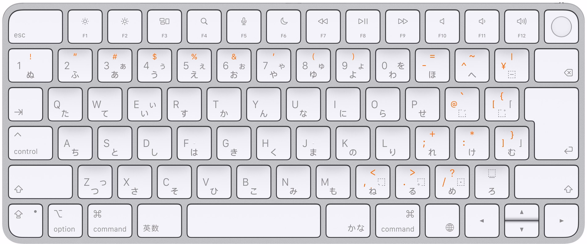
So knowing whether the keyboard is “US in the US” or “US in Japan” is important not just to place keys in the right position visually in a few places in macOS, but also for those keys to output what they actually show:
By the way, Apple’s own keyboards do not pop up this dialog. This is because while a keyboard can not do much when connected, it can at least send a vendor and model identification numbers, and Apple knows which of its keyboards sport what physical layout.
Why doesn’t macOS do that for third-party keyboards? They might, for some well-behaving ones; I don’t actually know. Unfortunately, the vendor/model identification is a wild west and a lot of the keyboards I have identify simply as “unknown,” so building up an all-encompassing keyboard layout database is not really possible.
Either way, I mostly wanted to share why the dialog exists. Mind you, I don’t love it in that its language could be better and at one point it breaks a cardinal rule of reorienting options, which makes it hard to remember “oh yeah, it was the first scary setting that worked before.”
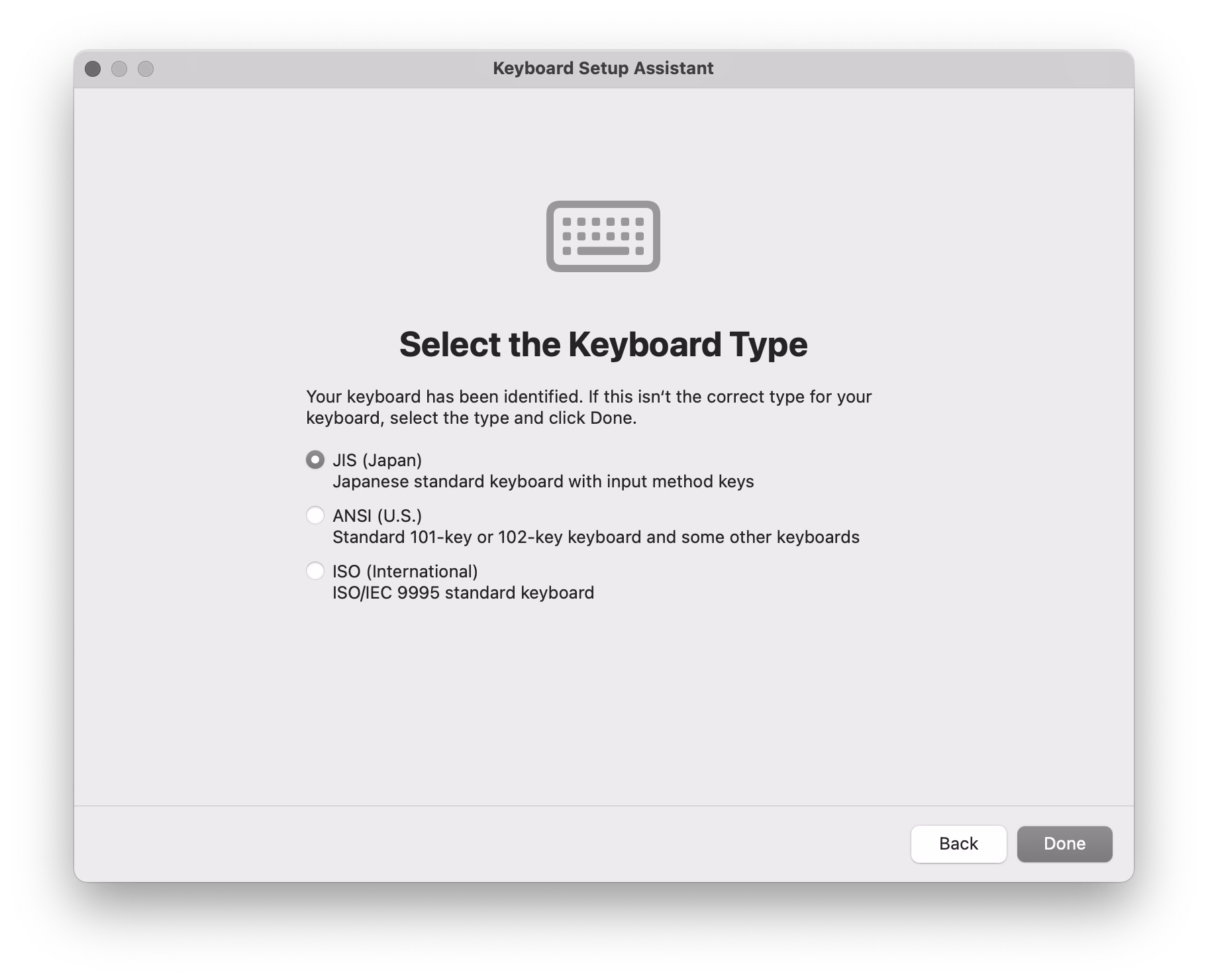

But overall, I thought it is a clever solution to a surprisingly hard problem. Sometimes primitive is better than nothing.
#keyboard / #mac os
“And if I were to end this story here, this would be a great story.”
Sunday, April 5
A 21-minute video from Karl Jobst about a 2025 videogame cheating scandal:

In short: One of the professional teams in the FPS game Squad built a sophisticated set of scripts that made it easier to use the game for esports tournaments by adding additional UI, useful stats, a floating camera, an extra over-the-shoulder view, and so on. The community embraced the scripts as they genuinely made the spectating much better.

Months later, it turned out that the creators not only hardcoded easier rules for their own team, but even added a pretty comprehensive set of cheating keyboard shortcuts.
The useful esports spectating scripts were, in effect, a trojan horse. A fascinating story, plus an interesting case of psychology of cheating.
#games / #youtube
“If you use your computer to do important work, you deserve fast software.”
Saturday, April 4
Two great posts about interaction latency on the hardware and software side. First is from Ink & Switch:
There is a deep stack of technology that makes a modern computer interface respond to a user’s requests. Even something as simple as pressing a key on a keyboard and having the corresponding character appear in a text input box traverses a lengthy, complex gauntlet of steps, from the scan rate of the keyboard, through the OS and framework processing layers, through the graphics card rendering and display refresh rate.
There is reason for this complexity, and yet we feel sad that computer users trying to be productive with these devices are so often left waiting, watching spinners, or even just with the slight but still perceptible sense that their devices simply can’t keep up with them.
We believe fast software empowers users and makes them more productive. We know today’s software often lets users down by being slow, and we want to do better. We hope this material is helpful for you as you work on your own software.
I loved the slow-motion videos comparing what is normally impossible to notice:

Dan Luu has a complementary post digging a bit more into computer hardware latency from the 1970s to now:
I’ve had this nagging feeling that the computers I use today feel slower than the computers I used as a kid. As a rule, I don’t trust this kind of feeling because human perception has been shown to be unreliable in empirical studies, so I carried around a high-speed camera and measured the response latency of devices I’ve run into in the past few months.
I feel both of these essays are fantastic, and important to develop some sense of what are specific numeric thresholds separating fast and slow, also in the context of being able to have an informed conversation with a front-end engineer. (Luu subsequently links to even more articles in the “Other posts on latency measurement” section, if you are curious.)
Otherwise, from my observation, the two most quoted laws of user-facing latency are still Jakob Nielsen’s response time limits, and the Doherty Threshold. But the Jakob Nielsen 100/1000/10000ms rule is from 1993 and as far as I understand is concerned primarily with UX flows: reactions to clicking a button, responses to typing a command, and so on. And the Doherty Threshold is even older. Both are simply not enough, especially not for things related to typing, multitouch, or mousing, where for a great experience you have to go way below 100ms, occasionally even down to single-digit milliseconds.
(My internal yardstick is “10 for touch, 30 for mousing, 50 for typing.” Milliseconds, of course.)
At the end of his essay, Luu writes:
It’s not clear what force could cause a significant improvement in the default experience most users see.
Perhaps one challenge is that these posts are dense and informative, but only appeal to people who care? Maybe latency eradication needs a PR strategy, with a few memorable rules and – perhaps arbitrary, but well-informed – numbers that come with some great names attached? I know in the context of web loading some of the metric names like FCP (First Contentful Paint) broke through at least to some extent, but those still feel more on the nerdy side. Even Nielsen’s otherwise fun 2019 video about response time limits didn’t stick the landing – why focus on slowing down an arbitrary label appearing above the glass when the ping sound was right there for the taking?!
I can’t help but dream of interaction speed’s “enshittification” moment.
#keyboard / #mouse / #performance / #touch
“It moved too slowly to be an asteroid.”
Friday, April 3
In the previous post, I wrote:
I understand that the best way to compare two things visually is to switch between them promptly in situ; our visual system is really good at spotting even small changes when aided this way.
I thought it would be fun to talk about it briefly, because it gives me a chance to show you a really fun device:
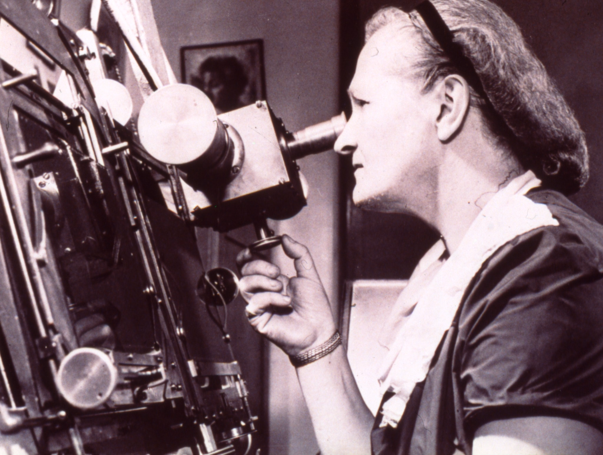
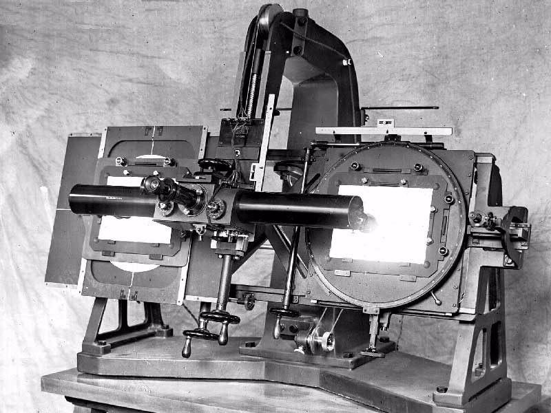
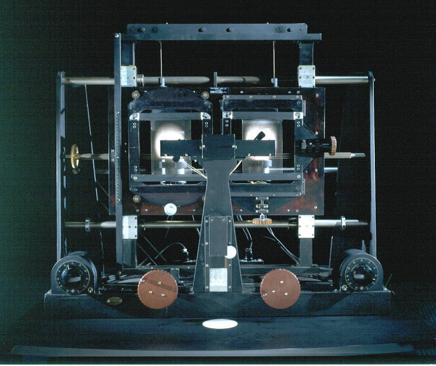
This is a blink comparator, an apparatus built for astronomers to easily flip between two images of the night sky, taken at the exact same position some time apart.
It makes it easy to spot a moving asteroid, like in this set of two photos:

Blink comparator was used in 1930 to spot Pluto:

(Pluto is the blinking dot a bit to the top and to the right from to the center – that dot moves to the left in the other frame. The fact that it moved at all made it an object of interest, but it didn’t traverse the sky like an asteroid or space debris would.)
This is why the “spot 10 differences” puzzles are always shown side by side…
…otherwise everything would be much, much easier to spot:

Today, this kind of stuff doesn’t require complex devices, but it’s useful to know the principle.
If you’re comparing a reference design with its implementation, instead of measuring things on both sides it can help to align them in two windows, and then switch between them using ⌘Tab.
If you’re working on an interface for users to see differences between two images – don’t (just) show them side by side, but also allow your users to flip between them this way. And, resist the very natural urge to add any transitions that would seem to be nicer and friendlier; it is sharply switching between images that is the most effective.
#hardware / #history / #principles / #real world
Linear’s clever internal redesign UI
Friday, April 3
I was impressed with this clever internal interface at Linear, shown inside this larger blog post:
The dev toolbar exists directly inside the app and allows us to easily toggle feature flags on and off. When something didn’t look right in the refreshed UI, it took us just one click to compare it with the previous version. That made it easier to determine whether the refresh had broken something or whether it had behaved that way before. Having the updates live behind feature flags also meant that instead of developing the redesign in isolation and shipping all the changes at once, we could integrate incremental changes to the platform.
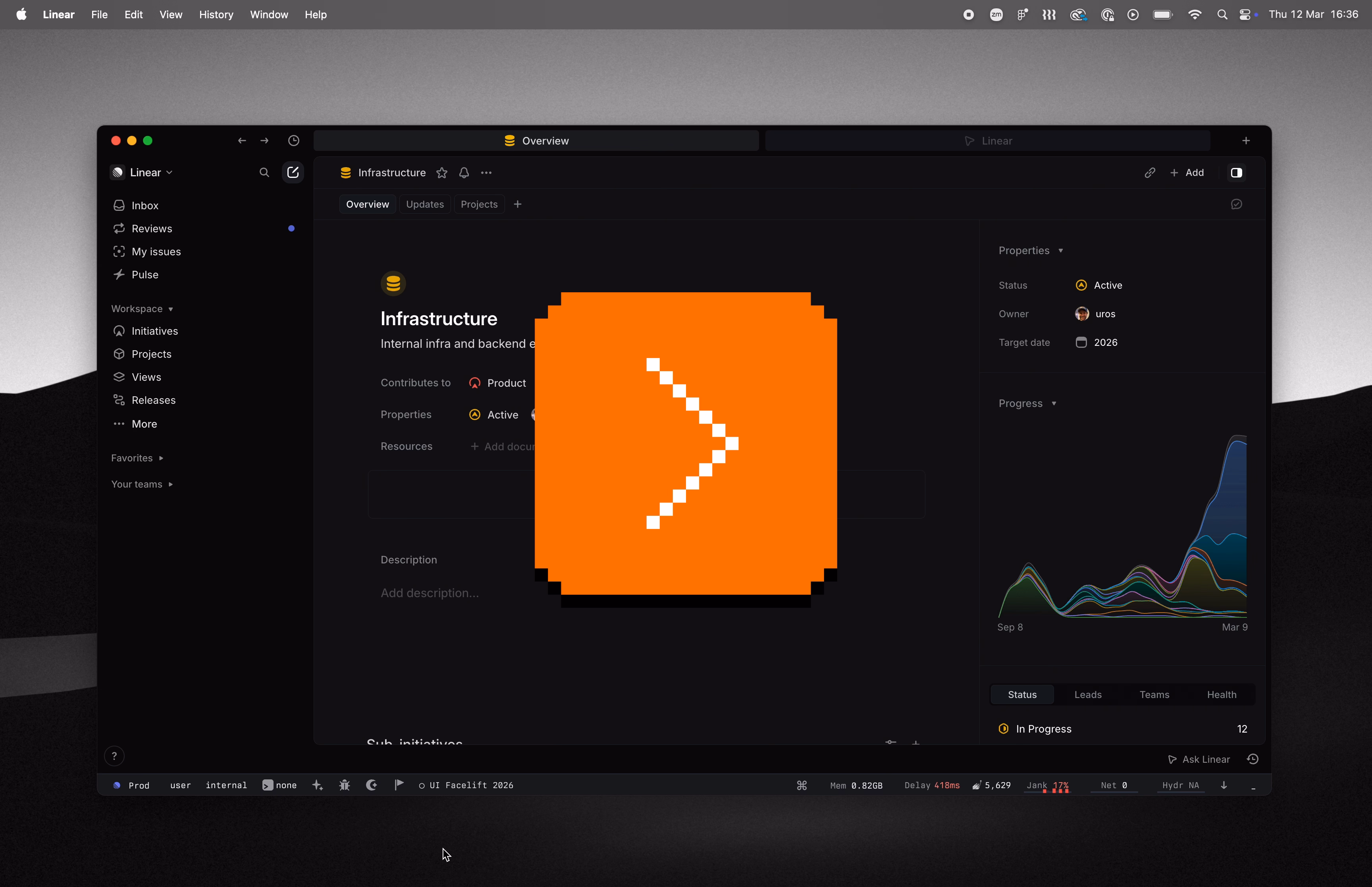
I also cut it out here so it’s easier to see:

Here’s what I like about it:
- It’s a separate UI surface: Rather than being awkwardly integrated alongside production UI and adding jank to it, it is a clearly delineated toolbar you know users won’t ever see, allowing the rest of the interface to always feel like production.
- The feature flag toggling is easy: You don’t have to go anywhere else and possibly log in to toggle a flag, and you don’t have to wait for it to take effect. This will mean more people than just the core team members will be using it.
- Toggling this particular feature flag is as easy as clicking on a tile: I don’t know if anyone can promote others flags their care about to be easily toggle’able tiles, but I can imagine this really beneficial, too.
- The feature flag toggling is instantaneous without any visual jank: I understand that the best way to compare two things visually is to switch between them promptly in situ; our visual system is really good at spotting even small changes when aided this way.
Each one of the above bullet points is individually a small point of friction and easy to renege on, especially when it comes to internal-only interfaces. However, a combination of all of them results in great compounded interest, and I bet makes this interface effective – in addition to just feeling like fun to use.
Appreciate Linear sharing this internal detail; if you are using an interesting internal tool or UI that you are allowed to share, please consider it and let me know!