“If you did it right, it looks like it was effortless.”
Welcome to this week’s digest of Unsung, a blog about software craft and quality. Here’s what was posted in the last week:
“A collection of beautiful letters? A beautiful collection of letters? You decide.”
Thursday, February 5
This is neither the first nor the last time I’m sharing David Jonathan Ross’s work; today I want to link to a really fun glyph explorer he put together recently:
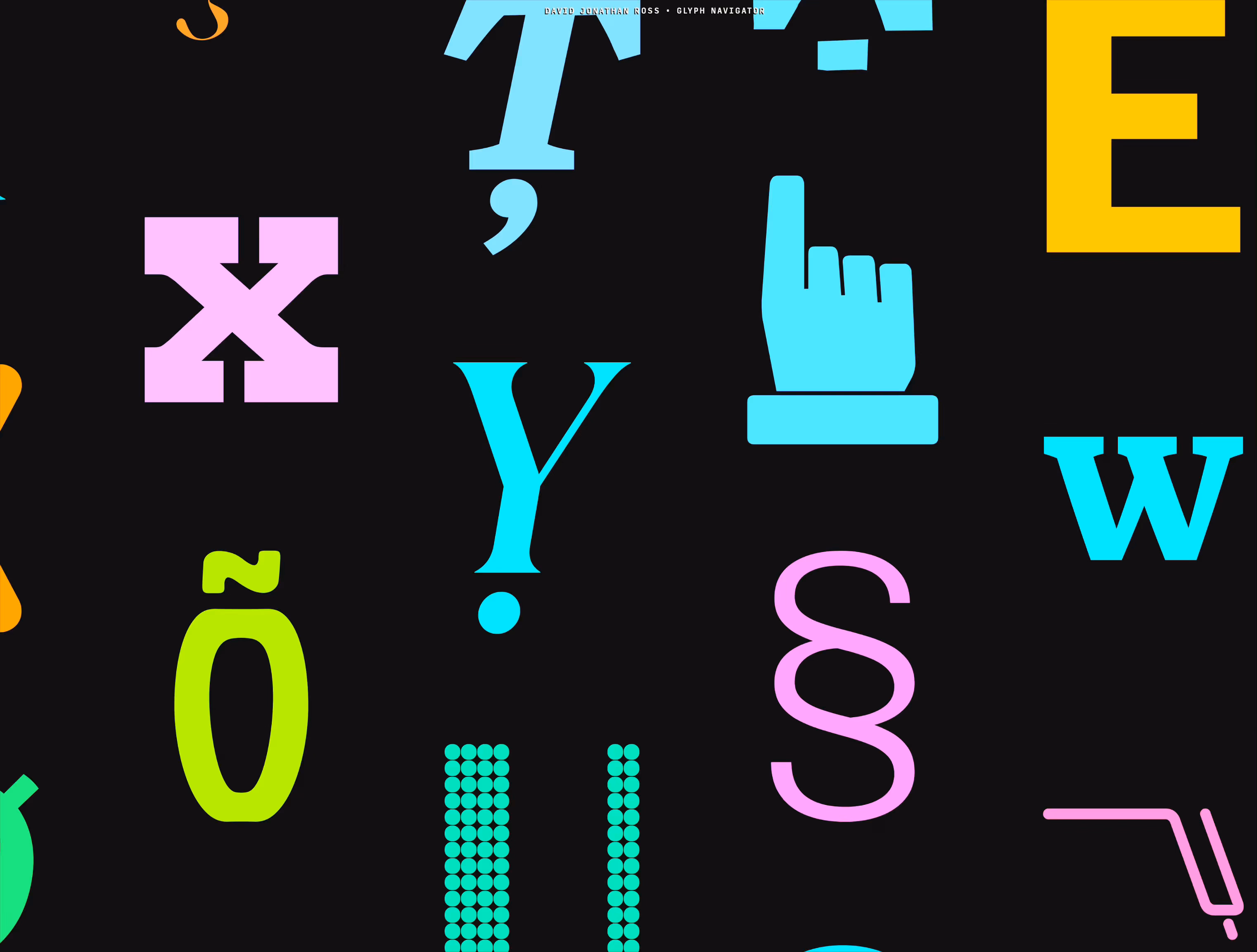
That’s it. That’s the tweet. On this blog I generaly want to capture the meaning of well-made things, deeper thinking, going beyond cheap sugary delight, the discomfort of rigor meeting joy and craft coliding with function, and the “why” of it all – and a lot of that is actually all here, too, as long as you keep clicking on things.
But: sometimes it’s also just so nice simply to look at beautiful letterforms for a while.
(Also available on Masto and on Pixelfed.)
“It’s a good idea though, and there aren’t even many of those in Tahoe.”
Wednesday, February 4
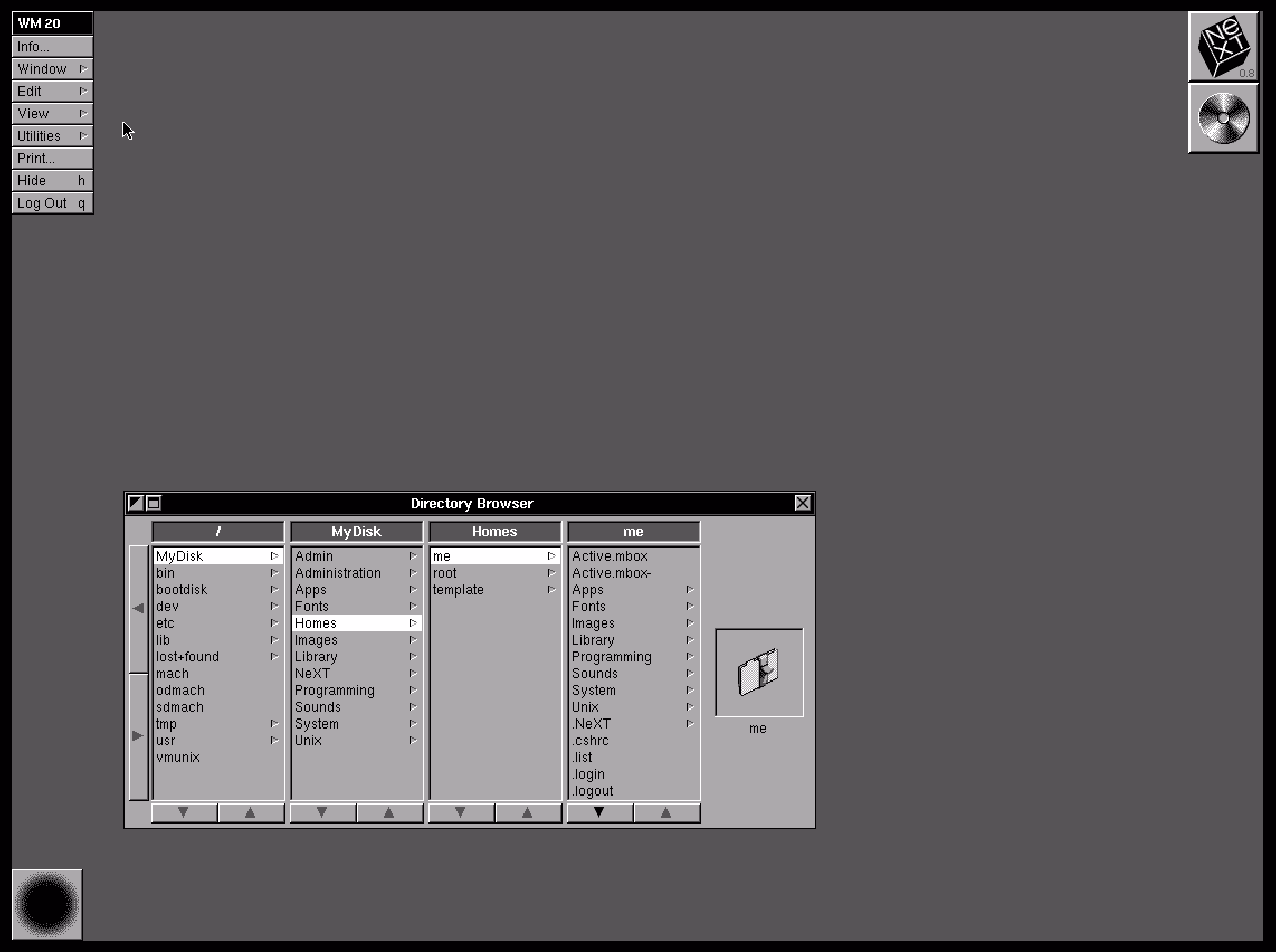
A few thoughts after reading Gruber’s take on Finder and its new auto-sizing columns:
1.
Column view as a concept and when done well deserves to be in the UI hall of fame. It flew and still can fly high in the Finder, and it was the unsung hero of both the iPod and the iPhone. It’s really fun to fire up NeXTSTEP 0.8 in Infinite Mac and see its first incarnation.
2.
Apple decided not to ship the auto-sizing columns a few years ago, hiding it under a “defaults write” incantation as a sort of a beta, but then seemingly just launched it this year without any changes. There are some charitable explanations – perhaps the beta was hard crashing Finder and the released one no longer does? – but in the current zeitgeist I’m feeling that it’s something more like this: the people with taste who were stopping it from getting launched in the bad state were either sidelined or are no longer there.
3.
And it is a bad state. It’s a first draft made public. Like anyone who deals with layouts learns over time, things like this one need careful min and max widths to have certain good pleasing and stable visual rhythm. They might even need a scale or a grid on top. And the fact that the width accommodates only visible objects doesn’t seem to make sense. The top hand doesn’t know what the bottom hand is doing, and it feels the feature is incompatible with itself.
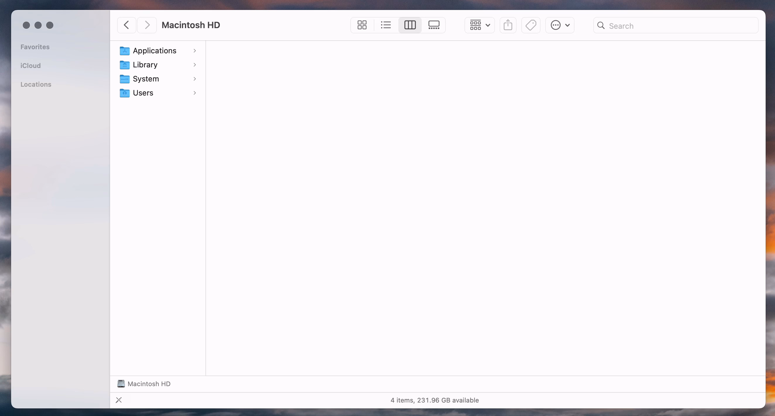
This feels like an old Unix windowing feature, a sketch of an idea for GUI nerds who get excited about just the cool concept alone, ignoring the execution. Although, to be fair – this is opt-in and buried as the last checkbox inside a pretty obscure window. This might still be GUI nerd territory.
4.
So Apple really did think we’re going to love Liquid Glass, huh?
“The floppy disk icon relies on interface familiarity, not object familiarity.”
Wednesday, February 4
Just a few hours after writing about floppy disks, I stumbled upon a bona fide floppy icon in the Bluesky’s iOS app, anno domini 2026:
![]()
I imagine this, in a nerdy view deep inside settings, might be more of a fun nod, but it made me curious – does Word still use a floppy icon?
![]()
Yes, it does! Right next to the icon-less AutoSave toggle, deep within a veritable kowloon walled city of interface elements.
And yet, maybe I should chill with the jokes – NN/Group revisited the save icon in July of last year and surprise! People still understand them.
83% of participants associated the floppy disk icon with saving. […] Another 13% described this object literally with responses such as “disk,” “disc,” or “this is an SD card for storing information.” These responses were not coded as “save,” but still suggest familiarity with the image.
What a fascinating journey! The icon didn’t change at all, but its perception went from being a literal representation of a familiar object, to a skeuomorph once floppies were replaced by hard drives, to then a symbolic representation of physical media in general (a lot of people think it’s an SD card – or perhaps even that floppy disks and SD cards are one and the same), to increasingly just an abstract symbol that represents saving as a concept, registering similarly to the circular arrows for syncing, and an arrow pointing south for downloading.
NN/Group is itself kind of a floppy disk, trying to walk a fine line between their legacy and reinventing themselves. They’re dismissed by many as old-school, academic, boring enterprise software aficionados, relics of a different era. I see some of that and often disagree with them, but I also sometimes appreciate their rigor, reliance on user studies, and outright dismissal of fashion in UI design. I want to revisit their site in more detail and see how I feel about it today, 30 years after Jakob Nielsen’s books rocked my world.
How to shoot a screen using a board of keys
Tuesday, February 3
Everybody who routinely takes screenshots on a Mac knows very well the motor memory heaven and hell that are the screenshotting shortcuts: ⌘⇧3 to grab the whole screen, ⌘⇧4 to grab part of it, hold ⌃ ahead of time to put the result in the clipboard, press space at the right moment to select a window, hold ⌥ at a different time to remove a shadow, and so on. (Yes, there’s more.)
It’s strange to talk about those shortcuts, because the world is divided into two groups: people who have never used any of these because they are the scariest shortcuts that induce RSI if you just think about them, and people who have used them for so long that their fingers do all the work. Either group would struggle with writing the above paragraph – as did I, needing to watch my hands first, and then take notes.
But: why do the shortcuts start with 3? After all, ⌘⇧1 and ⌘⇧2 don’t seem to do anything.
That wasn’t always the case. Turns out that once upon a time Apple was trying to create a larger universe of nerdy shortcuts for your Mac. The effort is so old – they were introduced in 1986 – that ⌘⇧1 was added as a quick shortcut to… eject the floppy disk. And, since you could also have an external floppy drive, ⌘⇧2 was assigned to eject that, and the shortcuts for screenshots followed in sequence: ⌘⇧3 to save the screen, and ⌘⇧4 to send it straight to your printer. (Even then, there was already Caps Lock thrown into the mix, too, switching between the entire screen and the current window.)
Early BASIC programmers knew to separate their line numbers by 10 because there will always be a line you want to insert in between, but keyboard shortcut designers do not have that luxury.
And so the nice system backfired immediately. Some Macs started coming with two built-in floppy drives, but still allowed you to plug in an external one. What would you press to eject that?
Well, of course it had to be ⌘⇧0, since ⌘⇧3 was already taken.
(In an absolutely delicious bit of rhyming, the 0 key itself is on the “wrong” side of most keyboards – except Hungarian – because it was added to keyboards before the 1 key was! It felt more natural to put it after 9 than right before 2.)
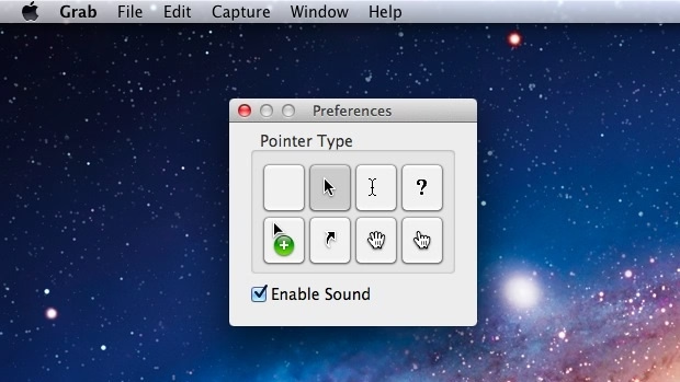
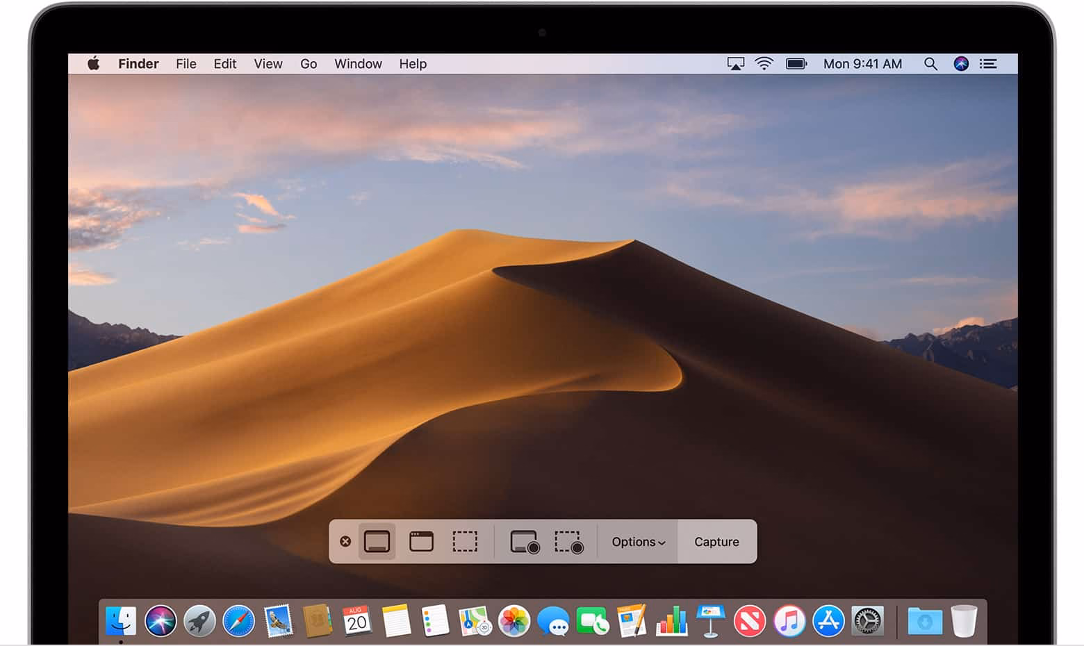
Things were quiet for a while. Floppies disappeared over time. Only in 2018, Apple evolved the old Grab app that it inherited from NeXT into a Screenshot app, and assigned it a new shortcut, ⌘⇧5. That was a nice improvement – video recording, a very helpful timer, a few smaller options, and a bit of a GUI thrown atop for convenience.
There are a bunch of system and change management lessons in here, but I want to talk about something else I just learned about.
Acorn 8, a graphic app, has a delightful screenshotting feature parked under ⌘⇧7 that does something incredible: it takes a screenshot, but does so in a way where windows are separate layers, grouped by app. It’s amazing; you can re-compose stuff afterwards, reveal covered stuff, remove windows, even change the wallpaper. A mouse cursor arrives too in its own tiny layer, like a cherry on top.
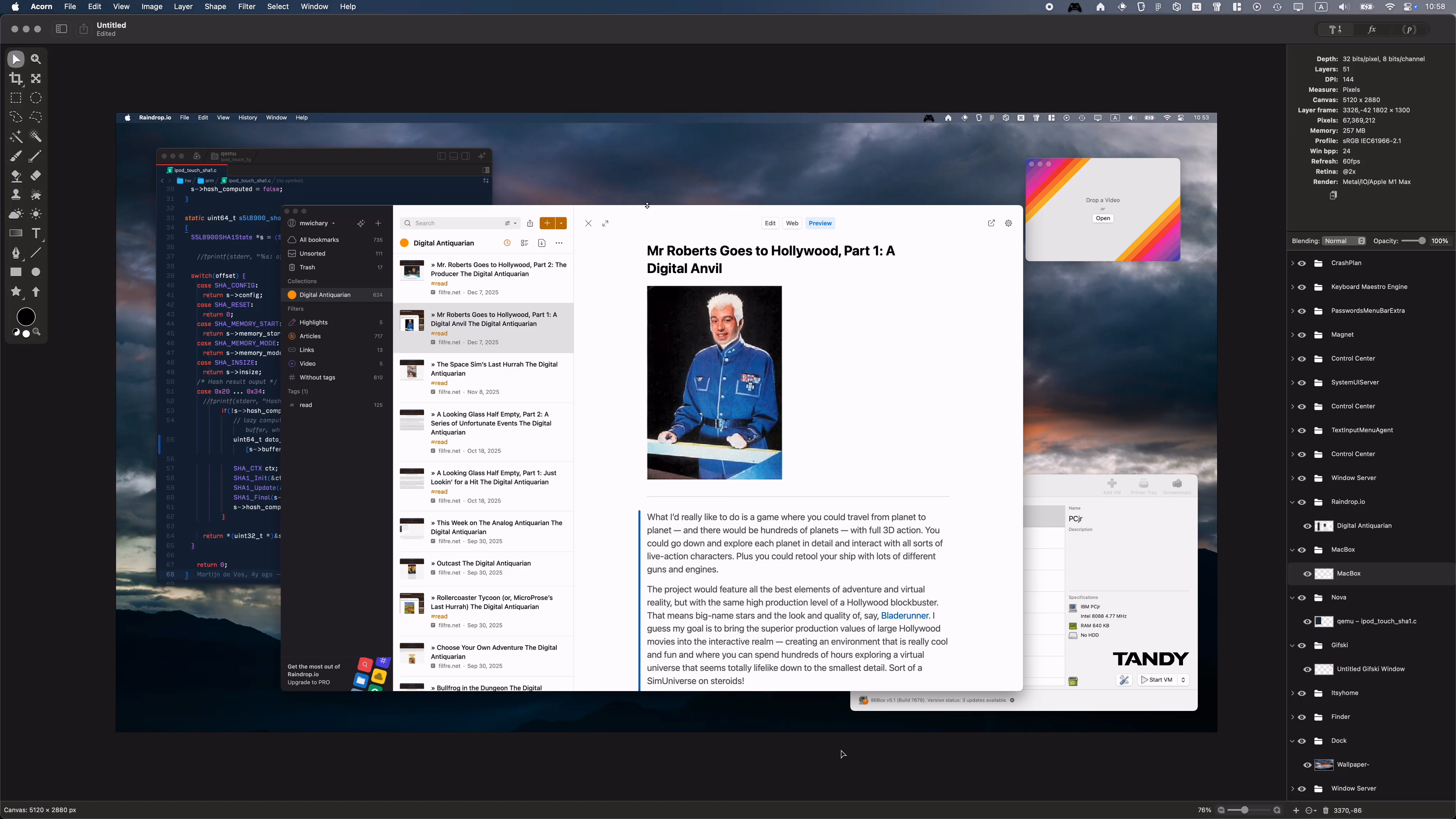
I’m sharing this both because I gather people who read this blog take a lot of screenshots – but also because this is software craft. I know “delightful” is (mis—? ab—?)used to refer to beautiful but slow transitions, and cute but distracting UI copy, but this is the stuff of true delight: using newly abundant technology to actually do something useful, and rewrite the rules of something that hasn’t been touched for ages, in a way that feels magical. There is still room for improvement – notably, you cannot just fire and forget a screenshot straight into your filesystem – but I find this kind of stuff inspiring.
I also know what you’re thinking: hey, what happened to ⌘⇧6? I’m not going to tell you. It’s probably not that hard to google it, but maybe you’ll enjoy trying to guess like I did. What was a feature of Macs that arrived after 2018 that Apple would want you to forget about even more so than the floppy disks?
“Users were gleefully told to reload the game”
Tuesday, February 3
This 9-minute video from the fun game show Lateral (with Tom Scott!) covers a particularly interesting bug in the 1984 game Karateka:

If you don’t want to watch the video and try to figure it out alongside contestants, you can read more about it here, and also see it in action.
Karateka was made by Jordan Mechner and I bet his name will come up again.
Testing tip: Always show scrollbars
Monday, February 2
Many designers and engineers have Apple products with their flawless and praise-worthy trackpads. By default on macOS, trackpad means only “shy” (iPhone-like) scrollbars are shown. Shy scrollbars become half-visible when two-finger scrolling, and only fully visible when hovering over them.
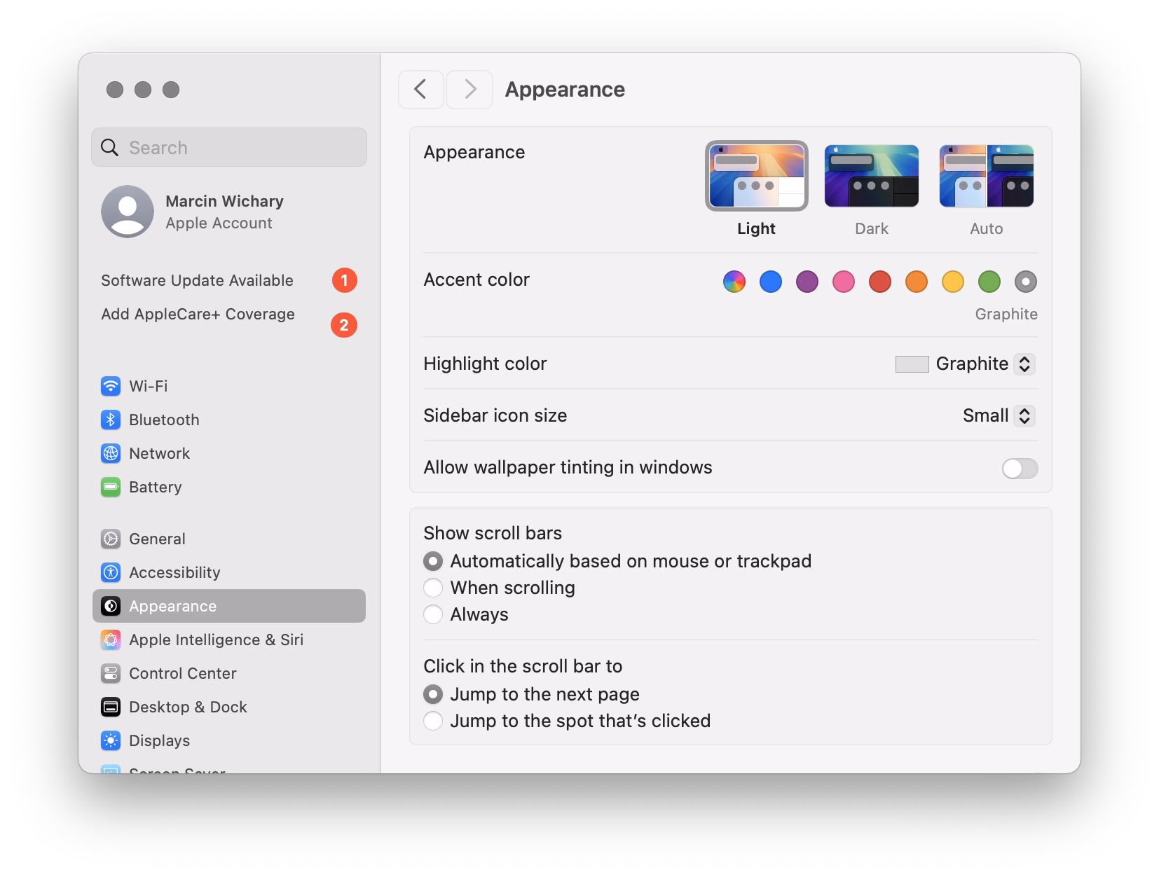
To anyone working on front-end, I encourage you to toggle this setting to “Always,” and convince half of your team to do the same. Your macOS will now pretend you have a mouse connected, and show more traditional scrollbars, all the time.
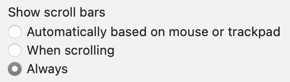
Why? Because you might already be accidentally generating spurious scrollbars without realizing. Here’s something I just spotted in Coda today:
This scrollbar serves no purpose, so it will become visual noise for a lot of your users. But when you yourself use “shy” scrollbars, you might not even realize.
Of course, the scrollbar is just a symptom of a bigger problem – an accidentally scrolling surface that will be janky to everyone regardless of their scrollbar visibility status.
Always-visible scrollbars make it easier to spot these, not to mention also being helpful in spotting:
- scrollbars mismatched in theme (e.g. light scrollbars on dark-theme surfaces) or accidentally left unstyled
- scrollbars not fully nestled into their correct edge, accidentally being offset from the top or the right
- using a wrong CSS setting for overflow (or not knowing about the -x and -y variants), and consequently showing both scrollbars when one will suffice
- the loading state or skeletons not anticipating a scrollbar appearing later
- that most frustrating occasional math/measurement issue where the appearance of vertical scrollbar reduces the horizontal space, and as a result also makes a horizontal scrollbar appear (see also: scrollbar-gutter)
“How do they spit in Korea?”
Sunday, February 1
An entertaining 9-minute video by Shloop that starts with a common mistake of typing in an English mode on a Korean keyboard, but then goes through a bunch of other fun and light input internationalization stories:
This is the page for non-English programming languages that is shown at some point. Quite a bit of stuff in there.
Oh, also, in Polish (my native tongue), spitting is “tfu.”
Three iOS 26 transitions
Sunday, February 1
This first one – in response to pressing the volume buttons – feels world-class. Subtle responses to buttons being pressed, nice haptics, good physics:
This one – stretching of the control center – made me incredulous. The performance and physics of it all feels fluid, but this feels like absolutely the wrong thing to do here. I think it’s as designed, but it feels buggy to me. Maybe I’m oversensitive to stretching type and shapes like this, but I can’t stand how icky it feels. I am not sure I have seen another place in iOS 26 where elements would stretch in such a cheap way:
And this one – tapping on the album cover to make it show and hide – is bad in perhaps every possible way. It feels designed poorly and engineered poorly, like an HTML approximation of a real thing. All sorts of bad curves and sudden switches, slight reorientations of UI, even some flickering of interface elements at the bottom. It feels so rough I would probably just do a hard switch, no transition, until I got this right. After all, no animation is better than bad animation, and this is not responding to fingers in real time (when the user controls the “speed,” and you absolutely need a transition):

Ultimately I don’t know if this is “as designed,” or rushed, or what are the causes. But It’s interesting and a bit hard to realize that these days even animations in iOS 26 – once, I believe, a staple of good design and execution – are all over the place.
“State-sanctioned monster executions over a server hiccup”
Sunday, February 1
This is a really funny story happening in the online universe of Final Fantasy 11:
Once killed, a notorious monster shouldn’t respawn until after the next monthly tally, but lately defeated notorious monsters in Limbus have been reappearing early. That’s because, Square Enix said, “the server-side data recording the defeat status of notorious monsters is unexpectedly being cleared.”
Thus, there’s only one way to guarantee no players are robbed of hard-earned Limbus loot: Square Enix is dispatching Game Masters to personally murder every notorious monster in Limbus so the FF11 servers can properly verify that they’re really, truly dead.
“To achieve this, Game Masters will visit each World in sequence and defeat each motorious monster individually,” Square Enix said. “We apologize for the inconvenience.”
I know this is not a bug fix per se, but it’s interesting to be doing some bug cleanup from the inside.
“As the vision decays or blurs and new features are conceived without consideration of the whole”
Saturday, January 31
I recently learned of the OG App from 2022, which offered an ad-free, simpler experience to users frustrated with Instagram changes.
The app didn’t last – it couldn’t last – but it was a fascinating statement.
In a different corner of the internet, Michael Leggett, one of the former Gmail designers, created Simplify – an alternative “shell” to Gmail:
Hundreds of improvements (small and large) to streamline, simplify, and enhance Gmail’s design and functionality. Hide the features you don’t use, customize the ones you do including setting the list and message width and fonts.

It seems this attempt is not running afoul of any Google rules. I enjoyed reading about the project more on its website, especially this bit:
Bad design can occur for a number of reasons including but not limited to:
- Our needs as users are not well understood, prioritized, or aligned with the company’s goals.
- Entropy: The natural decline of products over time as the vision decays or blurs and new features are conceived without consideration of the whole and added faster than the system’s overall design and architecture can evolve to support them.
- Good design is hard. Good design is more than making a product pretty. It is about having the right capabilities in an intuitive, respectful, and well-crafted offering. I hope to expand on this topic in future posts.
I know ad blockers and “reader modes” exist, but these alternative shells go much further and change the original app’s design. I wonder what other examples of that are out there.
The Moylan Arrow of software
Saturday, January 31
After James Moylan’s death in December, we were reminded again of the Moylan Arrow, the little arrow telling you which side of your car has the little fuel door:
![]()
I started wondering: what would be the conceptual equivalent of this in software? My best guess would be iOS offering to fill the one-time code from a recent SMS:
![]()
This is what it has in common with the Moylan Arrow:
- everyone benefits from it
- it happens all the time
- it solves an actual little (but not too little) frustration
- it’s there at the right place at the right time
- it is relatively low-tech (it’s not an overdesigned or an overengineered solution)
- once you know it’s there, you will love it forever
Curtosis on Mastodon unearthed the original 2019 Twitter thread from one the creator of the iOS feature, Ricky Mondello (link to XCancel), which I‘m reproducing here:
The idea for Security Code AutoFill came out of a small group of software engineers working on what we thought was a much more ambitious project. It wasn’t a PM, it wasn’t just one person, and it wasn’t what we set out to do initially.
It started as a small side idea we had while designing something very different. We jotted it down, tabled it for weeks, and then picked it up after the “more ambitious” project wasn’t panning out. It was hard, but I’m so glad we changed focus.
Even with a gem of an idea, it was still just an idea. Ideas are obviously super important — they’re necessary, but not sufficient. Here, the end result came from the idea, teamwork, and execution.
Years later, I’m still so proud of the team for making this feature happen. The team combined expertise from several areas to ship magic that worked on day 1, while asking nothing of app and website developers, without giving anyone your text messages. This still inspires me!
To every one of the folks who made this happen, I’m still in awe. Y’all are the best. <3
Addendum: FAQs
- “SMS is bad.”
↪ I know.
- “MITM.”
↪ I know.
- “FIDO is better.”
↪ It’s complicated, but acknowledged; I totally get it.
- “Android did it first.”
↪ Nah. Details matter. Privacy matters. And clipboard != AutoFill.
- negativity
↪ Not now. :)
I asked others on social and here are some other contenders I liked:
- The indicator that alerts you of Caps Lock when typing passwords
- Underlined letters in Windows
- Return key as an equivalent of the default action in a dialog box
- Proportionally-sized scroll bar handles
- Showing the current folder at the prompt in the terminal
- The quick link to your post after you post it
- The preview of the outside of the frame from the wide angle lens in the Camera app
- Holding space to move your cursor in iOS
- iPod automatically pausing music when you unplug the headphone jack
You can check out Mastodon and Bluesky threads for more ideas, if you are interested.
“If you did it right, it looks like it was effortless”
Saturday, January 31
I read Mike Monteiro’s book of pre-pandemic essays called The collected angers. The book has less to do with the subject of this blog, but I grabbed a few quotes that resonated with me and seemed relevant.
In order not to make it too reductive, I’m also linking to the original essays for those who want to follow up:
The worst feedback you can get from a client is “Wow. It looks like you worked really hard on this!” Stop using your work like a time card. If you did it right, it looks like it was effortless. It looks like it’s always existed. And the client will probably be irritated that they paid you for 30 hours of work to do something that looks like it took an hour. Which it did. They’re just not seeing the 29 hours of bad design that got you to that one hour of good design. And for the love of god, please don’t show them those 29 hours of bad design. A presentation is a shitty place for a sausage-making demonstration, and you’ll just come across as a defensive, unsure person needing validation.
—from 13 ways designers screw up client presentations. This sounds like a version of “My kid could’ve painted that” argument.
Learn how to steal. Be aware of your history. Design is the oldest profession in the world. You’re not the first person to tackle whatever design problem you’re tackling. See how others tackled it. Take the best solutions you find and improve on them. Don’t burn time solving things from scratch. Make use of what others have learned.
—from 10 things you need to learn in design school if you’re tired of wasting your money
The world needs fixing, not disrupting.
—from 8 reasons to turn down that startup job
And:
“The way you get a better world is, you don’t put up with substandard anything.”—Joe Strummer
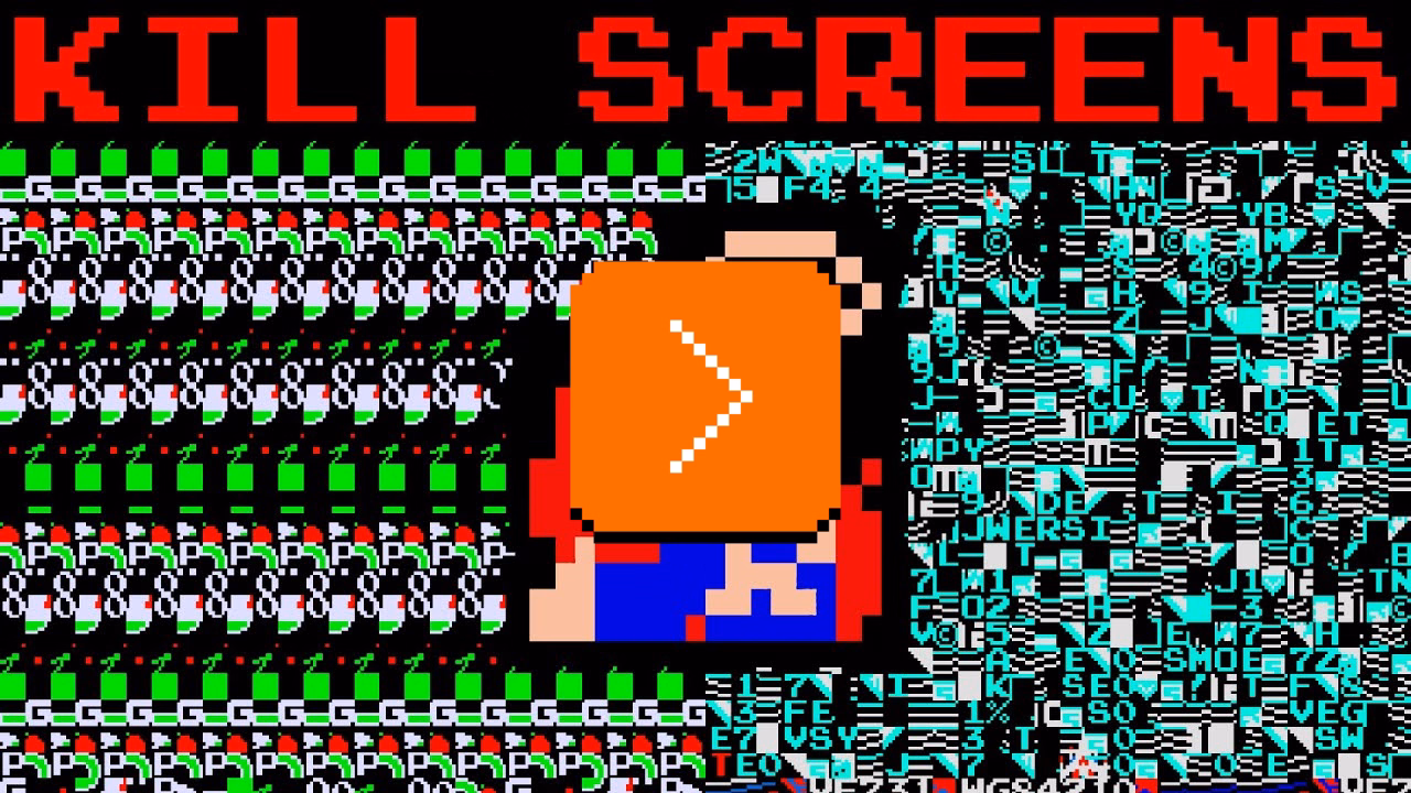
“An integer overflow causes an enemy to spawn directly on top of the player”
Saturday, January 31
A nice counterpart to my post from a few days ago – a 5-minute video by philive of more kill screens from various classic arcade games, with simple explanations.
“The autocorrect battle of wills”
Friday, January 30
I liked the angry website Bugs Apple Loves because it’s hitting on something that got me worried in recent months: Apple has been bad at bugs for a while now, but we might be overfocusing on giving them crap solely for some of the most visible – even visual – Tahoe stuff.
This is a condensed list at the time of writing, as the site itself doesn’t make it easy to see it:
- Mail search doesn’t work
- Autocorrect won’t take no for an answer
- Apple Pay: card icon changes address
- Google Contacts sync is a black hole
- AirDrop: Looking for devices...
- iCloud Photos: ‘Uploading X Items’
- Spotlight: ‘Indexing...’
- Personal hotspot won’t auto-connect
- Apple Watch widgets won’t let go
- iOS text selection is pure chaos
- AirDrop shuffles targets mid-tap
- macOS 26 window resizing doesn’t work
There are themes here: “the interface doesn’t remember my preference,” and “things move around as I interact with them,” and “some process gets clogged up,” and “a thing gets stuck and doesn’t respond to interface actions.”
What I appreciate about this is that none of this is very “visible” stuff, but the insidious things that add up and bother on the daily basis, chipping away at your flow first and sanity second – which the site tries to quantify via a formula:
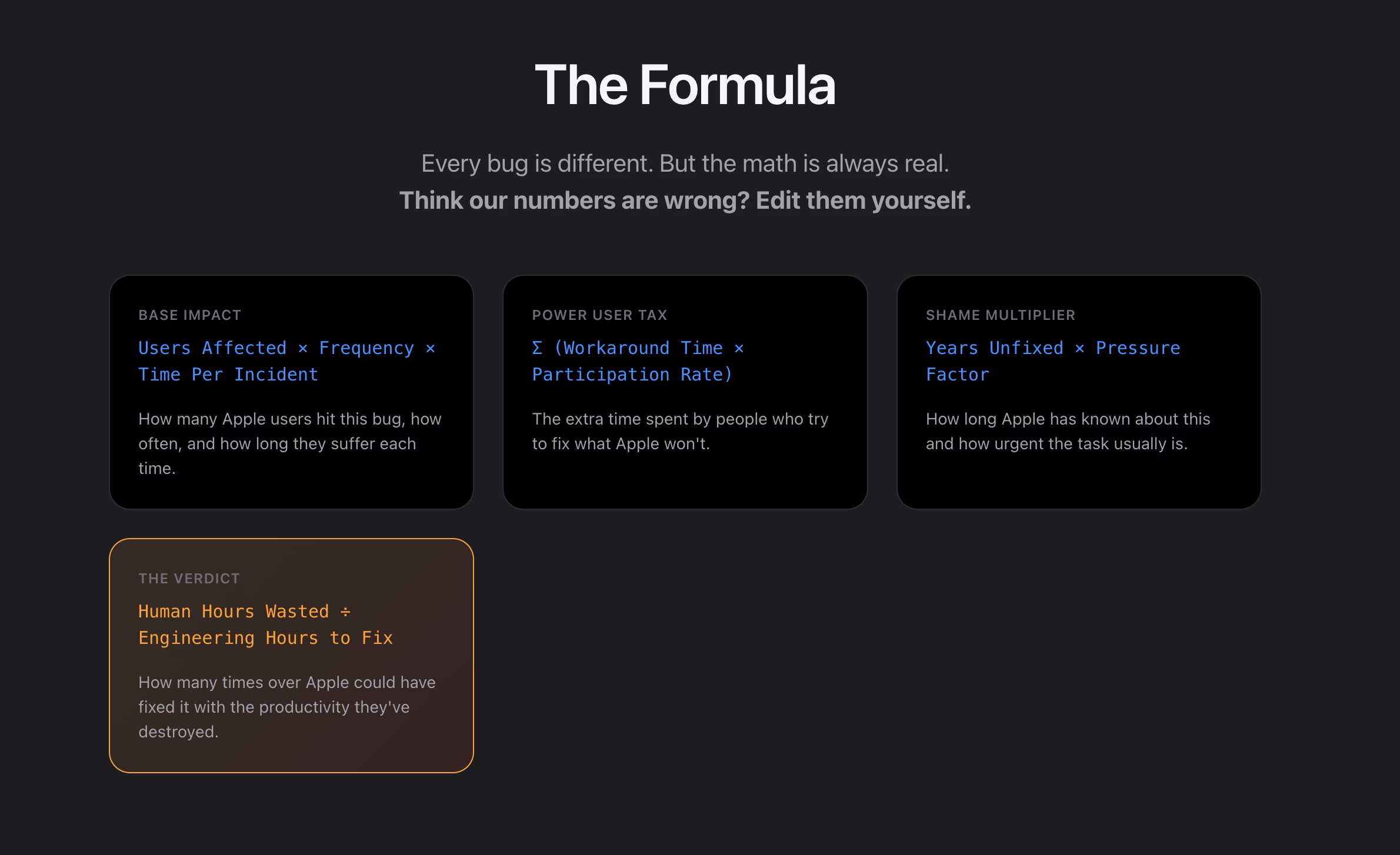
I think this is really interesting, even as a satire.
I found it’s really hard, if not impossible, to justify design or experience bugs using the same frameworks as other engineering bugs. As Mike Swanson wrote: “You cannot easily measure the resentment. Or the rage clicks when they smash a button to dismiss another […] pop-up.”
A lot of it is utterly subjective. Various small frustrations add up in non-linear ways. A lot of it doesn’t subscribe to binary “data loss or not” or “does it function or not” classifications. A lot of it feels heavy to fix in terms of context switching, so it’s timeboxed and then discarded when the time box overflows.
I have seen engineers say “Oh, it’s a long-standing bug, it’s been like this for 3 months” as a justification to deprioritize something, while to me it feels like that should be an accelerant. The users have already been suffering for 3 months!
So maybe metrics like these could actually help? Quantifying at least the blast radius (affected users + usage per day) seems valuable, not to mention the embarrassment of seeing something like “9.1 years unfixed by Apple.” (And yes, internal embarrassment and shame should also be a metric.)
This would be harder to do for creators of the site, but easier inside Apple: I would also try to quantify vocal user frustration. One of my tricks when thinking about bugs has been “Notice when your users are really angry about invisible stuff.”
…for example someone going on and on about Finder.
Sins of our Finders, pt. 4: Eject
Friday, January 30
If you plug in a CD drive (he said with a straight face in the lord’s year 2026), and then eject too soon, the system offers this dialog, which allows you to say: Eject whenever you’re done with whatever you have to do.
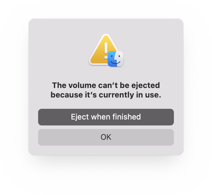
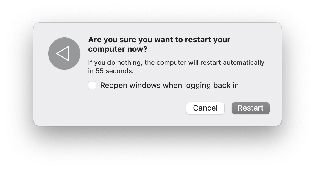
But more modern media, like SSD drives, don’t show that window. The best case scenario is that you get a dialog box like the 1990s never ended:
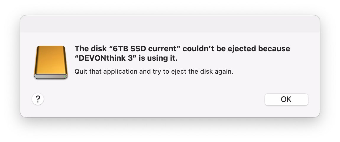
It gets worse. Often, you get zero help in identifying what the “programs” actually are. (The word on the street is that it might be stuff like Spotlight indexing, which you can’t really control.)
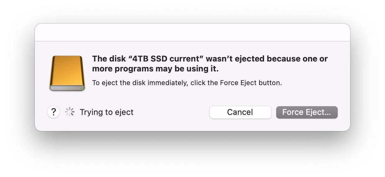
More often than not I just click Force Eject or jank the drive cable out, which feels really unpleasant. I would guess many people do the same.
So at this point we are two steps worse than the original CD experience, which… wasn’t even that great! A pretty clear improvement on this already exists elsewhere in macOS, and could be reused here – “hey, you don’t have to do anything, just give me a second while I finish up here.”
(Can’t help but notice the discrepancy of visual styles of these windows, and even the inconsistency between calling things “applications” vs. “programs.”)
Reported to Apple as FB21787458.