“I trust in TextEdit.”
Welcome to this week’s digest of Unsung, a blog about software craft and quality. Here’s what was posted in the last week:
“I trust in TextEdit.”
Thursday, February 19
A pair of essays has been rattling in my head for a while.
First is Kyle Chayka from October, in “TextEdit and the relief of simple software”:
Over the past few years, I’ve found myself relying on TextEdit more as every other app has grown more complicated, adding cloud uploads, collaborative editing, and now generative A.I. TextEdit is not connected to the internet, like Google Docs. It is not part of a larger suite of workplace software, like Microsoft Word. You can write in TextEdit, and you can format your writing with a bare minimum of fonts and styling. […]
I trust in TextEdit. It doesn’t redesign its interface without warning, the way Spotify does; it doesn’t hawk new features, and it doesn’t demand I update the app every other week, as Google Chrome does.
John Gruber at Daring Fireball responded to it in January:
But I get the feeling that Chayka would be better served switching from TextEdit to Apple Notes for most of these things he’s creating. Saving a whole pile of notes to yourself as text files on your desktop, with no organization into sub-folders, isn’t wrong. The whole point of “just put it on the desktop” is to absolve yourself of thinking about where to file something properly. That’s friction, and if you face a bit of friction every time you want to jot something down, it increases the likelihood that you won’t jot it down because you didn’t want to deal with the friction.
Part of me agrees with this vehemently – for casual text wrangling, Notes is by far the best iteration of what both the old Stickies app and TextEdit attempted.
But Notes are still evolving. The UI keeps changing. I’ve had a note shared by a friend hanging alongside my own notes for years, without me asking for it. I remember the moment when tags were introduced, and suddenly copy/paste from Slack started populating things in the sidebar. Then there was this scary asterisked dialog that slid so well into planned obsolescence worries that it felt like a self-own:
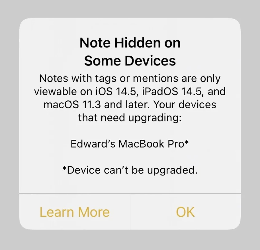
And the attendant warning, ostensibly well-intentioned, adorned my notes for months, just because I had an older Mac Mini I barely touch doing menial things in a dusty closet:

On top of that, the last version of Apple Notes on my macOS occasionally breaks copy/paste (!), which led to some writing loss on my part. (If you cut from one note intending to paste in another, and realize nothing was saved in the clipboard, you lost the text forever.)
These are not show stoppers. But they too are friction that has to be juxtaposed with what Gruber lists in his essay. They’re also friction of the unexpected, new, stochastic flavour. TextEdit’s challenges, on the other hand, are known knowns. In this context, TextEdit is in that rare – and maybe increasingly treasured – place where it no longer gets updates, but it doesn’t feel abandoned, or falling apart, or at the risk of outright cancellation. (I think on the inside of tech companies this is called being “maintenanced” – not actually staffed to be improved, but still eligible for breaking bug fixes and security updates.)
A user named Millie captured this feeling recently on Mastodon:
We need to normalize declaring software as finished. Not everything needs continuous updates to function. In fact, a minority of software needs this. Most software works as it is written. The code does not run out of date. I want more projects that are actually just finished, without the need to be continuously mutated and complexified ad infinitum.
And I saw another person, JP, sharing a similar sentiment:
Personally I would be very happy to live in a postcapitalist world where it was 100% FINE that desktop operating systems had “stopped evolving” because they were good enough to meet basically everyones’ needs, and there was no stock price to crash from an old monopoly having clawed its way to the top with nowhere else to go. “Let [certain] software be finished” has always felt to me like oblique pining for humanity to outgrow our current political-economic system.
Even on my crowdsourced list of well-made apps and sites, someone mentioned Bear – interestingly enough another note-taking app – this way:
The fact that in the 10+ years I’ve been using it, there’s only been a single major overhaul update is a feature, not a bug to me.
I have seen this sentiment grow in recent years, as AI is seemingly shoved into every crevice of everything whether or not it even had crevices to begin with. Liquid Glass on the Mac side and incessant ads plus bugs on the Windows side add to the malaise.
But I’ve also been in technology so long that even outside of tensions of capitalism, it’s hard for me to imagine software not changing. Code does run out of date even if you try very hard. So I don’t know yet how to square all this.
Bear is not finished/“maintenanced,” but it seems to not be changing the same way some other software is changing, either. I’m excited reading its blog – even if there are features or updates that do not pertain to me, they don’t bother me, and make me excited for others benefitting. Its innovation feels considered, not reckless.
In a week I’m praising products I didn’t expect to praise, I feel similarly about Lightroom Classic. When Adobe in 2017 forked Lightroom Classic out of the newly-refreshed Lightroom, a lot of us got worried about the “Classic” tag having “dead man’s walking” connotations. But nine years later, and Lightroom Classic is still being lightly updated with fixes, camera presets, and – occasionally – feature changes that largely feel welcome. Lightroom Classic appears, to once again use industry jargon, “stable.”
Maybe the answers are somewhere in this post: celebrate and fund “maintenanced” apps, fork apps into “stable” and “modern” paths, or encourage and practice slow, considered growth. I bet there are other approaches and altogether new ideas to try, too. (There used to be a tradition, when software was physical, to list all the new stuff at the back of the box. What if we started writing out the things we didn’t add?) But I like at least talking about it to begin with. There are apps in my life I want to feel like TextEdit, there are apps that I want to feel like Notes, and there are ones I’m happy to put on the cutting edge/beta/canary path, where bugs are a promise, and motor memory a distant dream.
I yearn for a software ecosystem that allows all of these types of apps to blossom.
“One of the smaller but downright disturbing issues with dark mode”
Thursday, February 19
As a Mac user I naturally focus on that platform, but Windows 11 has had its own share of problems – and that list has grown so vast it’s hard to know where to start.
So let’s pick it up at random, with a post by Thom Holwerda with a great title “You can actually stop Windows Explorer from flashbanging you in dark mode”:
One of the most annoying things I encountered while trying out Windows 11 a few months ago was the utterly broken dark mode; broken since its inception nine years ago, but finally getting some fixes. One of the smaller but downright disturbing issues with dark mode on Windows 11 is that when Explorer is in dark mode, it will flash bright white whenever you open a new window or a new tab. It’s like the operating system is throwing flashbangs at you every time you need to do some file management.
I find the videogame-inspired nickname darkly – I’m sorry! – funny, but the problem is real. It looks like this (video via windowscentral.com):
It’s not a problem unique to Windows 11 – just the other night I saw this on Wikipedia on my iPhone, exacerbated by the delayed reaction of Liquid Glass buttons spastically adapting to the changing background:
But there is something about this that feels a notch more important than other visual and layout issues.
I think this is because dark mode is a contract – we’ll lower the brightness, and we’ll let your eyes rest. There’s a physiological part to it: a sudden flash of light when your eyes are not expecting to it can be actually physically painful. I think it’s worth thinking about it and futureproofing and sanding dark-mode views especially at their edges: loading states, error messages, signing in and logging off areas. The “flashbang” analogy is very apt, and especially so on bigger screens.
Tactical version history
Thursday, February 19
I have been enthralled with this tiny feature in Google Sheets called “Show edit history,” which premiered in 2019:
Mind you, it’s not unconditional love. The execution feels a bit clunky, showing the edit values in a pop-up rather than in situ, with formatting that feels too heavy, and an awkward “No more edit history” state rather than just disabling the button.
But! Just its very presence here is delightful. Version history is often this huge, comprehensive, perhaps disorienting mode you enter that by design deals with the entire file. It always feels like a longer trip:
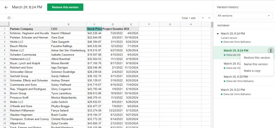
But edit history reimagines the feature from the perspective of the cell. You can just peek inside, quickly and effortlessly. Right click menu, a few arrows, I learned what I needed, and I barely even moved my hand. It’s a perfect example of the rule “to make something feel faster, make it smaller.” It’s like picking your newspaper at your doorstep in your pajamas rather than having to dress up to go to the newspaper store.
(…he said, dating himself and perhaps also thinking of The Sopranos for some reason.)
This kind of reimagining of something that already exists (see: undo send in Gmail) can be really hard, and I don’t even imagine Google Sheets was the first with this idea – but for me seeing this remix was eye-opening, and it inspires me to this day.
“They even thanked the coders for giving them such a difficult challenge.”
Thursday, February 19
A 12-minute video from Tech Rules about how the 2000 PlayStation game Spyro: Year of the Dragon dealt with software piracy:

The video extends upon a 2001 Game Developer article by Gavin Dodd, but Tech Rules adds a good intro about PlayStation’s modchips, and then actually shows the piracy protection in action.
I’m not going to spoil the surprise. Am I fully supportive of the approach? Not sure. PlayStation’s region protection complicates my feelings, and any sort of DRM-esque approach eventually backfires when it comes to software preservation. But you can’t deny what Spyro developers did is a really fascinating and weird approach.
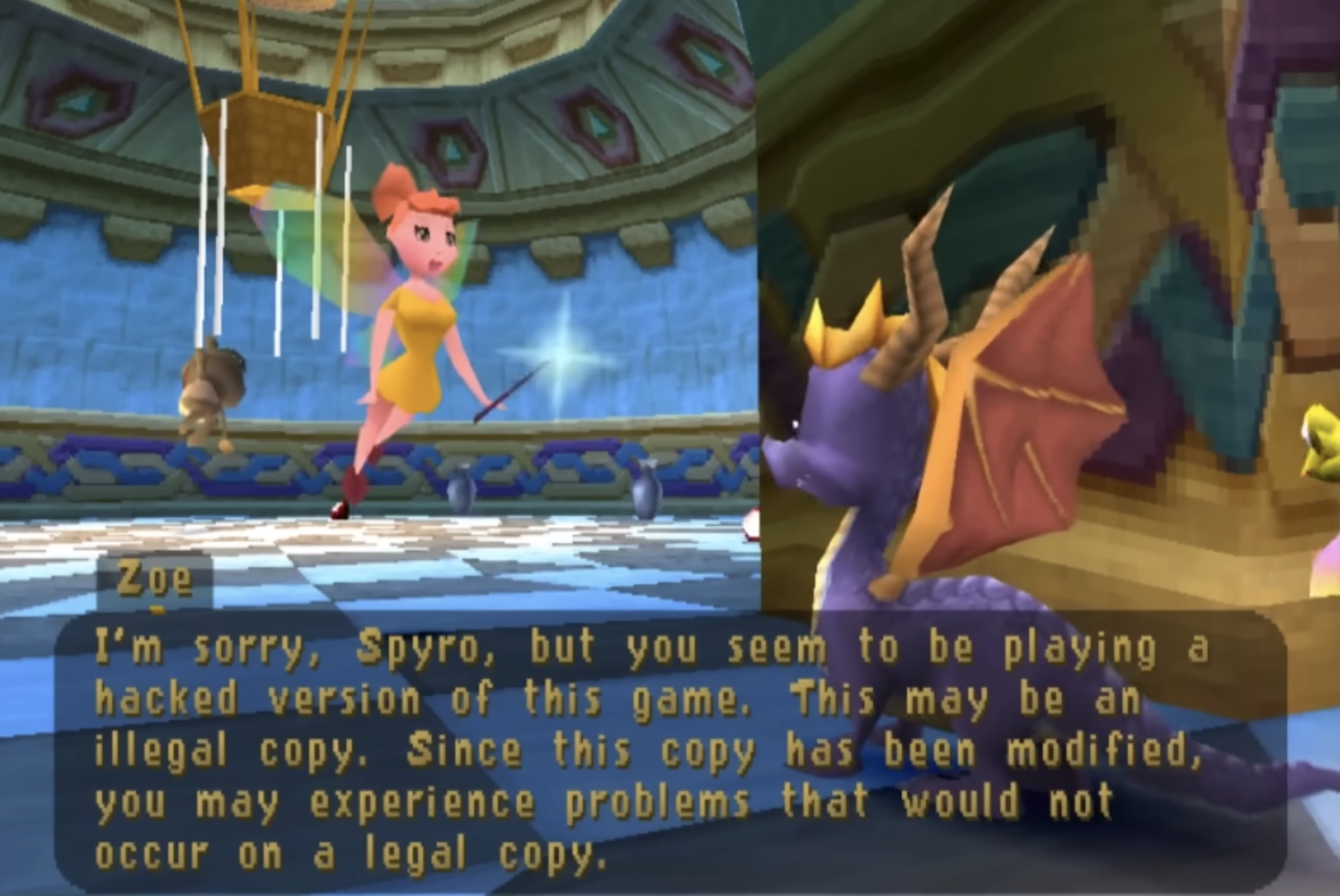
The quote in the title of this post refers to the hackers who eventually did conquer the Spyro’s copy protection system. I guess – and I apologize in advance – game recognize game.
“So, I made another tool.”
Wednesday, February 18
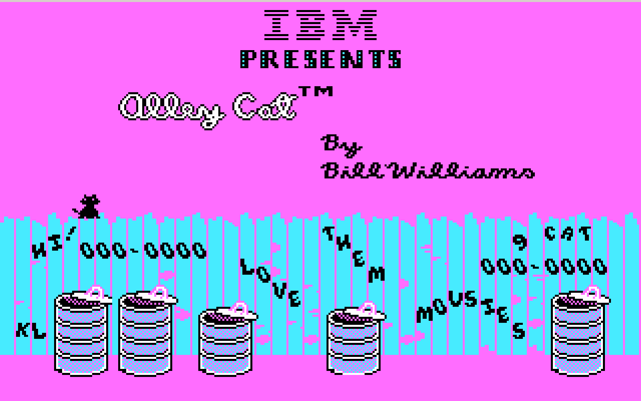
Palette cycling is an interesting technique borne out of limitations of old graphic cards. Today, any pixel can have any color it wants. In the 1970s and 1980s, you were limited to just a few fixed colors: as few as 2 for monochrome displays, or 4, or 8, or – if you were lucky – 16. Some of those fixed palettes, like CGA’s, became iconic:
But there was an interesting hybrid period in between then and now where you still were only allowed 4 or 8 or 16 or 256 color choices in total, but you could assign any of these at will from a much bigger palette.
So, as an example, each one of these three is made out of 16 colors, but each one is 16 different colors:
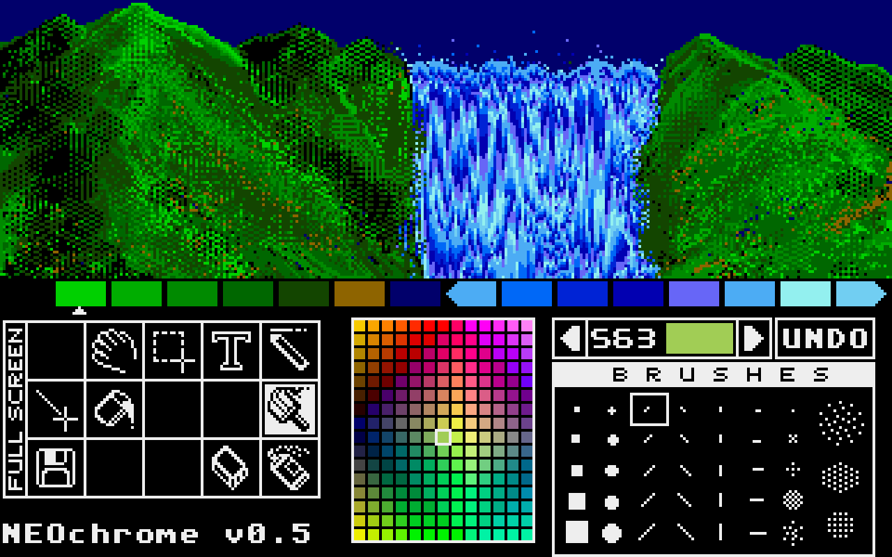
Moving pixels was slow. But palette swaps were so fast and easy, that it led to a technique known as palette cycling. This is probably the best-known example, from an Atari ST program called NEOchrome.
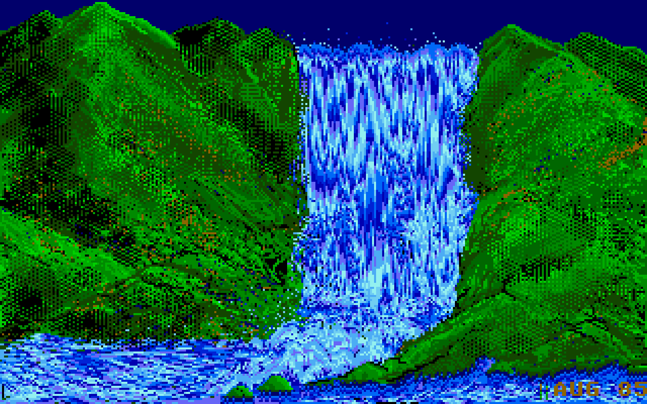
Despite so much apparent movement, no pixels are changing location, as that’d be prohibitively slow in 1985. Only the palette is changing. If you watch the same animation with the UI visible, you can clearly see which colors are “static,” and which are moving around:
But this was 1985, so why I am mentioning it 40 years later?
I like looking at old computers for a few reasons. Some of these seeminly-ancient techniques are inspiring and remind me that the limitations are often in the eye of the beholder. Seeing someone really good pushing a platform to its limits is just a good thing to load into your neurons – this could be you next time! And, believe it or not, some tips and tricks can still be relevant.
For example, this is a 9-minute video by Steffest from just earlier this year that walks through a modern attempt to make a palette cycling animation, including starting on an iPad:
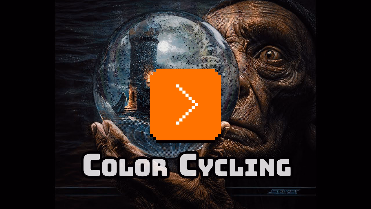
The end result goes much harder than I expected. It was interesting to see again the technique of dithering to simulate transparency (we’ve seen it before, but this one is more advanced). But what particularly stood out to me here was the artist making his own little tools to aid in the creative process; I’ve always loved the notion that a computer is really just meant to be an accelerant, making it easy for you to avoid drudgery.
“Repeat until smooth”
Wednesday, February 18
A nice 2024 essay by Jim Nielsen about the process of “sanding” user interfaces he’s working on:
One of the ways I like to do development is to build something, click around a ton, make tweaks, click around more, more tweaks, more clicks, etc., until I finally consider it done.
The clicking around a ton is the important part. If it’s a page transition, that means going back and forth a ton. Click, back button. Click, right-click context menu, “Back”. Click, in-app navigation to go back (if there is one). Click, keyboard shortcut to go back. Over and over and over. You get the idea.
It’s kind of a QA tactic in a sense, just click around and try to break stuff. But I like to think of it as being more akin to woodworking. You have a plank of wood and you run it through the belt sander to get all the big, coarse stuff smoothed down. Then you pull out the hand sander, sand a spot, run your hand over it, feel for splinters, sand it some more, over and over until you’re satisfied with the result.
This is a clever metaphor and I wish I thought of this before. What follows is a specific story of finding a few dead pixels in between related interface elements, which is an absolutely perfect example of something with non-linear frustration: It might not register at all on the first try, but it will bother you 1,000-fold on the 20th go.
I was just on Internet Archive earlier today, uploading some documents I scanned this weekend. Their UI is… how would I put this… let’s just say Internet Archive makes Teams feel like Linear. (I love Internet Archive and their work and mission, but let’s be honest here.)
Yet, I found something marvelous. Whoever put the upload form UI together knew there will be people like me who’ll be filling out 20 of these forms one right after another. So they made sure every pixel in their form is clickable to edit the nearest field. And I mean, every pixel.
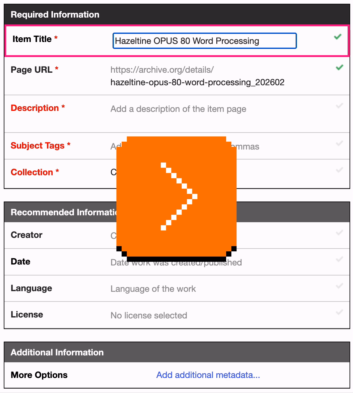
Whoever you are, you have my nod of recognition. In at least this one respect, it’s clear someone spent a lot of time with the sander.
Mailbag: URLs as UI
Tuesday, February 17
My post about Flickr URLs gathered some interesting responses (especially on Mastodon, thank you all!), so I thought I’d do what podcasts call a “mailbag episode”!
Some people pointed out other good examples for inspiration. Chris Silverman:
The idea of URLs as user interface elements is such a good take. I’ve seen some people use URLs as design/communications elements as well, like Jessica Hische:
www.jessicahische.is/thinkingthoughtswww.jessicahische.is/workingjessicahische.is/anoversharer
I love that approach. Modern browsers and preview cards often obscure URLs, but people still see these things; printed materials, links in emails, etc.
Matt Goldman:
I really like letterboxd’s urls these days:
- all the films in my diary in 2024?
letterboxd.com/robotmlg/diary/films/for/2024/- movies I’ve tagged as seeing at Film Forum?
letterboxd.com/robotmlg/tag/film-forum/films/- five star reviews that I wrote in 2021?
letterboxd.com/robotmlg/reviews/films/for/2021/rated/5/
Both Erin Sparling and Nelson Miner highlighted how much the craft of Flickr URLs related to the craft of its API:
Literally used to talk about how good this URL scheme was in class, it was so informative. The Flickr API still informs everything I do these days, URLs included.
There was some discussion about the pattern I suggested. Which one should it be?
flickr.com/mwichary/sets/72177720330077904/alishan-forest-railwayflickr.com/mwichary/sets/alishan-forest-railway-72177720330077904flickr.com/mwichary/sets/alishan-forest-railway/72177720330077904
I will admit: I don’t know. Each has pros and cons – some are better for autocomplete, others better for conveying hierarchy or surviving “removing from the end.”
This note arrived via email:
Hey,
wwwis not redundant. In services like NextDNS it allows blocking only main site, without subdomains. So it gives more control and cost nothing :)
To which my answer is: I don’t think you’ll get to great user experience by prioritizing corner cases like this one.
Jim Nielsen shared some of his favourites, and Søren Birkemeyer suggested more evergreen reading on the subject, with more inspiration inside:
- URL design by Kyle Aster
- URLs are UI by Scott Hanselman
- Four cool URLs by Alex Pounds
The middle one caught my attention because it talks about URLs that are not just user readable, but also user guessable. I think that’s a perfect word for something I tried to capture in my post: if a user successfully guesses a URL from your scheme, then you know you have something good on your hands.
Lastly, a few people mentioned the late 1990s classic written by a relatively unknown dude going by “Tim BL,” called Cool URIs don’t change.
Historical note: At the end of the 20th century when this was written, “cool” was an epithet of approval particularly among young, indicating trendiness, quality, or appropriateness. In the rush to stake [out] DNS territory involved[, ] the choice of domain name and URI path were sometimes directed more toward apparent “coolness” than toward usefulness or longevity. This note is an attempt to redirect the energy behind the quest for coolness.
“These platforms are ad-heavy to the detriment and frustration of users, yet they remain successful and growing.”
Tuesday, February 17
A good batch of history and observations by Nick Heer at Pixel Envy about ads coming to AI chatbots:
It is incredible how far we have come for these barely-distinguished placements to be called “visually separated”. Google’s ads, for example, used to have a coloured background, eventually fading to white. The “sponsored link” text turned into a little yellow “Ad” badge, eventually becoming today’s little bold “Ad” text. Apple, too, has made its App Store ads blend into normal results. In OpenAI’s case, they have opted to delineate ads by using a grey background and labelling them “Sponsored”.
Now OpenAI has something different to optimize for. We can all pretend that free market forces will punish the company if it does not move carefully, or it inserts too many ads, or if organic results start to feel influenced by ad buyers. But we have already seen how this works with Google search, in Instagram, in YouTube, and elsewhere. These platforms are ad-heavy to the detriment and frustration of users, yet they remain successful and growing. No matter what you think of OpenAI’s goals already, ads are going to fundamentally change ChatGPT and the company as a whole.
Trust your fingers
Tuesday, February 17
For a few months now, when re-running search queries in Bluesky’s iOS app, I ended up occasionally arriving on the wrong search, and it happened enough that I started suspecting something’s afoot. (Ahand?)
So I opened the app on my Mac via iPhone Mirroring, and started clicking testing carefully. This is what I saw:
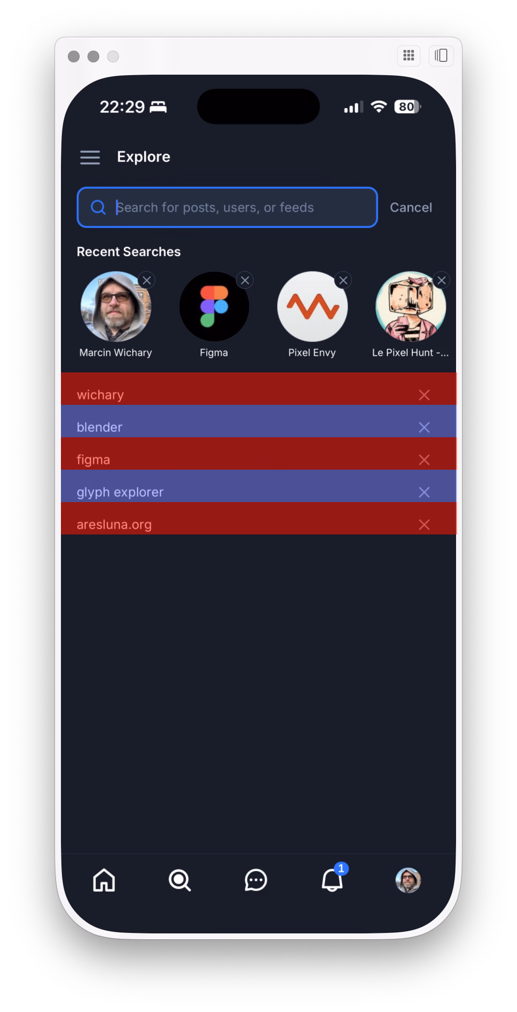
Turns out there was something wrong there – the touch targets are so vertically lopsided you’ll often end up tapping the item below by accident.
I reported the bug to Bluesky, and a few days later I saw Norbert Heger doing a similar thing vis-a-vis the macOS Tahoe rounded corner bug (previously):

Heger’s method is automated and a lot smarter than mine, but I enjoyed seeing these parallel efforts.
What’s the lesson here? I think it’s this: Trust your fingers, and occassionally speak for them as they can’t speak for themselves.
Make yourself at home
Monday, February 16
This is a nice way iOS Safari behaves the moment you tap one of the font size buttons – it immediately ejects all the other chrome:
After Liquid Glass specifically, we seem to be going through an interesting re-evaluation of whether “the content is the king; it should feel expansive and UI should get out of the way at all costs,” so seductive as a principle, is ultimately the right approach. Liquid Glass-sporting operating systems have so many contrast and blending and distraction issues that I wonder if they alone are radicalizing people, making them appreciate traditional rigid toolbars with solid backgrounds and fortified borders.
But here? Here letting contents shine and putting the UI atop feels like the absolutely right thing to do, since you are redesigning your reading experience.
Contrast this with Books:
It’s not even that the crossfaded transitions feel awkward. It’s mostly that the interface takes up so much room that the content preview slice becomes almost claustrophobic. And it’s even weirder when you tap the Customize button, and whatever was visible gets inexplicably replaced by a pop-up with… largely the same content anyway.
How will the entire page feel? For that you have to use your imagination – or keep tapping back and forth.
“The reason this never caused a problem before was pure luck.”
Sunday, February 15
An interesting 14-minute video about a bug in Grand Theft Auto: San Andreas:
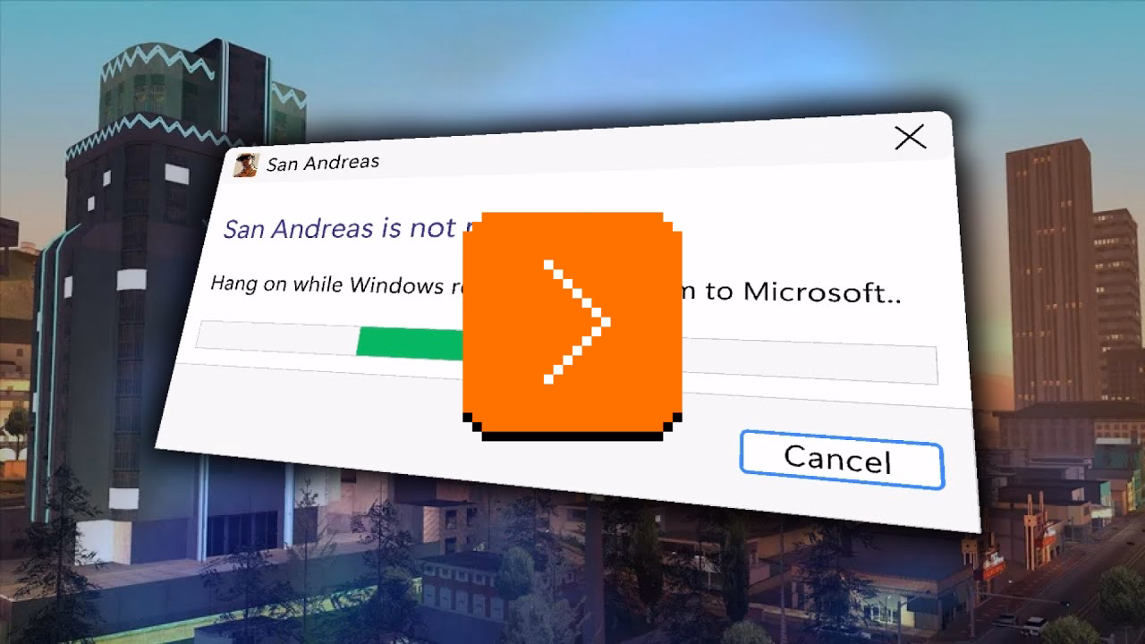
San Andreas was released in 2004, but the game started breaking only after Windows got updated… in 2024. Turns out the bug was sort of a ticking time bomb just waiting for the right set of conditions. We covered one similar bug before, in Half-Life 2 – but this investigation goes deeper, and shines a light on the difficulty of making Windows, whose backwards compatibility comes at a price.
Unsung heroes: Flickr’s URLs scheme
Sunday, February 15
Half of my education in URLs as user interface came from Flickr in the late 2000s. Its URLs looked like this:
flickr.com/photos/mwichary/favorites
flickr.com/photos/mwichary/sets
flickr.com/photos/mwichary/sets/72177720330077904
flickr.com/photos/mwichary/54896695834
flickr.com/photos/mwichary/54896695834/in/set-72177720330077904
This was incredible and a breath of fresh air. No redundant www. in front or awkward .php at the end. No parameters with their unpleasant ?&= syntax. No % signs partying with hex codes. When you shared these URLs with others, you didn’t have to retouch or delete anything. When Chrome’s address bar started autocompleting them, you knew exactly where you were going.
This might seem silly. The user interface of URLs? Who types in or edits URLs by hand? But keyboards are still the most efficient entry device. If a place you’re going is where you’ve already been, typing a few letters might get you there much faster than waiting for pages to load, clicking, and so on. It might get you there even faster than sifting through bookmarks. Or, if where you’re going is up in hierarchy, well-designed URL will allow you to drag to select and then backspace a few things from the end.
Flickr allowed to do all that, and all without a touch of a Shift key, too.
Any URL being easily editable required for it to be easily readable, too. Flickr’s were. The link names were so simple that seeing the menu…
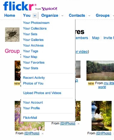
…told you exactly what the URLs for each item were.
In the years since, the rich text dreams didn’t materialize. We’ve continued to see and use naked URLs everywhere. And this is where we get to one other benefit of Flickr URLs: they were short. They could be placed in an email or in Markdown. Scratch that, they could be placed in a sentence. And they would never get truncated today on Slack with that frustrating middle ellipsis (which occasionally leads to someone copying the shortened and now-malformed URL and sharing it further!).
It was a beautiful and predictable scheme. Once you knew how it worked, you could guess other URLs. If I were typing an email or authoring a blog post and I happened to have a link to your photo in Flickr, I could also easily include a link to your Flickr homepage just by editing the URL, without having to jump back to the browser to verify.
Flickr is still around and most of the URLs above will work. In 2026, I can think of a few improvements. I would get rid of /photos, since Flickr is already about photos. I would also try to add a human-readable slug at the end, because…
flickr.com/mwichary/sets/72177720330077904-alishan-forest-railway
…feels easier to recall than…
flickr.com/photos/mwichary/sets/72177720330077904
(Alternatively, I would consider getting rid of numerical ids altogether and relying on name alone. Internet Archive does it at e.g. archive.org/details/leroy-lettering-sets, but that has some serious limitations that are not hard to imagine.)
But this is the benefit of hindsight and the benefit of things I learned since. And I started learning and caring right here, with Flickr, in 2007. Back then, by default, URLs would look like this:
www.flickr.com/Photos.aspx?photo_id=54896695834&user_id=mwichary&type=gallery
Flickr’s didn’t, because someone gave a damn. They fact they did was inspiring; most of the URLs in things I created since owe something to that person. (Please let me know who that was, if you know! My grapevine says it’s Cal Henderson, but I would love a confirmation.)
“A design variation that doesn’t make sense”
Saturday, February 14
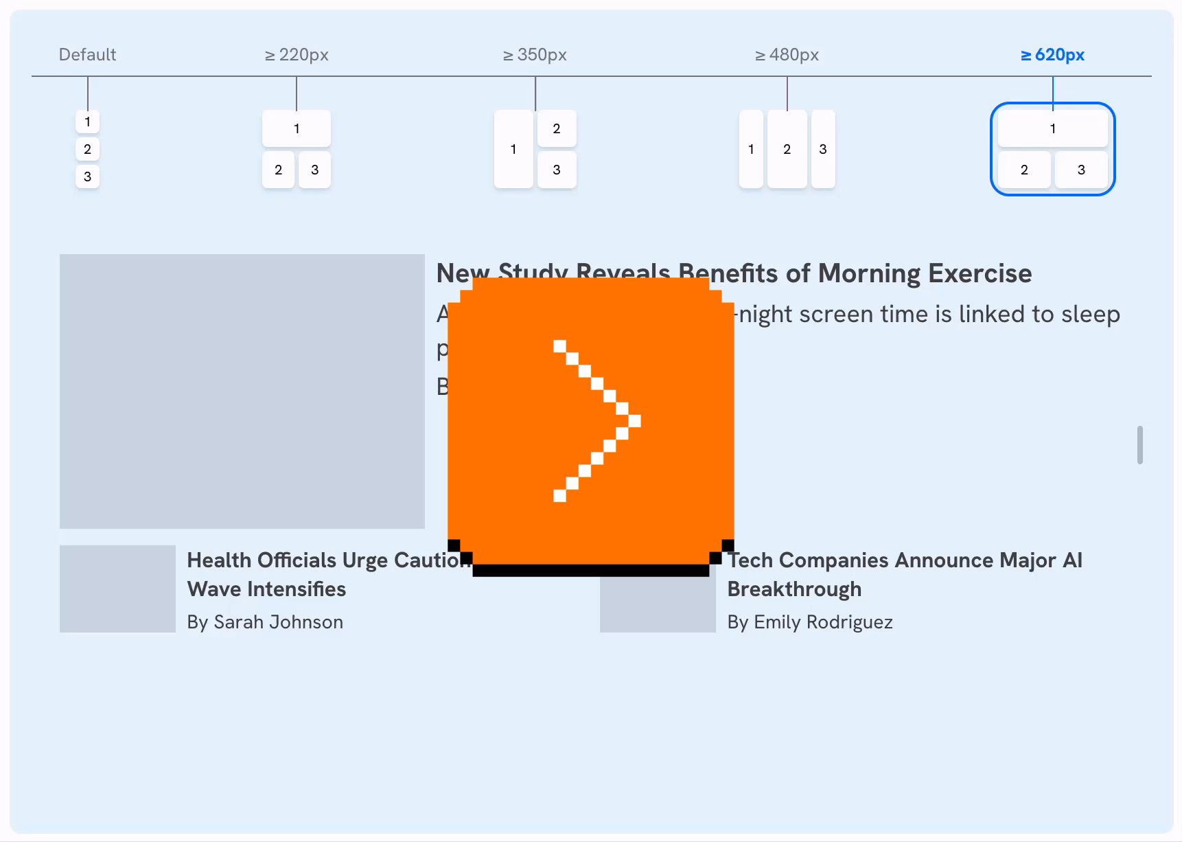
A good quick essay by Ahmad Shadeed about a mistake I bet I committed myself, too – switching to a full-width style too soon with responsive design, which makes pages look strange:
Shadeed argues that this ugly responsive interregnum happens a lot more than people might assume, as part of natural window management on larger screens. If you un-maximize the window, use one of the many split-screen features, or something like link preview, it might push the browser into a width slice you might have thought was not actually realistically occupied.
Also, what caught my attention at the bottom of the post was this smart visualization. I wish the responsive design features in my browser’s web inspector did this kind of thing automatically:
Book review: The iOS App Icon Book/The macOS App Icon Book
Friday, February 13
★★★★★ (as books)
★★★★☆ (for the purposes of this blog)
I still remember Mac OS X arriving on the scene with icons that felt infinite in every possible way: in size, in color palette, in dimensionality. We got used to them over the last quarter century, but Michael Flarup’s books rekindled that feeling for me; the icons presented here are lavish, larger than life, and basically pixel-less.
I do not generally like coffee-table books. But I really liked these. The iOS App Icon Book came out in 2022, and the macOS App Icon Book followed two years later. They’re “almost-coffee-table” – which is a compliment! – extremely well-made but portable, and with soul, and thoughtful details, and inspiring evidence of being labours of love.
Each one has an almost-absurd amount of icons (I counted almost 1,200 in one book, and consequently didn’t even attempt counting in the other), but it’s not just the quantity that impresses. The icons are laid out carefully on gorgeous color-coordinated spreads. Many appear in variations so you compare their evolution over the years. Each one is big enough and printed so well you can study it in detail, and I have not noticed one technical flaw in their reproduction.
In addition to beautiful collections of beautiful icons, the book also veers a bit into history, and design advice, and adds ~10 interviews with icon designers each. Those are welcome additions that elevate the books from a boring coffee-table existence, but those are also its weakest parts – although “weakest” in a comparative sense. The things missing for me in the book are: more work in progress and rejected efforts, more specific advice and hard-learned lessons rather than general-interest interviews, a bit more about recognition of icons when reproduced small on screens, and some harder/cerebral conversations about iconography and its place in the universe.
On the other hand, I know that of all icons it’s app icons that get to be least concerned with semantics and semiotics, as they’re maybe the closest to just pure art and graphic design. I can understand how talking through it all would be an extremely hard task; all of the fantastic icon designers I know personally would struggle with explaining why their output is better than others. It’s possible the extra “left-brain” stuff I want from these books would also make them less desirable for those who just seek visual or artistic inspiration.
Both books are otherwise basically a love letter to app iconography, and awash in memorable details: delightful covers, colour-coordinated ribbon bookmarks, beautiful ex librissen, and a product index and an artist index.
The price – $84 without shipping (they’re printed in Denmark, so for once Europe gets an advantage) – might be a bit of a showstopper. The books are well-made, but you are definitely paying a premium for a short/bespoke print run. The volumes complement each other well on a shelf, but you’ll do no wrong with getting either one if two is too much for your budget. (There is also a half-price PDF version, if that’s of interest to you, but I cannot vouch for that.)
![]()
![]()
“We internalize so much by doing things slower and making mistakes.”
Friday, February 13
Another good post from Roger Wong thinking through Anthropic’s findings on how offloading coding effort leads to understanding less:
So the AI group didn’t finish meaningfully faster, but they understood meaningfully less. And the biggest gap was in debugging—the ability to recognize when code is wrong and figure out why. That’s the exact skill you need most when your job is to oversee AI-generated output.
Inside it, a quote from the Anthropic post that resonated with me:
Cognitive effort—and even getting painfully stuck—is likely important for fostering mastery.
I wonder if part of the appeal of AI tools is the promise of “exercise without exercise,” like the vibrating belt machines of the 1950s.

Elsewhere, I found an essay about the craft of writing by Kristie de Garis:
Writing at speed privileges what arrives first. The obvious phrasing, the familiar structure, a thought that you heard somewhere before.
Also this:
A book is not retrieved fully formed from memory, or pulled up in a full bucket from some deep creative well in your body.
The old saying goes “everyone dreams about having written a book, not about writing one.” Now we’re building software that allows people to “have written a book” and “have designed something.”
I am open (I think!) to the idea that the nature of the effort will change as tools change. But I can’t see mastery arriving without effort. And I’m worried people will start mistaking prompting mastery for material mastery.