“Houston, we have 1 problem(s).”
Welcome to this week’s digest of Unsung, a blog about software craft and quality. Here’s what was posted in the last week:
Software proprioception
Thursday, March 12
There are fun things you can do in software when it is aware of the dimensions and features of its hardware.
iPhone does a cute Siri animation that emanates precisely from the side button:
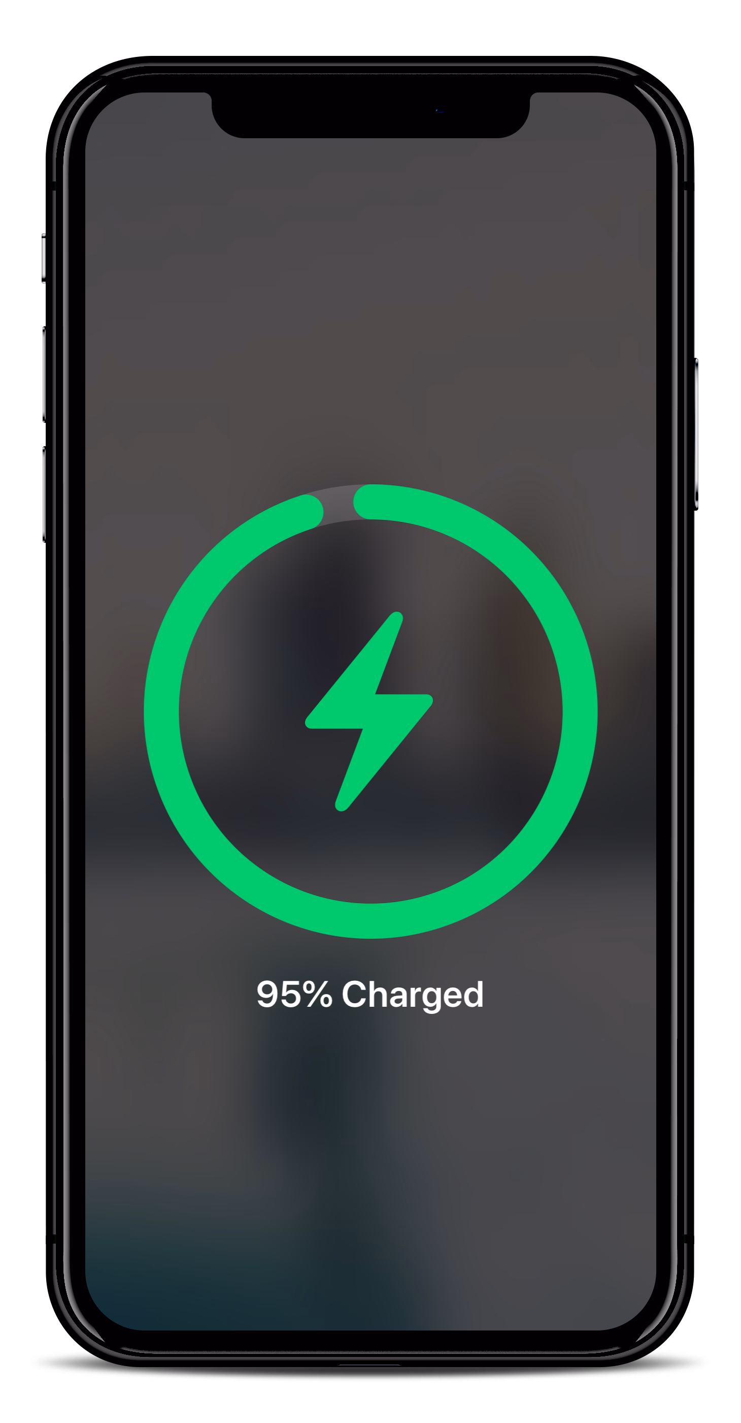
A bunch of Android phones visualize the charge flowing to the phone from the USB port…

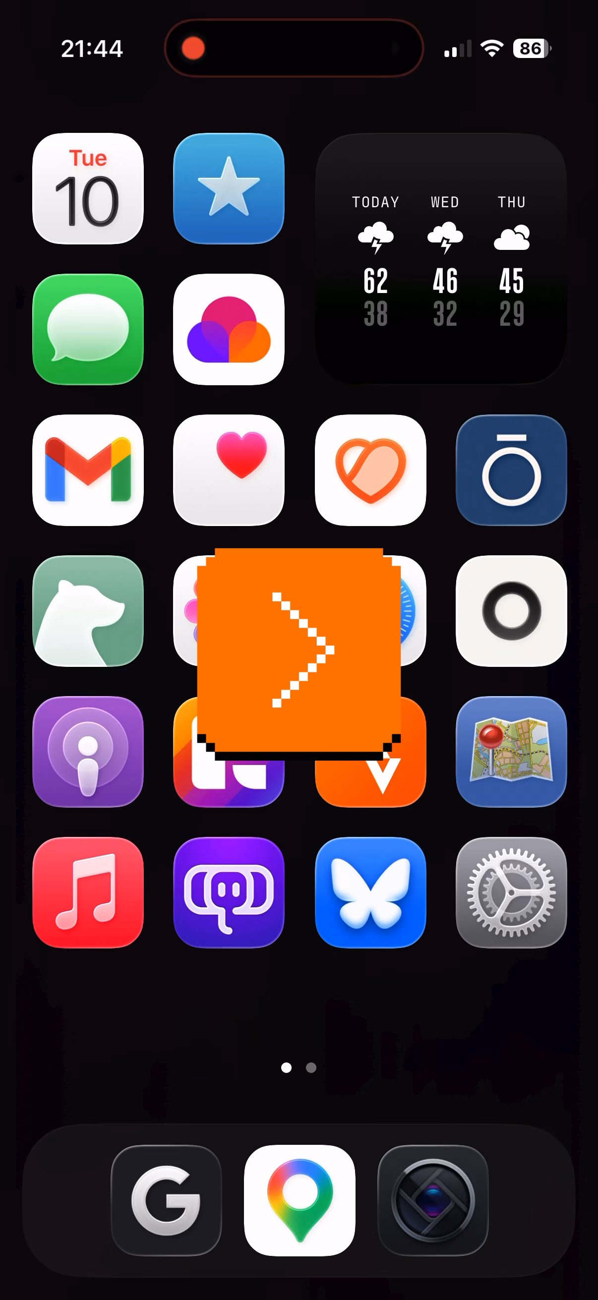
…and even the whole concept of iPhone’s Dynamic Island is software cleverly camouflaging missing pixels as a background of a carefully designed, ever morphing pill.
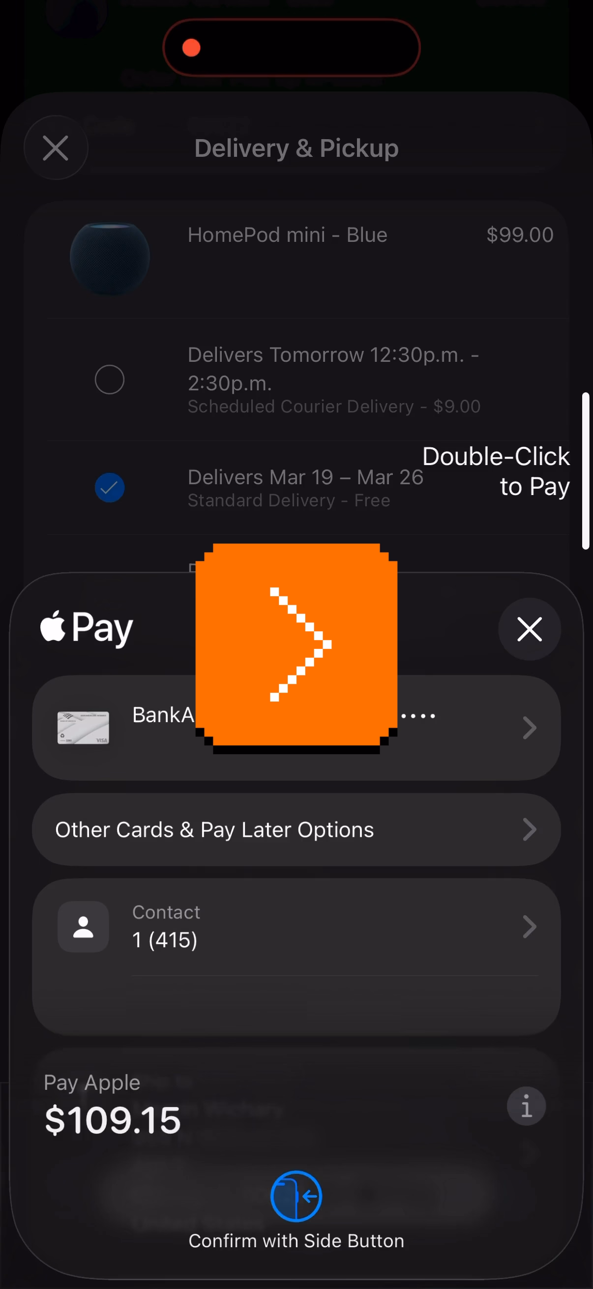
But this idea has value beyond fun visuals. iPhone telling you where exactly to tap twice for confirming payment helps you do that without fumbling with your phone to locate the side button:
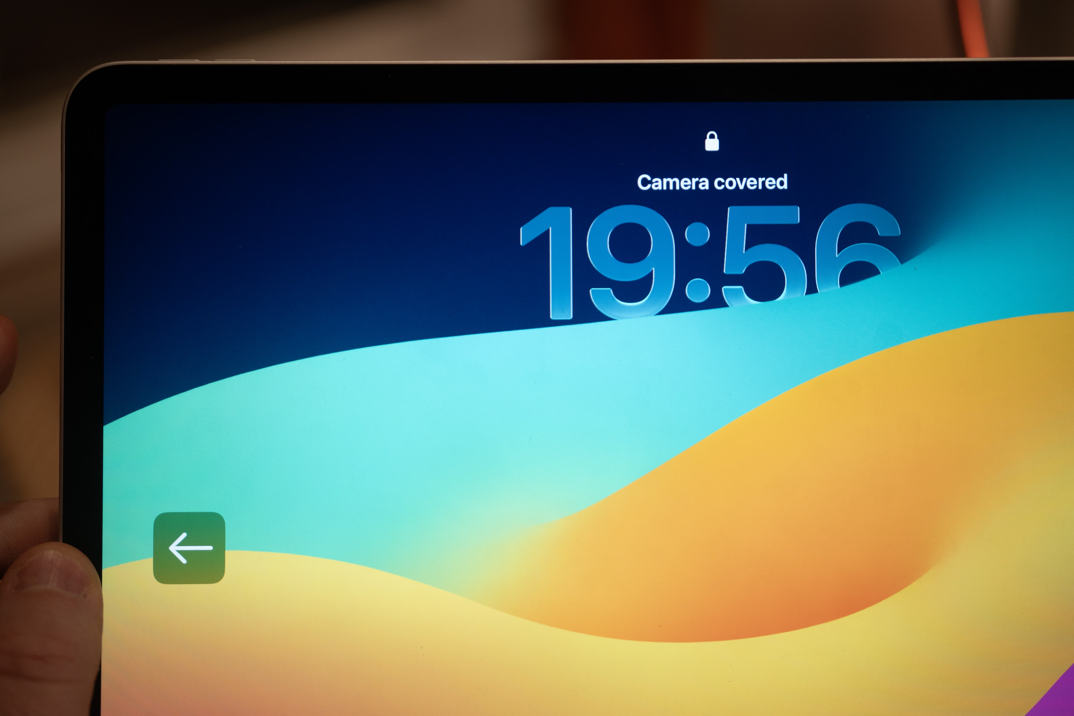
Same with the iPad pointing to the otherwise invisible camera when it cannot see you:
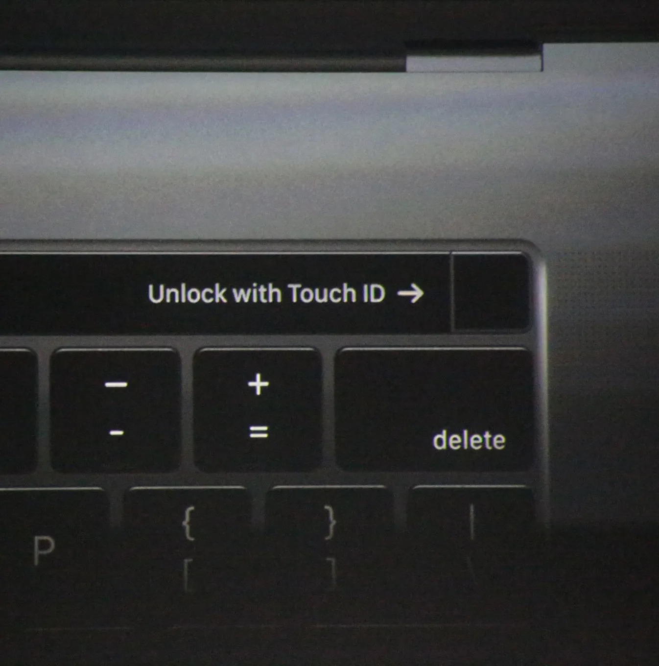
Even the maligned Touch Bar also did something similar for its fingerprint reader:
The rule here would be, perhaps, a version of “show, don’t tell.” We could call it “point to, don’t describe.” (Describing what to do means cognitive effort to read the words and understand them. An arrow pointing to something should be easier to process.)
You could even argue the cute MagSafe animation is not entirely superfluous, as over time it helps you internalize the position of the otherwise invisible magnets on the other side of your phone:
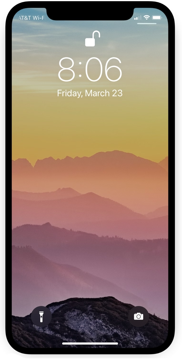
In a similar way, as it moved away from the home button, iPhone X introduced light bars at two edges of the screen – one very aware of the notch – as swiping affordances:
And under-the-screen fingerprint readers basically need a software/hardware collab to function:

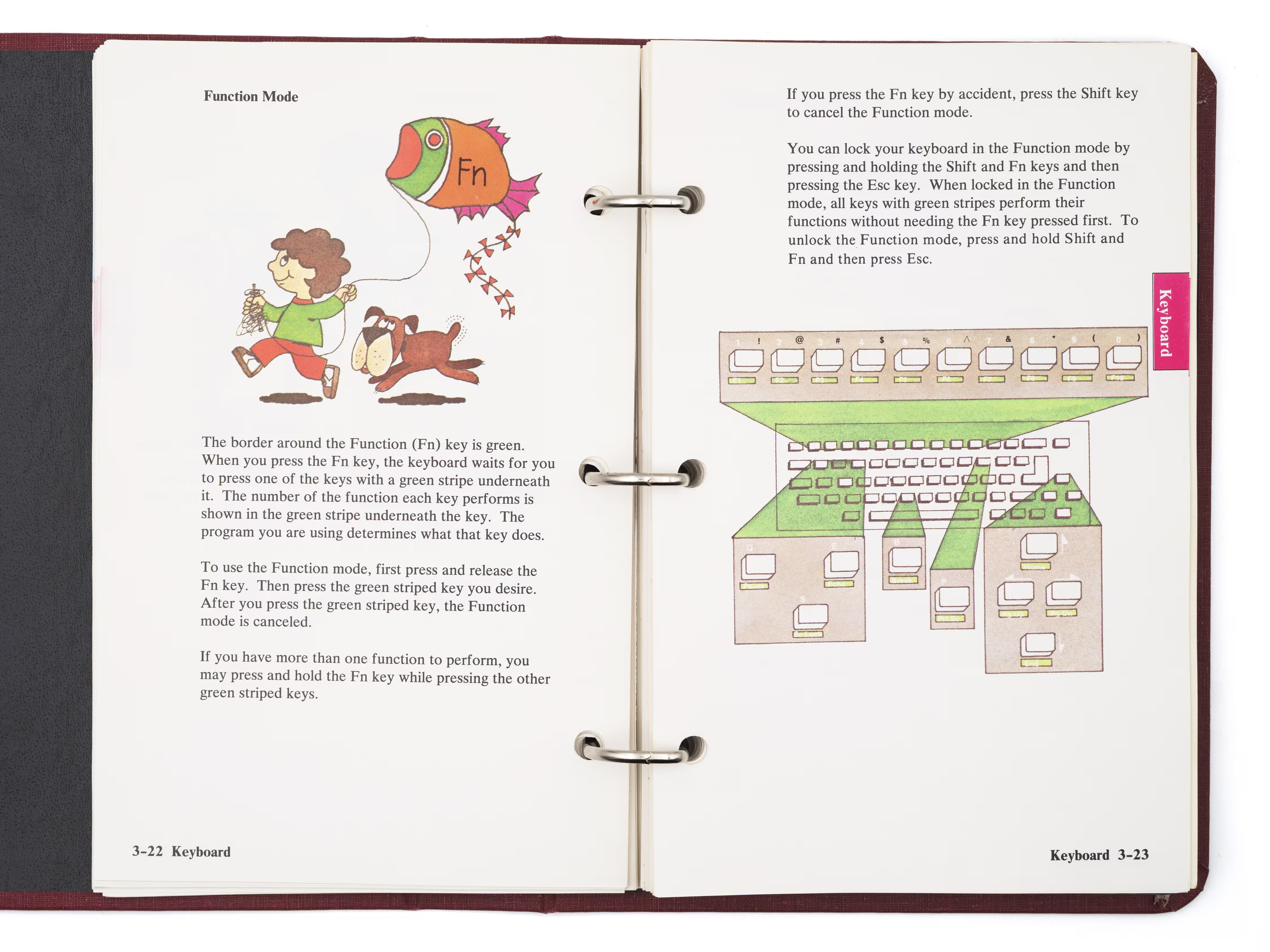
One of my favourite versions of this kind of integration is from much earlier, where various computers helped you map the “soft” function keys to their actual functions, which varied per app…
…and the famous Model M keyboard moving its keys to the top row helped PC software do stuff like this more easily:
(And now I’m going to ruin this magical moment by telling you the cheap ATM machine that you hate does the same thing.)
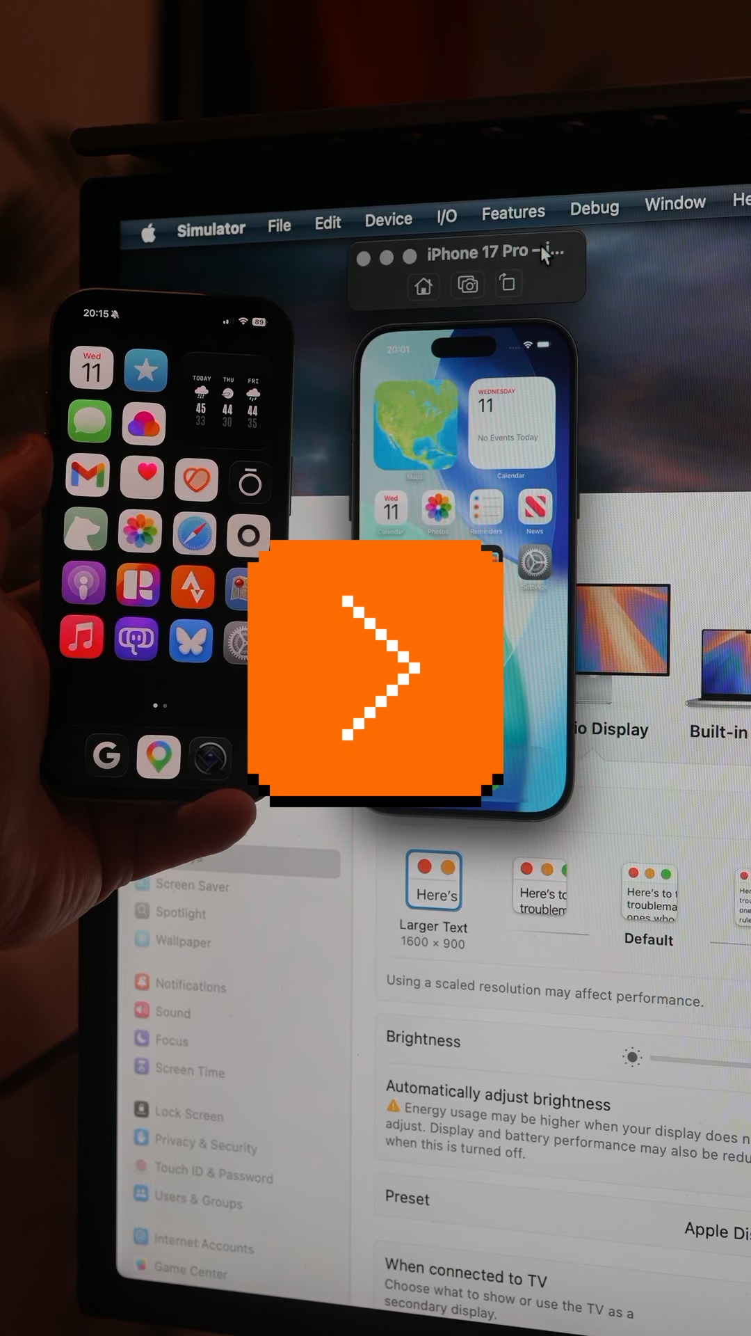
The last example I can think of (but please send me your nominations!) is the much more sophisticated and subtle way Apple’s device simulator incorporates awareness of the screen’s physical size and awareness of the dimensions of the simulated device. Here’s me using the iPhone Simulator on my 27″ Apple display. If I choose the Physical Size zoom option, it matches the dimensions of my phone precisely. The way I know this is not an accident is that it remains perfectly sized if I change the density of the whole UI in the settings.
Why am I thinking about it all this week?
The new MacBook Neo was released with two USB-C ports. Only one of the ports is USB 3, suitable for connecting a display, an SSD, and so on. The other port’s speeds are lower, appropriate only for low-throughput devices like keyboards and mice.

To Apple’s credit, macOS helps you understand the limitations – since the ports look the same and the USB-C cables are a hot mess, I think it is correct and welcome to try to remedy this in software. It looks like this, appearing in the upper right corner like all the other notifications:
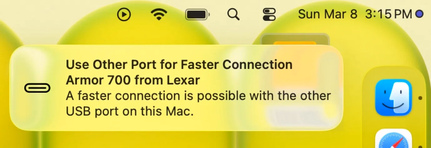
I think this is nice! But it’s also just words. It feels a bit cheap. macOS knows exactly where the ports are, and could have thrown a little warning in the lower left corner of the screen, complete with an onscreen animation of swapping the plug to the other port – similar to what “double clicking to pay” does, so you wouldn’t have to look to the side to locate the socket first.
“Point to, don’t describe” – this feels like a perfect opportunity for it.
“A few small details I use to make my interfaces feel better.”
Wednesday, March 11
I enjoy little lists like these, and the presentation here is also delightful. From a design engineer Jakub Krehel, Details that make interfaces feel better. A few of these stood out to me:
Make your animations interruptible. […] Users often change their intent mid-interaction. For example, a user may open a dropdown menu and decide they want to do something else before the animation finishes.
Yes. Never make the user wait for your animation to finish, unless the animation itself is meant to cause friction and slow the user down (which is very rare).
Make exit animations subtle. Exit animations usually work better when they’re more subtle than enter animations.
I love asymmetric transitions. My go-to analogy for this is “in real life, you don’t open the door the same way you close it.”
Add outline to images. A visual tweak I use a lot is adding a 1px black or white (depending on the mode) outline with 10% opacity to images.

This is very nice and (both literally and figuratively) sharp. In some contexts, I bet you could even try to go for 0.5px.
(If you liked this page, it’s worth checking out Krehel’s other explainers, for example about gradients or drag gestures.)
“Houston, we have 1 problem(s).”
Tuesday, March 10
In my head, some bugs belong to categories that feel important, and yet remain hard to define and quantify: embarrassing bugs, dumb bugs, flow killers.
Somewhere in the hard-to-explain space is another tricky category: UI decisions that feel cheap.
The examples of cheapness that come to my mind readily will, I bet, be different for each one of you reading this:
- using emoji instead of iconography
- using text and typography instead of graphic design elements as UI (except in terminal/text-based interfaces)
- excessive centering
- obvious misalignments and overflows
- accidentally mismatched fonts and unspecified fallback fonts
- reflow and bad loading states that do not match the eventual UI
- selectable user interface element that betray “bad webiness” of the UI
- typos
But my absolute #1 go-to example is definitely this:
Computers could pluralize nouns basically for free already in the 1970s, and sure, there are objective arguments of why this is bad, but there’s also this: I wince so hard every time I see something like this.
I think it’s important for every designer to notice when they wince, and teach others how to wince and notice, too.
(I stole the brilliant title from this short post by Joe Leech in 2018, in which Leech uses the word “lazy” rather than “cheap” – they’re related!)
“Two lights that you never want to see when you’re landing on the Moon.”
Tuesday, March 10
Many of you have probably heard the repeated story of the first Moon landing in 1969 almost getting undone by a bunch of onboard computer glitches:
There could not be a worse time in the flight to have computer problems. At, the time the press gleefully reported how Armstrong seized manual control from a crippled and failing onboard computer and managed to heroically and single-handedly land the spaceship on the surface of the Moon against all odds.
Robert Wills argues against this narrative in this 2020 talk, wanting to shine a spotlight away from Neil Armstrong and toward people who designed the software (among them Margaret Hamilton), and the mission control’s Steve Bales, who made a decision not to abort the launch as the 1201 and 1202 errors were piling up.
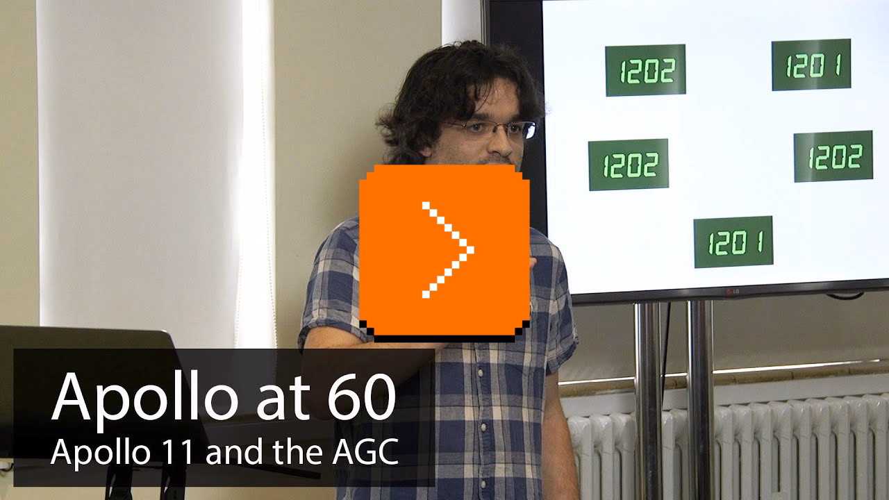
The argument: the computer was working as intended, it fixed itself over and over again owing to its clever software, and it actually helped Buzz Aldrin understand (at least subconsciously) what led to the seemingly random and distracting computer errors.
The above is more of a traditional talk than the videos I usually share – a bit more technical, taking up an entire hour, and with generic slides – but it’s buoyed by Wills’s enthusiasm and knowledge.
Besides, it’s lunar landing! Did you know about DSKY and its fascinating keyboard and UI? Did you know the spacecraft’s window was part of the interface, too? Or that its software was woven into the hardware? Or that the Apollo 11 had a… guillotine in it?
Unaddressed in the talk, but also important:
An unsung hero of the decision not to abort the landing is Richard Koos, a NASA simulation supervisor who […] 11 days before the launch of Apollo 11, put the team of controllers including Bales […] through a simulation that intentionally triggered a 1201 alarm. […] Unable to figure out what the 1201 was, Bales aborted that simulated landing. He and Flight Director Gene Kranz were dressed down for it by Koos, who put the team through four more hours of training the next day specifically on program alarms. When the 1202 and 1201 alarms occurred during the actual landing, Garman, Bales, and even Duke recognized them immediately.
Fortune favors the prepared.
From dawn (or dusk) till dusk (or dawn)
Monday, March 9
This iPhone UI for dark/light theme is doing something clever:
Ostensibly, there are two modes here:
- automatic, for when you want the theme to match the time of day
- manual, for when you want to keep one of the themes forever
But check out what happens when I am in automatic mode, but toggle the theme by hand anyway:
More rigid or less thoughtful interfaces would either disable manual changes when you’re in automatic mode, or understand a manual theme switch to mean “I want to turn off automatic.”
But here, iOS is quietly putting me in a temporary hybrid mode: a manual theme override until the theme catches up with what automatic mode would do, at which point it snaps back (I’m resisting very hard calling this rubber banding) to automatic mode.
What I think is clever is that this isn’t presented as a third mode – which could be more confusing than helpful – but the design simply reuses the existing Options field to set the expectations.
One has to be careful designing in shades of gray; once you enter the space you really have to commit to it and see it through. My go-to analogy is symmetry vs. asymmetry. Symmetry in visual design is usually easier and safer. If you venture into asymmetry you have to make an effort to make it work. The highs of asymmetry will be higher than anything symmetry can provide, but getting to those highs can be arduous and sometimes might even be impossible.
I thought this particular example was really nicely done and the team found a great balance. (I think Apple’s previous shade of gray – “Disconnecting Nearby Wi-Fi Until Tomorrow” – ended up slightly less successful.)
My essay about the Fn key
Monday, March 9
I just published a new photoessay about the history of the Fn key, and particularly what Apple has been doing with it recently.
Do we need yet another person crashing out about Apple’s design decisions? Am I doing it only because it’s fashionable to be on Apple Design Hate Train these days? I’ll be honest: I don’t know.
But I have been bothered by Apple’s approach to this aspect of its keyboard design for a while, because it starts breaking what I think is really important in using a computer well: keyboard shortcuts.
I hope it’s also a fun visual history of the most tricky of modern modifier keys.
(And if you like it, I linked to a few of my other keyboard essays in the footer.)
“Durial321 is a banned RuneScape player and a bug abuser.”
Sunday, March 8
RuneScape is a popular MMORPG that reached its peak popularity in the late 2000s.
In the game, combat – colloquially known as PvP, or player vs. player – is limited to a specific map area (called the Wilderness) and otherwise people’s houses.
On 6/6/6 (sic!) a bug in RuneScape made it possible for a few players to start killing others outside of designated areas, without them being able to defend themselves. One of these players, Durial321, gained a lot of notoriety:
A player called Cursed You had invited some friends to his in-game house once he had maxed his construction skill, but decided to eject them all from the premises. Things turned sour, however, as a group of players marked as PvP in the house didn’t lose this PvP flag when ejected, allowing them to storm through Falador and massacre whoever they pleased. The most notorious of these players was named Durial321.
This event went down in internet infamy and meant that many players lost their items when killed as well as the banning of those involved.
I don’t have any context of RuneScape and I found it really funny to learn about this event from different retellings of the story.
This wiki entry reads almost as journalism:
Several others were able to use this glitch, but Durial321 abused it the most. His rampage lasted for about an hour, starting at Rimmington, where the house party was, then proceeding to Falador and subsequently Edgeville. At Edgeville, he gave Voodoolegion the green partyhat, who never gave it back to him. Soon after, he finally encountered a Jagex Moderator, Mod Murdoch, who disconnected him and locked his account. Durial321 was later permanently banned from RuneScape. In a 2006 interview, he said that player killing outside of the Wilderness was exciting, although he felt bad for the players who lost their belongings.
The 2006 incident later became known as the Falador Massacre.
(The tone is even more funny if you actually read the interview.)
There is also this more modern retelling that feels like scary story time by the campfire:
Reactions from players were initially kind of incredulous. Plenty of people were shocked and found the whole incident quite funny. Durial had essentially broken the game, after all. Some players wanted to be like him, whipping strangers to death and taking their items. But soon, as more players started hearing about what had happened and seeing the video, the mood shifted. Players wanted Durial321 hung, drawn and quartered, with his head displayed on a pike outside Lumbridge Castle.
You can witness the event PC Gamer called “one of the best all-time MMO bugs” by yourself since there is video capture of the Falador Massacre taken by one of the witnesses. At least to me, it’s rather incomprehensible.
Fear not, however, because there are many (!) documentaries. This recent one is reportedly the best one and also goes into the technical details:
Without spoiling too much, the bug was a classic Swiss cheese situation involving a new untested item, a race condition, peculiar timing, and a player with an unusually high uptime and a whole lotta luck.
“It’s beautiful and kind of mesmerizing.”
Sunday, March 8
I’ve learned recently that “rubber banding” can mean at least three different things in the context of UI/UX design:
- whatever happens at the edges of your scroll container when you’re using elastic scrolling, which started on the first iPhone and have spread more widely since
- in videogames, balancing the difficulty in real-time so that inexperienced players stand a chance and good players are not bored (a classic example in any racing game is computer-controlled cars slowing down if they are running too far ahead, as if held by a rubber band, to give you a chance to catch up)
- in multiplayer experiences (mostly videogames, too), the experience of snapping back and forth (example) during gameplay when your connection speed is low and the game has to reconcile your predicted position with your real one
Each one is interesting in its own way. (Each one is also controversial, although for a different reason!) But what I understand they all have in common is – well, obviously – the specific mechanics of rubber banding.
I imagine many reading this are familiar with basic interpolation between A and B using curves like ease in, ease out, and so on. But in gaming and I think increasingly in UI design, that’s not enough. When coding stuff related to movement – imagine dragging an elastic scrolling view near its edge – the challenges compound:
- the object might already be in motion
- its destination might also be in motion
- the load or framerate can vary, so calculations have to take that into account
With that in mind, I found these two videos helpful and informative:
- an 8-minute video by SimonDev
- a 50-minute talk by Freya Holmér (with a 10 minute Q&A session you can skip)
The videos together start with basic lerp (linear interpolation), then move to lerp smoothing, and then arrive at frame-independent lerp smoothing. There’s light math/physics here, but that’s to be expected, as all these experiences are meant to feel like real-life objects would.
I found especially lerp smoothing where you feed a lerp into itself particularly conceptually beautiful.
“When you make a release that’s okay”
Saturday, March 7
I saw this fly by before, but just today I learned that Pride versioning is a tiny project by Niki Tonsky, whose work I shared before:
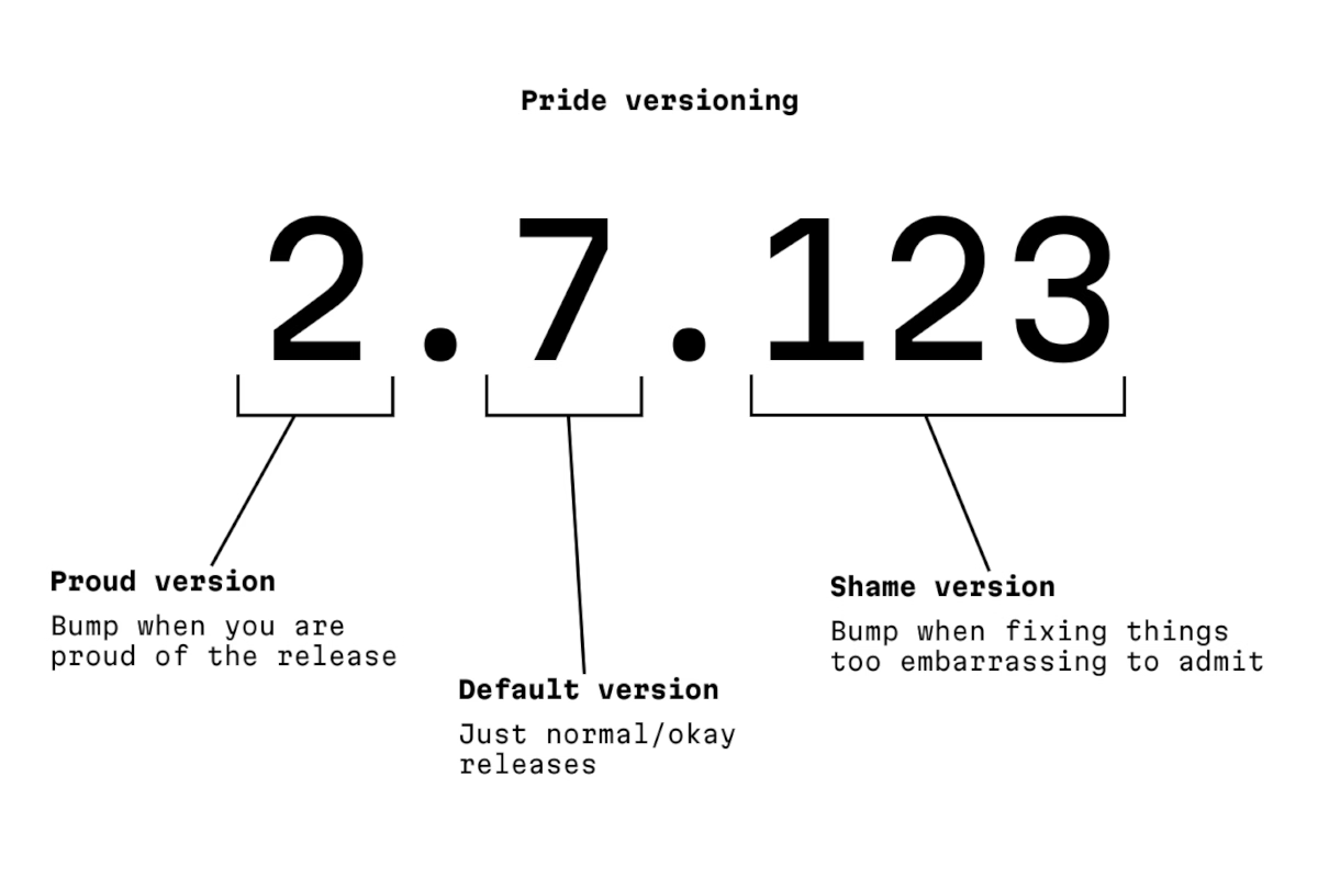
The author says:
This is a parody and a homage to the awesome Semantic Versioning.
…but I think it stands on its own. You can’t have craft without being at peace with pride and embarrassment existing.
“Kapor had projected first year sales of $1M, but did $53M instead.”
Saturday, March 7
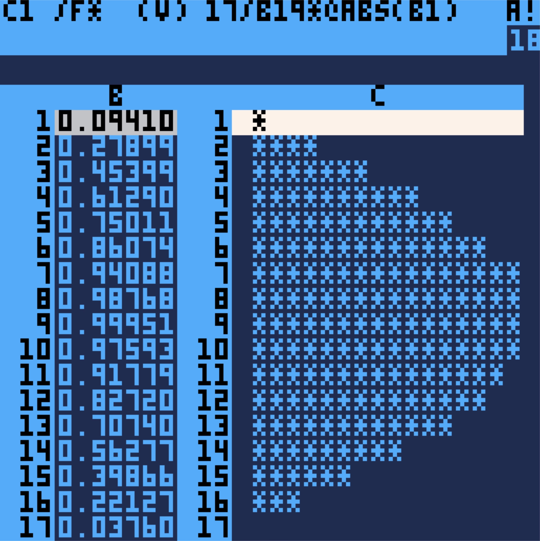
I mentioned VisiCalc not long ago and Lotus 1-2-3 just this week. Yesterday, a new issue of Stone Tools came out, nicely tying the story together.
Stone Tools is a project by Christopher Drum where he grabs old productivity apps, spools up the correct emulator, and writes a review from today’s perspective. I like the emulation part – Drum even provides specific instructions so you could do it, too – and the fact he’s actually putting the tools through their paces.
Anyway, Drum reviewed VisiCalc a few months ago, and Lotus 1-2-3 yesterday.
The reviews can probably be a bit intense if you are unfamiliar with the territory, but you will be rewarded with a lot more detail than just casual understanding of these apps. Reading about VisiCalc first and 1-2-3 second really drives home how “VisiCalc walked so 1-2-3 could run” and it’s fun to see the beginnings of spreadsheet conventions that we take for granted today, for example $ absolute addressing:
In VisiCalc I’m prompted for a “relative or fixed?” decision for every cell reference in every target cell. Replicate a formula with 5 cell references across a column of 100 cells and be ready to answer 5 x 100 prompts. Unfortunate and unavoidable.
Like always, one can find inspiration in surprising places. In the review of Lotus 1-2-3, there’s this interesting tidbit:
The more I encounter [the horizontal menu-bar], the more I wonder if we gave up on it too soon. This could be “blogger overly immersed in their subject matter” brain, but I’m growing to oftentimes prefer two-line horizontal menus over modern GUI menus. […]
It also provides something GUI menus don’t: an immediate explanation of a menu item before committing its action to the document. If a menu item is not a sub-menu, line two describes it. It’s easy to audit features in an unknown program.

I have just been pondering that maybe we moved away from status bars and question mark (Windows)/balloon (Mac) help too soon – pretty much everything these days relies on tooltips – and this slotted right into that.
Anyway. Drum seems to be having fun with the project, and I appreciate that. There are little custom visuals and jokes in every post. Also, as an example, you can download an absolutely delightful recreation of VisiCalc called PicoCalc and run it on your Mac. I have never expected a spreadsheet to be so cute:
And it’s not just most well-known tools. What astonished me in the review of Scala Multimedia in January is how absolutely gorgeous the software (which I’ve never seen before) looked:
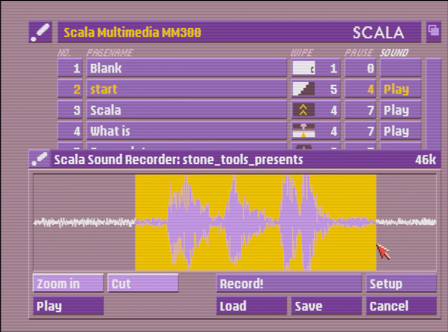
This ain’t Windows 3.1; just that palette alone is worth bringing back.
Not going to excerpt more, but there is a lot more. Check out Stone Tools and the 13 programs reviewed so far!
“Make a tiny box that fits around your F1 key.”
Friday, March 6
⌘T is a very important shortcut in Slack. It allows you to quickly talk to someone just by typing in their name. I use it probably dozens, if not hundreds of times a day.
⌘T is right next to ⌘R, which reloads Slack. Occasionally, on the way to ⌘T, my fingers graze ⌘R. Fingers being fingers, I immediately realize something went wrong and wince, and within a second or two I witness Slack completely reloading. It’s not a big deal – no data is lost, and the reload is only 5 to 10 seconds, but when you move fast, it feels like eternity.
⌘O is a very important shortcut in Finder. It opens the selected file in the correct app. I use it probably dozens, if not hundreds of times a day.
⌘O is right next to ⌘P, which prints the file I’m pointing to. Curiously, and in contrast with most apps, the print function is not gated in any way by a confirmation dialog box, or an intermediate print settings window.
So, occasionally, on the way to ⌘O, my fingers graze ⌘P. Fingers being fingers, I immediately realize something went wrong and wince, and within a few seconds, the lights in my old apartment dim for a second. Then, far away, I hear the recognizable sound of my laser printer spitting out a page.
Gamers used to deride Windows key for automatically ejecting them from the game to the desktop, before an option to disable it started appearing in gaming keyboards. (Some of the professional gaming leagues were very strict about how a player could use their keyboard.)
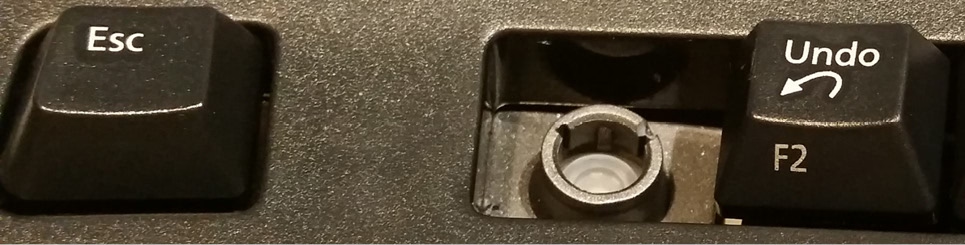
Similarly, professional Excel champions and players started physically removing keys: In Excel, F1 (right next to an often-used F2) opens the help dialog and slows you down.
I served as a judge for the ModelOff Financial Modeling Championships in NYC twice. On my first visit, I was watching contestant Martijn Reekers work in Excel. He was constantly pressing F2 and Esc with his left hand. His right hand was on the arrow keys, swiftly moving from cell to cell. F2 puts the cell in Edit mode so you can see the formula in the cell. Esc exits Edit mode and shows you the number. Martijn would press F2 and Esc at least three times every second.
But here is the funny part: What dangerous key is between F2 and Esc? F1.
If you accidentally press F1, you will have a 10-second delay while Excel loads online Help. If you are analyzing three cells a second, a 10-second delay would be a disaster. You might as well go to lunch. So, Martijn had pried the F1 key from his keyboard so he would never accidentally press it.
I enjoyed this essay that presents prying off the key as a rite of passage:
Removing the F1 key from the equation is just the beginning. By embracing the keyboard-centric approach, you have the opportunity to become an Excel Wizard!! Okay, maybe that’s not a technical term, but it perfectly captures the essence of those who navigate Excel solely using the keyboard.
And I particularly liked this tongue-in-cheek answer telling people they could construct their own homemade molly guard to protect against “fat-fingering”:
Here’s an alternative snippet that can be used:
- Use bits of plastic or cardboard to make a tiny box that fits around your F1 key.
- Affix this box with duct tape, so that the F1 key is guarded.
- Fool-proof, works on any key, and can easily be reversed if needed!
Obviously, none of this can help me with my ⌘R and ⌘P woes, so, two final thoughts:
- If your app has a well-trafficked shortcut, it’s worth thinking of the shortcuts immediately adjacent to that one. Could they cause any inadvertent damage or confusion?
- Apps and operating systems should very easily allow you to unset a keyboard shortcut, in addition to setting or changing it. (Unfortunately, this is not as common as it should be.)
“There’s something about it that can’t be objectively measured: It’s funny.”
Friday, March 6
This video from Marblr about adding fall damage to Overwatch is really intense – 45 minutes of length and a lot of footage of frantic gameplay – but really informative, too.

It’s a great case study of how something seemingly really simple – deducting health from the player as they fall from height – can be a complicated thing to figure out in all the detail.
I never played Overwatch and rarely play videogames anymore, but many of the lessons here more universal for any sort of UI and system design:
- You will have to introduce tactical inconsistencies for the system to feel consistent, but be careful as there might be a point those inconsistencies start to outweigh the whole thing.
- Wanna learn how you and others feel about something? Overcrank it to make the feelings come out more easily. (And to find bugs.)
- There will always be tensions between what the data says and how you feel about something. (I was surprised how often the word “intuitive” entered the picture.)
Also, it’s just a really well-made video, filled with little presentation and storytelling details that elevate it. I wish more videos like this existed for UI mechanics.
But maybe the most important takeway? You don’t have to choose between rigor and fun. You can have both.