

Unsung (Weekly Digest) logo

Unsung (Weekly Digest)

Archives
Log in
Subscribe
October 2, 2026

“Have conviction in what you want to share with the world.”

Welcome to this week’s digest of Unsung, a blog about software craft and quality. Here’s what was posted since last time:

View this issue in the browser with inline videos and better formatting

“I didn’t know about this shortcut until recently.”

On his fascinating and long-running Windows dev blog The Old New Thing, Raymond Chen writes about the story of scrollbar right-click menus:

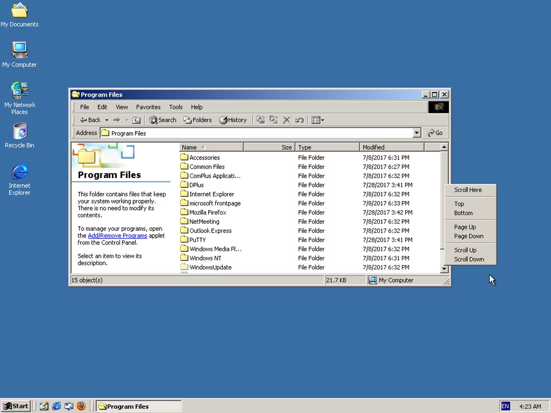
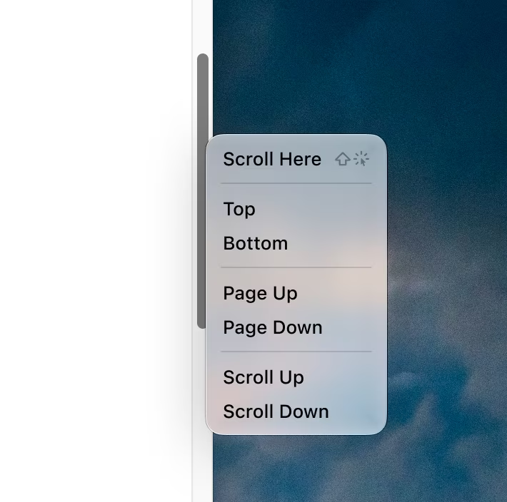
Windows 2000 added a right-click menu to the scroll bar. This menu gave you four options that matched existing mouse operations, two operations that matched existing keyboard operations, and a new operation.

The interesting new one is “Scroll Here”: You can right-click directly on the spot you want to scroll to, and then pick “Scroll Here”. This is much more convenient if you want to scroll a long distance, since you don’t have to grab the scroll bar thumb and then drag it all the way to where you want to go. You can just focus on where you want to go and not where you are coming from.

I used this context menu a lot when I needed to jump long distances. […] An even-more-hidden shortcut was added at the same time: Holding Shift while clicking on the scroll bar jumps the thumb directly to the spot where you clicked. ¶ I didn’t know about this shortcut until recently.

The menu looked like this, for what it’s worth:
(An equivalent function also exists on a Mac, except there it’s hiding under ⌥, and not ⇧.)

Chen covers a few interesting things in his post, including the challenge of new frameworks losing hard-won UI affordances of their predecessors. But what caught my attention was something else I’ve thought about occasionally: why are menus so averse to mousing shortcuts?

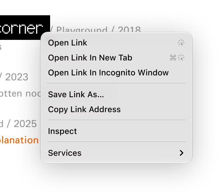
For example, you can imagine a browser link menu showing a few simple click gestures:
Or, this tapback details shortcut in the right click menu in Messages:

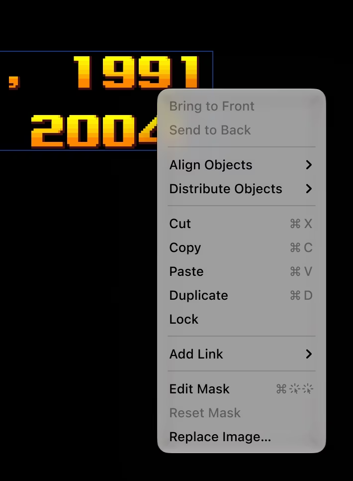
Or this for masking in Keynote when you right click an object:
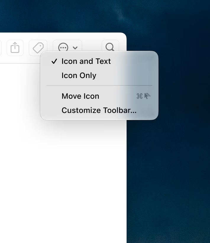
You could even imagine announcing simple gestures, like ⌥+dragging to duplicate, or ⌘+dragging for a quick modeless move:
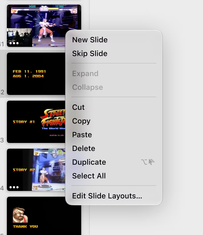
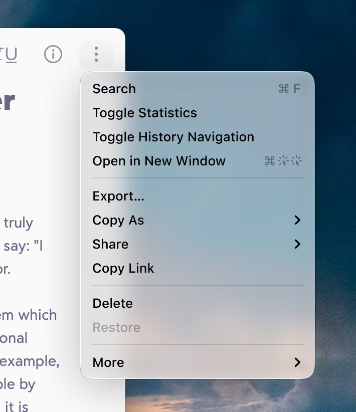
Item menus would also work, not just right click menus (and yeah, ⌥-opening is a real Finder feature!):
And you could even imagine integration with the hold-a-modifier-key interaction:
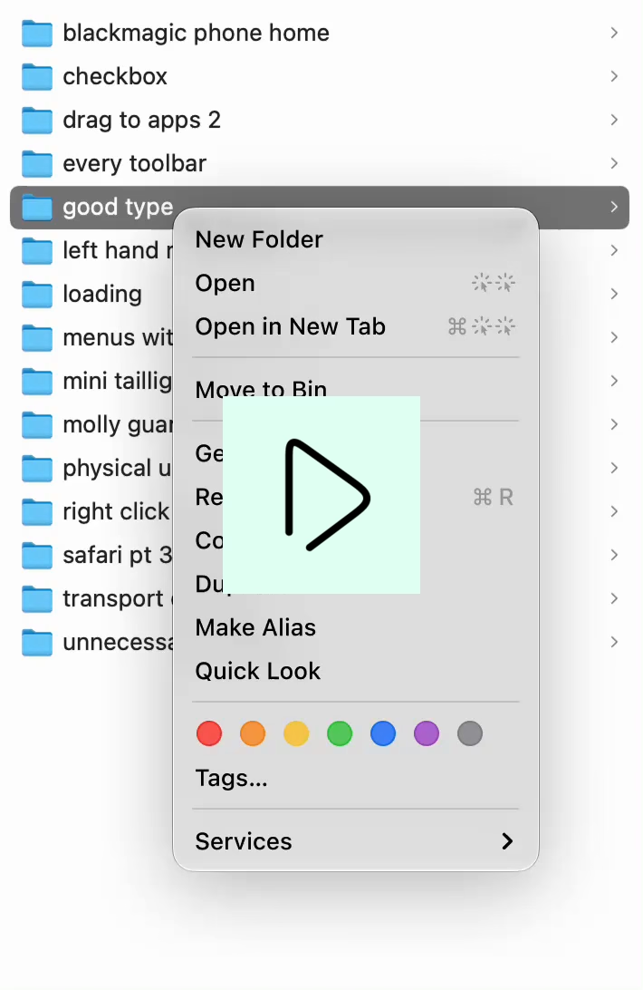
I am curious why we’ve never gone in that direction. I haven’t seen anything like this, and I can imagine some counterarguments:

  • “The symbols might be confusing.” I am not sure. Here, I used a few temporary SF Symbols that have some challenges (the double click in particular feels clunky), but I could imagine a talented icon designer taking it all for a spin, and arriving at a clean and elegant visual vocabulary.
  • “It’s too specific. It will only work for right click/​context menus.” Yeah, I see this challenge. The mouse gestures and shortcuts require the mouse cursor to be at a specific position – the noun to the menu item’s verb – which only context menus provide. When you look at one of the menu commands I invented – Move Icon – there is a lingering question: what would that command do if I selected it? But on the other hand, I also see this visual gestural vocabulary growing to be useful in other places: hint text, tooltips, documentation.
  • “Power users don’t need onboarding.”

This last one I feel passionate about, and this is where we can go back to where we started. If Chen, having written about Windows in detail for decades, didn’t know about this keyboard shortcut, what chance do we have?

I believe onboarding should be universal and ongoing. There is always a new thing to learn somewhere regardless of one’s proficiency; you don’t ascend some sort of a Mountain Of Poweruserness, get a certificate, and proclaim your learning complete. Plus, proficiency is usually localized: no one is fully an expert in every aspect of even one app, let alone all of them. If Chen were to see something like this back in the day, it could have helped him – and I imagine others, too:
I’m curious if you have seen any app attempting anything like it. If you did, please reach out.

Friday, Sep 25 / #keyboard / #menus / #mouse / #onboarding


“But it looks like a lot less work than we had to do.”

I wrote recently, about macOS, “it’s hard when the operating system cedes its responsibilities to provide good design patterns,” and Mac developer Brent Simmons in a recent essay shares a parallel line of thinking about how unreliable and untenable designing with the basic macOS UI components has become:

But there’s another reason: the stock Mac UI is designed by Apple, the best designers in the world, and do you really think you can do better? Really?

The app world is full of people who think they’re better and they’re really, really, really not.

Well, I still think Apple has the best collection of UI designers in the world, but, for whatever reasons, the guidance from above on how the Mac UI should look is missing the mark. I’m not blaming the people doing the work — they’re doing great work with the direction they’re given.

So this — bad direction — is where the secret third reason falls down. And we’re left with no real reason to stick with stock Mac UI (except for wanting approval from longtime Mac people like me, and you really shouldn’t care about that at all).

In addition to low interface quality and sometimes flimsy guidance, Simmons also adds how much effort it is just to keep up with default macOS interface, which feels like the opposite of its social contract:

The idea was that by using stock Mac UI you the developer would be carried along — you’d get most of the macOS changes every year mostly for free or with not that much work, since you’d kept up every year.

But my app NetNewsWire has a very stock Mac UI, and Liquid Glass adoption last year was a lot of work. Using stock Mac UI didn’t save us much — in fact, we had more work to do compared to the apps with more custom UI.

We talked about this before in the context of all those menu icons that were mandatory… for just one version. Imagine sinking time and resources to create the icons one year, only to learn 12 months later that this was just a head fake, and one without – as far as I know – even a hint of an apology from Apple.

Saturday, Sep 26 / #apple / #mac os

“First, don’t interfere with user input.”

In response to a previous post, one of the readers wrote this:

I would phrase this as the fault of the animation having violated the Hippocratic oath for animations, which is “first, do no harm” a.k.a. “first, don’t interfere with user input”.

Yes, one has to be afraid of hyperbole – was there ever an onscreen transition that saved a life? – but there is something I really liked about this phrasing. After all, most transitions and animations are decorators, and every transition and animation is, by definition, also a delay.

Here’s Shazam as I open it, and overlaid are my frantic taps as I’m trying to make it start the song recognition process:

It’s a cute cold start animation, but:

  • It’s not interruptible, like animations should be.
  • It doesn’t even buffer the taps, so – in case the animation covers for something truly uninterruptible, like loading from the cloud – I can’t simply tap and forget, but instead have to wait and tap after it’s done animating.

What’s particularly frustrating here is how Shazam is being used. On the other end of this whole flow is a song that might already be fading out – timing myself, a user, can’t control – so time wasted on the uninterruptible animation might be seconds separating failure from success.

I know it does feel like a blink of an eye when watched out of context, and it is literally just a bit over a second of a delay in the best case scenario, but I wanted to share it as a general example. I believe these seconds add up, especially in a stressful moment, on an older device, repeated many times a day, across different apps… or all of the above. (My go-to example: Imagine your keyboard keys reacting with a second of delay!)

At least, I should compliment Shazam for not making another mistake: after the recognition starts, tapping the same button doesn’t cancel it – instead, you have to tap a close box in the corner. Here, the designers realized I might actually be slamming the big button many times over, and I shouldn’t be punished for it even more.

Saturday, Sep 26 / #flow / #motion design

“I’m especially proud of the 1e+9 duration.”

I liked this post by Roel Nieskens, about

ten lines of code that, one way or another, mean something to me. Either because I wrote them, or I extensively copied them, or they made me laugh. Or cry.

It’s perhaps a different take on cursed knowledge, and made me wonder what those would be for me, or for other people with different specializations. (We previously talked about Duff’s device, which had a certain impact on me – even though I never used it myself.)

Saturday, Sep 26 / #coding

A loading state within a loading state

1.

One of the classic parables about loading goes as follows.

A building manager had a problem: people were complaining about the elevator being too slow. But upgrading the elevator was an enormous expense, so the manager came with an alternative solution: they put a mirror next to the elevator call buttons. Even though the elevator didn’t become any faster, complaints trickled to a halt, as people were checking themselves out in the mirror and that changed their perception of how long the wait really was.

2.

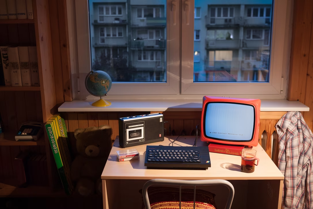
In the late 1970s and early 1980s, it wasn’t uncommon to equip early home computers with audio tape players, using the same cassettes designed to record and play music. Software was encoded as sound. A lot of redundancy was needed to account for many low quality cassettes and misaligned playheads, so loading times were really long. There were other disadvantages – no random access but definitely random errors, tapes wearing out and being “eaten” by the player – but tapes were so much cheaper than floppy disks or cartridges that they endured.

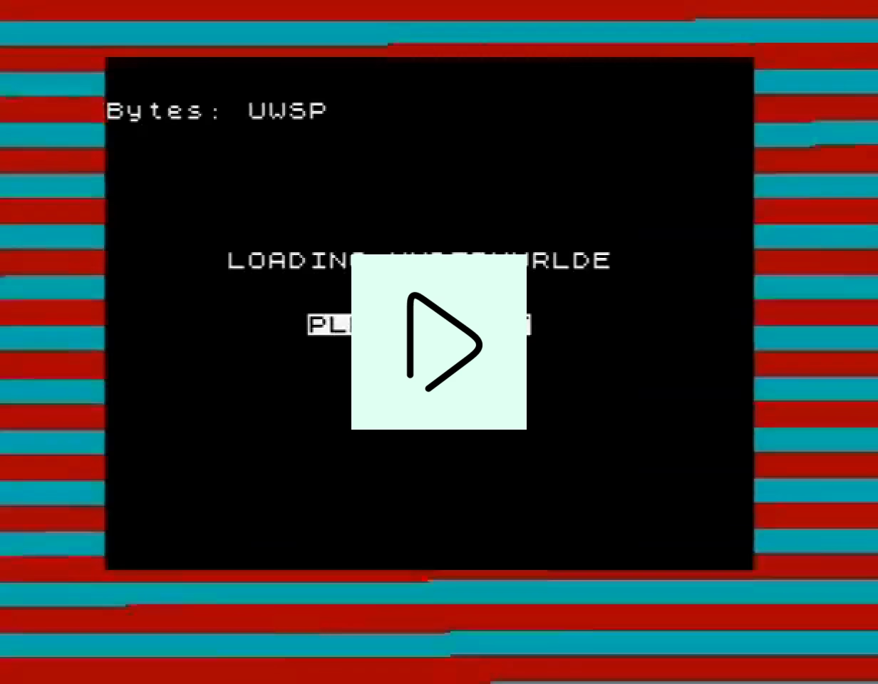
On one of the computers, the British ZX Spectrum from 1982, an interesting convention emerged. As the game was arriving from the cassette, what was loaded before the code itself was its “title card.” The loading process of just this one image took about 35 seconds, and watching the graphic emerge was mesmerizing, almost like deciphering a puzzle – especially when, only toward the end, the color attributes appeared and the whole thing clicked into place:

Some of these were beautifully done (here’s a gallery of… all of them?), created by talented artists working in a very unforgiving medium, a pleasure to watch materialize on the screen…

…or, at least, it felt so for the first few encounters. Upon loading the game for the nth time, you grew more and more aware of the fact that you are spending precious time waiting to load a screen you’ve already seen. This was different than the first example; the mirror existing never slowed down the elevator.

Sure, it was just 35 seconds out of a 5–20 minute load time – I told you cassettes were slow! – but still. Some people loved them, others built truncated versions that skipped the title screen altogether (as much as you could imagine just fast forwarding through it like you would through a song, it didn’t work that way).
3.

Figma is a web design app, and its editor arrives in a big, everchanging blob of JavaScript, in addition to having to load and decode the contents of the file itself. This isn’t 5–20 minutes, but it’s long enough that it necessitated a loading screen of the heavy variety: one with a progress bar.

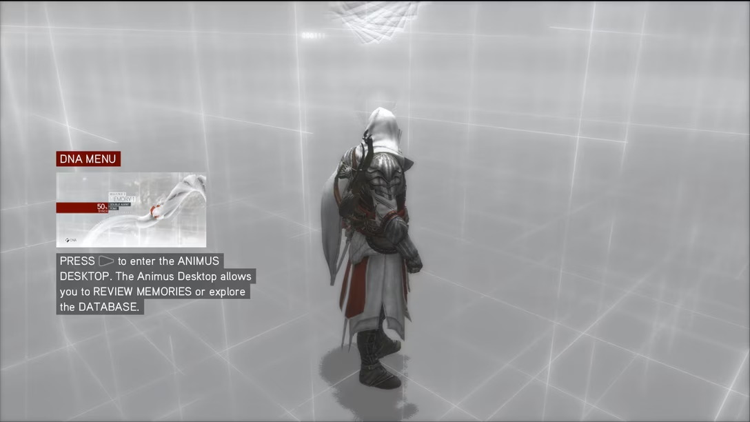
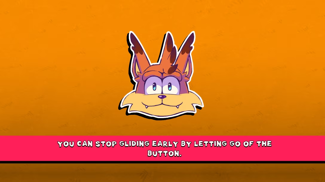
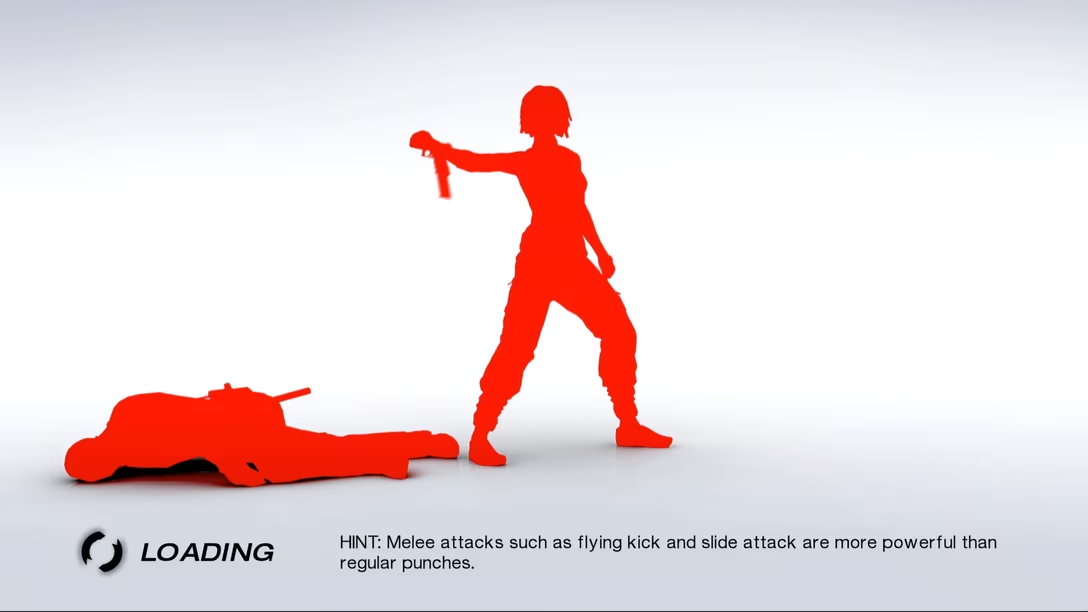
During my time at Figma, an idea would reappear with surprising regularity: what if we put a little hint next to the loading bar? Something that could teach you about a useful keyboard shortcut, or a trick? You’ve seen that before, often in games:

It seemed like a thoughtful gesture for the user, a mirror of the elevator mirror idea. But I fought it, tooth and nail, for one very specific reason: this would remove pressure to make this screen fast.

Had we given the screen another purpose, subconsciously or not, we might start caring less about improving it – as a matter of fact, you could make an argument to introduce artificial minimum loading time just so that the user could finish reading the tip!

4.

I had a similar feeling when, in 2018, Gmail replaced its simple progress bar loading state with this:

It was huge, corporate, intense. It felt like an admission of defeat: our app is slow, and I guess we’re surrendering ourselves to it.

But recently, I’ve noticed not just that Gmail’s loading state has been simplified, but also that it doesn’t appear nearly as often:

I don’t know the technical details: is it caching? a more intense refactor? Either way, as much as I absolutely dislike what Gmail has become – there might be no more harrowing place in the web app world than Gmail’s settings, for example – kudos to the team for making it better. Gmail seems to be loading a lot faster now.

(There is one small exception: it would appear that the loading state image itself doesn’t have a proper loading state – a rather strange omission.)

5.

There is, I believe, a more universal lesson in here.

Loading is a complex space, where sometimes the most natural solution is a bad one, sometimes making things faster is making things slower, and sometimes new thoughtful design for whatever delay there is can be a better use of engineering effort than focusing on shaving off more milliseconds. (It’s both speed and the perception of speed that matter.)

Also, this is exactly what Y2K was: We remember and react to loading states that are elaborate, cute, memorable – but we never see or link to loading states avoided.

And while you see occasional stories told by engineers making things faster, you don’t often hear accounts of people within companies, somewhere at the intersection of design and engineering, who work hard designing thoughtful loading states, avoiding loading state bloat, or figuring out some clever hybrid approach.

But, to be fair, there is also no parable of a building manager who just forked over some cash and installed a better elevator.

Sunday, Sep 27 / #history / #loading states

Arc’s good keyboard shortcuts

As someone who’s been a keyboard shortcut tzar at a few companies, I developed a certain kinship with the unknown and unnamed others who have the same job elsewhere. It’s a fun but weird challenge, rewarding and unrewarding at the same time, a job of maneuvering a little dinghy between the winds of Motor Memory, the waves of Change Management, and the storms of Shortcut Conventions That Came Before You. It’s a job where you quickly learn you can never really win – but at least you can try not to lose very badly.
One day I’ll write about some of the proudest and darkest moments in my own keyboard shortcut design history, but today let me instead do a short “game recognize game” post. This one is about Arc, a browser that had at least three shortcuts I found myself nodding vigorously at.

In Arc, ⌘S no longer does save, but instead invokes show/​hide sidebar. As far as I can tell, no common shortcut for hiding and showing a sidebar emerged over the last decades, and ⌘S feels like a mnemonically clever takeover of a traditional save shortcut (which in the context of the web doesn’t make sense), and at the same time doesn’t conflict with a lot of web apps, which generally shy away from using it.
Save still does exist, but it has been moved to ⌘⇧S. This historically has been Save As and that also makes sense to me, as you can’t really save a website, just its copy of sorts!

Lastly, Arc’s internal screenshotting function is ⌘⇧2, right next door to the standard ⌘⇧3. Nice.

Monday, Sep 28 / #keyboard

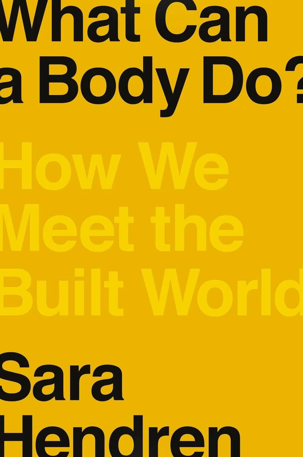
Book review: What Can A Body Do?

★★★★☆

A new confession: I struggle with a lot of accessibility writing.

I am not necessarily saying this to blame people writing in this space, whose work I respect even if it’s not resonating with me. I think it’s more of a recognition of how difficult it is to talk about accessibility and disability. Advocacy is never easy. It’s hard not to be impatient with the pace of progress, hard to contain your incredulity that others don’t get that what is so obvious to you, hard not to constantly expect more from people, hard to imagine others – and the society as a whole – not caring. On top of that, accessibility is a more difficult subject than many I cover regularly on this blog. There are hard-to-explain technical issues wrapped in deep legal considerations, and some aspects of disability are taboo or taboo-adjacent. To me, all this often makes even best-intentioned accessibility writing less approachable.

I am also, personally, to blame. I sometimes struggle with design writing, too. Some of the taboos and hangups live inside me. I might be obstinate when corrected. I have also personally seen a few times the opposite of the curb-cut effect: not fully thought through accessibility accomodations making software worse for some groups of people. All of this is making me a tricky customer.

I’ve been wanting to find accessibility writing that would work for me, with just the right amount of push and pull: detailed but not overwhelming, inspiring but not cheesy, gentle but not basic, pleasant without being cheap.

This book by Sara Hendren is as close as I’ve ever been to all this. It’s exceedingly well-written, to a point that it’s really hard not to quote it excessively. Witness the very opening:

Every day every body is at odds with the built environment. Bodies come up against stairs and sinks and subway platforms, sometimes with ease and grace and sometimes blundering and awkward, over hurdles, even in a sudden clash. Each flesh envelope is miraculous and mundane in its way, lugging all its gear and getting where it needs to go. Maybe you handle a sharp knife with enjoyment of its grip; maybe you wince as you sit down in or get up from your office chair.

Or, just a few pages in:

But consider: this dual job that design has to do is a mammoth task! How do you make a charismatic thing – not just a thing that works, but a thing that has elegant presence or pleasure in its handling, some kind of draw, a thing that pulls you in or makes you think while also being handy, modest, even garden-variety in its value? This combination is what makes design so interesting to so many people. It’s not just the quest for a better mousetrap, and it’s not just a free-form experiment, and it’s not just a slick new color scheme. […]

When Hendren early on decides to focus on the right words and the best definitions – a theme permeating the entire book, important in an area of sensitivity around language – it has none of the awkwardness of a wedding toast’s “the dictionary defines X as…” but is instead a lucid exploration of the power and beauty of language, piercing right through some of the taboos I mentioned:

Among disabled people there’s a bigger catch-all term, a slang for this particular mismatch: it’s called life on “crip time.” Crip is short for cripple, a name that disabled people have repurposed in an act of political reincarnation, dropping the degradation attached to a word that was used to describe them in the past, cripple, and investing it with in-group pride. “Crip time” is flexible shorthand in disability culture, used to indicate a range of uneasy relationships to the pace of contemporary industrialized life, with its relentless and clock-driven organization of hours and days. As a disabled person, to say you’re “on crip time” on a Tuesday might signal the extra time that it takes you to get to the train platform or in and out of a public bathroom. It can also stand for bigger systemic fits and starts – the spiky, unpredictable time it might take a person to proceed through a fairly rigid K-12 education that’s built on all kinds of normative chronologies.

This whole book is this – it’s accessibility and disability as details, as creativity, as confidence, as joy, as warmth, and as craft. The writing has so much range and color, covering some of the aspects I expected, but also talking about autism, dementia, phobias, and general intellectual disability (who knew? your brain is your body, too). Hendren dips into history as needed – the origins of the usually simplistically portrayed curb-cuts is fascinating – but the book is anchored in the present.

There isn’t a lot of software in the book, and the other reason I’m giving it only four stars is that I wanted… more photos. I’m a single-issue voter this way, always dreaming of visual evidence of devices, people, and places. But don’t let this stop you. This book will help you understand accessibility and disability – and if you already do, it might help find good ways to talk about it. You should read it.

Thank you to Ethan Marcotte for suggesting the book and a conversation about it, and to everyone who answered my question about good accessibility writing – check out the answers on Mastodon or Bluesky if you are interested in more recommendations!

Tuesday, Sep 29 / #book / #book review

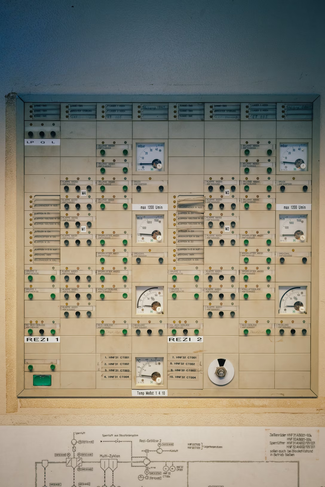
Before pixels: Modular industrial dashboards

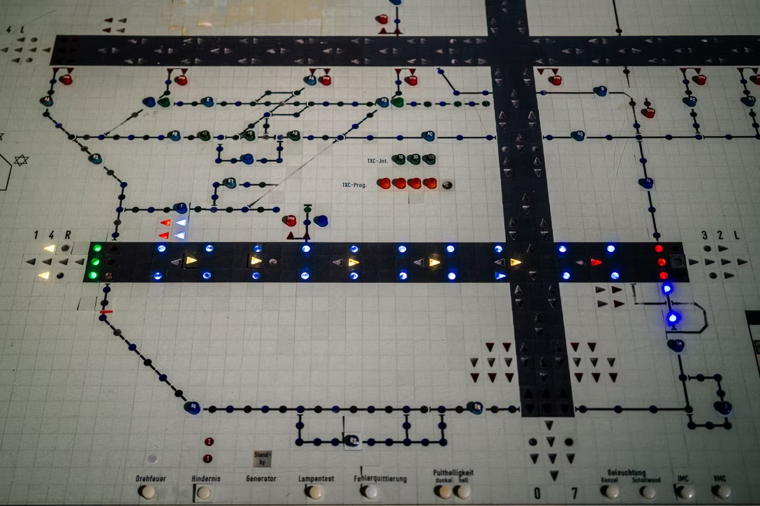
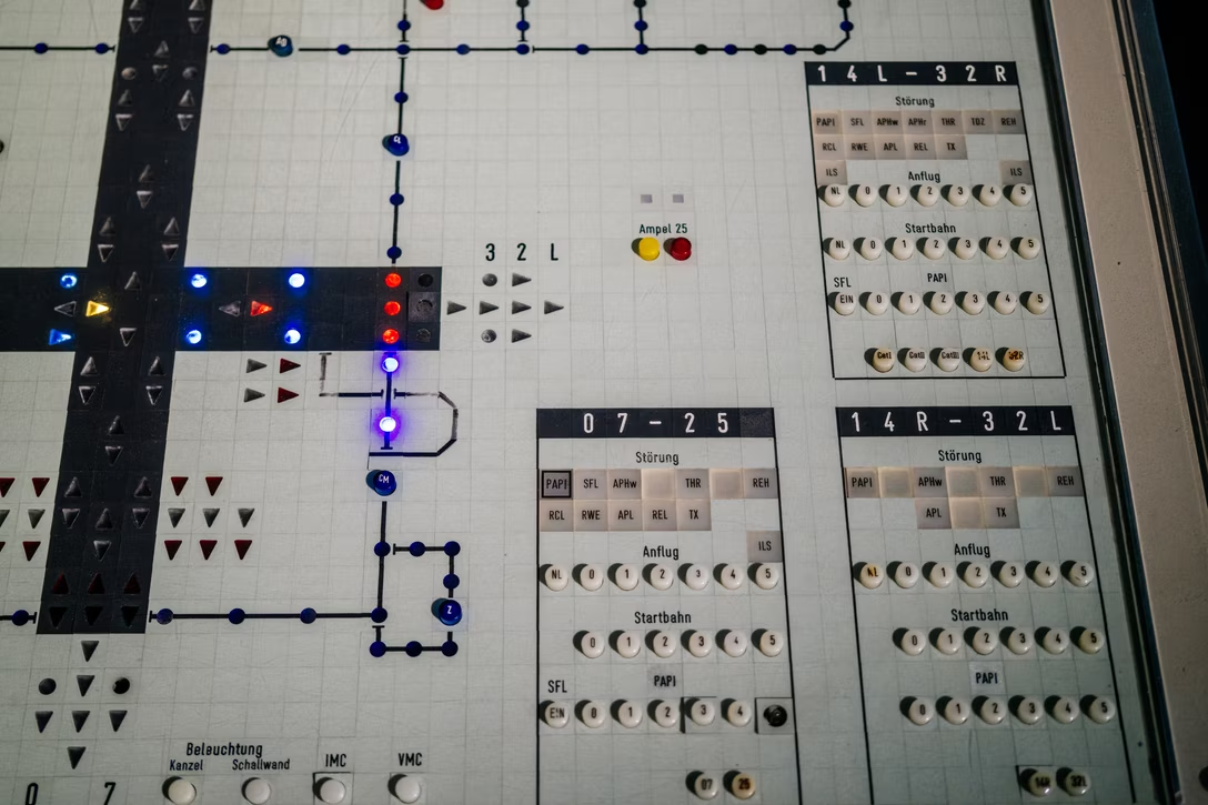
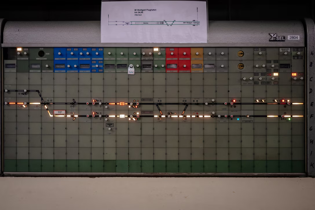
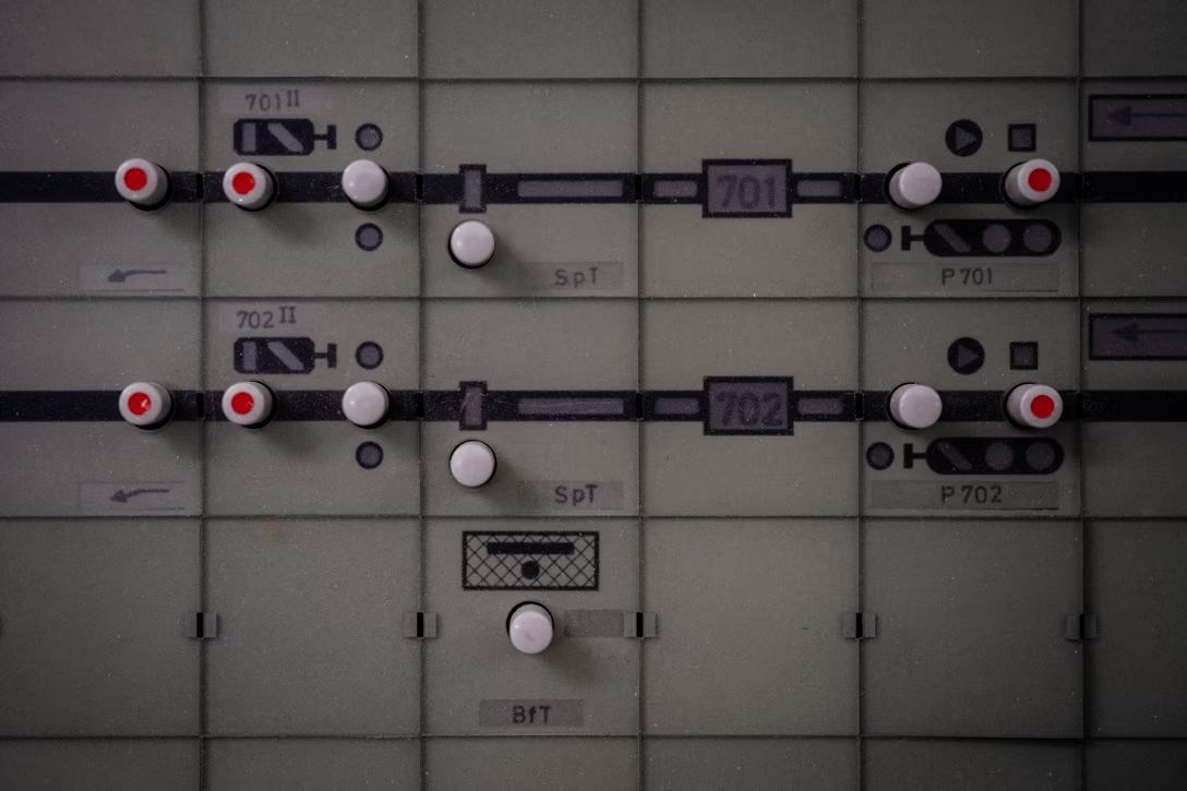
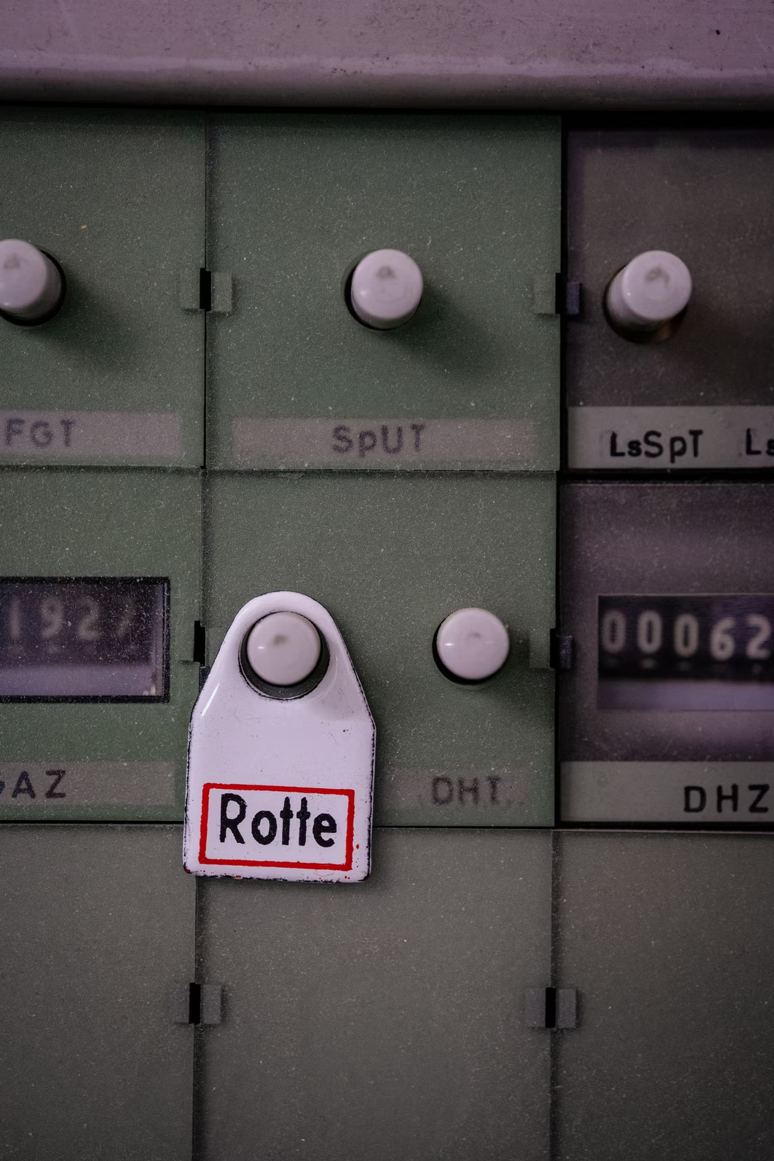
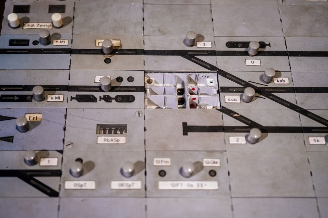
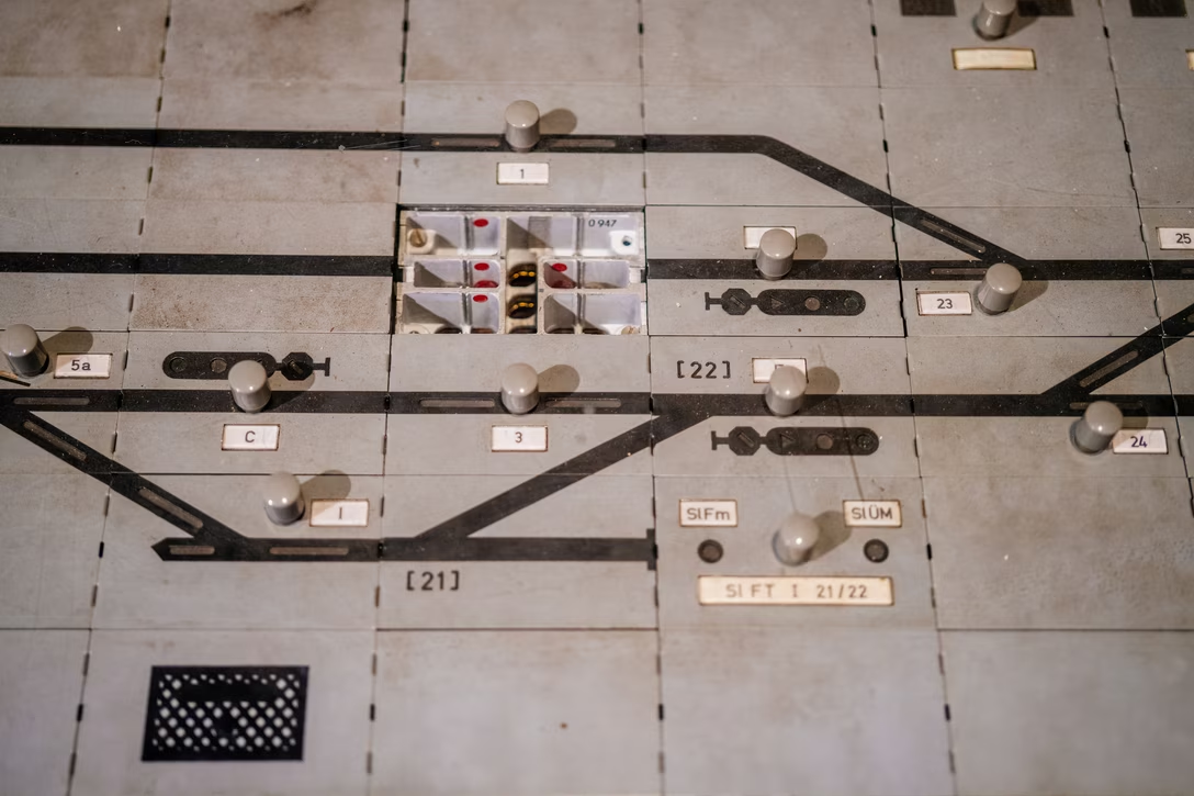
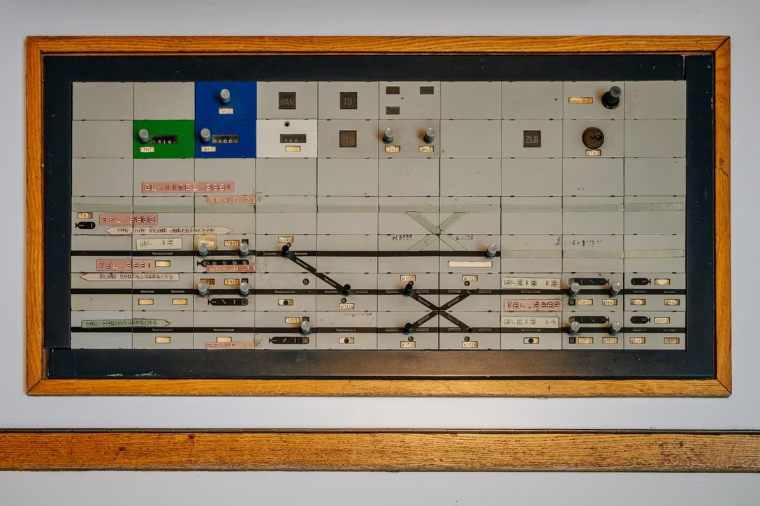
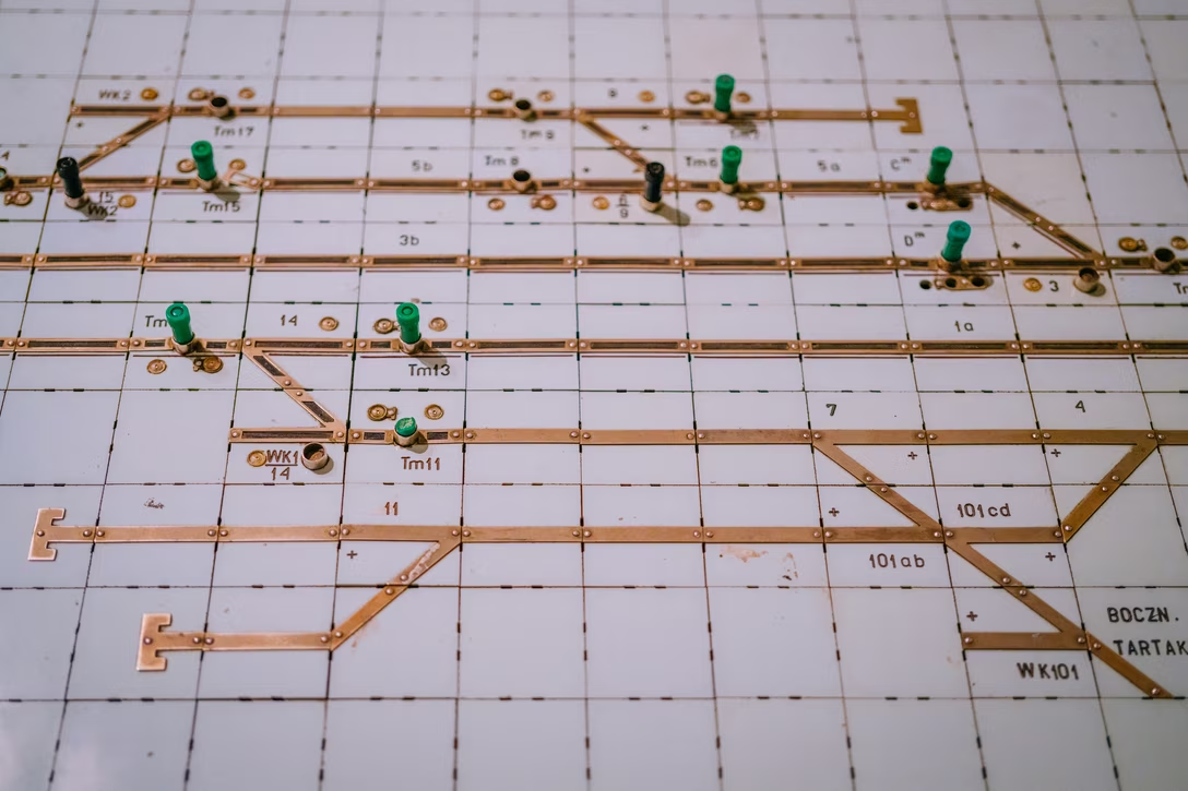
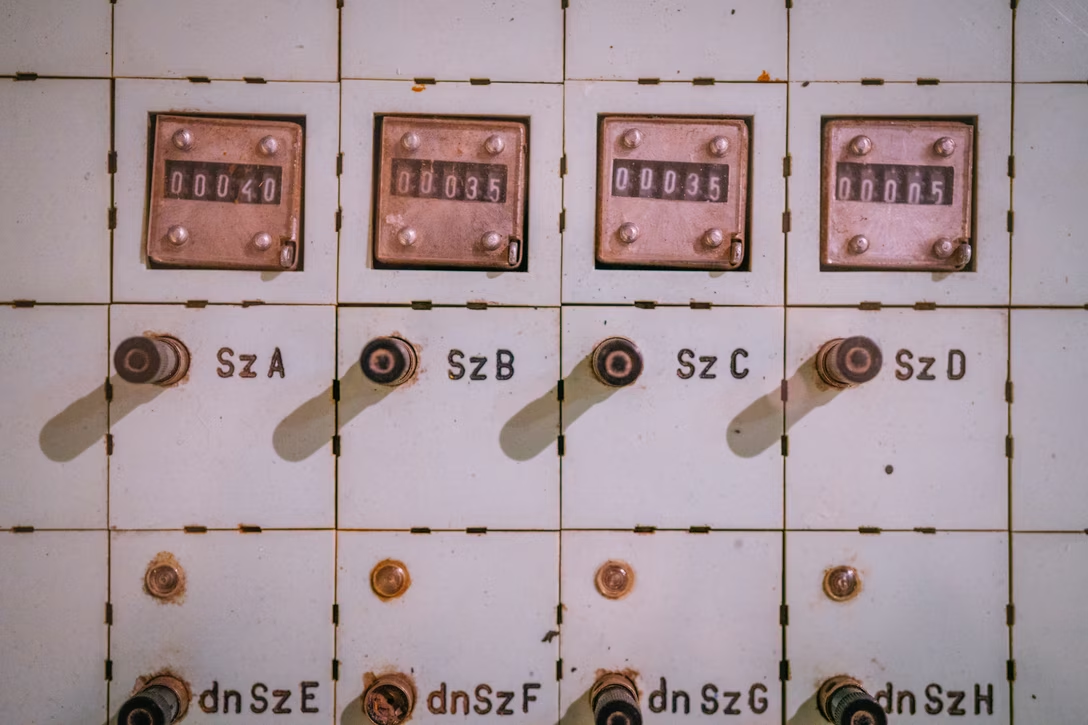
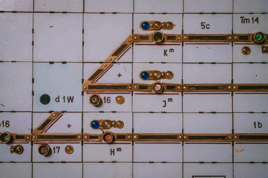
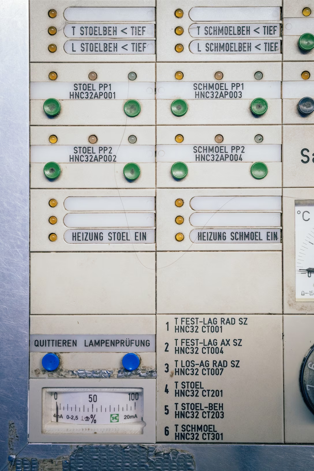
In my recent visits to German and Polish museums, I noticed a recurring theme: modular industrial dashboards, which I imagine have by now been all replaced by software.

I don’t know much about these – please write me if you do – but I wanted to share them anyway, perhaps for context, or amusement, or inspiration. They’re interesting design systems, and interesting interaction systems as well.

This was a very cool physical display for air traffic control, at the The Deutsches Museum in Münich:

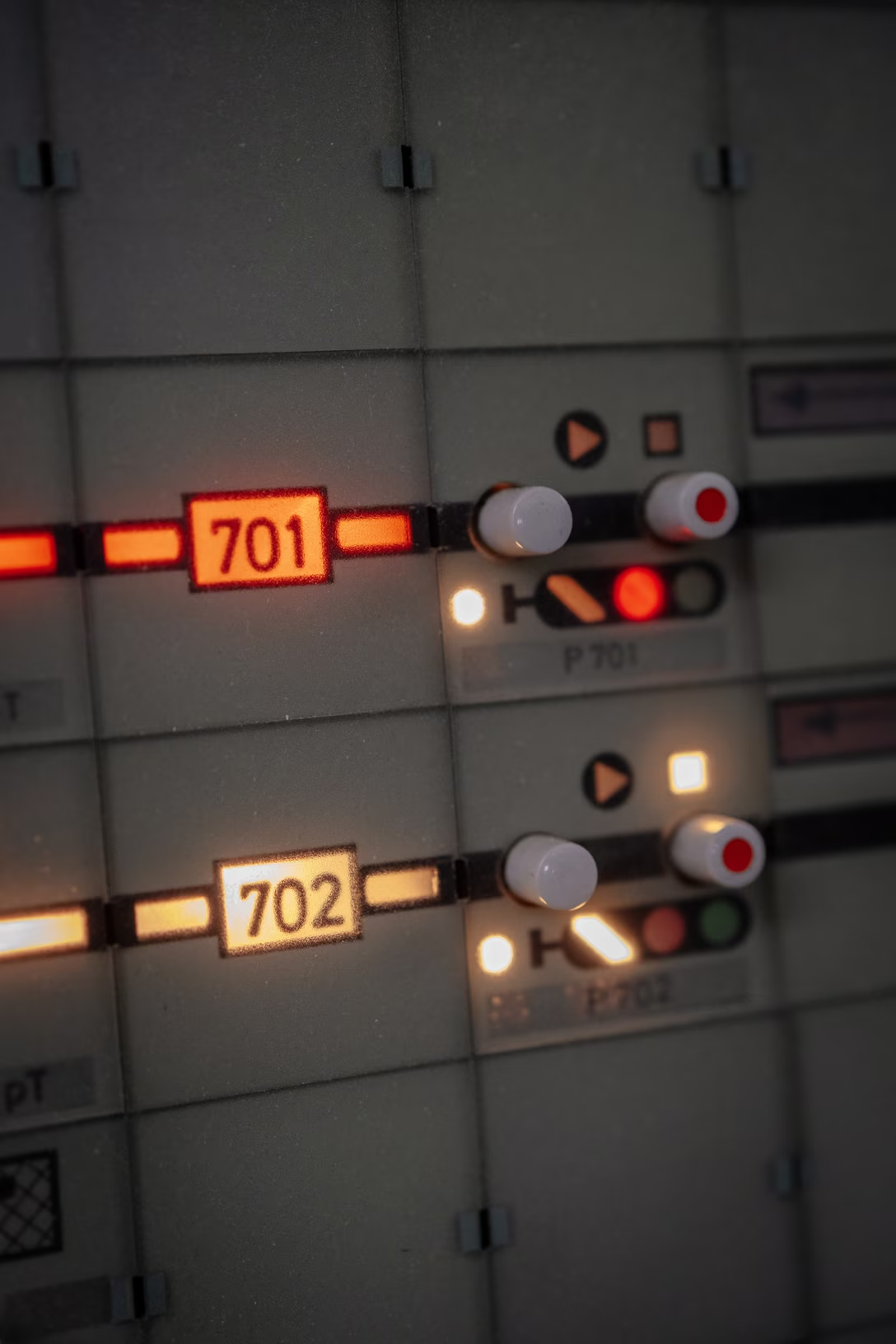
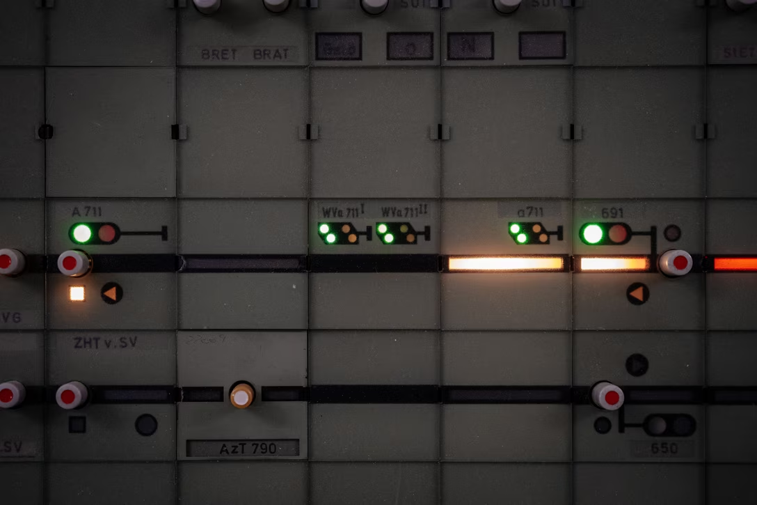
At Fernmeldemuseum Stuttgart, these were used to monitor subway trains, or light rail. I do imagine these panels must have been interactive with all the buttons?

I like that they light up to show status:

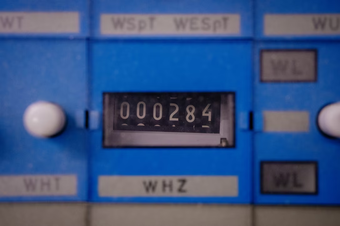
One of the modules was a counter:

And I believe this was a way to annotate that something was… fixed, maybe? Or on its way to being fixed?

A railway museum in Nuremberg used what looks like the exact same system, and I spotted a few modules with their plates removed:

And, here’s a similar panel shown in a tram museum in Stuttgart, filled with an incredible typographical tension between DIN and the German equivalent of Dymo:

Warsaw’s train museum had a slightly different system, but similar in look and feel:

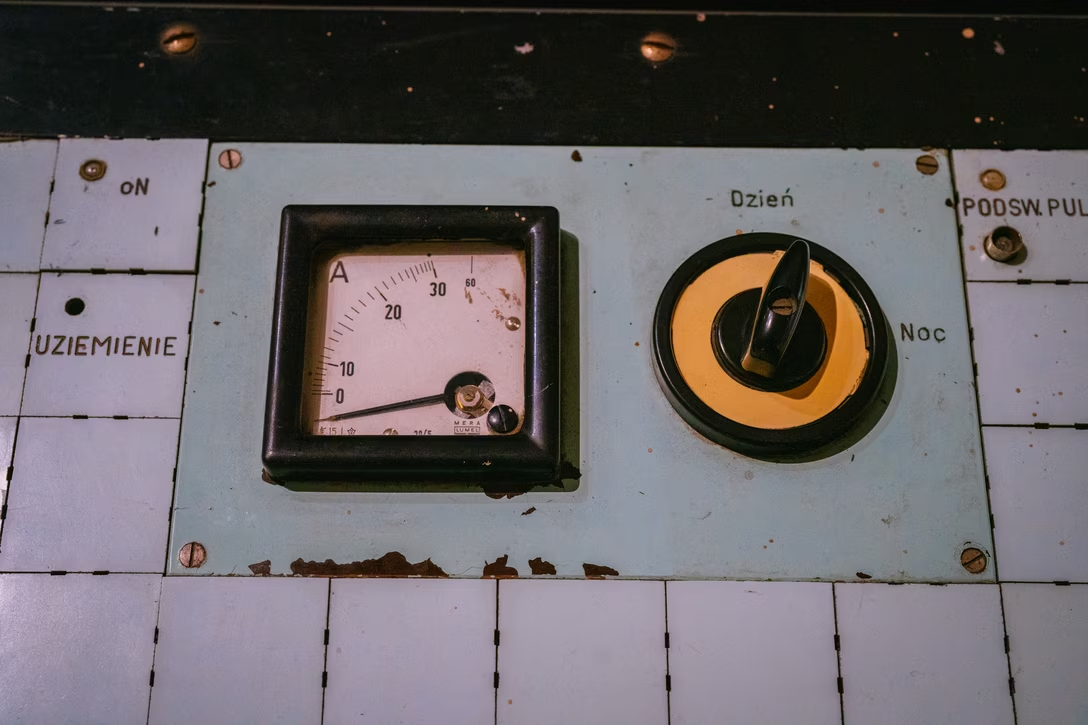
This big industrial switch toggled between day and night. I don’t know if it changed the operation of the system, or is just switched on some sort of a dark mode for the panel itself:

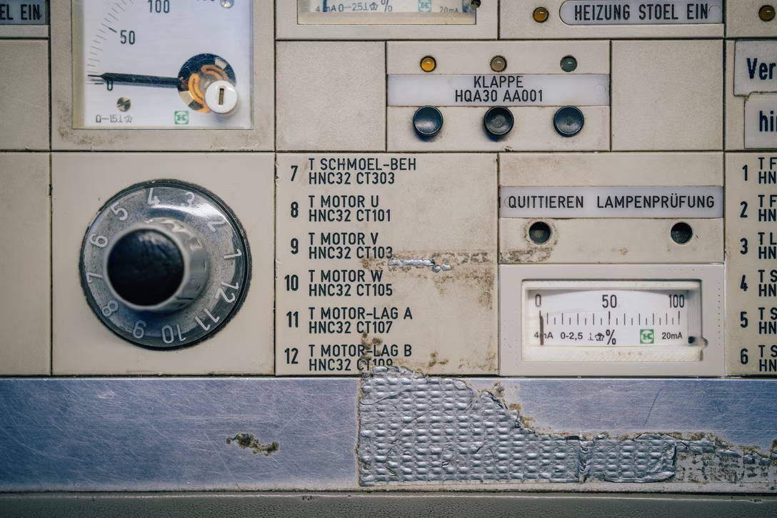
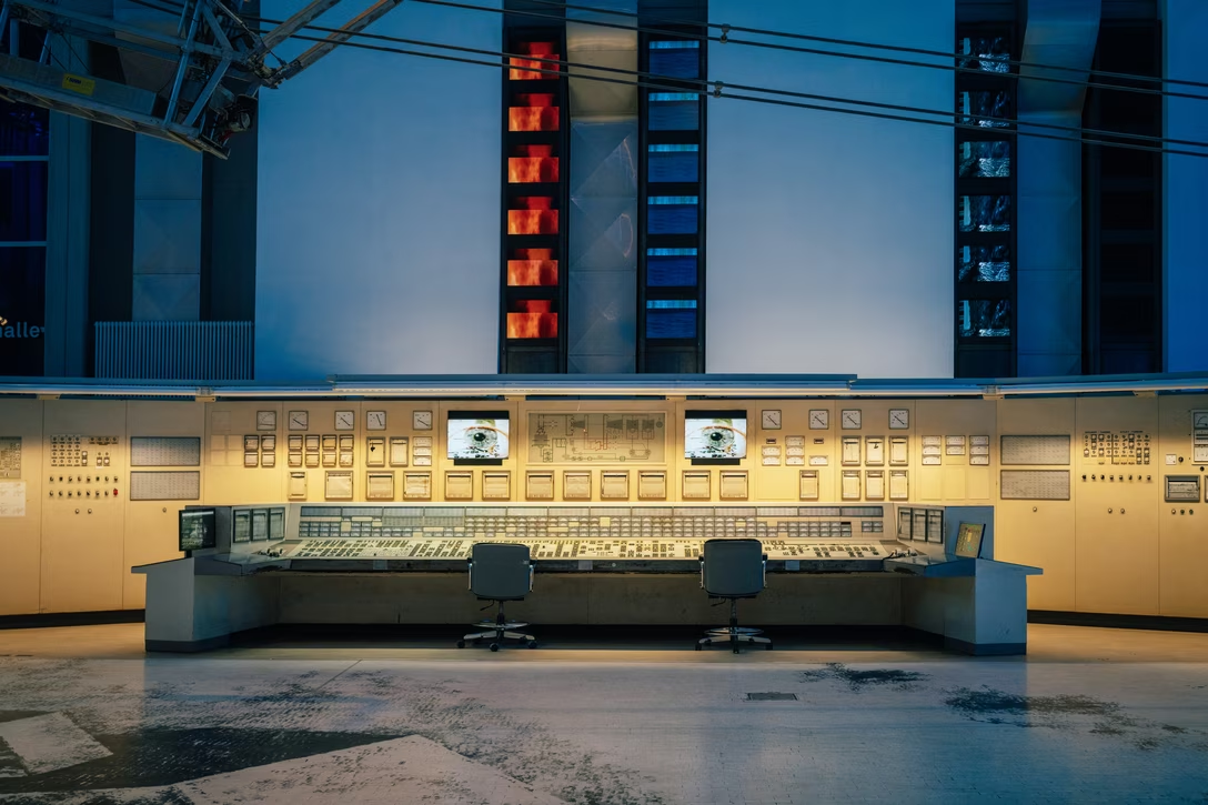
And this was at the DASA Museum in Dortmund, from a power plant control room:

This was by far the biggest one of the ones I’ve encountered…

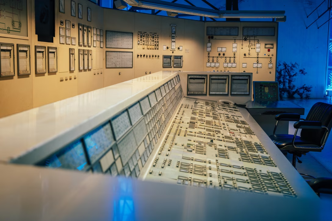
…with the biggest variety of modules…

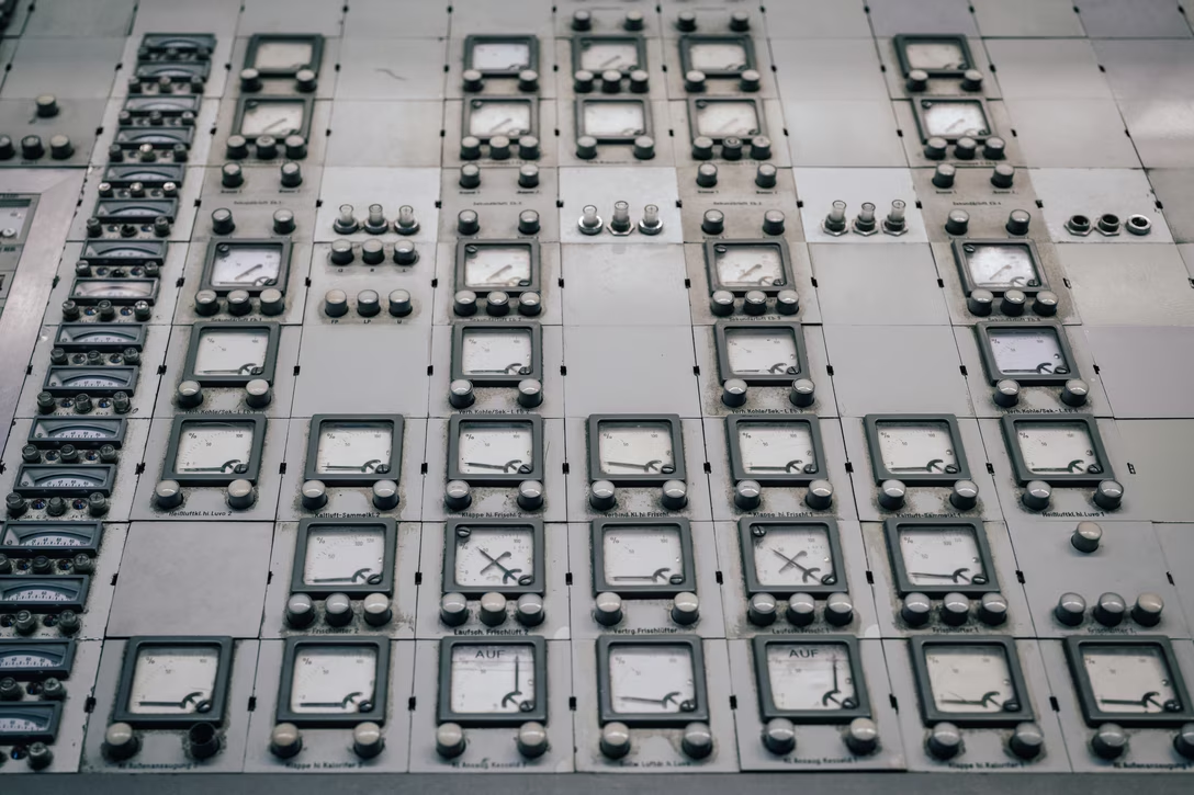
This was also the panel I showed some molly guards from before. But today I want to end at this great switch:

Don’t you just want to rotate it, no matter what it does?

Wednesday, Sep 30 / #before pixels / #dark mode / #popular / #real world / #system design

A hacker’s guide to bending the universe

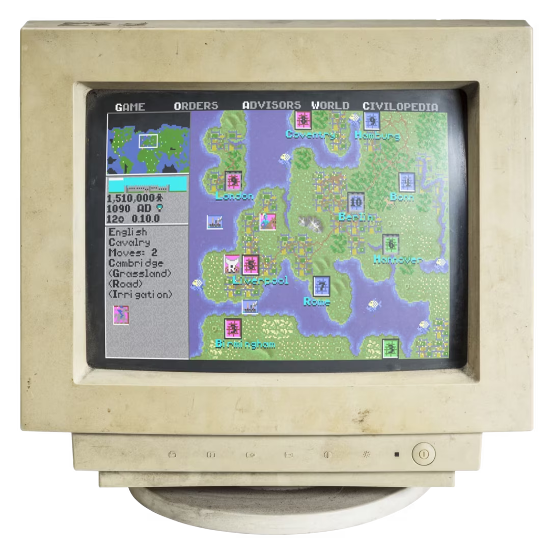
Continuing the theme of software fixes for hardware problems, here’s an essay I wrote in 2016 about a broken computer display that I “fixed” as a teenager, just because I wanted to play Civilization.

It remains one of my favourite things I’ve ever written.

Wednesday, Sep 30 / #hacks / #marcin wichary

The left hand should know what the right hand is doing

1.

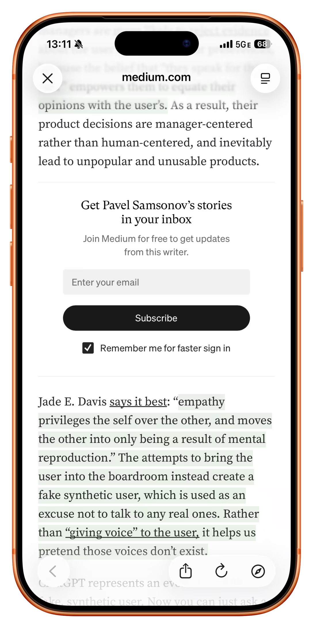
One day, as I was reading an essay on Medium, I saw an automatically inserted subscribe block:

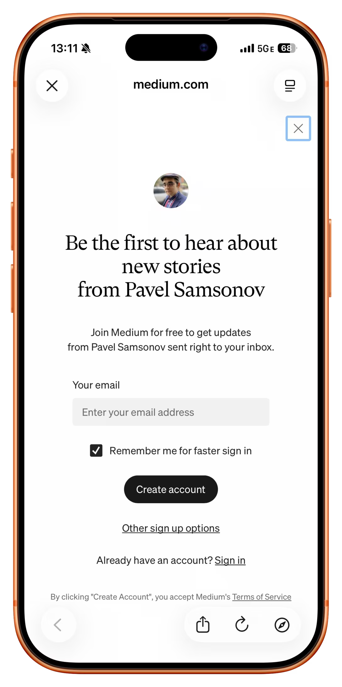
But as I was exactly on top of it, a new thing popped in my view, an interruption on top of interruption, both saying the exact same thing:

2.

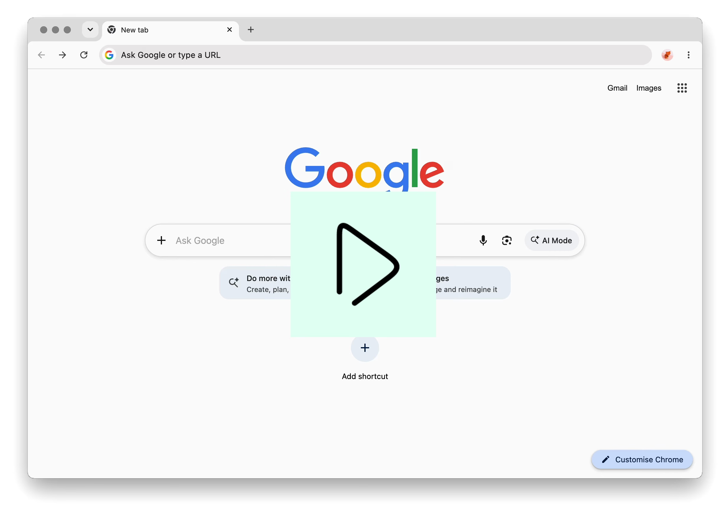
For a while now, whenever I try to follow a link to a site that no longer exists, Chrome shows a strange “This site doesn’t support a secure connection” flyout, just before hiding it itself, and then following it by a generic error page:

This feels truly eerie: either a bug where the flyout gets triggered too soon without having all the information, or the flyout is trying to warn you about Chrome’s very own internal page.

3.

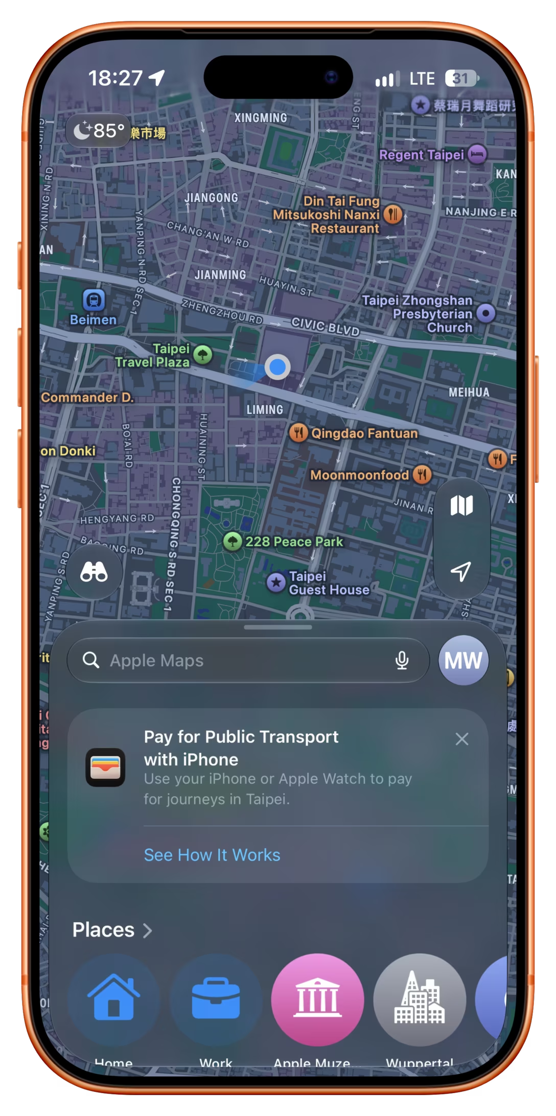
Just this week, after already having been in Taiwan for five days, and after having used Apple Pay to pay for public many times on each of these days, Apple Maps helpfully told me that I can… use Apple Pay to pay for public transit:

4.

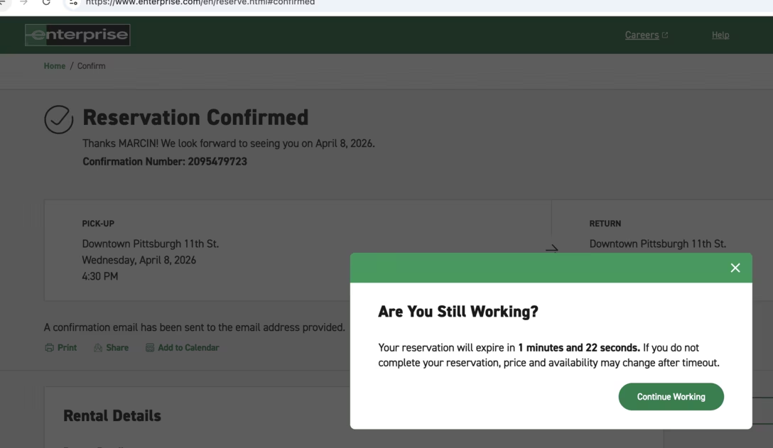
Some months ago, after finalizing my car reservation and moving my attention elsewhere, an automatic “keep the session warm or lose it” window appeared, suggesting my reservation might actually “expire”:

5.

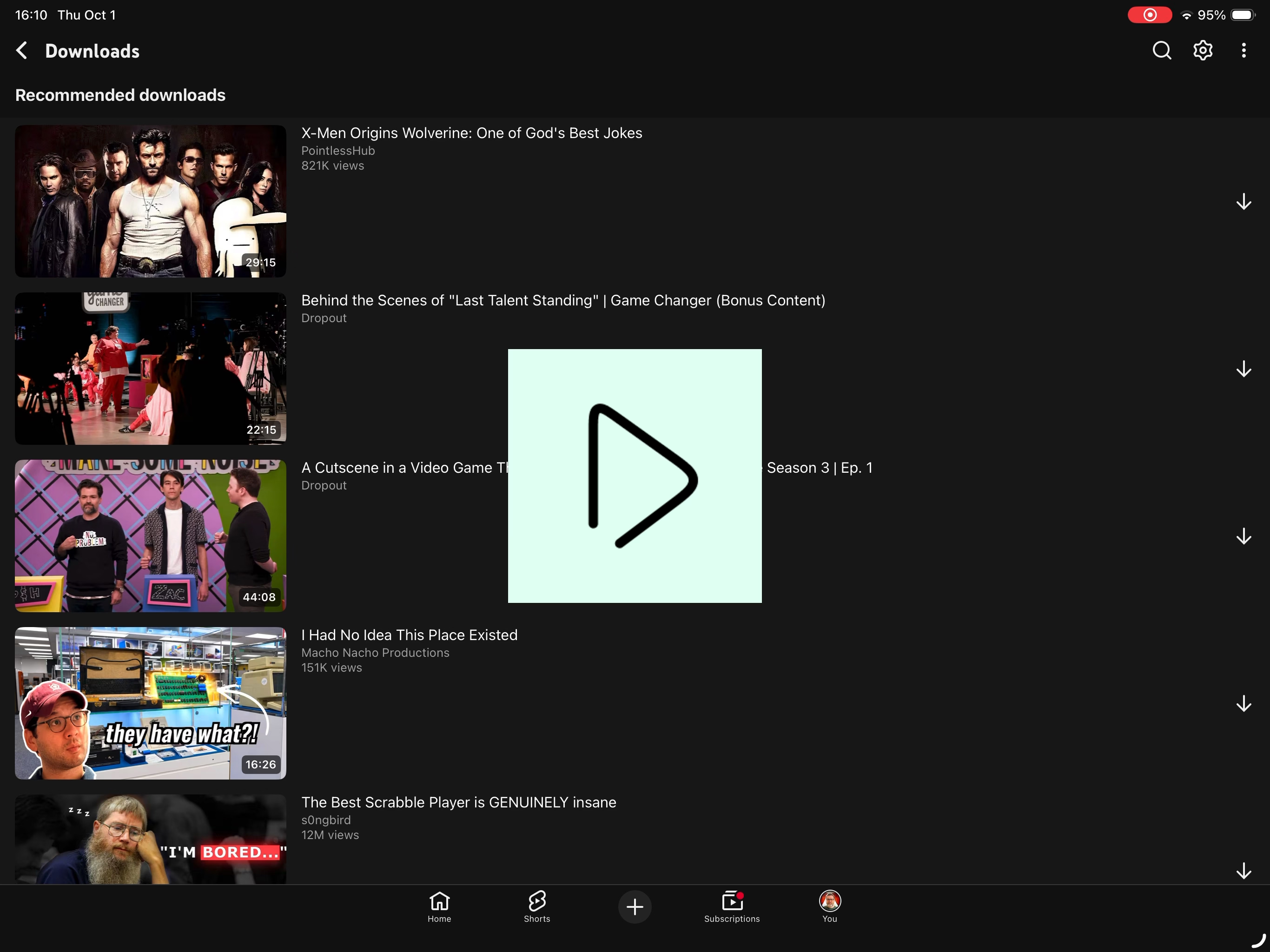
Downloading is possible on YouTube Premium and actually helpful, allowing you to load up some videos ahead of a long flight. There even exists a section where it suggests some things to download.

However, download suggestions include member-only videos, and whenever you try to grab one of those, you get this result – a pretty poor “Video wasn’t downloaded” message:

6.

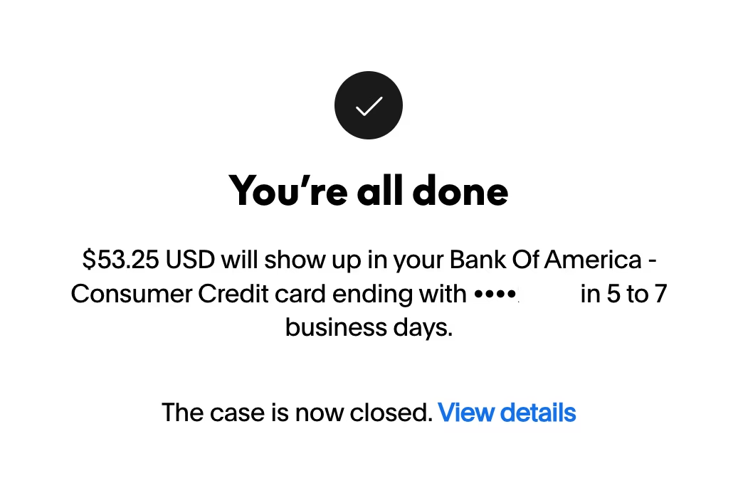
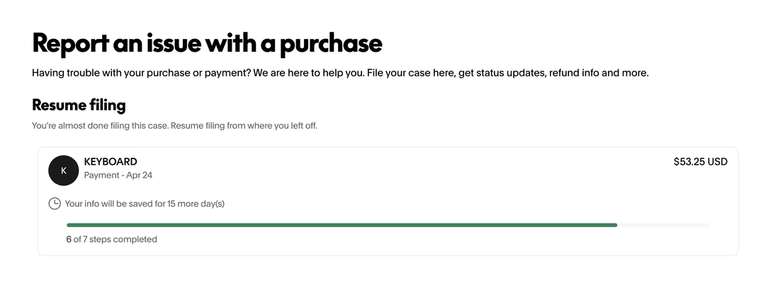
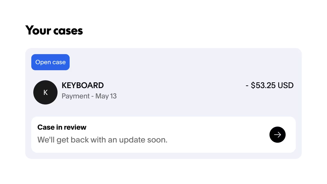
When I recently opened a dispute on PayPal for a keyboard I never received, at the end of the process, I saw these three screens in succession:

In effect the screens said, in order: we closed the case and decided in your favour, you haven’t finished filing the case, the case is open and we’ll update you.

7.

I feel uneasy bundling all these “the left hand doesn’t know what the right hand is doing” examples, because they’re not all the same.

Examples #1–3 from Medium, Chrome, and Apple Maps are frustrating and somewhat embarrassing, outbursts from badly-behaving software that doesn’t know that it’s not okay to throw pop-ups at the screen whenever you feel like it. I particularly dislike announcements of features that the user has already been using since they feel condescending to me, but I don’t want to assume it’ll be the same for everyone else.

Examples #4–6, however, are more insidious. Whether they happen because of plain old carelessness, or lack of imagination, or Conway’s Law – different teams not talking to each other – they can lead to people jumping to wrong conclusions or building entirely wrong mental models. Is my reservation truly done, or have I not actually finalized it? Is it possible to download member-only content, except I need to do something special to set it up? What is the status of my PayPal dispute?

The answers in this case: yes + no + the first screen was the one telling the truth. But each answer required extra effort for me to figure out, and that effort would be avoided if only someone tested the flows better.

Thursday, Oct 1 / #attention / #definitions / #errors / #system design

“Have conviction in what you want to share with the world.”

Marques Brownlee published a video commenting on YouTube’s just-announced A:B testing feature. In short, for some creators, it will be possible to publish slightly different versions of the video at launch time to different parts of their audience, if those versions are deemed “close enough” to the original.

Brownlee digs into how confusing this feature might be in actual use for viewers, never sure whether they’re watching, commenting, or rewatching the same video as others see, or even as themselves earlier saw. Toward the end of the video, Brownlee shifts his focus toward other YouTubers, with a monologue that I wanted to quote here because it captures something important:

You know, this is being framed as a tool to help you improve your videos. But I think for 99.9% of creators – well, to be literal, it’s not actually helping you make better videos; it’s helping you find which version of your video has the best retention, which doesn’t necessarily mean it’s a better video – hot take.

And there are so many examples of creative decisions that I have made, and that so many others have made in the video creation process, that are definitely not the best retention-optimized decisions, but they’re fun, and creative, and interesting, and new, and entertaining, and characterful.

So there’s always going to be the top 0.1% of channels that are all about mass appeal, and that’s fine. But last time I checked, a lot of what makes YouTube fun is the stuff that is more niche down, that is not mass appeal by definition. It’s the cool small hobby you found, or it’s the fun, unique thing that you just discover that only a few people are talking about that – that stuff! That’s what makes it fun.

I think if a lot of those channels and videos suddenly became like superoptimized, retention-maxing, and everything, those would get a lot less fun to watch. And so imagine if all the feedback anyone ever listened to was just to have the best retention – as you optimize over and over and over again, you start to trim out all of the other creative stuff that happens to not be the most efficient way to tell a story.

So I guess what I’m trying to say is... the skill of being a video creator on YouTube is not always necessarily about the maxed out, most efficient, optimized way to do everything, but it’s to find creative ways to share something, or teach something, or explore or explain something, or review something. So I just think making and finishing and publishing a bunch of videos is a better use of a creator’s time than making one thing and then, you know, a whole bunch of different drafts of titles, and thumbnails, and different cuts of the video to try to optimize for, like, the last few percent. […]

That’s all. I think just stand by your creative choices. You made this video, this is the video you chose to make. And now you get to share it, and you put it out, and you learn from it. […] That’s the creative process. Have conviction in what you want to share with the world.

There is another half-pulled-on thread in his video: Brownlee doesn’t say it directly, but dances around the idea that the very fact this feature was launched is reflecting on YouTube’s own insecurity as a product. Jim Nielsen follows up on that on his blog:

I find it interesting how Brownlee shares his opinion that YouTube spends way too much time chasing their competitors and not enough time being YouTube.

Which, when you think about it, is exactly the kind of place a feature like this would stem from: an insecurity in your own creative choices. How YouTube approaches its own insecurities is now trickling down as a feature to its users.

“Let’s let people make lots of variations on things, try all of them, and see what performs best” is exactly the kind of thinking you get in a platform that doesn’t know what it wants to be. So it’s left spending its time 1) doing what others are doing, and 2) following the fickle whims of whatever it can measure.

Brownlee talks a lot about YouTube videos being “fun, and creative, and interesting, and new, and entertaining, and characterful.” Those might not be the most important adjectives to apply to all of software, of course, but there are some interesting throughlines here. I have also personally not seen a lot of thoughtful A:B testing in my career. I think those are an easy way to lose yourself, to have your app become a bundle of metrics that everyone obeys, but no one understands, and – once you open the door to being driven by poorly-understood experiments – for the desire to fall back on patterns from other successful apps, without reflection, to grow stronger and stronger.

That’s how you end up with stuff Nielsen and perhaps even Brownlee argue YouTube itself has become: a set of Brownian reactions, or a warmed-over software cosmic latte, if you will. From my perspective, this often also leads to systems of interactions or features that don’t come together well to the user, as you end up borrowing from other places without the necessary hard work of translating them to feel at home and consistent with your system and its quirks and conventions. From what I’ve seen in my career, A:B tests do not promote design execution rigor. The tests are meant to be light by definition, since a lot of them are expected to fail. Before the test, there is limited incentive to invest in quality, but neither there is one after the test – if A or B successfully raises a metric, you don’t want to mess with it then, since what if you change the very thing that made it “work”?

On top of all that, we can add what Brownlee started with in his video: overeager A:B tests feel like software’s version of gaslighting. How can you trust an app if it feels like it’s changing without rhyme and reason seemingly on a weekly basis, whose changes are not announced or documented anywhere (small A:B tests never are), and when other people don’t see the things you see?

Thursday, Oct 1 / #change management / #craft / #culture / #software evolution / #youtube

Don't miss what's next. Subscribe to Unsung (Weekly Digest):
← Newer “But it would have bothered us the rest of our lives.” Older → “Hey, this isn’t your father’s 737.”