“A day some have predicted and many have feared”
Welcome to this week’s digest of Unsung, a blog about software craft and quality. Here’s what was posted in the last week:
“I’m obviously taking a risk here by advertising emoji directly.”
Thursday, March 5
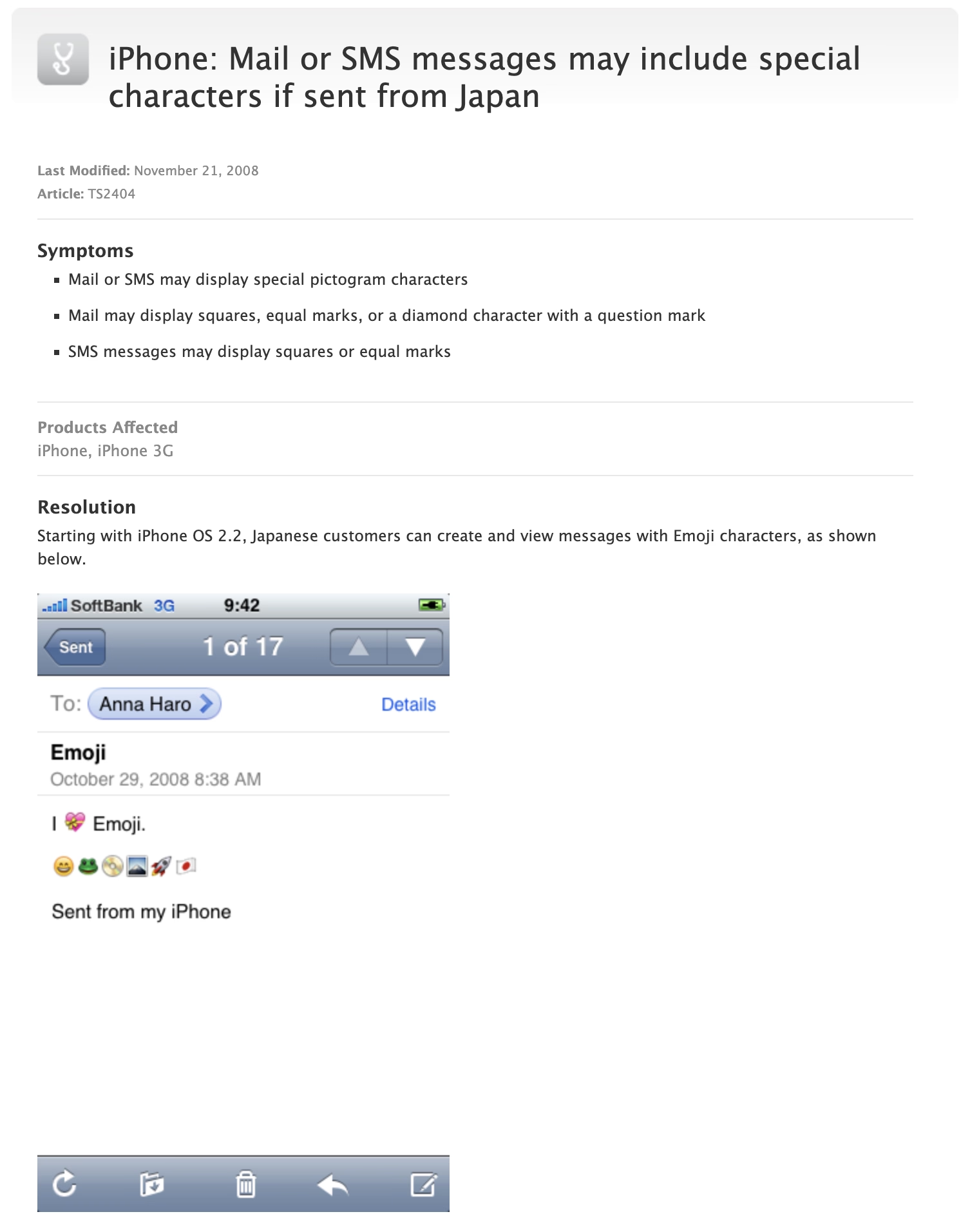
It’s hard to imagine it now, but during iPhone’s first year, no emoji were available at all. It took four years until 2011’s iOS 5 gave everyone an emoji keyboard.
But in between 2008 and 2011, there existed a peculiar interregnum where emoji were only available on Japanese iPhones. The situation had to be carefully explained and caveated:
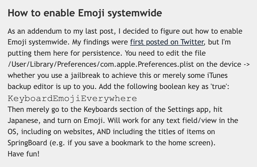
Eventually, an enterprising developer realized that emoji outside Japan was as easy as toggling a UI-less preference with a great name KeyboardEmojiEverywhere, hiding inside the innards of the iPhone:
Except, “easy” is in the eye of the beholder. This was still a few too many hoops to jump for an average iPhone user. So, developers figured out that there could be an app for that: the above preference incantation wrapped inside an application with an easy UI, and put in the burgeoning App Store.
The interesting part is that Apple initially fought some of these efforts, by rejecting a Freemoji app and likely a few others. (Not sure if this was about emoji specifically, or more principally about losing control.)
The developers had to get sneaky, and started hiding emoji enablers inside other apps. A $0.99 “RSS reader for a Chinese Macintosh news site” called FrostyPlace unlocked emoji by “simply pok[ing] around in it for a minute or so by tapping in and out of an article and playing with the two buttons at the bottom of its screen. That part is important, so be sure to do some genuine tapping.”
Then there was the free Spell Number (you can still see its old App Store page), where punching in a certain secret number would give you the same.
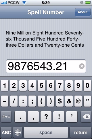
The author called it an “easter egg” and even wrote candidly at the end of instructions that “you can also delete Spell Number if you don’t want it, the setting will still be here.” (The number also had to change from 9876543.21 to 91929394.59 at some point, perhaps to evade… something?)
Eventually, Apple seemingly gave up – Ars Technica has a fun interview from 2009 from someone who renamed their app from Typing Genius to “Typing Genius – Get Emoji” and got away with it:
Ars: As the screenshot at the start of this post shows, you haven’t been shy about advertising the Emoji support over at App Store. Are you worried that adding Emoji to your application might have negative consequences? Are you worried about Apple pulling it from App Store?
Fung: I’m obviously taking a risk here by advertising Emoji directly on iTunes. That being said, I’m not the first. Worst case scenario, I’ll update the application with Emoji support removed. I’m hoping that Apple will turn a blind eye to this because I can’t see any harm done in allowing users to use Emoji.
Not quite “I am ready to do some time for the good cause,” but close enough.
Yet, it still took until 2011 for emoji support to be universally available with iOS 5, and even then you had to enable the keyboard in settings.
I like this little story of a mysterious latent cool new thing hiding inside your device, a thing that you could unlock only if you followed some seemingly nefarious instructions that never fully made sense but that actually worked.
An interesting tidbit: At least early on in 2008, for emoji to work both the sender and the recipient had to follow the instructions. So the toggle wasn’t just about adding a keyboard, but also enabling the decoding and rendering. (And complicating things further, iPhone’s Japanese keyboard had emoticons, and that keyboard was widely available without any hacks. The difference between emoji and emoticons was not obvious to many people, leading to a lot of extra confusion.)
Lastly, a fun sidebar: I asked about all this an old internet buddy, Steven Troughton-Smith, whom I remembered back from my GUIdebook days, and who still routinely posts fun hacks and discoveries about Apple platforms on Mastodon. I thought “Steven might remember that story; he seems like the kind of person who’d at least know how to find an answer.” Turns out, my hunch was better than I thought: Steven was the enterprising developer who actually discovered how to give emoji to any iPhone, all the way back in 2008.
A more eager typeahead in Chrome
Thursday, March 5
I just stumbled upon a nice little power-user innovation in Chrome’s Web Inspector.
In Safari, and previously in Chrome, when editing CSS properties, you’d get a usual editing typeahead for the property name, and then the same on the other side for the property value.
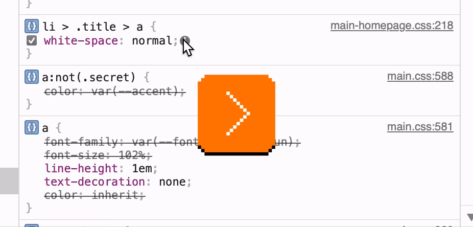
In newer versions of Chrome, the typeahead menu works as before on the right side. However, the menu on the left side also includes the right side.
I think this is really clever in this context – not just to speed you up, but also to aid understanding. Just like the inert mouse up and down in the previous post could serve as a safe “peek” into the values, this new interaction can quickly allow you to explore the CSS space if you are curious, or if you only lightly remember part of the name, or even just one of the values.
This blog is authored in Apple Notes, and some time ago Notes added quick linking via typing >>, and that has a similar effect: The interactions are so nimble and precise that it is very easy to link to something, but a nice side effect is that it also feels very welcoming just to type a few letters to remind yourself of a title of an article, and then cancel out.
The downside of the Chrome change is, well, more stuff matching, but I think the audience for this UI is going to be okay with that.
Not a mountain – but not a molehill, either
Tuesday, March 3
I know we’re probably collectively a bit tired talking about macOS Tahoe, but I just noticed something that I think is a good example of how small details can ladder up to bigger things.
This is macOS Sequoia (the pre-Tahoe release) and a typical pop-up button:
One clever thing macOS has been doing since basically the dawn of GUIs is that upon clicking on a button like this, the currently selected row will be in the same place as before you clicked. (As opposed to, for example, the entire menu appearing below like it would from a top menu bar.)
This has interesting and often underappreciated consequences. It allows you to orient yourself quicker since you don’t have to find the selected option again. And, it saves you movement overall: the next or previous option will always be at the absolutely shortest possible distance. (Of course, the approach also has some challenges, for example if the button is positioned close to the top or bottom of the screen.)
There’s another clever thing that happens throughout macOS: All the menus work using a classic click-to-open and click-to-select sequence, but they are also usable via the slightly more advanced, but faster mousedown-drag-mouseup gesture.
These building blocks work together and mean that selecting the next option can be as simple as a little flick of a mouse.
Now, check out macOS Tahoe (current release):
You will notice that iCloud Drive, upon clicking, is now misaligned both horizontally and vertically.
On the surface, this feels just like a visual blemish – slighly embarrassing, but without much consequence. But check out what happens if you hold your mouse button at a certain position, and then release it without moving:
The stability of macOS’s interface and the thoughtful set of aforementioned rules allowed for an emergent fast behaviour: mouse down and up meant you could “peek” into a menu safely, or you could change your mind right after seeing what’s inside. In a bigger sense, it created a certain trust between you and the operating system: it’s worth learning those gestures, as they will be rewarded.
In Tahoe, some of that learned behaviour – by the way, I see it in all of these buttons, not just this one – will now work against you. Now, you can accidentally change an option without intending to do so.
Is it a big deal? No, not really. This likely – hopefully! – simply fell through the cracks in a rush to get Liquid Glass out the door, rather than no one being there to care, or no one understanding that all these gestures add up in aggregate, creating a GUI that feels fast, trustworthy, and catering to your motor memory in a way that elevates your experiences with the interface in the long run.
But I’d feel better if it wasn’t almost half a year since the release, and if we hadn’t already seen other things exactly like it.
“Which is definitely not good to do to it.”
Tuesday, March 3
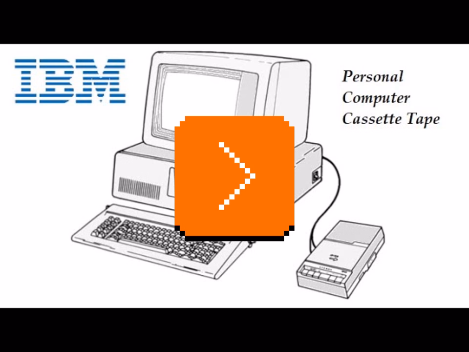
The year is 1981. Your IBM PC is equipped with a tragic speaker that sounds awful for anything except occasional beeps. (Those beeps sound awful, too.)
You can’t afford a sound card and besides, sound cards for your PC have not been invented yet. You can’t even afford a floppy drive, so you’re one of the rare people who actually uses an audio cassette player as a storage device – a technique usually reserved for more primitive machines that have half the bits your new PC does.
But there’s a silver lining. Your cassette player has a little relay that controls its motor. You can engage and disengage the relay at will.
So, someone figured out that toggling the relay kind of sounds like a metronome. Like percussion. It’s a hack, but in the sonic landscape inhabited solely by your sorry speaker, it’s a breath of fresh air (scroll to 7:26 if you don’t land there automatically):
The year is 2026. Your computer itself is the size of an audio cassette, fits in your pocket, has better storage, graphics, sound, pretty much everything compared to a 1981 PC. It even has a special haptic motor. Except, that motor can only be controlled by native apps, and there is no official API to do it from a browser.
But there’s a silver lining. Tapping any checkbox on a site generates a haptic pulse. And that apparently works even if the checkbox is hidden and if the computer is doing the tapping.
So, someone figured out a way to use that to build a library that gives websites powers to provide haptic feedback. It’s a hack, but damn if it’s not one someone took to its logical conclusion.
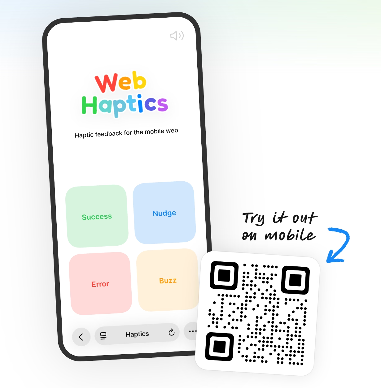
I love these kinds of hacks, and I wonder what’s going to happen to this one. Will it fly under a radar, or will some websites start abusing it? If so, will Safari clamp it down, or will it actually give people a proper API for haptics?
“Podcasts are a radical gift.”
Tuesday, March 3
This blog is about craft, but sometimes the answer to craft is not skill or taste or awareness or effort, but it’s creating conditions for craft to flourish. Workday looks like Workday, and your banking app looks like your banking app, not because there aren’t enough designers and engineers around that know how to do it better.
This is a thoughtful post by Anil Dash about Apple’s recent announcement of introducing video podcasting, warning how the conditions set up right now will lead to enshittification, and proposing changes:
This will also start to impact content. You don’t hear podcasters saying “unalive” or censoring normal words because there is no algorithm that skews the distribution of their content. The promotional graphics for their shows are often downright boring, and don’t feature the hosts making weird faces like on YouTube thumbnails, because they haven’t been optimized to within an inch of their lives in hopes of getting 12-year-olds to click on them instead of Mr. Beast — because they’re not trying to chase algorithmic amplification.
It’s worth reading even if you don’t care much about podcasts.
Lock Scroll With a Vengeance
Monday, March 2
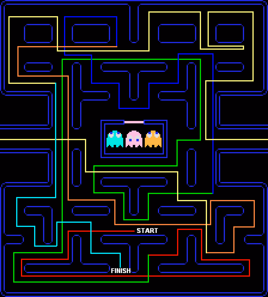
One of the most mysterious keys on the PC keyboard has always been Scroll Lock, joining Caps Lock and Num Lock to create the instantly recognizable LED triumvirate:
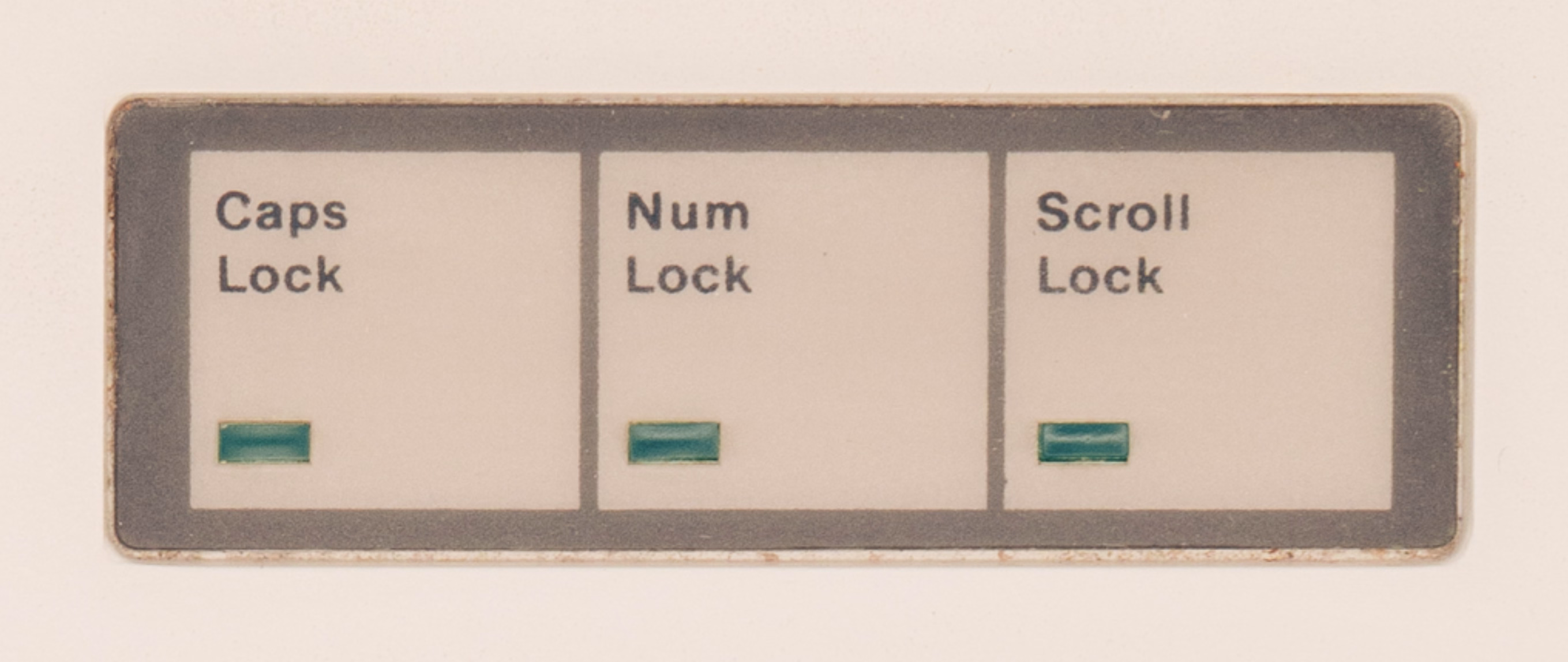
Scroll Lock was reportedly specifically added for spreadsheets, and it solved a very specific problem: before mice and trackpads, and before fast graphic cards, moving through a spreadsheet was a nightmare. Just like Caps Lock flipped the meaning of letter keys, and Num Lock that of the numeric keypad keys, Scroll Lock attempted to fix scrolling by changing the nature of the arrow keys.
This is normal arrow key usage in Lotus 1-2-3, doing what you’d expect, if likely a bit slower:
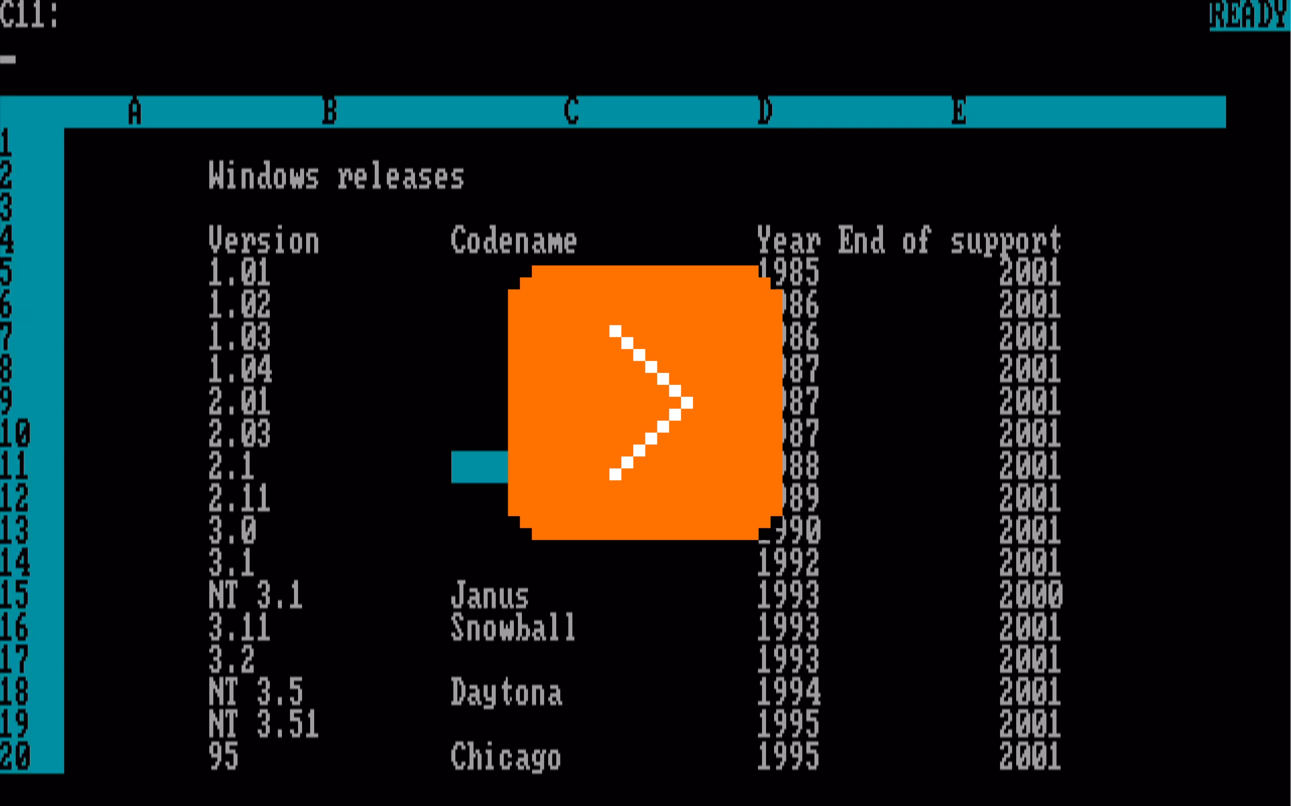
And this is Lotus 1-2-3 with Scroll Lock enabled. Here, the arrows do not move the cursor, but move the spreadsheet:
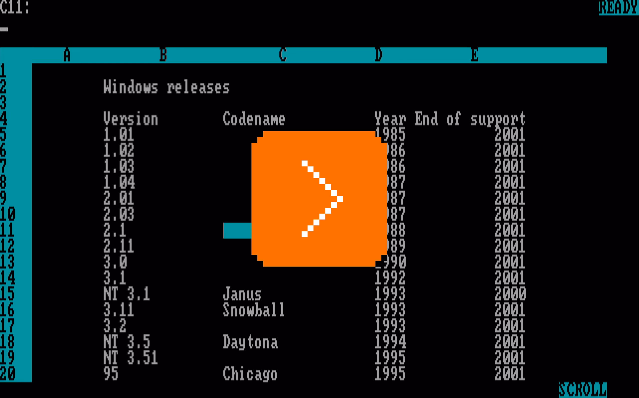
(You can play with it yourself!)
In time, scrollbars helped with the problem, then mice with wheels solved it in one direction, and then trackpads in both. (Although even though my 2025 Windows laptop doesn’t have a Scroll Lock key, its onscreen keyboard does, and the key still works in Excel.)
But, I grew to believe that UI problems never fully die, and often come back dressed up in new clothes.
This is the TV app on my Apple TV, doing movement as you’d expect:
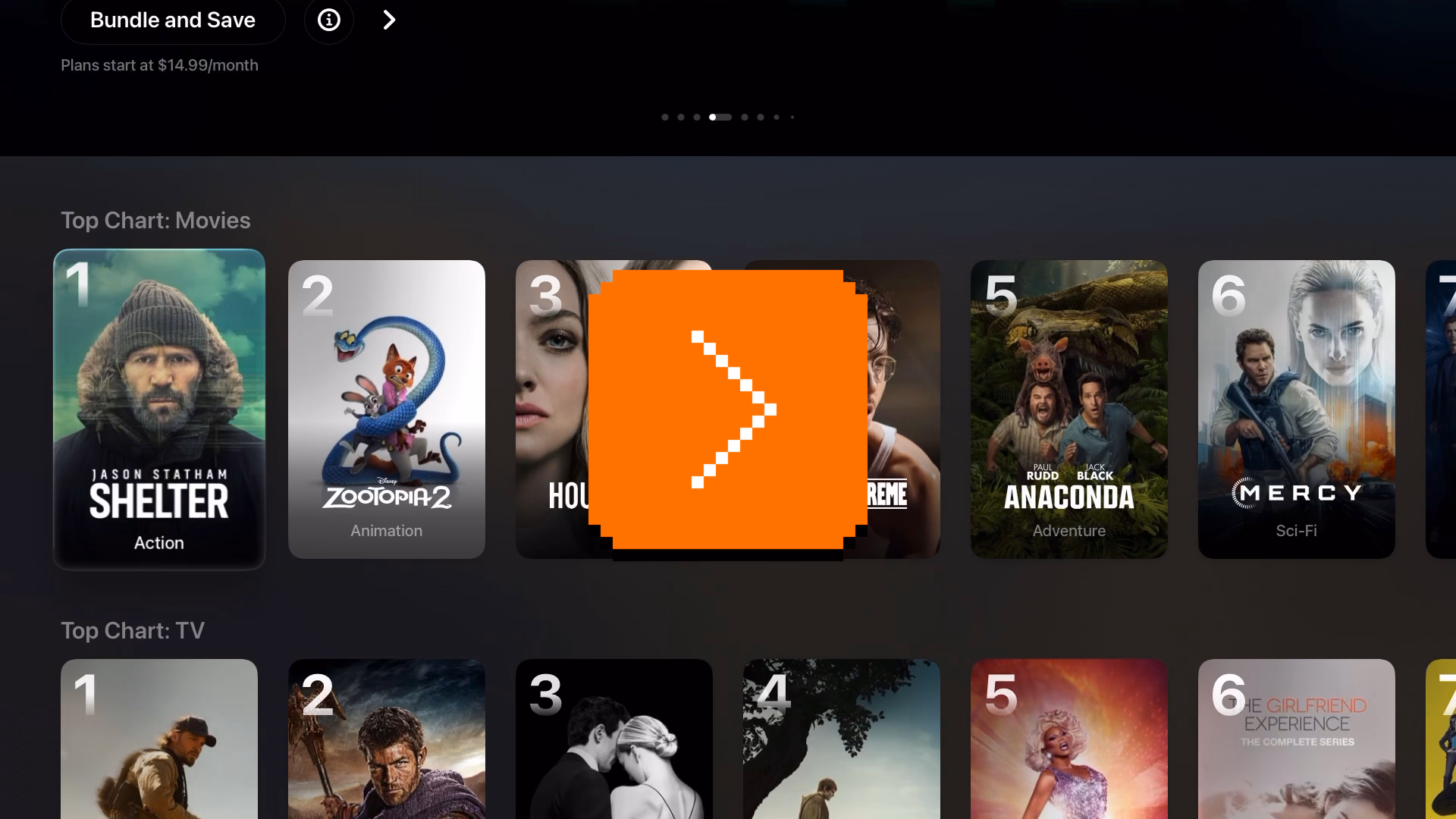
But Netflix a while back picked a different approach – scrolling almost as if Scroll Lock was on:

More recently, I saw that approach spread to HBO Max and YouTube apps as well:


Is this good? To me personally, the Scroll Lock-esque approach feels strange and claustrophobic. I see the (hypothetical) value of keeping the selection in one place, but the downsides are more pronounced: things feel lopsided, going back in this universe is flying blind, and the system creates strange situations at the edges, where Scroll Lock struggled as well.
And yet, given I just dated myself by reminiscing Lotus 1-2-3, I’m curious how it feels to others.
“Your wife’s new legal name is TAARGÜS TAARGÜS.”
Monday, March 2
I realized recently that I conflated two similar user-interface comedy skits.
This one is from Sean Wing from 2023:

And this older one is from Tim and Eric Awesome Show, Great Job!, from 2009:
Speaking of Tim and Eric, this one was also funny and ostensibly on topic for this blog!
(And re: previous post – I had to cut a new version of University font with the Ü glyph just for TAARGÜS in the title.)
“Every time there’s a massive technological shift, intellectual property rights suddenly and very conveniently become a blind spot.”
Monday, March 2
From May last year, a 21-minute video by Linus Boman about font piracy, specifically during the era of personal computing and early internet:
The nuances of what separates font piracy from non-pirated revivals or general inspiration are too much even for me, but I liked how the video moved on from the obvious and cheap “haha, you wouldn’t pirate a font” story to cover a few of the more complex issues with panache.
My small contribution to the discourse is that I just scanned an interesting booklet from 1979 called Typeface Analogue, which catalogs various names different phototypesetting manufacturers used for their “replica” fonts – a sort of a translation table between once-relevant parallel type ecosystems.
Some are pretty uninspired: CS for Century Schoolbook, OP for Optima, Eurostyle for Eurostile, and so on. Others are more interesting: a version of Palatino called Patina, American Classic becoming Colonial, or Futura renamed to Twentieth Century. Absolute fav? Helvetica becoming Megaron.
The display fonts you see on this blog are my vector conversion and slight improvement (kerning pairs!) over a bitmap PC/GEOS font called University, which itself was inspired by the original Macintosh’s Geneva. Inspired or downright stolen? You decide:

Deterministic vs. idempotent
Monday, March 2
Those terms confused me back in the day, and occasionally they still do, so I thought it might be nice to write it all out. This is how I understand them:
- deterministic: whenever you do something, it gives you identical results as any previous or next time you do it
- idempotent: if you do something twice, or thrice, or more times, it will be the same as doing it once
Or, in short:
- deterministic: same every first time
- idempotent: same every next time
This might be confusing. Outside of LLMs, computers are supposed to be deterministic, no? They’re famously bad at random numbers; if you memorize a pattern, you can beat Pac-Man every single time.
But “deterministic” in UI design might mean something more specific. Let’s take pressing ⌘B to bold, for example:

Every time you press ⌘B on an identical selection, it will behave the same. But, pressing ⌘B doesn’t guarantee something will get bold. If it already is bold, the command will reverse its meaning. In this sense, ⌘B is non-deterministic.
It’s not hard to imagine a determistic version of bolding. Make ⌘B bold the text, and make another shortcut – say, ⌘U – unbold it. This way, you can always press either and be absolutely confident you will get a predetermined result without worrying about anything else. It’s a boon for motor memory, but it is more complex to explain, and it adds more UI surface.
There is also another, more interesting way: you can make ⌘B always bold first, and unbold second. This way, your fingers can remember ⌘B is for bolding, and ⌘BB is for unbolding. But this also gets tricky: for already fully bolded text, it might seem the feature is broken, because the first keystroke does nothing!
Only the second of these three approaches is idempotent, meaning you can invoke it many times and it will always give the same result:
- ⌘B toggles bolding from current state: non-deterministic, non-idempotent
- ⌘B bolds, ⌘U unbolds: deterministic, idempotent
- ⌘B toggles bolding, always starts from bold: deterministic, non-idempotent
One of my favorite idempotent concepts is the Clear key present on many calculators, and still on some larger Mac keyboards.
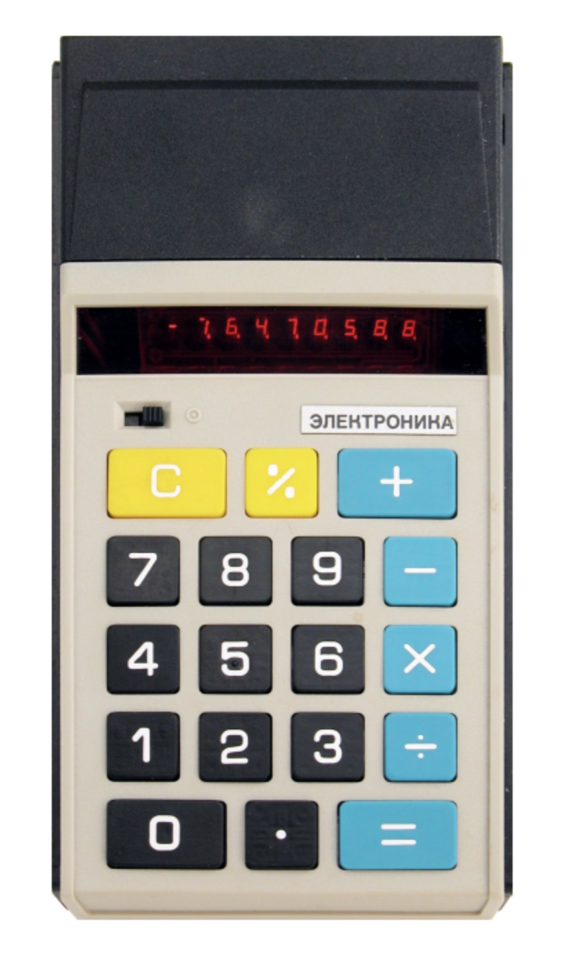
The idea behind Clear is simple. Let’s say you’re a professional keypad user – maybe an accountant? – typing in numbers for hours a day. You just made a mistake. Pressing Backspace will remove the last digit, but are you sure you only made a mistake on that last digit? What if your fingers brushed another key and you typed in two digits by accident?
Instead of using the non-idempotent Backspace key where you’d have to look at the screen to confirm, it’s easier just to press the idempotent Clear which will always remove the entire number, and then start from scratch without even having to look anywhere (as gamers would say, “no scope!”).
And, for people who are moving fast, it feels safe just to press the shortcut or a button instinctively, for ease of their mind, even if nothing has to be done. Some people might choose to press it a few times, just in case. The Esc key often has that property – isn’t it just nice to slam Esc many times? – and Jeff Jarvis in his 2014 essay talked about another shortcut that felt that way:
Since I don’t need ⌘S anymore, I can now appreciate how much it had become a part of my ritual of writing and even of thinking. I used to hit ⌘S not just as data insurance — hell, I’d often hit it after having not made a single change in my text since the last time I’d hit it. I hit ⌘S as a break, a psychic, semiotic semicolon. It gave me a moment to search for the right word, to plan the structure of where I would go next, to commit to what I’d written, or to wonder whether I had the courage to erase what I’d written and try again.
(In Figma, where ⌘S wasn’t necessary, we used to show this – but we only showed it once every fortnight, since some people would press the shortcut instinctively like Jarvis, and find the message distracting and maybe even patronizing.)
All of these options have pros and cons. The beauty of determinism and idempotence is that they free you from paying attention. I always get a bit nervous when someone tells me that in their country, you can press the elevator button again to unset it. Even if you don’t make a button a toggle, visually disabling it or showing a message (“Nothing to delete!”) when it has nothing to do could feel like a friendly gesture toward newcomers, but its non-idempotence will grate people who know what they’re doing. Determinism and idempotence are good for motor memory to develop, but – just like the above bolding example – might be initially more confusing.
The approaches can coexist; browsers give you ⌘⌥←→ to move between tabs (non-deterministic, non-idempotent) and ⌘1/2/3 to switch to a specific tab (deterministic, idempotent). Some places even offer a choice. In macOS, you can say whether you want clicking on a scrollbar chute to be deterministic or not:
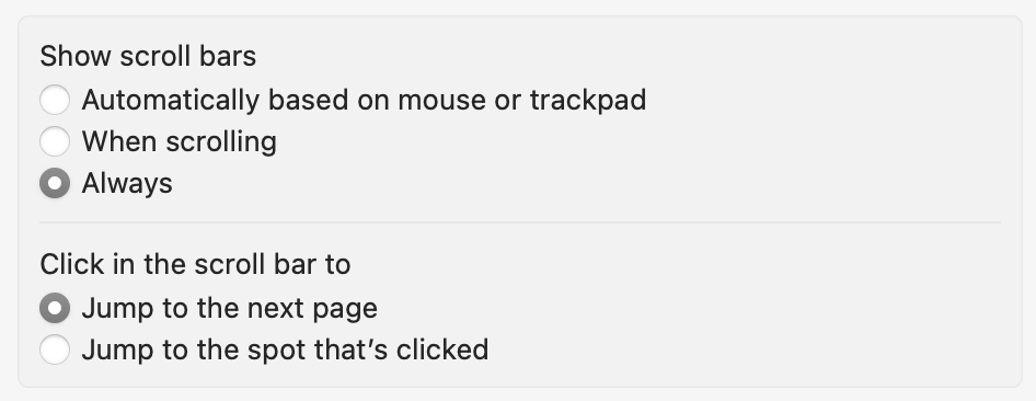
…although usual choice-giving caveats should apply.
I think it’s good to think about those things, especially for interfaces used professionally. Magical things happen if you can trust your fingers and sometimes, if you worry too much about novice users, that might make it hard for pro users to emerge.
“A day some have predicted and many have feared”
Sunday, March 1
As a former ISP employee I occasionally like dipping my toes into some networking stuff, and this 25-minute video from The Serial Port is a good retelling of the day in 2014 when one of internet’s important routing tables crossed a threshold of 512K, which caused all sorts of trouble:
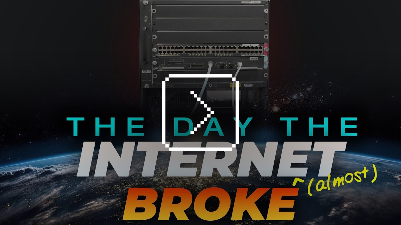
What I appreciate about The Serial Port is that they always seem to actually test the vintage hardware or rebuild the old software they’re commenting on, and this time was no exception: they grabbed a classic unsung hero of ISPs, a Cisco Catalyst 6500-series router, and then recreated “The 512K Day” in their studio.
This was a nice comment under the video:
Have absolutely no knowledge about networking, but watched this video as if a thriller movie. Thanks for opening my world of tech to networking.
Yeah, the video is kind of nerdy and intense, but maybe you’ll enjoy it; even a classic aging piece of hardware with an arbitrary ticking-bomb limit deserves some respect.
Also, the funniest comment:
I had a 2.4k day a couple days ago when I realized Farm Sim 22 only allows a max of 2400 bales. Couldn’t load into my saved game. Had to go into items.xml and temp remove a hundred bales.
“Designed to be loveable by managers”
Saturday, February 28
I read Erika Hall’s Just Enough Research. I’m not going review the entire book as it feels a bit off-topic for this blog, but the chapter about surveys had me nodding my head so much I’d love to excerpt a few things:
The questions can be asked in person or over the phone, or distributed on paper or collected online. The proliferation of online survey platforms has made it possible for anyone to create a survey in minutes.
This is not a good thing.
Surveys are the most dangerous research tool — misunderstood and misused. They frequently blend qualitative and quantitative questions; at their worst, surveys combine the potential pitfalls of both. […]
If you ever think to yourself, “Well, a survey isn’t really the right way to make this critical decision, but the CEO really wants to run one. What’s the worst that can happen?”
Brexit.
Hall highlights that surveys are much harder to debug than other methods:
It’s much harder to write a good survey than to conduct good qualitative user research—something like the difference between building an instrument for remote sensing and sticking your head out the window to see what the weather is like. Given a decently representative (and properly screened) research participant, you could sit down, shut up, turn on the recorder, and get useful data just by letting them talk. But if you write bad survey questions, you get bad data at scale with no chance of recovery. It doesn’t matter how many answers you get if they don’t provide a useful representation of reality. […] Surveys are the most difficult research method of all.
[…] Bad code will have bugs. A bad interface design will fail a usability test. A bad user interview is as obvious as it is uncomfortable. […] A bad survey won’t tell you it’s bad.
And that they might be seductive because they feel like hard data:
Designers often find themselves up against the idea that survey data is better and more reliable than qualitative research just because the number of people it is possible to survey is so much larger than the number of people you can realistically observe or interview. [… But] unless you are very careful with how you sample, you can end up with a lot of bad, biased data that is totally meaningless and opaque.
There’s also this hilarious bit:
Managers love NPS because it was designed to be loveable by managers. It’s simple and concrete and involves fancy consultant math, which makes it seems special. But is this metric as broadly applicable and powerful as it claims to be?
Nah.
NPS is not a research tool. I shouldn’t even be talking about NPS in a research book.
The entire book is worth a read, with a lot more to offer than the pithy quotes I excerpted above. I really liked its pragmatic approach to research that understands the realities of the industry.
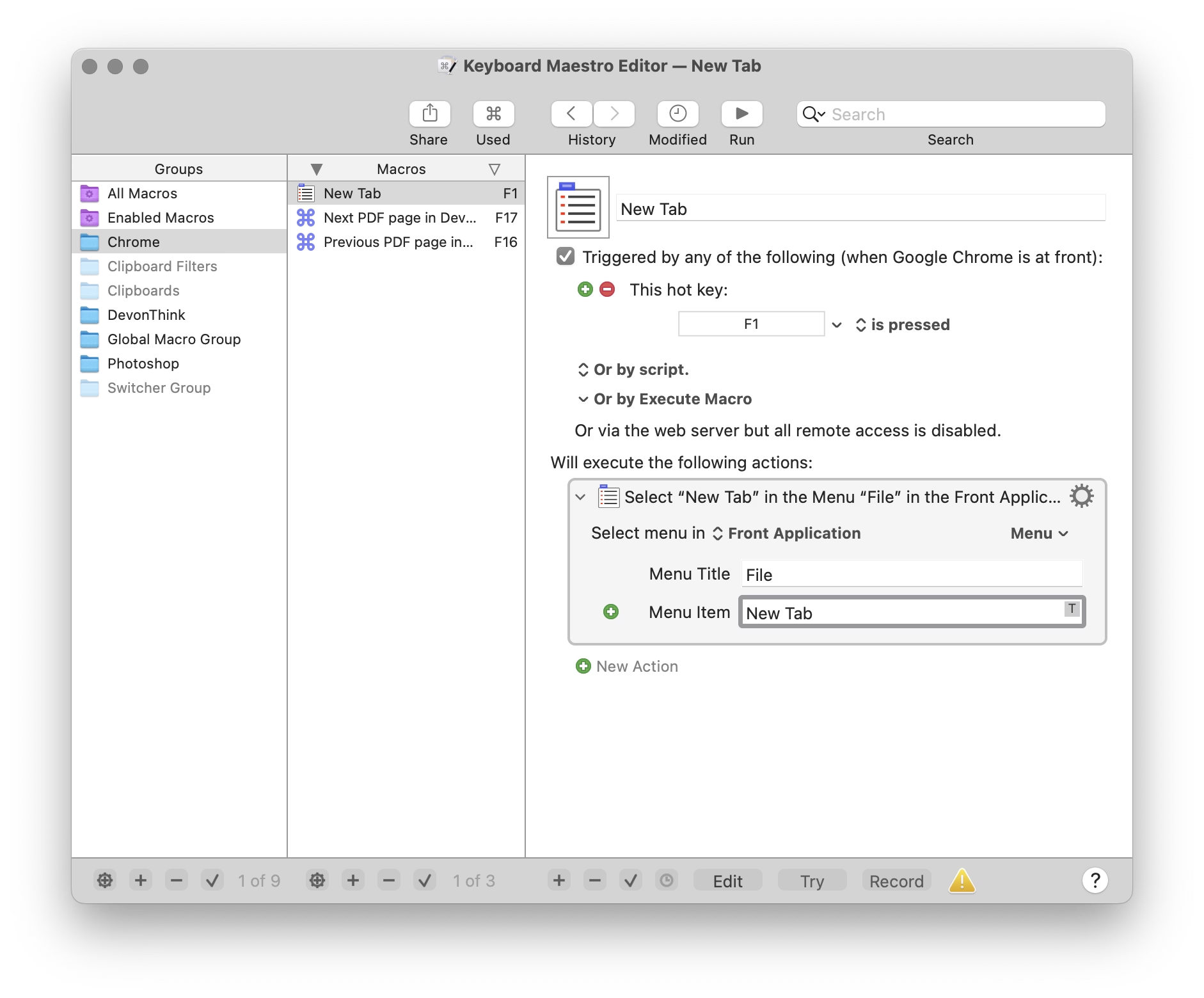
Tales of direct manipulation, pt. 1
Saturday, February 28
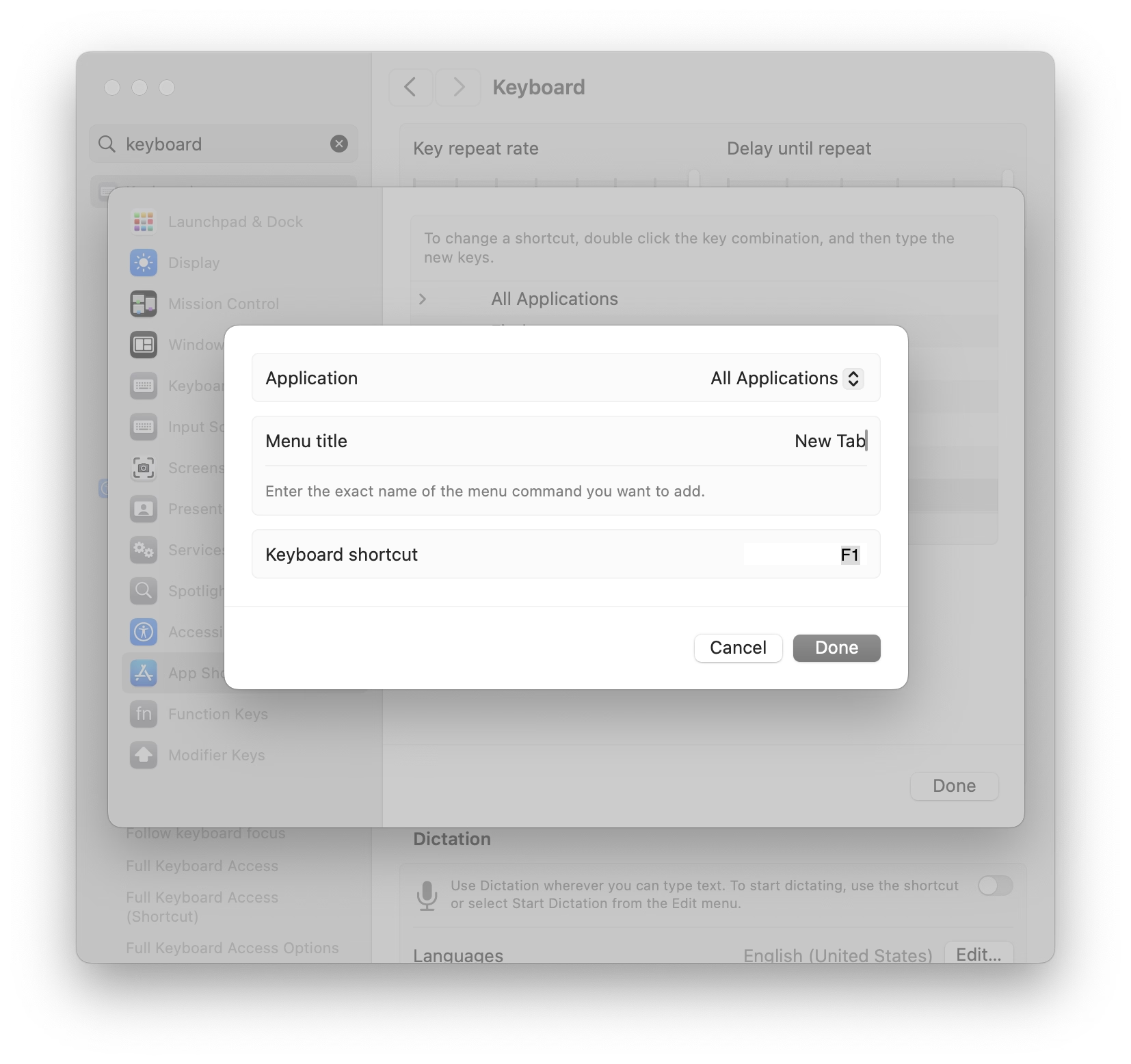
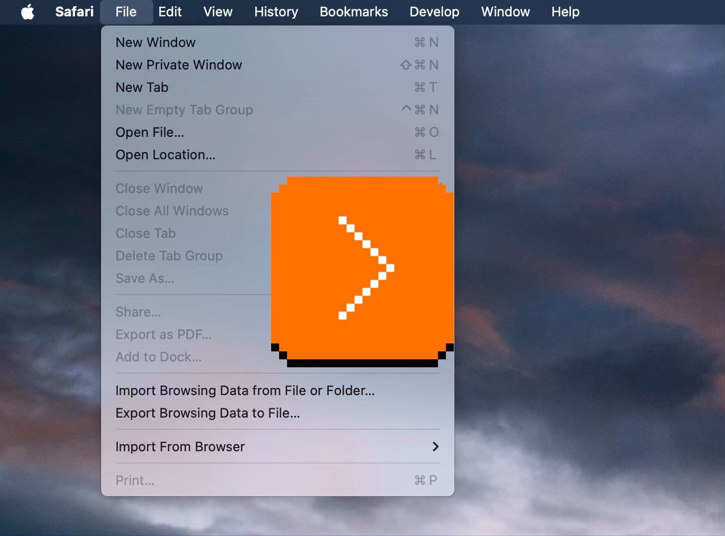
Mac allows you to assign keyboard shorcuts to menu items, but the interface is clunky – you have to select the app even if you just came from it, and then type in the menu item name by hand without any assistance:
Other tools, like Keyboard Maestro, do something similar. You either have to type it again, or you can point to it, but in a replica of the menu of the app shown in a very different style and orientation:
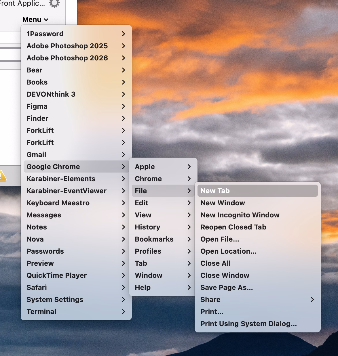
But this week I learned of another app, KeyCue, that approaches this differently. You simply point to the menu item and hold the desired key for a while:
Okay, this is not a universal endorsement. The feature works clunkily, and KeyCue as a whole is way too comfortable adding itself to login items without asking.
But as far as singular interactions go, this is great and eye-opening. It made me realize that the previous things I’ve shown – System Settings, Keyboard Maestro – are really not GUIs, and they don’t practice direct manipulation. They’re still partially command line interfaces dressed up in GUI clothing.
We kind of lightly made fun of Jonny Ive going angelic on “staying true to the material” and things being “beautifully, unapologetically plastic.” And there is, of course, value in command line and those kinds of approaches. But this part of KeyCue at least is unapologetically a graphical user interface, and it is nice to still be surprised in this space.
“Simultaneously old-fashioned and futuristic at the same time”
Friday, February 27
Before computer graphics, movies relied on matte paintings to extend or flesh out the background. This is perhaps my favourite matte painting, from the end credits of Die Hard 2:

Turns out, videogames do something similar, except the result is called a skybox, since it has to encompass the player from all sides. It’s another way to use cheap trickery to pretend the world is larger than it is.
This 9-minute video by 3kliksphilip shows a few more advanced skybox tricks from Counter Strike games using the Source engine:
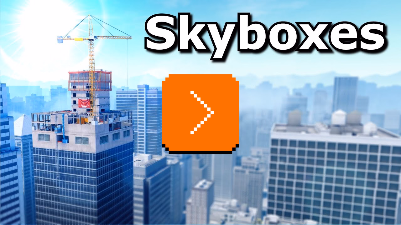
I particularly liked two discoveries:
- In real world, you wouldn’t style backfacing parts, because the player will never be allowed to see from the other side. Here, you don’t even have to render them.
- Modern skyboxes have layers and layers of deceptions: more realistic 3D buildings closer to you, and completely flat bitmaps far away. It almost feels like each skybox contains the history of skybox technology that preceded it.
On the other hand, seeing clouds as flat bitmaps was really disappointing.