Tangible Tuesday #15 How Remotes Got Lost
A wall of remote controls, three kinds of simplicity, and the nine-year story of Apple finally admitting its own Siri Remote was wrong.
Tangible Tuesday is a free newsletter for the upcoming book Designing the Tangible Interface. Past issues in the Archives > > Want to support? Just forward this email to someone who would enjoy it.
Tuesday Tune: "CooCool" by Róisín Murphy
A wall of remote controls, three kinds of simplicity, and the nine-year story of Apple finally admitting its own Siri Remote was wrong.
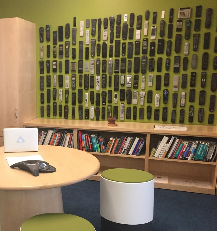
My office had a wall of remote controls. It made a great conversation starter — everyone has an opinion on remote controls, even tough executives who doubt they need designers. If someone mentioned their cable remote, I knew we’d be talking for ten minutes at least.
Is there a common product more disliked than the TV remote? With so many manufacturers over so many decades, you’d think a best design would have emerged by now. It hasn’t, and the reason reveals a deep confusion about what “good” physical interaction actually is — three very different kinds of simplicity: engineering simplicity, conceptual simplicity, and aesthetic simplicity. Getting them mixed up, especially the last one, is how a company as design-savvy as Apple shipped a remote its own customers couldn’t hold the right way up.
Engineering Simplicity: A Light Bulb
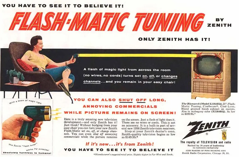
The remote control was designed from the start around engineering convenience, not users. Early remotes had a reasonable hierarchy — channel up, channel down, mute — because the hardware forced the choice. Zenith marketed their Flash-Matic as “absolutely harmless to humans.” Clearly, sedentary obesity was less scary than ray guns.
As TVs added features, engineers added buttons — one per function, never removing anything. Over thirty years this produced the canonical remote: dozens of buttons, no hierarchy, designed for the people who wired the circuit board rather than the people watching TV in the dark. Nobody chose these remotes; they came in the box. Manufacturers treated them as a cost center, not a design opportunity.
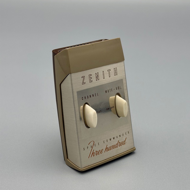
Zenith’s Space Commander worked by mechanically striking a tuning fork — earning it the nickname the clicker.
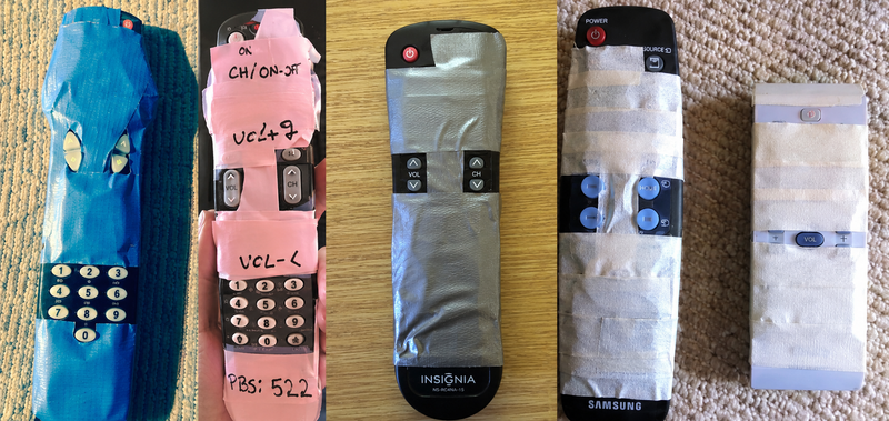
When a remote gets bad enough, users design their own fix — tape over the buttons they never touch, leaving only the ones they need.
Conceptual Simplicity: The Original Apple TV Remote
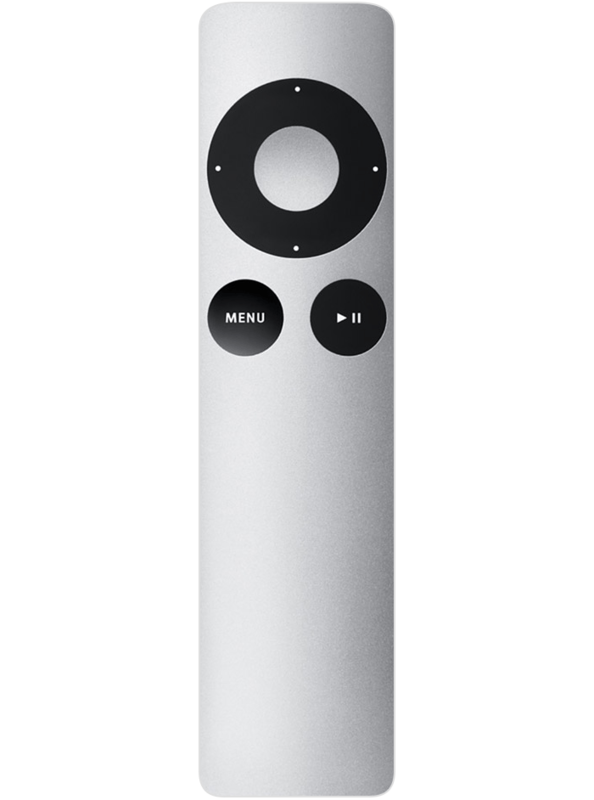
The first-generation Apple TV remote broke from this pattern entirely. Instead of mapping every function to a physical button, Apple moved complexity onto the screen. The remote had almost nothing on it: a directional pad, a select button, a menu button.
The key insight was mental model clarity. The remote had no local state — it wasn’t a controller with modes, it was a pointer for navigating an on-screen menu. You always knew what you were doing and what any button would do.
It was beautiful, too. Apple invested in a silver aluminum body, easy to spot in a dark room and delightful to hold. On my wall of remotes, it stood out immediately.
Aesthetic Simplicity: Where Apple Lost the Thread
When Apple launched the Siri Remote, it looked like a design triumph. Fewer buttons. Clean surfaces. Powerful internals — a trackpad, accelerometer, voice control, game controller capability.
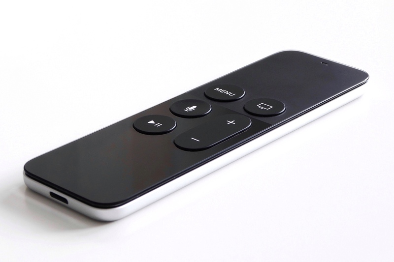
It turned out to be harder to use than the remote it replaced. Owners made the same complaint, over and over: people routinely picked it up and clicked on the wrong end. Reviewers said they did it at least once a night. It’s easy to see why — the flat trackpad looks identical to the flat handle. Everything is aligned, symmetrical, and black on black.