Tangible Tuesday #12 There Is No Frequency for Magenta
What is color anyway? A deep dive into the theory and practice of using color. LOTS OF PICTURES!!!
> Tangible Tuesday is a free newsletter for the upcoming book Designing the Tangible Interface. Past issues in the Archives > > Want to support? Just forward this email to someone who would enjoy it.
Tuesday Tune: Inheritance featuring Ellen Renton
> I hope your Summer is delightful! Back to the writing here in Brooklyn.
> Hope you enjoy! -Steve
The eye is not a camera. We don't see reality, we construct it, including a color that has no wavelength at all.
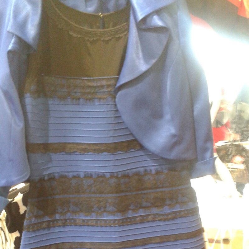
In 2015 a bizarre internet debate arose over the color of a dress. People couldn’t agree on whether it was blue and black or white and gold; what really upset them was that other people could disagree on such an obvious fact. It’s fascinating for another reason; it shows the eye is not a camera. We don’t see reality, we construct reality.
Neuroscientist Pascal Wallisch said the differences in perception was due to our assumptions about how the dress was illuminated.
The original image was overexposed, rendering the illumination source uncertain. People color correct images all the time. In this case, some people thought the dress was in a shadow and mentally subtracted the blue light, which then appears as bright gold and white. On the other side, thinking the dress was artificial light they mentally subtracted yellow, which then appears as dark black and blue dress.
Vision is not a passive recording device, the brain is continuously interpreting all the senses to construct a model of reality, and heavily dependent on context. What we experience as “reality” is a stabilized inference, not raw input. The brain cares about different things than you do; it is constantly solving “where is the lighting from?” before “what color is this object?”
Designers prioritize sight above all other senses, but our intuition hides surprising blind spots. More than a third of the brain is involved in visual processing in some way, perhaps more than all other senses combined, but learning how sight works offers opportunities to design engaging experiences.
There is no Frequency for Magenta
Every designer has used a color selector in design apps, but have you noticed the strange way it looks? The color spectrum user interface component sweeps hue (aka color) from left to right, like the classic color wheel. Red sits at both ends, closing the wheel. The six traditional hues Red, Orange, Yellow, Green, Blue, Violet, are defined as exactly 60° apart.

But wait! You also know that color is a frequency of light, the small part of the electromagnetic spectrum that we can see. They look similar, but Cyan and Magenta are missing, yellow is barely there. Also, the spectrum doesn’t loop like a color wheel. How can both these be true? The answer is deeply weird, very human, and essential to designing for sight. Designers use color every day, but few understand how it works.

The visible wavelength is real, in the physics sense, a continuous linear range around 380–700nm (nanometers). Violet and red sit at opposite ends; every point is a physically measurable light frequency.
The color wheel and color picker are also real, perceptually. Red and violet/blue are adjacent in a loop measured in a “hue angle” of 0–360°. Magenta is the “seam” that closes the circle; magenta does not have a frequency at all, it’s invented by your visual system.
The Secret: Your Eye Doesn’t See Colors
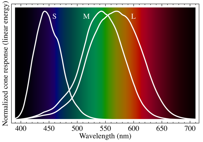
Answering this conundrum powered the scientific revolution and only was answered with dedicated scientists across biology, physics, and psychology. Your eyes have three types of color detecting “Cone” cells, sometimes described seeing Red, Green, Blue, but the eyes and brains are much cleverer than that. Scientists call the cones short, medium, and long (S, M, L) for their peak wavelengths, but they respond to a range of wavelengths that highly overlap.