
Tangible Talk: Apple health- Bad UX or Irresponsible UX?
What is a designers responsibility to resist bold marketing when the data doesn't back it up? An exploration into Apple Health.
What is a designers responsibility to resist marketing? An exploration into Apple Health.
Apple health is full of snazzy, mysterious charts, and data points. But what did these numbers actually mean? I was bored one evening and decided to try and find out. Come join me on this trip down the rabbit hole!
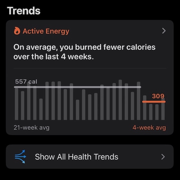
Like perhaps millions of people, I received a surprising alert on my iPhone. “On average, you burned fewer calories over the last four weeks”
I hadn’t realized anything was being tracked on my phone.
I didn’t ask it to track my calories. I don’t use an Apple Watch and no longer use exercise tracking apps.
I happen to know a bit about exercise tracking as a (slow) runner who’s done 16 marathons. I’ve learned that health and fitness measurement is HARD to do. If you get deep into V02max, glucose testing, etc you will not leave with a simple measurement for health. The human body is weird and complicated.
What might Apple, with its billions of dollars, and access to all my data, be able to say?
Let’s start with what triggered this alert. What data was behind it?