History repeating
A look back at the ground-breaking work of Oxfam's Oxjam Music Festival, with lessons aplenty about harnessing social media.
A lot of my writing tends to be about looking back – sometimes fondly, sometimes not so – on the way things used to be in the olde worlde Internet.
This post is an attempt to view a previous project through fresh eyes and show that (maybe?) things don’t change quite as much as we think they do. It’s a very tenuous follow on to my piece earlier this year about shaking up your social media.
Towards the end it also links to some decent material about how digital was employed in the recent UK election. Worth a look/listen before it all fades from memory and we collectively move onto the next thing – it’s been a whole week after all.
First off I’m going to write about that most contemporary of social networks:
[drum roll]
MySpace!
Bear with me. 🐻
Jam yesterday
Earlier this year my wife wrote a LinkedIn post that sparked a nice little thread of collective reminiscence.
The subject matter was Oxjam: an Oxfam fundraising initiative that she had helped create and manage back in 2006.
Oxjam first took place in October of that year, and was an annual fixture for several years thereafter.
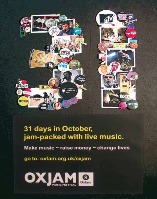
Billed as a ‘month-long music festival’, people were encouraged to put on their own music-based fundraising events all over the UK.
Oxjam’s community fundraising model was a similar concept to Macmillan Coffee Mornings, and was based on people putting on gigs, concerts, recitals, and performances in many shapes and forms to raise money for Oxfam’s work.

Oxfam provided toolkits to help organise events, merchandise to assist with promotion, and a dedicated searchable website to register and plug gigs and reach a wider audience.
The format was new to Oxfam, so there was a lot to learn in terms of logistics, rollout and success measures. But it also helped pave the way for how the organisation made use of social media.
It’s provided me with some of the key learnings I’ve been applying (aka stuff I’ve been boring on about) in my work ever since.
Charities = digital?
In the early 2000s, a lot of progressive, change-making organisations were already active in the burgeoning digital space.
I’d argue that, to some extent, we’re all using platforms and technology in ways that have been influenced by the early innovation of mission-driven institutions.
Much of the work of charities and the third sector can be boiled down to ‘getting people to do stuff’.
Whether that’s shaking a collection tin, getting people to fill in a sponsor form, writing to your MP, signing a petition – it’s almost always about engaging people to take action.
Digital tools offered opportunities to adapt traditional practices and reframe them for new audiences. Take a look at the history of MoveOn to see how crowdsourcing, bite-sized content, and virality were baked in from the late 90s.
When social networks came along they naturally fitted into a long line of tools and methods for generating awareness and driving action that campaigners and fundraisers had been honing for decades.
Enter MySpace
It’s maybe hard to conceive of now, but in 2006 MySpace was everything. Launched in 2003 it grew to be one of the most popular websites on the planet – surpassing one billion monthly visits – and no other Web 2.0 platform came near it in terms of traffic or reach.

Driven largely by music, MySpace became a major player in shaping the zeitgeist of the time. Why not nostalgically peruse some of the artists whose success was built on it?
To a certain degree it differed to almost every major platform that’s come since in the level of customisation and creative freedom it gave users, via editable HTML and CSS.
One of the fun aspects about looking back at MySpace is seeing how messy it is. Not quite GeoCities messy, but certainly a lot more freeform than how most of the web looks today.
Social media platforms have largely sanitised the web and turned most things a shade of vanilla. After all, it’s much more difficult to monetise your product if you can’t predict where the ‘buy’ button will land.
Oxfam wasn’t new to MySpace. It had scored its biggest ever online petition numbers when it lobbied against Starbucks’ efforts to trademark specific types of Ethiopian coffee. This was in no small part down to MySpace’s impact, and word of mouth generated on the platform.
But Oxjam was a different flavour of project altogether and represents a bit of a watershed (in my brain anyway) for how digital platforms transitioned from being used in a top-down “we’re in control” way to something much more community-oriented.
The challenge of control versus reach
In common with many organisations at the time, from a communications perspective Oxfam was used to doing things in quite a hierarchical: ‘we’ are in charge of the output, ‘we’ tell the story, ‘we’ make the decisions.
And why would it have been any different? In 2006 there wasn’t a whole lot of evidence of the much-hyped but largely intangible impact of user-generated content.

So the MySpace effect was met with delight and some head scratching. People suddenly had their own creative tools, access to networks that had never existed before, and the power of algorithms at their disposal.
And they went for it big time; control was suddenly much more in the hands of users.
Very abruptly the concept of creating a neat, self-contained online destination, and promotional activity that drove traffic to it, seemed somewhat antiquated.
My role in the revolution
I’d love to be able to say that I was fully behind this game-changing moment, but that would be mostly a lie.
As Oxfam’s Head of Digital at the time, working within the Communications division, a lot of my role meant gatekeeping online content.
Oxfam is a huge organisation: it operates in over 80 countries, has a shop network of over 700 stores in the UK, and is now made up of over 21 affiliate organisations.
That’s a lot of people passionate about ending poverty.
And where better to indulge this passion than in the creation of an eclectic array of websites, blogs and digital trinkets.
Everyone who’s managed any sort of large-scale corporate web function knows this pain - the ease and flexibility of creating funky new digital stuff is both a blessing and a curse.
Keeping tabs on an array of websites that, politely, aren’t as on brand and on message as you’d like them to be can be an on-going challenge.
So when an initiative comes along that rips up the not-very-well-established rulebook it requires a hasty rethink.
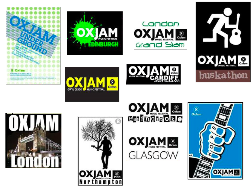
It was evident pretty quickly that all across MySpace the Oxfam logo was being reinterpreted, brand fonts and colours were abandoned, links were going to the wrong places, there were some quite loose interpretations of Oxfam’s work, there were some swears.

If you’re used to calling the shots, and having campaigns largely roll out on your own terms, this can be challenging territory.
But it’s easy to miss the bigger picture – sure, the punters might be riding roughshod over your brand playbook, but just look at how keen they are to be involved!
Oxfam’s culture of empowerment proved to be a huge asset in helping steer things to a position that worked for everybody.
The massive amount of work going on behind-the-scenes, where a network of coordinators was helping to galvanise communities of musicians, was key to finding a happy medium where light-touch guidelines didn’t compromise people’s creative ambitions.
It would have been easy to come down heavy handed and impose restrictions. But responding with trust, empathy, and meeting folk part-way worked far better.
It’s a good reminder that successful campaigns, online or otherwise, don’t just happen by accident. To build things that scale and sustain takes the proverbial village.
Lessons learned
The Oxjam experience was formative in a lot of the situations I’ve dealt with subsequently, and part of the reason for writing about it is to capture a few elements that continue to resonate.
I won’t pretend I’ve been anywhere near the creative end of a digital brief for more than a decade, however there are still some evergreen points that are worthy of consideration.
Logos are there to be broken?
It still surprises me how much people can get worked up about a logo. Where it’s placed, how prominent it is, its size in comparison to other logos. Pixels get nudged from side to side, designers cry into their MacBooks.
This was relevant in the days where print dominated, and you could surround your pretty brand marque with as much whitespace as your heart desired.
In the digital realm it’s just not the same. You relinquish near total control of your organisation’s visual identity when it comes to social platforms particularly. Doubly so if you’re asking people to participate.
Embrace that fact, and design with it in mind. If you accept that your house font, brand palette, and logo may get hopelessly mangled in the process, it’ll cause a lot less heartache later on.
A strong proposition is your starting point…
Probably the thing that I bleat on about most when it comes to making ideas work in digital form.
If your motivation is to create an Instagram thing, or a TikTok thing, or an AI thing, you’re probably doing it wrong.
Focus on making it a valuable thing, a worthwhile thing, a shareable thing, and then plot your channel strategy accordingly.
The beauty of Oxjam and its easy transition to the digital space was the fact it was a solid concept in the first instance – very little shoehorning required.
The alternative is you end up with a monstrosity like mayonnaise in the metaverse. And literally nobody wants that.
…but only if you’re sure the fit is right
The way in which digital was employed during the tumultuous UK election campaign tells some insightful stories.
If you look further than the slovenly headlines about THE FIRST TIKTOK ELECTION!!! (Private Eye’s podcast on the state of online advertising made me laugh when they talked about “the fifth consecutive first social media election“) there’s lots of useful tidbits to pick through.
Even if your organisation’s mission and purpose is vastly different to that of a political party, there’s benefit in seeing how different digital strategies played out.
John Curtice and Rachel Wolf’s Trendy podcast is always worth a listen and has some nice analysis on the different online marketing techniques employed, including the on-going difficulty of regulation in the digital space. And it’s worth reading this piece by Timandra Harkness to get a breakdown of the tactics employed by different parties.
If data is your thing then the excellent Who Targets Me website gave a real-time snapshot of how parties were directing their online spend. This collaboration with Sky News digs into the detail.
Clearly the dust will need to settle before there’s a definitive picture. It’ll be interesting to understand whether the parties that got under the skin of their data and made informed targeting decisions saw better returns than those who arbitrarily threw their budget at (and in the case of the Tories, really didn’t understand the vibe of) TikTok.
While the odd genuinely viral moment may have taken off, I’d be willing to wager there’ll be a correlation between nuanced messaging, targeted spend and geographical awareness when it comes to seats actually won.
Which brings us right back to the theme of the post: happy accidents do happen, but finding the right horse for the right course is kinda fundamental when it comes to developing digital products that prove their worth.
If you'd like to support Oxfam's life-saving work, there are loads of ways to get involved on their website:

Get involved | Volunteer, Fundraise, Campaign & more | Oxfam GB
Get involved in any way that suits you. Set change in motion and start transforming lives today.
📜 Thank you for reading
Add a comment: