The Pudding explains queuing theory, abortion mazes, NBA jerseys, crokinole
New projects, from crokinole to navigating abortion mazes!
Hello! We’re back in your inboxes because we’re on a publishing streak, with many new projects to share!
[Essay] Do you know about the game of crokinole? Nope? Neither did most of our team until Russell introduced us to this mashup of shuffleboard and curling. Learn about this tabletop game while playing our crokinole simulator.
[Essay] To show how difficult it is to get abortion care in the U.S., we built a maze for each state where the complexity is based on the state’s abortion policies. Work through all 51 mazes.
[Essay] For decades, NBA fans had it easy: Teams wore white at home and colors when away. But today, teams are switching it up. Tyler Machado looks at which teams buck tradition and which ones embrace trends using data from the 2023-24 season.
[8-min Video] We spend a significant part of our lives waiting — from ordering coffee, to snagging Taylor Swift/Beyoncé tickets, to navigating airport security lines. Uri Bram and Mureji Fatunde explain why queues are so tricky.
If you haven’t already: take this survey and help us sort 35 K-pop artists into generations. We’ll make a story with the data!
But first, we’re excited to bring back…
The 8th annual Pudding Cup

We started The Pudding Cup back in 2017 to crown our favorite data viz of the year. Since then, it’s evolved to exclusively focus on non-commercial passion projects to give them the attention they deserve but might not receive. Up to three winners will receive $1,500 each.
See more details and submit your project
Welcome to Crokinole, the greatest game you’ve never heard of
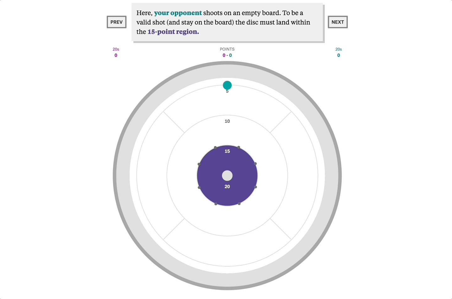
The objective is simple: flick your discs into higher-scoring areas. In this simulation, your opponent shoots on an empty board and lands within the 15-point region. Not bad, but the real goal is to sink the 3.2cm disc into the 3.5cm center hole for 20 points. In competitive matches, 41% of these open shots are missed.

So, how do the Crokinole greats perform? And how would you compare?
Read the essay
Play the Crokinole simulator (built with Matter.js)
If you like this story, consider our other essays about games:
The United States of Abortion Mazes
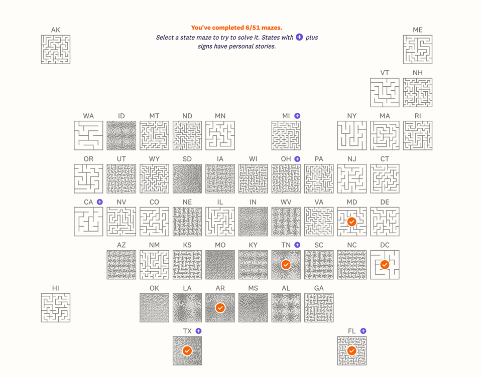
We used 28 state-level data points from the Guttmacher Institute to calculate the complexity of each state maze. The Southeastern U.S. is home to both dense, complex policies and challenging mazes.
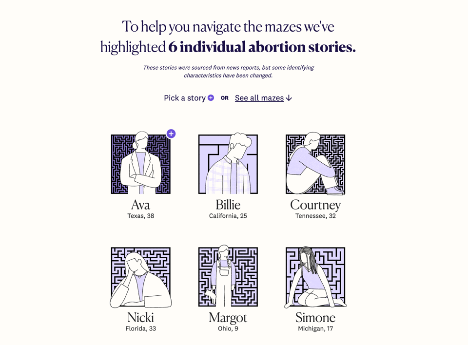
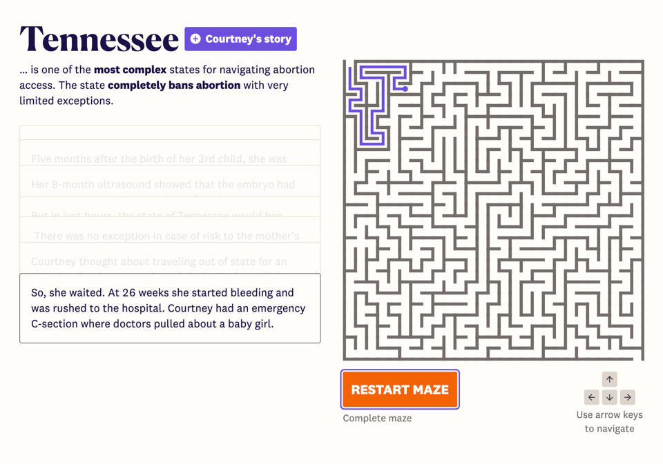
To help you navigate, we’ve included six personal abortion stories, which you can follow while working through the mazes for select states.
Read the essay + navigate the mazes
If you like this story, we’ve written about reproductive rights in the past:
Colors of the Court
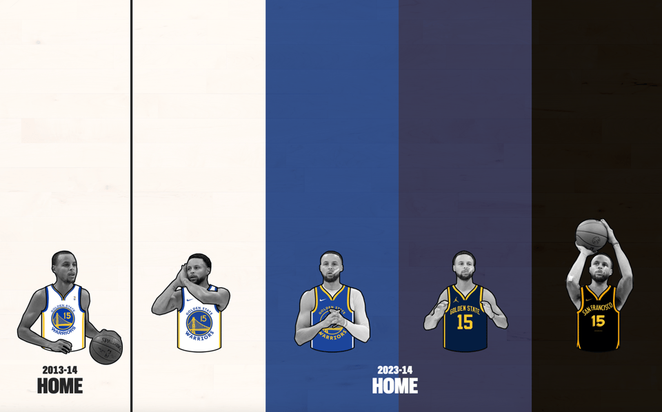
If you watched Steph Curry and the Warriors play at home during the 2013-14 season, you would have only seen them in white jerseys — except for the special sleeved Christmas uniforms.
But last season, the Warriors sported four different colors: blue, navy, black, and, of course, white.
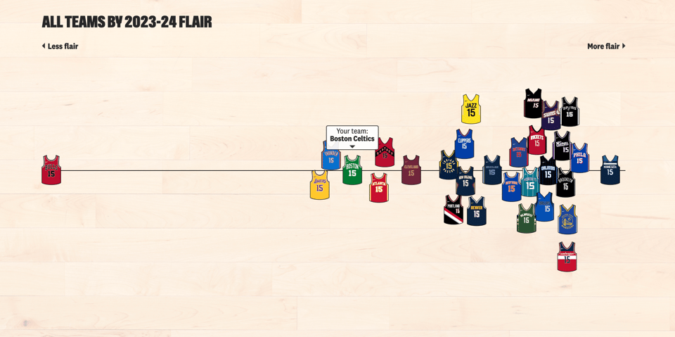
To measure how much each NBA team has deviated from the classic white-home/color-away format, we created a “flair score.” Find out where your team falls, which colors they wear most often, and how they compare to the rest of the league.
Enjoy basketball? Check out these classics from our archive:
Tired of waiting in line? An expert explains why queues are so tricky.

In this video, we break down four different queuing scenarios: pooled vs. parallel queues, priority queues, alternative queuing disciplines, and boundless queues. We can’t promise it will make lines move faster, but you’ll definitely understand why they don’t!
Here are a few other explainers, from our archive:
Quick asides!
Have a cool essay idea that you want to make? Check out our pitch guidelines.
Want to hire our team to create data-driven, visual stories? Visit our sister studio, Polygraph.
#stuff-we-love at The Pudding
Here are some special links shared on our Friends of The Pudding slack-channel (get access via Patreon)!
Kelli Anderson’s interactive pop-up book Alphabet in Motion
Datawrapper’s blog post on choosing colors for race, ethnicity, and world regions
Arborville, an explorable ASCII town (click on the red characters!)
A big thanks to our recent Patreon subscribers — your support means a lot!
Thanks for reading!
The Pudding team
You just read issue #18 of The Pudding. You can also browse the full archives of this newsletter.