Hello CSSpooky Friends!
It has been fun to receive extra styles this month due to Hacktoberfest!
Those styles have also given me an opportunity to identify common errors during PR reviews. Most of the fixes I request from contributors have to do with contrast and :focus, so here are some quick tips. These are useful for any site 😉
- If you create a "button" style, the button background needs to meet 3:1 contrast with it's surrounding background
- Do not remove outlines on
:focuswithout providing an alternate style (and the best route is to keepoutline: 2px solid transparentto support Windows High Contrast Mode) :focusneeds to meet 3:1 contrast against the previous color if you are changing text color, and I would suggest meeting the other minimum criteria as proposed in WCAG 2.2- If you allow the browser's
:focusstate, ensure it isn't cut off and that it is visible against any custom background styles/imagery - Don't forget the
.skip-link! It needs to be made visible at least on:focus - Meeting color contrast may not be sufficient for legibility if your text is also very narrow, or a small script/italic font - consider bumping size and/or weight
💫 If you'd like to share these tips, I originally posted them in this Twitter thread.
There are now 48 styles available - go check them out!
Recently Added Styles
-
Animado By Elisangela Silva
-
Fresh By Thomas Champion
-
Hackytoberfest By Jordana Harrison
-
Dot grid By Abigail Colina
-
Moccasin Stage By Gabriel Paixao
-
Plants on Pink By Nicole Ortiz
-
Purpleland By Dawntraoz
-
Rainbow By Nic Mayer
-
Russian Inspiration By CandiceCz
-
Severe with Rainbow By Lizard Morrow
-
Yellowed By Sowmya Seshadri
CSS Tip: Use CSS gradients to create single element illustrations
I created this slightly spooky lil' pumpkin last year as an exercise to familiarize myself with CSS illustration.
The biggest thing I learned: when using multiple gradients, the first listed is the "top" of the stack. So, using an entirely gradient method, your background gradient elements need listed at the end.
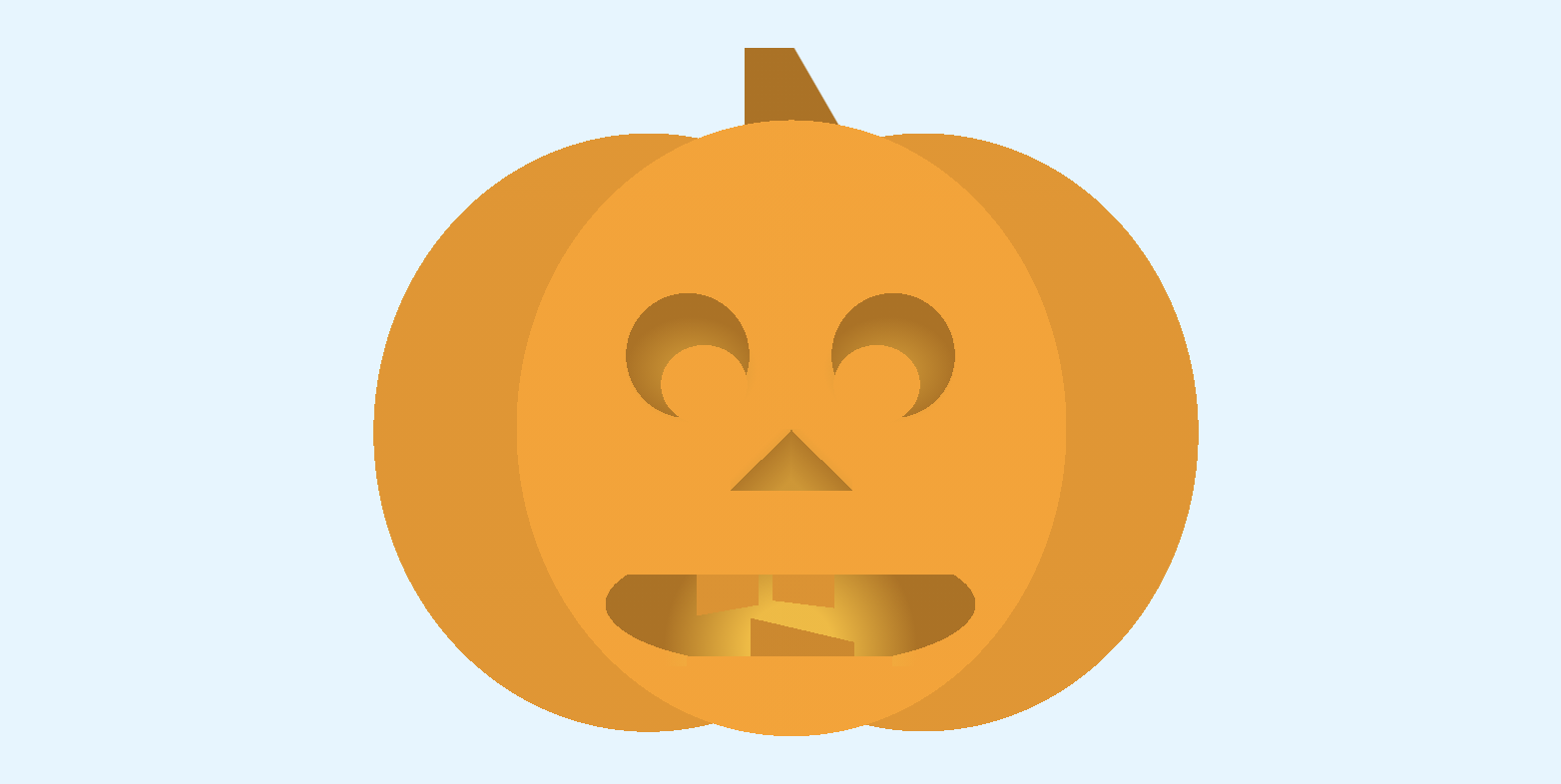
I'm sure there are improvements to be made, but this pen also shows one way to make your illustration stage responsively contained to the viewport. Jhey also has a video tutorial on creating a responsive unit and container as the foundation for a CSS illustration.
Link Roundup
Here’s some links you may have missed:
- 📺 Hidde de Vries SingaporeCSS talk on auto sizes in Grid layout
- Manuel Matuzovic's demo on progressively enhancing .gif inclusion based on
prefers-reduced-motion - 7 myths designers and developers believe about web accessibility by Sophie Koonin
- Looking for a CSS blog post idea? Check out what folx want to learn more aboutaccording to Lea Verou's Twitter thread (Spoiler: it's grid)
- I got my start on the web with Flash, so I submitted this "Flash" intro to a recent CodePen challenge. It was fun to play with orchestrating CSS keyframe animations, which is something I haven't had a lot of reason to explore! This is a near recreation of my actual original website intro.
Keep it .class-y,
Steph • @5t3ph
You just read issue #10 of Style Stage Updates. You can also browse the full archives of this newsletter.