Friends!
Blackletter fonts are back in vogue.
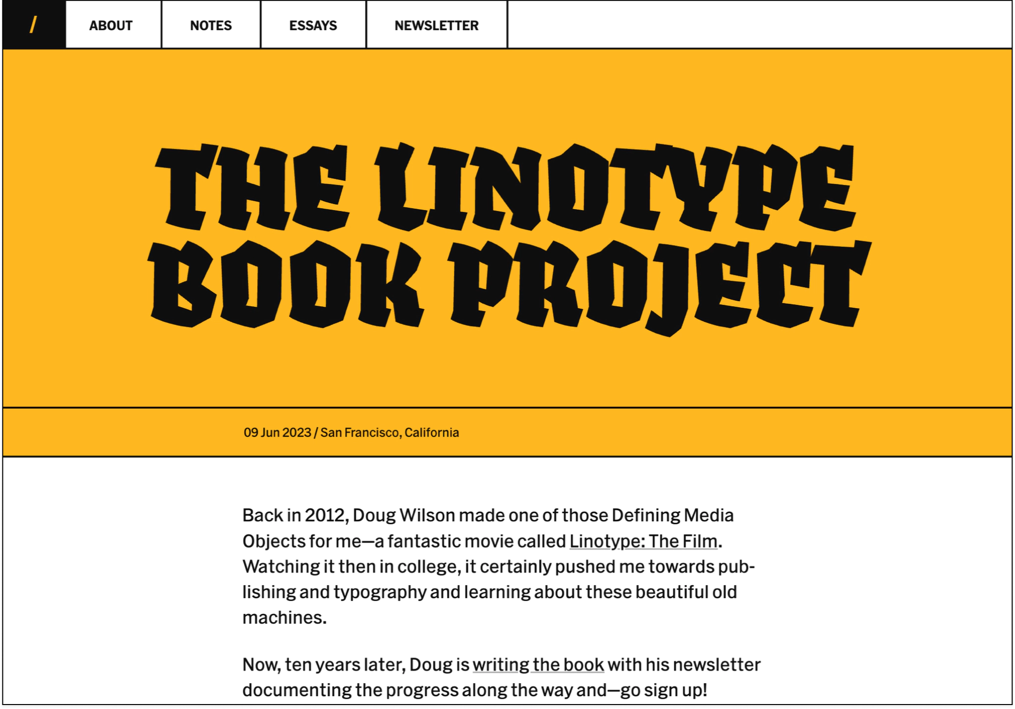
Yesterday I made an update to my website with some big, blocky colors and wild new typographic styles; Fakir now takes center stage. I’ve been wanting to use this typeface for more than a decade since each letter looks like it was shaved out of a large block of marble and great care was taken to smooth out the decorative edges that garner each flank.
But when you stack these letters close together like I’ve done here then there’s this real WHOA WHAT feeling that only a great font can give you.
Here, look:

Right!?
For a while I was thinking about going real fancy with the visual design of my blog since I just made a micro-wedding-website and I liked the direction of it; fancy fonts, swooping illustrations, gold gold gold! It was a side project that pushed me to learn new things about typography and how to elevate a few small words with visual flourish alone. So I wondered if I should take this same fanciness and apply it to my blog.
Last week I was considering using Klim Type’s beautiful and newly released Martina Plantijn which I simply cannot close the tab on. It’s graceful and elegant and makes my writing look as if it was written from a palace ballroom. But, I eventually conceded that this fancy visual style of my site didn’t fit my writing; my notes are often slammed out in twenty minutes without much thought or editing and so using something as beautiful and stately as Martina Plantijn didn’t feel...honest?
But damn this typeface sings.
I wrote about the update and how I figured out the combo of JavaScript and CSS required to make these headings scale up and down depending on the number of letters and words each title has. It’s a bit tricky and I wish there was a simpler way but it’s not too gnarly.
Why the redesign? Well, remaking my website is endless therapy. I love goofing around with new things in CSS and having the freedom to do whatever I want without someone looking over my shoulder. In this version, I hoped to pack a punch each time you click a link or find a post, each time I want the typography to stand up and grab you by the lapel and wiggle you about.
I explored making custom styles for each post—imagine each page with a different color or font depending on the mood of the piece. That wouldn’t take much effort, but one thing I’ve learned over the years is that custom styles and fonts and colors makes the overall site harder to care for and maintain in the future. Each new variation in the design or visual flourish is something I have to make sure doesn’t slow me down or break apart with time.
With each new feature I have to ask myself:
Is this thing worth maintaining forever?
I know that optimizing for the longterm, even if that means pulling back on some design elements that might feel cool today, is what’s best for my site. In the past I’ve had to throw everything away and start again because I made too many custom pages, too many things to maintain for myself and it all became impossibly overwhelming.
So with each redesign I have to take great care of my website to make sure it’s easy to take care of in the future.
In the design notes for Martina Plantijn, Kris Sowersby writes:
To curate means to care, not to make a list. We like to remember those who start things, but the real work of archives and institutions is the maintenance and continuation of them. Starting something is easy, caring for it over centuries is hard.
I wouldn’t say that what I’ve done on my website is anything close to professional archival work, but I bring this up because this is the longest running project of my life so far and it does require a great amount of care over a long period of time. There’s something humbling about that, something inspirational about that, about how this website and me are gonna stick around to the end.
And so this snippet from Kris above reminds me why I love reimagining my website; I love finding new ways to care, new details to pay attention to. Maintaining a website for this long has changed my perspective and forced me to learn how to make everything less brittle and wobbly in the future.
But, but, but.
There’s always some detail that I’ve overlooked where I could have been more careful, more considerate, with endless potential kindnesses waiting for me to discover in the future. It might be a tiny HTML attribute like adding the width and height to an image. Or it might be image optimization, or fixing the color of the text to make it more accessible. It could be ten thousand things.
But what web design proves to me over and over again is that there’s always new ways to expand the scope of our care.
See you next week,
Robin
You just read issue #18 of Robin Rendle. You can also browse the full archives of this newsletter.