quantum of sollazzo

quantum of sollazzo

Archives
Sponsor
Subscribe
October 31, 2026

preview 681: quantum of sollazzo

Quantum of Sollazzo

Forwarded this email? Subscribe here  ·  View it online

No. 681  · 

Quantum of Sollazzo
 

Things that caught my attention

I wrote a piece on how to measure where AI speeds up the software development process. In Government, we use the GDS Service Standard, which covers technology, but also design, user research, resilience, and support. Which of these are sped up by AI? At this stage: not all..

·

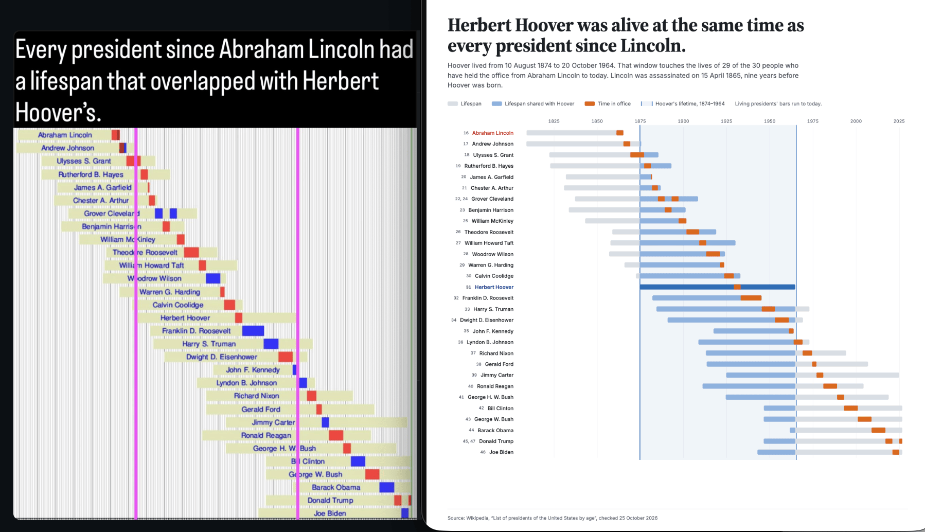
Instagram suggested me to look at this chart and I couldn't help but think it could be improved. The version on the right was re-designed and fact-checked using Claude.

Presidents
·

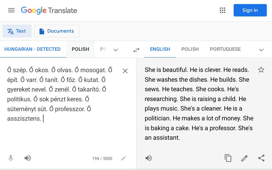
Do you remember this rather famous Google Translate screenshot?

LinkedIn post

Often used to illustrate bias in machine learning, it originates from this paper titled "Gender Bias in Machine Translation and The Era of Large Language Models".

I tried again recently, and Google Translate seems to have "resolved" the issue with a workaround that highlights the issue of translating gendered languages.

·

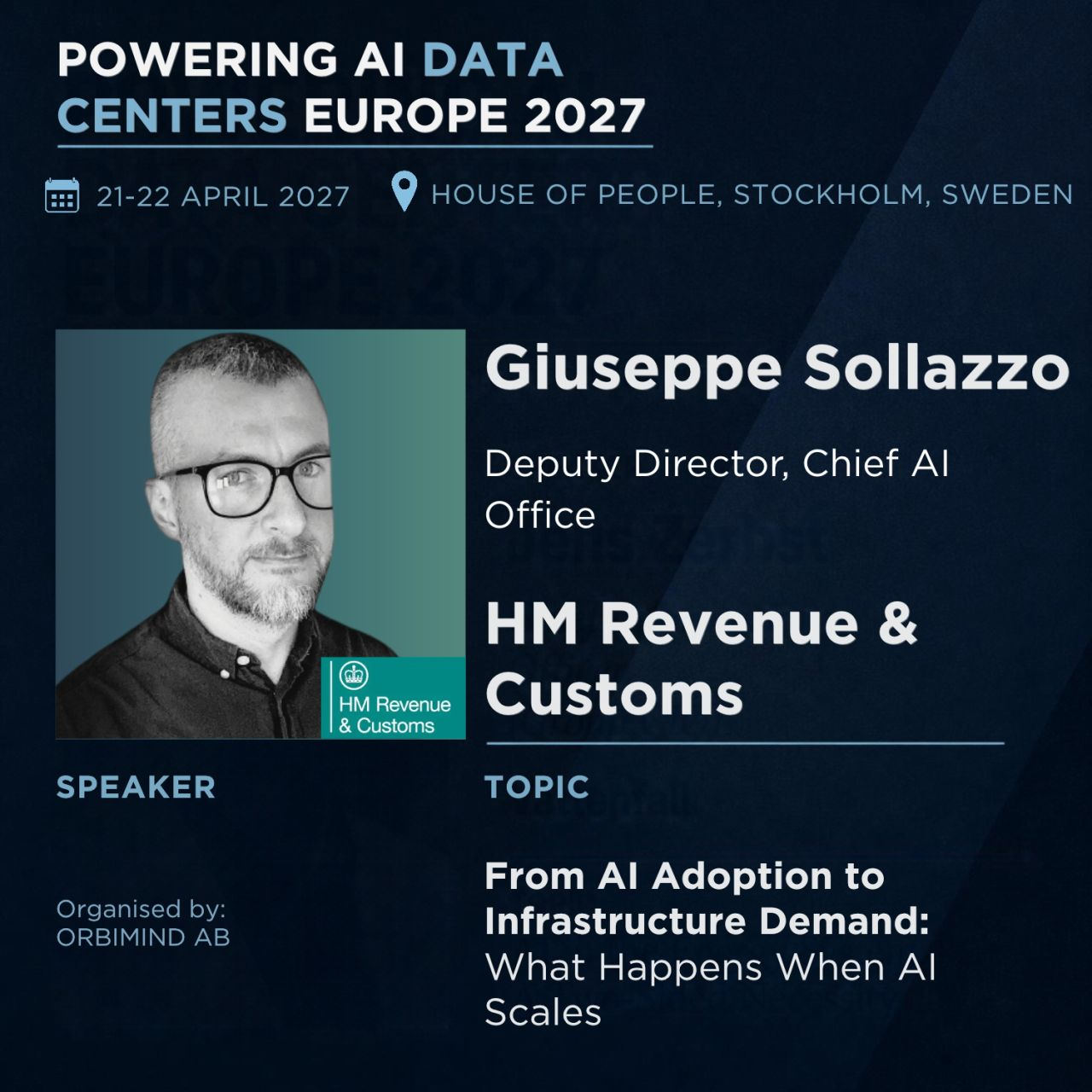
Finally, I'll be speaking at the House of People in Stockholm in April on the topic of "From AI Adoption to Infrastructure Demand: What Happens When AI Scales". If you're in Stockholm, let's catch up for a chat!

LinkedIn post

'till next week,
Giuseppe @puntofisso.bsky.social

Sponsored by Jane Street

Jane Street depends on all sorts of messy, real-world data to understand financial markets and the global economy: think world news, decades of weather patterns, deidentified credit card spending, or packet captures of stock exchange market data feeds.

We're hiring Data Engineers to turn datasets like these into reliable inputs for trading. Working closely with our researchers, you'll evaluate unfamiliar datasets, build robust ELT pipelines, develop deep domain expertise, and decide what's worth exploring next. 

The job requires a mix of engineering, data analysis, and product sense. If you love the detective work of investigating a weird dataset and figuring out what it actually means, we want to hear from you. No financial background is necessary.

Want to hear what the job is really like? Eric Mannes, who leads our alternative data team, talked with Ron Minsky about it on Signals & Threads.

We have openings in New York, London, and Hong Kong.

Jane Street

Topical

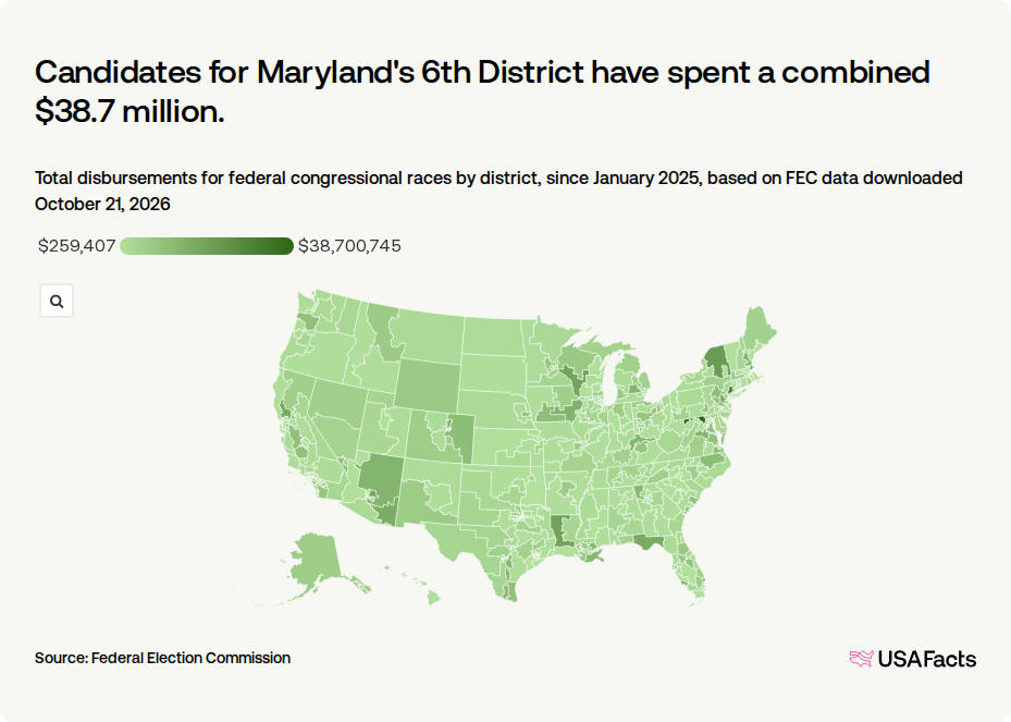
How much are candidates spending for the 2026 midterm? | USAFacts

USAFacts: "Based on FEC (Federal Election Commission) data downloaded October 21, 2026, Senate and House candidates have spent around $2.86 billion on races for the 2026 November midterm election. That's about 84.6% of campaign funds raised this election cycle."
There are some intriguing local differences, too.

How much are candidates spending for the 2026 midterm? | USAFacts

Tools & Tutorials

Shipping 103,802 Dots in 82 KB

Layers: "How we packed our hand plotted dot art into a very compact binary format, reduced geometry delivery by 93% and stopped rendering the background entirely when nothing was changing."
They did this by creating a custom binary format that shrank 103,802 hand-placed dots from 1.25 MB to 82 KB. Splitting data into separate planes drove most of the savings.

Shipping 103,802 Dots in 82 KB

Welcome | The TADA-Wiki

"This wiki sets out four steps to take before you submit a paper, so that anyone who downloads your code can run it and get your results: make your code Transferable, Available, Documented and Annotated."
It offers a pre-submission checklist plus guidance on README/licence writing, repository choice, and code review before paper submission.

How the UK public data tools work

Onibaku.Apps has launched tools that use UK Government Open Data: "planning constraints, food hygiene ratings, the Charity Commission register and Ofsted. None of them scrape anything. Each time you run one, it reads the official API or open data file there and then, and gives you back one flat row per thing, so you're never looking at an old copy."

A Primer for Earth Data Embeddings

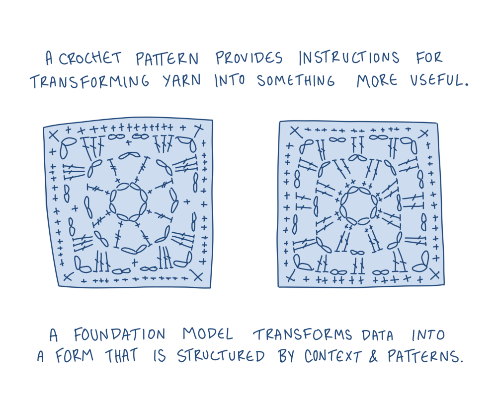
Geospatial foundation models (GeoFMs) learn general representations from Earth observation data, producing embeddings reusable across tasks like classification, retrieval, and change detection.
"Embeddings are one way we make use of the rich representations learned by geospatial foundation models, supporting everything from search and retrieval to natural language interfaces. Yet for many practitioners, the concept remains opaque. This primer explores how embeddings are generated, the kinds of questions they help answer, and why they’re useful across the geospatial ecosystem."
A Primer for Earth Data Embeddings

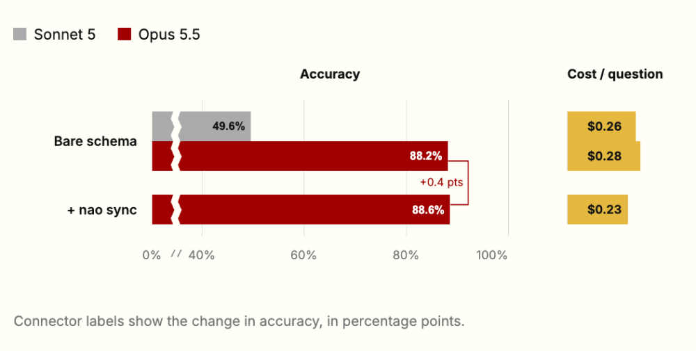
Getting an analytics agent from 50% to 96% accuracy

The Benchouse team reports how switching from Sonnet 5 to Opus 5.5 lifted accuracy from 49.6% to 88.2% using only bare schema, before any context work, and illustrates how adding full documentation, context-rule writing, and explicit business definitions pushed Opus to 96.5% accuracy at 100% completeness.
Getting an analytics agent from 50% to 96% accuracy

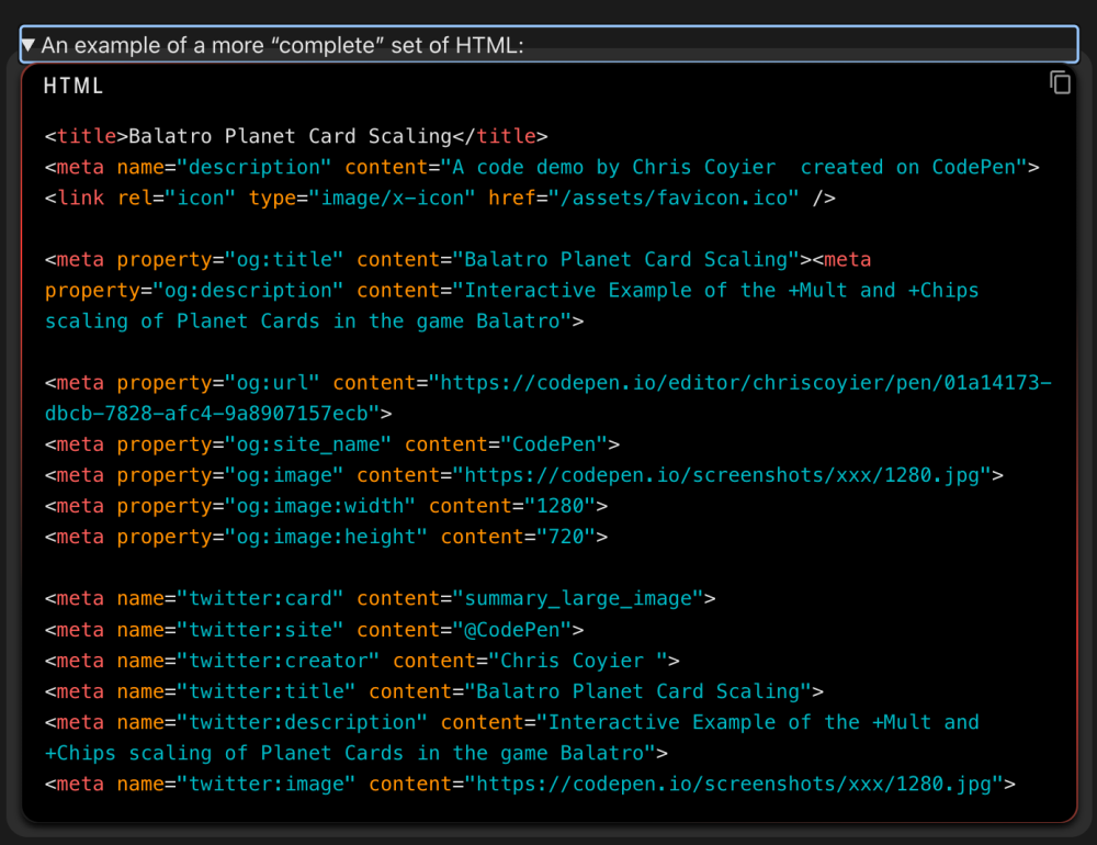
Creating Dynamic Social Media Cards for User Content

"By “dynamic” social media cards, I mean cards for pages of user-generated content or something like an e-commerce site with loads of different products. Meaning too many pages to reasonably design a custom graphic by hand for each. So what we’re talking about here is a system to generate dynamic images with dynamic data."
Different platforms (Discord, Slack, X, iMessage, etc.) render "unfurls" (apparently this is the term...) very differently, so you can't fully control how a card appears.

Creating Dynamic Social Media Cards for User Content

Dataviz, Data Analysis, & Interactive

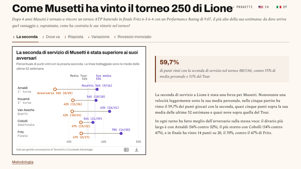
How Musetti won the ATP 250 in Lyon

Danilo De Rosa digs deep into ATP data to show how Danilo Musetti won the Lyon ATP 250 tournament.

Come Musetti ha vinto il torneo 250 di Lione - Danilo De Rosa

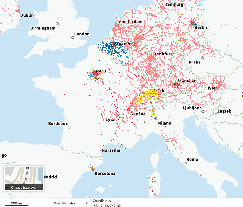
Maps for Mobility | geOps

This Mobility Portal shows the live positions of thousands of public transport vehicles worldwide, derived from timetable or real-time data.
(via Ettore Ferranti)

Maps for Mobility | geOps

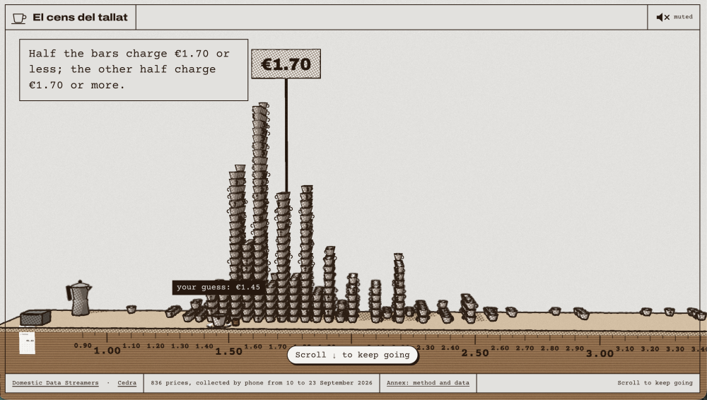
El cens del tallat/The cortado census

Don't worry, there's an English version so you won't have to learn Catalan 😃 "In September 2026 we rang thousands of bars, bakeries and restaurants across Barcelona with a single question: how much is a cortado?"
(via Ananth Iyer)

El cens del tallat — Saps quant val un tallat a Barcelona?

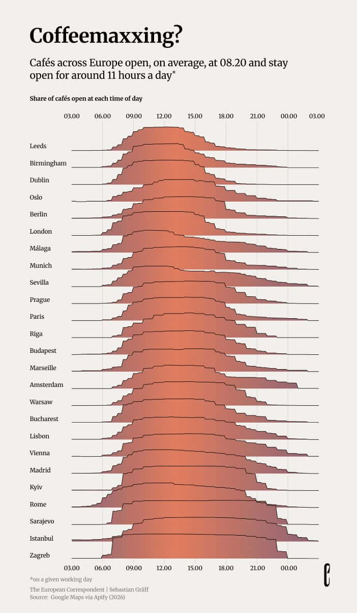
Coffeemaxxed lifestyle

Speaking about coffee, The European Correspondent ran an analysis of 15,000 cafés across 80 European cities. It found that London and Istanbul have the most listings but mediocre reviews, while Bucharest's cafés boast the best ratings. That said, the longest opening hours are in Tirana, Podgorica, Zagreb and Pristina.

Coffeemaxxed lifestyle

The Real Kevin Bacon

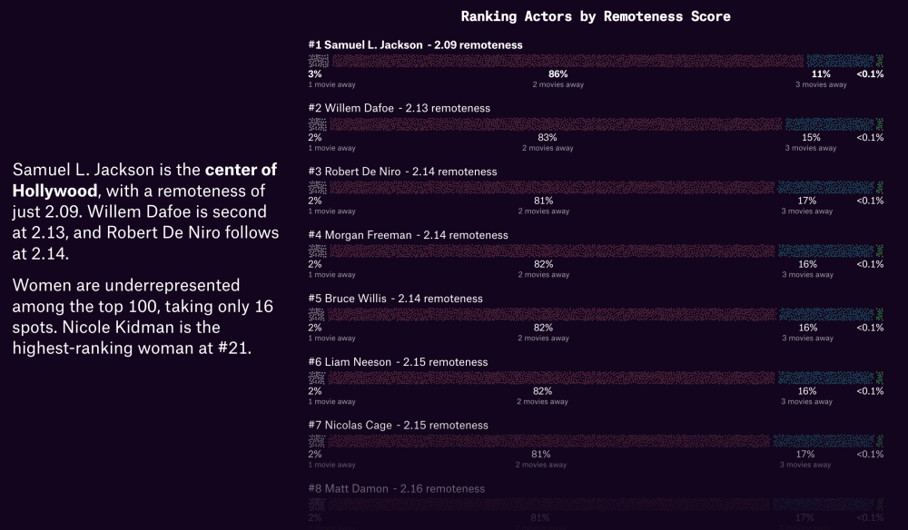
The Pudding's data-driven take on the famous "Six Degrees of Kevin Bacon", showing that other actors are better hubs than Bacon (or, they outbacon Bacon?).

The Real Kevin Bacon

WJP Rule of Law Index | Insights

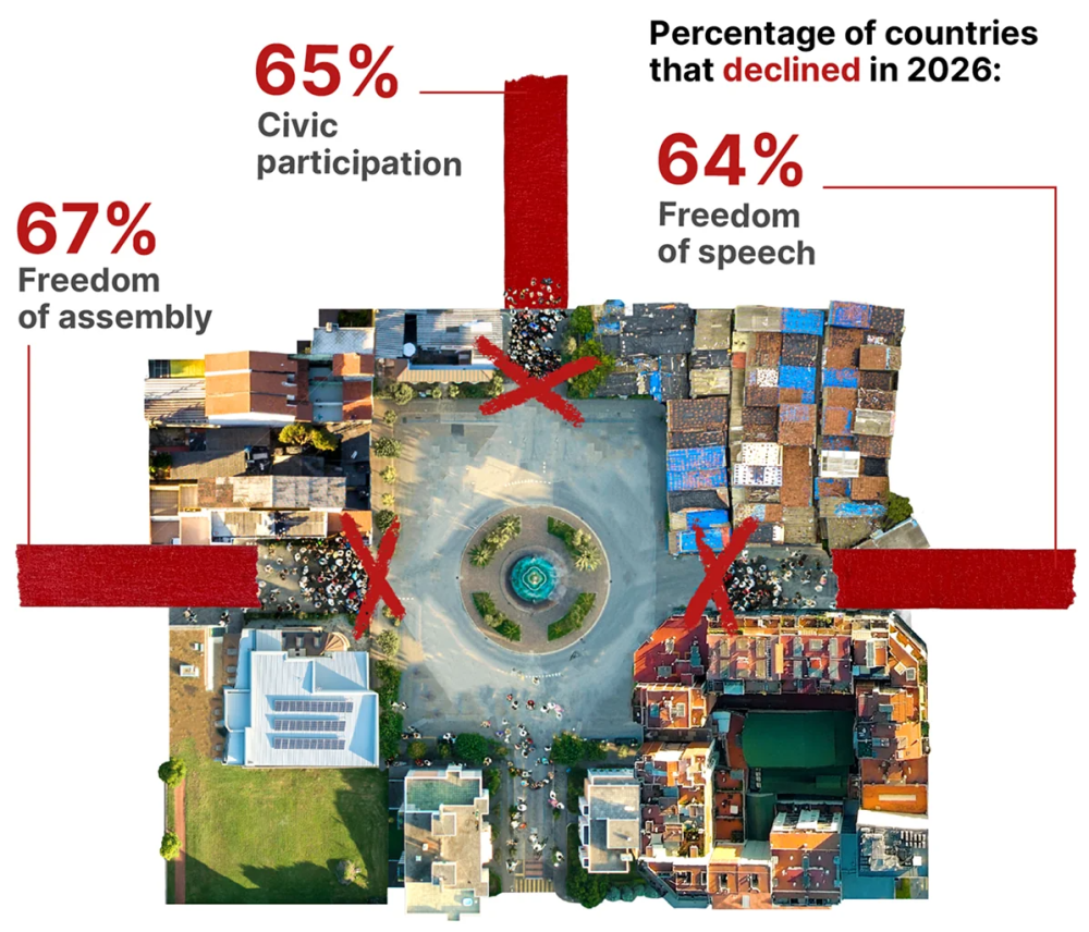
The World Justice Project's analysis suggests that indices of the global rule of law have declined for the 9th consecutive year.

WJP Rule of Law Index | Insights

Instagram

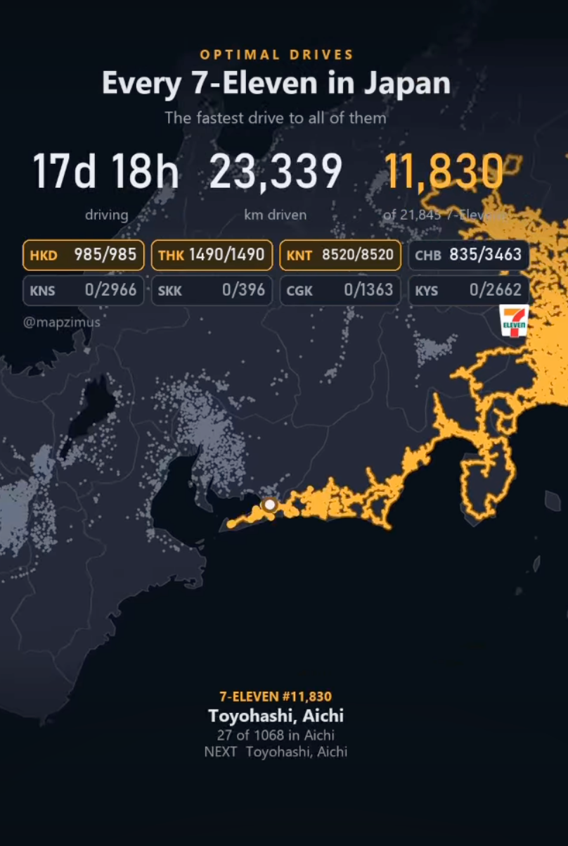
This Instagram animation shows how to visit every 7-Eleven konbini in Japan in one single drive (i.e. a TSP solution, for you computer science geeks).
(via Stefano Arteconi)

Instagram

Is doomsday three weeks away?

This article shows "the perils of extrapolating growth, from populations and pathogens to running and revenue".

Is doomsday three weeks away? - Understanding the unseen

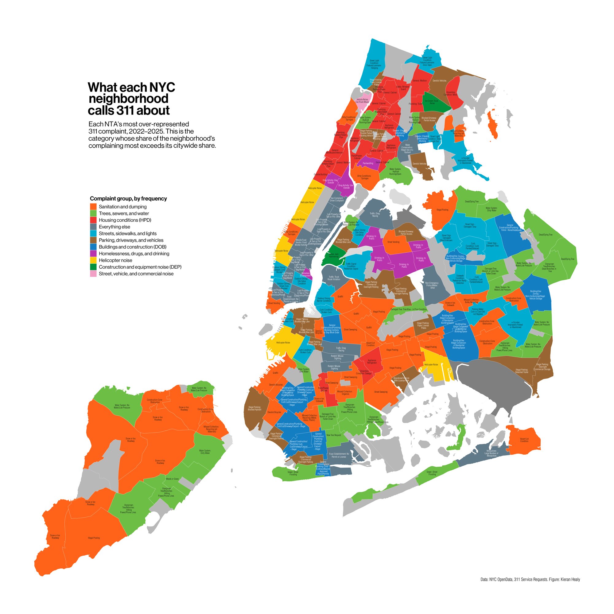
Characteristic NYC Neighborhood Complaints

Kieran Healey does a brilliant data analysis and visualisation of New York City's 311 Services and Complaints data.

Is doomsday three weeks away? - Understanding the unseen

The Lancet Commission on 21st Century Global Threats to Health

"Explore how 17 major threats could shape health worldwide through 2100, and how much of that burden policy could still avert."
It requires (free) registration.

The Lancet Commission on 21st Century Global Threats to Health

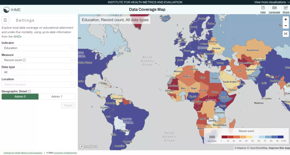
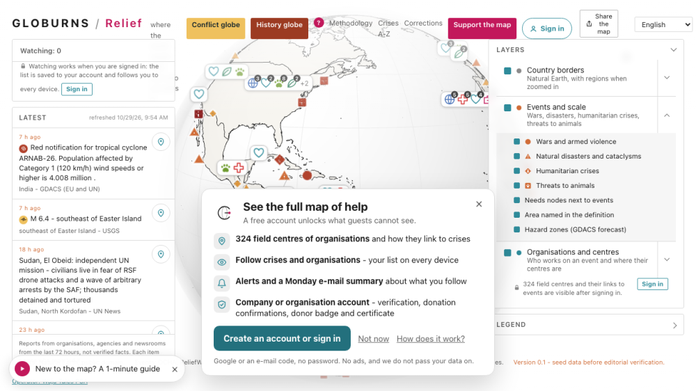
Humanitarian crises map and who is helping

This map brings together many different humanitarian data sources.

Humanitarian crises map and who is helping | GLOBURNS Relief

AI

Revisiting Open Science in the Age of AI - by Carly

A blog looking at four angles of Open Science in the Age of AI: open AI models, AI-ready data, the fear of getting scooped by the AI model owners, and AI as a tool for openness.

Top AI companies of September 2026 on podcasts and YouTube | Arcmira

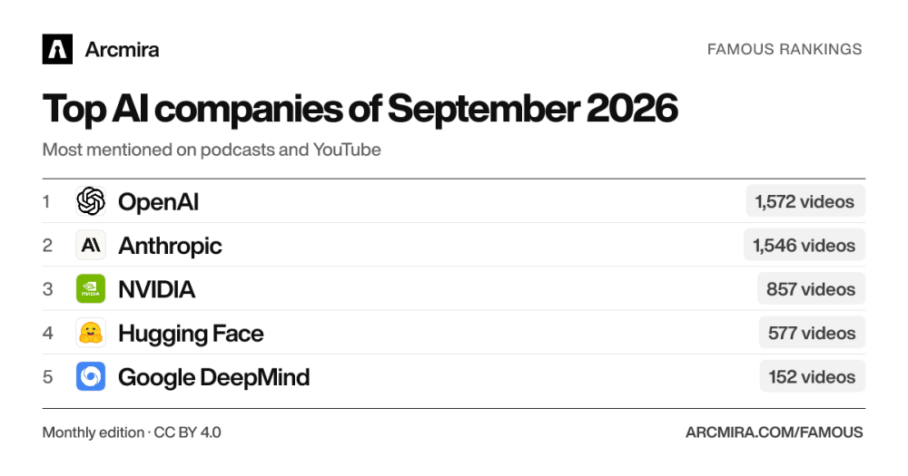
Arcmira runs a comparison of AI company based on transcrpts of YouTube and podcasts.
OpenAI topped September 2026 rankings with 1,572 mentions across 151 shows, narrowly ahead of Anthropic's 1,546 mentions, while METR surged as the top "Rising Star".

Top AI companies of September 2026 on podcasts and YouTube | Arcmira

Did you like this issue?

Buy Me A Coffee


You're receiving this because you subscribed to Quantum of Sollazzo, a weekly newsletter covering all things data, written by Giuseppe Sollazzo (@puntofisso). Have a product or service data people should know about? Sponsor an issue.

The Quantum of Sollazzo grove now has 50 trees at Trees for Life, helping offset this newsletter's carbon footprint.

Proofread by Andy Redwood at Proof Red, who also makes motion graphics about climate change.

Proof Red

© 2012–2026 Giuseppe Sollazzo · London · UK  ·  Unsubscribe

Don't miss what's next. Subscribe to quantum of sollazzo:
Older → 680: quantum of sollazzo
Powered by Buttondown, the easiest way to start and grow your newsletter.