preview 642: quantum of sollazzo
#642: quantum of sollazzo – 27 January 2026
The data newsletter by @puntofisso.

Hello, regular readers and welcome new ones :) This is Quantum of Sollazzo, the newsletter about all things data. I am Giuseppe Sollazzo, or @puntofisso. I've been sending this newsletter since 2012 to be a summary of all the articles with or about data that captured my attention over the previous week. The newsletter is and will always (well, for as long as I can keep going!) be free, but you're welcome to become a friend via the links below.
Quantum #641 had an open rate of 46.85% and a click rate of 14.58%.
The most clicked link was FabricJS.
Quantum has a new sponsor for the next few issues!
Ed Freyfogle, organiser of geospatial meetup Geomob, co-host of the Geomob podcast, and co-founder of the OpenCage, has offered to introduce a set of points around the topic of geocoding.
See a few paragraphs below for an interesting look at building or buying a geocoder.
You might remembers on last week's AMA – Ask Me Anything! a question about genealogy visualization that I couldn't answer and invited readers to send ideas. You're still welcome to send ideas, and we have some good thoughts from reader and generative artist John Cartan.
The question: "One of my hobbies is doing genealogy. My family tree now spans 7 generations including 770 individuals in over 250 families. The "usual" display of this tree is huge and contains many areas of white space. I have used the "dot language to generate a more compact representation, but is is hard to follow the connections between individuals forming marriages. What is the most compact printed representation that maintains the clarity of the "standard" graph, and what is the algorithm for generating it?"".
John says: "I’ve had a long fascination with trees in data visualization. I once made a study of different visual techniques for representing hierarchies and was able to plot large org charts (150,000+ employees) on a single sheet of paper in a way that still allowed users to spot interesting patterns. You can represent each person as a dot (small colored circle) and arrange clumps of those dots in 2D space to suggest global relationships. A ZUI (zoomable user interface) can allow you spot color patterns from a distance and zoom into an individual dot which could hold microscopic text and other information. I have even made animations showing large org charts evolving over time.
Like you, I have used the dot language to describe hierarchy graphs; there are apps that can read a dot file and plot a graph using various algorithms. This sometimes works well and sometimes doesn’t. To create my more bespoke drawings I used an open source visual language called Nodebox. Nodebox is easy to use for simple diagrams, but not easy for things like large trees. I have developed a library of Nodebox nodes that make such charts more feasible (but still not easy).
Genealogy charts pose some special challenges. Last summer I used my tools to create a nice visualization of one branch of my own family tree with hundreds of descendants. You can read about the project and see it (including a PDF) here: http://www.cartania.com/history/hogue%20genealogy.html
This chart is fairly standard, but uses a vertical layout for the second generation in order to fill the space more efficiently. Color coding based on birth order of a progenitor allows you to clearly isolate specific branches of the family with ease.
Your chart is twice as big as mine, so may need additional innovations. As with any data visualization project, I recommend thinking through exactly what relationships in the data you wish to emphasize. What aspects of the connections between marriage partners do you want your users to explore? If actual hierarchy of generations is not one of these key aspects, you might consider breaking out of the tree structure and explore other paradigms, e.g. a scatter plot of age at time of marriage vs year of marriage with shapes or colors representing genders and lines connecting couples. I mention this only to help you think outside the box (or the tree)."
Some good ideas here about interactivity, ways to hide complexity (similar to Google Maps "grouped" clusters), and colour-coding.
If you want to Ask Me Anything, submit a question via this anonymous Google form. I'll select a few every 4-5 weeks and answer them on here :-) Don't be shy!

The Quantum of Sollazzo grove now has 40 trees. It helps managing this newsletter's carbon footprint. Check it out at Trees for Life.
Just a final note from me to say a quick hello to a couple of people I recently had conversations with. Luis Natera and Kristoffer Tjalve both publish very interesting newsletters I've been reading for a while. It was nice to say hello in person (well, on video!) and I do recommend their newsletters for something slightly different from Quantum, but with a similar spirit of experimentation and awe about the world.
'till next week,
Giuseppe @puntofisso.bsky.social
✨ Topical
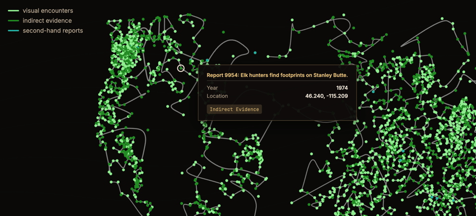
Big Feet
A dataviz about, you guessed, sightings of the Bigfoot.
(via Mark D)
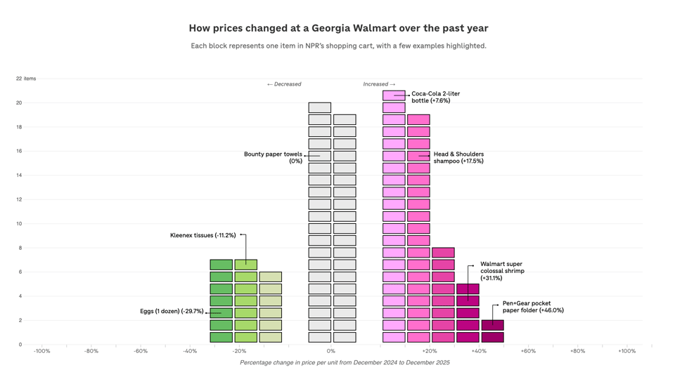
How have prices changed in a year? NPR checked 114 items at Walmart
Alina Selyukh and Connie Hanzhang Jin (NPR): "The cost of living in the U.S. rose 2.7% in December compared with a year before, according to Tuesday's federal data. "
Build or Buy? Should you try to create your own geocoder?
Welcome to part four of our series on geocoding.
Given freely available opensource software, and open data like OpenStreetMap, should you run your own geocoder? Or should you pay a service like ours to host the geocoding software for you? The whole point of open data is that you can do it yourself, right?
The short answer is that yes, you can run, or even write, your own geocoder. Unqiue technical requirements may mean it makes sense to craft your own custom service, but most people prefer to leave it experts and get on with their real work.
Our geocoding API aggregates many different open data sources and provides enterprise level reliability. One factor we see many people overlook: setting up the software is one thing, keeping the underlying data current is another. Put another way: building is easy, maintaining is hard. OSM alone gets 4-5 million edits per day. Still, as a developer myself and long-time OSM contributor, I understand the inclination to get your hands dirty. Hopefully it helps put you at ease to know that we’re doing our part to give back to the open data and open source geo software community.
Finally, rest easy knowing that if you ever need to the data and code is all there for you to dive into. That’s the real power of open-source and open data.
Have a project that will need geocoding? See our geocoding buyer's guide for an overview of all the factors to consider when choosing between geocoding services.
![]()
🛠️📖 Tools & Tutorials
Data Engineering Design Patterns
Free O'Reilly book by Bartosz Konieczny (if you're willing to part with some personal data, that is).
"Covering everything from idempotency to error handling and data observability, this is the definitive guide to building resilient data pipelines with reusable, proven design patterns."
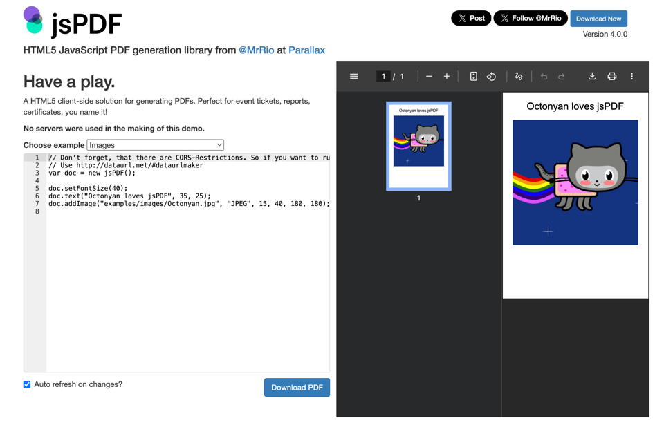
jsPDF
"Client-side JavaScript PDF generation for everyone."
Geomob Events – it’s all in the data, geojson is VERY unforgiving
Steven Feldman continues his exploration of geo dataviz using LLMs. This time he tries Gemini.
mviz
"A chart & report builder designed for use by AI." It's a Claude skill.

GetQRCode
Arnaud Ferrand: "Building tools that respond to real user feedback is what keeps software development interesting.
Just shipped a much-requested feature for the advanced QR Code generator: backup and restore settings!
After getting feedback from beta users, you can now save your QR code configurations and reuse them across projects. No more recreating complex settings from scratch."

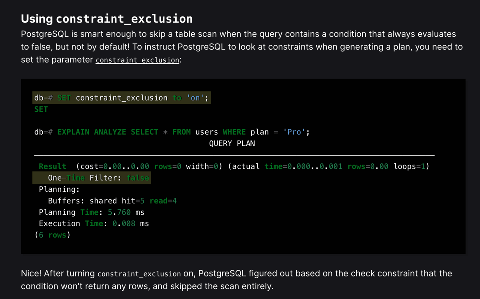
Unconventional PostgreSQL Optimizations
"Creative ideas for speeding up queries in PostgreSQL"
🤯 Data thinking
The Resonant Computing Manifesto
Kristoffer Tjalve highlighted this interesting approach to technology during our call and it's giving me a lot of food for thought: "This is where AI provides a missing puzzle piece. Software can now respond fluidly to the context and particularity of each human—at scale. One-size-fits-all is no longer a technological or economic necessity. Where once our digital environments inevitably shaped us against our will, we can now build technology that adaptively shapes itself in service of our individual and collective aspirations. We can build resonant environments that bring out the best in every human who inhabits them."
📈Dataviz, Data Analysis, & Interactive
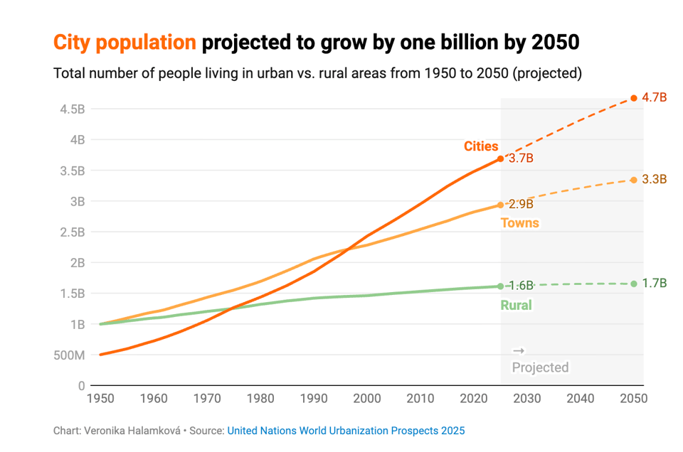
All the people who live in cities
Veronika Halamková from Datawrapper looks at the growth of urban living.
How long can it take to become a US citizen?
"For some immigrants, becoming a US citizen takes a few years. For others, limited visa availability and annual country caps mean waiting decades before even applying."

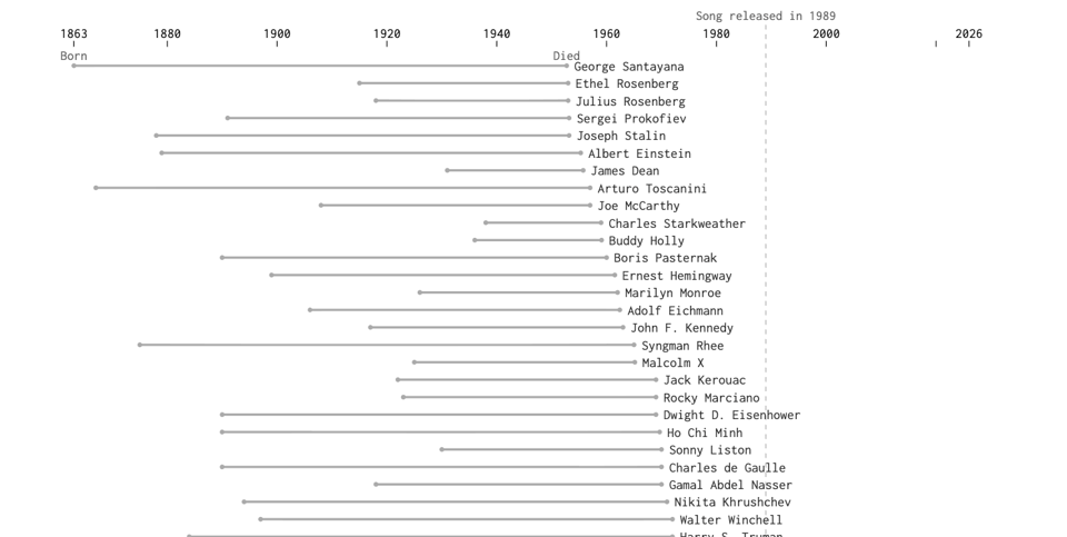
Timelines for people references in “We Didn’t Start the Fire”
You may remember from Quantum #635 a dataviz about all historical references in Billy Joel's "We didn't start the fire". Nathan Yau (FlowingData) has created an interactive version focussing on the people mentioned in the song.
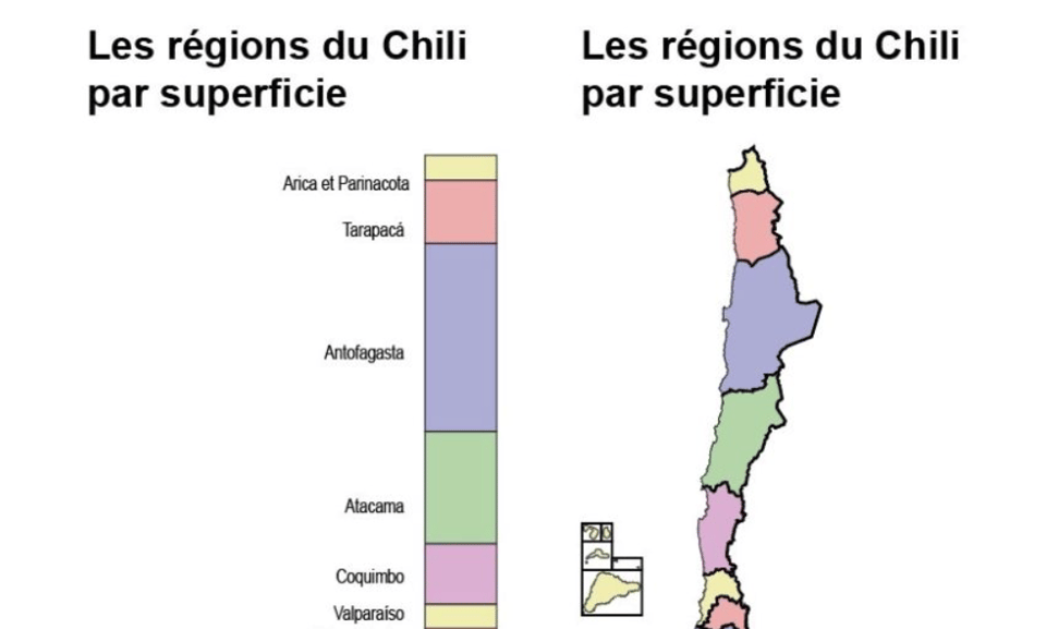
Chile as a dataviz
Clara Dealberto notes on Linkedin.
🤖 AI
Claude Code and What Comes Next
Academic Ethan Mollick, who is usually careful about AI hype, reports on his experiments with Claude Code "A big reason Claude Code is so good is that it uses a wide variety of tricks in its agentic harness that allow its very smart AI, Opus 4.5, to overcome many of the problems of LLMs. For example, an interesting thing happened while the AI was doing its user research: its context window filled up. As you might know, AIs can only “remember” so much information at a time. ... Claude Code handles this issue in a different way. When it runs out of context, it stops and “compacts” the conversation so far, taking notes about exactly where it was when it stopped."
|
DID YOU LIKE THIS ISSUE>? → BUY ME A COFFEE!  You're receiving this email because you subscribed to Quantum of Sollazzo, a weekly newsletter covering all things data, written by Giuseppe Sollazzo (@puntofisso). If you have a product or service to promote and want to support this newsletter, you can sponsor an issue. |
quantum of sollazzo is also supported by Andy Redwood’s proofreading – if you need high-quality copy editing or proofreading, check out Proof Red. Oh, and he also makes motion graphics animations about climate change.
