535: quantum of sollazzo
#535: quantum of sollazzo – 3 October 2023
The data newsletter by @puntofisso.

Hello, regular readers and welcome new ones :) This is Quantum of Sollazzo, the newsletter about all things data. I am Giuseppe Sollazzo, or @puntofisso. I've been sending this newsletter since 2012 to be a summary of all the articles with or about data that captured my attention over the previous week. The newsletter is and will always (well, for as long as I can keep going!) be free, but you're welcome to become a friend via the links below.
Last issue's most clicked link was Baryon's population profiles visualized as Joy Division's Unknown Pleasures.
I really enjoyed csv,conf,v7 last year (a video of my keynote is here). The organising committee has just announced that csv,conf,v8 will be 7-9 May in Mexico City. I'm not sure I'll be able to go yet, but I really recommend it. All details on their website.
'till next week,
Giuseppe @puntofisso
|
Before you go... DO YOU LIKE QUANTUM OF SOLLAZZO? → BECOME A SUPPORTER! :) If you enjoy this newsletter, you can support it by becoming a GitHub Sponsor. Or you can Buy Me a Coffee. I'll send you an Open Data Rottweiler sticker. You're receiving this email because you subscribed to Quantum of Sollazzo, a weekly newsletter covering all things data, written by Giuseppe Sollazzo (@puntofisso). If you have a product or service to promote and want to support this newsletter, you can sponsor an issue. |
✨ Topical
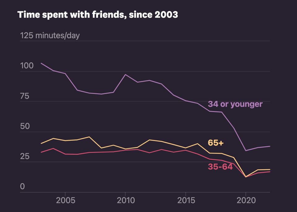
24 hours in an invisible epidemic
Alvin Chang for The Pudding uses the American Time Use Survey data to look at loneliness.
El Nino's Global Impact
Axios: "El Niño can reshape weather patterns around the world, bringing drought for tens of millions and floods to others."

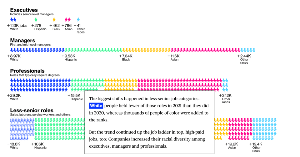
Corporate America Promised to Hire a Lot More People of Color. It Actually Did.
"For a brief moment in 2020, much of corporate America united around a common goal: to address the stark racial imbalances in their workplaces.
Mass protests sparked by the murder of George Floyd led to a flurry of company promises, both specific and vague, to hire and promote more Black people and others from underrepresented groups.
Exclusive analysis by Bloomberg News shows how many of the biggest public companies did."
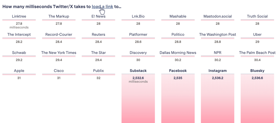
Twitter is Still Throttling Competitors’ Links—Check for Yourself
"Loading links to Bluesky, Facebook, Instagram, and Substack takes far longer than to other sites. We built a tool so you can check any domain you like."
🛠️📖 Tools & Tutorials
Upsert in SQL
"Upsert is an operation that ➊ inserts new records into the database and ➋ updates existing ones. Let's see how it works in different DBMS. The examples are interactive, so you can read and practice."
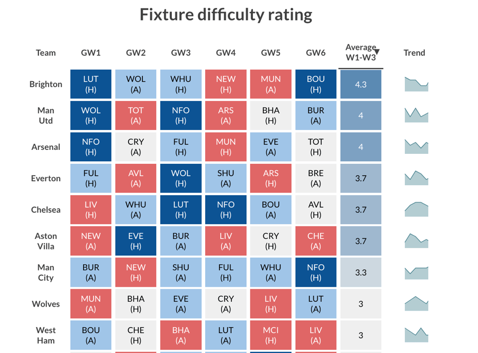
Eight ways to visualize football data
New tutorials by Flourish: "Bring Premier League data to life with interactive charts, league tables, fantasy football, and more". Some are rather pretty.
The R Graph Gallery
"The R Graph Gallery boasts the most extensive compilation of R-generated graphs on the web."

The Python Graph Gallery
As the one above, but for Python.
Satellite image deep learning
There are quite a few goodies on this topic in these repositories, which are linked to a newsletter about the same.
Batch size one billion: SQLite insert speedups, from the useful to the absurd
"A little-discussed method enables inserting rows with bound data into SQLite faster than any existing technique. This novel method is then discovered to have a drawback that makes it generally unusable. The rest of this article explores how to get the best insert performance out of SQLite generally; what's in your control, and what isn't."
From AI automations to content generation, Constant Contact offers a range of advanced features to help you create highly targeted, effective campaigns without the hassle of writer's block. Say goodbye to the frustration of content creation and hello to more time doing what you love with who you love. 🙌
📈Dataviz, Data Analysis, & Interactive
Data for Morocco and Lybia Disasters
The Humanitarian Data Exchange of OCHA (the UN Office for the Coordination of Humanitarian Affairs) now offers dedicated pages with useful data to help with the earthquake in Morocco and the floods in Lybia.
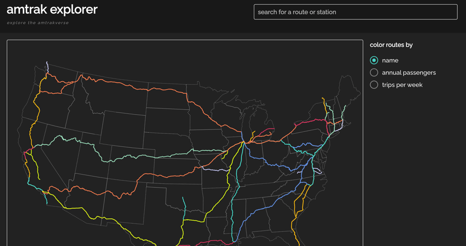
Amtrak Explorer
A simple "at a glance" interactive visualization of Amtrak lines.
Ancient Roman Roads in Italy Transformed Into Modern Subway Map
I've seen a few variations of this idea, but this one is one of the best executed.

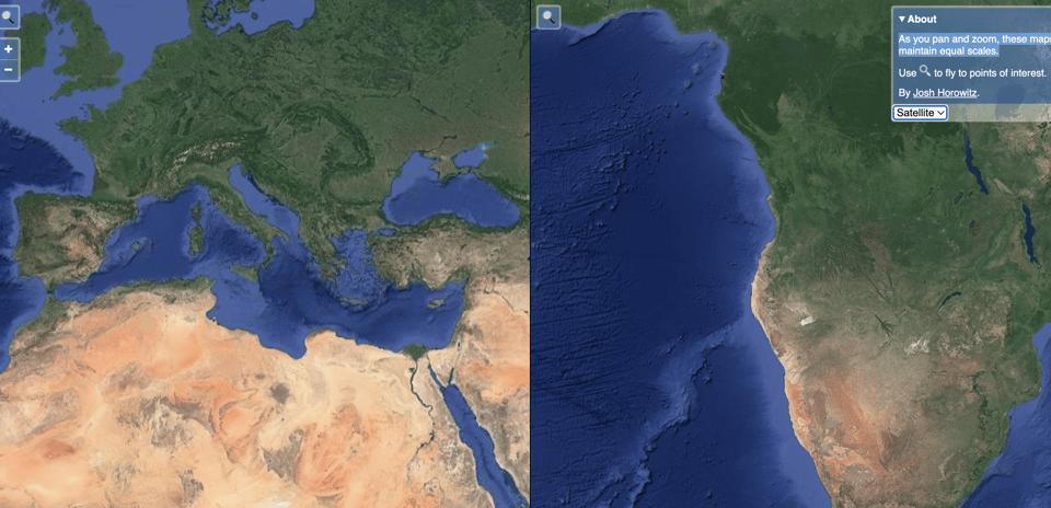
Same scale maps
A simple idea to check distortions: "As you pan and zoom, these maps maintain equal scales."
You can switch between map and satellite views.
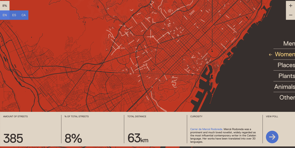
Only8
"Only 8% of Barcelona streets are named after women" and other interesting facts.
This chart ranks Bay Area’s most populous cities over past 100 years
"For decades, San Francisco was the Bay Area’s most populous city. But ever since San Jose took the No. 1 spot in 1990, San Francisco has been relegated to second place."

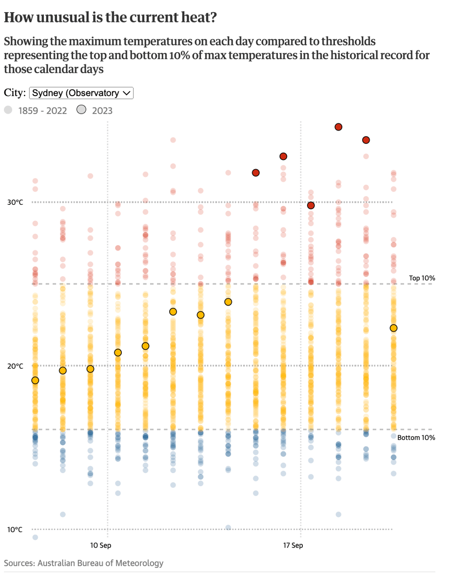
Eastern Australia sweltered under heatwaves this week. How unusual were they?
The Guardian: "Recent temperatures among highest on record in Adelaide, Melbourne and Sydney with data stretching back more than 100 years."
You can check, interactively, for Sydney, Melbourne, and Adelaide.
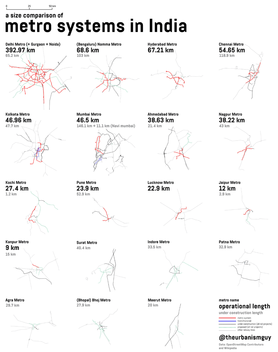
Metro systems in India
Twitter thread.
quantum of sollazzo is also supported by Andy Redwood’s proofreading – if you need high-quality copy editing or proofreading, check out Proof Red. Oh, and he also makes motion graphics animations about climate change.

Supporters*
Alex Trouteaud
casperdcl / iterative.ai
Naomi Penfold
[*] this is for all $5+/months Github sponsors. If you are one of those and don't appear here, please e-mail me
