534: quantum of sollazzo
#534: quantum of sollazzo – 26 September 2023
The data newsletter by @puntofisso.

Hello, regular readers and welcome new ones :) This is Quantum of Sollazzo, the newsletter about all things data. I am Giuseppe Sollazzo, or @puntofisso. I've been sending this newsletter since 2012 to be a summary of all the articles with or about data that captured my attention over the previous week. The newsletter is and will always (well, for as long as I can keep going!) be free, but you're welcome to become a friend via the links below. I hope you're well. I've been away for a few weeks, so here's a bit of a longer issue for you.
The most clicked link in the last issue was the Berliner Morgenpost look at climate change making parts of the planet uninhabitable.
Speaking of climate, the European Space Agency Climate Office has launched a new data visualization competition, for creatives using satellite records and climate products data. Good prizes. All details are here.
(I'm also very flattered that they asked me to add this to the newsletter!)

'till next week,
Giuseppe @puntofisso
|
Before you go... DO YOU LIKE QUANTUM OF SOLLAZZO? → BECOME A SUPPORTER! :) If you enjoy this newsletter, you can support it by becoming a GitHub Sponsor. Or you can Buy Me a Coffee. I'll send you an Open Data Rottweiler sticker. You're receiving this email because you subscribed to Quantum of Sollazzo, a weekly newsletter covering all things data, written by Giuseppe Sollazzo (@puntofisso). If you have a product or service to promote and want to support this newsletter, you can sponsor an issue. |
✨ Topical
Revealed: almost everyone in Europe is breathing toxic air
"Guardian investigation finds 98% of Europeans breathing highly damaging polluted air linked to 400,000 deaths a year". Things change from place to place. This was, over a decade ago, one of the reasons I decided to try and move out of Bologna, which is in the middle of one of the highest PM2.5 areas in Europe.

UK air traffic control meltdown
An interesting explanation of how the algorithms worked and how it failed. Maybe some data journos will be interested to take a look at this and see if there have been any close calls? It includes code showing how the code could be written in a safety assured way.

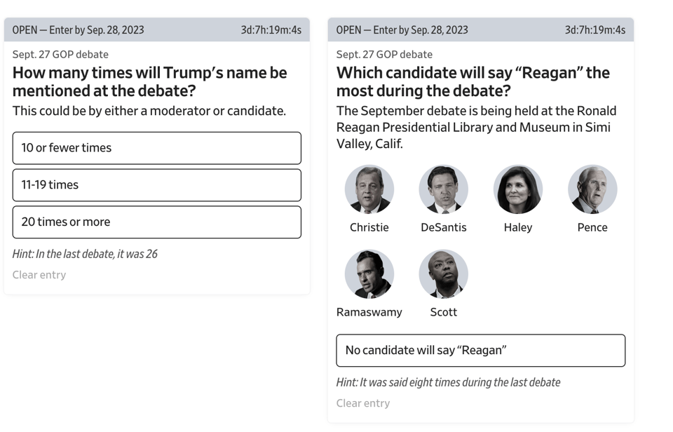
WSJ Election Challenge
"Welcome to the WSJ Election Challenge. Guess what will happen at various moments during the 2024 election and stay updated with the Journal."
By my newsletter-nemesis-turned-friend (:P) Soph Warnes and colleagues. It requires registration but it's good fun.
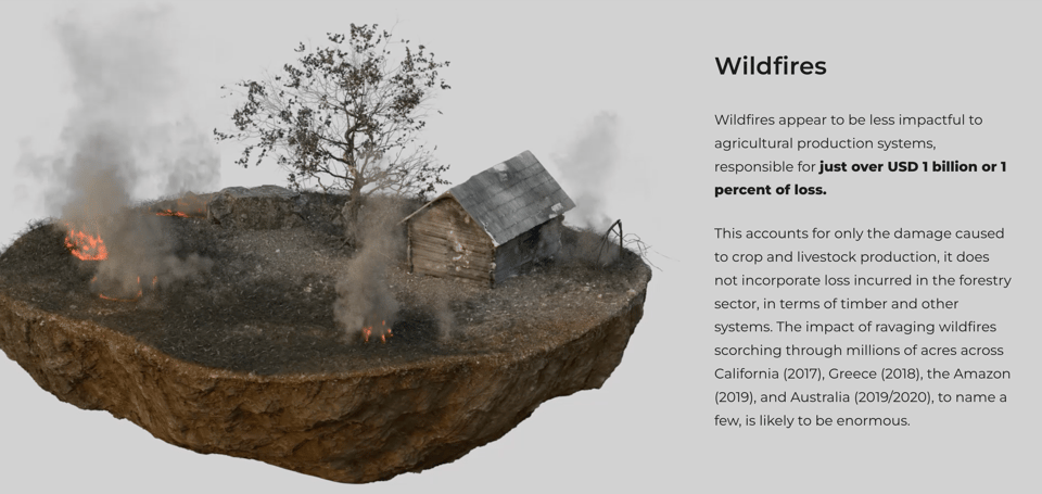
Damage and loss – Agriculture on the proving grounds
"Available data shows us that an increased occurrence and intensity of disasters is the new normal."
International agency FAO looks at the issue of soil depletion – and, consequently, agriculture and food production – caused by climate disasters of various kinds.
(via Andy Redwood)
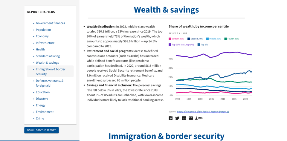
America in Facts 2023: A Data-driven Report for Congress
USAFacts has launched a report they created on several US-based metrics. The process of creating the report sounds interesting, as they started by interviewing Congressional staff on both sides of the political fence to understand their approach and understanding of data, so that the report could maximise its usefulness – a brilliant approach in itself.
The magic and mastery of US Open Champion Carlos Alcaraz
ESPN has published this great visual article about tennis player Carlos Alcaraz, who's being outstandingly successful at a very young age. It includes a few comparisons with other famous champions.

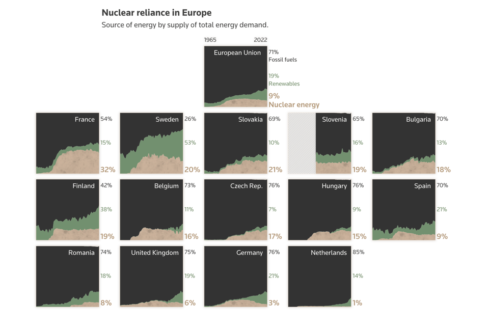
The Nuclear Aged
"Europe’s atomic reactors are getting old. Can they bridge the gap to an emissions-free future?"
Hearts and minds
"How Europeans think and feel about immigration."

From AI automations to content generation, Constant Contact offers a range of advanced features to help you create highly targeted, effective campaigns without the hassle of writer's block. Say goodbye to the frustration of content creation and hello to more time doing what you love with who you love. 🙌
🛠️📖 Tools & Tutorials
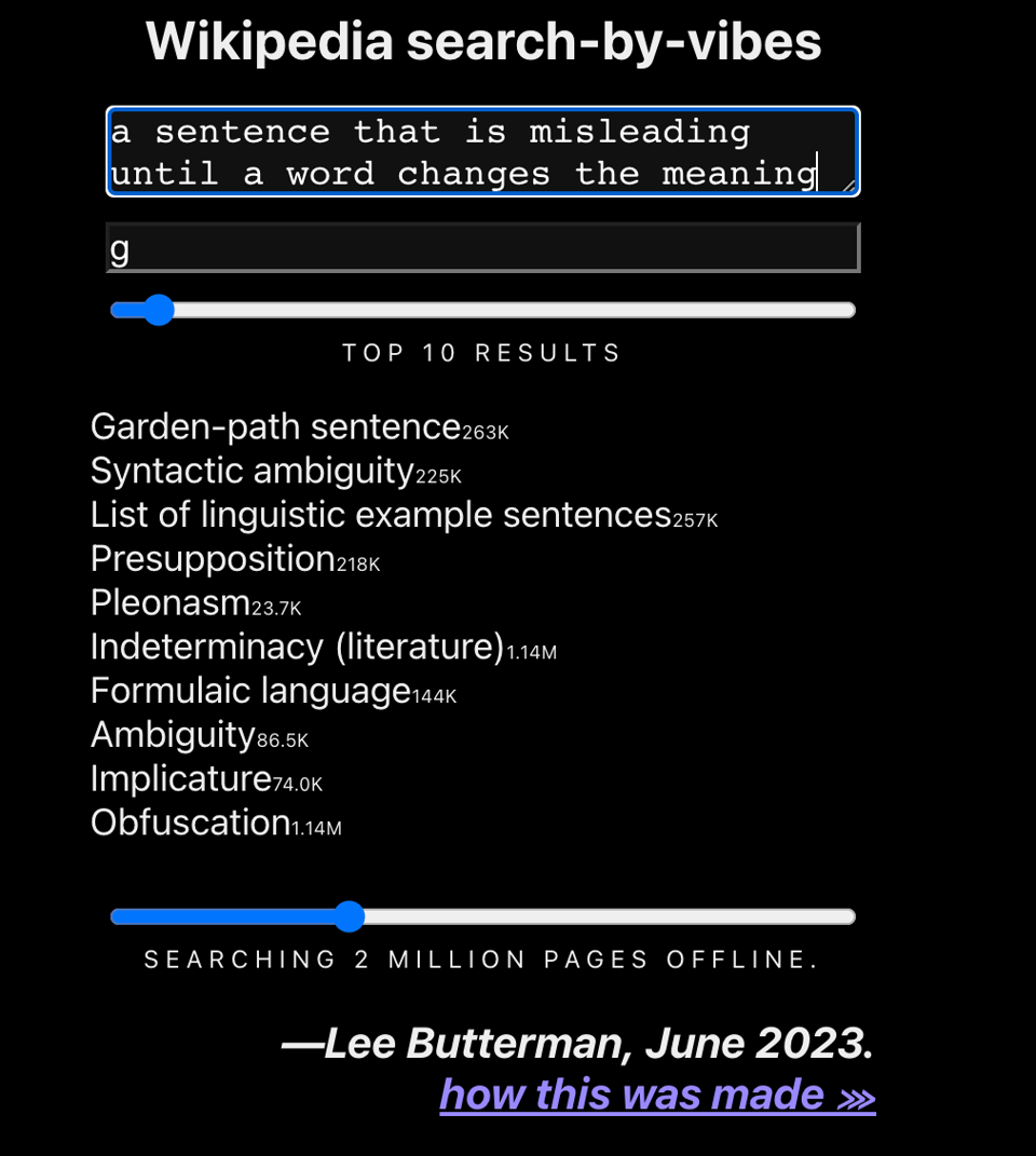
Wikipedia search-by-vibes through millions of pages offline
"This is a browser-based search engine for Wikipedia, where you can search for “the reddish tall trees on the san francisco coast” and find results like “Sequoia sempervirens” (a name of a redwood tree). The browser downloads the database, and search happens offline."
Pretty amazing. I ran the example below and... it's bonkers, it got it!
It runs in a browser, offline, with a 100MB only download required.
Harlequin
"A drop-in replacement for the DuckDB CLI."
It's an IDE that works in the Terminal.

pixel-icon-library
"The classic pixelated icons that define HackerNoon.com, are now free to use on your own site / app / product / project.", under MIT License.
How to Create Animated Stacked Triangle Charts Without Code
"This chart type is good for displaying the order in which teams score in various sports."

A Database in your Browser in sqlite3 Steps
SQLite official documentation on how to create and populate a database in the browser. It's pretty useful for any use case where you have a lot of data which needs to be transient.
Why my favourite API is a zipfile on the European Central Bank's website
"A simple data pipeline powertools: sqlite, pandas, gnuplot and friends" with an example of csvbase that uses the European Central Bank's zipfile API
FlowerJS
"JavaScript Framework for Flower Shapes and Animation extended CreateJS on HTML5 Canvas."

JPEG and EXIF Data Manipulation in Javascript
"The Exchangeable Image File Format (EXIF) is a standard that specifies formats for images and sounds. It stores technical details through metadata, data that describes other data, such as the camera make and model and the date and time the image was taken."
There are a few reasons why you'd want to manipulate EXIF on a webpage, for example in some journalistic investigation.
BANg
"Generate a KPI Tracker Dashboard directly in your Tableau Workbook in minutes. The tool automatically creates all the calculations and worksheets and presents them in a sleek dashboard."

Functional Data Structures and Algorithms
"A Proof Assistant Approach". By Tobias Nipkow (Ed.)
Big PDF.
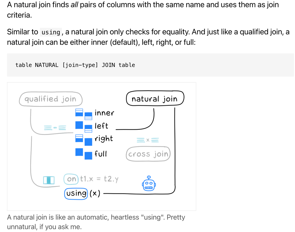
SQL join flavours
"There is more to SQL joins than you might think. Let's explore them a bit."
Generative AI exists because of the transformer
The Financial Times: "This is how it works."

🤯 Data thinking
Connected Scatterplots Make Me Feel Dumb
"Connected scatterplots are sometimes used to show how two variables are related over time. In this article, I argue that alternatives like stacked line charts and indexed line charts are virtually always better choices since they can communicate the same insights as connected scatterplots but are much easier to read and less prone to misinterpretation."
What This Graph of a Dinosaur Can Teach Us about Doing Better Science
"“Anscombe’s quartet” and the “datasaurus dozen” demonstrate the importance of visualizing data."

📈Dataviz, Data Analysis, & Interactive
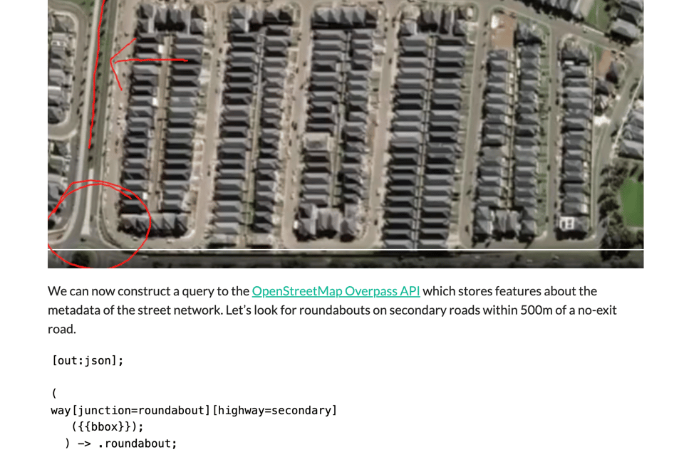
Geolocating Sydney’s weirdest property
"Using Open Street Map and R to geolocate an image."
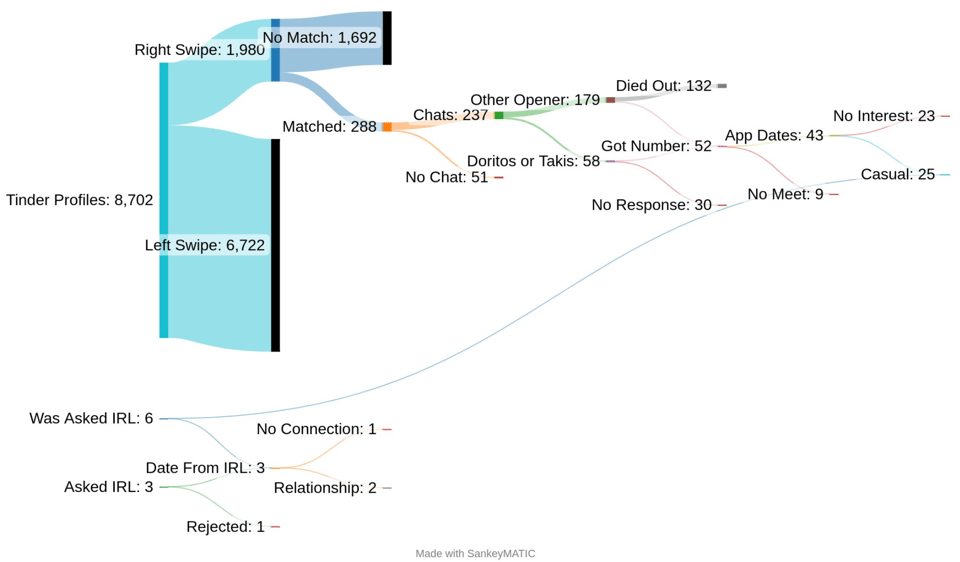
How do successful chats differ from unsuccessful ones?
This guy has made a number of charts about his attempts at online dating.
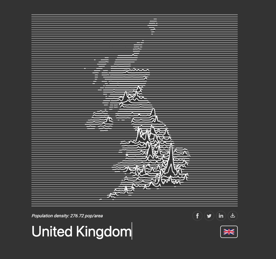
Population density for every country in the world, visualized as a ridgeline plot.
Search a country here.
Und Bach? A data-driven Odyssey into the Well-Tempered Clavier
"Is there a difference between harpsichord and piano recordings? It's complicated."
Piccinelli mentioning Bach in a data newsletter? How could I not link to this? :)
Even better, the (R) code used for the analysis is available.

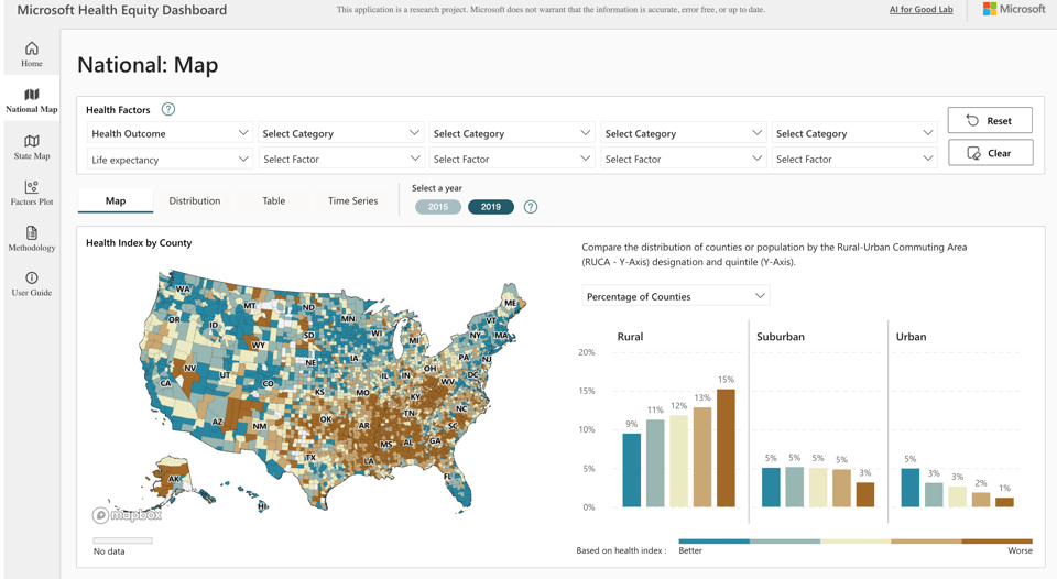
Microsoft Health Equity Dashboard
A Microsoft research project trying to put a lot of data in one place (using PowerBI).
Meltdown flags
I think the idea here is nice (we, as countries, could vanish), but it's a slightly convoluted way to display climate change.

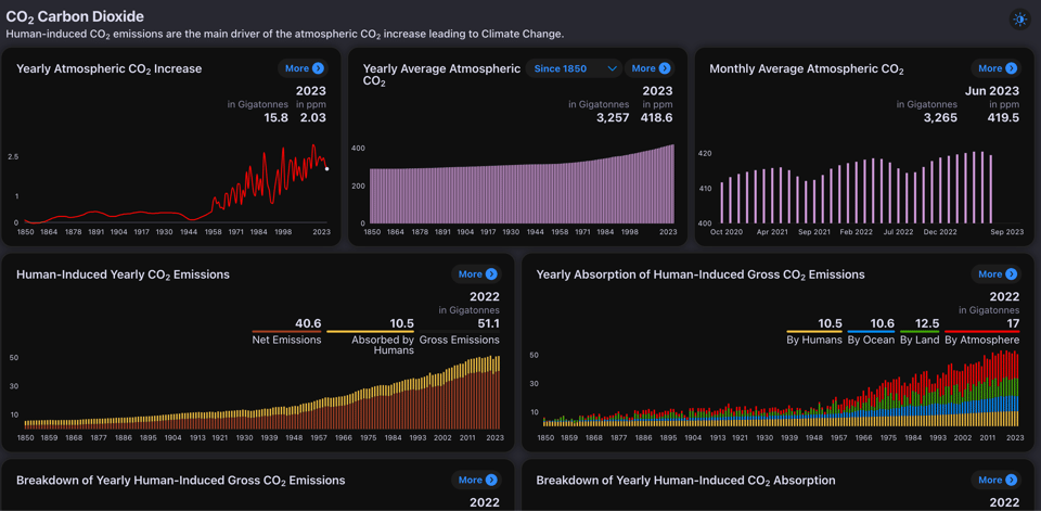
Climate Change Tracker
This is part of a Horizon2020-funded programme.
Civic honesty around the globe
"Cohn et al. wanted to examine the trade-off between material self-interest and more altruistic behaviors (see the Perspective by Shalvi). They distributed more than 17,000 wallets containing various sums of money in 355 cities across 40 countries."
Science that warms the heart (hopefully). Nice chart, too.
(via Peter Wood)

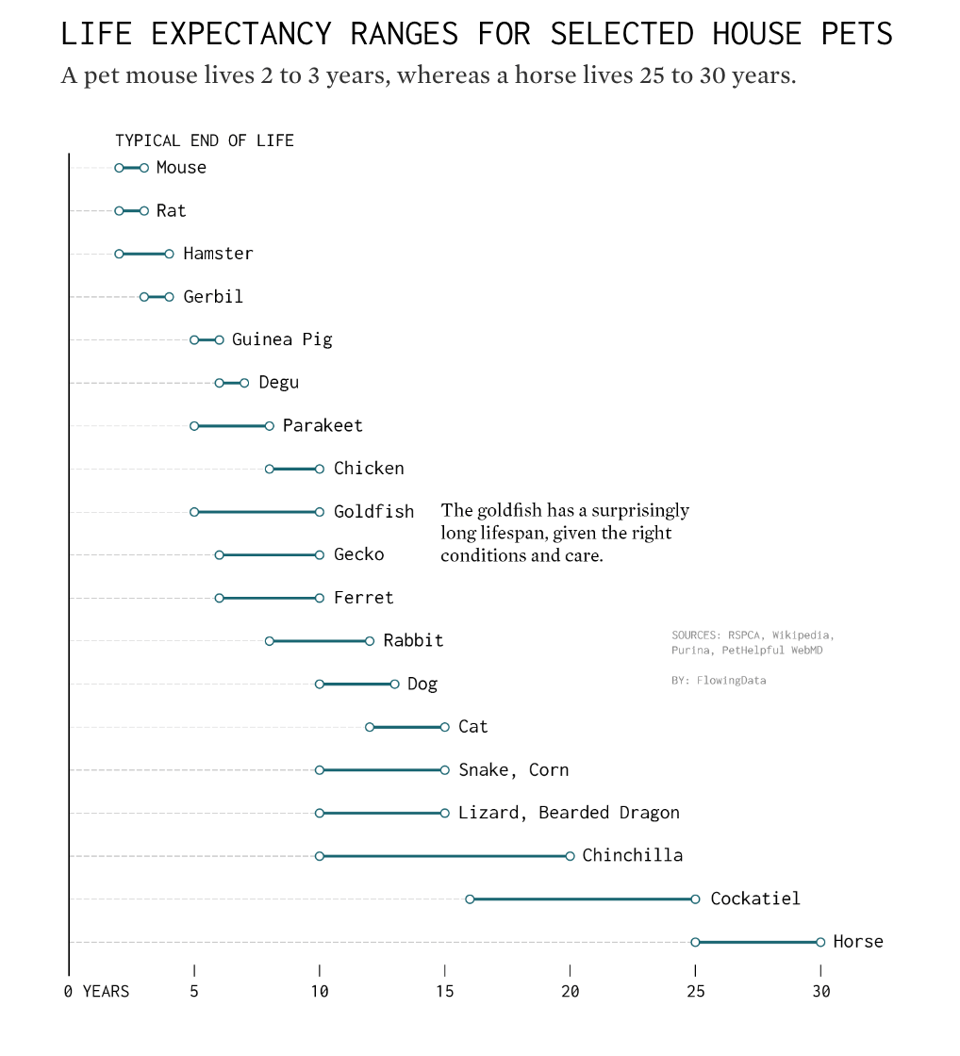
Life Expectancy of Pets
FlowingData's Nathan Yau: "Like people, individual life spans can vary based on environment and health, but you can at least get an idea."
🤖 AI
Can LLMs learn from a single example?
"We’ve noticed an unusual training pattern in fine-tuning LLMs. At first we thought it’s a bug, but now we think it shows LLMs can learn effectively from a single example."
Unleashing AI
The banking giant City has published this chunky report on generative AI.
(via Peter Wood)
One of the best under-appreciated use of ChatGPT & ilk...
"customized stories for kids, particularly under-represented story lines."
Asking 60+ LLMs a set of 20 questions
"Benchmarks like HellaSwag are a bit too abstract for me to get a sense of how well they perform in real-world workflows.
I had the idea of writing a script that asks prompts testing basic reasoning, instruction following, and creativity on around 60 models that I could get my hands on through inferences API.
The script stored all the answers in a SQLite database, and those are the raw results."

Why Nvidia’s AI Supremacy is Only Temporary
"I want to explain why I believe it’s top spot in machine learning is far from secure over the next few years."
This article makes for interesting reading. There is an assumption that training somehow plateaus over the next few years, which I'm entirely unable to assess.
quantum of sollazzo is also supported by Andy Redwood’s proofreading – if you need high-quality copy editing or proofreading, check out Proof Red. Oh, and he also makes motion graphics animations about climate change.

Supporters*
Alex Trouteaud
casperdcl / iterative.ai
Naomi Penfold
[*] this is for all $5+/months Github sponsors. If you are one of those and don't appear here, please e-mail me
