654: quantum of sollazzo
Hello, reader!
In Quantum 652 I told the story of how my attempt to reach London City Airport was almost derailed by Google Maps suggesting me to get off at the wrong bus stop, and that I wasn't the only passenger who happened to do that.
My Traveline board colleague and Quantum reader Graham Pether wrote to suggest a possible explanation: "It looks like someone has created a duplicate location for the Private Jet Centre, and for some reason the Maps algorithm has created an entrance for that location and conflated it with the London City Airport entrance mapping. Thus users are being directed to the nearest available entrance to the airport… despite this being an erroneous place." He also added that by the time we'd spoken, the bus stop duplication had been rectified, but that this hadn't solved the problem of which bus stop is recommended for inbound bus journeys, which is puzzling. It has been reported to Google Maps.
In other news, Anthropic has launched Claude Opus 4.7. 4.6 was impressively powerful but also very quick to run out of tokens if used mindlessly. I'm curious to see how 4.7 performs.
Quantum #653 had an open rate of 50% and a click rate of 15%. The most clicked link was this Artemis tracking dashboard. 653 is a prime number. 654 is not.
Do keep buying my hand-printed maps on my shop ;-)
'till next week,
Giuseppe
Topical
The Mythos Threshold
"A speculative timeline through 2028 of what happens when the AI model starts thinking for itself".
The piece explores cascading consequences: a new "builder class" achieving unprecedented productivity, massive labor displacement, geopolitical AI arms races, and regulatory paralysis.
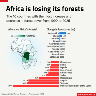
Africa is losing its forests
Brilliant dataviz from the Outlier. It's one of my favourite newsletters, but they don't have a public archive, so you'll need to subscribe if you want to access it.
Jane Street depends on all sorts of messy, real-world data to understand financial markets and the global economy: think world news, decades of weather patterns, deidentified credit card spending, or packet captures of stock exchange market data feeds.
We're hiring Data Engineers to turn datasets like these into reliable inputs for trading. Working closely with our researchers, you'll evaluate unfamiliar datasets, build robust ELT pipelines, develop deep domain expertise, and decide what's worth exploring next.
The job requires a mix of engineering, data analysis, and product sense. If you love the detective work of investigating a weird dataset and figuring out what it actually means, we want to hear from you. No financial background is necessary.
We have openings in New York, London, and Hong Kong.

Tools & Tutorials
Using CSS animations as state machines to remember focus and hover states with CSS only
"Recently, I was searching for a way to style an element depending on whether it was ever focused. ... what if I used a CSS animation for this?"

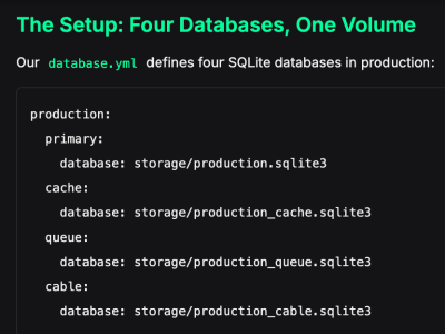
SQLite in Production: Lessons from Running a Store on a Single File
"We run a production e-commerce store on SQLite. Not as a proof of concept. Not for a side project with three users. A real store, processing real Stripe payments, serving real customers.
Rails 8 made this a first-class choice. And for most of our operation, it's been excellent — simpler deploys, zero connection pooling headaches, no database server to manage. But "most of our operation" isn't all of it. Here's the part nobody warns you about."
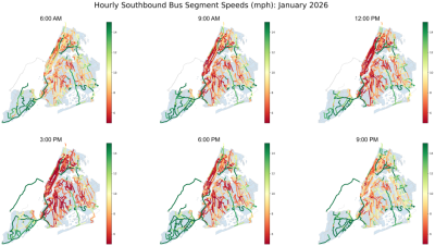
Mapping movement: Exploring NYC bus route shapes through segment-level speed data
"Understanding how buses move through New York City is a data problem as much as it is a transportation problem. Every route has its own geography and operating patterns, each stop a unique context, and each street segment faces fluctuating traffic, pedestrian activity, construction, and other operational conditions. Over time, the spatial structure of the bus network, including its routes, stops, and surrounding traffic patterns, shapes the daily experience of millions of riders. To help analysts, researchers, and everyday New Yorkers make sense of this complexity, the MTA continues to expand its geospatial open data offerings. This post highlights two new datasets, MTA Bus Stops and MTA Bus Routes, to show how they can be combined with existing dataset such as Bus Route Segment Speeds to visualize route-level and segment-level speeds for a recent month."
Introduction to gglite
"The gglite package provides a lightweight R interface to the AntV G2 JavaScript visualization library. It follows the Grammar of Graphics framework—the same theoretical foundation behind ggplot2—but renders interactive, web-based charts powered by G2."
Charcuterie
Charcuterie is a visual exploration tool for the Unicode character set. It uses visual similarity matching by embedding rendered glyphs using SigLIP 2, then comparing them in vector space to identify visually related characters. It's pretty neat!

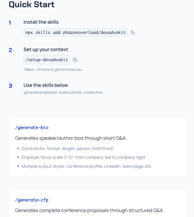
DevAdvokit
DevAdvokit is a toolkit of AI agent skills designed specifically for developer advocates to streamline content creation and speaking engagement workflows. It's by my friend and developer guru Kevin Lewis. (via kevin lewis)
How we OCR'ed 30,000 papers using Codex, open OCR models and Jobs
Hugging Face indexes arXiv papers on its platform, allowing researchers to claim their work, link related resources, and engage in Reddit-style discussions. Here they explain their pipeline.
GitHub - heygen-com/hyperframes: Write HTML. Render video. Built for agents.
"Hyperframes is an open-source video rendering framework that lets you create, preview, and render HTML-based video compositions — with first-class support for AI agents."
The project enables developers to write standard HTML with data attributes to define video timelines, preview them in a browser, and render them to MP4 format.
Data Thinking
Our ideas graveyard
This newsletter from The Economist's data journalism team discusses Donald Trump's approval rating, the Iran, and other ideas. It also looks at their "ideas graveyard", i.e. pitches that never made it to publication. These include analyses of Scottish holiday costs, a data visualization of Billy Joel's "We Didn't Start the Fire", London Underground stress scores derailed by COVID-19, and hypothetical calculations about China's urbanization offsetting its aging population.
Why Shannon Entropy Catches What Schema Validation Misses
"Everything validated. Nothing was correct. If this sounds familiar, you have a monitoring blind spot — and it is not a tooling gap you can solve with more schema checks."
An interesting approach to validation by using Shannon Entropy.
The Revenge of the Data Scientist
Hamel Husain argues that data scientists remain essential despite concerns that LLMs have made their role obsolete. While foundation-models and their APIs allow teams to integrate AI without data scientists on the critical path, Husain contends that the core work, i.e. experimental design, debugging stochastic systems, and designing metrics, hasn't disappeared.
Dataviz, Data Analysis, & Interactive
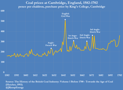
London’s coal supply in the 17th century – a case study in energy security
Fantastic dataviz by energy analyst John Kemp.
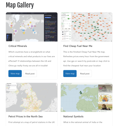
Map Gallery
If you read Quantum regularly, you have seen a few maps made by Steven Feldman using various LLMs, and related blog posts where he chronicles his experiments. He has now created a gallery with all the maps he's created this way.
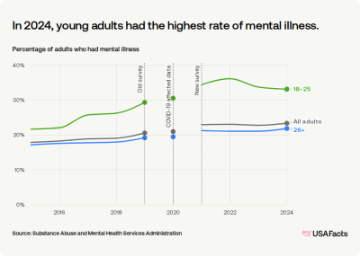
How many people have mental illness in the US?
USAFacts: "About 61.5 million adults had a mental illness in 2024. That's the equivalent of 23.4% of the adult population of the US, or 11 in 47 adults. This data comes from an annual survey by the Substance Abuse and Mental Health Services Administration (SAMHSA), which defines mental illness as a range of disorders, from mild to severe, affecting a person's thinking, mood, or behavior."
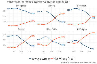
Acceptance of same-sex relations
Religion researcher Ryan Burge illustrate the evolution of opinion polls in various religious traditions to the question: "What about sexual relations between two adults of the same sex?", highlighting when the "not wrong at all" crossed the "always wrong" line. In these cohorts (probably meaningful to US audiences but less so in the UK and Europe), the lines have crossed for every group except Evangelicals.
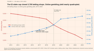
The Machine Is Friendly. That's Why It Wins.
Lauren Leek: "How Australia kept its third places alive, what it hid inside them, why Britain’s fix made the problem worse, and what happened when I tried to beat the machine." It examines Australia's unique relationship with gambling machines (pokies), revealing how they've become embedded in community spaces.
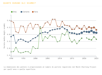
Il tennis è diventato tutto uguale? Has all tennis become the same?
Danilo De Rosa has published this intriguing analysis about tennis surfaces. It's in Italian but you can find an automatically translated version here. The analysis examines whether tennis surfaces have become homogenised over recent decades. The scrollytelling article explores the traditional differences between clay (slow, high bounce), hard court (medium bounce), and grass (fast, low bounce), which historically produced specialist players. Using Jeff Sackmann's surface speed rating, which measures actual aces against expected aces based on player quality, the analysis reveals that over thirty years, the three surfaces have actually not converged in speed, but rally length has.
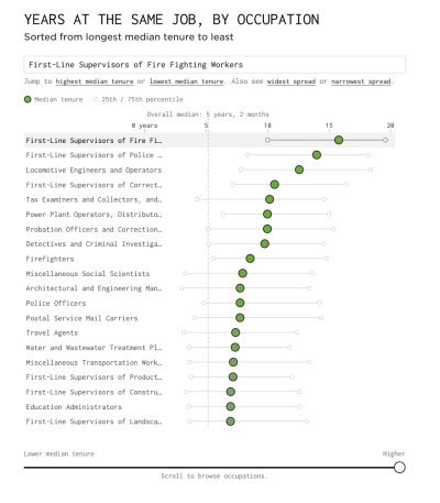
Job turnover by occupation
Nathan Yau: "Some occupations have more turnover than others. For example, waiters and waitresses tend to stay at the same job for fewer years than those in supervisor roles. In the chart below, see the median years spent at the same job for different occupations."
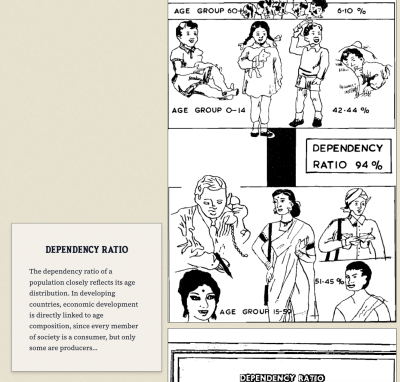
Portraits of Population
"An archive of 700 hand-drawn charts and graphics from India's census, and why they were made".
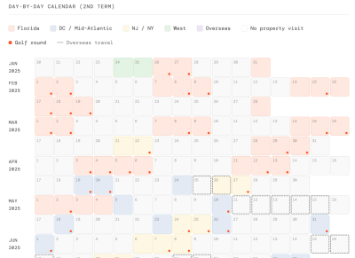
Trump Property & Golf Tracker
Is this stalking? :) Philip Bump presents a data visualisation tracking Donald Trump's visits to his own properties and golf courses during his presidency.
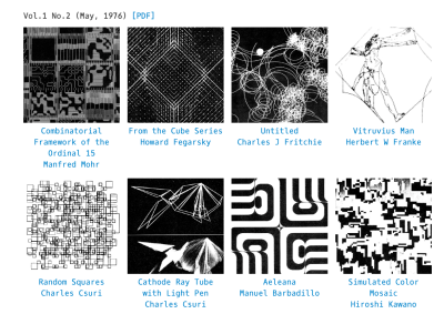
The Recode Project
"The ReCode Project is a community-driven effort to preserve computer art by translating it into a modern programming language (p5.js)."
(via Web Curios
AI
Before he wrote AI 2027, he predicted the world in 2026. How did he do?
In 2021, Daniel Kokotajlo wrote "What 2026 Looks Like," a narrative prediction of AI development before ChatGPT's launch. This interview evaluates his forecasts.
AMA – Ask Me Anything! Submit a question via this anonymous Google form. I'll select a few every 4-5 weeks and answer them on here :-) Don't be shy!

The Quantum of Sollazzo grove now has 40 trees. It helps managing this newsletter's carbon footprint. Check it out at Trees for Life.
'till next week,
Giuseppe @puntofisso.bsky.social