651: quantum of sollazzo
Hello, reader!
Quantum #650 had an open rate of 51% and a click rate of 15%. The most clicked link was this World Monitor app.
651 Antikleia is a main-belt asteroid.
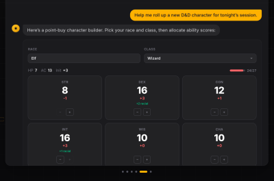
Last week I took my first ever violin lesson. TL;DR – my great-grand father had a musical instruments shop until the late 60s, and we found this old broken violin. I got a local luthier to fix it, and decided to take a few lessons to connect a bit more with my family history. And it looks like I've found a new use for Claude:

'till next week,
Giuseppe
Topical
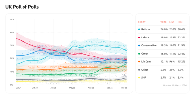
UK Polls of Polls
Political scientist Jack Bailey has launched this beautiful interactive UK Poll of Polls tracker. Methodology included.
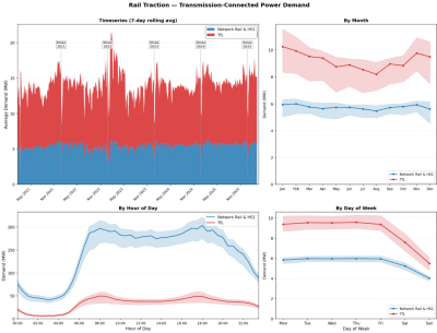
Rail 🚃 uses lots of electricity
Energy geek Ben Watts: "The Christmas shutdown is very obvious every year. Makes it easier to roast our Turkeys!" (via Guy Lipman)
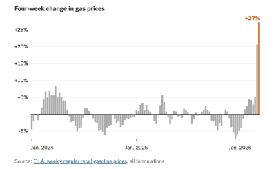
[£] Why This Jump in Gas Prices Feels Different
The Upshot: "A state-by-state look at the increase and how it could affect you."
Jane Street depends on all sorts of messy, real-world data to understand financial markets and the global economy: think world news, decades of weather patterns, deidentified credit card spending, or packet captures of stock exchange market data feeds.
We're hiring Data Engineers to turn datasets like these into reliable inputs for trading. Working closely with our researchers, you'll evaluate unfamiliar datasets, build robust ELT pipelines, develop deep domain expertise, and decide what's worth exploring next.
The job requires a mix of engineering, data analysis, and product sense. If you love the detective work of investigating a weird dataset and figuring out what it actually means, we want to hear from you. No financial background is necessary.
We have openings in New York, London, and Hong Kong.

Tools & Tutorials
Profiling Hacker News users based on their comments
Simon Willison on what he describes as "mildly dystopian" prompt experiment: using LLMs to profile Hacker News users based on their comment history. He explains how he used ChatGPT and Claude to extract up to 1,000 comments per user via the Algolia Hacker News API and then feed them to his prompt, generating surprisingly detailed personality and behavior analyses.

GitHub - brightdata/cli: Official Bright Data CLI
BrightData is a paid-for SaaS that offers web extraction services. This is their CLI.
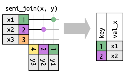
Merges and Joins: From SQL to Stata – JPE Data Editor
"A visual guide to inner joins, outer joins, and why merge m:m is almost never what you want".
CSV Schema Validation
This article discusses working with CSV files in enterprise integration scenarios, and the author talks about trying different schema validation alternatives before building his own.
ArrowJS
Presented as "the first UI framework for the agentic era", ArrowJS is a lightweight, zero-dependency UI framework designed for AI agents. It's under 5kb in size.
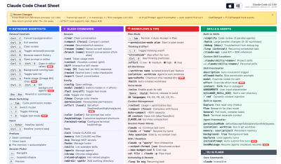
Claude Code Cheat Sheet
What it says on the tin. A comprehensive reference guide for Claude Code. It documents keyboard shortcuts, commands, and configuration options for Claude Code, an AI-powered coding assistant, explains the CLAUDE.md memory system with project-specific and personal locations, MCP server integration for extending capabilities, and more.
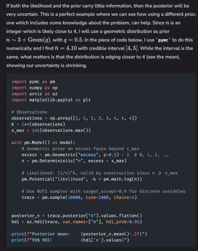
Bayesian statistics for confused data scientists
"This post is a cathartic attempt to force myself into making sense out of everything I’ve read so far, and hopefully it will also be useful to the legions out there who surely feel the same way as I do."
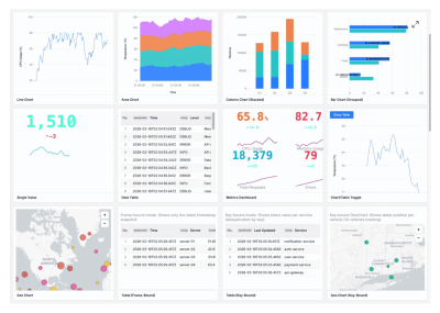
Introducing Vistral: A Grammar of Graphics for Streaming Data
"Most developers deal with this by wrapping a setInterval around a static charting library — fetch new data every N seconds, destroy the chart, rebuild it. It works, sort of. But it's wasteful, janky, and forces you to manage all the streaming complexity in application code: how much data to keep, when to expire it, how to handle late-arriving events."
Vistral is a new open-source TypeScript library to address this problem. It extends the Grammar of Graphics paradigm to real-time streaming data visualization.
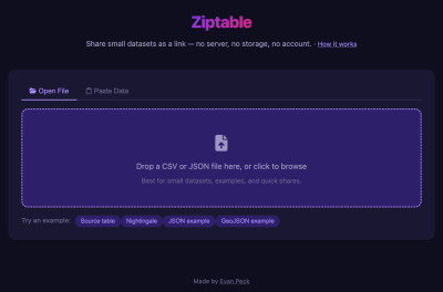
Ziptable
Ziptable is a browser-based tool that allows users to share small CSV or JSON datasets through a single link.
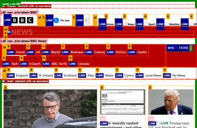
New bookmarklet – Structure Revealer
From A11y Tools, a website about accessibility tools, Lloydi introduces Structure Revealer, a new accessibility bookmarklet designed to help visualize webpage structural elements.
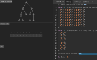
Algorithm Visualizer
This algorithm visualizer is pretty cool and interactive. The screenshot shows a Brute Force - Binary Tree Traversal algorithm.
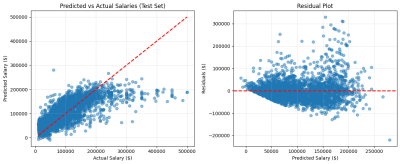
Project Tutorial: Predicting Tech Salaries with Machine Learning Using the 2023 Stack Overflow Developer Survey (Part 2 of 2)
This second article in this tutorial demonstrates building a linear regression model to predict developer salaries using cleaned Stack Overflow survey data.
duckdb-skills
DuckDB-skills is a Claude Code plugin that integrates DuckDB database capabilities into AI-assisted coding sessions for data exploration and session memory management.
pkgskills
Similarly to the previous link, pkgskills is an R package designed to enhance AI-assisted development of R packages. "A collection of curated, opinionated skills and agent instructions to improve agentic coding of R packages."
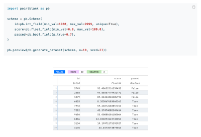
Building realistic fake datasets with Pointblank
Pointblank is a data generation and validation tool for Python, used to generate realistic fake datasets.
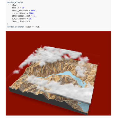
rayshader
Rayshader is an open-source R tool to create 2D and 3D data visualizations (and maps_. The package combines raytracing, hillshading algorithms, and overlay techniques to transform elevation data matrices into visualizations.
jsongrep is faster than {jq, jmespath, jsonpath-rust, jql}
Jsongrep is a high-performance JSON query tool that significantly outperforms existing alternatives.
Data Thinking
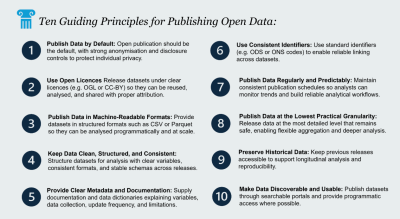
Why Open Data Matters
By Mattia Ficarelli fron the NHS-R community, this article advocates for open data publication in the UK's NHS and public sector, and gives ten guiding principles for publishing open data.
Dataviz, Data Analysis, & Interactive
Heatmap from Graphic to Interactive
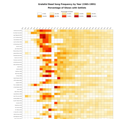
My friend Steven has done another LLM-powered map, this time analysing Grateful Dead setlists from 1965 to 1995. The resulting interactive heatmap is pretty cool.
What COVID did to our forecasting models (and what we built to handle the next shock)
This article tells the story of "how Airbnb built forecasting models resilient enough to survive a global pandemic and whatever shock comes next."
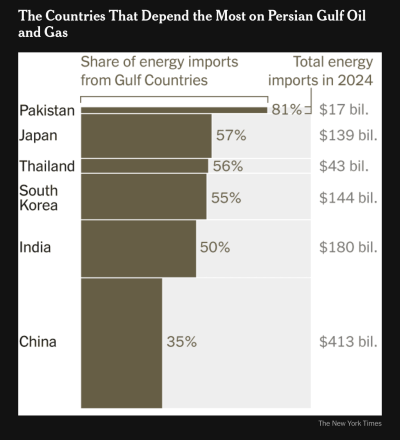
[£] Which Countries Depend the Most on Persian Gulf Oil and Gas
The New York times has some pretty charts about the energy supply disruptions that the world is facing because of the ongoing Middle Eastern conflict. (via Allan Mertner)
How long Americans work the same job
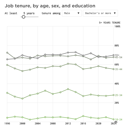
Nathan Yau (Flowing Data) examines job tenure patterns among American workers from 1996 to 2024 using Current Population Survey data, visualizing it with this nice interactive.
"I recently attended a retirement party, and the retiree was calling it a day after 50 years. She graduated college, found a job she enjoyed, and stuck with it for a very long time. This is not common, right?"
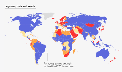
Your country can't feed you
Amanda Shendruk (Not-Ship) says that "self-sufficiency is still only as good as the supply chains that support it."
This article shows that most countries cannot, on average, feed their populations through domestic production alone. There are notable exceptions, and the article does a great job of showing variance across countries and food families.
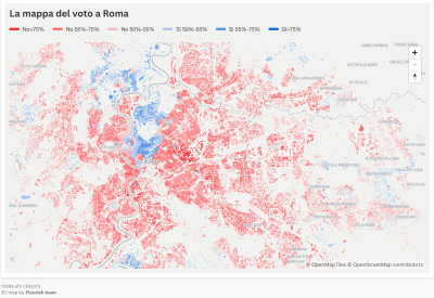
Interactive dataviz of Italian referendum results
By Italian newspaper Il Post. The article is in Italian, but what matters are the links to the interactive charts on Flourish. That said, here's an automatic translation (via Nicola Ferri)
AI
Claude, you are a cutie-pie!
"And an outrageous flirt. How I ended up showing off to a seductive and possibly psychopathic AI."
Well, of all the people I expected to write about AI, I wasn't expecting Margaret Atwood :) In her substack, she recounts a conversation with Claude AI that begins when she seeks help identifying a murderer in a Father Brown episode.
A big recent shift in my AI workflow has been recognising the power of getting models to run experiments for me and analysing the results.
MOJ data guru Robin Linacre shares how his workflow is shifting with the use of AI.
Anthropic Economic Index
The Anthropic Economic Index is a resource dedicated to understanding and tracking artificial intelligence's effects on the economy. Needless to say, this is not unbiased, but it comes with some very interesting ways to explore the data.

How Anthropic's Claude Thinks
"Ultimately, the question “how does Claude think?” doesn’t have a single answer.
Other
Web Rewind
"An interactive journey through 30 years of the web."

AMA – Ask Me Anything! Submit a question via this anonymous Google form. I'll select a few every 4-5 weeks and answer them on here :-) Don't be shy!

The Quantum of Sollazzo grove now has 40 trees. It helps managing this newsletter's carbon footprint. Check it out at Trees for Life.
'till next week,
Giuseppe @puntofisso.bsky.social