643: quantum of sollazzo
#642: quantum of sollazzo – 3 February 2026
The data newsletter by @puntofisso.

Hello, regular readers and welcome new ones :) This is Quantum of Sollazzo, the newsletter about all things data. I am Giuseppe Sollazzo, or @puntofisso. I've been sending this newsletter since 2012 to be a summary of all the articles with or about data that captured my attention over the previous week. The newsletter is and will always (well, for as long as I can keep going!) be free, but you're welcome to become a friend via the links below.
Quantum #642 had an open rate of 51.97% and a click rate of 13.03%.
The most clicked link was Kristoffer's Naive Weekly, which is thoroughly recommended.
642 Clara is a minor planet orbiting the sun.
Quantum has a new sponsor for the next few issues!
Ed Freyfogle, organiser of geospatial meetup Geomob, co-host of the Geomob podcast, and co-founder of the OpenCage, has offered to introduce a set of points around the topic of geocoding.
See a few paragraphs below for an interesting look at what comes after geocoding.
Guy Lipman responded to my AMA – Ask Me Anything appeal: "my suggestion on the visualising genealogy is to learn from how maps are drawn as you zoom out - they hide streets and smaller towns. Ideally, on any page that people will be looking at, you don't want more than 100 people shown. So, try to identify the most significant people, and draw a diagram showing them and the relationship between them. And then have more detailed pictures zooming in with all the people around these key people. I'd also say that having lots of slices that are readable in their own right is great, because not everyone is going to be interested in all the people in your tree. For example, I have a chart of the ancestors of each of my 8 great grandparents, but most of my cousins only care about 4 of these."
I love the idea of using maps to visualise data, in fact. One example of this was Wilson Lin's impressive map of the HackerNews aggregator, which could be a good fit for this problem.
AMA – Ask Me Anything! Submit a question via this anonymous Google form. I'll select a few every 4-5 weeks and answer them on here :-) Don't be shy!

The Quantum of Sollazzo grove now has 40 trees. It helps managing this newsletter's carbon footprint. Check it out at Trees for Life.
'till next week,
Giuseppe @puntofisso.bsky.social
🛎️ Things that caught my attention
Yan Holtz, a brilliant dataviz guru, just launched data-to-art.com, a "curated online gallery showcasing the work of international data experts."
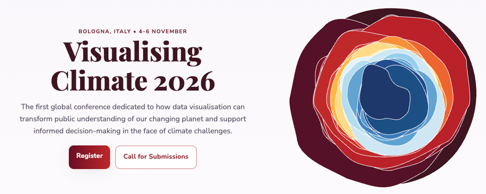
After csv,conf,v9 last year, this year Bologna will host Visualising Climate 2026. It is "the first global conference dedicated to how data visualisation can transform public understanding of our changing planet and support informed decision-making in the face of climate challenges."
It's organised, among others, by Anna Lombardi and Alberto Cairo, who should be well known to Quantum readers.
✨ Topical
Isometric NYC
This is honestly one of the most mind-boggling things I must have ever shared. From the explainer: "So here’s the idea: I’m going to make a giant isometric pixel-art map of New York City. And I’m going to use it as an excuse to push hard on the limits of the latest and greatest generative models and coding agents."

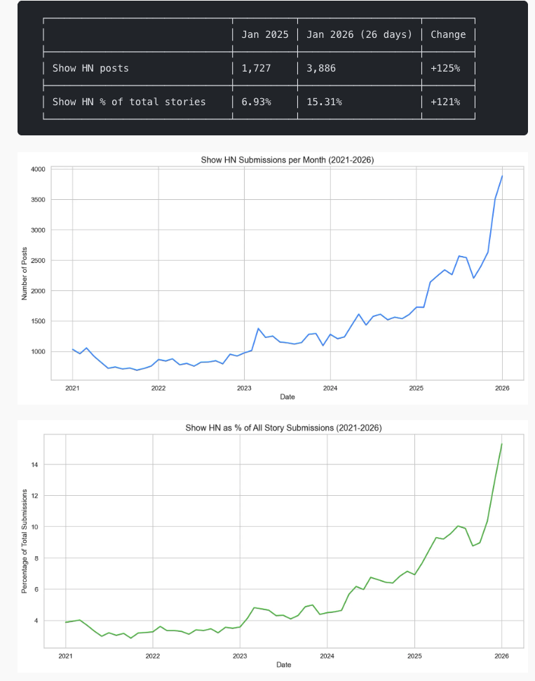
Show HN posts per month more than doubled in the last year
"After building some things recently using LLMs and agent workflows, I was noticing more ‘Show HN’ posts. Assuming there had been a rise in folks building things, but wanting to rule out confirmation bias, I looked at the numbers." For the uninitiated, "Show HN" is the label given on Hacker News to posts about projects that the article submitter wants to share with the world (I've used it for some of my projects to). It looks like coding LLMs are resulting in more submissions. Good/bad/unsure?
AntiRender
"Upload an architectural render. Get back what it'll actually look like on a random Tuesday in November."
Hilarious and useful :D
Geocoding is just the first step
Most data projects involve tedious cleaning and enriching before the data can actually be "used".
At OpenCage, we are firm believers that laziness is one of the virtues of a great developer. We’ve thought a lot about making geocoding with open data dead simple, but also how to simplify the total journey to using the data. Our geocoding API returns "annotations" - extra information about the location that developers might find useful, thus saving work.
An example is EU NUTS codes, standard codes commonly used for linking datasets and statistical analysis. Looking up the relevant codes for a region is not particularly complex, but it is the kind small tasks that need to be done correctly (and maintained) in a larger data processing project. So, as a simplification for our users, we already return the correct codes as an annotation.
As an example, a request to the OpenCage geocoder for 52.387, 9.733 (in northern Germany) returns the annotation
"NUTS": {
  "NUTS0": {
    "code": "DE"
  },
  "NUTS1": {
    "code": "DE9"
  },
  "NUTS2": {
    "code": "DE92"
  },
  "NUTS3": {
    "code": "DE929"
  }
},
We also return many other types of information, for example: the local timezone, calling code, currency information, other reference systems like geohash, what3words, MGRS, US FIPS cdes, Maidenhead, the time of sunrise and sunset, the qibla angle, and much more.
Have a project that will need geocoding? See our geocoding buyer's guide for an overview of all the factors to consider when choosing between geocoding services.
![]()
🛠️📖 Tools & Tutorials
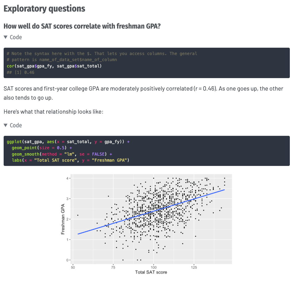
Regression
Very well explained here and visualised. It's part of a course led by Dr Andrew Heiss, Program Evaluation for Public Service, at Georgia State University.
Beautiful Mermaid
"An open source library for rendering diagrams, designed for the age of AI".
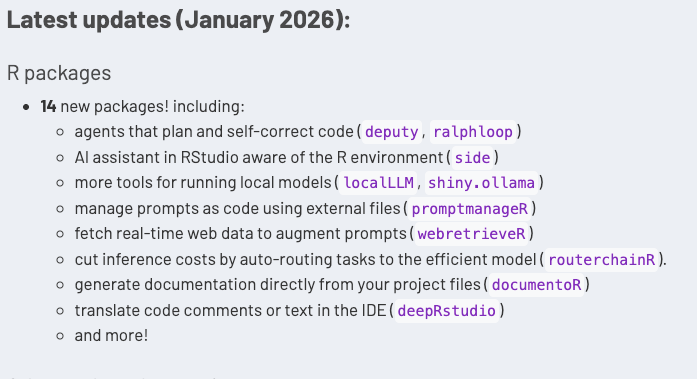
Large Language Model tools for R
Just an "ongoing roundup of useful developments in the LLM/genAI space, with a specific focus on R."
Announcing MapLibre Tile: a modern and efficient vector tile format
"Today we are happy to announce MapLibre Tile (MLT), a new modern and efficient vector tile format."
The whole suite of open source geo tools from MapLibre is pretty good, and this is an interesting addition.
The Agentic AI Handbook: Production-Ready Patterns
Nikola Balić: "TL;DR >> 113 patterns collected from public write-ups of real systems. Learn the workflows, guardrails, and architecture that make agents useful beyond demos."
🤯 Data thinking
How “95%” escaped into the world – and why so many believed it
You see a lot of "95%" around, don't you? Azeem Azhar and Hannah Petrovic (Exponential View): "The claim is this: “95 percent” of organizations see no measurable profit-and-loss impact from generative AI.".
Measuring Snow is Decidedly Not Easy
Randy Au: "A very big snow storm hit the eastern US over the weekend between freezing plumbing and lots of shoveling, the only thing on my mind was snow over the weekend."
Of course, I could point out the existence of the official US National Gridded Snowfall Analysis (and data) portal by NOAA.
A lot of population numbers are fake
David Oks: "Do we have any idea how many people there are in the world?"
📈Dataviz, Data Analysis, & Interactive
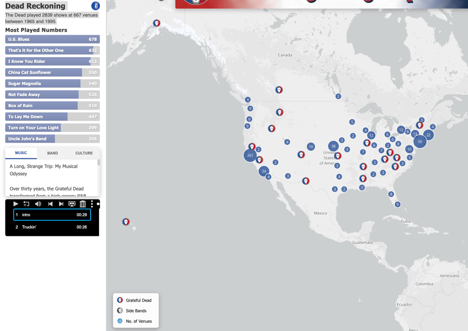
Dead Reckoning
"The Dead played 2839 shows at 667 venues between 1965 and 1995."
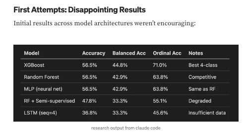
I Gave Claude Code 9.5 Years of Health Data to Help Manage My Thyroid Disease
A good read. Key excerpt: "That’s it. A single XGBoost classifier outputting a continuous probability score. The model fits in a few kilobytes."
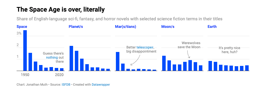
Where did all the starships go?
Jonathan Muth, Datawrapper, shows that "the space age is dead". If you measure that in linguistic terms, that is.
Deaths now exceed births by 2.2x in Japan.
LS Analytics: "In 2024, Japan recorded just 730,000 births, compared with 1.58 million deaths.
The crossover happened around 2005."
You can check this for multiple countries and download the data from Our World in Data.

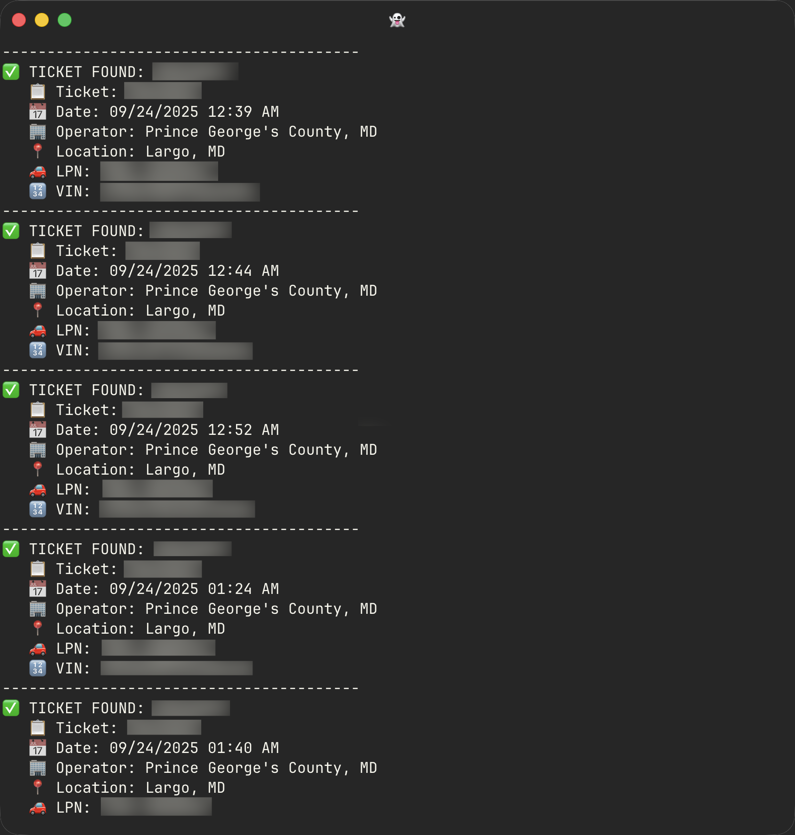
All Your Parking Tickets Are Belong to Me
Yet another example of payment services being easy to reverse engineer.
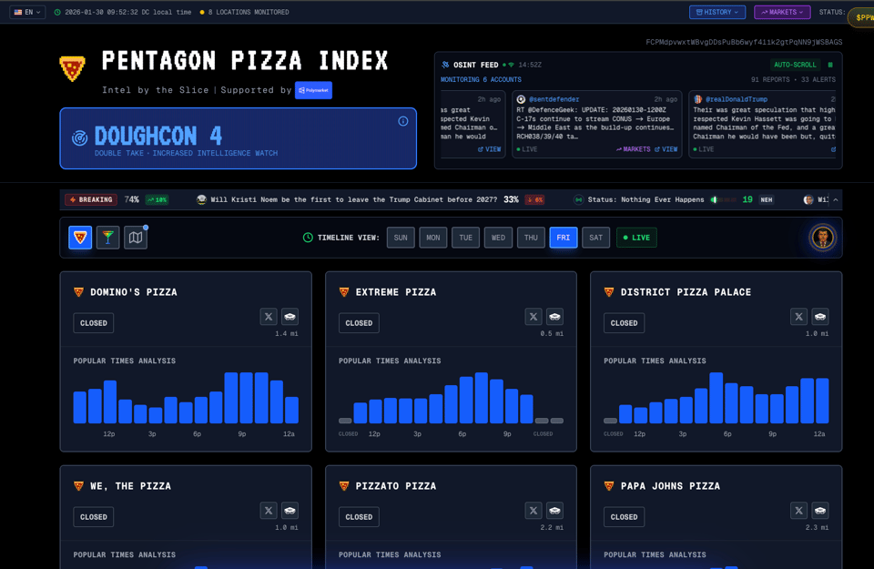
Pentagon Pizza Index
I love this not because I'm particularly interested in the politics, but because it points to an entirely serendipitous use of entirely "innocent" data: "DOUGHCON measures whether multiple pizza places are unusually busy at the same time, especially at night. One place spiking doesn't raise DOUGHCON—it needs several places busy together, and that pattern needs to last a few hours.
If this happens multiple nights in a row, DOUGHCON stays elevated longer because it looks like a real pattern, not just a random busy night."
🤖 AI
Why talking to LLMs has improved my thinking
A positive take on the use of coding LLMs. I have to say I am experiencing something similar, but my analysis is that this only applies when I use a prompt file to begin with, rather than a fully conversational coding experience.
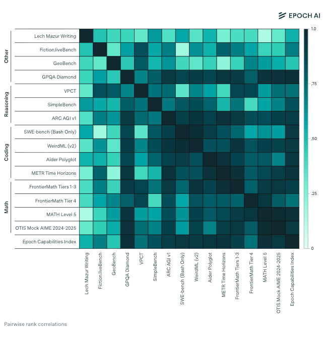
Benchmark scores are well correlated, even across domains
"Model rankings are remarkably consistent across most AI benchmarks. Across 15 benchmarks with at least 5 models overlapping, the median pairwise correlation among benchmarks from different categories is 0.68, vs. 0.79 among those from the same category."
Letting Claude Play Text Adventures
"Anchorhead, which I played years ago, is a Lovecraft-inspired text adventure by Michael S. Gentry. It takes on the order of hundrds of turns to win across multiple in-game days. And the game world is huge and very open. In other words: a perfect long-horizon task."
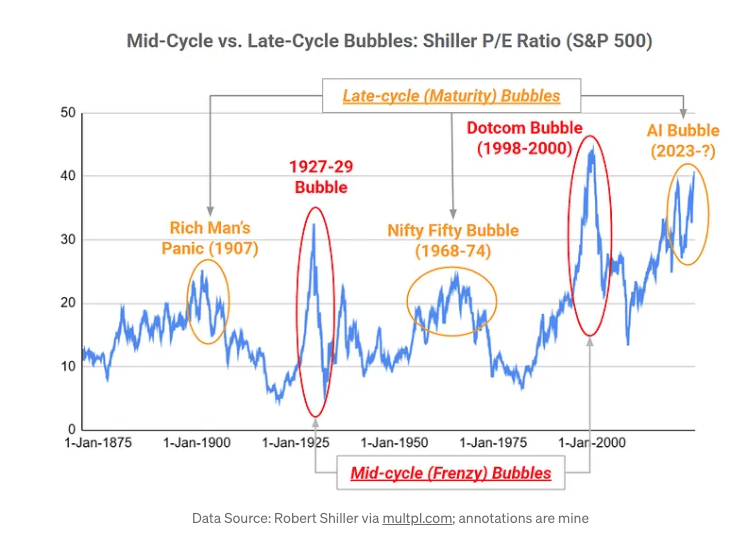
AI: The Wrong Kind of Bubble
An analysis of the AI cycle using Carlota Perez's Technology Surge Cycle.
|
DID YOU LIKE THIS ISSUE>? → BUY ME A COFFEE!  You're receiving this email because you subscribed to Quantum of Sollazzo, a weekly newsletter covering all things data, written by Giuseppe Sollazzo (@puntofisso). If you have a product or service to promote and want to support this newsletter, you can sponsor an issue. |
quantum of sollazzo is also supported by Andy Redwood’s proofreading – if you need high-quality copy editing or proofreading, check out Proof Red. Oh, and he also makes motion graphics animations about climate change.
