636: quantum of sollazzo
#636: quantum of sollazzo – 16 December 2025
The data newsletter by @puntofisso.

Hello, regular readers and welcome new ones :) This is Quantum of Sollazzo, the newsletter about all things data. I am Giuseppe Sollazzo, or @puntofisso. I've been sending this newsletter since 2012 to be a summary of all the articles with or about data that captured my attention over the previous week. The newsletter is and will always (well, for as long as I can keep going!) be free, but you're welcome to become a friend via the links below.
Quantum #635 had an open rate of 50.65% and a click rate of 14.12%.
The most clicked link was my website for some reason. And beyond that, Globe of History, which deserves a mention way more than it.
AMA – Ask Me Anything! Submit a question via this anonymous Google form. I'll select a few every 4-5 weeks and answer them on here :-) Don't be shy!

The Quantum of Sollazzo grove now has 35 trees. It helps managing this newsletter's carbon footprint. Check it out at Trees for Life.
'till next week,
Giuseppe @puntofisso.bsky.social
🛎️ Things that caught my attention
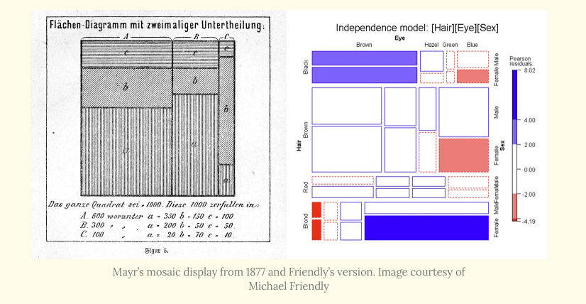
Historian of data visualisation Michael Friendly was interviewed by the Cabinet of Infographic Curiosities' Attila Bátorfy on his research. The Milestones Project he launched, covering the history of cartography, stats dataviz, and similar areas, is an absolute masterpiece. Enjoy the interview!
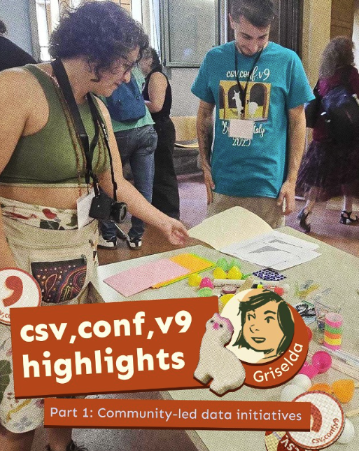
Kontinentalist's designer and co-lead Griselda Gabriele attended csv,conf,v9 (the data conference I helped organise in Bologna last September), and is doing a pretty nice multi-part write-up of her experience.
✨ Topical
The power crunch threatening America’s AI ambitions
The Financial Times graphics team has released this very interactive piece arguing that "A lack of electricity for new data centres could deflate the AI ‘bubble’".

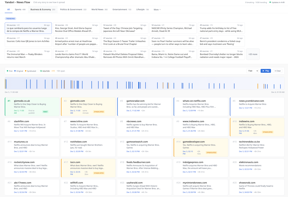
Yandori - News Flow
"Click any story to see how it spread".
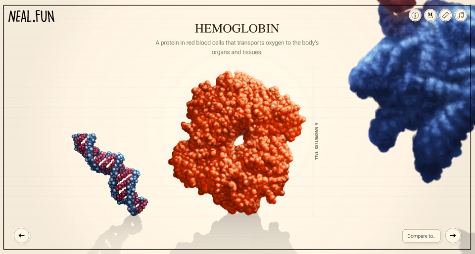
Size of Life
Neal Agarwal is back with one of his brilliant interactive stories. Illustrations by Julius Csotonyi. This one looks at the size of various entities linked to living organisms.
Brain food, delivered daily
Every day we analyze thousands of articles and send you only the best, tailored to your interests. Loved by 505,869 curious minds. Subscribe.

🛠️📖 Tools & Tutorials
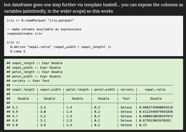
Haskell IS a Great Language for Data Science
Theoretical physicist and R developer Jonathan Carroll: "In this post I’ll demonstrate some of the features and explain why I think it makes for a good (great?) data science language."
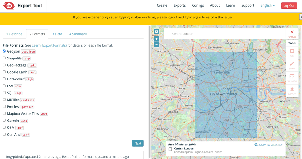
HOT Export Tool
The Humanitarian OpenStreetMap Team (HOT) have launched their own OSM Export Tool. It works much better than any other tool I've tried, with an intuitive UI, and it allows multiple format downloads.
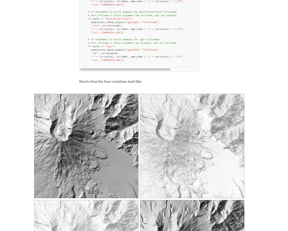
A Gentle Introduction to GDAL Part 10: Python & the Command Line
Speaking of geo, this is part 10 of a brilliant, hands-on tutorial on the geoprocessing library GDAL.
How fast can browsers process base64 data?
"Base64 is a binary-to-text encoding scheme that converts arbitrary binary data (like images, files, or any sequence of bytes) into a safe, printable ASCII string using a 64-character alphabet (A–Z, a–z, 0–9, +, /). Browsers use it in JavaScript to embedding binary data directly in code or HTML or to transmitting binary data as text."

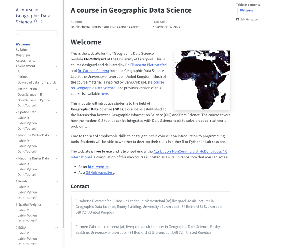
A course in Geographic Data Science
Academics Dr Elisabetta Pietrostefani and Dr Carmen Cabrera "have developed a dual-language R/Python framework for teaching Geographic Data Science. It’s a simple idea."
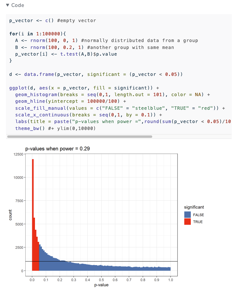
I don't think Lindley's paradox supports p-circling
"The act of p-value circling is to look at a p-value that’s significant but close to 0.05 and go: “hm, I don’t know about that…” Perhaps you use a red ballpoint pen to circle it on the print journal you subscribe to in the year 2025. If not, you may underline it with some sort of digital pen technology and share it online."
I am no longer familiar enough with this to get to some conclusions without a lot of revising, but the author is seeking to be proven wrong.
The Geospatial Ecosystem - GIM 1-2025
"This is a truly valuable ‘industry directory and partner guide’ to keep close to hand on your desk, on a shelf or in your bag. Whenever you are searching for a manufacturer or service provider to help with your next project, grab The Geospatial Ecosystem and have a quick flick through it – especially if you are looking for a bit more information about the inner workings of these companies that are active in the broad field of photogrammetry and remote sensing, aerial imagery, land surveying, GNSS or laser scanning. What really drives them, what do they regard as the key highlights, and which success stories have they worked on? Of course, there’s some practical information as well: contact details and a handy QR code to take you directly to the supplier’s profile on Geomatching or GIM International."
Free resource with no strings attached.
🤯 Data thinking
Saloni's guide to data visualization
Works In Progress' co-founder and editor Saloni Dattani writes on "Why data visualization matters, and how to make charts more effective, clear, transparent, and sometimes, beautiful."
(via Ken Figueredo)
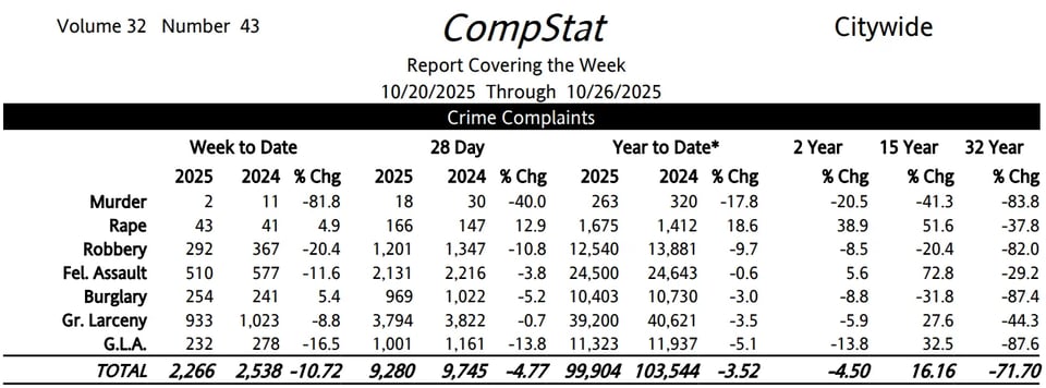
A graph is worth 1000 tables
"There are two common reasons police departments want to examine crime trends. One is to identify if crime is spiking, e.g. this week had 5 robberies, is that normal? Even in large cities, a single prolific offender can go on a spree and noticeably impact citywide crime statistics.
The second reason is to identify longer term trends. Crime can be smoothly trending upwards or downwards. If upwards, this suggests it is not due to one prolific individual, but a broader pattern of increased criminality. Like when motor vehicle thefts exploded due to the hack of Kia’s and Hyundai’s. If downwards, it can be evidence you are doing something right (or in some occasions there are anomalies in reporting).
Well executed charts can identify between these two specific scenarios in ways that a table of two numbers cannot. "
📈Dataviz, Data Analysis, & Interactive
How Google Maps quietly allocates survival across London’s restaurants - and how I built a dashboard to see through it
Lauren Leek: "I wanted a dinner recommendation and got a research agenda instead. Using 13000+ restaurants, I rebuild its ratings with machine learning and map how algorithmic visibility actually distributes power."

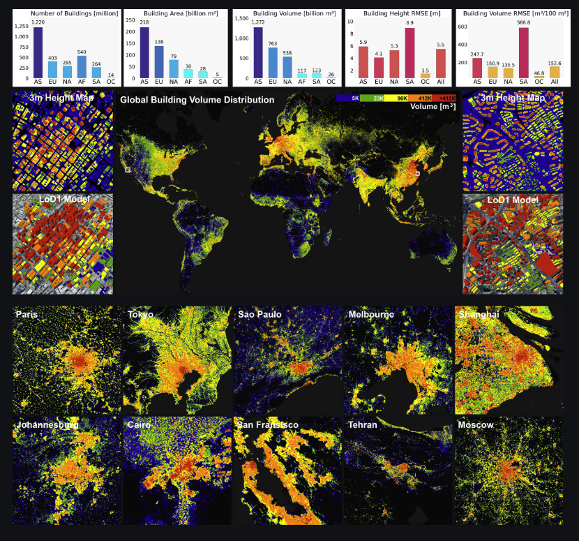
GlobalBuildingAtlas
A group of researchers at the Technische Universität München has announced the release of "GlobalBuildingAtlas, a publicly available dataset providing global and complete coverage of building polygons, heights and Level of Detail 1 (LoD1) 3D building models."
Academic paper here, code MIT-licensed on GitHub, and data downloadable here (put the kettle on, it's 36TB – at the same link you can also file a smaller, 8GB representative sub-dataset).
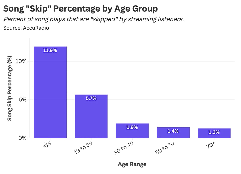
Which Songs Do We Replay the Most? A Statistical Analysis
Stat Significant's Daniel Parris: "Which songs do we listen to on repeat? And how does binge-listening behavior change with age?"
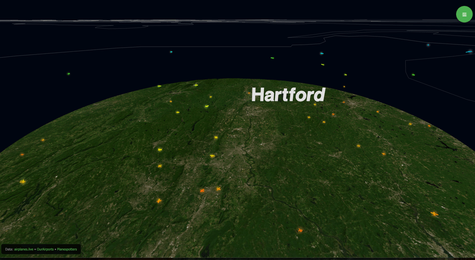
AirLoom
Wow. Using various real-time and static data sources, this website displays airplanes in the skies in real-time in 3D.
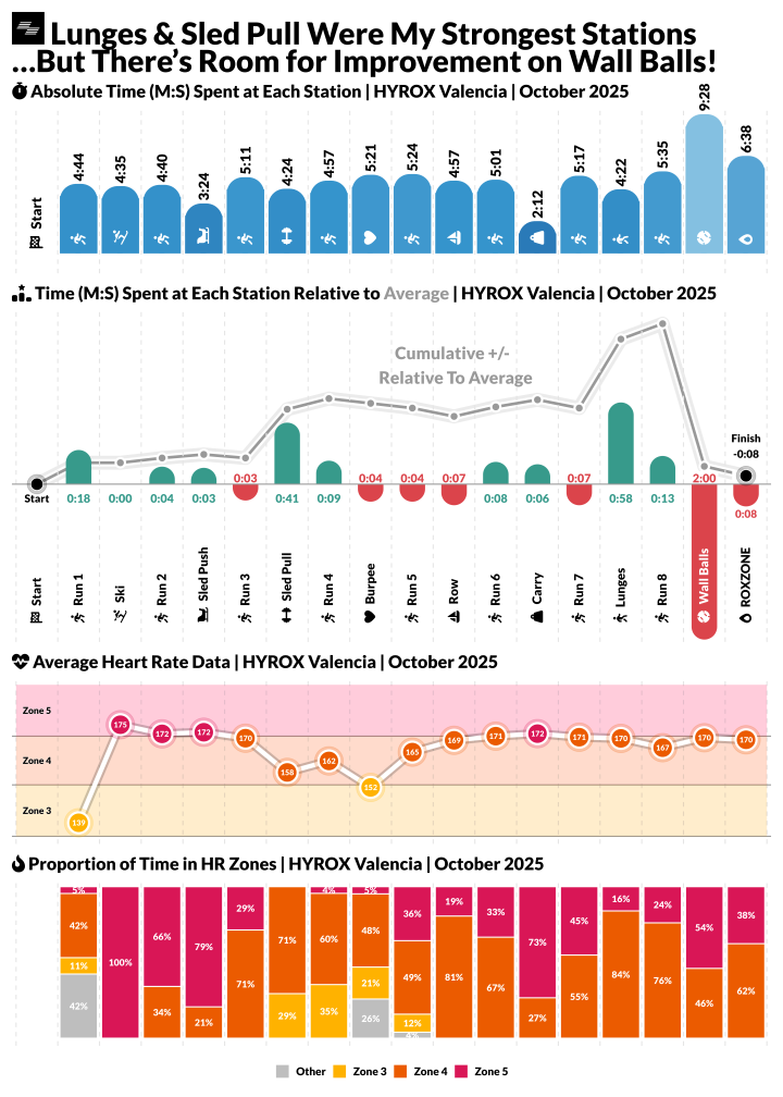
From Metrics to Mood: The Emotional Story in A HYROX Race
Andrew Peters for Nightingale: "The aim was to analyse my HYROX performance, which is the fast-growing hybrid fitness event."
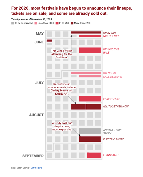
Music festivals, IRL
Datawrapper's Ceren Dolma explores music festivals in Ireland.
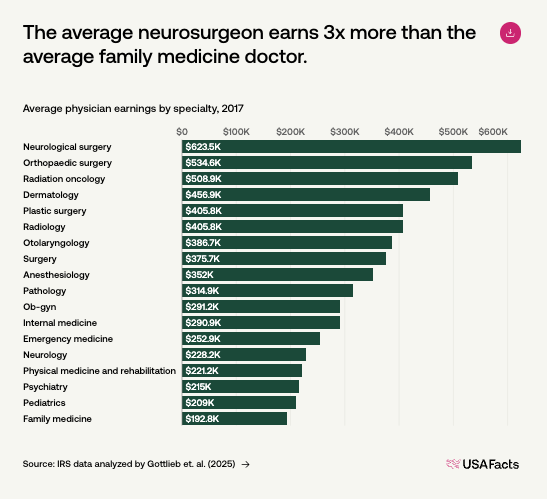
How much are doctors paid?
USAFacts does the maths and discovers that they are paid "More than 1.75 times as much as USAFacts readers think."
That said, there is no amount of money that would convince me to become a neurosurgeon...
🤖 AI
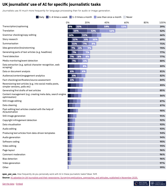
AI adoption by UK journalists and their newsrooms: surveying applications, approaches, and attitudes
"This report is based on a survey conducted between August and November 2024 with a broadly representative sample of 1,004 UK journalists. The survey was primarily focused on whether and how journalists and news organisations use artificial intelligence (AI), and how it relates to other aspects of their work."
AI-voice mansplaining, or mansplaining-voice AI?
Linguist Kimberly Pace Becker: "I’m compiling a corpus of what I call “AI-voice mansplaining” and this post is a textbook example."
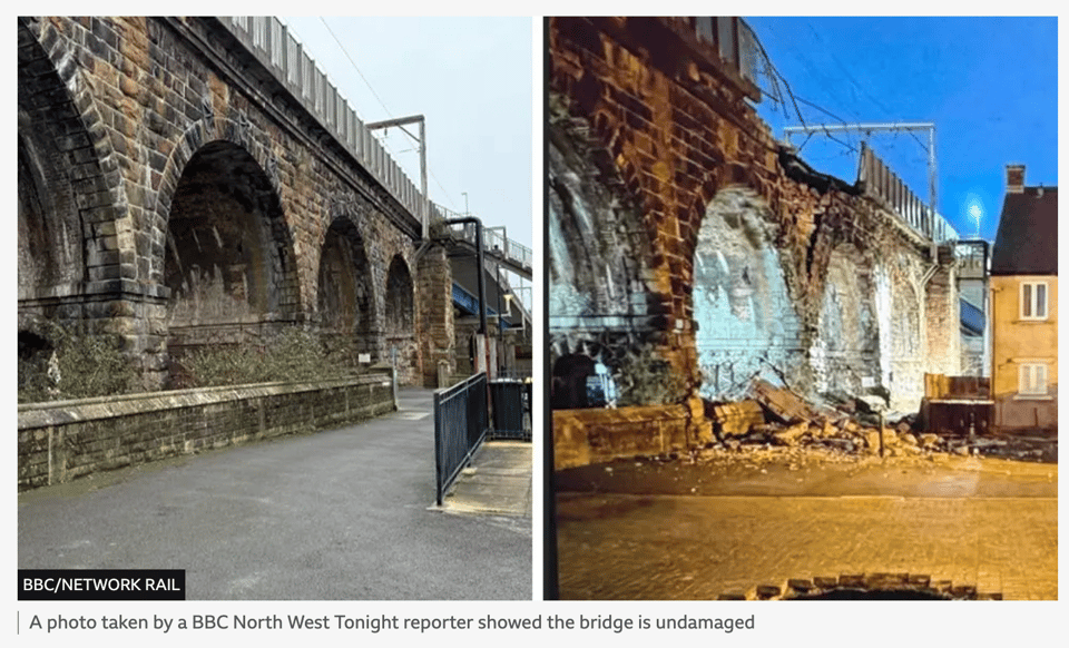
Trains cancelled over fake bridge collapse image
Humans keep being intent on showing they're less clever than machines...
This is the BBC coverage of what happened.
|
DID YOU LIKE THIS ISSUE>? → BUY ME A COFFEE! 
You're receiving this email because you subscribed to Quantum of Sollazzo, a weekly newsletter covering all things data, written by Giuseppe Sollazzo (@puntofisso). If you have a product or service to promote and want to support this newsletter, you can sponsor an issue. |
quantum of sollazzo is also supported by Andy Redwood’s proofreading – if you need high-quality copy editing or proofreading, check out Proof Red. Oh, and he also makes motion graphics animations about climate change.
