634: quantum of sollazzo
#634: quantum of sollazzo – 2 December 2025
The data newsletter by @puntofisso.

Hello, regular readers and welcome new ones :) This is Quantum of Sollazzo, the newsletter about all things data. I am Giuseppe Sollazzo, or @puntofisso. I've been sending this newsletter since 2012 to be a summary of all the articles with or about data that captured my attention over the previous week. The newsletter is and will always (well, for as long as I can keep going!) be free, but you're welcome to become a friend via the links below.
Quantum #633 had an open rate of 49.38% and a click rate of 14.52%.
The most clicked link was this handy image converter.
AMA – Ask Me Anything! Submit a question via this anonymous Google form. I'll select a few every 4-5 weeks and answer them on here :-) Don't be shy!

The Quantum of Sollazzo grove now has 35 trees. It helps managing this newsletter's carbon footprint. Check it out at Trees for Life.
'till next week,
Giuseppe @puntofisso.bsky.social
✨ Topical
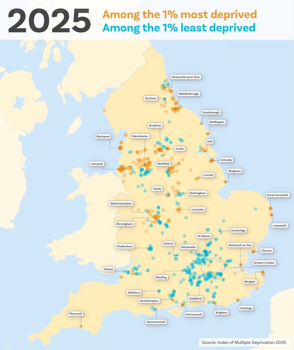
2025 most deprived vs least deprived areas in England
The Ministry for Housing, Communities, and Local Government (MHCLG) has recently published the Indices of Multiple Deprivation for this year, and the regularly great map supremo Alasdair Rae has done a chart that looks at the 1% most and least deprived areas, uncovering some patterns.
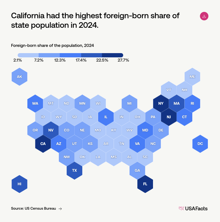
How many immigrants are in the United States?
USAFacts: "About 50.2 million in 2024. This represents approximately 14.8% of the population, or about 1 in 7 residents in the United States. Immigrants are defined as foreign-born residents, which includes people who became US citizens, are authorized to come to the US (e.g., on work visas, student visas), or are undocumented residents".
This is fully interactive, and allows navigating to state-level data.
Brain food, delivered daily
Every day we analyze thousands of articles and send you only the best, tailored to your interests. Loved by 505,869 curious minds. Subscribe.

🛠️📖 Tools & Tutorials
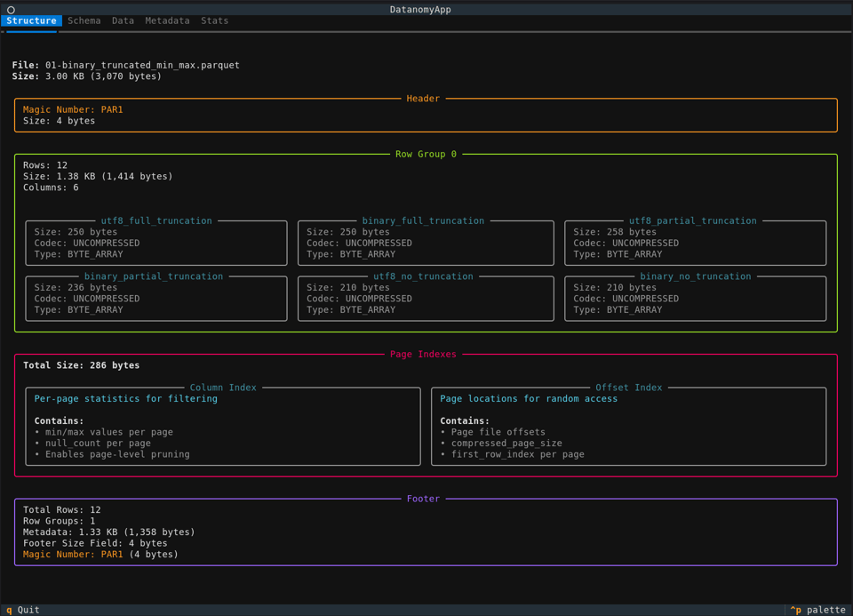
Datanomy
"Datanomy is a terminal-based tool for inspecting and understanding data files. It provides an interactive view of your data's structure, metadata, and internal organization."
It's under development, and for now only works with Parquet, but it's promising.
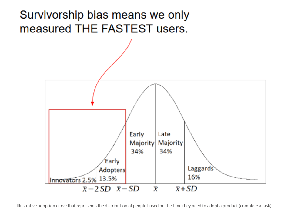
Why You Are (Probably) Measuring Time Wrong: Why do we need to use Survival Analysis more
"...what if I told you that most of the intuitive methods we use to measure time are fundamentally flawed, leading to systematically optimistic and misleading results?"
runprompt
"Dotprompt is an executable prompt template format for GenAI. A .prompt file contains both the prompt template and metadata (model, schema, config) in a single file.
runprompt is a minimal, single-file Python implementation with no dependencies."
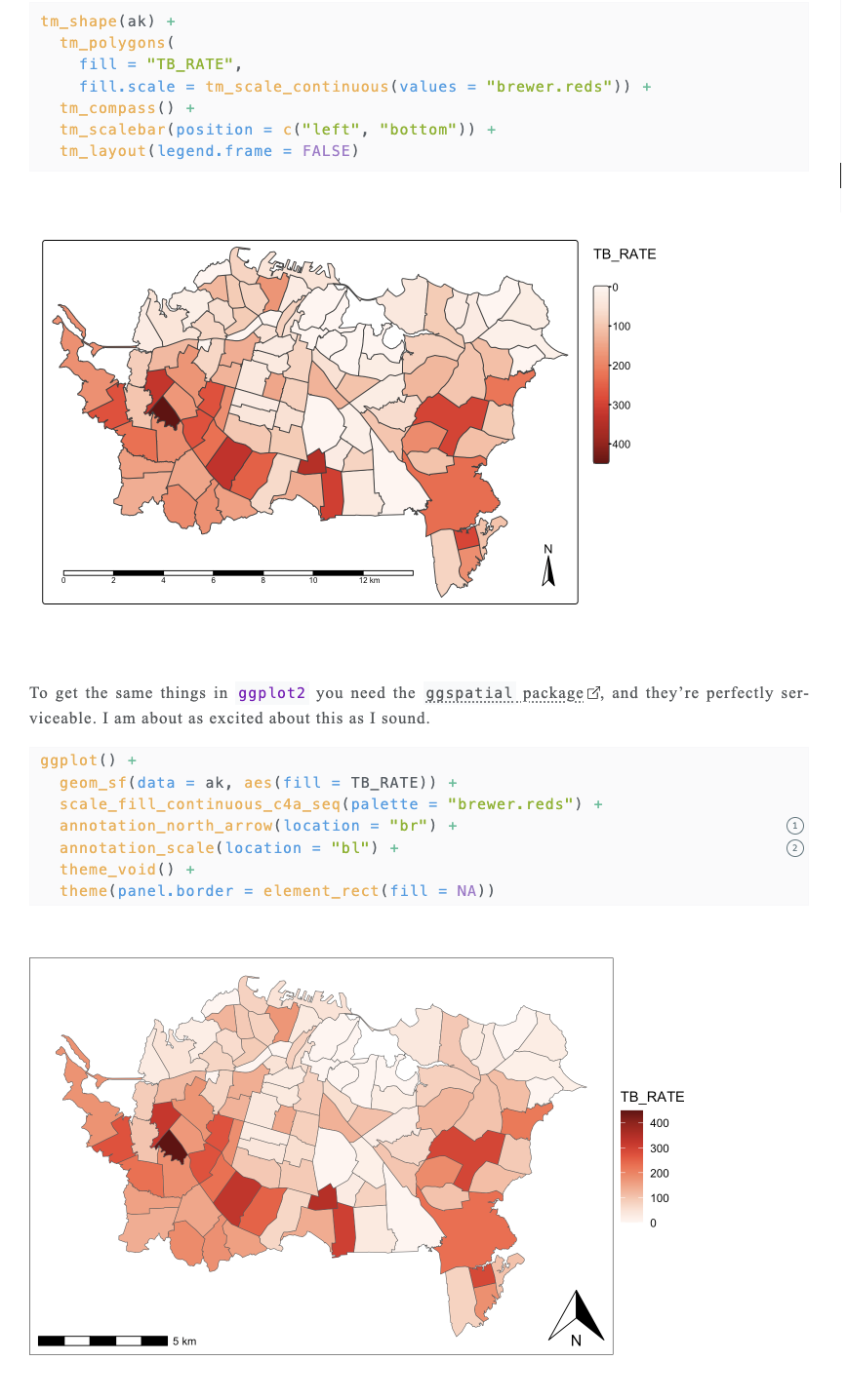
tmap vs. ggplot2 for mapping
David O'Sullivan: "I realised that since doing last year’s 30 Day Map Challenge (see my efforts here) I use ggplot2 a lot more for my everyday mapping work than I do tmap. That’s in spite of having taught tmap for several years, a choice I made because its learning curve is less steep than ggplot2’s. Anyway, long story short, migrating the code on my book website from tmap v3 to v4 turned into more of a mixed bag: migrating some code to tmap v4, and some to ggplot2.
In this post I discuss some things to consider if you are choosing which of these two excellent packages—that’s important: they are both excellent packages—to use in various situations."
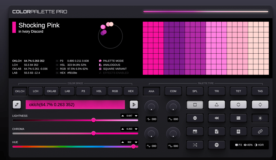
Colorpalette
This is a super good colour palette system.
How SQLite Is Powering the New Generation of Serverless Backends
Thinh Dang: "If you’d told me a few years ago that SQLite would be at the center of “planet-scale” serverless architectures, I would’ve assumed you were trolling."
SQLite is becoming an increasing solid proposition at enterprise level.
🤯 Data thinking
Lessons learned in starting a central data team
"Learn how the MTA succeeded in setting up a central data team and a general purpose, cloud-based platform for data analytics."
This resonates in many ways.
📈Dataviz, Data Analysis, & Interactive
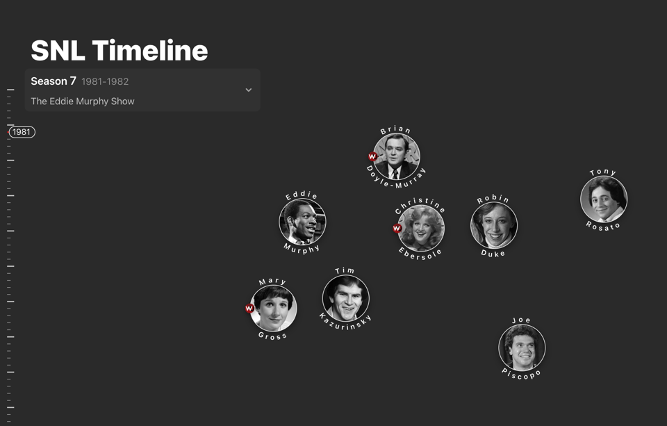
SNL Timeline
Kayla Plunkett has made this pretty cool scrollytelling viz of SNL hosts.
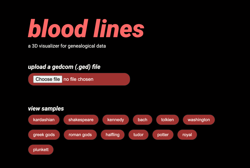
Blood lines
Always from Kayla, a little nice tool to visualize genealogical data in 3D, with plenty of examples.
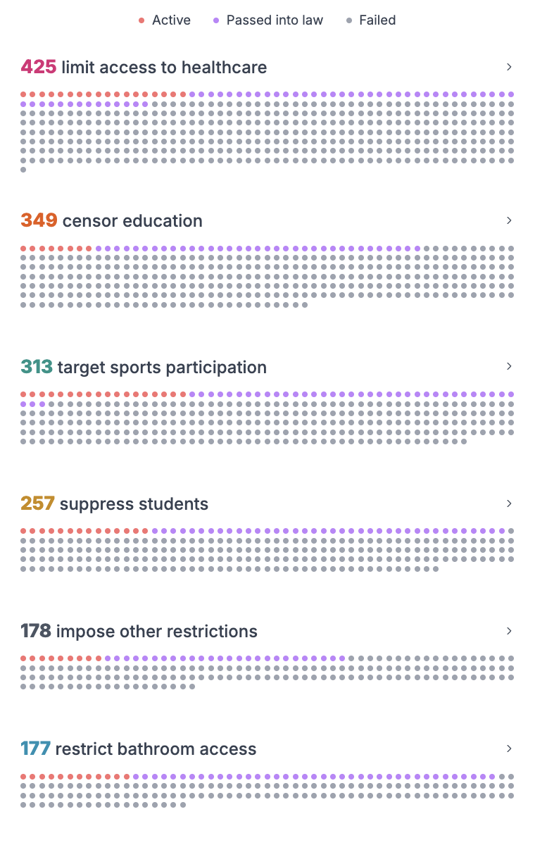
We can protect trans rights, together.
"Since 2021, US lawmakers have passed 237 pieces of legislation targeting the rights of trans Americans."
Observable... quite a bit of it this week
The last Observable monthly newsletter was full of goodies, and I really need to share a few of the pretty good reusable notebooks they've shared:
Bivariate maps with plots, by Eurostat's Joe Davies. (Joe's list of dataviz work is outstanding).
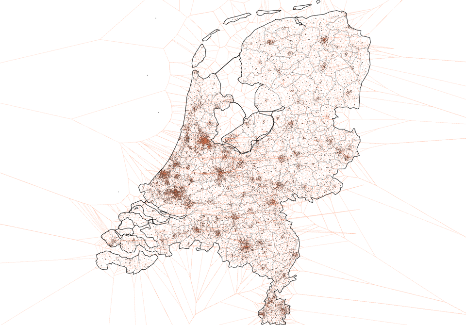
Voronoi map of cell antennas in the Netherlands, by Jules Blom.
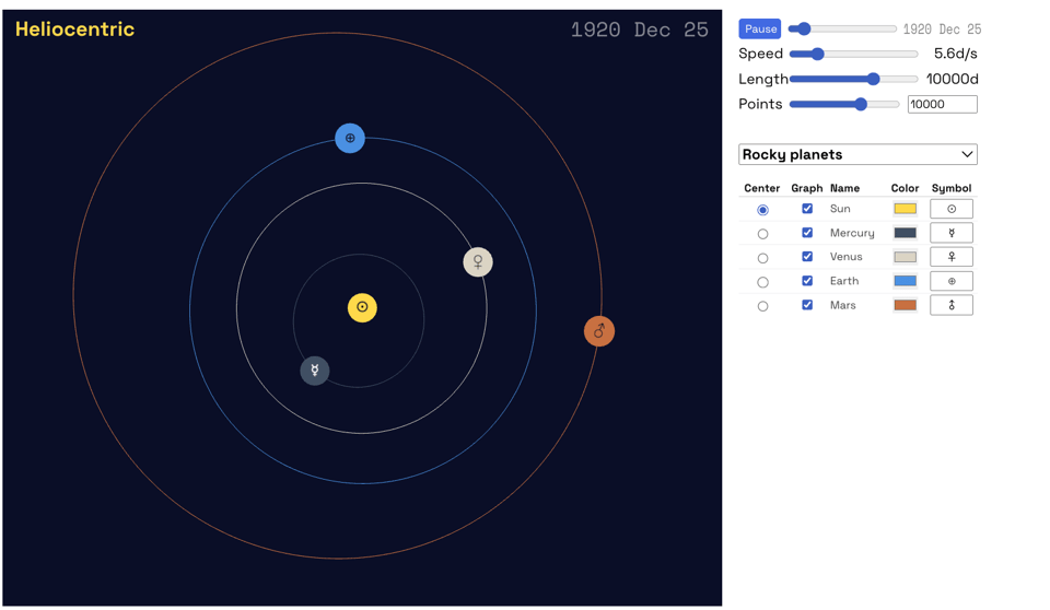
3D Celestial Body-Centric Orbits (i.e. Graph ephemeris data as orbits centered on any celestial body) by Cato Institute's Lao (I'm obsesses with ephemeris data, so this was right up my street)
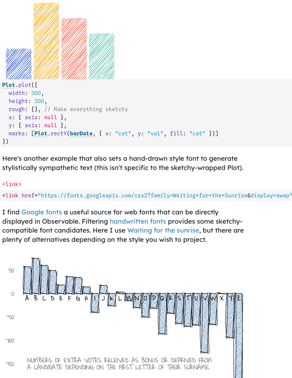
Finally, an entertaining way of Making Plot Sketchy by academic Jo Wood.
🤖 AI
What AI is Really For
"Best case: we’re in a bubble. Worst case: the people profiting most know exactly what they’re doing." A clearly critical take by designer Cristopher Butler (who runs an AI-powered business).
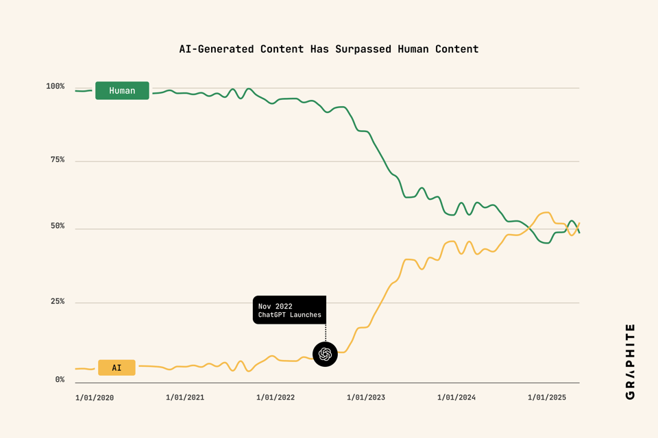
More Articles Are Now Created by AI Than Humans
"The quantity of AI-generated articles has surpassed the quantity of human-written articles being published on the web. However, the proportion of AI-generated articles has plateaued since May 2024."
|
DID YOU LIKE THIS ISSUE>? → BUY ME A COFFEE! 
You're receiving this email because you subscribed to Quantum of Sollazzo, a weekly newsletter covering all things data, written by Giuseppe Sollazzo (@puntofisso). If you have a product or service to promote and want to support this newsletter, you can sponsor an issue. |
quantum of sollazzo is also supported by Andy Redwood’s proofreading – if you need high-quality copy editing or proofreading, check out Proof Red. Oh, and he also makes motion graphics animations about climate change.
