629: quantum of sollazzo
#629: quantum of sollazzo – 21 October 2025
The data newsletter by @puntofisso.

Hello, regular readers and welcome new ones :) This is Quantum of Sollazzo, the newsletter about all things data. I am Giuseppe Sollazzo, or @puntofisso. I've been sending this newsletter since 2012 to be a summary of all the articles with or about data that captured my attention over the previous week. The newsletter is and will always (well, for as long as I can keep going!) be free, but you're welcome to become a friend via the links below.
Quantum #628 had an open rate of 46.83% and a click rate of 11.87%.
The most clicked link was this twitter thread about the relationship between public transport and cars.
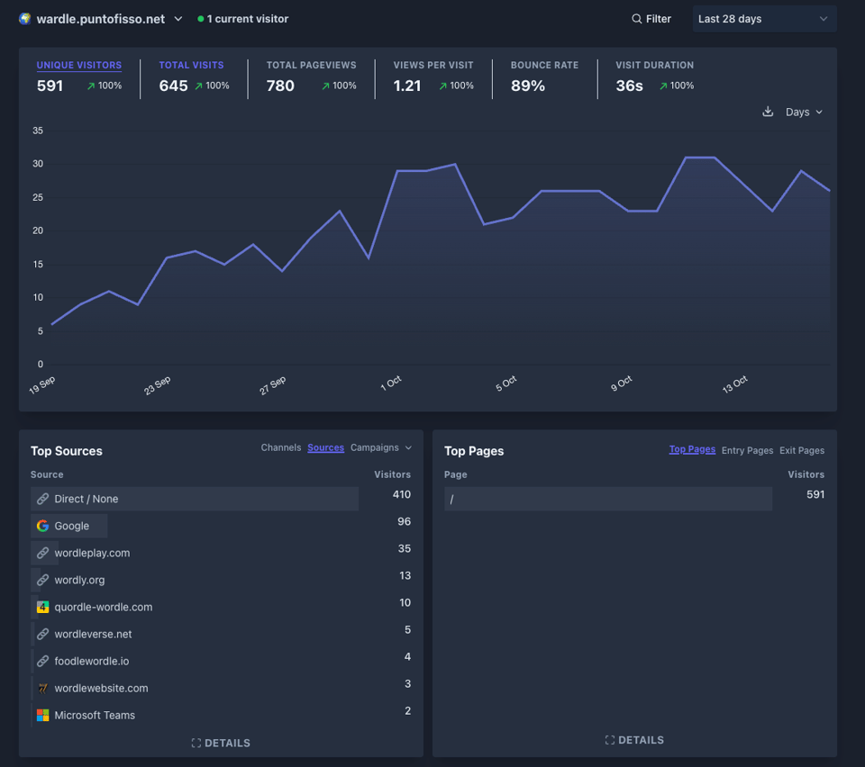
Ah, I checked my most visited websites last week and, interestingly, the most regularly visited is still Wardle.
AMA – Ask Me Anything! Submit a question via this anonymous Google form. I'll select a few every 4-5 weeks and answer them on here :-) Don't be shy!

The Quantum of Sollazzo grove now has 35 trees. It helps managing this newsletter's carbon footprint. Check it out at Trees for Life.
'till next week,
Giuseppe @puntofisso.bsky.social
🛎️ Things that caught my attention
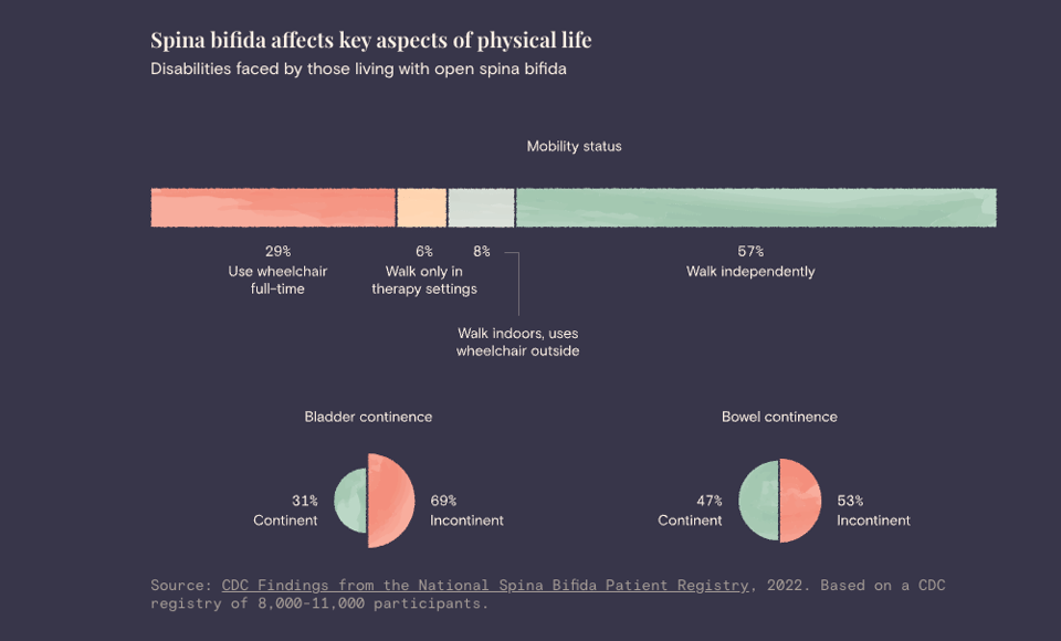
Evelina Parrou (one of the legends of dataviz that Quantum follows attentively) has released this story that relates to her personal experience of pregnancy termination, caused by spina bifida. It is really admirable to see this level of openness and sharing in a situation that is a huge personal trauma, captured is such a great way. Read it here, The Prevention Gap.
✨ Topical
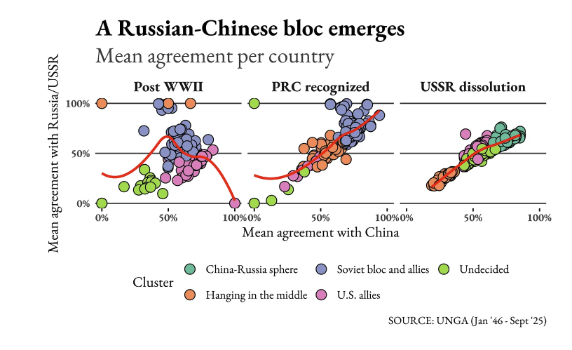
The Struggle for Global Influence in the United Nations General Assembly
"How China, Russia, and the U.S. compete for power in the UN's consultative body."
Good to see Francesco Piccinelli back with his DaNumbers newsletter!
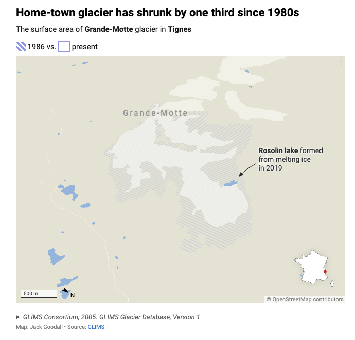
The glaciers are melting. Are ski resorts digging their own graves?
Datawrapper's Jack Goodall: "Throughout my life, I saw and continue to see my local glacier, La Grande-Motte, retreat at an accelerating pace up the mountain year after year."
Brain food, delivered daily
Every day we analyze thousands of articles and send you only the best, tailored to your interests. Loved by 505,869 curious minds. Subscribe.

🛠️📖 Tools & Tutorials
nanochat
Andrej Karpathy has released this repo claiming it's "the best ChatGPT that $100 can buy."
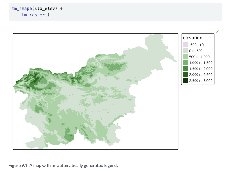
Spatial Data Visualization with tmap
"A Practical Guide to Thematic Mapping in R".
Build a stunning data portfolio
Dataviz guru and trainer Yan Holtz has launched this new service, a no-code dataviz portfolio-builder tool. "Type your name. Adjust a few sliders. Add text and images. Hit publish. Boom — your portfolio is live."

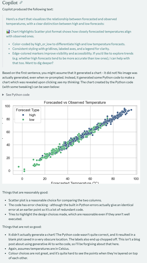
Generative AI for Data Visualisation
Nicola Rennie: "Can generative AI create good data visualisations? This blog post compares the performance of ChatGPT, Claude, Copilot, and Gemini when presented with a generic request to visualise a dataset."
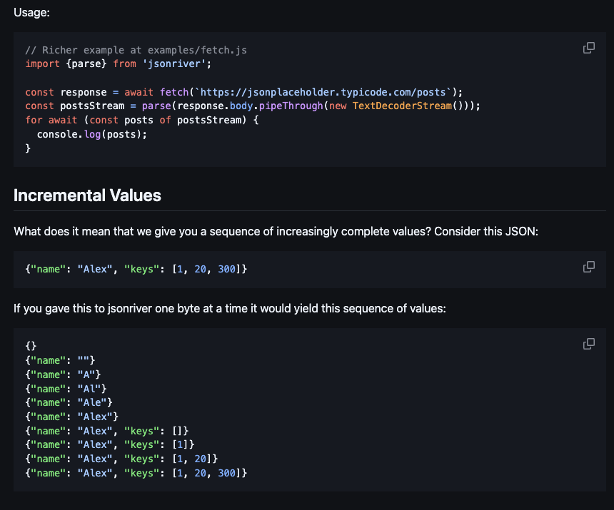
jsonriver
Jsonriver is a "simple, fast streaming JSON parser built on standards."
"Parse JSON incrementally as it streams in, e.g. from a network request or a language model. Gives you a sequence of increasingly complete values.
jsonriver is small, fast, has no dependencies, and uses only standard features of JavaScript so it works in any JS environment."
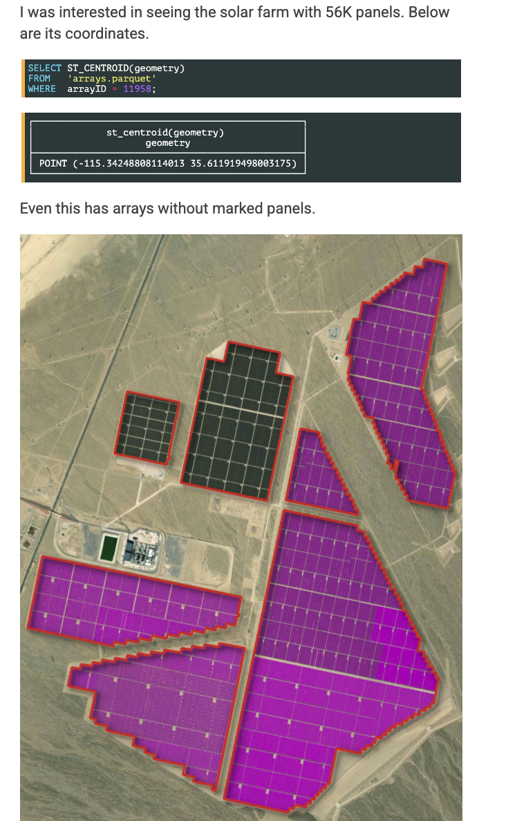
American Solar Farms
"Last week, Jake Stid, a postdoctoral research associate at Michigan State University, announced Ground-Mounted Solar Energy in the United States (GM-SEUS). This is a 15K-array, 2.9M-panel dataset of utility and commercial-grade solar farms across the lower 48 states plus the District of Columbia. This dataset was constructed by a team of researchers including alumni from NOAA, NASA and the USGS." GIS expert Mark Litwintschik shows how to use its Solar Farm data and visualize it.
Welcome to Anthropic's Prompt Engineering Interactive Tutorial
"This course is intended to provide you with a comprehensive step-by-step understanding of how to engineer optimal prompts within Claude."
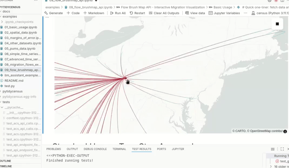
pitidycensus
Academic Michael Mann announced a good development in the pitidycensus package: "I'm thrilled to share a major enhancement in the Python package pytidycensus—seamless integration with Lonboard for visualizing U.S. Census Bureau migration flows!
We can now quickly generate stunning, interactive, and GPU-accelerated flow maps from the ACS Migration Flows data. This is a game-changer for working with large geospatial datasets in Jupyter environments."
The Kaggle Grandmasters Playbook: 7 Battle-Tested Modeling Techniques for Tabular Data
From the NVIDIA Developer Technical Blog, "Lessons from years of competitions, made practical with GPU acceleration."
📈Dataviz, Data Analysis, & Interactive
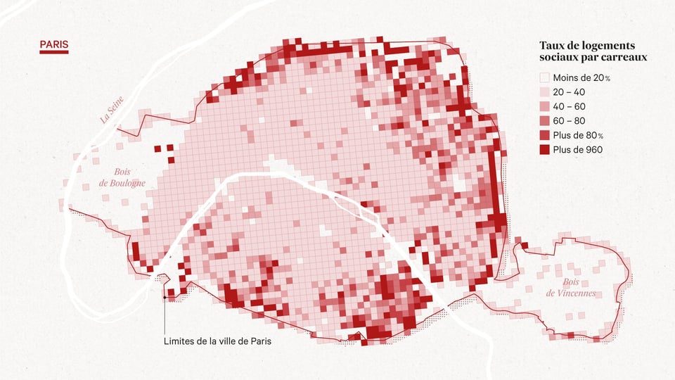
Ce que la carte des kebabs révèle de Paris
If you speak French, watch the video linked in this post. Otherwise, simply enjoy the maps of Paris kebabs :)
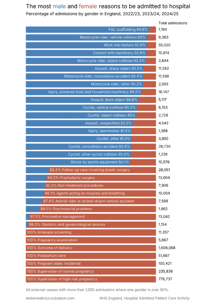
The most male and female reasons to end up hospital 🚑
Leo Benedictus displays some interestingly wrangled NHS England data.
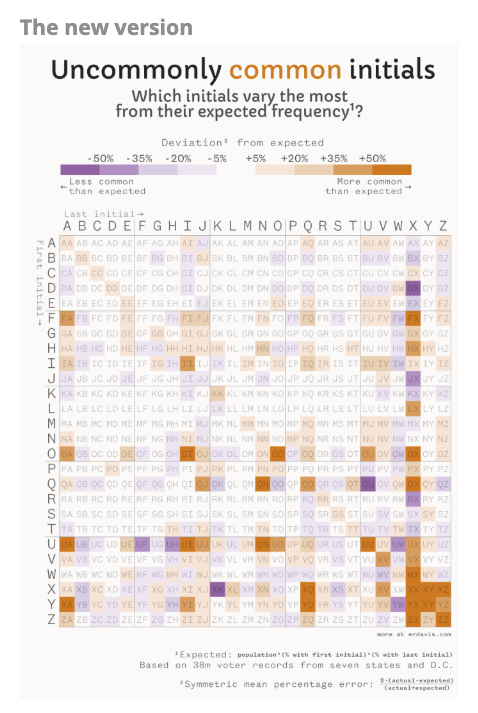
Revisiting dataviz: Uncommonly common initials
Erin Davis revisits some old dataviz and explains what she would do differently this time.
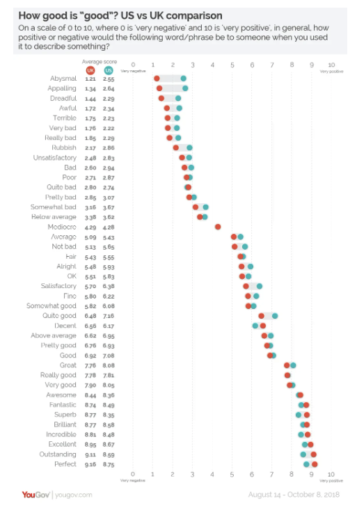
How good is “good”?
In Quantum #625 we looked at this great analysis by YouGov. What I didn't spot back then was the chart below. What I find remarkable is that the perception, broadly speaking, shifts from the UK being slightly more positive on negative adjectives to the US being more positive but only on very positive adjectives. With some juicy outliers. Enjoy.
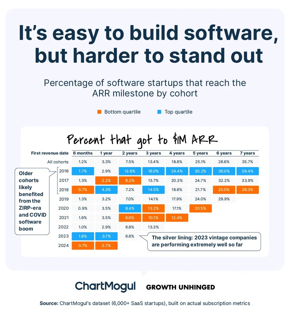
The odds of making it
"A new look inside startup growth from zero to $25 million ARR".
TL;DR: it's bloody hard.
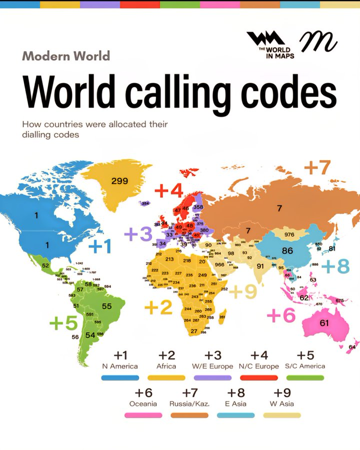
World calling codes
"How countries were allocated their dialling codes". By geography, that is.
(via Peter Wood)
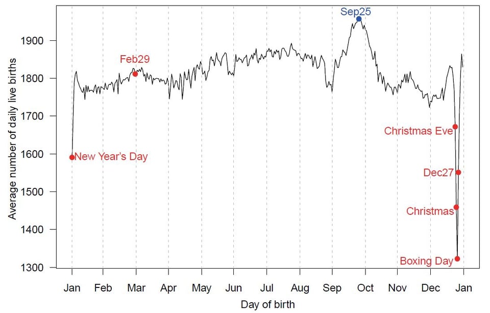
Birthday frequency
Alex Selby-Boothroyd on LinkedIn: "I do love a birthday-frequency chart or four, and the various stories hidden in these are fascinating: there are big peaks every September—nine months after Christmas—and sharp drops on public holidays, notably the Fourth of July in the US and Anzac Day in Australia (April 25th). There's no such obvious day to avoid in England and Wales though (the first chart). And despite the lack of precision, I prefer the heatmap at the end for instant grokability."
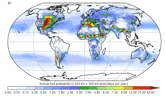
Global estimates of damaging hail hazard
Interesting academic paper looking at hail hazard. Chart below is for the distribution of hail probability, which has some very interesting properties.
(via Peter Wood)
|
DID YOU LIKE THIS ISSUE>? → BUY ME A COFFEE! 
You're receiving this email because you subscribed to Quantum of Sollazzo, a weekly newsletter covering all things data, written by Giuseppe Sollazzo (@puntofisso). If you have a product or service to promote and want to support this newsletter, you can sponsor an issue. |
quantum of sollazzo is also supported by Andy Redwood’s proofreading – if you need high-quality copy editing or proofreading, check out Proof Red. Oh, and he also makes motion graphics animations about climate change.
