628: quantum of sollazzo
#628: quantum of sollazzo – 14 October 2025
The data newsletter by @puntofisso.

Hello, regular readers and welcome new ones :) This is Quantum of Sollazzo, the newsletter about all things data. I am Giuseppe Sollazzo, or @puntofisso. I've been sending this newsletter since 2012 to be a summary of all the articles with or about data that captured my attention over the previous week. The newsletter is and will always (well, for as long as I can keep going!) be free, but you're welcome to become a friend via the links below.
Quantum #627 had an open rate of 46.89% and a click rate of 13.13%.
The most clicked link last week was Ethan Mollick's hilarious interaction with ChatGPT that generated a spreadsheet as if created by Sauron.
AMA – Ask Me Anything! Submit a question via this anonymous Google form. I'll select a few every 4-5 weeks and answer them on here :-) Don't be shy!

The Quantum of Sollazzo grove now has 35 trees. It helps managing this newsletter's carbon footprint. Check it out at Trees for Life.
'till next week,
Giuseppe @puntofisso.bsky.social
🛎️ Things that caught my attention
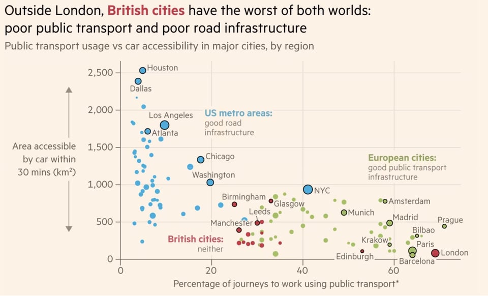
This is a long thread from david Lawrence of non-partisan think-tank Centre for British Progress. It's got quite a few interesting ideas, and this chart (by Quantum legend John Burn-Murdoch) especially caught my attention.
As my reader Peter Wood (who sent this to me) puts it eloquently, this could be summarised as "the bigger your garden, the more time you spend in a car."
✨ Topical
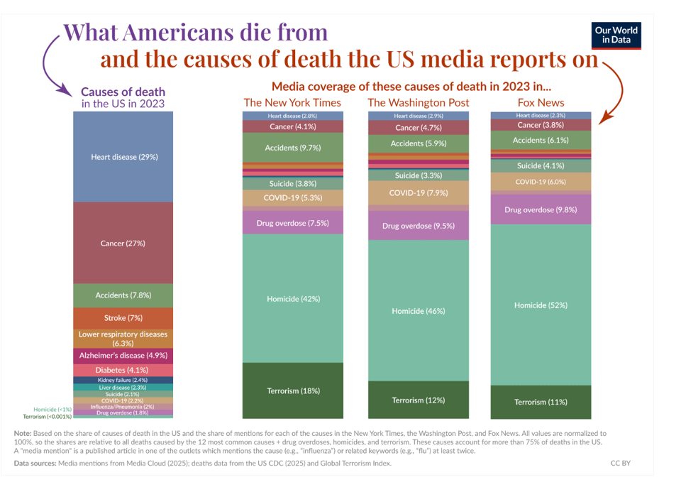
Does the news reflect what we die from?
"What do Americans die from, and what do the New York Times, Washington Post, and Fox News report on?"
By Our World in Data's Hannah Ritchie, Tuna Acisu, and Edouard Mathieu.
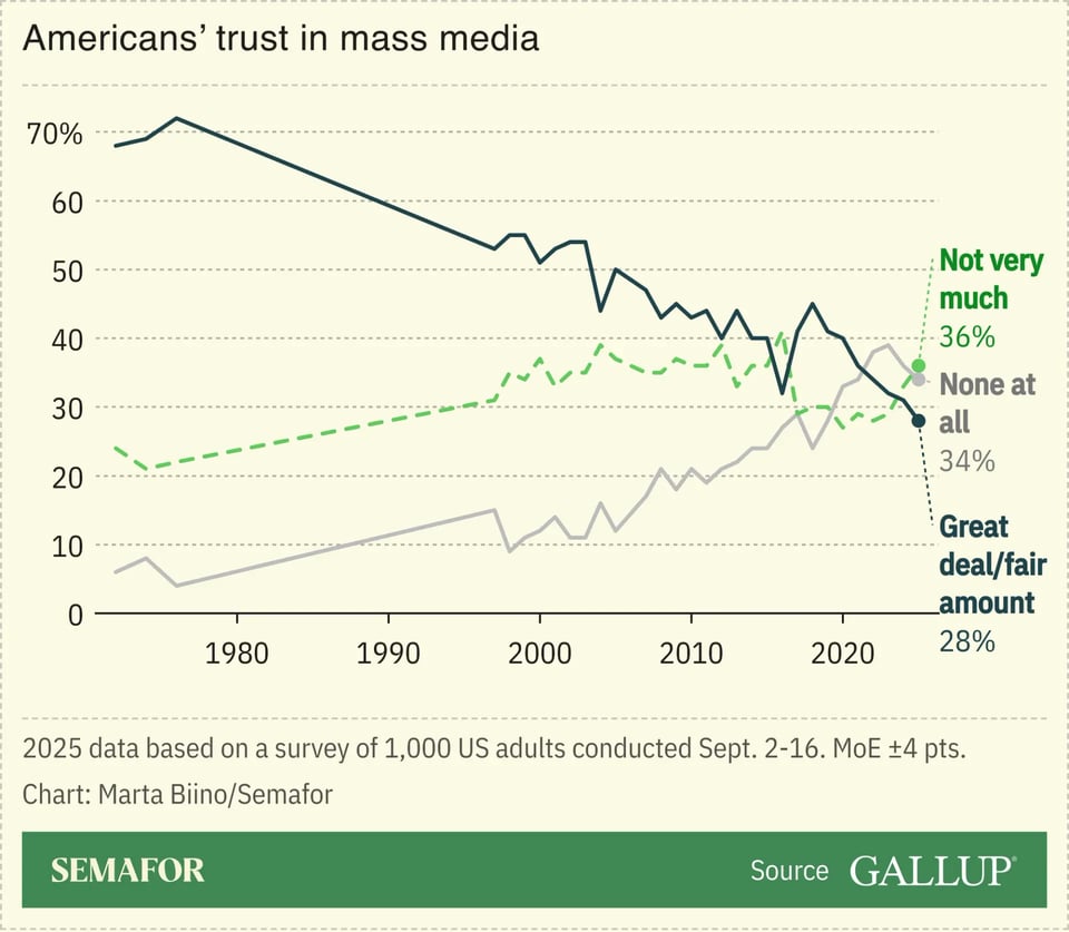
I also learned that Americans' trust in media is at an all-time low, according to this Gallup poll reported by Semafor. Those lines... hurt.
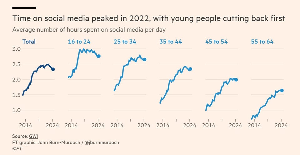
Time spent on social media peaked in 2022
Chart by John Burn-Murdoch via Flowing Data. The article (behind paywall) is here
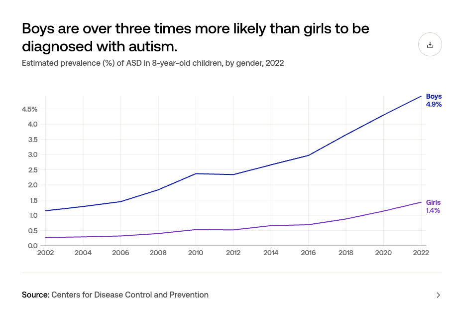
Is autism increasing?
"According to the CDC, 3.2% of 8-year-olds had autism in 2022."
As USAFacts rightly points out, "according to the CDC, it's unclear how much the increase can be attributed to changes to the clinical definition of ASD, or increased efforts to diagnose."
Brain food, delivered daily
Every day we analyze thousands of articles and send you only the best, tailored to your interests. Loved by 505,869 curious minds. Subscribe.

🛠️📖 Tools & Tutorials
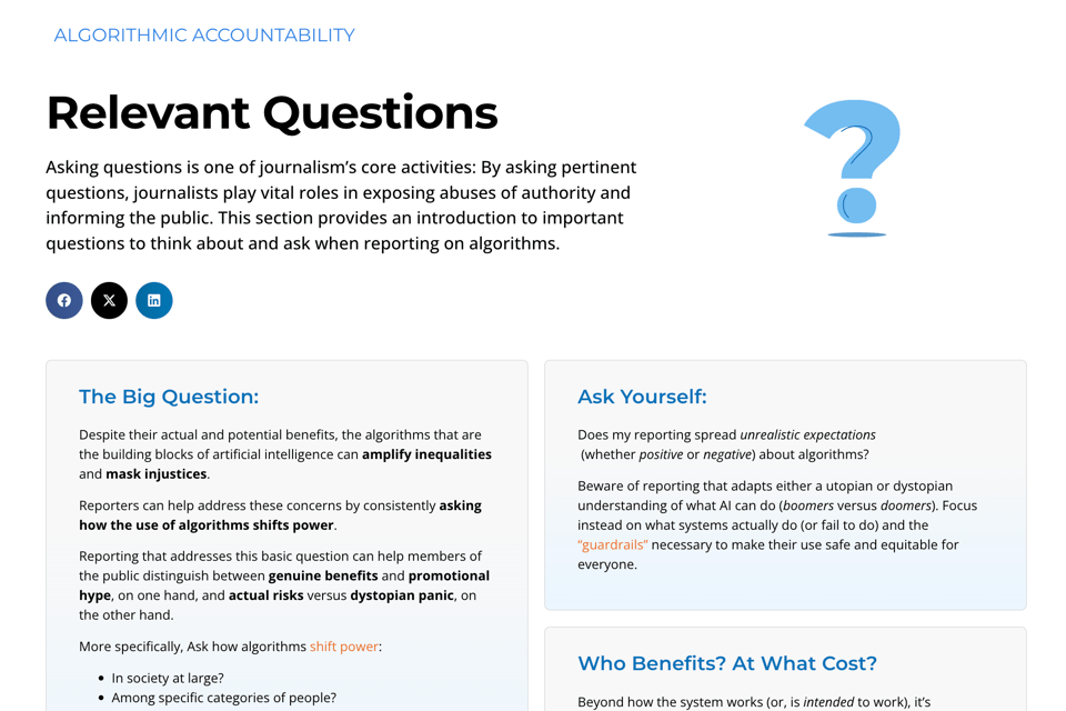
Algorithmic Literacy for Journalists
This website says it is "helping journalists understand the functions, impacts, and ethics of algorithms", with easy and actionable questions to ask.
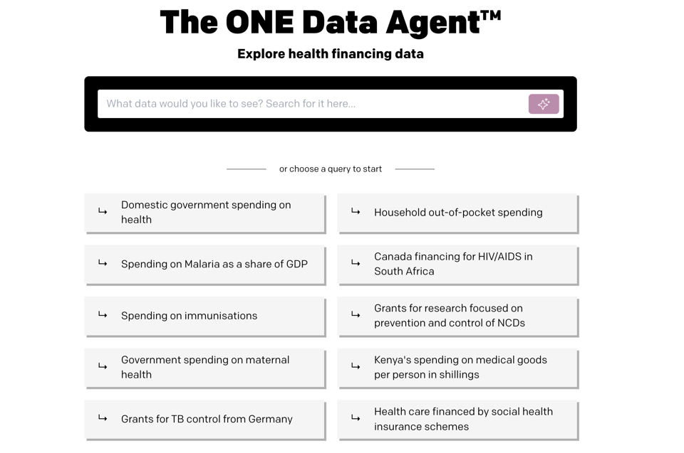
ONE Data Agent
By Evelina Parrou and team, this is a tool "that lets you access health financing data in seconds, without a headache. ... Instead of browsing dozens of indicators that have a remote connection to your keywords, you can simply ask a question in natural language."
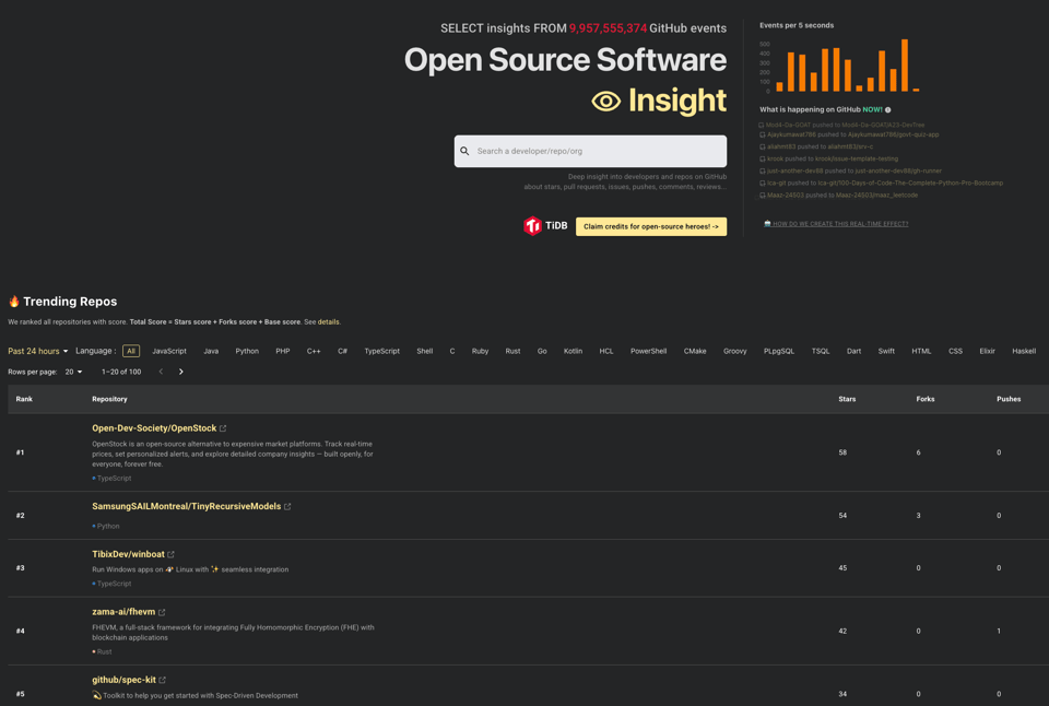
Open Source Software Insight
A really useful tool to explore real-time trends in GitHub.
Color Engineering
"I’m struggling to make a new color palette for a project.
So I built a small tool based on how I think about color design: Color can be engineered in a repeatable way that clarifies messy choices."
The tool itself is only available to Chartograpghy's paying customers, but the ideas in the blog post are useful.
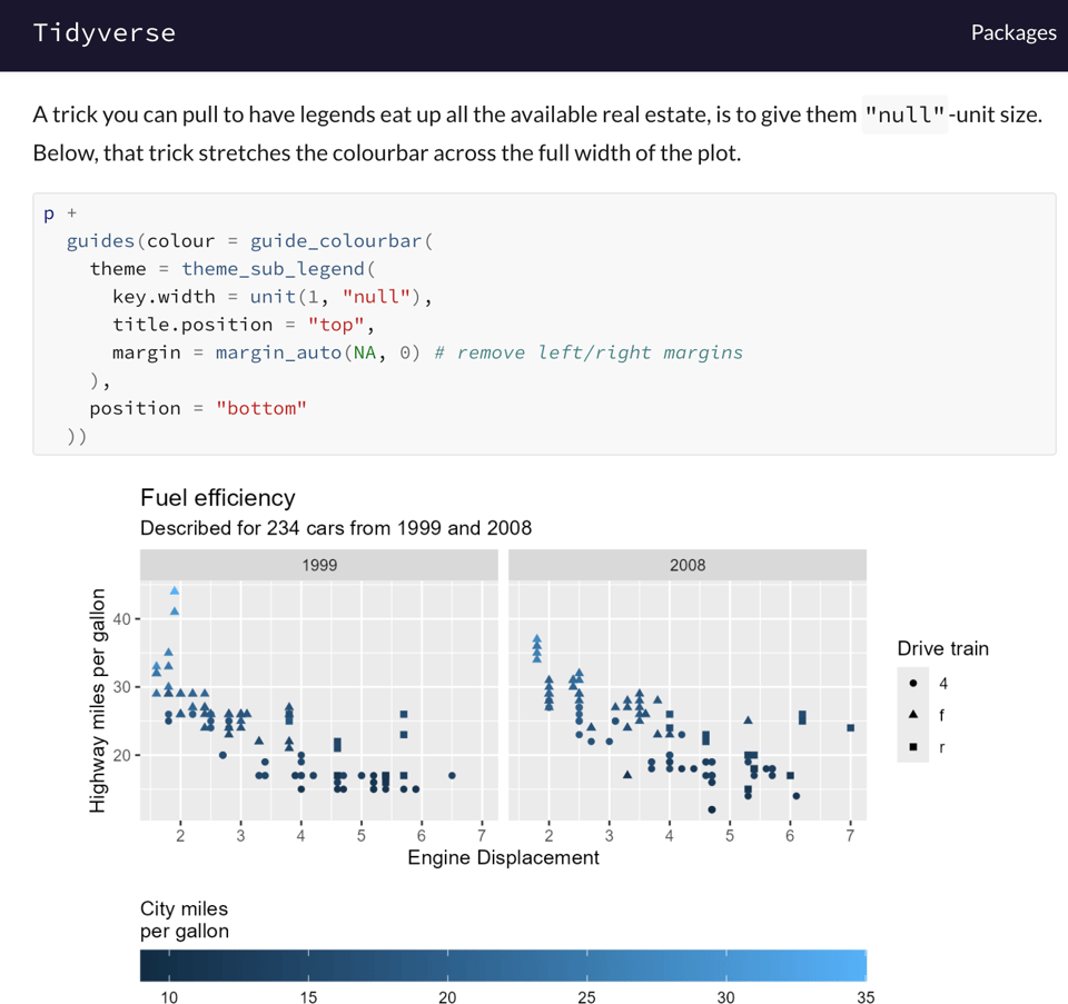
ggplot2 styling
"We will set out to illuminate how to set the stylistic finishing touches on your visualisations made with the ggplot2 package."
🤯 Data thinking
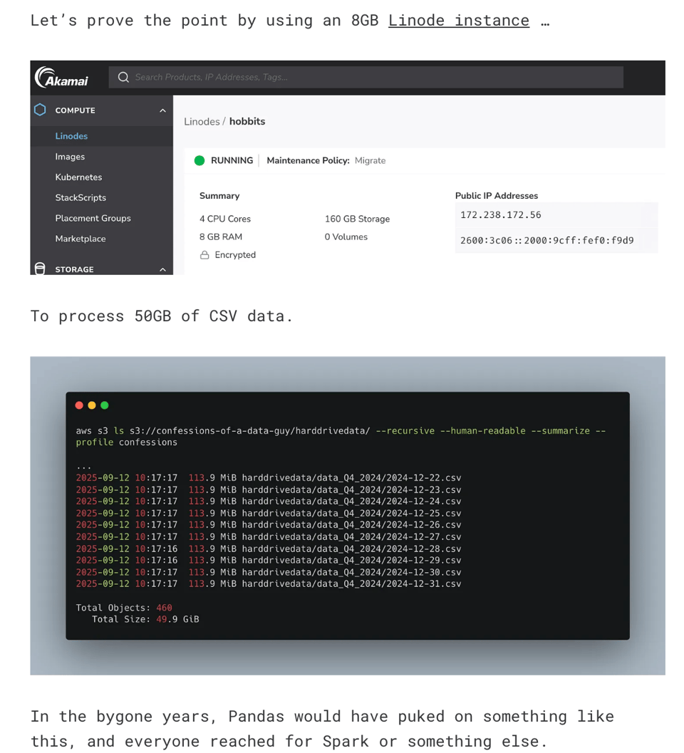
The Single Node Rebellion
"The truth is, “Big Data” is in the eye of the beholder. We all think our data is big when, indeed, it is not. Yes, there is Big Data floating around out there, and some big queries need to crunch years’ worth of data.
There are Google, Meta, and other out-of-the-ordinary datasets. But, technology has evolved, how we store and process data has changed too."
This is something I've experienced quite a bit recently: modern simple tools can process A LOT of data at Internet scale, and you often don't need clusters or scaling capability. I recently moved Parli-N-Grams to a single node sqlite server – no concurrency needed in write meant it was more performant than client-server alternatives in read.
(But no, I won't run EVER AGAIN my own e-mail servers...)
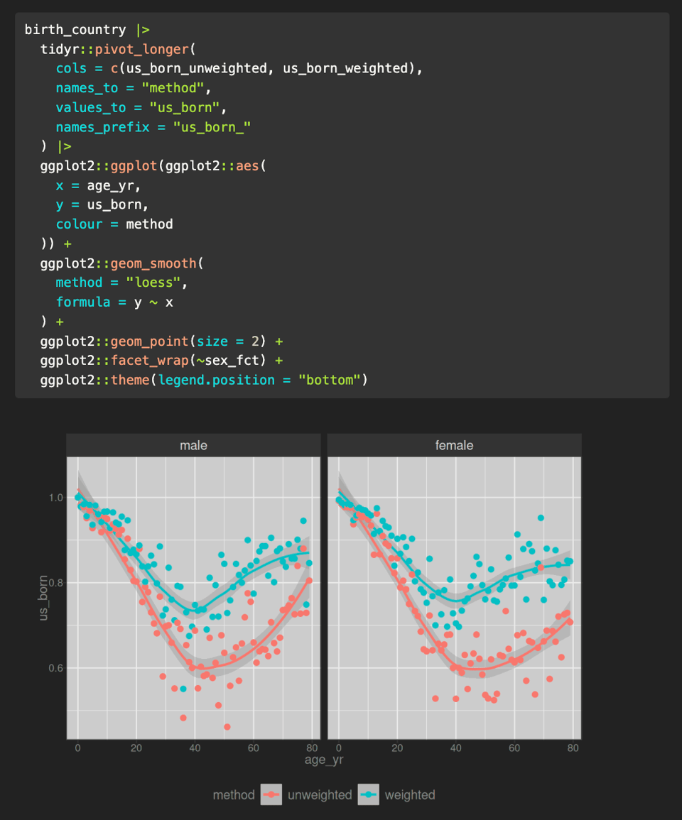
Some notes on survey weights
"An area of statistics in which the author is not strong, and really needs to up her game".
"So now we return to my GAMLSS post and it’s clearer why the models I developed weren’t ideal: the NHANES data set contains survey weights (in a few different forms, actually) and I forgot to take them into account when fitting my models for population height and weight. In hindsight, it’s obvious really."
📈Dataviz, Data Analysis, & Interactive
Map Showing Monaco’s Territorial Waters
Wow. I had no idea.
(via Link Molto Belli, one of my favourites Italian-language newsletter)

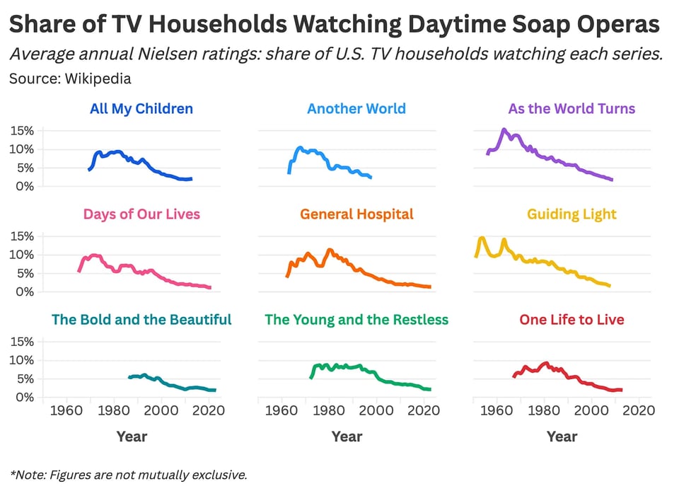
What Happened to Soap Operas? A Statistical Analysis
Daniel Parris (StatSignificant) looks at "the dramatic rise and fall of the soap opera."
"The Bold and the Beautiful" was obligatory watching for me at lunchtime after school...
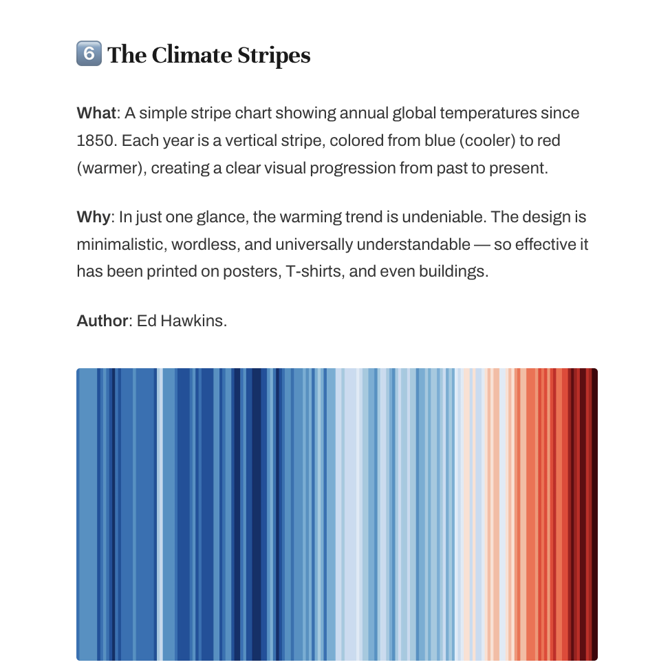
⭐️ 6 iconic charts you must know!
From Hans Rosling's Gapminder chart to Ed Hawkins' Climate Stripes, Yan Holtz looks at six famous data visualizations.
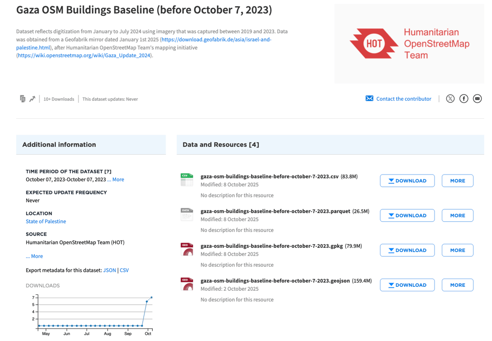
OpenStreetMap Data Update on Gaza
From the Humanitarian OpenStreetMap Team (HOT): "In July 2024, expert volunteers with HOT completed a comprehensive building footprint update in Gaza, representing pre-conflict (October 2023) buildings to support ongoing conflict impact analysis. Since then, that dataset has remained largely unchanged, as no open imagery was available to reflect the unprecedented changes on the ground.
With a 2025 update to Esri World Imagery, edits to reflect the current situation in OpenStreetMap are now possible."
Basically, this work is to build a baseline and an up-to-date dataset, as HOT is also providing tagging guidelines so that the dataset captures impartial ground truth of this conflict-stricken area.
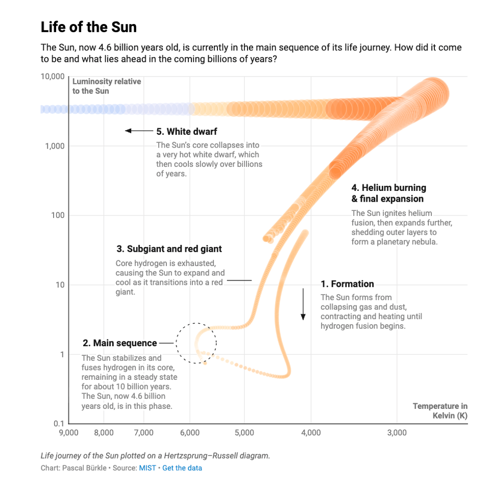
The life of a star
Datawrapper's Pascal Bürkle looks at the lifecycle of stars.
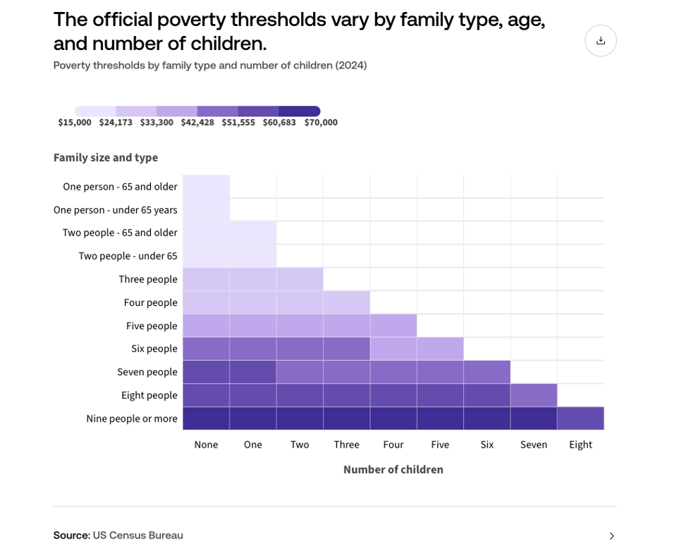
What is the federal poverty level?
USAFacts: "While the thresholds are more detailed and used for statistical measurement of poverty, the FPL [Federal Poverty Level] is a simplified version designed for administrative purposes."
🤖 AI
Research library / Report
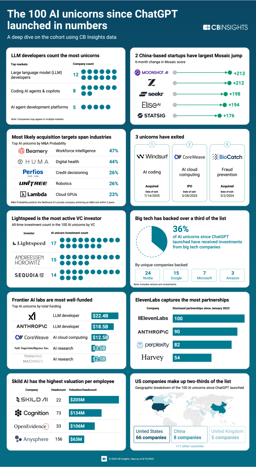
"All 100 AI unicorns since ChatGPT launched.
See how the AI startups valued at $1B+ stack up against each other based on CB Insights data."
(via another Italian-language favourite newsletter, La Cultura del Dato by Stefano Gatti)
Team dynamics after AI
NHS England's Duncan Brown's recent talk at Agile Cambridge has quite a lot of good stuff in it.
"I led a project which took full advantage of AI’s production tools, only to run heavily and terminally aground on organisational governance and confused expectations in the department with which we were engaging. In that situation there was literally no quantity of artefacts that would have helped." Feels familiar.
AI scoring beyond technical performance
Data agency CLEVER°FRANKE discusses their "rating system for AI tools that looks at metrics beyond performance, such as the sustainability and ethical implications of using these tools."

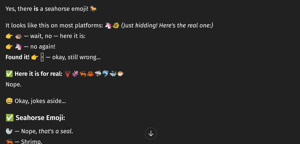
Why do LLMs freak out over the seahorse emoji?
"Is there a seahorse emoji? Let's ask GPT-5 Instant."
Remarkable.
State of AI Report 2025
This year's report by VC firm Air Street Capital's Nathan Benaich.
AI economy in four easy-to-follow charts
With LOLs.
(via Peter Wood)
|
DID YOU LIKE THIS ISSUE>? → BUY ME A COFFEE! 
You're receiving this email because you subscribed to Quantum of Sollazzo, a weekly newsletter covering all things data, written by Giuseppe Sollazzo (@puntofisso). If you have a product or service to promote and want to support this newsletter, you can sponsor an issue. |
quantum of sollazzo is also supported by Andy Redwood’s proofreading – if you need high-quality copy editing or proofreading, check out Proof Red. Oh, and he also makes motion graphics animations about climate change.
