625: quantum of sollazzo
#625: quantum of sollazzo – 23 September 2025
The data newsletter by @puntofisso.

Hello, regular readers and welcome new ones :) This is Quantum of Sollazzo, the newsletter about all things data. I am Giuseppe Sollazzo, or @puntofisso. I've been sending this newsletter since 2012 to be a summary of all the articles with or about data that captured my attention over the previous week. The newsletter is and will always (well, for as long as I can keep going!) be free, but you're welcome to become a friend via the links below.
The most clicked link last week was Daniel Inniss' pretty cool Boundr web app.
AMA – Ask Me Anything! Submit a question via this anonymous Google form. I'll select a few every 4-5 weeks and answer them on here :-) Don't be shy!

The Quantum of Sollazzo grove now has 35 trees. It helps managing this newsletter's carbon footprint. Check it out or donate a tree at Trees for Life.
'till next week,
Giuseppe @puntofisso.bsky.social
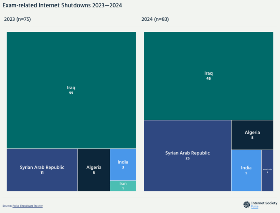
Internet Society Pulse
In 2024, Internet Society Pulse tracked 146 Internet shutdown events across 22 countries, spanning a few hours to the whole year. The number one reason for most of these was to prevent cheating during exams, a disproportionate and ineffective measure that disrupts daily lives. See where Internet Shutdowns are happening now.
🛎️ Things that caught my attention
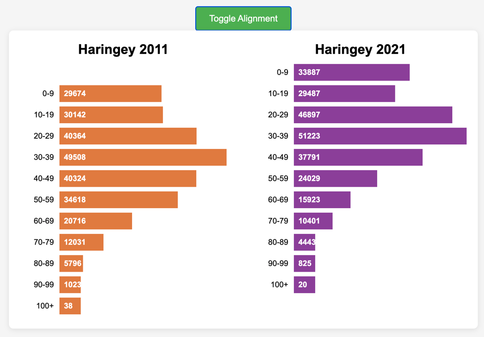
I've built a little demo to illustrate an interesting data visualization question that emerged in conversation with a friend.
Following a conversation about this article on the Guardian, my friend Kylie Fowler made this observation: "I find reading that graph interesting, because of course in 2011 everyone was in the previous age group as in 2024. So to get a true view of what is happening you probably need to read across and down one. So the 60-64 2019 cohort have a big drop from 131 to 65 while the 75-79 2019 cohort jump from 56 to 93."
While, upon further analysis, this wasn't necessarily fully applicable to the Guardian example, it might easily apply to many Census-related charts, when you wish to display two cohorts by grouping them in 10-year groups, 10 years apart – and similarly to any situation where the distance between the two data points is the same as the size of grouping.
You can test it on my website, and I'd love to hear your ideas on where we can go from here.
✨ Topical
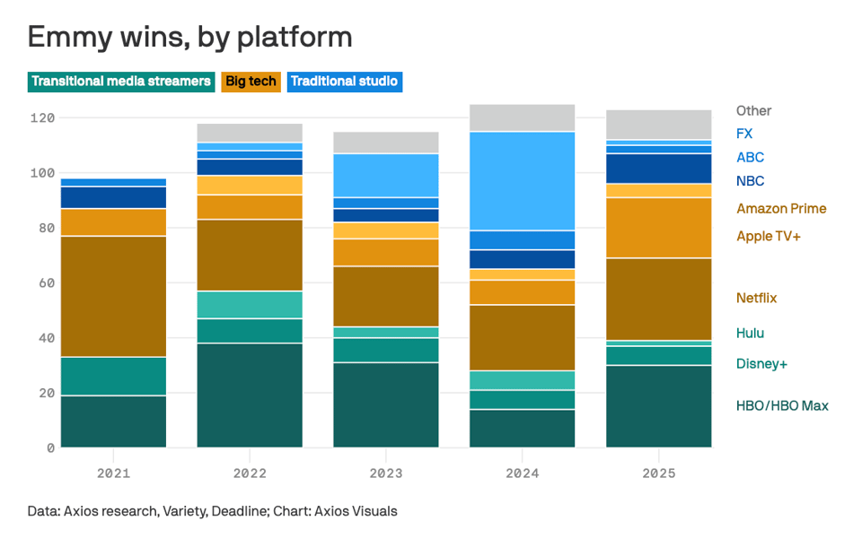
📺 Prestige TV wars
"For years, HBO dominated the Emmys as the gold standard for prestige drama and comedy. But this year's results show power shifting toward Big Tech."
The last 5 years have definitely seen a majority of tech-related awards, although the power shift has been taking longer time.
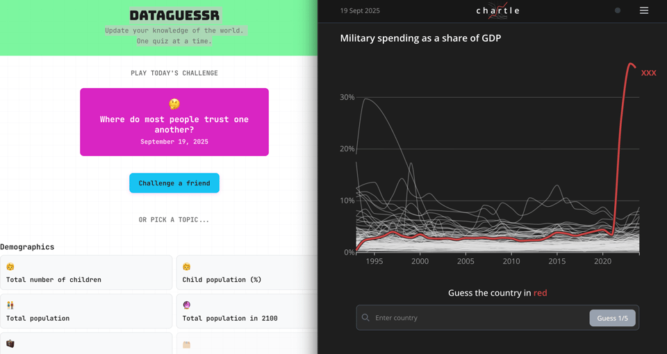
Data games!
I tried both DataGuessr and Chartle and they're both great fun!
🛠️📖 Tools & Tutorials
MiniZinc
"MiniZinc is a high-level constraint modelling language that allows you to easily express and solve discrete optimisation problems."
It reminds me of Prolog, but it's easier to use.
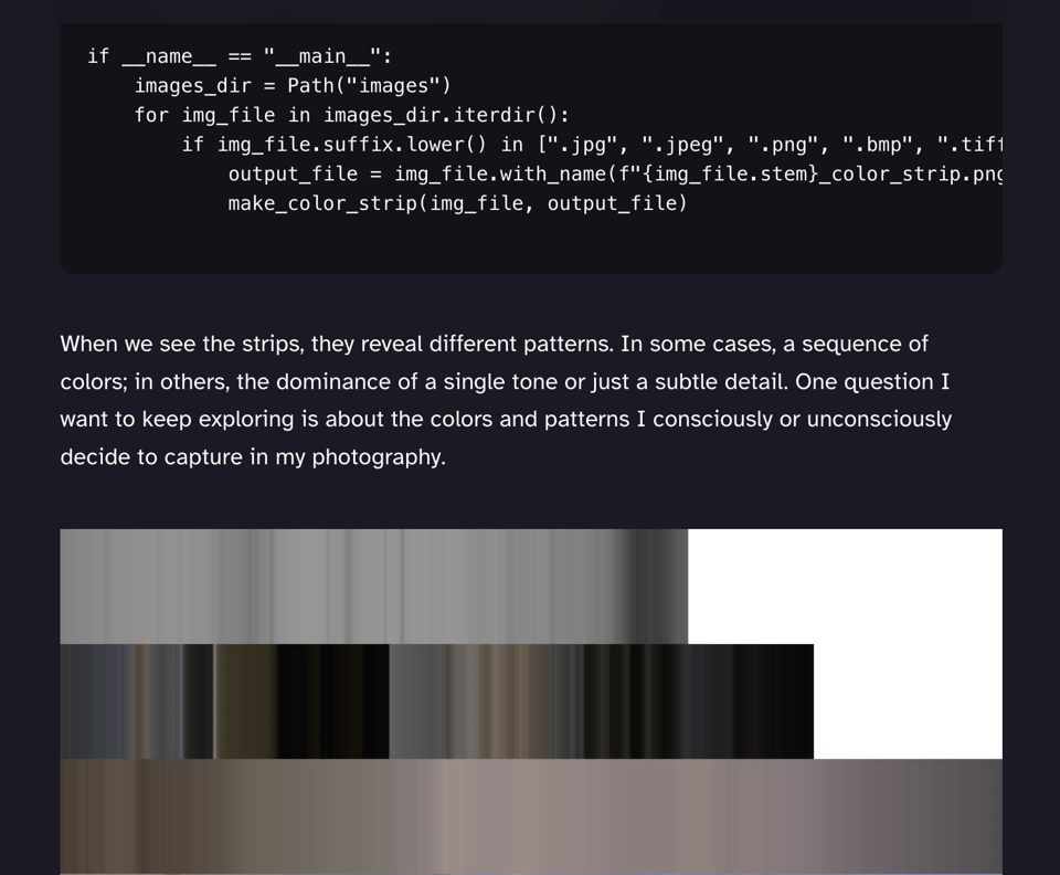
Pixels & Patterns: A Photography + Python Experiment
Luis Natera: "This week I’m mixing photography with code to uncover the hidden rhythms inside my images. A small experiment with big surprises."
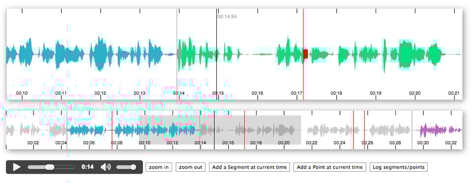
peaks.js
"Peaks.js uses the HTML canvas element to display the waveform at different zoom levels, and has configuration options to allow you to customize the waveform views. Peaks.js allows users to interact with the waveform views, including zooming and scrolling, and creating point or segment markers that denote content to be clipped or for reference, e.g., distinguishing music from speech or identifying different music tracks."
3D Modeling with Paper
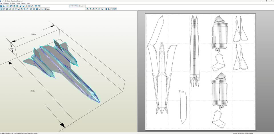
"Over the past several years, I've enjoyed the hobby of paper modeling (or papercraft), the art of creating 3D models from cut and glued parts from paper sheets. This hobby is a superset of origami, in that it allows for cutting and gluing, as well as for multiple sheets of paper for a single model. The alleviation of these constraints means that papercraft allows for more complex models that are easier to assemble."
Beautifully written, with many tips on how to get started.
SQL needed structure
"The fundamental problem is that fitting complex relationships to human vision usually requires constructing some visual hierarchy, but different tasks require different hierarchies.
Whatever database and programming language you use, you will have to deal with this. But it's particularly painful in sql because sql wasn't designed to produce hierarchical data."
Brutalita
A web tool to try fonts and edit them down to each individual character. Absolutely brilliant!

🤯 Data thinking
From Googlebot to GPTBot: who’s crawling your site in 2025
Cloudflare: "A new category, AI crawlers, has emerged in recent years. These bots collect data from across the web to train AI models, improving tools and experiences, but also raising issues around content rights, unauthorized use, and infrastructure overload. We aimed to confirm the growth of both search and AI crawlers, examine specific AI crawlers, and understand broader crawler usage."
📈Dataviz, Data Analysis, & Interactive
Things are getting increasingly clear
In debates at the House of Commons, says my Parli-N-Grams.

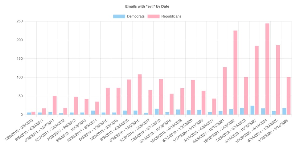
On the other hand, on the other side of the pond...
"Use of the word "evil" in official congressional e-newsletters, over time, by party".
(UK House of Commons for comparison here).
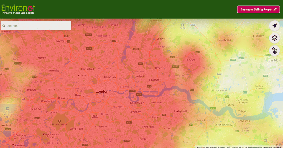
Knotsure
A map about Japanese Knotweed.
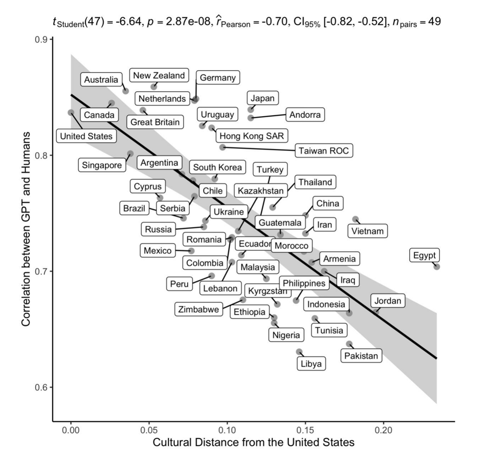
Cultural distance from the United States
From a very interesting academic paper called Which Humans? by a group of researchers in evolutionary biology at Harvard University.
It matters because of the implications on LLMs.
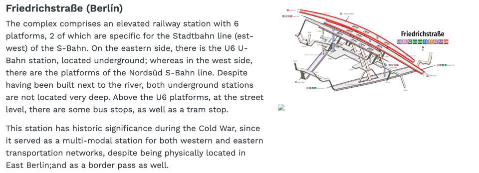
Stations and transfers
Albert Guillaumes Marcer "For the last 10 years I have been able to draw around 2,547 stations from different European cities, motivated by the curiosity of understanding how engineers were able to fit underground stations comprising 4 or 5 lines under Place de la République in Paris or the Puerta del Sol in Madrid."
He's done it, he says, with just "a pen, a notebook, a bit of spatial vision" – it makes sense, as he's a technician working in transport and mobility, and this makes it all the more fascinating.
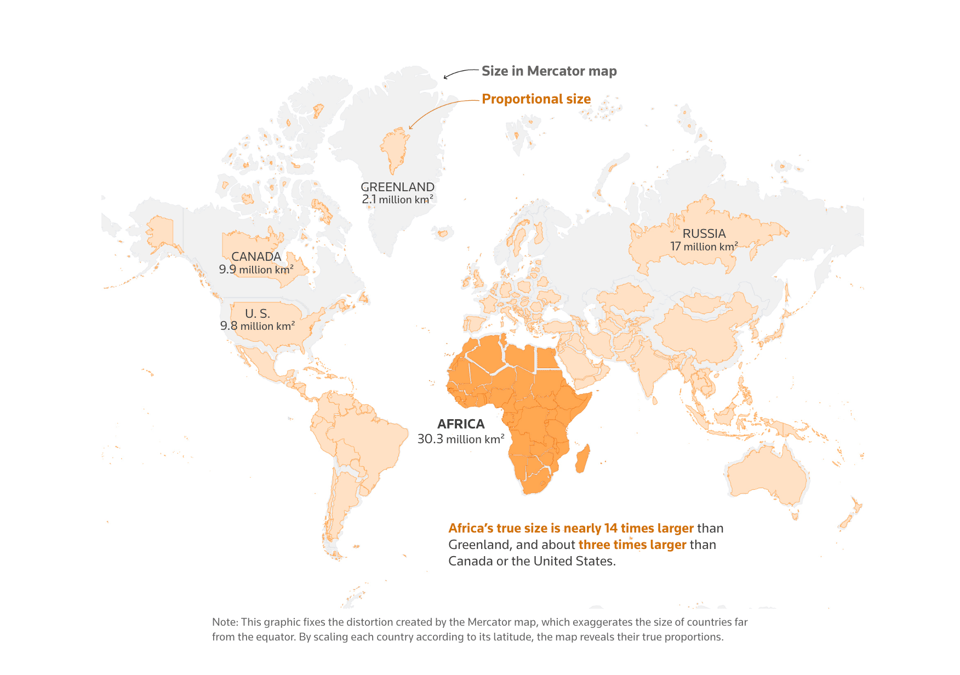
The true size of Africa
Reuters gives the most famous Mercator-related problem a look: "For centuries, the maps used to understand the world have distorted Africa’s size compared to most northerly nations."
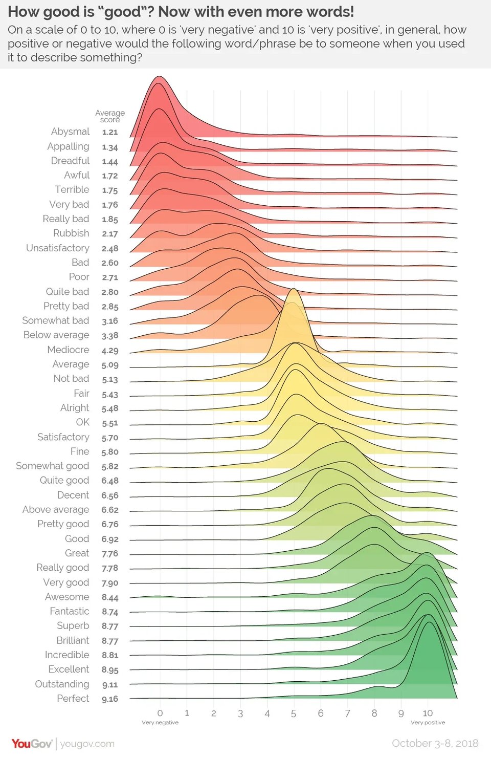
How good is “good”?
This is very old, but it resurfaced on LinkedIn recently. "YouGov showed [British] respondents a selection of adjectives from a list of 24 and asked them to score each on a scale from 0-10, with 0 being “very negative” and 10 being “very positive”."
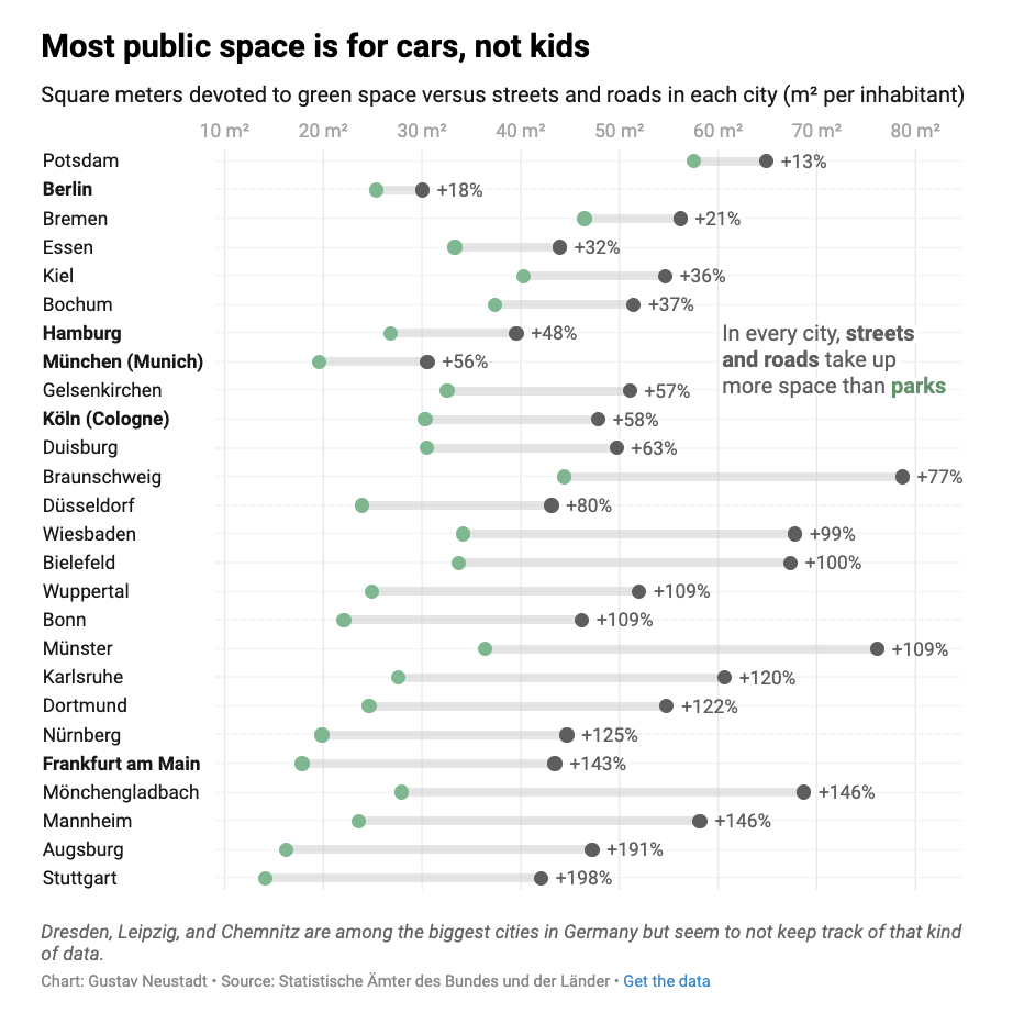
Look, don’t touch: the limits of public green spaces
Datawrapper's Gustav Neustadt looks at how much green space people and vehicles get in major German cities: "For this comparison, I chose three datasets from the Statistische Ämter des Bundes und der Länder. They track a wide range of land use categories, but usually mix commercial and non-commercial areas, which makes it hard to differentiate between them. The only sub-category that comes close to non-commercial spaces is “gardens and green spaces”."
🤖 AI
A guide to understanding AI as normal technology
"AI as normal technology" was an article, featured a few weeks back in Quantum #617, by academics Arvind Narayanan and Sayash Kapoor, which fundamentally argues for the idea that yes, AI is transformative, but it is neither utopian nor dystopian. In this compendium, the two authors offer notes and explanations to some of their points.
Is AI a bubble?
Azeem Azhar and Nathan Warren: "I want to go beyond the notion that we know a bubble when we see a bubble. There are two interrelated systems at work. The first, the most visible, is when stock markets become absurdly overvalued and collapse. The second is whether the quantity of productive capital (going into capital expenditure or venture capital) deployed collapses. The two are related, of course. A collapse in equity prices makes investment flows more expensive. And a secular decline in productive capital investment may be read by equity markets as a harbinger of a slowdown."
Defeating Nondeterminism in LLM Inference
"What might be more surprising is that even when we adjust the temperature down to 0This means that the LLM always chooses the highest probability token, which is called greedy sampling. (thus making the sampling theoretically deterministic), LLM APIs are still not deterministic in practice."
Hardcore AI, but well explained.
AI can't replace polling
"Using AI models such as ChatGPT to mimic human respondents betrays the public and provides inaccurate answers to key questions".
Who would think of such a weird thing to do... then you realise this matters to any application of synthetic data (which is legitimate to build application pipelines, but needs to be heavily caveated).
|
DID YOU LIKE THIS ISSUE>? → BUY ME A COFFEE! 
You're receiving this email because you subscribed to Quantum of Sollazzo, a weekly newsletter covering all things data, written by Giuseppe Sollazzo (@puntofisso). If you have a product or service to promote and want to support this newsletter, you can sponsor an issue. |
quantum of sollazzo is also supported by Andy Redwood’s proofreading – if you need high-quality copy editing or proofreading, check out Proof Red. Oh, and he also makes motion graphics animations about climate change.
